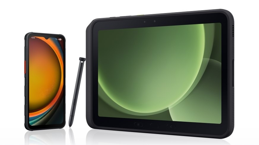
Motorola Xoom review
Big, black and powerful. That pretty much sums up the Motorola XOOM (henceforth to be referred to as the more eye-friendly Xoom), the opening salvo in what is about to be a deluge of tablets running Android 3.0 Honeycomb. And the Xoom not only ushers in a major change to the Android operating system, it also launches a new era in mobile hardware, faster and more powerful than ever.
But for all that, the usual questions remain. Does the Xoom match up with the competition? And does it justify the price? And is the darn thing just too big and too heavy? All that and another picture or two, after the break.
Ed. note: The bulk of this review will address the hardware and overall experience of the Motorola Xoom. That's not to say there's no mention of Honeycomb and the apps on the Xoom. But for the full Android 3.0 rundown, check out our "What's new in Honeycomb?" post.
Video walkthrough
Youtube link for mobile viewing
The hardware
Like we said at the outset -- this is one big black slab. The Xoom basically is a 10.1-inch (diagonal) touchscreen with a monster battery tacked onto it, with a couple of cameras (one front, one back) and stereo speakers that will make your laptop cower in fear.



Physically speaking, the Xoom is 9.8 inches wide, 6.6 inches tall and is a hair thicker than a half-inch. On the front, the touchscreen (at the relatively tablet-standard 1280x800 resolution) is surrounded by a half-inch bezel. There's also the Motorola and Verizon logos, and the front-facing 2MP camera, and a small but stylish notification light. That's it on the front. Big, black, slab. The screen itself is decent enough, with 150 pixels per inch, but we'll be wanting a higher density before long. And the thing is a fingerprint magnet, to say the least. And it appears to have some sort of static attraction to dust and other particles floating around. Point is, you're going to want to keep a microfiber cloth nearby.
Flip the Xoom over and things get a little busier. You've got a a pair of stereo speakers, the 5MP rear camera with dual flash, power/lock button and more Google, Verizon and Motorola logos, along with the usual FCC labels. The top quarter of the Xoom's rear is encased in a soft-touch plastic. The bottom three quarters is metal (aluminum, perhaps?), so get ready for scratches and marks. You might well want to consider a case.
Be an expert in 5 minutes
Get the latest news from Android Central, your trusted companion in the world of Android
These speakers are worth further mention. They're loud. And we find ourselves saying this for the first time -- they're too loud. Loud to the point that sound is distorted coming out them. That could possibly just be a problem with our review unit, but it's definitely a distraction. But when things are at a more manageable level, the sound is great. You get sucked into gaming that much more. Listening to podcasts and talk radio is without effort. And listening to music doesn't make you want to throw the device through a wall.
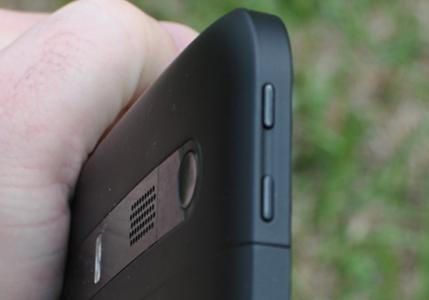
A word or three about buttons. You have the power button on the back, and volume buttons on the left-hand bezel, and that's it. Gone are the physical home-menu-back-search buttons of previous versions of Android. They've all been moved into the Honeycomb experience. And that's not necessarily a bad thing. But what it does mean is that any time you need to wake the Xoom and turn on the screen, you have to pick it up (or at least lift it up) to do so. That's a trade-off, and for us it's a pretty good argument for moving the power button to one of the side bezels.


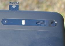
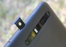
On the top bezel you have the 3.5mm headphone jack and the tray for the Verizon LTE 4G SIM card. You get to the tray by prying up the rubber cover, which is done easily enough. The spring-loaded microSD card is tucked in there as well. And as has been widely publicized since the Xoom's announcement at CES in January 2010, neither the LTE SIM card or microSD card worked when the tablet became publicly available. Despite the Xoom's plentiful 32GB of storage space, the microSD card not working is a pretty big strike against it, even if it's a software issue and not one of hardware. As for LTE, that will take a hardware upgrade which requires you sending your Xoom to Motorola for six days. Another big strike.
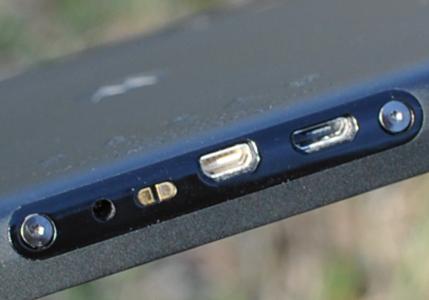
On the bottom bezel you'll find the Xoom's microUSB port, microHDMI port for outputting high-definition video, charging contacts used by the accessory docks, and the proprietary wall charger. It's unfortunate you can't charge this thing over the more traditional microUSB, but that's another trade-off we're going to have to accept for devices with larger batteries such as the Xoom.
What's under the hood
A big touchscreen's nothing new. What really gets us excited about the Motorola Xoom is a big touchscreen powered by a dual-core Tegra 2 system on a chip (SOC). What you have a is a dual-core ARM Cortex-A9 processor at 1GHz, plus NVIDIA's low-power graphics processor, all on a single chip. There's been a lot of thought given to dual-core processors, but we can really sum it up in a single sentence: It's fast, powerful, and doesn't suck your battery dry. And if you'll allow us a second sentence: You want it. While processor nerds may be waiting for Qualcomm or Texas Instruments to finally get dual-core chips out, you'll be perfectly happy with Tegra 2.
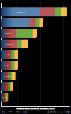
We've yet to run into any serious hiccups, so far as we can tell, with processing power. There's plenty of overhead. Instead, the bigger issue is that most applications haven't been optimized for Android 3.0 Honeycomb, and there's occasional instability with the native Honeycomb apps, such as the browser and Gmail. That's nothing that can't be fixed, but it is a bit of a headache -- and embarrassing for a major release.
Battery life, of course, is another big question when it comes to dual-core systems. And we've said it before, you're not pulling twice as much power. In fact, as NVIDIA reminds us whenever we're within earshot, Tegra 2 systems use less power. But no worry, as the Xoom has a pretty monster battery. It's rated in the specs as 24.5 Watt-hours (6500 mAh), or about 9 hours of browsing over 3G, 10 hours over Wifi, 3.3 days of mp3 playing, 10 hours of video playback and 2 weeks of just hanging out and doing nothing.
In our usage, we've had no problems going a whole day -- and then some -- without worrying about charging. It all depends on your usage, of course. But for sporadic e-mails, browsing, music playback and an hour or so of gaming, you're not going to worry one bit. In fact, if you do manage to run the battery down in one sitting (and aren't on a long international flight), we're going to start asking why you have so much free time.
Android 3.0 Honeycomb, and apps

If phones like the Motorola Droid, Nexus One and Nexus S are a pure "Google experience" -- aka stock Android -- the same can be said about the Motorola Xoom. Like we wrote at the outset of this review, check out our Honeycomb guide for a full rundown of Android 3.0. You get the full stock experience on the Xoom. There's no crapware loaded by Verizon.
So what do you get? You get the latest (and tablet-specific) version of Android. It's not unfamiliar, but there are numerous tweaks to explore. Apps on the Xoom include: Google Books, a new web browser, Calculator (with scientific mode), new Calendar, new camera app, Clock, new Contacts, Dungeon Defender, E-mail, Gallery, Gmail (again, new for Honeycomb), Google Search, Latitude, Maps, Market, Movie Studio, Music, Navigation, Places, Google Talk (and it's finally useful), Voice Search and YouTube.
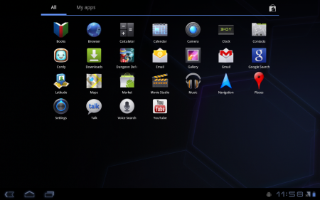
We've said it before (again, that Honeycomb guide), but it's worth noting here that you've likely read about apps crashing, and Honeycomb being unfinished. Yep, a good number of apps you might download likely will, at first, force close more than you're used to. And that brings us to one of the major issues with the Xoom, which really isn't the Xoom's fault at all. The vast majority of Android apps -- which more than likely will work in Honeycomb, even if it's only badly -- are not designed for a tablet screen, and likely are just now in the process of being updated and optimized for Android 3.0.
The Motorola Xoom went on sale on Feb. 24. The finalized Android 3.0 software development kit -- the SDK -- was made available just two days earlier. That doesn't mean that there were no Honeycomb-optimized applications available at launch. A select few (16 or so) initially were featured in the Android Market's "Android Apps for Tablets" section. And all of Google's native apps on in Honeycomb are designed for the new OS and feature the "Fragments" that make the large-screen experience oh so sweet. But everybody else is still playing catch-up. At the time of this writing there is no tablet-optimized Twitter application. No tablet-optimized Facebook app. Do the current apps work? Sure. But it's not a good experience on a 10.1-inch screen.
But is that the Xoom's fault? Or is it Google's? Or is it the developers? (Hint: It ain't the first or the last.) The good news is that things will get better, but it will take time, and it's a black eye that shouldn't have happened.
Gaming on the Xoom is great experience -- until your wrists give out. The coating on the touchscreen means quick gestures, the Tegra 2 processor brings beautiful graphics, and the stereo speakers -- so long as they're not too loud and distorting -- lend the Xoom to a highly immersive experience.
The camera(s)
For all the magic that Honeycomb and Tegra 2 bring to the Xoom, cameras are still cameras. The Xoom's rear shooter is of the 5-megapixel variety. And it quality of the pics is about what you'd expect.
Images below open in a new window


And the video, well, it shoots at 1280x720 at 30 frames per second (that's high-def), but it's still a basic cell phone camera, right?
Youtube link for mobile viewing
And beyond that -- it's not like you're going to be running around with a 10-inch tablet as your point-and-shoot camera, right? A 10.1-inch, 1.6-pound point-and-shoot camera. Nope. Not so much. (Even though the new camera app in Honeycomb is much improved.)
No, it's the front-facing camera that's actually of interest to us. And that's because Google Talk has video chat built into it in Honeycomb. (For those of you used to Apple-talk, think Facetime for Google.) Using Google Talk is blessedly simple. Sign in with your Google account -- and if you have more than one account, you can finally chose, and hop back and forth between them! -- and you see your list of contacts. Tap one and tap the video button, and you're off and running -- erm, chatting.

But for as simple as the process is, the quality of the video chat is still pretty poor. The 2-megapixel camera does its job, but we'd like better quality. Of course, you have to sacrifice some quality for easier data transmission. We're still waiting for flying cars, too.
Speaking of video, the Xoom has Honeycomb's new Movie Maker app. If you want to shoot video on your Xoom, add a photo or two that you took on your Xoom, and toss in some background music, be our guest. We'll be over in the corner, doing the same thing quicker and easier with our laptops and real cameras.
Hackability
The (relatively) good news: The Xoom is unofficially Google's Honeycomb developer device. It has an unlockable (and relockable) bootloader, meaning we'll be able to easily load custom ROMs. It can be rooted with a few text commands. And rolling it back to stock is simple enough. Things can be a tad tricky because the microSD card isn't yet active, but that's not a huge hurdle.
So do I buy a Xoom or not?
That's the question, isn't it? At $599 with a two year contract ($799 month-to-month) with Verizon, it ain't cheap. And the old "I could just buy a laptop" argument remains. But let's assume you're in the market for an Android tablet. The question for the Xoom (at the time of this writing the only Honeycomb device available) then becomes, "Do I buy a Xoom now, or wait for something else later."
If you have to have the latest and greatest hardware, by all means, go for it. And be prepared to send your Xoom to Motorola for a week to get the LTE radio turned on.
If you want a Wifi-only Xoom, you're going to have to wait a little bit. We're expecting one, but it hasn't been announced yet.
And if you don't want to put up with the hassle of sending your Xoom back to Motorola for that LTE retrofit, we'd wait. Actually, that's a pretty strong argument for waiting, as that endeavor is likely to be fraught with problems. And by the time that retrofit begins (probably sometime around late May), we're likely to see new tablets on the market.
It's a conundrum.
Android's Honeycomb branch has some serious potential. But Android 3.0 is very much a Version 1.0 as far as its tablet OS is concerned. But the hardware Motorola has provided here is powerful (even with quad-core devices waiting in the wings), and we're pretty sure the Xoom won't die as a platform in a month or two. It's solid, and Google's going to use it to improve the Honeycomb experience.
If a 10-inch tablet's the size for you, and you can put up with the weight, and the headaches Android apps catching up to the Honeycomb universe, and the Xoom's LTE radio not yet working, and making do with the 32GB of internal storage while you wait for the microSD card to be activated, and can afford the price, by all means, purchase. You'll be among the first in exciting new world of Android tablets, and the Xoom's not likely to let you down. But if you're looking for something a little more polished, lighter and (eventually) cheaper, you might just want to hold off a bit.

