Motorola Droid 4 review
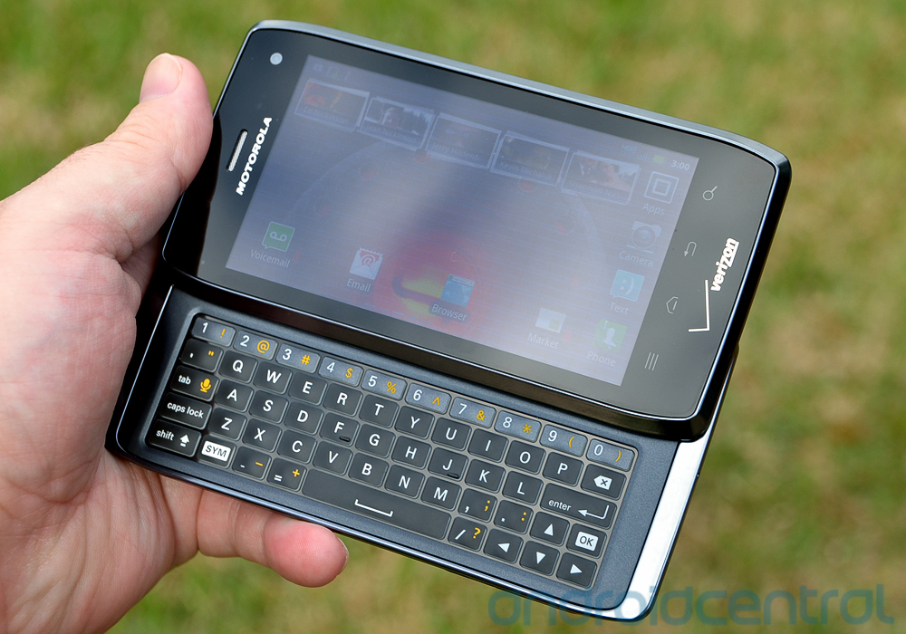
After two years and four hardware iterations, the Motorola Droid 4 is the pinnacle of the line that brought Android into the living rooms of America, if not the world. That's it. Plain and simple. If you're looking for an Android phone with a sliding keyboard, there is none better, insofar as the keyboard goes.
The Droid 4 isn't a radical departure from its predecessors. You've got a keyboard, and you've got a screen, though both have undergone further tweaking that keep it in the style of other current Motorola smartphones like the Droid RAZR and Droid RAZR MAXX.
But that's not to say the Droid 4 is the perfect smartphone. Oh, we're going to sing its praises, to be sure. But it's also got some quirks that leave us scratching our head.
Check in after the break for our full Droid 4 review.
Pros
- An excellent physical keyboard, good size and heft in the hand. Motorola's software continues to have excellent customizations.
Cons
- Yet another phone awaiting an upgrade to Android 4.0 Ice Cream Sandwich. The 4-inch display leaves a lot to be desired. Battery is not removable.
The Bottom Line
Be an expert in 5 minutes
Get the latest news from Android Central, your trusted companion in the world of Android
This is the best iteration yet in the original Droid line. But for as good is the keyboard is, the display is that bad. And launching with an aging version of Android -- even one that's perfectly functional -- is starting to wear on our sensibilities.
The video walkthrough
Youtube link for mobile viewing
The hardware
The keyboard
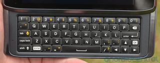
When you get down to it, the hardware of the Droid 4 (or for any of the phones in the range) starts and ends with the keyboard. As such, the Droid 4 keyboard has five staggered rows of the best chicklets we've had the pleasure of using. They're more rounded, better spaced and better defined. They're "laser-cut," for what that's worth. We don't really care how it happened -- just know that this is the best damn physical keyboard you can get.
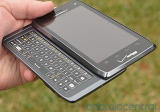
The keys themselves have just the right amount of travel and "click" to them, though they don't move independently. When you press one, you'll see the others around it move ever so slightly as well. But that doesn't affect the ability to type, and chances are you won't even notice. It's a nice slight-of-hand.
The matte finish contrasts nicely with the glossy background, giving the keys the illusion of depth when you're using the phone in daylight. When things are a bit darker, a backlight kicks in, lighting up the characters on each key, as well as ringing the keys themselves. It's a great design feature that helps you hit exactly the button you're intending to, and it does so without washing out the entire experience.
There is a small LED indicator just to the left of the caps lock key, so you'll know if you're about to BE TYPING LIKE THIS.
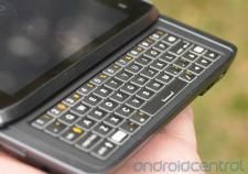
Motorola's cleaned up the overall look of the Droid 4 keyboard by getting rid of the secondary characters on all of the letter keys. To make up for it, the number row at the top of the keyboard now houses most of the basic symbols. Punctuation like the comma, period, slash, apostrophe and hyphen are still top-level characters.
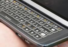
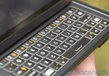
This is where we have our greatest complaint about the Droid 4 keyboard. Traditionally, you trigger secondary characters by first pressing an ALT or Fn key, then the key with the secondary character. The secondary characters usually are stenciled in a different color (most often yellow, though they were blue on the Droid 2), and same goes for the ALT or Fn key you use to trigger them. There's no such thing on the Droid 4. There's a big SYM key, but but that brings up an on-screen symbol menu. (Nothing wrong with that, but it's not what we were looking for.)
No, to get to the yellow secondary characters on the Droid 4, you have to first press the Shift key. That makes sense with a traditional keyboard experience. But on smartphones, it's a bit of a divergence. Nothing you won't get used to, of course, but it's different than the other phones in the Droid line.
The display
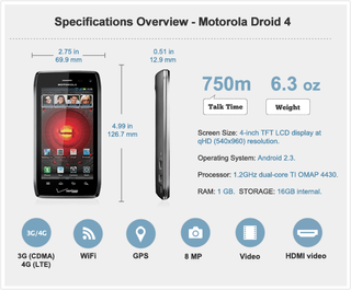
Of course, what good are all those keys if you can't see what you're typing? The Droid 4 has a 4-inch display at qHD (540x960) resolution. Unlike the larger Droid RAZR MAXX, which has an AMOLED screen, this guy uses a TFT display.
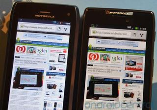
The big difference here is the hue of the display. Whereas the Droid RAZR MAXX has a yellowish tint, the Droid 4 is decidedly blue-gray. That's the Droid 4 on the left, and the Droid RAZR MAXX on the right. Unless you're switching phones a lot (like us) or have them side by side (guilty as charged), you might not notice. But it's an interesting difference. We prefer the blueish tint.
The display itself, well, it's not great. Things are OK so long as they're stationary. But once they start moving around, everything goes to pot. That goes for the home screens, menus, web pages, etc. Start scrolling, and things go dim and sort of seem to sort of hope you won't notice something's awry. Videos aren't horrible, and apps seem to be OK. But for everything else, it feels like you've taken too much cold medicine (if not something stronger). Plus there's a bit of the checkerboarding we've had to get used to in the displays Motorola uses.
But, hey, it's a crappy display covered in Gorilla Glass. So it's got that going for it.
The rest of the design
Most of the rest of the Droid 4 is fairly traditional. You've got four capacitive buttons below the display, done in the menu-home-back-search configuration. Above the display is a 1.3MP camera capable of shooting video in 720p. There's a small, hidden notification light at the top-left corner of the display.
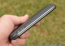
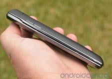
The Droid 4 retains much of the boxy shape it's had for years now, but the corners are slanted in the same design as the Droid RAZR MAXX. The display slides up to fully reveal the keyboard, and gone is the chin of Droids past. It's a better look.
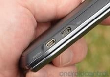
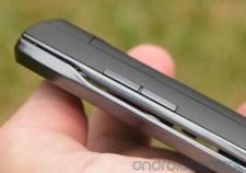
The left-hand bezel has microUSB and HDMI outputs. The right-hand side has the volume rocker.
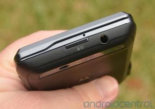
On top is the power button, awkwardly positioned in the center of the phone, and a pinhole microphone used for noise cancellation. (The main mic is on the bottom bezel.) The power button on our review unit seemed to fit a bit loose and list to one side. Not a big deal, but it looks a little sloppy on what otherwise is a tightly designed device.
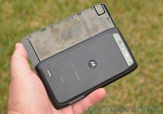
Flip the phone over, and this is where things get interesting. You've got a textured soft-touch battery cover with Verizon and Motorola logos on it, and a cutout for the rear speaker. Up top is the 8-megapixel camera and flash, and what looks like it might be a hole for a third microphone. If only it were that simple.
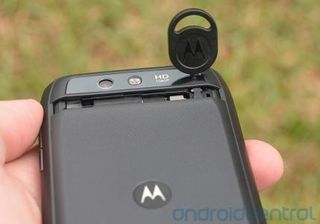
What you have here is a hole for what we're calling the battery cover unlocking mechanism tool device thingy. That is, the Droid 4 comes with a little plastic tool that you stick in that hole, and then you can slide down the battery cover.
That's great and all, but you can't actually remove the battery. No, the 1785 mAh battery is stuck in there. Glued in place, actually. But you can get to the SIM card and microSD card slot, and those are important. But, no, you can't swap out the battery for a fresh one.
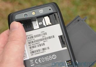
Removing the the rear door also exposes the vibrating motor and what looks to be four contacts for an inductive charging back.
Youtube link for mobile viewing
What's under the hood
There's not a whole lot to be said about the power plant behind the Droid 4 -- it's got a dual-core TI OMAP 4430 running at 1.2 GHz, with 1GB of RAM. You've got 16GB of internal storage. But the way it's partitioned, you get about 3 GB for app storage, and 8 GB for media and the like, with the rest allocated for the operating system. That's not unusual, but neither does it really mean you have 16GB of useable storage.
As for battery life, we've been pleasantly surprised. The 1785 mAh battery is a respectable size. Standby time has been excellent (that isn't always the case with Verizon LTE devices), and the Droid 4 holds its own in actual use. LTE data still eats through a battery, but things are getting a little better in that respect. As is always the case, your mileage will vary. But we didn't have any real issues to report, except that phone didn't like to charge on a lot of the USB chargers we have just laying around. You'll likely need to use the included one.
The software
The bad news: The Droid 4 is yet another Android device that launched with Gingerbread. The not-quite-as-bad news: It's already been promised an update to Android 4.0 Ice Cream Sandwich -- we just don't know when it's coming.
(By the way: We're getting really tired of writing that paragraph.)
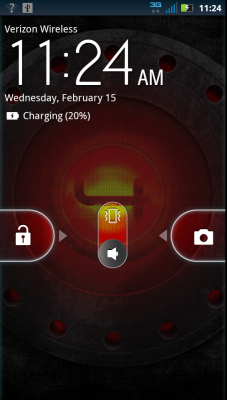
The software on the Droid 4 is nearly identical to that of the Droid RAZR MAXX. You start off with the slider lock screen. Slide your finger one way, you unlock the phone. Slide the other way, you get quick access to the camera. There's also a nice toggle for sound on/off.
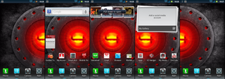
You've got five home screens on which to place icons and widgets. And, again, what's preloaded is nearly identical to that of the Droid RAZR MAXX. Motorola and Verizon haven't overloaded them, so you've got plenty of room to work.
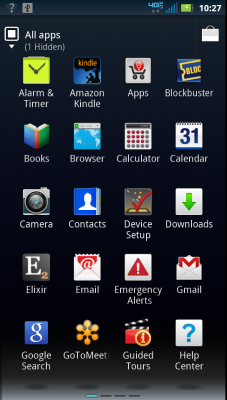
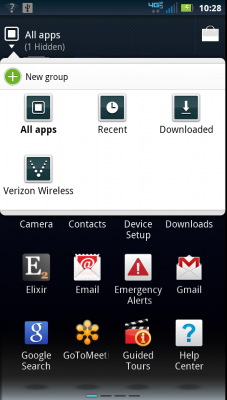
The App Drawer scrolls horizontally -- seriously, manufacturers, we want some vertical options here -- and you're able to put apps into groups for individual viewing. You also can sort the App Drawer alphabetically, or by most frequently or recently used apps.
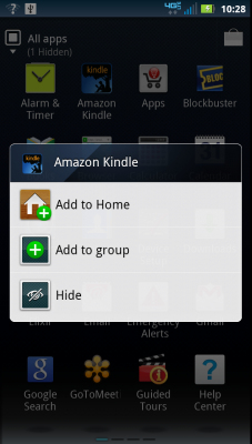
Motorola's borrowed half a feature from Ice Cream Sandwich. You might not be able to uninstall every unwanted app from your Droid 4 (preloaded apps are fickle like that), but you can hide the icons from sight. It doesn't go as far as in ICS, which will also sandbox the hidden app so that it can't hit the battery or use RAM in the background. But it's a nice addition. (Apps that are hidden go into their own group, so you can unhide them later.)
As far as preloaded apps go -- well, they go a long way. This thing's loaded with them, which isn't unusual for a Verizon phone. Apps like Amazon Kindle and BlockBuster are back, as are GoToMeeting, Let's Golf 2, Madden NFL 12, MOG Music, Netflix, NFL Mobile, Quickoffice, Slacker and Slingbox. And, of course, there's Motorola's suite of apps like MOTOACTV and MOTOPRINT, plus Verizon's VCAST apps.
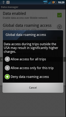
The Droid 4 also is loaded for the business types. In addition to the apps listed above, it's good hooks for device administration (that's also built into Google Apps accounts if that's how you roll), and in addition to using 4G LTE on Verizon, it's a global-ready device, so you can use it on GSM CDMA networks outside of the United States.
(Update: Verizon tells us that the screen shot you see here is for CDMA roaming, but Verizon has told Phonescoop that intends to enable GSM/CDMA roaming sometime this year.)
Motorola's also included its excellent Smart Actions app, which lets you tweak and set all sort of conditional settings. Arrive home? Get a reminder to charge up, or turn of Wifi automatically. It's one of the most useful things Motorola's added to its phones in the past generation of devices.
The cameras
So the Droid 4 has a couple of cameras. There's a 1.3-megapixels shooter out front, and an 8MP shooter in the rear. Motorola's software remains excellent, with a slew of settings and scenes and other features, including multishot and panorama.
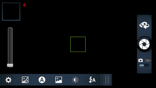
Examples below open in full resolution in a new window
Front-facing camera
Youtube link for mobile viewing

The front-facing camera isn't horrible. It shoots at 720x1280 resolution, and the mic worked well enough.
The rear-facing camera
Youtube link for mobile viewing

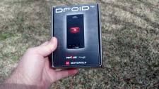


One thing to note about the Droid 4 (and other Motorola phones) is that while it has an 8MP rear-facing camera, by default it shoots in a 6-megapixel "widescreen" mode. That's 3264x1840, if you're interested. The idea is that the photos take up the entire screen that way.
Other odds and ends
Most of the Droid 4's quirks have been mentioned above. Here are a few other odds and ends:
- The speakerphone's plenty loud, and you've got 15 stops between silent and full-bore.
- Seriously, Verizon, it's time to get rid of the default DROOOOOOOOOID sound. We're over it.
- Location services are turned off by default. But once they're on, GPS works like a breeze.
- As for keyboards, you've got Motorola's pretty good multitouch input, and Swype is preloaded as well. Or you can go with any other third-party keyboard.
- Call quality on Verizon was decent enough.
- Verizon's got a wireless charging cover, if you're so inclined.
- Go to settings>applications and you can set an action for double-tapping the home button.
The wrap-up
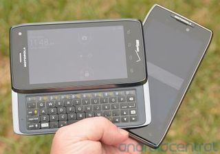
Just as we noted in our first meeting at CES, the Motorola Droid 4 is a capable Android smartphone, and it's easily the best in the Droid line. It's a worthy cousin of the Droid RAZR MAXX, with probably the finest keyboard we've used. But the keyboard doesn't make up for the underwhelming display. It's time for some 720p resolution, and time to get rid of the PenTile matrix. Period. Those are big negatives on what otherwise is a great phone.
As for the non-removable battery, well, it is what it is. We prefer the option of being able to swap in a fresh battery. But that's just not happening here.
But that's the smartphone reviewer in us talking. (Hey, it's what we do.) If you're less concerned about those things, and more concerned about having a powerful phone with fast data, a great keyboard and a slew of software features -- including domestic LTE and global roaming! -- the Motorola Droid 4 is well worth a look.
