There's nothing overly surprising about the new Moto X. Let's just get that out of the way. There's no one real whiz-bang feature that you're going to see repeated in commercials, or hear heralded by bloggers.
No, truth be told, the new Moto X — same name as last year's version — is one of those rare phones that is a near seamless transition from one model to the next.
And you know what? That's not a bad thing at all.
Article continues belowAnd that's not to say that we don't have a lot to talk about. Because we do, both good and bad.
So let's jump into it. This is the Android Central review of the 2014 Motorola Moto X.
About this review
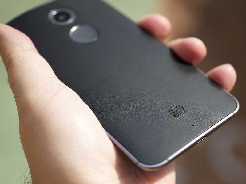
We're reviewing the AT&T-branded version of the 2014 Moto X as supplied by Motorola and made available before the retail release. We've been using it full-time for some three weeks before publishing this review. We've had it connected to a smartwatch all that time as well, which theoretically should (positively) affect battery life by keeping the screen off longer.
Get the latest news from Android Central, your trusted companion in the world of Android
Our Moto X is running Android 4.4.4 and will be updated to Android L after it's released later this year. It's important to remember that when it comes to software features in the Moto X, a good many of them can and will be updated through Google Play and are subject to change. (In fact, the umbrella "Moto" app got a very noticeable refresh about a week and a half into our use of the phone.)
We've also got a "Pure Edition" Moto X in leather cognac. It's missing the bloatware the AT&T version has, and it's also got a slightly newer software build than the review unit we've used — x.42 versus x.38. We've also noticed a slight difference in display temperature that's only really noticeable when you have the two side by side. Otherwise, they're the same phones.
Moto X Hardware
Bigger, better, but lacking part of its soul
Much of the conversation surrounding the original Moto X was that it wasn't the most technologically advanced phone — an odd decision considering it was supposed to be (and indeed was) the second coming of one of the world's greatest mobile companies. We had to come to terms with this "X8 Mobile Computing System" for a processor. We were left with a 720p display in an era in which 1080p was the norm, and talk of even higher resolutions was starting to become real. And there was the hype over a "Clear Pixel" camera.
None of those things turned out to be what made the original Moto X special. (The camera, in fact, was a pretty big disappointment.) Instead, what stood out was the size of the Moto X — with its 4.7-inch display tucked into a body that felt smaller, and had some of the best ergonomics we've seen — the software, and, perhaps most importantly, the price.
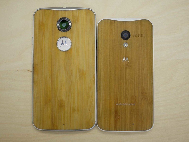
This year, we've got a better phone, but a bigger phone. The display has been increased to 5.2 inches. Motorola, in introducing the phone, told us that 75 percent of folks in a survey said they'd upgrade to a larger phone than what they were currently using. So, the Moto X got bigger.
Motorola said that 75 percent of users wanted a bigger phone. So, the Moto X got bigger.
And that's a shame.
There's nothing wrong with a top-end phone that doesn't take two hands to handle. And we phone journalists remind the manufacturers of this every chance we get. "Mini" phones, more often than not, turn out to be mid- to low-enders, shunned by those who know better. You could argue that the original Moto X never was a top-shelf phone thanks to the camera and what was powering it, but that phone always was about the sum of the parts. And it was done in a size that worked. And what's more, it was something that nobody else was doing. A phone you wanted in a size that stood out.
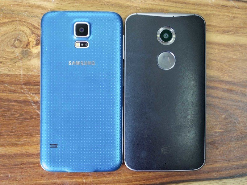
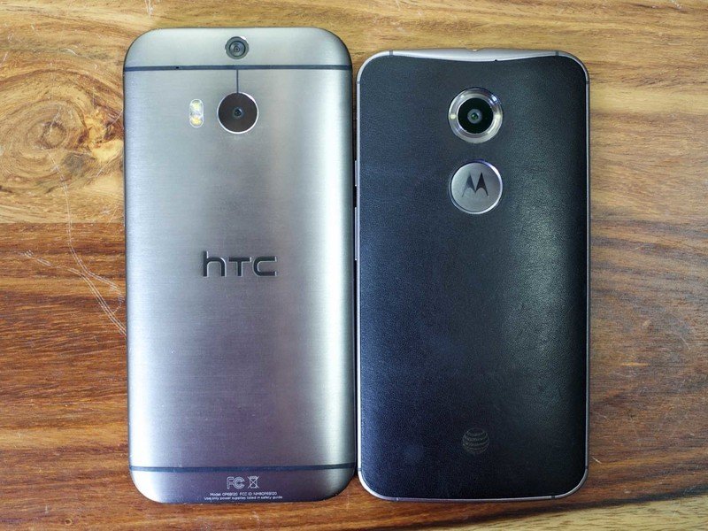
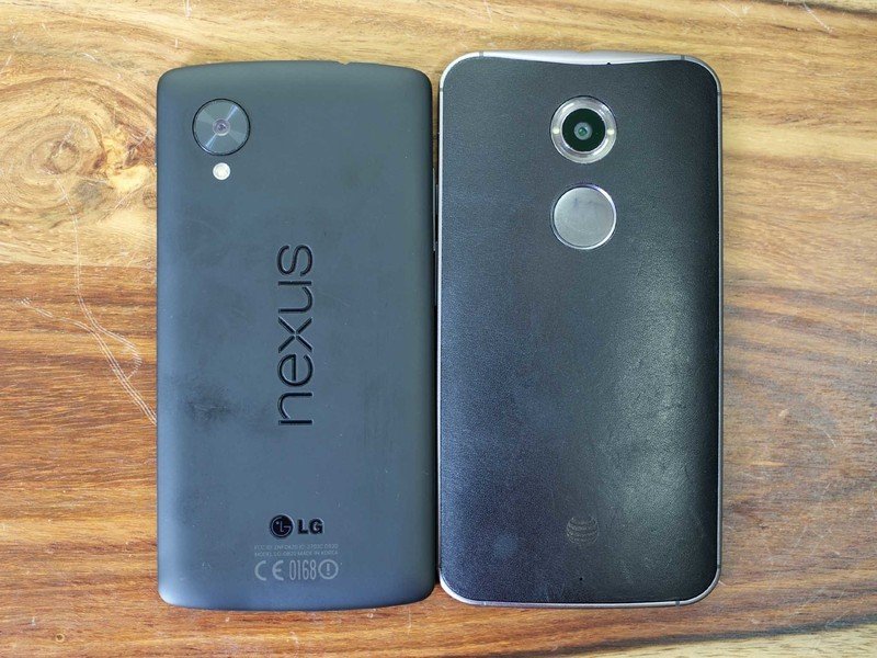
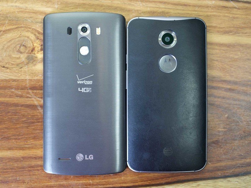
Now? The 2014 Moto X is just about as tall and as wide as the Galaxy S5, but not as thin. It's basically the same size and shape as the LG G3, just not quite as tall.
Not so different anymore.
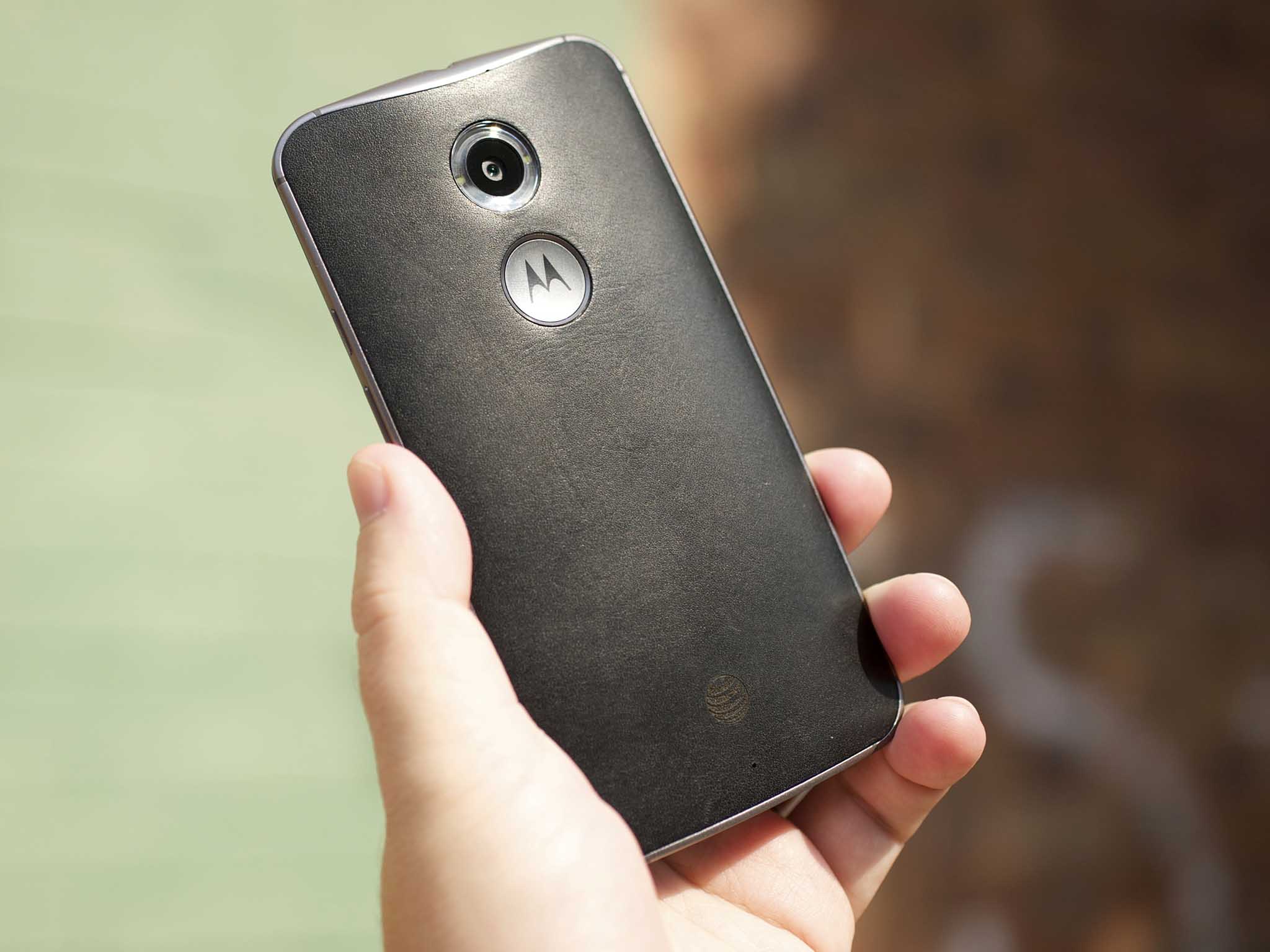
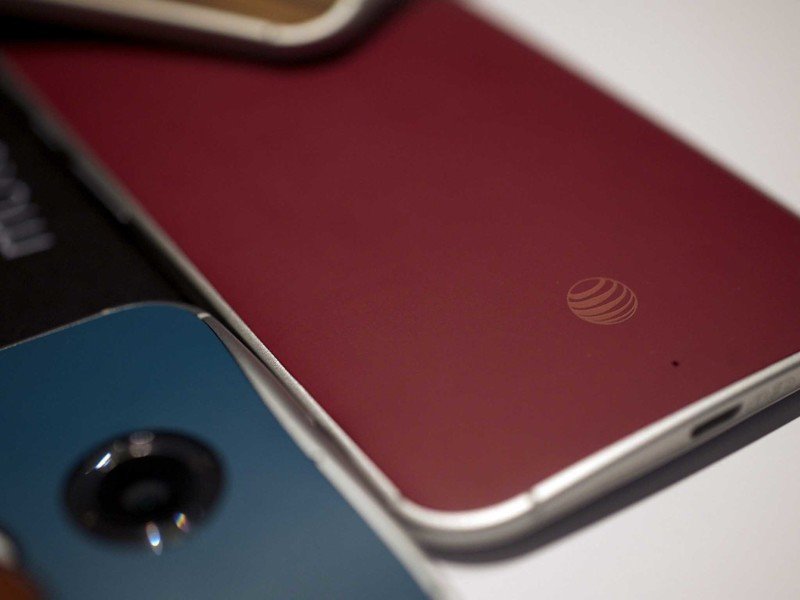
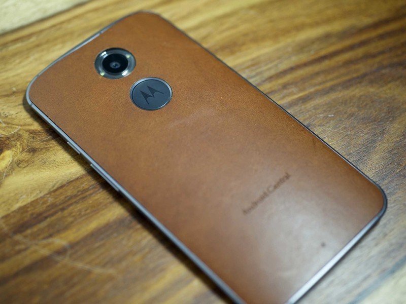
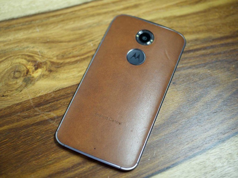
That said, the build quality of this Moto X absolutely has improved. You've essentially got three layers now. There's the back panel of the phone, which like last year's model can be customized in some 17 colors of soft-touch plastic. Or you can get a wood finish — teak, rosewood, ebony and bamboo have returned. And new this year is leather, from the Horween Leather Company in Chicago. You've four colors from which to choose — black (which we've had for review here), natural (a sort of light-ish tan), cognac and Navy blue.
The soft-touch and wood backs are exactly what you'll remember from 2013's model, so far as we can tell. Leather definitely kicks things up a notch. And it also presents the obvious question of how it'll hold up after eight or 10 or 16 months or more. We simply can't answer that yet. But scratches and blemishes are going to happen. This is leather, after all. We'll just have to see how it ends up. (Carrier logos and custom inscriptions are embossed; it'll be interesting to see how they hold up as well.)
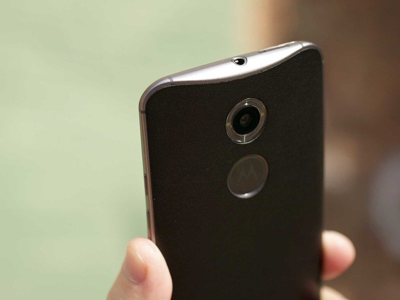
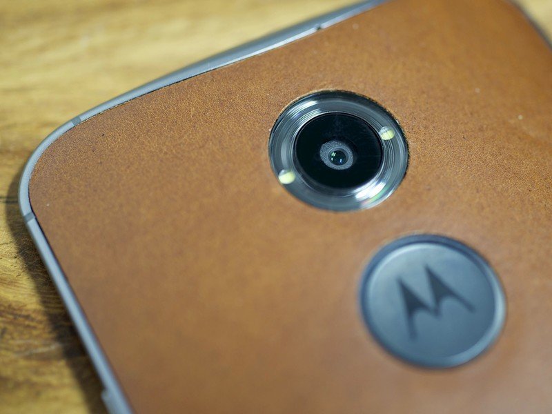
You can't talk about the back of the phone without, of course, talking about the dimple. Or, rather, what used to be a dimple and is now more of a crater. Gone is the subtle depression that gave your index finger a natural resting spot. In its place is a plastic-lined pothole, a pockmark on what otherwise is a sleek soft-touch/wood/leather back.
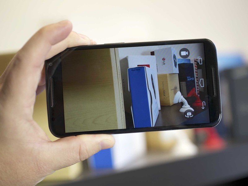
One last feature on the back is the new ring flash. There are LEDs on either side of the camera lens that bounce the light through a ring. How's it work? We'll show you in a bit.
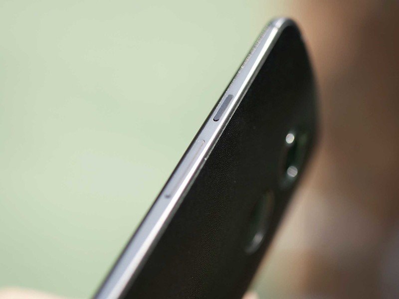
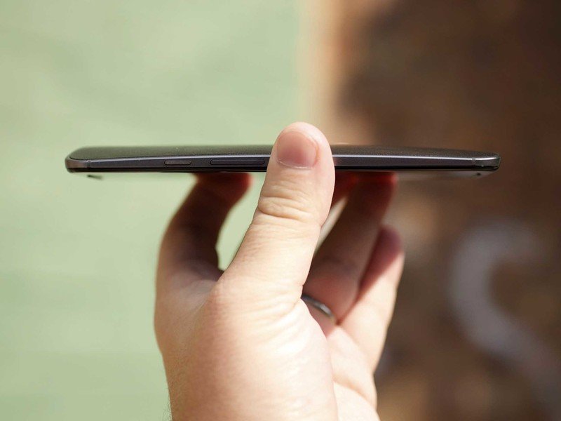
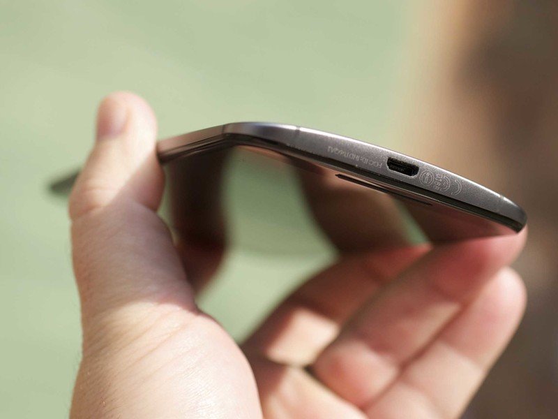
The matte metal midsection is a really nice touch. For one, it eliminates the plastic-meets-plastic seam of the first-gen Moto X, giving things a much more sophisticated transition. But it's also nicely designed, with a sweeping curve from the top of the phone. The volume rocker and power button don't look out of place, and the latter has a nice texture to it, making it easier to find by feel.
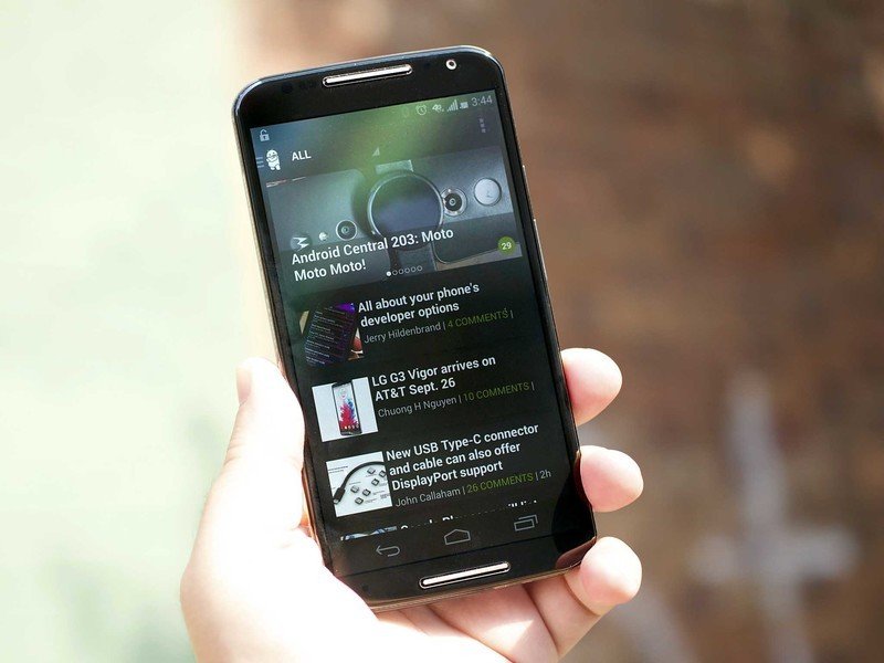
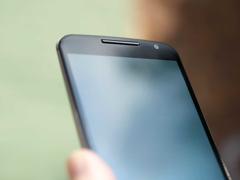
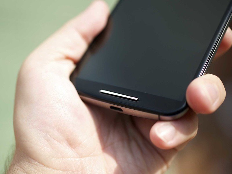
The front of the Moto X has had a bit of a refresh as well. The glass has a really nice curve where it bends over to the side of the phone. (Last year's model saw the plastic bezels making that transition.) You'll also quickly note the appearance of dual speakers. The top, however, is only a traditional earpiece. You'll not be cranking the jams (or whatever it is the kids do today) out of this speaker. The bottom grille, however, does serve as the traditional speaker. And it's pretty darn good. Crisp, clear and loud. It's still not in the same league as the HTC One, but it's pretty good for a single-speaker smartphone. (And as we've constantly reminded over the years, Motorola's always done well with speakerphones.)
The matte metal midsection is a really nice touch. It gives things a much more sophisticated transition, with a sweeping curve from the top of the phone.
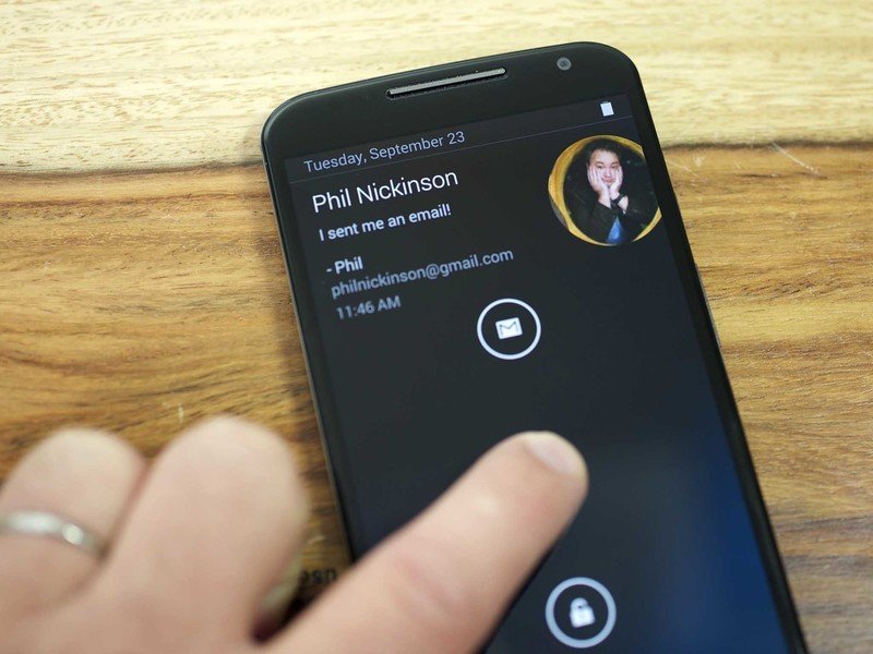
One other fun feature on the front of the new Moto X is the appearance of four infrared sensors on the four corners of the face. Those are used to detect motion and movement in front of the phone as part of "Moto Actions." If you get a call or an alarm goes off, you can wave your hand over the phone to silence it. Or if the phone sees you coming, it'll go ahead and fire off the renamed "Moto Display" (previously "Active Display"), which shows the time and notifications in black-and-white fashion for a quick peek. The IR sensors stand out if your Moto X has a white front; they're mostly hidden on the black face. (You can, however, see their eerie red eyes looking at you in the dark.) This is all different — and much more subtle — than the four exposed cameras on the front of the Amazon Fire Phone. It's looking for motion is all.
The 5.2-inch AMOLED display itself is decent enough, if not overwhelming. A 1080p resolution is what you'd demand at this size, and the 423-ppi density means you're not seeing individual pixels. The display temperature leans a bit on the yellow side, and the whole thing is covered in Gorilla Glass 3. It's decent outdoors in sunlight, but not stunning.
Internally, we're no longer talking about an "X8" processing system or anything. We're back on a relatively standard quad-core Snapdragon 801 processor at 2.5 GHz, and an Adreno 330 GPU. Two gigabytes of RAM also keep things running smoothly, and the phone's available in either 16GB or 32GB of storage, with the latter costing $50 more and only available if you order through Moto Maker. Our 16GB model came with a little more than 10GB available to the user at first boot, so we recommend splurging for the 32GB model if you can.
There's not a whole lot to say about the power plant — it gets out of the way and works as we've come to expect. The Spartan user interface and animations transition exactly how you'd expect. (And figure the Android L upgrade should be just as fast.)
Moto X (2014) battery life
Battery life was a bit of a concern from the get-go, as the 2,300 mAh battery has a good 20 percent lesser capacity than what we've seen in other recent flagships. What's more is that unlike those larger batteries in the Galaxy S5, Galaxy Note 3 and LG G3, the Moto X has a non-removable battery. So you're stuck with what you've got, and if you want more you'll have to plug in to charge. (Motorola is happy to sell you a fancy new Power Pack Micro to do just that.)
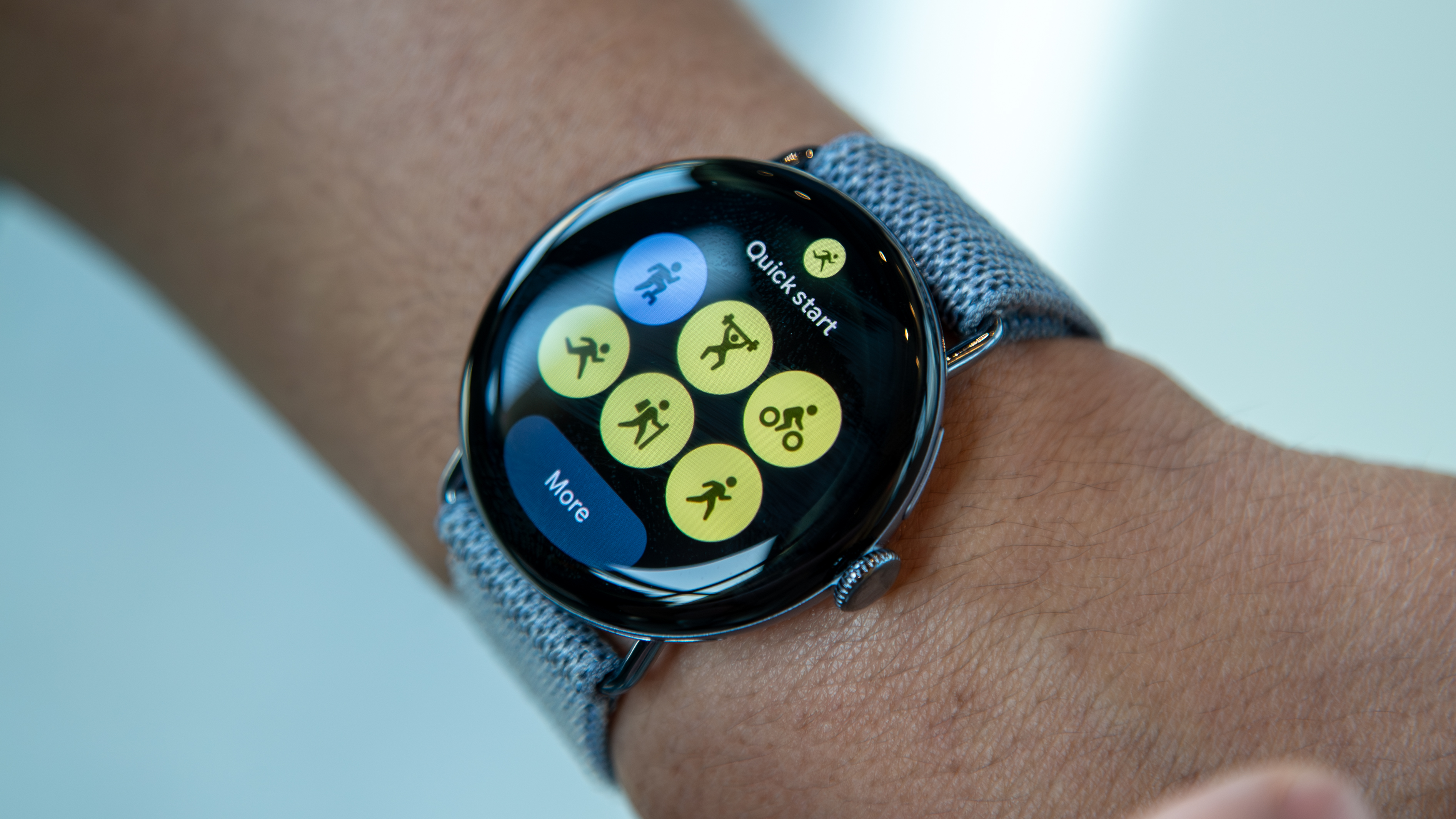
In our several weeks of use we've averaged between 12 and 15 hours of typical daily use. Life on the road bouncing around networks was predictably harsh. It's worth a reminder, though, that a big part of using the Moto X is that you won't be turning on the entire display as often thanks to the "Moto Display" preview feature that gives peeks at the clock and notifications. In addition, we've also used the Moto X from the start connected to a Moto 360 smartwatch, keeping us from needing to light up the display that much more. We'd err on the shorter side of battery life because of this, but your mileage will vary.
Basically, the takeaway is if you're really hard on your phone, you might well need to top off the Moto X midway through the day. It's times like these you love to have wireless Qi charging. But with the Moto X, it's plug in or nothing.
The new Moto X software
It's Android, but better
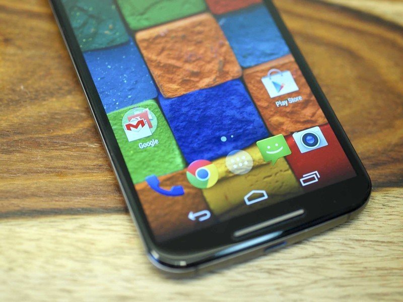
Software on the Moto X, much as it was with the previous model, is simultaneously boring and exciting. For one, we're looking and what on the surface is a standard Android 4.4.4 build. No skinning or theming, just Android as Google intended. That's good for the purists out there, and it also means you don't have to spend time learning where things are, or sifting through a million features you might not actually use.
It's worth a reminder, though, that for as pure as Motorola's kept the Google experience on the new Moto X, the carriers that sell the phone have no such pretensions. AT&T's got its usual suite of bloatware on board, as does Verizon. If you want to avoid that, Motorola is selling an unlocked "Pure Edition" based off the T-Mobile SKU. Looking at the official specs, it's actually got the same radio bands as the AT&T version — it comes without all that carrier app nonsense.
The Moto X comes with the Google Now Launcher installed, but you can put anything you want on top of that without worry.
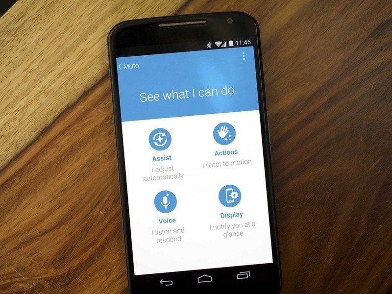
The biggest change on the software front is that Motorola has consolidated all of its major services under a single "Moto" app. Within it you'll find:
Moto Assist
For setting the do-not-disturb sleep mode, driving mode (automatically read back texts and incoming calls), home mode (same sort of thing, so you don't have to always have your phone in your pocket or have to run to see who's calling), and a meeting mode that ties into your calendar so your phone won't bug you when you're busy.
Moto Actions
This uses the four IR ports on the front of the phone. You can wave to silence calls and alarms, and it looks for your approaching hand (or face or whatever) to turn on the display peek so you can see time and notifications without waking the entire phone.
The old "OK, Moto X" voice command prompt still works, but now you can get cute with it. "OK, NeckBeard" is absolutely an option.
Actions also controls the wrist-flick action for launching the camera app, a feature you don't realize how much you missed until you start using other phones without it.
Moto Voice
Motorola made talking to your phone cool with the original Moto X. And it's gotten better. You now can official set your own launch phrase. The old "OK, Moto X" still works just fine, but now you can get cute with it. "OK, NeckBeard" is absolutely an option. And like before, you can utter your launch phrase at any time — the phone doesn't actually have to be awake.
You also can now speak your PIN to unlock the phone, if that's what you're using (though Trusted Bluetooth devices are back, and we highly recommend that if you have a Bluetooth device nearby), and you can choose with voice commands work while the phone is locked.
Moto Display
This is the renamed Active Display. It's what lets you peek at the clock and notifications without having to hit the power button, and it's controlled form within the umbrella Moto app. You can chose whether you want to use it in the first place (it's on by default), choose which apps you want to appear in Moto Display (maybe it's not the best idea to have a Tinder notification show up while you're sitting next to the boss), and you can chose to hide notification details if you're using a screen lock.
Again, one of the important things here is that each of those features is able to be updated independently from the operating system. That means Motorola — and not the carriers — controls those updates.
Other software features of note
And that's not all, folks. There's also the aforementioned Trusted Bluetooth feature, which also made its debut on the 2013 Moto X. It lets you set some actual security on the lock screen, but bypass it so long as you have a designated Bluetooth device connected.
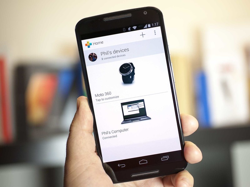
For instance: I have a PIN code on my phone. But if my Moto 360 is connected, I don't have to enter the PIN to unlock the phone. But as soon as the phone is separated from the watch — whether it's lost or stolen or whatever — I'll have to enter that PIN to unlock the phone. It's changed the way I secure my phones (meaning that I actually do it now), and it'll be built in standard to the Android L update later this year.
New this time around is "Attentive Display." It uses those IR ports to keep the phone lit up longer while you're actually looking at it, and to go to sleep sooner when you're not.
We also have Motorola Connect, which has grown up a bit since its early days as a way to get texts and calls on your computer via a Chrome extension. It now also will manage your Moto 360 Android Wear smartwatch, or the Motorola Power Pack Micro, which in addition to charging things can be used as a Trusted Bluetooth device. Moto Connect also has the rudimentary beginnings of a wellness profile (which should get more useful when Android Fit lands alongside the Android L release), and it'll show you the last known location of your Bluetooth device.
OK, so that's actually quite a lot going on with software on the Moto X. But the thing is that none of it is too in-your-face. It's almost all useful — Connect may be the only dubious entry, as it currently requires a Moto 360 or the Power Pack Micro for the Bluetooth features or a connected computer for the Chrome extension — easy to use, and absolutely worth a look should you pick up a Moto X.
The Moto X camera
Last version's biggest shortcoming sees the biggest improvement
One of our chief complaints about the 2013 edition of the Moto X was its 10-megapixel camera with overhyped "Clear Pixel" technology. It didn't take long to see that the camera simply wasn't going to live up to the way Motorola was selling it. That's not to say you couldn't get some decent shots out of it. But it just wasn't on par with offerings from LG, Samsung and Sony, and to a lesser extent HTC (which was doing its own "lower resolution but more light" thing).
This year we've got a 13-megapixel sensor for the rear camera. It's paired with what mostly looks like the same custom camera app Motorola used previously, with a couple additions.
First is that you now have a choice between shooting in 16:9 aspect ratio for a total 9.7MP resolution — and that's what you get by default — or you can do 4:3 at the full 13MP (which is what we're using for our samples below). We've tended to leave HDR on auto mode — sometimes it uses it, sometimes it doesn't. Video's still being shot at 1080p, but the slow motion feature is now able to use that same resolution (up from 720p). In addition, you can now shoot full-speed video at 4K resolution. (Please, use a tripod.) Otherwise, same camera app.
The camera also does one of those "best shot" things in which it'll actually buffer frames along with the one you get when you actually hit the shutter button. It'll then look at them all, and if it sees something better — as in if your subject blinked or was a little blurry — it'll suggest the better picture. We haven't really used that all that much, but it's there if you want it.
Motorola's using a custom Gallery app this time around. In addition to the usual camera roll and album views, it now has a Highlights feature that groups together photos and videos from a similar time and place and creates a video montage. And it does so in a way that's simple to follow, and easy to use. (Here's how it works.) You're not bludgeoned with post-shooting effects, and there's no pressure to defocus everything. Just take your pictures and 1080p video (4K won't work for the obvious reason), and share the highlight. You can chose what you want to appear, how long you want the whole thing to be, and what music you want in it.
That said, it's also a little hidden — chances are you'll miss it if nobody tells you.
The new Moto X has a no-frills camera with a no-frills camera app, and for most people and for most photos that's going to be just fine.
As for the camera itself, it's ... well, it's OK. We've gotten some rather nice-looking shots out of it, if all you're going for is a picture to share on Facebook and Instagram. And for a good many folks that should be fine. But even well-lit shots tend to get noisy pretty quickly just as soon as you zoom in. The ring light serves its purpose, but we're still of the opinion that flash in mobile photography should be a last resort. (And frankly we'd trade a flash for optical image stabilization any day of the week.)
What the camera really has going for it is its simplicity. It's a breeze to use, from the wrist-double-twist to launch the camera app (seriously, we still love that feature) to the single-tap to shoot a pic. It's a no-frills camera with a no-frills app, and for most people that's going to be just fine.
Now for the important part:


Sample video:
Other odds and ends
- We've had no issues making calls on AT&T. Both the earpiece and the speaker sound great.
- At times we've caught the Moto 360 disconnecting. But that appears to have been fixed in an update to the watch pushed just before this review went live.
- Wood is still more slippery than soft-touch plastic or leather.
- We've had no issues with GPS. Works as expected.
- We're relegating Moto Maker to a bullet point here, but it's still a really cool part of the Moto X experience. Being able to design your own custom phone, and receive it in a timely manner is something nobody else has done.
- Phone calls are phone calls. They've been fine over AT&T.
The new Moto X: The Bottom Line
Better than ever, but strayed from the path
We've heard the talk about how the 2014 Moto X is the best Android smartphone ever. We could probably even make that same argument. It's got a large display. It's got a speaker that's pretty loud. It's fast. It's got a decent camera. It's got software that gets out of the way, and gets updated in a timely manner.
And we can't stress enough how incredible it's been seeing Motorola update the software on its phones as quickly as it has in the past year or so. The entire company should be commended for that. Every other manufacturer should strive for that sort of turnaround. (And Motorola's also set the bar really high for itself going into the Android L era.)
But we still have this nagging feeling that the 2014 Moto X has lost a big part about what made the 2013 Moto X special. (Yes, some of us here even go so far as to say it's lost a little bit of its soul.) That is, the 2014 Moto X gave up its more diminutive size. We get it — smartphones are all about compromises and tradeoffs.
But for a good many folks the more manageable size of last year's Moto X is what made it special. It's what made putting up with the disappointing camera and just-OK internal specs (on paper, anyway; real-life was another story). When everybody else continued to go bigger and faster, with more GBs and MBs and whatever, Motorola went smaller and smarter.
If I'm going to use a phone this large, why not get a Samsung Galaxy S5 or LG G3 and get better cameras in the process? Or hold out a bit and get a Galaxy Note 4 with the pen input customizations? Or get a Nexus phone that gets software updates just as quickly, even if it does miss out on some of the built-in customizations? Or, hell, why not stick with last year's Moto X?
The Moto X has always been about all the little things. And the 2014 Moto X continues that trend.
On the other hand, the Moto X has always been about all the little things. And the 2014 Moto X continues that trend. The unobtrusive software. (Again, though, the carriers and their unwanted bloatware get a stern wag of the finger.) The timely software updates, both at the system level and at the application level. A camera that's good (but not great) for most people most of the time. Customization options that nobody else can do. Colors. Leather. Wood. And price points that don't necessarily break the bank. (About $600 for the 32G "Pure Edition," and as low as $99 on contract.)
Never mind what the best is. The 2014 Moto X truly does come down being worth more than the sum of those parts. It's bigger, sure. But it's better. Maybe it's still unassuming, but it's also one of the best overall smartphone experiences you can get today.
