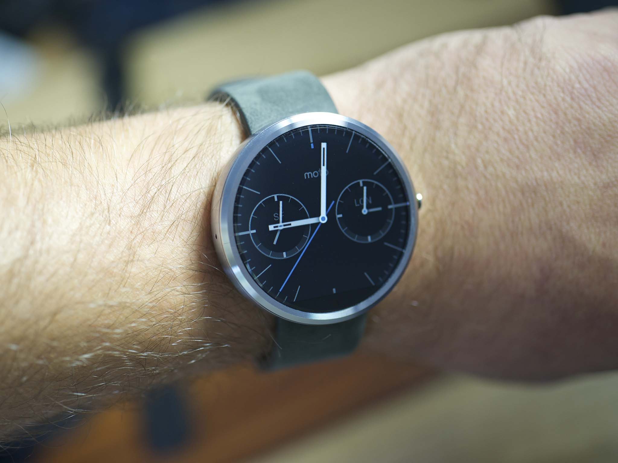
The Moto 360 has been a long time coming. Never mind the wait between the watch being announced and finally finally getting into folks' hands. From the first time we saw the Moto 360, it was clear this wasn't a spur-of-the-moment product. Clearly designed with purpose, it's not just a display on your wrist. This was the Android Wear smartwatch we wanted to wear. Round. Black. Big, but sleek. (And not quite as big as you think.)
It's a smartwatch that looks like a watch. Not just a gadget.
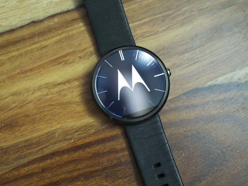
A good bit of that will be in the eye (and on the wrist) of the beholder. The practical matters of Android Wear in the round form factor are more easily discussed here, and in the case of the Moto 360 aren't all that different from what we've experienced on other Android Wear devices.
This, then, is our review of the Moto 360.
About this review
We're writing this review after two weeks' worth of use with the Moto 360. We first used a loaner unit (in black) supplied by Motorola, and later a retail stainless steel model, as purchased by us. We've been running Android 4.4W.1, Build KGW42N for most (if not all) of our use. We've used the Moto 360 connected to a number of devices, including the 2014 Moto X, the LG G3, Samsung Galaxy Note 3, Nexus 5, and the 2013 Moto X.
At the time of this writing, the Moto 360 is available in black and gray (silver) bodies, with black or gray leather straps. Other options will be available later, and steel bracelets will be available later this year and will significantly change the look and feel of this watch. (They'll also increase the price.) We'll update this review with more thoughts on the steel bracelets once they're available.
Moto 360 hardware
Bringing round to the Android Wear game
The first couple of Android Wear watches — the LG G Watch and Samsung Gear Live — are square. The Moto 360 is round. That's hardly a difficult conclusion to come to, but it truly is what stands out the most when it comes to Motorola's offering. It's a round Android Wear smartwatch.
Whether round is "better" than square is largely a matter of taste. There's nothing inherently wrong with either, and Android Wear as an operating system is designed to handle either with ease. The Moto 360 tends to look more like a traditional wristwatch. But on top of that, it's also really nicely designed.
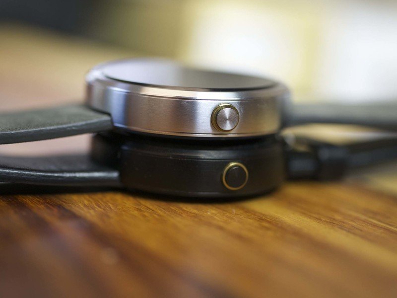
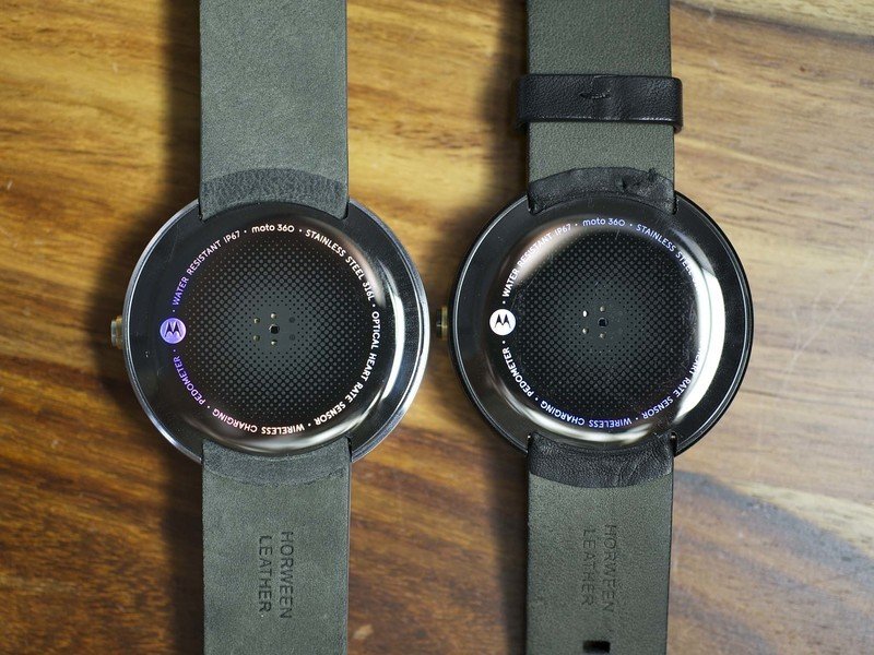
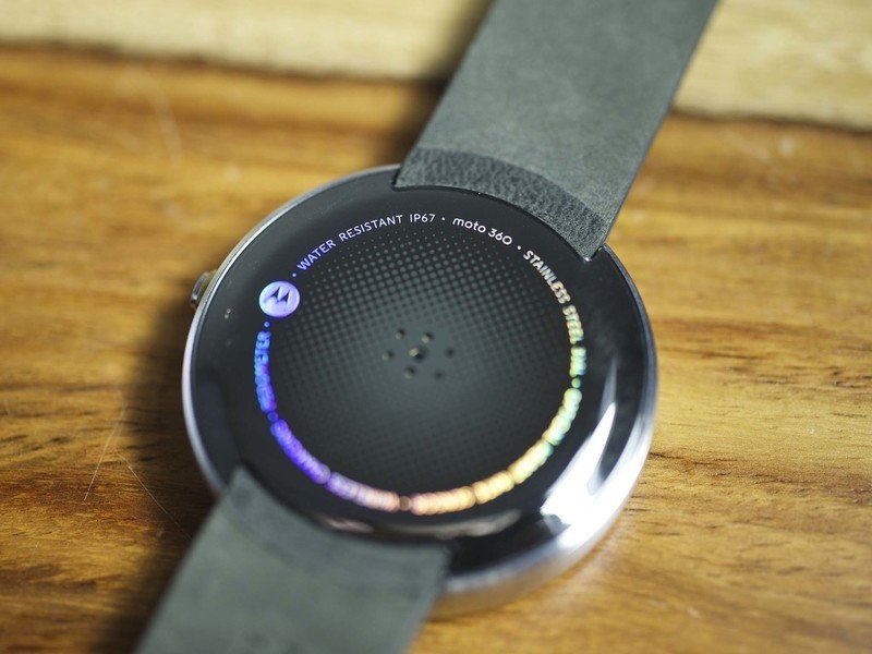
It's easy to look at the watch and think "OK, 360. It's a round watch. I get it." But when you really start to look at the watch, you get that it's more than that. It's more than just a round face. It's about a series of circles, all tied back into one cohesive design.
It's easy to look at the watch and think "OK, 360. It's round. I get it." But when you really look at it, you get that it's more than that.
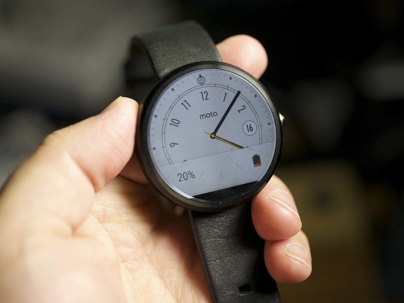
It's about the face, of course. And that's been the source of a good bit of grief because the round display has a small black bar at the bottom, home to the ambient light sensor (for automatically adjusting the display brightness) and the hidden connectors that tie the display panel to the rest of the watch's guts. Maybe that black bar bothers. Maybe it doesn't. (We're split internally on this one.) And interestingly, Motorola cheats on the display when the watch is charging, making sure that what's on the screen doesn't get broken up by that black bar.
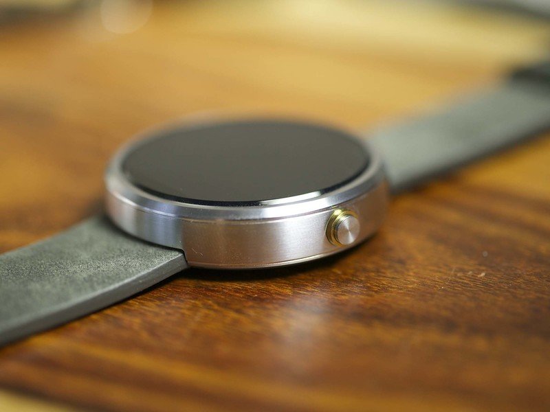
And it's about the chamfered edge that rings the display, and the two beveled edges after that that finally lead into the vertical wall of the body.
And it's about the brushed steel band that makes up that side of the 360. It's got a small pinhole mic on the left-hand side, and a round physical button, seated in another metallic ring, on the right.
And it's about the underside of the watch, with that ring of listed features that for months eluded us, hidden behind — wait for it — yet another ring.
Back to the display for a minute. It's 1.56 inches, with an oddball resolution of 320x290 (thanks to that black bar). That comes out to 205 pixels per inch, notably less dense than the LG G Watch or Samsung Gear Live. The difference is readily apparent, and a bit disappointing. Maybe not a deal-breaker, just something you can't unsee. It also means text is larger, so you don't get as much on the display at one time as you do with the other watches. (That's really something that'll only bug you if you're looking at them side by side, though.)
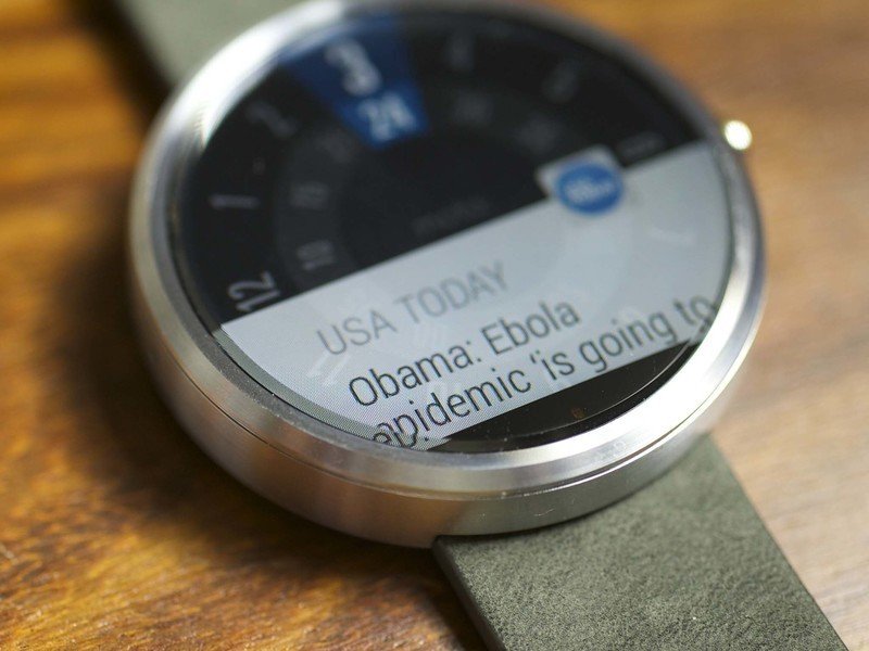
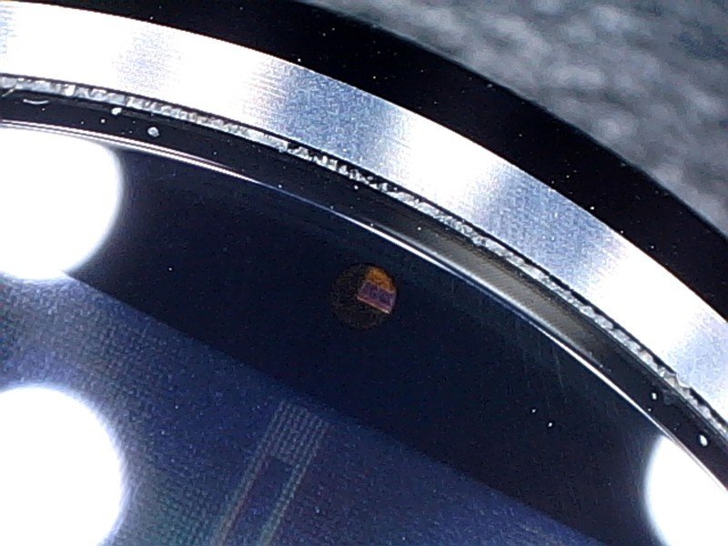
One other visual anomaly is from the chamfer on the glass — it gives the edge of the display the same sort of refractive effect you see with water. Lines bend. Colors shift. And any text that bleeds into that space is warped. It takes a little getting used to. (And, oddly, isn't anything we remember noticing in our initial hands-on.)
The Moto 360 as it stands today comes with either a black leather strap, or a gray strap. Both are from the Horween Leather Company, a local neighbor of Motorola in Chicago. And for as simple as the strap is, it's apparent that it wasn't an afterthought. It's not as sophisticated as the steel bracelets that'll be available later this year, but it's also a nice step up from the rubber straps other watches have shipped with.
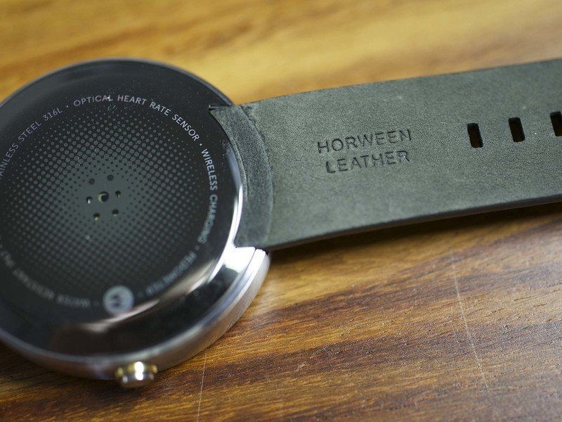
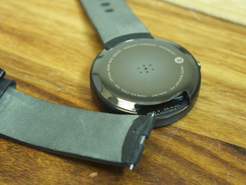
And speaking of straps, the Moto 360 uses a standard 22mm spring-loaded pin for the connection. But you're going to want to be careful before buying just any strap or bracelet. There's not much room to play with where the pin meets the body, and any replacement strap or bracelet needs to be pretty thin there. (The steel bracelet we've used on the LG G Watch, for example, doesn't quite fit. The Pebble Steel bracelet — never mind that it's suppose to be proprietary for the Pebble Steel — fits just fine.)
The overall look and feel? Again, it's a bit subjective, but it's also not that much of a stretch to say that the Moto 360 is the best looking, and the best feeling Android Wear smartwatch thus far. It's surprisingly light at 2.2 ounces (obviously the steel bracelet will change that later this year), and there aren't any hard edges to be wary of.
Moto 360 battery life
A story of all things ambient
One of the features unique to the Moto 360 is the ambient light sensor, which detects how bright your environment is and adjusts the display brightness accordingly. The idea is to maintain a balance between being able to see the display well, and not overpowering it and wasting battery life. You can see the watch do this, and it's not a seamless move from one level of brightness to another. But then again, you're probably glancing — not staring — at your watch.
Additionally (and somewhat confusingly), there's an "Ambient Screen" option in the settings – and turning it on pops up a warning that doing so will significantly impact battery life. This setting is the same as the "Always On" option in the other Android Wear watches in that it allows for a a dimmed watch face to appear. Only on the Moto 360, the watch still goes completely dark after a spell.
The best news with all this is that finally we have an Android Wear watch that you can see outside, in the sunlight. Not perfectly in direct sun, but good enough, and far better than anything else we've used thus far.
All this leads into the discussion about battery life and the Moto 360.
On any device there are any number of variables that affect battery life. Display is a big one. Processing power and thermal control is another. (Cooler is always better.) On a device like a smartwatch, these variables add up quick, especially one that's designed to be force-fed notifications.
We've had sort of a hard time pinning down battery life on the Moto 360. We've had occasional days where we had to stretch to get 10 or 11 hours of it. But we've also had a good number of days where the same amount of time left us with more than half the battery remaining.
On paper, the 320 mAh battery of Moto 360 has 20 percent less capacity (not to be confused with battery life) than the LG G Watch (which I was using full-time before the 360 became available). That's important to remember when you're comparing one of these watches to another.
Most days the Moto 360 lasts all day. Some days it's a stretch. Some it falls short.
What we've found is that the amount of time we've spent outdoors, as well as the influx of notifications we receive, can greatly affect battery life. On a slow Sunday, the watch will likely last longer than an on-the-go Monday, when everyone's catching up on e-mail. A morning spent outside at a soccer game is going to affect things much more significantly than a morning spent in meetings under fluorescent lights. We've left the brightness set to auto, and the ambient screen setting turned off, which is the default.
This much remains true, however: You're going to want to charge the watch overnight, every night. And you might well want (or need) to top it off at some point during the day. If that's a deal-breaker for you, it's understandable. But the Moto 360 starts with a smaller capacity than LG's watch, and it appears to be a bit more susceptible to hard use.
The good news is that on its stock charger, Moto 360 charges at just under 2 percentage points a minute, taking a little less than an hour to get from dead to 100 percent capacity.
We're of the belief that smartwatches need to last a "full day," from the moment you pick it up to the time you put it back down. Most days the Moto 360 meets that criteria. Some days it's a stretch. Some days it falls short. That's a consideration you need to take into account when purchasing. But we've not seen a cause for concern in two weeks of use.
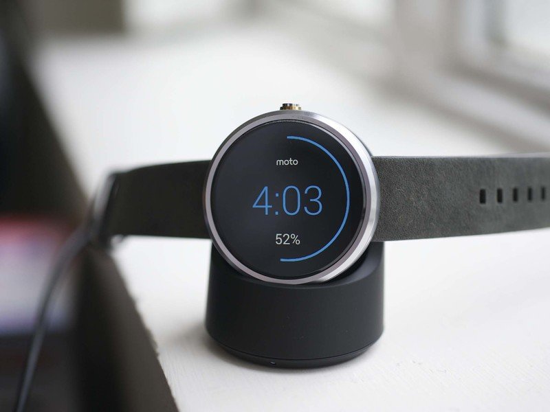
The flip side is that the Moto 360 does charging right. It's using the Qi wireless charging standard. You can use the excellent charging stand that comes with the watch — and note the cool charging face you get when the watch is taking on power. Or you can use any old Qi charging pad you have laying around. And that makes having one for one and one for the office (or in your car, or in your gear bag) so much simpler. (It took LG a number of weeks to put its proprietary charger on sale separately, for example.) If you want to top off during the day, it's pretty painless to do so.
And one quick word on performance, which until now hasn't really been a thing we needed to discuss. The animations on the Moto 360 at times seem sluggish. It's easy to look at the specs and say that the aging (but still custom) TI OMAP 3 processor likely is to blame there, but at the same time you have to wonder just how much processing power is necessary for a device this small. It doesn't ruin the experience at all, but the occasional lag and stuttering of animations is noticeable, and unfortunate.
Android Wear and the Moto 360
It's Android Wear, but round
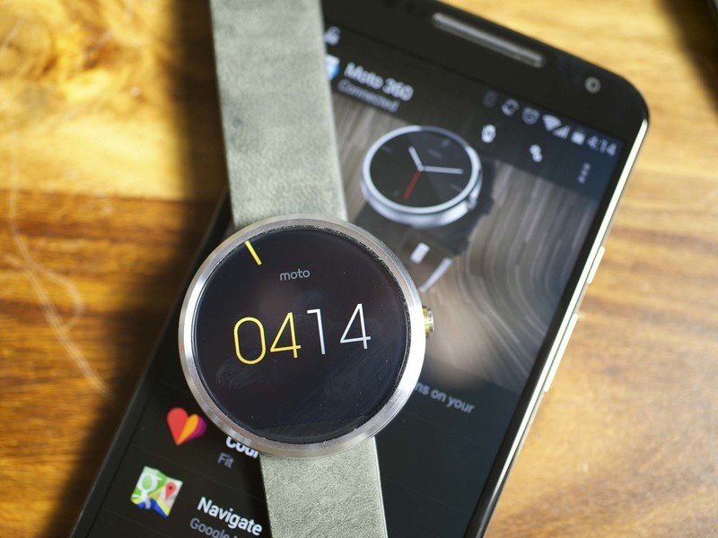
Android Wear remains Android Wear. Switching to a round design doesn't really change things, aside from the effect from the chamfer we mentioned. If you're coming from a square Android Wear watch, your eyes will need just a bit of time to get used to looking more toward the center of the watch, since the corners are lopped off. But that's hardly a big deal, nor does it really affect use of the watch.
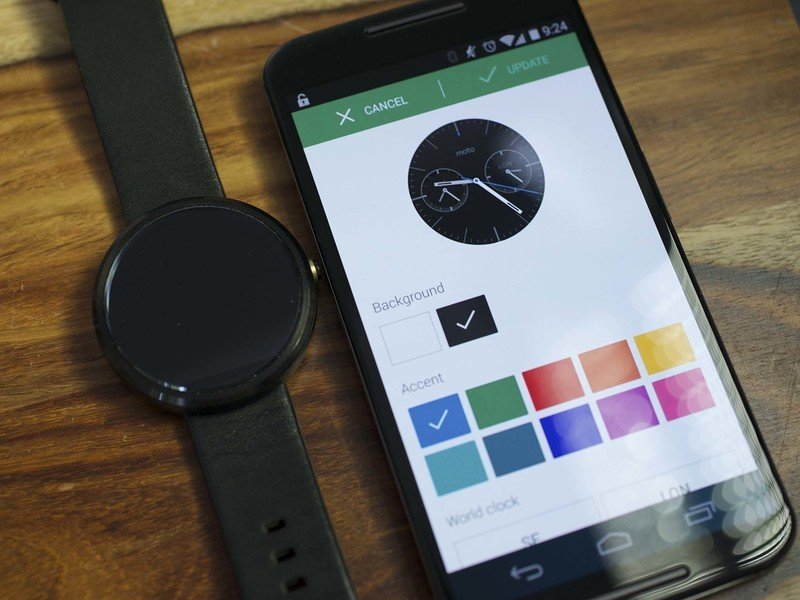
The most profound difference comes from the new watch faces Motorola has on board. The first couple sets of watch faces on the Gear Live and G Watch were boring. The Moto 360 has watch faces that look and act like someone put some actual through into them. A good many of them play on that ring metaphor, but the simple fact is they're nicely designed.
And what's more is that you can customize these new watch faces even further with the Moto Connect app. Motorola's done things right here.
And it's not that the software as it stands today is a moot point. It's decent, but it's still got a lot of room for improvement. And we should see that later this year with the update to Android L.
Moto 360: The Bottom Line
This is the smartwatch to beat
What is the most important part of a smartwatch? Is it how it looks? Is it what it does? Is it how long it lasts? Or maybe it's all these things.
The Moto 360 is the most expensive Android Wear smartwatch thus far, and for good reason.
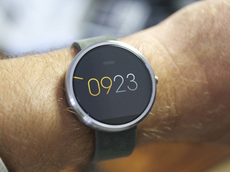
The Moto 360 is the most expensive Android Wear smartwatch we've seen thus far, and for good reason. It's also the most compelling in terms of design. It looks less like a display strapped to your wrist, and more like a high-tech accessory that you're going to want to check out. You can wear it with a suit, or with a T-shirt. It looks a good with the face off as it does lit up.
That said, the Moto 360 is an imperfect smartwatch. Like all other watches in this class, you'll have to get used to charging every night, and occasionally you'll need to top off during the day. The display resolution isn't as good as other choices. And the Android Wear software itself is still is in its infancy.
And you need to remember that more watches are coming. The Moto 360 is just the third watch we're reviewing, and it's a damned good one. But there will be others.
And we'll just have to see how they stack up. Because right now, warts and all, the Moto 360 is the watch to beat.
