MIUI 12: Top 12 features you need to know about
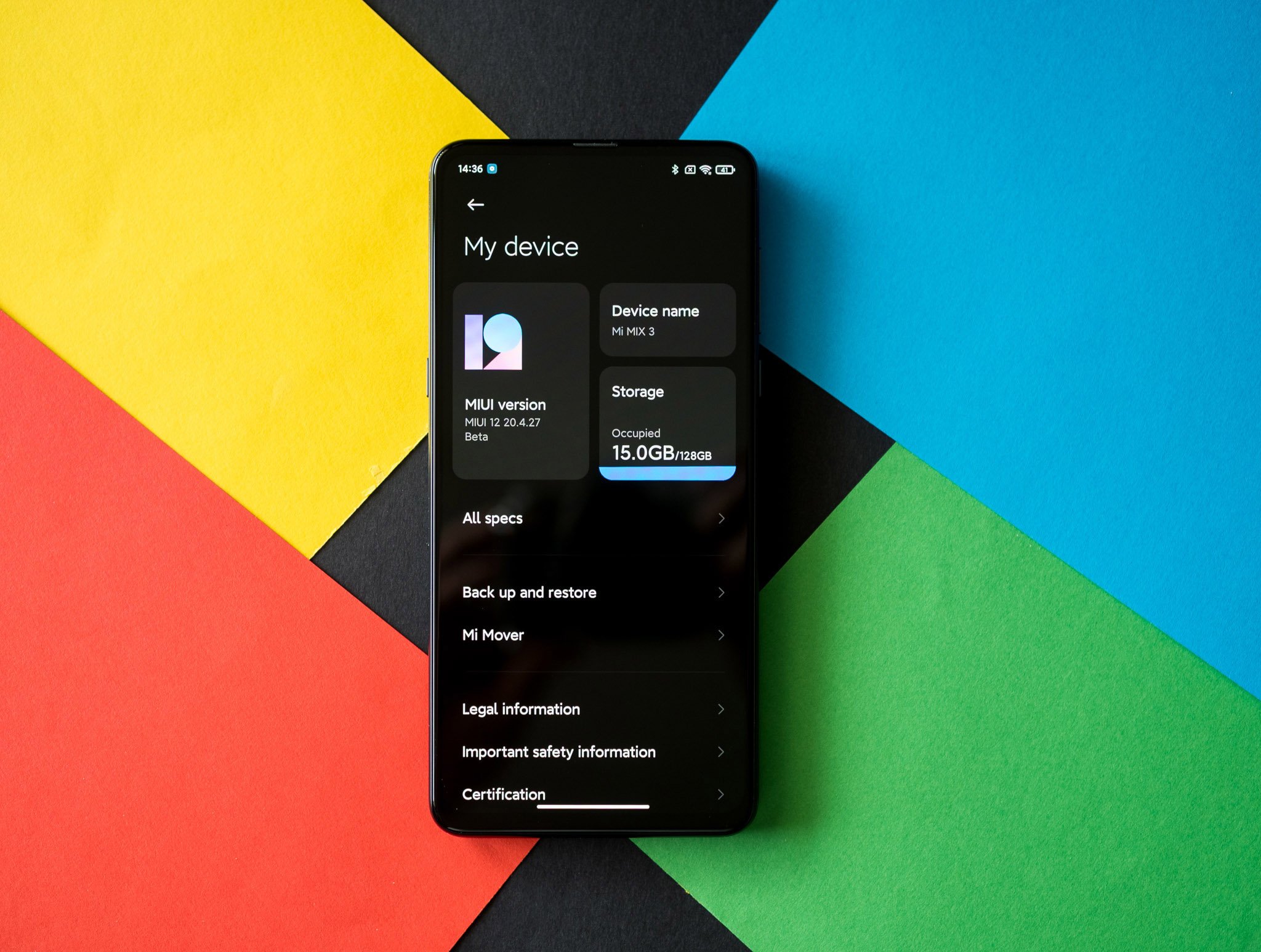
MIUI continues to be one of the most popular Android skins around, with over 400 million users around the world. Xiaomi is the number one handset manufacturer in India, and there are over 100 million MIUI users in India alone. Xiaomi hasn't done much to tailor MIUI to global users in recent years, but that has changed with MIUI 12. With Xiaomi increasingly focusing on the high-end segment, the Chinese manufacturer finally has a user interface that holds up to what Samsung and OnePlus offer.
MIUI 12 made its debut just six months after the introduction of MIUI 11. The MIUI 12 stable update is now live on most Xiaomi, POCO, and Redmi phones released in the last 15 months, and it will make its way to older devices in the coming weeks and months.
Even though it has just been six months from the release of MIUI 11, Xiaomi was able to add a host of new features to MIUI 12 to make it stand out. It's clear from using the ROM that Xiaomi focused its attention on optimization and tweaking the overall look of the UI. As a result, animations are smoother, visual elements are more modern, and the interface as a whole looks much more cohesive.
I've been using MIUI 12 on the Mi Mix 3, Redmi K20 Pro, and the Mi 10 series over the last two months, and it's safe to say that this is the most polished interface Xiaomi has rolled out to date. So without further ado, let's take a look at all the new features in MIUI 12.
1. Privacy gets a big overhaul
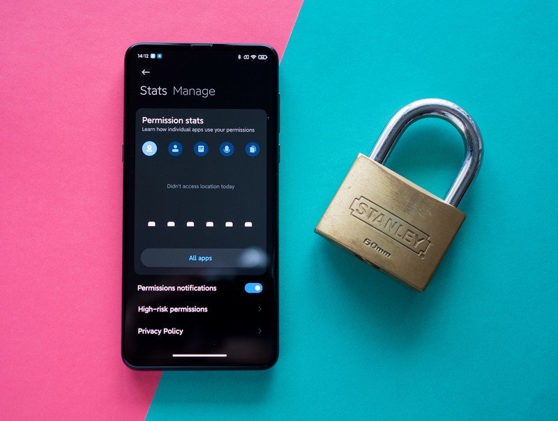
Xiaomi caught a lot of flak for collecting browser data even in incognito mode, and the manufacturer is now rolling out a toggle within its browser to let users opt out of data collection. Alongside the change, MIUI itself is getting a host of much-needed privacy and security fixes that make it easier to see what apps have access to permissions.
The privacy section has two tabs: Stats and Manage. Stats gives you an easy overview of all the apps that accessed key permissions for that day, and these include location data, contacts, call history, record audio, and storage. You can also hit the All apps button to get a detailed look at all the apps that you opened, or those that were allowed to autostart in the background. The Manage tab gives you a breakdown of all apps that have access to a particular permission.
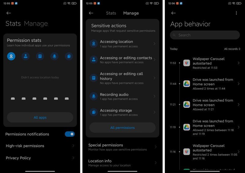
The feature offers a comprehensive account of all app behavior on your phone, and is a fantastic way to see just how many apps accessed key permissions. As always, you get granular access when it comes to allowing permission access to individual apps, and you can also set up alerts so that whenever an app accesses your location, takes a photo, or records audio, you'll get a notification in the status bar.
Be an expert in 5 minutes
Get the latest news from Android Central, your trusted companion in the world of Android
Xiaomi is also adding secure sharing options for photos, with the ability to automatically remove location and metadata from images. There's also a "Secure sharing" watermark that shows up when you share photos on WeChat without metadata. It's likely this particular feature won't show up in the global builds.
The new privacy tools go a long way in determining just how many apps have access to permissions on your phone. This is a big change, and it's great to see Xiaomi giving users granular control over these features.
2. Say hello to the Control Center
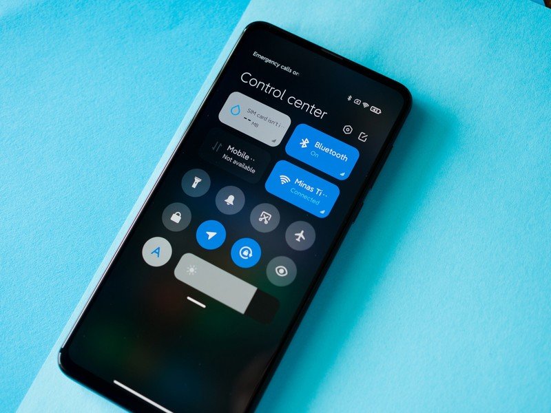
One of the new UI changes in MIUI 12 is the addition of a new Control Center. As you may have guessed from the name, it is very similar to how the Control Center works in iOS. You pull down from anywhere on the home screen, and you get a grid of toggles, brightness slider, and options for toggling Wi-Fi, Bluetooth, and cellular data.
The design and usability is identical to iOS, but at least here you get the option to change the layout of the quick settings tiles. Because it takes up so much room, notifications are now bundled into their own pane. A pull down from the top of the screen now shows the notification shade, and I don't like the fact that the toggles have been decoupled from notifications. Having said that, it is convenient to access the Control Center as all it takes is a pull-down gesture from anywhere on the home screen.
The best part about this is that if you're not a fan of the new style, you can easily switch back to the older MIUI 11 layout from the settings. As for incoming notifications, you can choose from the default MIUI system or switch to the Google-prescribed method.
3. Wallpapers that are out of this world
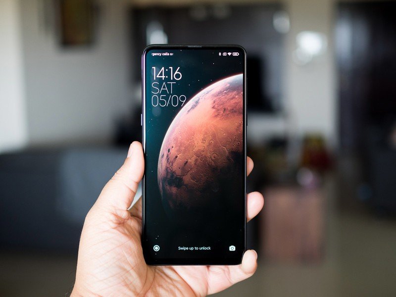
An exciting new feature in MIUI 12 is dynamic wallpapers. Think of these as the live wallpapers that you get with Google's Wallpapers app, but more dynamic. You get to choose between Earth and Mars imagery for the live backgrounds, and every time you wake the screen there's a swirling animation of the corresponding planet.
It is a very cool effect, and makes unlocking the phone that much more special. I'll admit that I unlocked the Mi Mix 3 a few times just to see that unlock animation. There's a similar animation once you go from the lock screen to the home screen, with the background itself shifting to terrain-level view. It is one of the more exciting changes in MIUI 12.
4. There's finally an app drawer
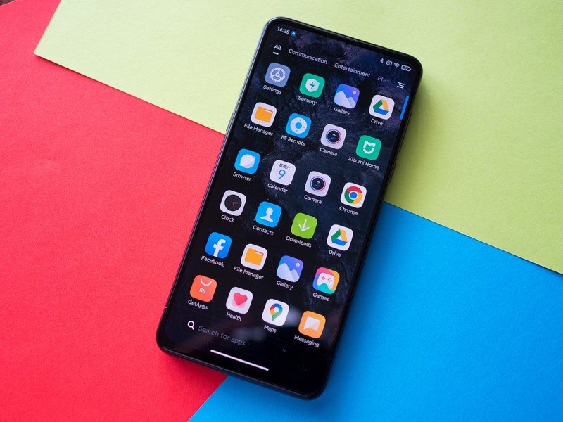
A continued criticism of MIUI was that it didn't feature an app drawer. With more and more Chinese manufacturers introducing an app drawer in their skins, Xiaomi was the holdout. That's not the case anymore, because MIUI 12 finally offers an app drawer. Just go to Settings -> Home screen -> Home screen to set up the app drawer.
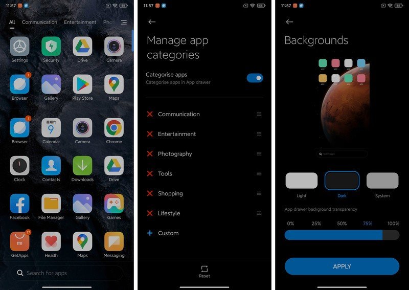
The drawer has a lot of similarities to the POCO Launcher, including app categories that automatically sort apps into various categories. You also get app suggestions at the top, a search bar at the bottom, and you can set up custom categories. There's also the option to change the background transparency.
You'll love all the new animations
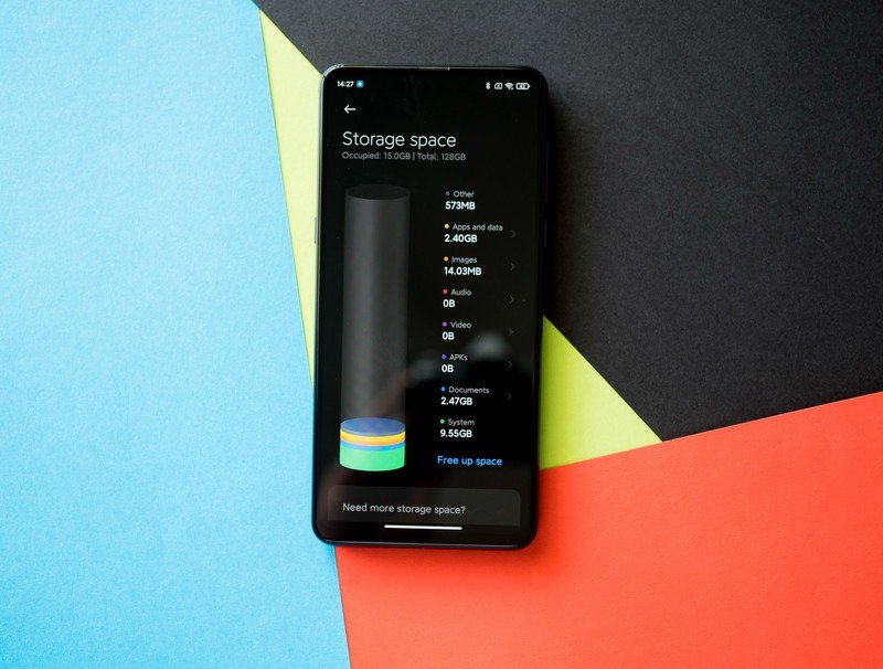
On the subject of animations, there are lots of clever little animations throughout the interface. The icon packs bundled with the default MIUI themes feature a cleaner design, there are new system animations, and transitions when you close an app to go to the home screen are also new. All the animations are clean and modern, and they make the interface much more interactive and playful.
The storage section in the phone settings shows up as a cylinder with multi-colored discs highlighting various categories, and the cylinder fills up to show the amount of storage remaining. Similarly, there's a battery bar that dynamically shows the remaining charge level once you go to the battery section, and the battery usage charts are also animated.
5. New navigation gestures based on Android 10
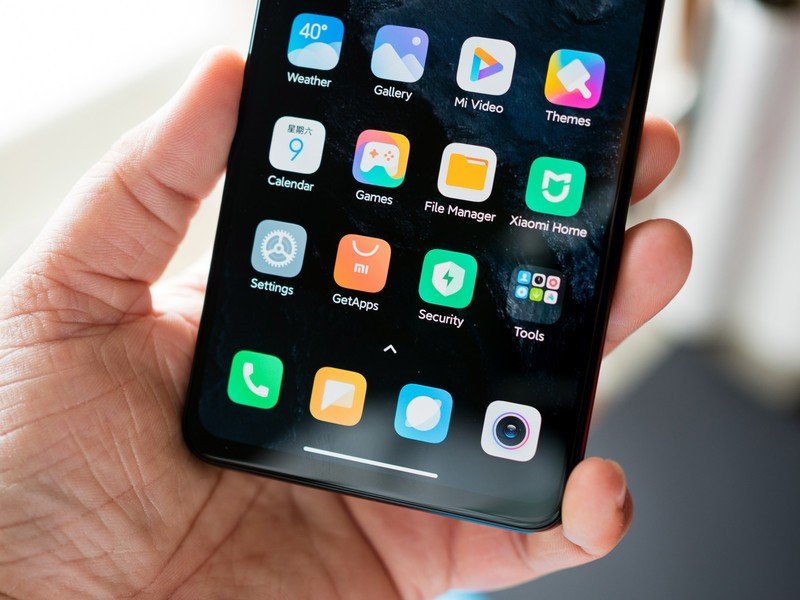
With MIUI 12, Xiaomi is embracing Google's prescribed navigation gestures for Android 10. There's a back gesture when you swipe in from either the left or right edges of the screen, you have to swipe up from the bottom of the screen to go to the home screen, and swipe up and hold from the bottom to pull up the overview pane.
You also get the option to quickly switch between apps with a swipe left or right gesture across the bottom of the screen. The gestures should be immediately familiar if you've used another device with Android 10, and it's clear that Google is setting the groundwork for unified gesture navigation across manufacturers. That's a good thing, because regardless of whatever phone you pick up, you'll get the same set of navigation gestures.
6. Do more with floating windows
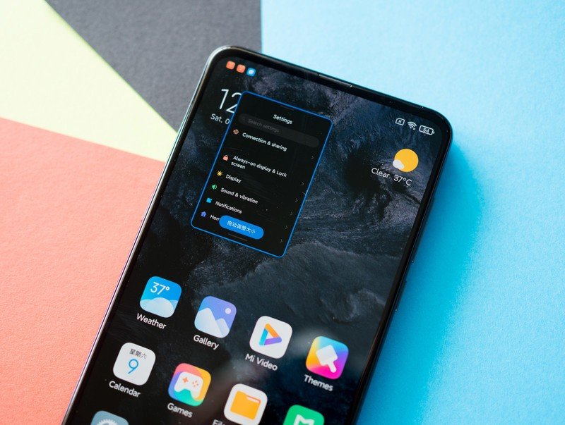
A new feature in MIUI 12 is floating windows, similar to what you get on Samsung phones. You can scale an app to fit on a portion of the screen, and the best part about this is that the floating window shows up over other apps. This is particularly great for things like calculations, and the fact that you can resize the windows to your needs makes it that much more useful.
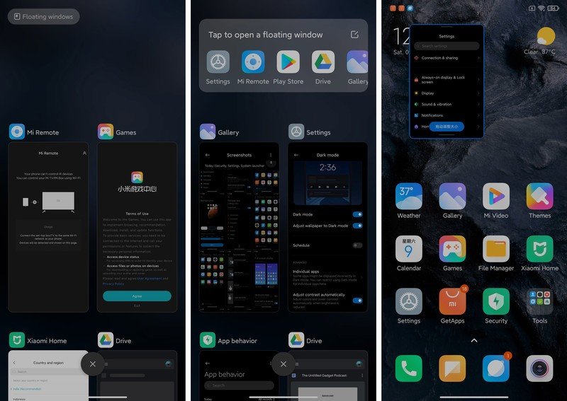
You can launch a floating window from the Floating windows button on the overview pane. You'll see a list of eligible apps, and you get to scale the app to your needs and put it wherever you want on the screen. To exit a floating window, you'll just have to clear the app from the overview pane.
7. Dark mode gets overhauled, and there's a new font
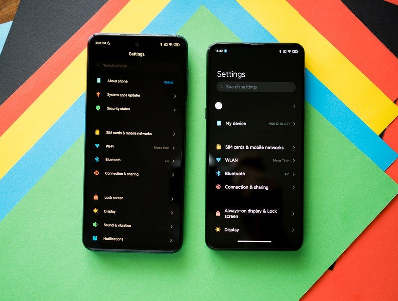
The settings page doesn't look as cluttered, and that's thanks to a new system font and larger text labels for the menus. You can see the difference from MIUI 11 (the phone on the left) to MIUI 12. The font is better for readability, and the rounded design looks more modern as well.
Dark mode is also getting an update, and you can now whitelist individual apps that may not work well with dark mode. The scheduling option is back, and there's also a toggle to adjust contrast automatically based on brightness levels.
8. Mi Share is the only file transfer service you need
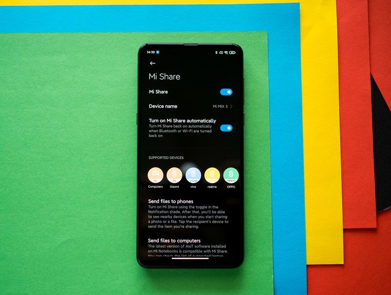
Xiaomi joined hands with OPPO and Vivo to create a unified file sharing service, and the results of that collaboration are evident in Mi Share.
Mi Share is baked into the settings, and you'll be able to access it by going to Settings -> Connection & sharing -> Mi Share. There's also a Mi Share tile in the notification bar for easy access to the feature. Mi Share now shows that you can share files across Xiaomi phones and notebooks — including the Mi Notebook series and the RedmiBook — and you can also do so for OPPO, Vivo, and Realme phones.
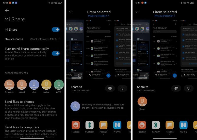
Sharing is as straightforward as it can get. Just select the photo, document, or any other file you'd like to send, and you'll see a Mi Share indent that will automatically search for other devices in your vicinity. As soon as it finds an eligible device, you'll see it highlighted on the page, and you can easily share files.
It is a seamless way to transfer files across devices, and the fact that it works across all OPPO, Vivo, Xiaomi, and Realme phones is a huge deal.
9. A great File Manager gets even better
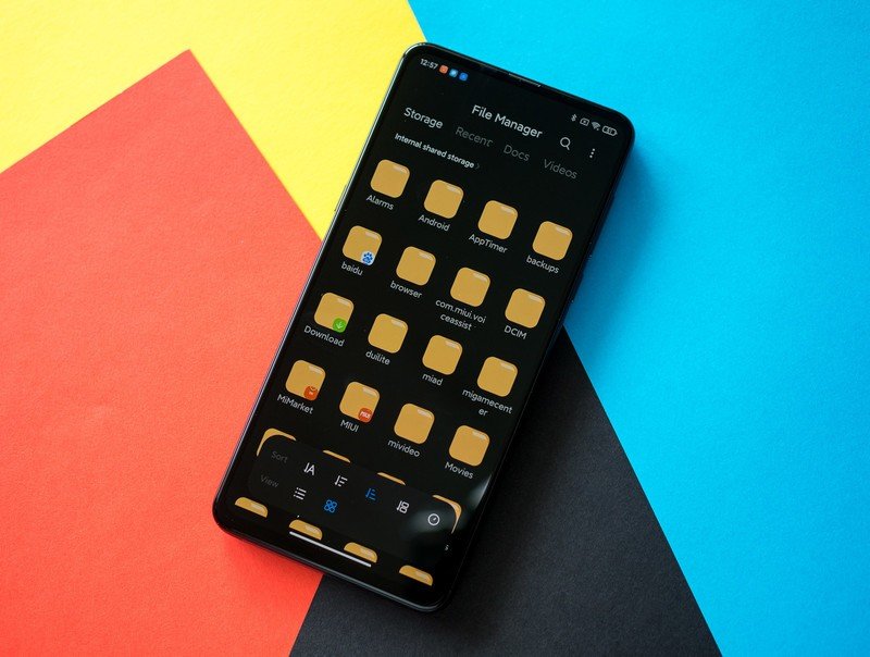
The built-in File Manager in MIUI is one of the best around, and it is getting a few new features in MIUI 12. There's a new interface that makes it easier to see recent files, and the grid layout has modern icons for folders. But the key change here is a sort option that lets you arrange folders by name, size, or creation date.
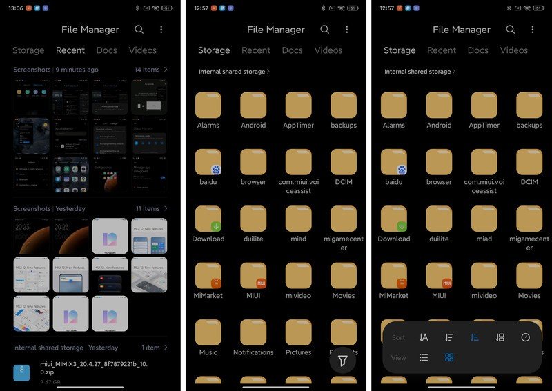
Like the app drawer, the file manager automatically sorts files into various categories. There's Docs, Videos, Images, Music, and More. The search feature lets you easily find files, and there's even a built-in FTP server for transferring files.
10. Use your phone less with Focus Mode
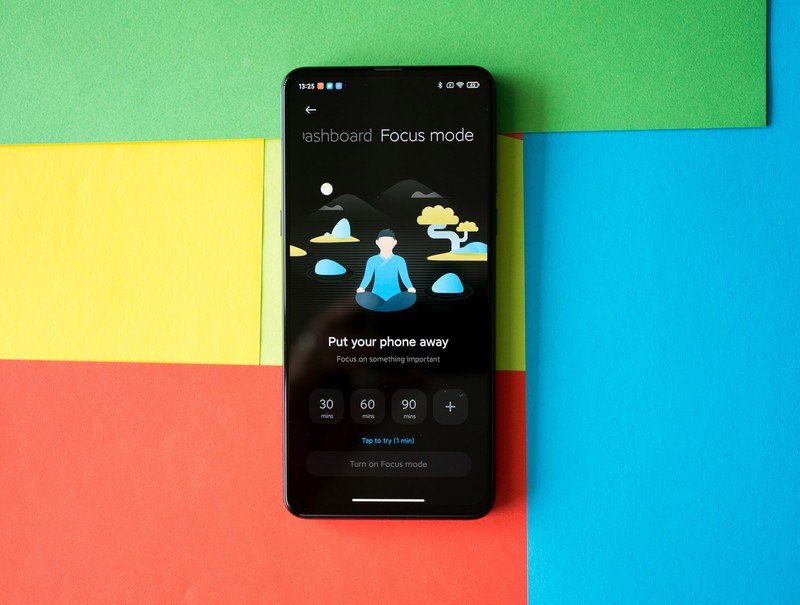
Like every other manufacturer, Xiaomi is adding controls to curb smartphone addiction. MIUI 11 had Google's default Digital Wellbeing dashboard, but in MIUI 12 Xiaomi is offering its own take on the feature. As with everything else in the interface, there are polished animations and usage charts that give you an overview of the amount of time you've used the phone — broken down in daily and weekly increments.
There's also the option to set a daily screen time limit, and you get to see the number of times you've unlocked your phone, and set up notifications for uninterrupted usage.
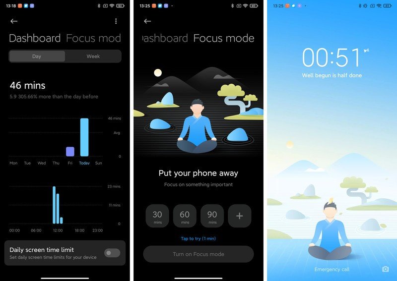
But the main highlight here is Focus Mode, which lets you take a break from using the phone. The feature is identical to Zen Mode on OxygenOS, and when enabled you won't be able to use any features on your phone other than the camera and dialer. Default time limits are 30, 60, and 90 minutes, and you also have the ability to set a custom time.
11. Activity tracking made easy with Xiaomi Health
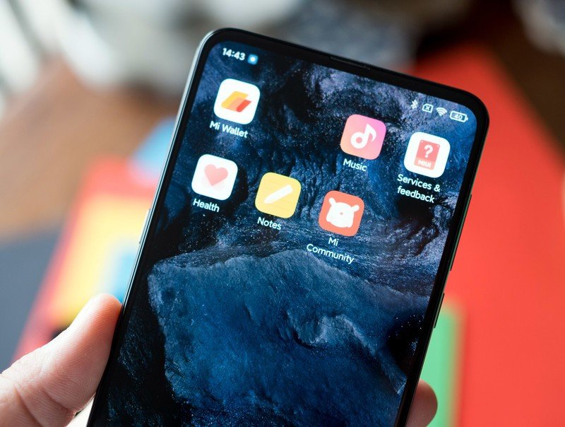
MIUI 12 already had a built-in activity counter, and it is now getting automatic tracking for stairs, cycling, running, and other forms of activity. More interestingly, it is also getting a sleep quality tracker that measures the time and quality of your sleep. It does so by recording the sounds you make at night (the feature records audio in the background). Now, if that makes you uncomfortable (because it should), you can always disable the feature.
12. For Chinese users: Let Xiaomi's AI take your calls
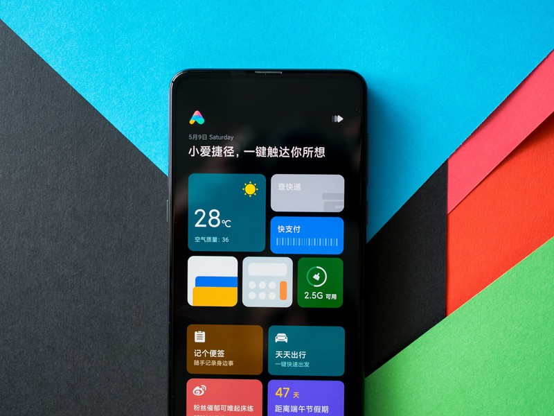
Xiaomi's XiaoAI is limited to China, and in MIUI 12 it is getting the ability to make calls on your behalf. The feature also automatically transcribes calls — similar to Live Caption on other Android phones — and lets you choose suggested responses during a conversation.
MIUI 12 is the most polished interface from Xiaomi yet
MIUI 12 has a lot to offer, particularly around privacy and data security. The visual changes make the interface feel that much more modern, and the UI finally feels cohesive. The system animations are more fluid, and MIUI 12 is a delight to use on the 90Hz Mi 10 and Mi 10 Pro.
It's great to see Xiaomi finally introducing changes aimed at global users, and with MIUI 12, it is closing the gap to OxygenOS and One UI. That's particularly interesting given that OnePlus is now moving away from a pure Android skin to one that resembles One UI. With Xiaomi increasingly focused on global markets, MIUI 12 is a step in the right direction.
Bezel-less design, incredible value
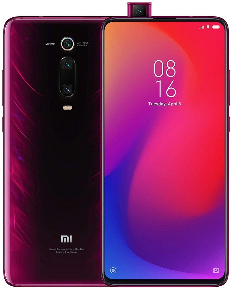
Xiaomi's Mi 9T excels at the basics: there's a 6.39-inch AMOLED panel backed by a Snapdragon 730 chipset, 6GB of RAM and 64GB of storage, and a 48MP camera at the back along with a 4000mAh battery and 18W fast charging. The front camera is hidden behind a retractable lens, and as such you get a bezel-less all-screen design that's ideal for gaming. For what you're paying, this is a steal.

Harish Jonnalagadda is Android Central's Senior Editor overseeing mobile coverage. In his current role, he leads the site's coverage of Chinese phone brands, networking products, and AV gear. He has been testing phones for over a decade, and has extensive experience in mobile hardware and the global semiconductor industry. Contact him on Twitter at @chunkynerd.
