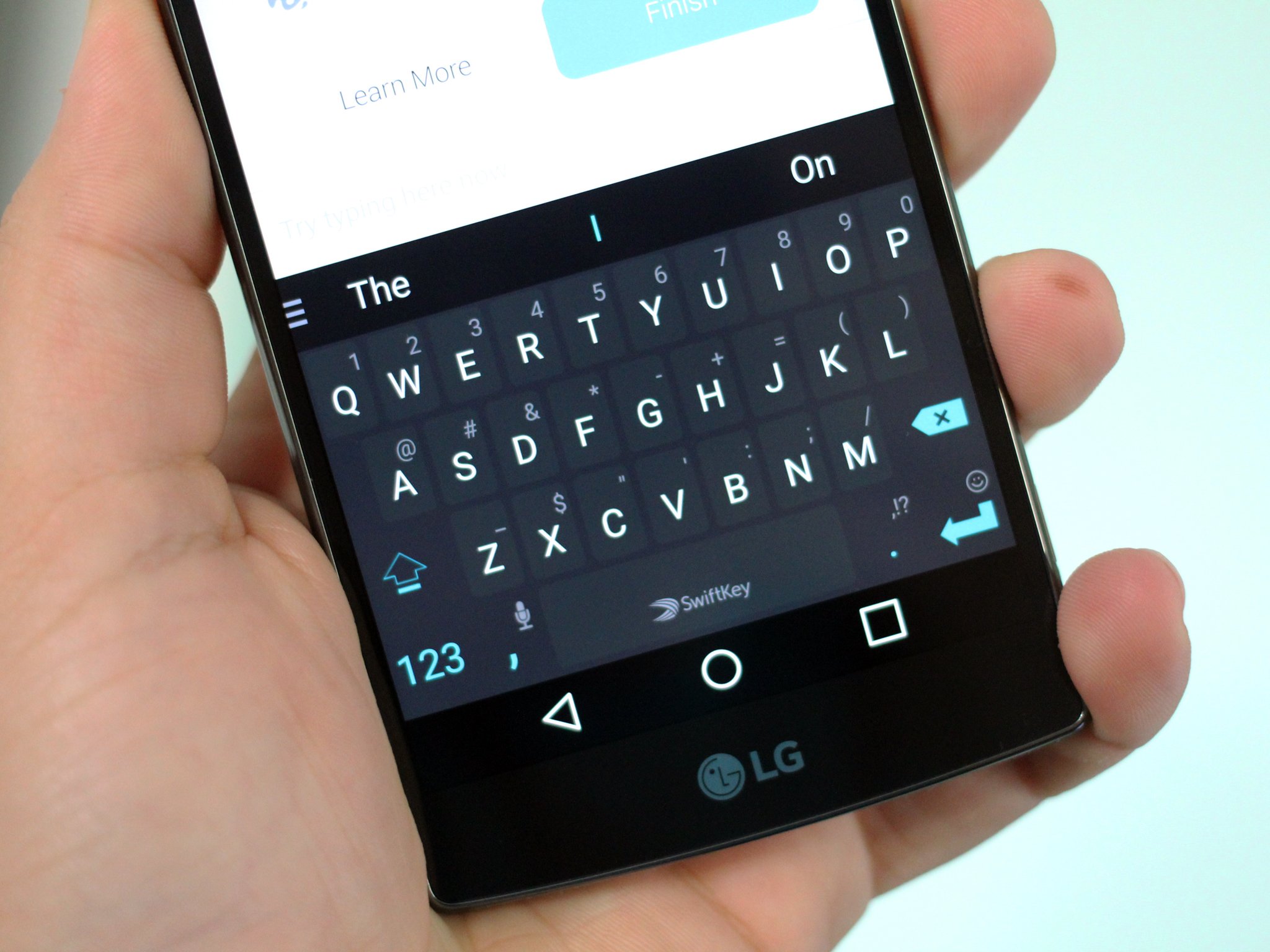
Microsoft's SwiftKey keyboard for Android isn't what it used to be
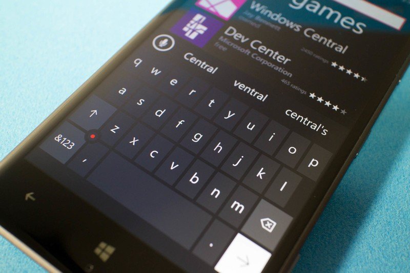
I was a Windows phone user for years before I finally made the switch to an Android smartphone. I had used everything from the HTC 7 Mozart all the way up to the HP Elite x3 as my daily driver. Back in 2010, when I made the switch from my iPhone 3GS to my HTC 7 Mozart, the keyboard was an obvious standout feature. It was so good.
Windows Phone 8.1 only improved the keyboard with the introduction of shape writing and better autocorrect, and although the Windows 10 Mobile keyboard was a little sub-par when it first launched, it didn't take long for that old behavior to return, maintaining Windows Phone's number one spot for best mobile OS keyboard.
But in 2017, that doesn't matter. But Microsoft made great keyboards, so I would at least expect it to have nailed the fundamentals on Android. It already has a great app launcher, superb Edge browser, Cortana, Outlook, and many more fantastic Android apps to help tie over any Windows phone converts. SwiftKey? Not so much ...
The SwiftKey experience
Look at how bad SwiftKey is at showing key popups when typing at a relatively fast speed on Android compared to the Google keyboard. pic.twitter.com/iwAEYNyWMxLook at how bad SwiftKey is at showing key popups when typing at a relatively fast speed on Android compared to the Google keyboard. pic.twitter.com/iwAEYNyWMx— Zac Bowden (@zacbowden) 5 December 20175 December 2017
SwiftKey is Microsoft's official Android keyboard. There are just so many things I don't like about SwiftKey on Android, including its slow, laggy performance that often drops below 30 frames per second (FPS) when scrolling through the keyboards settings. Keep in mind, all my experiences I write about here are on a OnePlus 5T and Samsung Galaxy S8, two of the most powerful Android flagships from 2017. Of course, my issues and opinions on this keyboard may differ from yours. These are my personal experiences.
Let's start with the typing experience, which sucks. Using the shape-writing function feels slow; the shape writing line animation is often laggy, and the keyboard is terrible at keeping up pace with key-popups. Key-popups are another thing that is disabled by default. Every other keyboard I've tried on Android can display key-popups at pace, no matter how fast I type. I find key-popups to be an integral part of all virtual keyboards, as it gives you visual feedback that you've hit the button you were aiming for. If the popups aren't able to keep up, it throws me off my typing pattern, and makes for a terrible user experience.
The actual appearance of the SwiftKey keyboard looks like something out of 2008. Sure, SwiftKey supports themes, and "some" of the themes available look OK. But the default themes are anything but. A lot of them look dated, from back when it was trendy for Android keyboard to look like crap. The keyboard supports custom themes, but I wouldn't call that anything special considering the "custom" element is just changing the keyboard's background. There's no color configuration options, just the background. Other keyboards have way better custom theming support.
There are much better Android keyboards available
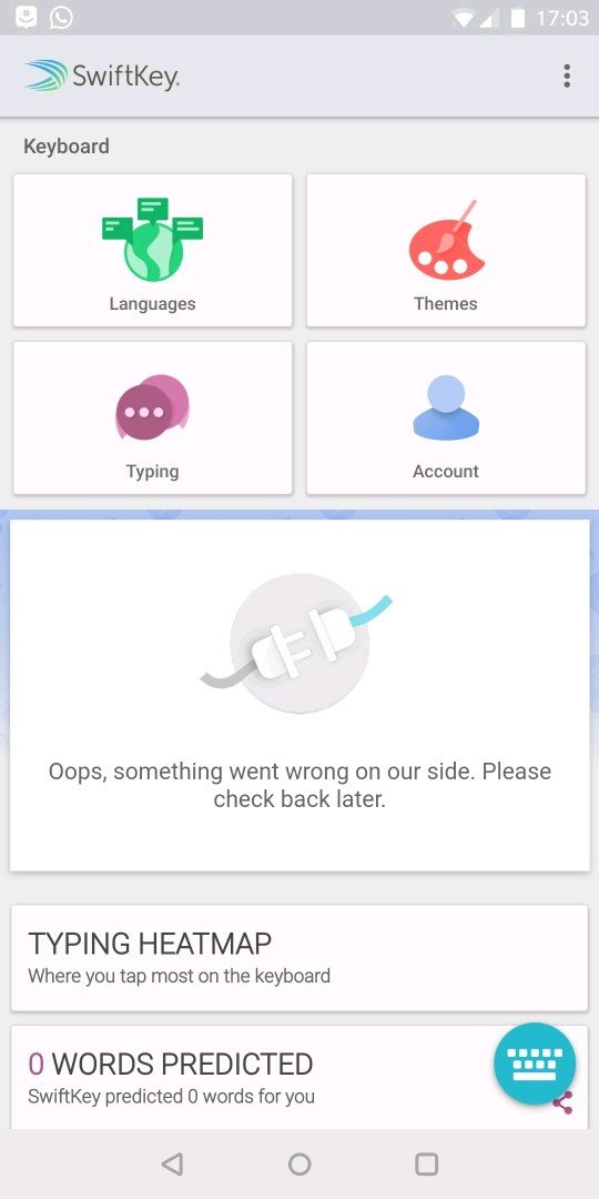
I've also noticed that the "stats" feature in the SwiftKey app never works. No matter what device I try it on. This is apparent on stable and beta releases of SwiftKey.
Be an expert in 5 minutes
Get the latest news from Android Central, your trusted companion in the world of Android
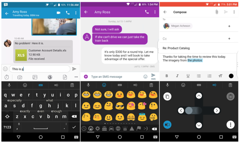
I've tried plenty of Android keyboards since I made the switch from Windows Phone, looking for one that can at least pretend to compete with the mighty Windows Phone keyboard. I've tried everything from Google's keyboard to Flesky, and I finally found my Windows Phone keyboard replacement. I present to you ... the BlackBerry keyboard.
This isn't a keyboard you're supposed to be able to install on non-BlackBerry devices, but you can bypass that block if you want to with an app called BlackBerry Manager. The BlackBerry keyboard is hands-down, the best virtual keyboard I've ever used on any platform. It's simple, fast, with great auto-correct and shape writing, and it even has CTRL shortcuts for copy and paste.
The BlackBerry keyboard gets the fundamentals right, and that's incredibly important. I never tap into a text field and have to wait for half a second for the keyboard to pop up as I did with SwiftKey. I'm able to use keyboard shortcuts I'm familiar with on my PC on my phone thanks to the addition of CRTL shortcut support on the BlackBerry keyboard. How is this not a part of Microsoft's keyboard offering on Android? And I realize the prediction engine between these keyboards is similar, it's not prediction I have an issue with. It's everything else about SwiftKey that I dislike.
Microsoft, it's time to turn SwiftKey into a flagship keyboard experience on Android. You have the resources to make a keyboard better than BlackBerry's. Take the excellent Windows Phone keyboard experience, add things such as CTRL shortcut support, more configurable options, merge it with SwiftKey, give SwiftKey a new, modern look, and maybe even give SwiftKey a rebrand. It's time to start taking your Android keyboard seriously because right now it's a joke.
I'm not bashing SwiftKey for the hell of it. I'm a huge fan of Microsoft's current Android efforts, and I really want the Microsoft Android experience to be good. I want SwiftKey to be good. In fact, I want SwiftKey to be the best keyboard on Android, it just needs work before it can attain that status. And sure, maybe SwiftKey is good enough for you, and if so then that's great, but there definitely are better keyboards on Android, and there shouldn't be. SwiftKey should be the best keyboard out there.
Now don't get me wrong, SwiftKey was once the best you could find on Android, but it isn't anymore. I agree, it was once ahead of its time, but so many other keyboards have surpassed it in quality and performance since then. SwiftKey is falling behind, and Microsoft has a lot of catching up to do because of it. Those who use SwiftKey and claim it to be the best on Android likely haven't tried the Google or BlackBerry keyboards. They are really, very good. SwiftKey could learn a thing or two from them.

