Android Central Verdict
Bottom line: The Surface Duo is an ambitious, flawed first-generation product that showcases what's possible with new form factors without fully realizing them.
Pros
- +
Hardware is gorgeous
- +
Hinge is versatile and reliable
- +
Multitasking really is better with two screens
- +
At its best, the Duo is just plain fun
Cons
- -
Severe software bugs
- -
Few apps optimized for screen spanning
- -
Terrible Bluetooth performance
- -
Camera is very bad
Why you can trust Android Central
What exactly is the Surface Duo? Every time I approach the outline of an answer, I do something with the thing that changes my opinion. That amorphousness is what makes this phone/tablet/hybrid thing so compelling. It's also what, over the last two weeks, has completely confounded me.
It's mainly the potential of the Duo that has me intrigued. By tacking on a second screen to a 360-degree hinge, the Duo can be and often is so much more capable than a traditional smartphone. But being built on Android, an operating system primarily designed for phones, it necessitates that, despite entreaties from Microsoft and its fans over the past few months to avoid the label altogether, the Duo is a phone.
Then there's the question of why the Duo exists. Microsoft says it's to enable the flexibility of multitasking, but in the wrong hands, that can lead to distraction. Over time we've been trained that mobile operating systems, for the most part, sandbox a single window in front of our eyes until we're finished, only to explicitly switch to another app or turn the display off. Various vendors have tried to window Android, and most have fallen short. After using the Duo, I'm cautiously hopeful Microsoft is the company to do it.
But that's also the reason I've rewritten this review so many times; the device, as it stands today, is a hot mess of half-finished ideas and buggy execution. And while the blame can't be entirely leveled at Microsoft's feet, the Duo feels like it's too early to market, with software that could have used a few more months in the kiln.
Microsoft Surface Duo Price & release date
If you're into the idea of buying the Surface Duo, it's currently only available in the U.S., either unlocked through Microsoft or Best Buy, or locked through AT&T.
The unlocked model comes with an eSIM in addition to a regular nanoSIM slot, so you can switch between carriers if desired. It will work on all U.S. carriers including Verizon.
The Duo starts at $1,400 for the 128GB model, and rises to $1,500 for the 256GB model. The versions are otherwise identical.
If you're looking for the best Surface Duo deal and price, Microsoft is offering up to $700 in trade-in value for some recent phones.
Microsoft Surface Duo Hardware & specs
| Category | Surface Duo |
|---|---|
| OS | Android 10 |
| Display | Single: 5.6 inch (1800x1350), 401 ppi, 4:3Opened: 8.1 inch (2700x1800), 3:2 |
| Processor | Qualcomm Snapdragon 855 |
| Memory | 6GB RAM |
| Storage | 128GB or 256GB UFS 3.0 |
| Camera | 11MP, ƒ/2.0 1.0um, PDAF, 84.0° diagonal FOV |
| Audio | Mono speakerDual mic with noise suppression and echo cancellation |
| Security | Fingerprint |
| Battery | 3,577mAhTimeFast Charging using 18W in-box power supply |
| Pen | Surface Pen (not included) |
| Network | WiFi-5 802.11ac (2.4/5GHz)Bluetooth 5.0LTE: 4x4 MIMO, Cat.18 DL / Cat 5 UL |
| SIM | Nano SIM + eSIM (no eSIM on AT&T model) |
| Dimensions | Open: 145.2mm (H) x 186.9mm (W) x 4.8mm (T)Closed: 145.2mm (H) x 93.3mm (W) x 9.9mm (T at hinge) |
| Weight | 250 grams |
For all the jargon about "next wave of mobile productivity," the Duo is still fundamentally an Android phone with two displays, and the way Microsoft's changes either do or don't cohere with Android's limitations say a lot about what features you will and won't be able to do on this thing.
It's important to say that up front, because when a company introduces a new form factor, it has to make sure the software experiences showcase the hardware in the best light. And to Microsoft's credit, the hardware is incredible, so the software has a lot to live up to.
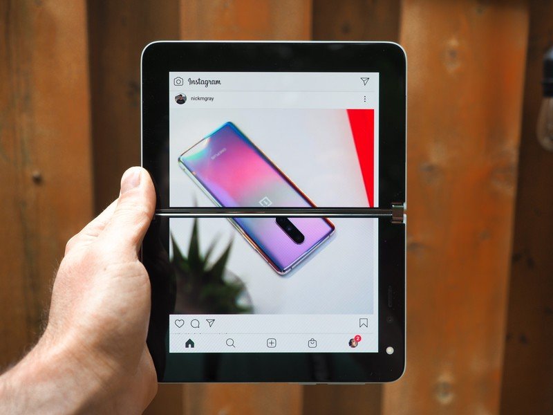
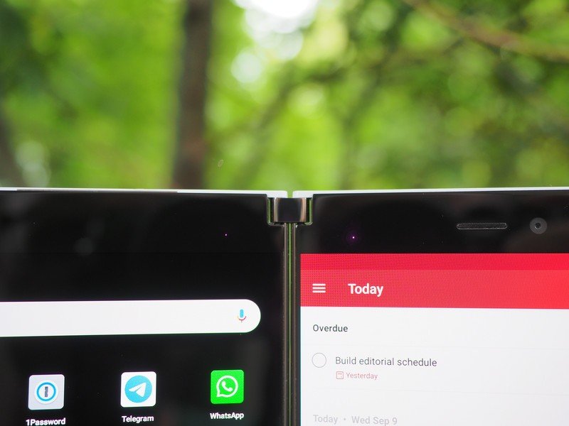
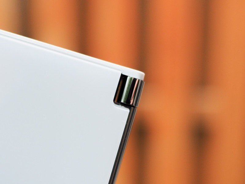
After spending two weeks with the Surface Duo, I can easily say that this is the best hinge in the game. Microsoft's 360-degree hinge is practically perfect — it's silent and small, smooth, and subtle — and can prop the two displays open at basically any angle.
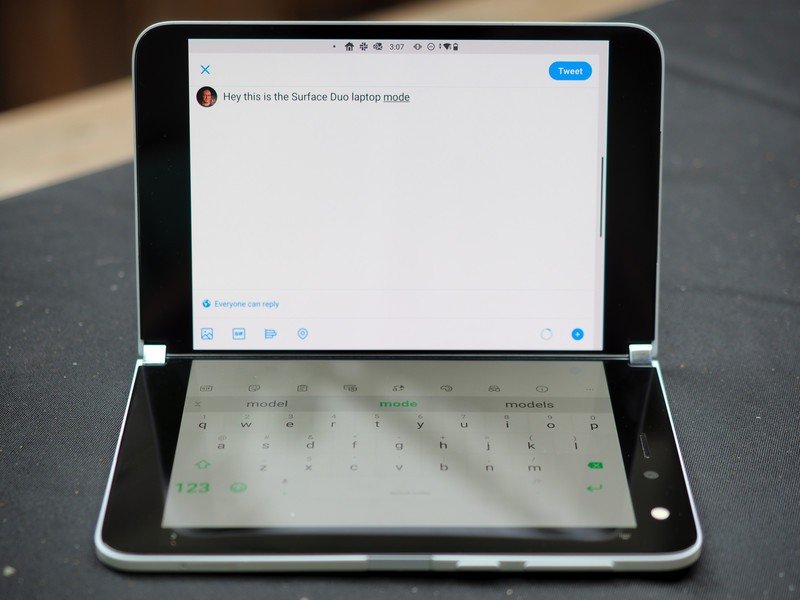
The hinge is so good, in fact, that I'm bummed Microsoft didn't take more advantage of that fact — as you'll see a bit later, there are very few things you can do right now when the phone is in laptop mode, for instance, or in tent mode.
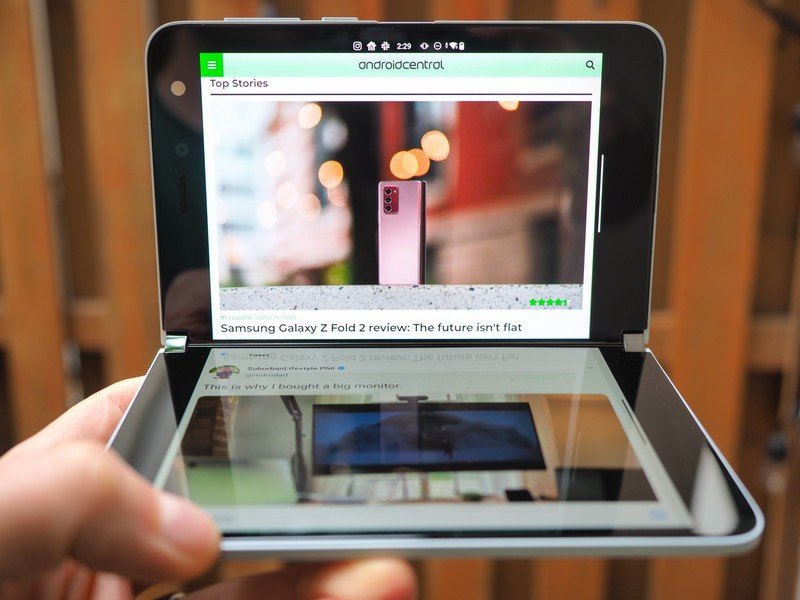
Of course, the hinge has a distinct advantage over other foldable phones on the market right now: namely, it doesn't also have to work in tandem with a folding OLED panel. Microsoft built two PixelSense displays, each with an impressive 1350x1800 resolution in a familiar 4:3 aspect ratio, covered in Gorilla Glass so they're sturdy and won't crack — literally and figuratively — under the pressure of your finger or an active stylus.
This is probably the most satisfying hinge I've used in a long time. Opening and closing the Surface Duo is a delight.
The displays themselves are pretty good, though they definitely don't get bright enough in direct sunlight, but the really impressive thing here is just how thin they are; each side is just 4.8mm, so when the Surface Duo is closed, it's under 10mm, which isn't that much thicker than most non-folding phones today. The fact that they support Microsoft's stupendous Surface Pens, which I used in OneNote, is an added bonus.
Source: Daniel Bader / Android Central
But two 5.6-inch displays in a 4:3 aspect ratio that open up to an 8.1-inch tablet at 3:2 makes for a pretty wide phone, and while my friend and colleague Daniel Rubino over at Windows Central may dispute this fact, the reality is that this is a very awkward phone to use in one hand. And despite the fact that you may at first be tempted to use the Duo with both displays open all the time, just to marvel in its productive glory, if you're anything like me and want to get on with your life, you'll spend a lot of time with one screen flipped all the way around, using it like a Nexus 6-like pocket-stretcher.
When used as a normal single-screen phone, the Surface Duo is wider than practically any phone on the market.
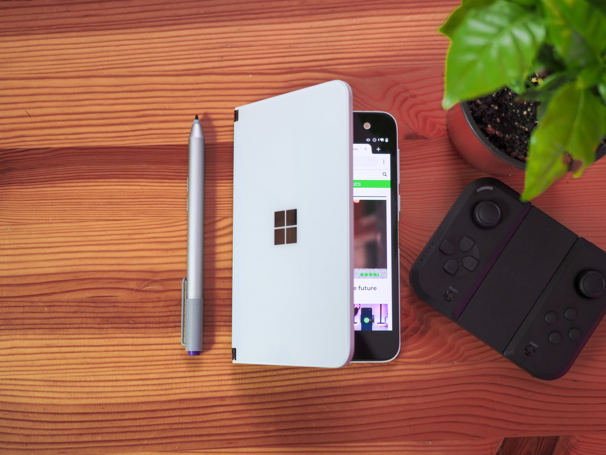
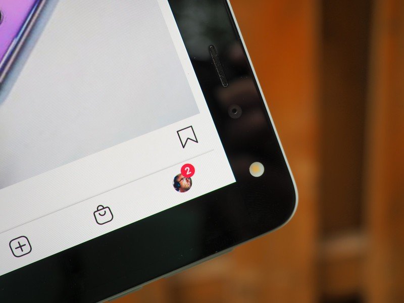
When closed the Duo resembles a book in the best way, with minimal branding and no bumps on either the front or back. In fact, this is the first phone I can remember that doesn't have a rear camera at all. The side-mounted buttons are clicky and responsive, and the recessed fingerprint sensor is easy to reach when you're holding the phone in single- or dual-screen mode, or in either hand. It's not the best fingerprint sensor I've used, and requires a pretty firm placement, but it works well most of the time.
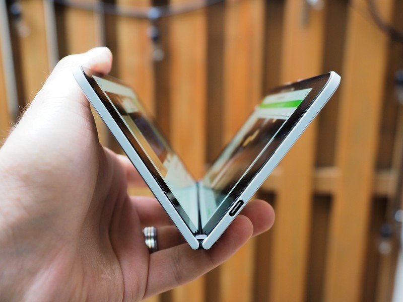
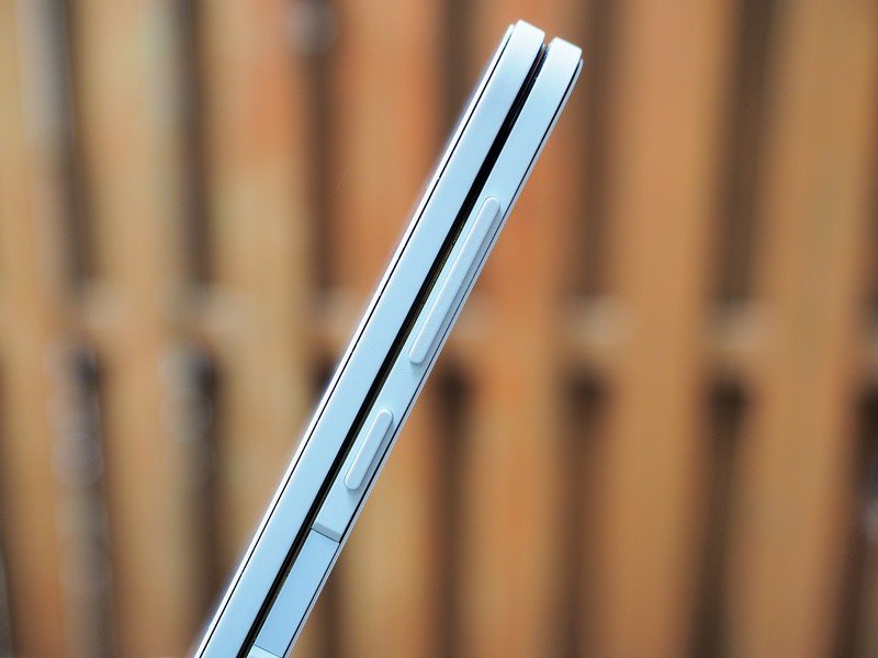
It's a shame there's no wireless charging, but the battery life should be good enough for most people to make it a whole day without topping up.
The phone charges at a Pixel-like 18 watts using the USB Power Delivery standard, which is a bit slow for my liking, especially since the 3577mAh battery, spread over two cells, takes nearly two and a half hours to charge. Wireless charging would make the whole enterprise a bit more convenient, but if you've been following the Duo's come-to-market journey at all, you famously know that Microsoft wanted to keep the phone as svelte and portable as possible, making it hard to justify the added thickness of wireless charging and NFC coils.
The lack of NFC actually affected more than I thought it would. Living with the Duo means keeping it in your pocket as a daily driver, and that means walking around — outside, in the real world — with a $1,400 pocket computer that lacks NFC. During the pandemic, I've been leaving my house without any credit cards because my phones either support Google Pay or Samsung Pay, but without NFC I'm forced to bring a payment card. Not a big deal, but definitely a reluctant change in behavior on my part.
But it's important to remember that Microsoft says it's been working on this phone for half a decade — Windows Central's Zac Bowden first reported about a Surface Phone more than four years ago. The long development process and sheer number of custom components meant that Microsoft had to finalize the hardware in 2019, long before today's flagship Snapdragon chips were available.
The Snapdragon 855 inside this thing was everywhere until late 2019, and while it's a good, solid chip, it's clear that it struggles to maintain a high frame rate when both screens are activated. But we'll get to that.
Microsoft Surface Duo The software experience
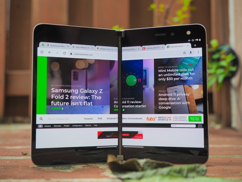
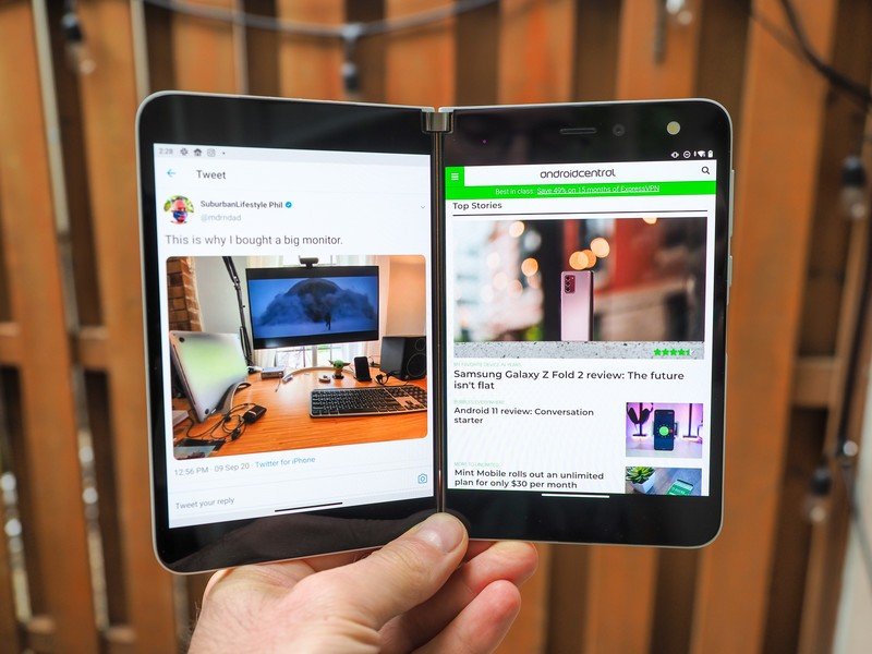
Things get more interesting when you open up the Duo. Microsoft's running a modified version of Android 10 here, and treats the two screens as distinct units unless told to do otherwise. That means despite the launcher spanning both displays, each one has its own app tray, and wants you to choose which app goes where.
The Surface Duo is one of the buggiest shipping products I've ever reviewed.
Microsoft is really pushing the productivity possibilities of this setup, showing off, say, Outlook Mobile on one side and Teams on the other, or Slack on the right and Edge on the left. You can drag text or images across the black divide, for instance, plopping an image from Edge into an email, or you can use apps that intelligently span across both sides of the screen, acting like Android tablet apps were promised all those years ago.
When I first began reviewing the Duo, the software bugs were so pervasive that almost none of these dual-screen examples were possible, at least not without some glitch getting in the way. Apps would jump randomly from one screen to the other, or one display would just turn off on its own. Gestures would register slowly or not at all, and rotation was completely broken. The phone just wasn't reviewable in that state.
But with the update Microsoft issued five days six days ago, presumably the same or similar to the one users will get when they buy the phone this week, I can now see the forest through the trees. So let's talk about the forest.
Microsoft's Chief Product Officer, Panos Panay, has repeatedly pushed back against labeling the Surface Duo a phone; it's a small Surface, he says. A book. Microsoft representatives told me that the Duo is for experienced Android users who have already enmeshed in Microsoft 365 applications like OneDrive, OneNote, Outlook, Teams, and Office. It's for people who live and breathe the Microsoft way of life but also want to dabble in the wider world of mobile apps, which is why the Duo runs Android and not Windows.
Microsoft's Android apps are amazing. The company has become one of the premier Android developers out there — for any smartphone.
I'm not typically a Microsoft 365 user, at least not beyond having a Microsoft account and occasionally testing the new features. But I bit; I logged into my Microsoft account, started taking notes and kept sketches in OneDrive, switched from my favorite email app, Spark, to Outlook Mobile, stored my files in OneDrive, wrote a couple of articles in Word, took some calls in Teams, and transferred my projects from Todoist to Microsoft To Do.
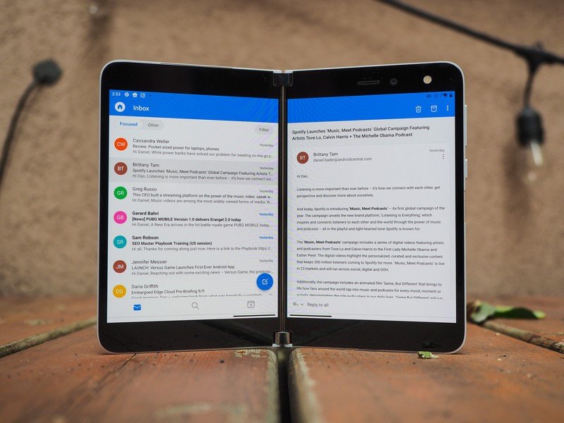
And you know what? They're great. They're great on the Duo just as they're great on a Galaxy Note 20 or Pixel 4, largely because Microsoft's become a really good Android developer. In fact, once I'm finished using the Surface Duo, I'm sticking with Outlook Mobile as my phone's new default email client. It's that good.
For this review, I decided to go all-in on Microsoft 365.
But I wanted to try to see what Microsoft wanted me to see, this so-called synergy, in using two apps at once, so I went all-in with the Duo.
There were occasions where this was helpful. I was writing an email to a coworker that referenced a bunch of numbers in a Google Sheet, so I had the spreadsheet open on the left display while I thumb-swiped my way through the email on the right side. I tried dragging-and-dropping an image from Edge into an email, but the process was so clunky that I didn't try a second time. I did the whole "looking at recipe ingredients on the left screen and copying them into my grocery list on the right" thing, too, and that was useful.
But most of the time, to be honest, I had Twitter or YouTube open on one side and a work thing on the other. That's what really sold me on this; not the day-to-day productivity improvements, but the honest-to-goodness multitasking potential of consuming visual media while plugging away at a piece of work.
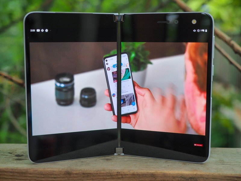
There's also the spanning feature that a few apps support right now, though you can force nearly every app to maximize across both, with varied success. YouTube, for instance, looks great across both screens, but the pause button is hidden by the small hinge gap between the two displays.
Most of Microsoft's apps, Spotify, Amazon Kindle, and a very cool video editor called Mylio, have been optimized for spanning, and it's in the moments when I'm holding the Duo as a book, flipping between Kindle pages, or using Microsoft news to browse articles on the left side and read them on the right, that I see little glimpses of why someone might come to love this.
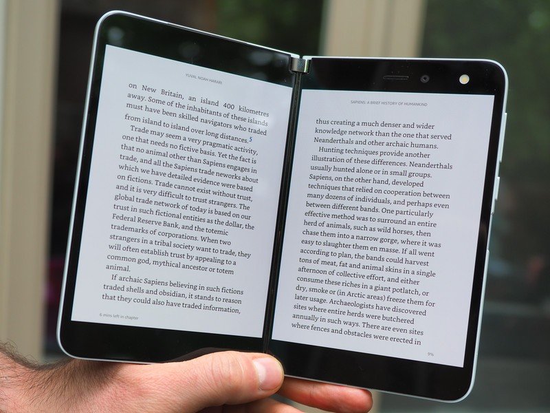
In fact, after using the Kindle app, which supports proper spanning and two-page turning on the Duo, to read books on the couch over the last two weeks, I am completely and utterly in love with the experience. I don't want to read books on anything else again.
Before buying the Duo, you really need to know whether you're the kind of person to find two screens a multitasking advantage or an unwelcome distraction.
The Duo is built on intentionality. Yes, it's easy to just flip around the second screen and forget it's there, but to realize its potential you must put yourself in situations where using that additional space, even just to luxuriate in having two apps side by side without needing to switch between them as on a regular phone.
But the experiences are so few and far between right now, and the implementation so unreliable, that I kept getting slapped back down to reality when an app would crash, or one of the displays would suddenly turn black, or the hinge would obscure some important piece of text, and I'd remember that Android just wasn't designed for this, and Microsoft is building a hill on a very steep mountain.
That mountain is Android. Google just released Android 11 this week, and buried in the list of developer features is improved support for phones with hinges, just like the Duo. While Microsoft promises monthly updates for the Duo which, along with new features, will inevitably fix more bugs, it's unclear whether the company can do much to overcome foundational issues with Android on two displays until Android 11 is available on this device.
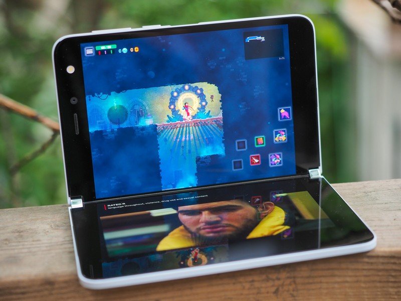
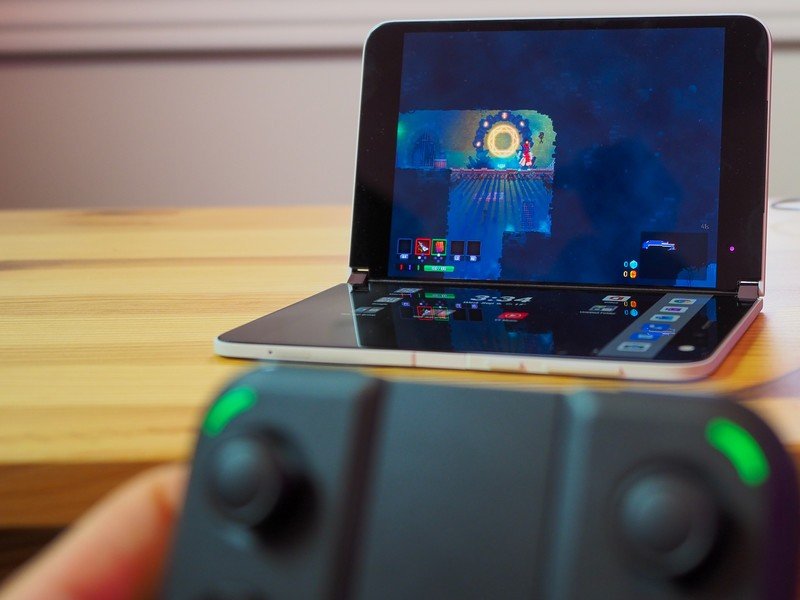
One of my favorite things to use the Duo for was propping it up in tent mode and connecting my Razer Thundercat controller and playing a few rounds of Dead Cells. Having a large display with a built-in kickstand anywhere I want is something of a gaming revelation; even if the phone runs last year's processor and only 6GB of RAM, all the games I opened, once properly loaded, ran without issue.
In fact, right now the phone's software seems to be in a stubborn, transitional phase. That sounds weird, but there's no other way to put it: sometimes the thing behaves as it should, nearly bug-free and full of hope. Other times I can't even get the damn fingerprint sensor to unlock the phone until I restart it.
Microsoft Surface Duo Performance issues & phone realities
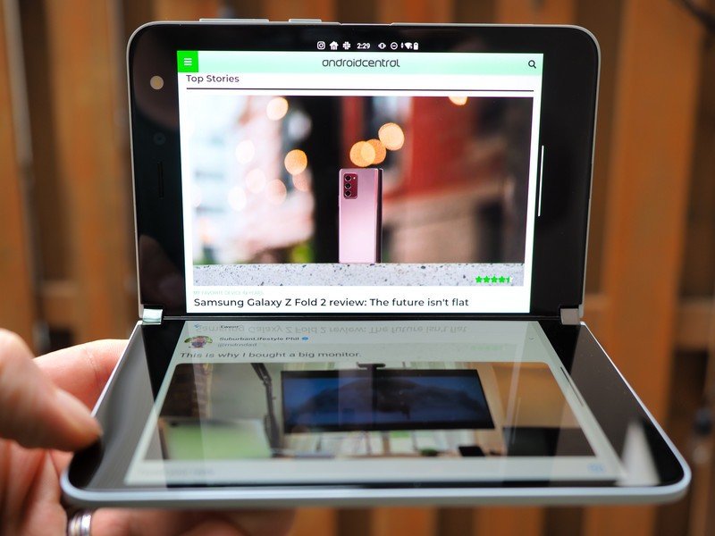
Even after its recent update, the Surface Duo just feels sluggish. I'm not even talking about the difference between 60Hz and 120Hz; this thing drops frames all over the place, and combined with pretty lackluster touch sensitivity, I find myself having to wait for animations to complete or repeat the same action because the first one didn't register properly.
From poor touch response to jittery animations and slow app load times, the Surface Duo feels slow.
Some of these bugs may be possible to fix in subsequent monthly updates, something Microsoft is promising, but I'm betting it's more about waiting until the Duo 2 next year for the hardware to finally be powerful enough to match the software's ambitions.
Those touch issues are no joke, either. Typing on the Duo is often a frustrating proposition, and I got so fed up with missed taps I'd often resort to voice dictation just to reply to a message.
I've heard through the grapevine that Microsoft knows this is an issue and will attempt to correct it in an upcoming patch, but as it stands right now I often have to repeat a gesture or tap the screen multiple times just to register my presence.
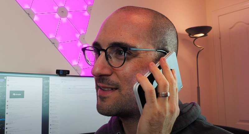
But how does the Duo perform as an actual phone? Well, for starters, it's awkward as hell to hold up to your ear because not only is it super wide, but it weighs 250 grams. The mono speaker gets pretty loud, but it's only on one side, so most content consumption should be done on the right display.
The good news is that the 3577mAh battery usually lasts all day, though perhaps due to outstanding bugs I experienced a couple days of awful uptime, usually needing a full top-up by early afternoon. That was more the exception than the rule, so I don't expect battery life to be an issue going forward.
There are, however, two big technical issues with the Surface Duo that present as showstoppers, and will likely be the reason I won't continue using it as my daily driver after this review, despite how much I've grown to enjoy other parts of the phone.
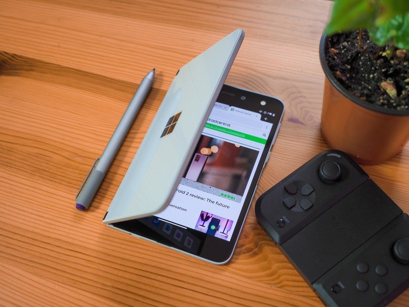
The first is Bluetooth performance. I literally cannot get a single pair of true wireless earbuds to connect consistently, even the pair of Surface Buds that came in the reviewer's kit. I don't know if it's a poorly-coded Bluetooth stack, or just a weak antenna, but every time I venture out of the house trying to kick back to a podcast, it's stutter city unless I hold the phone in my hand. This is something I've heard from other reviewers, too, and it's incredibly irritating.
There's no 5G on here, but you probably won't miss it.
Microsoft also omitted 5G support from the Duo, which I don't really mind, but it's something to consider; the Snapdragon 855 technically supports 5G, but for a number of technical issues, Microsoft didn't pursue it here. LTE performance is pretty good, though; I had no issues maintaining a strong connection to TELUS up here in Canada (my review unit is an unlocked model).
Microsoft Surface Duo The camera
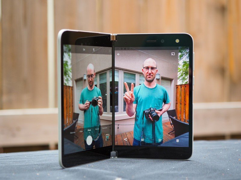
Another major issue is fundamental to the Surface Duo's design: the camera. There's only one sensor, on the inner right display, and it's just crummy. In decent lighting, the 11MP sensor captures a decent amount of detail, but an equal amount of noise creeps in there, too. And photos just look digital and artificial in a way that most phones, even cheaper ones, no longer do. This is admittedly Microsoft's first attempt at building an Android camera, so I'll also give the cool and subdued color science a pass, but overall I just don't like the photos that come out of here, even in ideal shooting environments.
The thing is, most of the time the environment is anything but ideal, and that's where the Duo falls on its face. Night mode? Forget it; in dark scenes, this thing has more noise than a soccer stadium, barely able to focus even when the subject isn't moving. Here are some examples so you can see what I mean.








Then there's the complication of relying on the phone to figure out which screen to use. Microsoft says the Duo is smart enough to know when you're trying to take a selfie and when you're trying to use the camera facing outward, but even after the most recent update, the viewfinder would often be on the wrong screen and I'd have to close the Duo altogether, or just frantically tap on the black display in front of me, to switch sides.
It's a mess and often a waste of time trying to get a good photo with this thing.


The added frustration is that given the form factor, the Duo could actually be quite a fun camera to use. Having a built-in kickstand means being able to place the phone on virtually any surface and having a nice big screen to coordinate a timed group selfie, or using the hinge at an awkward angle to get the type of photo normally impossible with a single screen smartphone.
I absolutely understand how difficult this is for Microsoft to solve, but I honestly dreaded using the camera during this review process, and kept it in my pocket even during times where, on a normal day, I would have taken out my Pixel or Galaxy and snapped a few.
Microsoft Surface Duo Competition
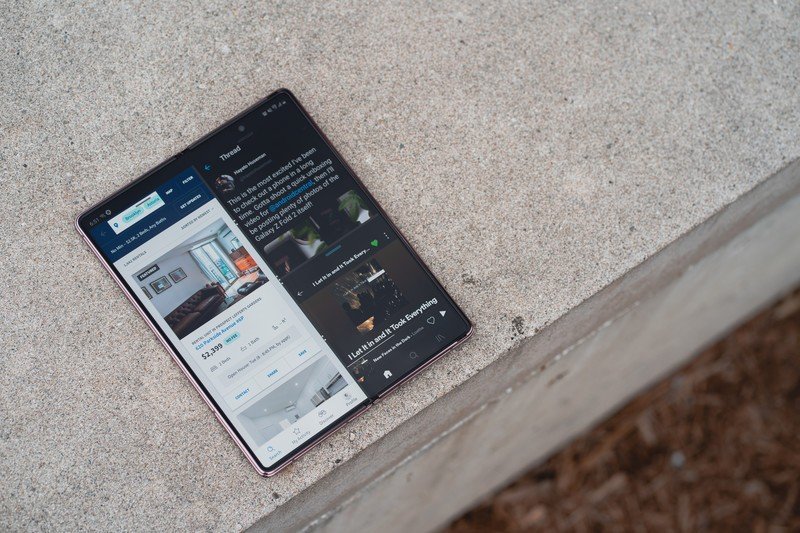
There really isn't another phone on the market like the Surface Duo, for better or worse. While many people will lump it into the same category as folding devices like the Samsung Galaxy Z Fold 2 or the Z Flip, the Duo is much more like a shrunken 2-in-1 laptop than a smartphone.
That said, the $2000 Galaxy Z Fold 2 is a far more cohesive product from start to finish, and while it lacks the versatility of two distinct displays, what is can do with a single display is far more enjoyable right now.
The only other real competitor to the Surface Duo, if you can call it that, is the LG V60, or any of LG's recent phones compatible with its Dual Display accessory. When you place the V60 in that case, which makes the phone comically thick and bulky, you too can navigate independent app trays and run two apps simultaneously, or force a single app over both displays, but LG's implementation lacks Microsoft's thoughtful app optimizations.
Microsoft Surface Duo Should you buy it?
You should buy this if...
You love the flexibility that comes with two displays.
Android may not have been designed with two displays in mind, but Microsoft has built a phenomenal canvas for seeing just how two apps can work in tandem, or a single app built with two screens in mind can make you more productive.
You love to be on the bleeding edge of mobile design.
There's no question that the Surface Duo is a stunning piece of hardware, and totally unique in its design and build.
You are completely invested in Microsoft's services.
While Microsoft makes great Android apps for all phones and tablets, the company's first-party experiences truly shine on the Surface Duo.
You shouldn't buy this if...
You aren't willing to put up with unfinished software.
The Surface Duo should not be available to purchase right now. Its software is still far too buggy to ask people to spend $1,400 for the privilege of owning Microsoft's smallest Surface yet.
You enjoy taking photos.
Yeah, enough said.
3 out of 5
At $1,400, the Surface Duo is a phone with two distinct screens that can be combined in a number of profound but not necessarily life-changing ways. Once I got into the groove, I loved having the versatility of a second screen — and honestly, this is the best e-reader I've ever used, though also the most expensive.
The hardware is also truly stunning. Seriously, I think Microsoft achieved something that only a couple of other companies in the world could pull off. Yes, the bezels around the screen are big, but they're there for a reason — so you can actually grip the damn thing when both displays are open without covering what's on the screen. The bezels make sense.
But it's buggy, still far too buggy in my opinion for a shipping product that's been gestating this long. If you choose to buy it, much like any new form factor you'll be spending a lot of money to help Microsoft beta test a new design, and I think a lot of people, especially those of us who have been following the company's travails in the mobile space over the past decade, are fine with that.
If it was just buggy, though, I would say sure, wait for a couple of update cycles and then maybe consider it once the price has dropped a bit. But something tells me that even then, with the Bluetooth the way it is and the camera the way it is, a Surface Duo purchase should only be indulged as a very pricey second phone, or if you really are in that demographic Microsoft described — the one who's an Android expert and lives in Microsoft 365.
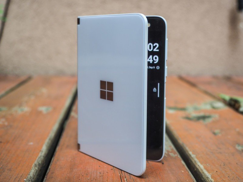
There's a lot to like here, and the hardware, despite the occasional wide load awkwardness, is truly gorgeous. But Microsoft is doing that Samsung thing of building it and hoping developers will come, entreating the world to come around to its vision of mobile computing. It didn't work when Microsoft itself built the platform, so now it's leaning on Google, which itself has struggled to get developers to care about anything beyond building apps for single-screen phones.
Having two regular apps running side-by-side is fine, and sometimes even great, but the Surface Duo really shows its potential when the software understands and embraces this new hardware — and judging from the past, I worry those moments won't ever be plentiful enough to warrant the price tag.
For me, it comes down to intentionality. Microsoft wants you to believe that you're going to be more productive with two screens, that your mind will embrace, and thrive with, the flexibility of a larger canvas when you want it. But in my experience, as I sit at my desk with two monitors distracted by a YouTube video on the left or a Twitter window floating near the flashing cursor that begs me to finish this review, I wonder if the benefits of having a single screen are in the intentionality of focus, of fewer distractions, rather than the opposite.
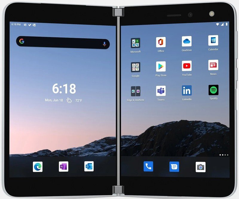
Microsoft Surfaceo Duo
A promising first attempt that will likely improve over time.
Bottom line: The Surface Duo is an ambitious, flawed first-generation product that showcases what's possible with new form factors without fully realizing them.
Daniel Bader was a former Android Central Editor-in-Chief and Executive Editor for iMore and Windows Central.
