Microsoft Interns transformed the News app for the Surface Duo

What you need to know
- A team of Microsoft Garage interns redesigned the Microsoft News app for the Surface Duo.
- The team figured out several ways to utilize the two screens of the Surface Duo.
- The team also had to figure out ways to change the app to fit the unique aspect ratio of the Surface Duo.
A team of Microsoft interns helped redesign the Microsoft News app and to optimize it for the Surface Duo. A new blog post from the team summarizes how they identified the core functionality of the app and expanded upon it to utilize the Surface Duo's unique form factor.
The team consisted of Eric Sun – Western University, Judy Zhong – University of Waterloo, Sara Li – University of Calgary, Eishan Lawrence – University of British Columbia, Rithvik Alluri – University of British Columbia, Kate Vlaar – University of Alberta, and Natalia Maximo – University of Ottawa.
Redesigning the news app wasn't just about making the app span across two screens or simply extending an article across displays. The team also made changes to how the app functions on a single display of the Surface Duo.
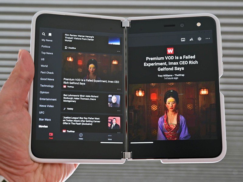
During testing, they discovered that you can't easily reach a thumb across one of the Surface Duo's displays due to its with. Because each of the Surface Duo's individual displays is wider than that of most standard smartphones, the team swapped the menu from a horizontal orientation to a vertical orientation.
Regarding taking advantage of both screens of the Surface Duo, the team had to evolve the app to expand functionality on two displays without hampering it for people using devices with one display. One way the app does this is by keeping a news feed on one screen while showing articles on the other.
Further testing provided insights to the team the helped them decide on how to handle embedded links. When you read an article on the Surface Duo and click a link, it now opens on the opposite display. This allows people to read relevant content from the linked article without losing their spot within the article.

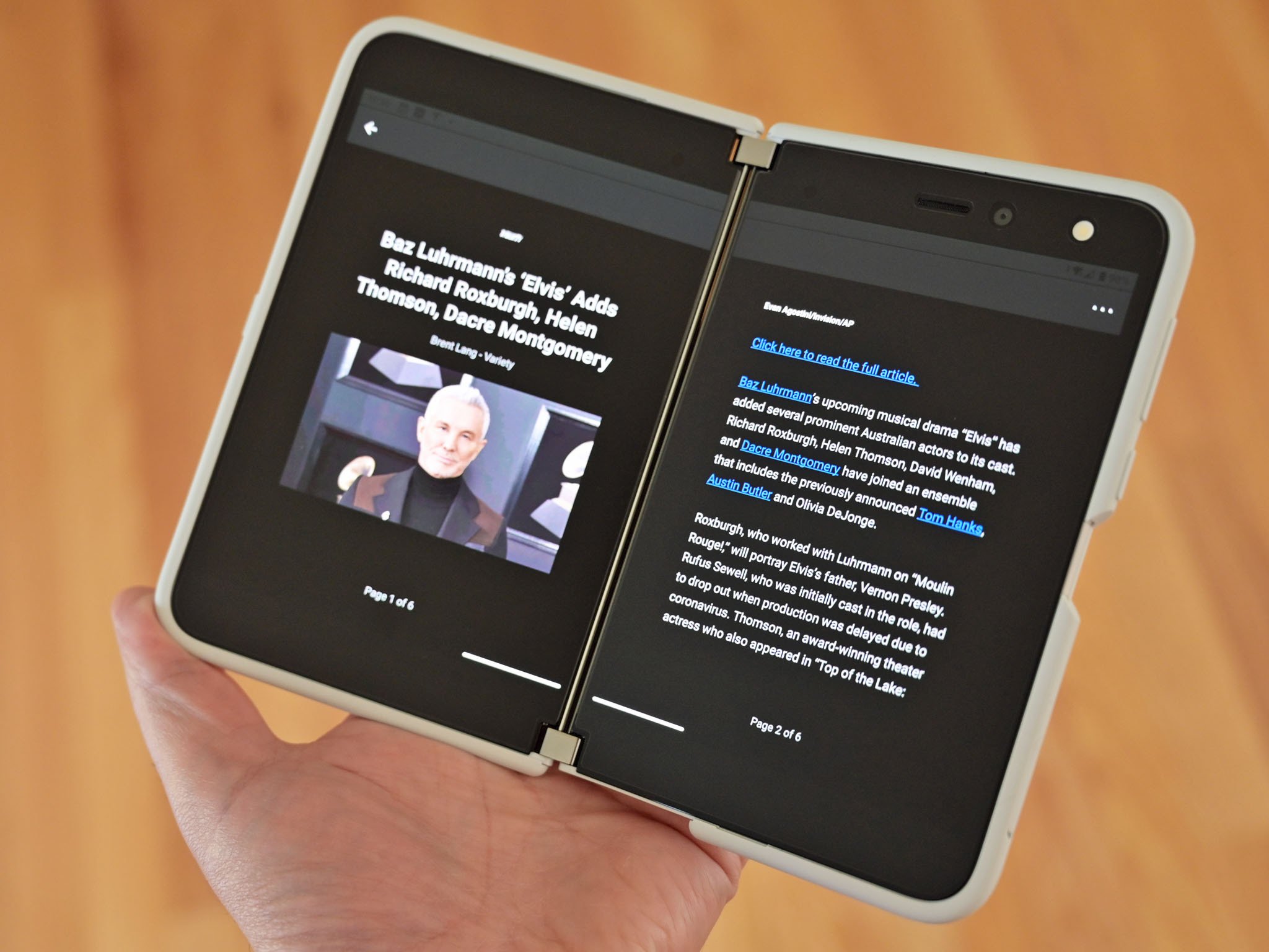
The team also showed flexibility when optimizing the app. The app now has a Book Mode that you can easily enable for any article. Doing so spans an article across both displays like a book.
Be an expert in 5 minutes
Get the latest news from Android Central, your trusted companion in the world of Android
While millions of people read content on a single screen, people seem keen to read on a device with two displays. There was quite a bit of excitement on the web when people saw that Amazon's Kindle app spans across both of the Surface Duo's displays. Book Mode within the News app appears to deliver a similar feel to that of Kindle's optimized app.
The list of Surface Duo optimized apps is still relatively short. This team of Microsoft Garage interns shows that taking advantage of the Surface Duo's form factor can be worth the effort.

Microsoft News
This news app features content from over 3,000 sources from around the world. You can customize what content you see to deliver a personalized news experience.

