Microsoft To Do gets fresh design that taps into its Wunderlist roots

What you need to know
- Microsoft debuted a new look for To Do today.
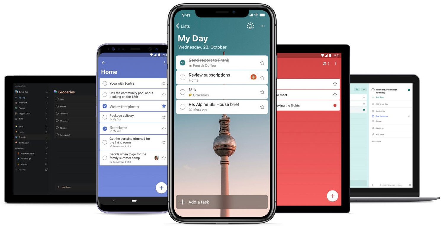
- The new experience incorporates more customization with background images and warmer colors.
- The updated experience will be available across Microsoft To Do on all platforms.
Microsoft To Do has evolved considerably since its initial launch in 2017. Over time, Microsoft has sought to make the app a replacement for Wunderlist, which it acquired (along with its team at 6Wunderkinder) in 2015. It's been a gradual process to say the least, but we've seen a marked increase in the pace of To Do's development over the past year or so. Today, Microsoft unveiled a new user experience and design tweaks for To-Do with the aim of merging the best of both To Do and Wunderlist.
"We've come a long way since those first Wunderlist days," Microsoft said [in a blog post today.](/e?link=https%3A%2F%2Fclick.linksynergy.com%2Fdeeplink%3Fid%3DkXQk6%252AivFEQ%26mid%3D24542%26u1%3DUUacUdUnU79566%26murl%3Dhttps%253A%252F%252Fwww.microsoft.com%252Fen-us%252Fmicrosoft-365%252Fblog%252F2019%252F09%252F09%252Fannouncing-new-version-microsoft-to-do%252F&token=COtEc2tC "Today is one more step in our evolution. We'd like to unveil what we've been building for you at the Wunderlist/To Do offices here in Berlin: the new version of To Do. Our best-of-both-worlds vision realized."
The refreshed look is a more polished experience for To Do. Gone are the large headers in To Do's current iteration. In their place, Microsoft has added more colors to "give the app more warmth and personalization." Even better, you can now select from several backgrounds for your lists, backgrounds that include the Berlin TV tower that was a prominent feature in Wunderlist. You can also now give each list its own background, helping to give them each their own unique flavor.

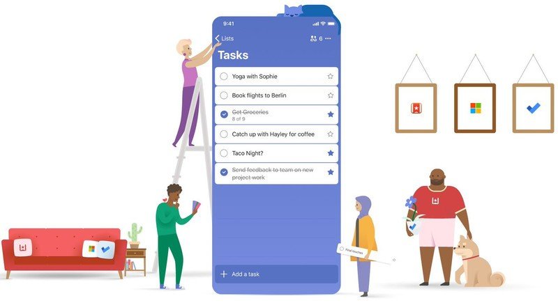
"We've freshened up our look so that it feels simple, yet modern," Microsoft says in its blog post on the revamp. And in giving it an initial look, you can definitely see some of the design elements from Wunderlist making their appearance here — something that fans of the older app will appreciate.
To the consternation of users looking to make the switch from Wunderlist to To Do, Microsoft was initially somewhat slow to migrating features. That pace of development came down to some technical issues, but the To Do team has been busy feaverishly adding new features over the past year.
Integration with Cortana and list sharing, along with integration across Microsoft's other apps and services, such as Outlook and Microsoft Launcher, have made the list app a whole lot more attractive. A dark mode, assigned tasks, and the Smart Lists feature have helped make To Do a much more viable option as well.
All of this combines for a more attractive experience looking to jump from Wunderlist. Still, because of Wunderlist's impending retirement, the app's founder recently expressed interest in buying the app back from Microsoft to keep it alive with a new team.
Be an expert in 5 minutes
Get the latest news from Android Central, your trusted companion in the world of Android
Microsoft To Do is available now across a variety of platforms, including Windows 10, Android, iOS, Mac, and the web.

Microsoft To Do
Microsoft To Do syncs your tasks and lists across all of your devices, including devices running Windows 10, iOS, Android, and Mac. It supports file attachments, sharing tasks and lists, and has a clean interface.

