The Android Wear market has been relatively quiet for the past few months, but as we near the back to school season, the release schedule is set to pick up pace. And as we've seen from so-called fashion brands like Fossil, as well as well-known mainstream watch brands like Casio, Android Wear has found its way into practically any and every retail opportunity. Like Android itself, its versatility is its biggest strength.
Another such fashion brand looking to capitalize on the (admittedly slowing) smartwatch trend is Michael Kors, releasing two lines of its Access smartwatches today starting at $350. And despite some minor issues, the watches are destined to be successful largely because of Michael Kors' existing distribution model of watch dealers and box stores and every mall in between. But next to the ultra-sleek Huawei Watch, Moto 360 and upcoming Asus ZenWatch 3, is the Access smartwatch right for you?
About this review
I (Daniel Bader) am writing this review after using the black stainless steel / black silicone band Michael Kors Dylan Access model for two weeks. It is running Android Wear version 1.5.0 based on Android 6.0.1 with the July 5, 2016 security patch.
Michael Kors Access Specs
| Category | Features |
|---|---|
| Size | 46mm casing x 14mm thick |
| Color | Black stainless steel (reviewed), Silver stainless steel, Gold stainless steel |
| Display | 1.5-inch 320x290 pixel transflective TFT LCD display (287.9 ppi) |
| CPU | Qualcomm Snapdragon Wear 2100 SoC |
| RAM | 512MB |
| Storage | 4GB |
| Battery | 360mAh |
| Sensors | Gyroscope, Accelerometer, Bluetooth 4.1 |
| Strap | Silicone (reviewed), Leather |
| Weight | 112 grams (reviewed) |
Michael Kors Access Hardware
Keep in mind that I am only reviewing one style of one model of the Access line; like all things department store, there is a color and style for everyone. Specifically, I have been using what is clearly the least provocative of the options — black stainless steel with a comfortable, textured black silicone band — that include multiple shades of gold-casing-on-gold-band and a snakeskin-style embossed leather.
More than a few times during my testing period, several people came up to me to ask about the watch on my wrist.
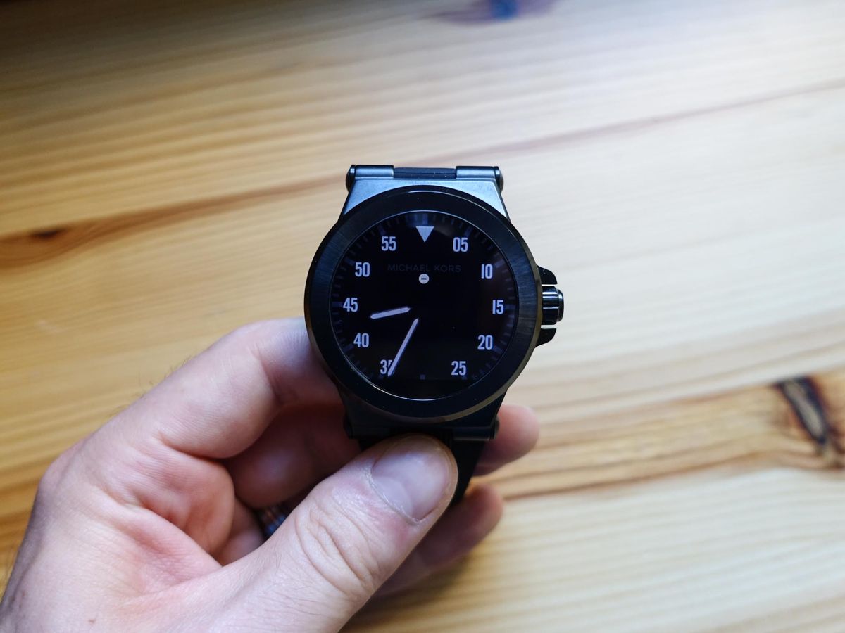
But between the two overarching styles and multitudinous color and strap variations, one thing is clear: this is a big, heavy, imposing piece of jewelry. At 112 grams, and a chassis that despite its round face juts out at angles to meet a set of 28mm lugs, the Dylan Access is present. When compared to the subtle, minimal and delicate design of last year's Moto 360, it's clear Michael Kors intends for this to be worn by people who want it to be noticed. And noticed it was.
More than a few times during my testing period, several people came up to me to ask about the watch on my wrist. Aside from my early days with the Pebble, and a few times with the original Moto 360, this has rarely happened to me. It appears the size gambit worked.
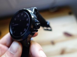
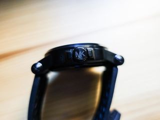
The Michael Kors branding is subtly entwined into the product itself; the crown to the right of the watch face has a clear MK emblem, giving texture to the button that, though it appears designed to twist like a regular crown, can only be depressed. Its function is limited to waking the screen from sleep or, when held down, activating Android Wear's app drawer (behavior that is set to change drastically with the release of Android Wear 2.0). On the other side is a set of microphones to enable Android Wear's excellent voice-activated "OK Google" support.
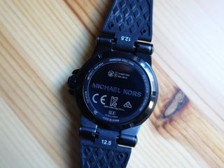
Underneath the watch is a metal plate sans heart rate sensor, an omission not mourned for due to its unreliable nature in previous Android Wear devices. In the silicone strap, with is surprisingly comfortable despite the heft of the metal, my wrist felt comfortable and, in the time I normally took to warm to an analog watch, I grew used to the Access on my wrist at all times. That strap can be swapped out with other silicone or leather options, but the lugs are specific to the Dylan Access line itself, which precludes the use of standard 28mm bands.
Like the Sony SmartWatch 3 before it, the Access has a transflective display, which denotes a reflective layer just above the LCD backlight meant to make it easier to read in direct sunlight. And while this is true, the relatively low-resolution 320x290 pixel screen appears to have a muddy sheen atop it in most all other situations, with poor viewing angles and blacks that appear milky. It's actually a better display than the SmartWatch 3 despite the lower pixel density — colors are more vibrant and, straight on at least, it offers a pleasant enough experience — but after using the Huawei Watch and Moto 360 (2015), this just doesn't cut it anymore.
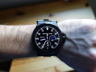
There's even a "flat tire" towards the bottom of the screen just to reiterate just how far behind the watch's display chops are. That flat tire area doesn't even include an ambient light sensor, so you'll be adjusting brightness manually (though the transflective screen somewhat makes brightness a moot point).
After using the Huawei Watch and Moto 360 (2015), this kind of low-resolution display just doesn't cut it anymore.
Internally, the Dylan is a mix of new and old: it is running Qualcomm's specialized Snapdragon Wear 2100 SoC, which offers a slightly more power-efficient mix of Cortex-A7 cores than the Snapdragon 400 in most Android Wear watches to date, a chip that was built for phones and coopted for wearables.
At 1.2GHz, the Wear 2100 cores are clocked identically to the Snapdragon 400s found in most Wear devices, and it is built on an identical 28nm process, so it's no surprise that the Access lasted roughly the same amount per charge as any previous Android-based wearable I've used. The main difference is the optional integrated X5 baseband, which will allow future watches 3G connectivity, a feature Michael Kors clearly doesn't care for. There is also 512MB of RAM and 4GB of internal storage — standard on Android Wear devices since their debut.
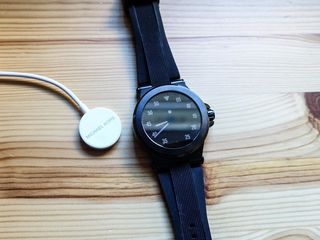
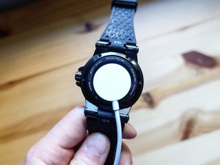
While battery life is on par with other smartwatches in its class, the charging experience certainly isn't. Taking design cues, without the know-how from Apple, the Access line charges wirelessly from its underside via a white, circular magnetic cable. While this allows the watch to be water resistant up to 10 meters (33ft), it is otherwise near-useless. The magnets are not nearly strong enough to latch on for any length of time, and I was forced to weigh it down the entire bundle with a book to get keep it connected. Even then, the orientation is such that it often slips off. I woke up to more than a few mornings of the Access fully dead despite being ostensibly attached to its charger.
Michael Kors Access Software
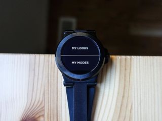
If you've used Android Wear since its inception, the experience here is a known quantity. While Michael Kors bundles its "Access" app, which allows for customizations of its varied and colorful watch face collection, there are no particularly unique tricks to note. It's also interesting that this is one of the least fitness-oriented Android Wear watches I've seen, with no native exercise or tracking app to speak of other than Google's own Fit experience.
The Access app is at once confusing and ultra-simple, and more than a little useless.
Like all Android Wear devices running the latest version, the Access supports a number of gestures to navigate through its Google Now cards — twist up or down to scroll through the cards; push down or pull up to move in and out — and I'm happy to report they work as well here as they do elsewhere. Similarly, the newly-implemented app drawer, which is accessed by swiping to the right of the watch face or holding down the crown, is alive and well. The dark theme, at least on my review unit, somewhat encourages a dark watch face, and thankfully most of the pre-installed options err towards an evening palette.
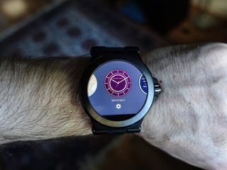
Those watch faces are not my personal liking — I am more of a spare, minimal kind of watch wearer — but unlike the Apple Watch, Android Wear supports downloadable third-party faces. Still, I settled on one that I liked, called Speedometer, and changed up the colors to suit my style. Most people won't get much out of the included Access app, though: it is at once confusing and ultra-simple, and more than a little useless. Many of the included faces also include support for complications, which Michael Kors calls Subeyes, that include shortcuts for alarms, a pedometer, calendar, and battery count.
Michael Kors Access Bottom line
The Michael Kors Access line is available September 6 starting at $350 for the model above (metal/silicone), going up to $395 for the more exclusive gold-tone Bradshaw varieties. Bands begin at $40, rising to $50 for the embossed versions). (In Canada, watch prices begin at $420, rising to $475, with bands running $50 to $60.)
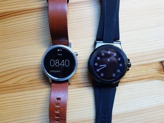
Despite the issues with the charger, and the imperfect display characteristics, I grew to enjoy the Access, and would certainly recommend it to anyone looking to engage with the more fashion-forward varieties of Android Wear. Like the Fossil Q Founder, this smartwatch is more about the brand than the product, and it's clear that certain decisions were made to reinforce its place alongside similarly-designed analog watches in endless glass displays.
But somehow it works: it is both fashionable and functional, comfortable enough (with a sizeable battery) to wear all day.
See at Michael Kors
Daniel Bader was a former Android Central Editor-in-Chief and Executive Editor for iMore and Windows Central.
