Me In My Place Android 'app' doesn't do the women justice (or the photographer, either)

Update (Dec. 5, 2012): The web app has been updated and now works very well on Android. See our post here.
Original: For far more than a year now, a semi-secretive series has graced the pixels of a Tumblr blog as well as the pages of Esquire magazine. Dubbed "Me in My Place," the series was shot by "a notable photographer, who has shot portraits of many notable people," said Esquire. The man behind the camera wasn't the point, after all. (He's since been unmasked, but we're going to make you work for it, too.) It was the subjects -- the various girls next door, Manhattan (and later L.A.) style -- who made the series at hit. The tag line: "Real girls in their own place. Not too crazy and just a pinch of naughty…"
Yes, the portraits are what they are -- probably not-safe-for-work photos of "real" women in their homes, comfortable in various stages of undress. The pics are sexy and a bit raw, and that's the appeal. Not too crazy and just a pinch of naughty.
Esquire magazine got involved, the odd actress made appearance and things, erm, took off from there. An app was promised. And now, an app has arrived.
Well, sort of. A web app. A $10 web app. A $10 web app that at its best gives what you can mostly get on the Tumblr site, and at its worst does so poorly becaues of screen orientations and varying resolutions. And that's a shame, because we want to pay for exclusive content. We want to appreciate fine photography (and, yes, attractive women) and support the people who create it. And in an ecosystem such as the Android Market, which can be a festering cesspoll of horrible "sexy lady" apps, we'd love to see an app with a little more class -- both in design as well as subject matter -- succeed.
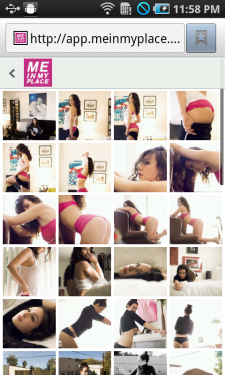
But in the case of Me in My Place, we're left wanting. Oh, the photography is top-notch. The women, beautiful and at ease. But the web app. Oh, woe is the web app. Paying and registering was simple enough. Then you sign in and are greeted by the index you see above, followed by thumbnails. From there, things take a wrong turn.
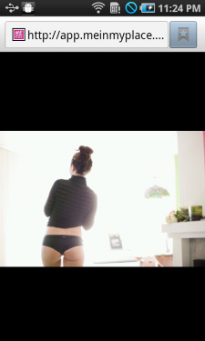

Images look fine in landscape, and that'd be OK except that most of them are shot in portrait. So, you rotate the phone.
Be an expert in 5 minutes
Get the latest news from Android Central, your trusted companion in the world of Android
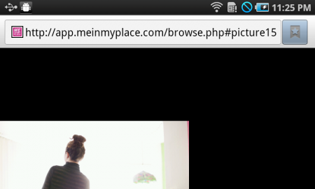
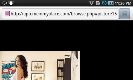
Whoops. For what it's worth, the screen shots you see here are 480x800. Got to a higher-resolution phone like the Galaxy Nexus or Galaxy Note, and things get even worse.
The good news is that because this is a web app -- OK, really it's just a website you have to pay to log into -- things can be fixed fairly easily. But that doesn't make it any less disappointing. And it really makes us long for something like Google Currents with in-app subscriptions. (Who wants to bet we'll see those eventually?) Blogs like 500px look beautiful in Currents. What we have here is with MIMP is a good thing done badly. Me in My Place is quality. The women are gorgeous. And they deserve better.
