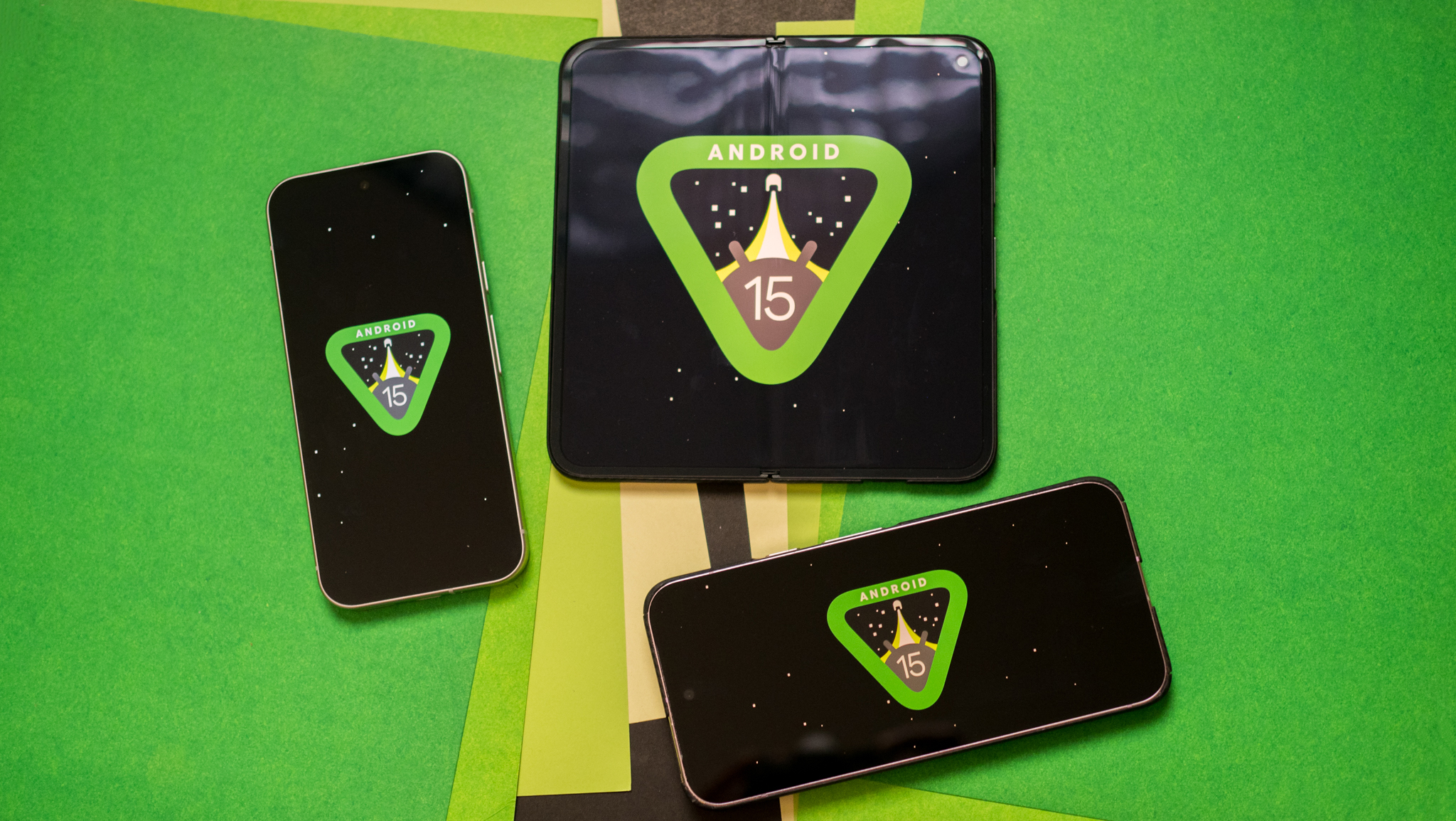
Material You is the one Android 12 feature Apple won't copy
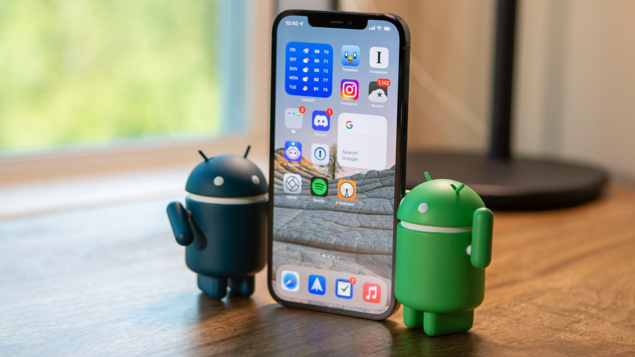
For every new feature in an iOS update, you'll find two "new" ones that Android users have enjoyed for years. iOS 15 will steal Android tools like smarter notifications, Live Text, and Google Assistant-like upgrades to Siri. iOS 14 also took Android features like widgets, PiP, an App Drawer, and app permissions, and put its own unique flair on them. Next year's WWDC will undoubtedly sell innovative advancements that Android users find familiar.
I'm not interested in weighing the ethics or comparing iOS's software quality to Android's. Google and Apple have a symbiotic relationship, and the more Apple adopts Android features, the more its customers could see Android as a cheaper-but-viable alternative. Plus, Google sometimes follows Apple's lead on new features, such as its Privacy Dashboard. Imitation is part of the industry.
Material You may be the one Android feature that Apple won't steal.
What I'm curious about is future features Apple will take from Android 12. In particular, I want to know what an iOS equivalent to Material You would look like.
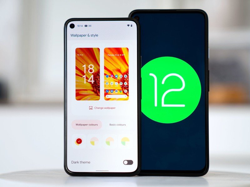
If Apple reimagined the automatic wallpaper extraction tool from Android 12 beta 2 or the manual color customization tools of beta 3 for the iOS ecosystem, that could give iPhones another burst of fresh air to go with their awesome widgets.
Here's the problem, though: Material You may be the one Android feature that Apple won't steal. Because no matter how popular Android 12 proves to be, Apple won't soften its anti-customization stance or lower its walled garden unless forced.
Apple will keep deciding what its users like
I reached out to some phone industry experts, hoping for a fun, hypothetical thought experiment. What would a customizable iOS look like? What would Apple have to change in iOS to make customization an option? And just how likely would it be that Apple will imitate Material You should it prove popular with Android users?
Their responses, while very helpful, were disappointingly pragmatic. For example, none envisioned any scenario where Apple would put significant customization in the hands of users because they see it as antithetical to the way it does business.
Be an expert in 5 minutes
Get the latest news from Android Central, your trusted companion in the world of Android
"Apple prefers a wall garden approach to the iOS look and feel." —Gene Munster
Loup Ventures analyst and Apple expert Gene Munster told me that while "Material You taps into a humanization of tech, something that is core to Apple," he finds it "less likely that Apple adds controls similar to Material You" to future iOS builds. While Munster agrees that "Apple often builds on insights from Android to improve iOS," he says that "Apple will likely pursue humanization of mobile OS with the walled garden approach."
Munster didn't elaborate on this last point. The obvious assumption is that Apple will stay its current course, optimizing the experience with its core software without resorting to any customization. You could also interpret his words to mean that Apple could "humanize" its software with a Material You-like upgrade, without disrupting its walled garden of apps; but again, that scenario is implausible by Apple's current standards.
Neil Shah, vice-president of research at Counterpoint Research, agreed that it's "highly unlikely" that Apple would "offer UI-level personalization flexibility to its users." In Shah's mind, "Intelligent or Adaptive Personalization is the next big trend that will shape the smartphone," with Material You's self-expressive tools as a "step in the right direction." Apple, on the other hand, is "way behind Google" on this front:
Apple has always been less open to offering UI/software level customization and personalization to the users. This gives Apple more control in offering a consistent software UX, scalable UI across the portfolio, and bundle/update in advanced features and services quicker to the entire iOS user base than Google Android. This, in turn, makes the overall look feel banal compared to Android. — Neil Shah
If Apple were to add customization to iOS, Shah told me, it would be done "selectively" to specific features like Apple Watch faces or widgets — not the entire interface.
Why customization tramples over Apple's garden

Apple's notorious walled garden makes its devices' software interconnected, so you'll buy them all, plus reserves its best apps and features to iPhones while excluding Android users from them. Of course, in theory, UI has nothing to do with that; so why can't Apple keep its monopolistic grip on apps while making them a bit more colorful and customizable?
A simple blueprint for this could be MacOS, which lets you change the accent color for its Finder menus, highlighted text, and so on. iOS could incorporate similar, superficial UI changes without enabling true customization or third-party launchers. It already incorporated iOS icon packs with the launch of iOS 14, so why not progress from there to painting its menus in a new shade?
Apple prioritizes new UX features over flashy UI changes.
Here's the problem: iPhones justify their existence in part with a streamlined design language that's different from what Android offers. Apple does the metaphorical landscaping and grooming so that its garden of apps looks good without users putting in any work. This clears away distractions from whatever new features Apple is pushing that year, like the Notifications Summary. UX is prioritized over UI.
Widgets broke from this trend last year, letting users have more say in home screen design. But even with that, its widgets are carefully tailored and sized to work exactly the way the devs wanted. Their inclusion was all about simplifying users' experiences with apps, not a fundamental redesign. By contrast, installing custom iOS icons is only about beautifying your home screen; so of course, Apple only grudgingly enabled them, making you use an obnoxious Shortcuts process to install them.
Apple already tends to use different colors for headers and highlights in various core apps. Apple Calendar and Music use red, TV blue, Notes yellow, Calculator orange, and so on. Will it make the iOS experience better if every app uses the same color? Or just bloat the Settings app with junk most users won't ever find?
What Apple could (but won't) learn from Material You
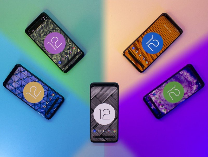
We don't know yet what Android 12 Material You's final form will look like. It started with more sparkly animations and colorful icons in beta 2 before abandoning them in the next beta. However it turns out, it will capture the same striking technicolor vibe that Apple fans love — see the popular 2021 iMac for exhibit A.
I hope — but don't expect — Apple will put more faith in its users to play with the iOS look in 2022.
Stock Android 11 was a very polished and efficient interface, but efficiency doesn't excite people to use phones. Compared to it, iOS 14 rekindled people's excitement in an OS that had remained stale for some time. But this year, it's Apple that's the boring John Hodgman to Android's cool Justin Long. So I'm hoping Apple bounces back in 2022 with a UI update that puts more power and faith in its users to play with the iOS look — even if only superficially.
Whatever Apple does, it won't be to allow launchers, as cool as that would be. That would truly bulldoze over its walled garden, and most Apple users are pretty ignorant when it comes to serious customization. It was only after I switched to Android that I fell in love with Android launchers and realized what I'd been missing.
But maybe, just maybe, Apple will let some life and color seep through the minimalist, gray UI without utterly messing up the serious Apple™ style it's been building up for a decade. I just don't expect it to happen.

Michael is Android Central's resident expert on wearables and fitness. Before joining Android Central, he freelanced for years at Techradar, Wareable, Windows Central, and Digital Trends. Channeling his love of running, he established himself as an expert on fitness watches, testing and reviewing models from Garmin, Fitbit, Samsung, Apple, COROS, Polar, Amazfit, Suunto, and more.
