Material You makes theming too easy for you to ignore it
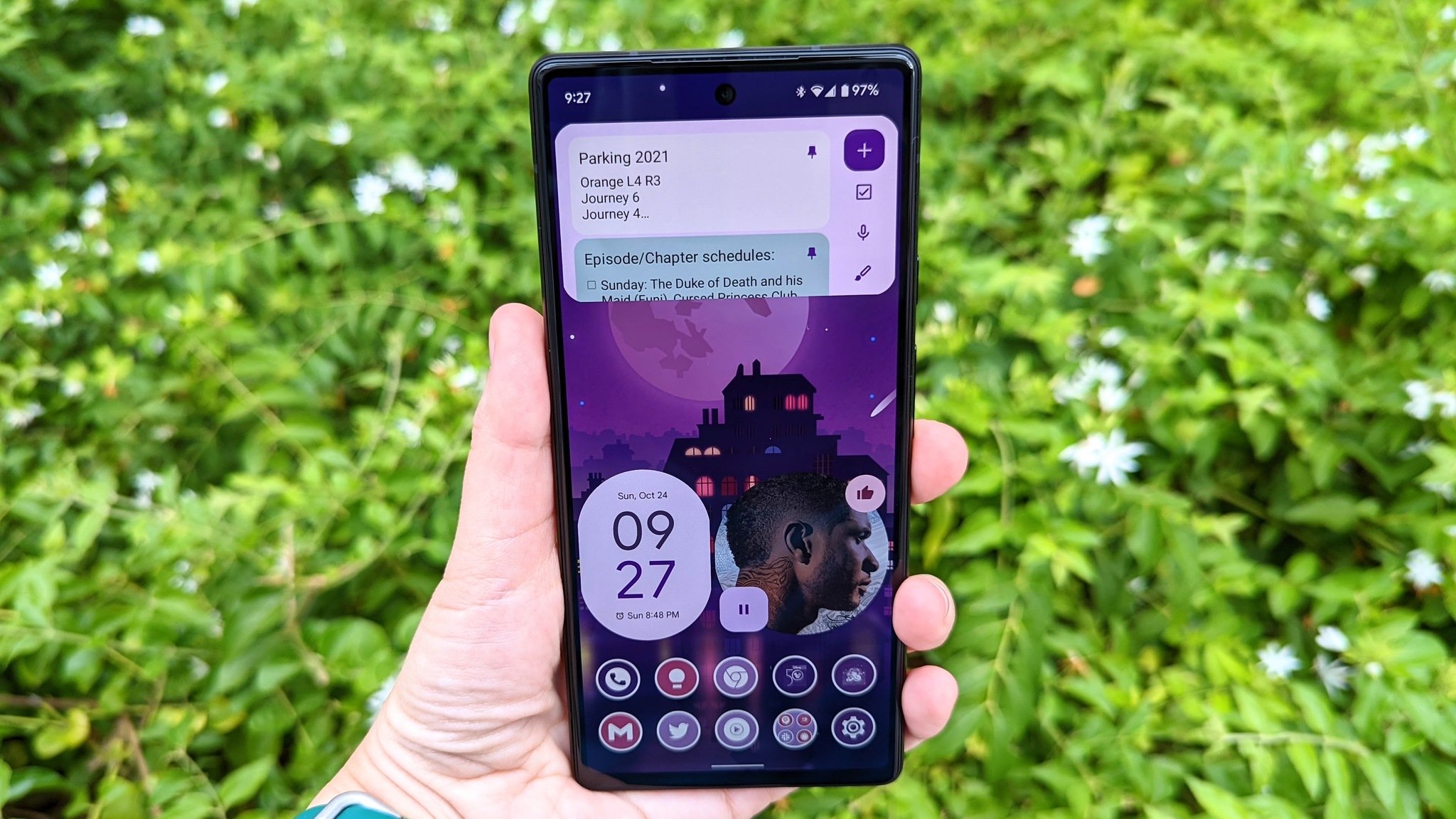
Almost a year ago, when rumors started to swell about a new UI overhaul for Android, I had to tamp down my expectations. After all, it took the Android team five years to bring us the system-wide dark theme we deserve, and this was a much more radical change than simply allowing you to flip between light and dark. But Material You launched with Android 12, and with it, the Android home screen experience got the kick in the ass it's needed for half a decade.
Widgets actually needed that kick the most: Android widgets became an absolute embarrassment when iOS 14 put widgets on the home screen and gave them a cohesive look. Material You finally gave widgets updated design guidelines and a way for them to better match whatever wallpaper you're using.
The biggest achievement of Android 12 stars in the Pixel 6 commercials: set an awesome wallpaper and your phone instantly themes around it. Samsung's version of Material You in One UI 4.0 might not skew as colorfully as Google's, but whether you're on a Pixel, a OnePlus, a Galaxy, or any other awesome Android phone running Android 12, here's why — and how — you should finally give theming a try.
One month of easy themes: My test of Material You's flexibility
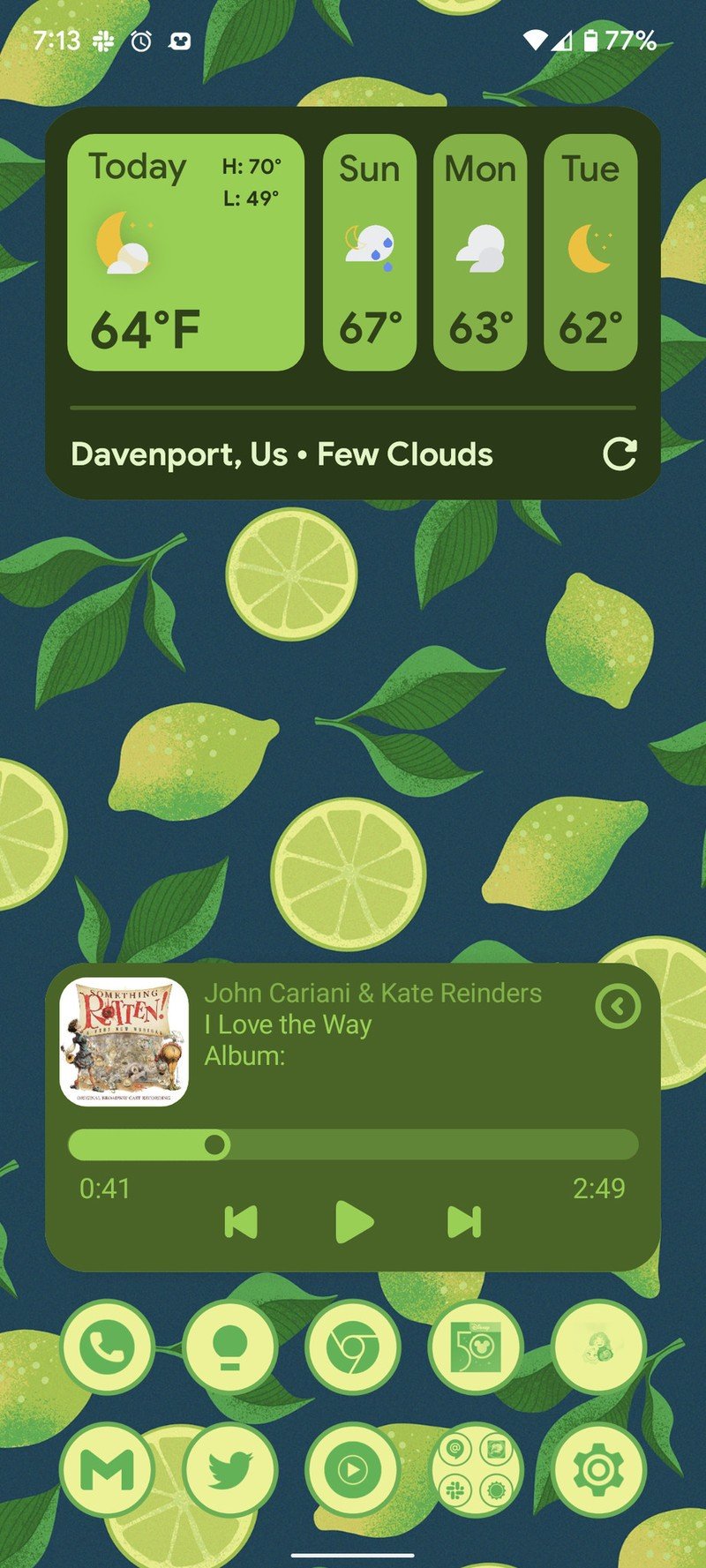
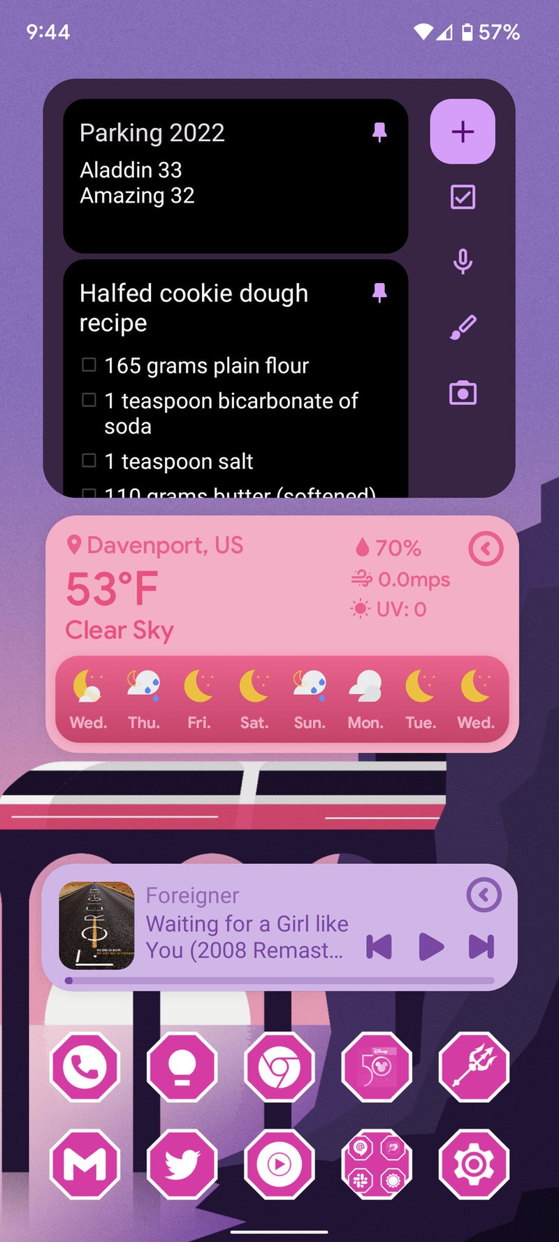
Source: Ara Wagoner / Android Central
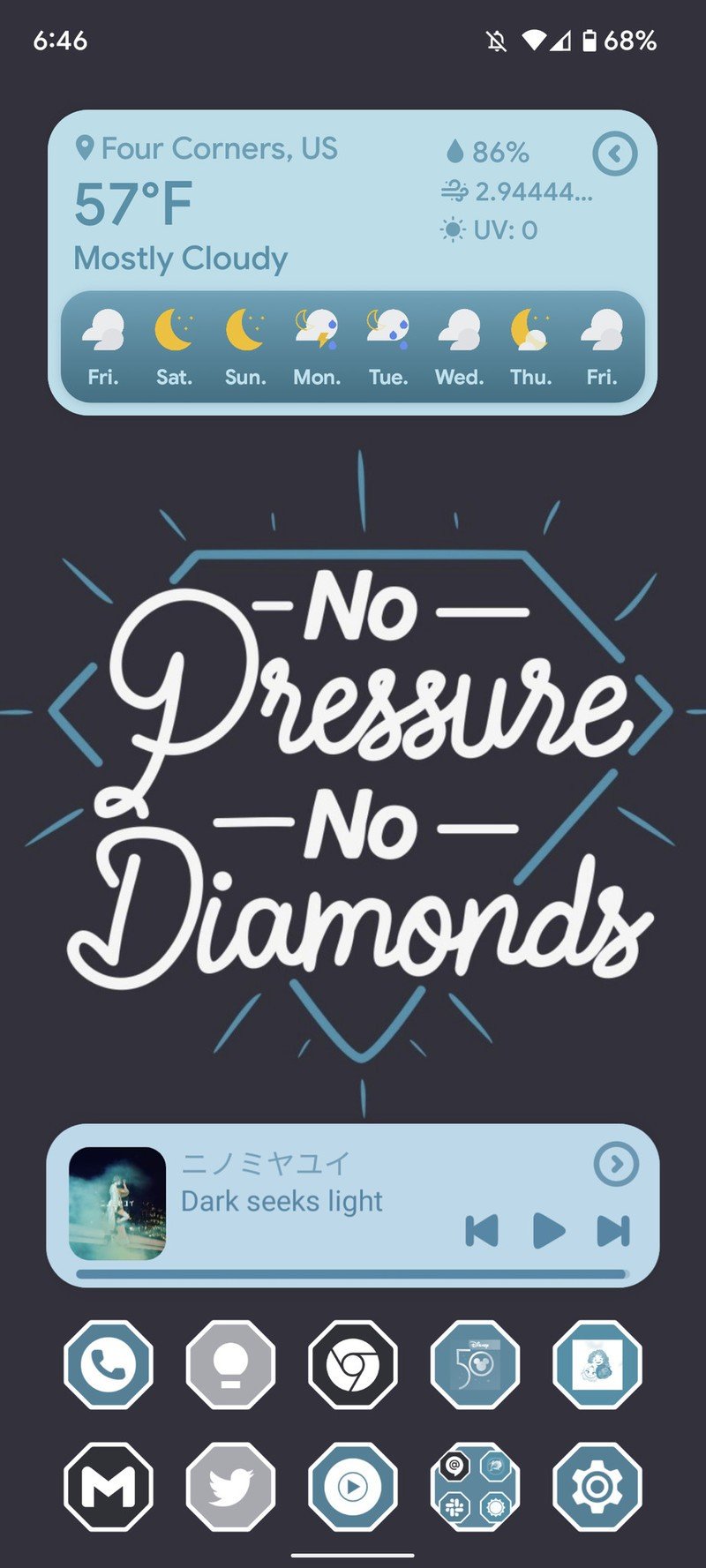
It's easy to talk a big game when it comes to theming, so instead, let me show you the New Year's resolution I came up with after CES's craziness finally died down. My goal is to make a new theme for my phone every day, no matter how busy I get.
New day, new theme, no exceptions.
Material You's Dynamic Colors mean that most of my widgets change colors with the wallpaper — or even change color based on their position on the home screen. Both the Pixel Launcher and the One UI Home launcher take this a step further by coloring some apps based on the same palette. This, in theory, should mean that no matter what wallpaper I set, the most I should have to do is move the widgets around.
The dynamic color matrix still has issues with some live wallpapers, so my previous theming system has had to shift from Kustom Live Wallpapers (KLWP) to Kustom Widgets (KWGT, which is more flexible overall. However, even without Kustom, you can build an amazingly flexible theme with the widgets from Google's apps and adaptive icons — either from your manufacturer's system theming or from a third-party app.
Be an expert in 5 minutes
Get the latest news from Android Central, your trusted companion in the world of Android
Once you have a good base, it doesn't matter what wallpaper you throw at it, it'll still look awesome.
Building your own universal theme
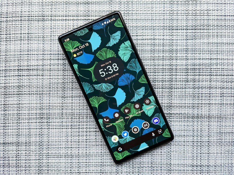
While most themes usually start with the wallpaper, for a "universal" Material You theme, we actually need to start with the icons. Google and Samsung only use dynamic colors for some apps; Samsung only does it for Samsung and system apps, Google does it for Google apps and system apps. This means that if you want dynamically colored app icons, you're going to need to go to a third-party launcher and a third-party icon system.
The easiest option for this is our favorite Android launcher, Smart Launcher 6, because it directly ties in with Icon Pack Studio, which can automatically recolor app icons based on your wallpaper. Making a Material You icon pack with Icon Pack Studio only takes 60 seconds, and if you use it with Smart Launcher, it'll shift to match a new wallpaper within seconds. If the dynamic colors miss the shade you wanted, you can manually set it to a color you extract from the wallpaper yourself.
If you're using another third-party launcher, a notification will appear to re-export the icons after changing wallpapers. Tap to install the updated pack then it should update on your home page. For Niagara Launcher, seen below in three styles, you have to re-apply the icon pack in Niagara Settings, but it's worth the effort. Niagara Launcher's minimal layout means you pick your wallpaper and icons, or you add one, maybe two custom widgets at the top of the feed. If you want any more widgets, you'll want to put them in a widget folder hiding in that floating action button in the bottom right corner.
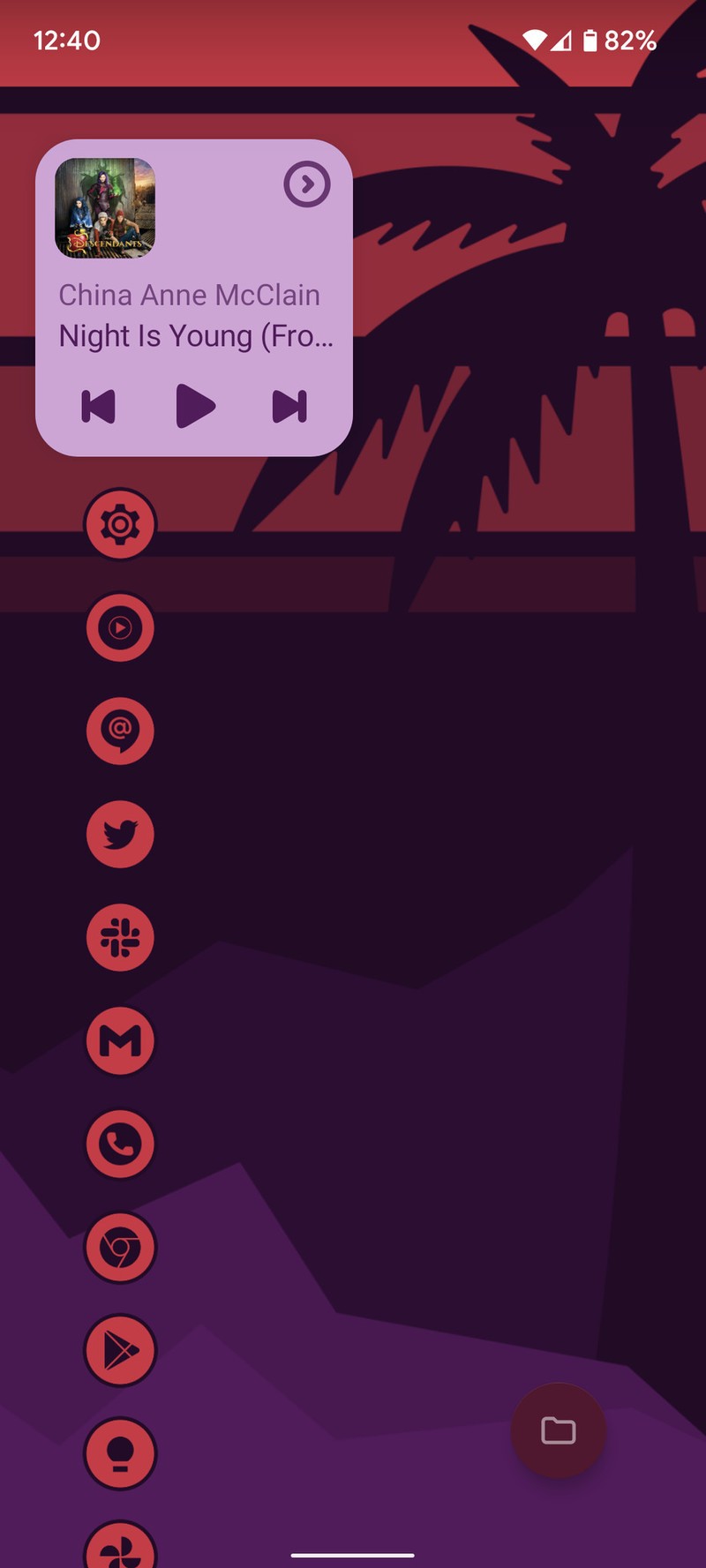
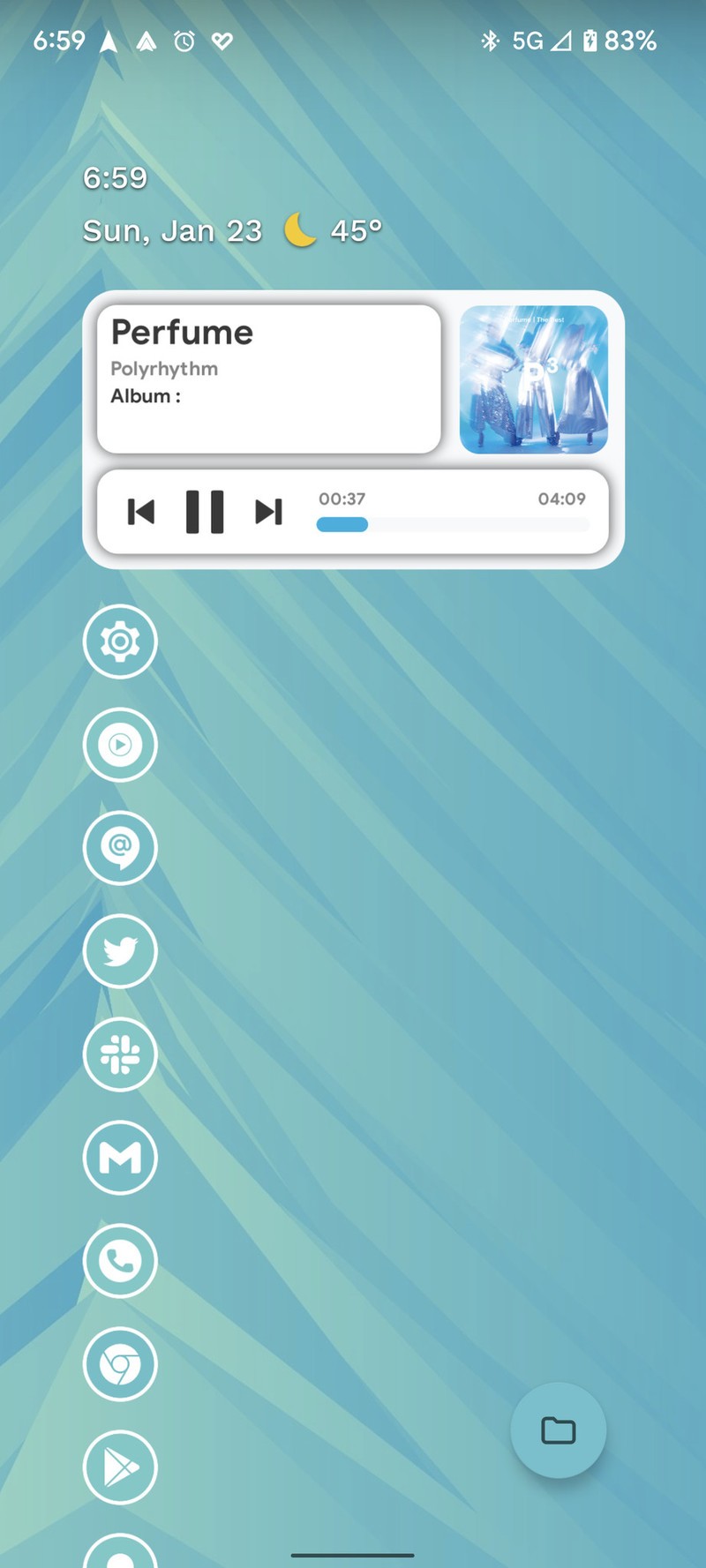
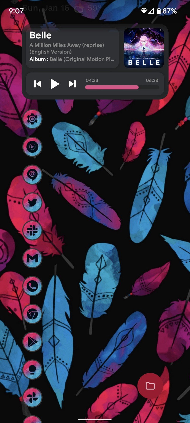
Source: Ara Wagoner / Android Central
The other reason to go third-party launcher is to get a denser, more precise home screen grid and fit more widgets at a time on it. Most of the Material You widgets Google added last fall are at least 2x2, which would only allow you room for one or two widgets on the screen at a time. Almost all third-party launchers let you have a more precise grid and thus more widgets on screen at a time.
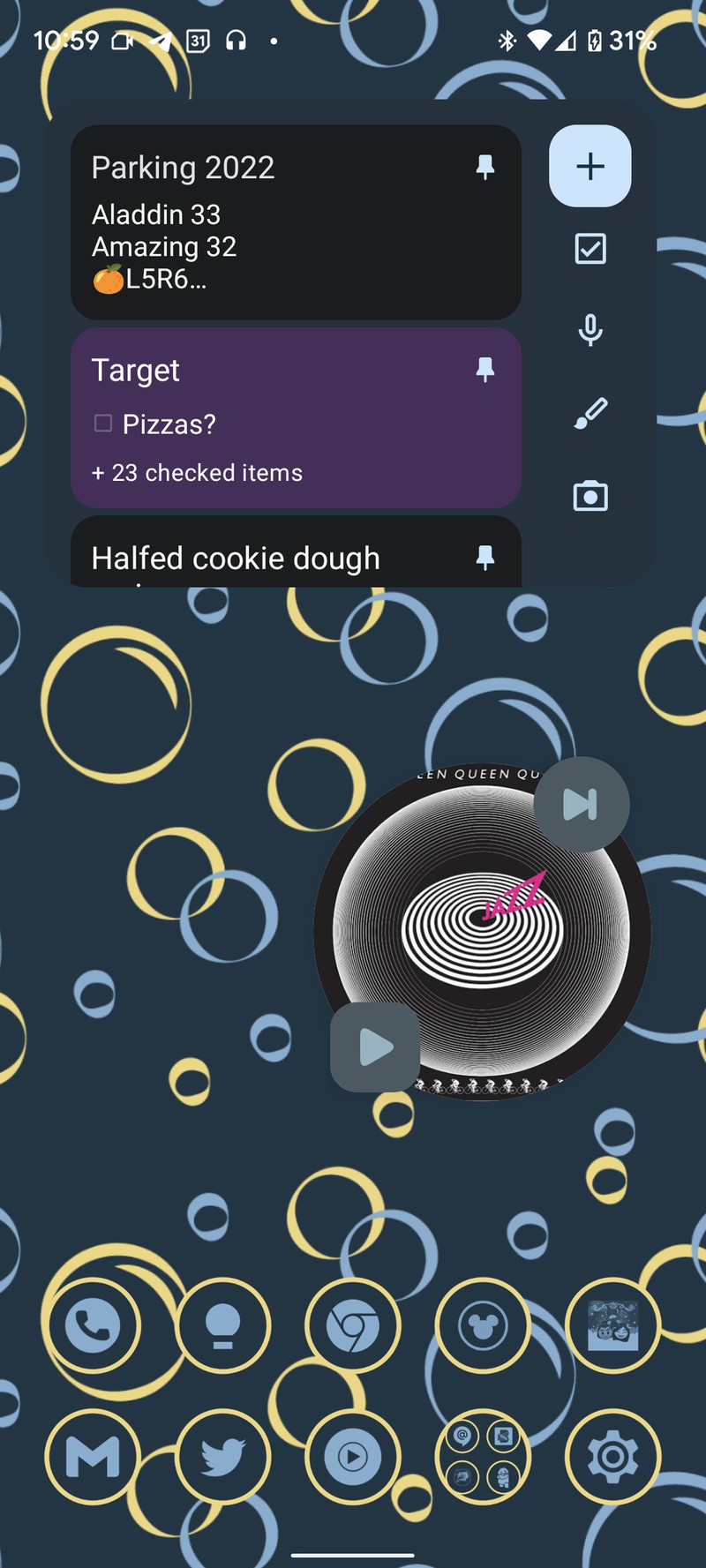
The Material You widgets in Google Calendar, Clock, Drive, Gmail, Search, Keep, Photos, and Maps are all solid, so the only instances where you might need to turn to third-party app widgets are subjects like finance, sports, and music. YouTube Music's Turntable widget is okay, but you can only hit pause/play and like a song. Thankfully, there are plenty of Material You widget packs for KWGT that you can use to get the widgets you want.
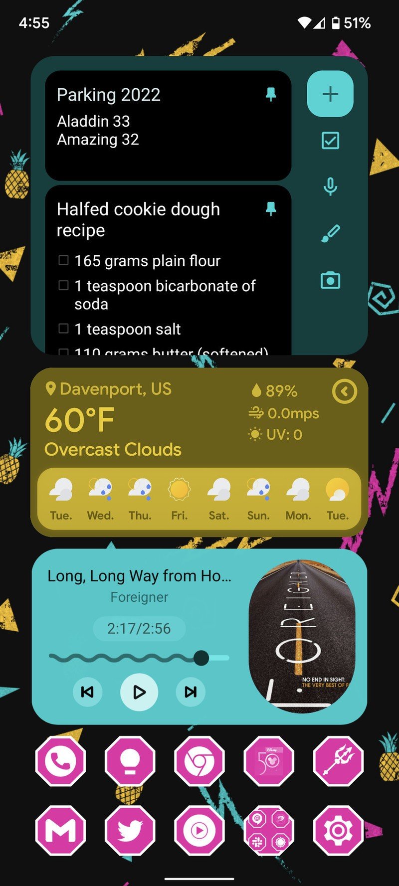
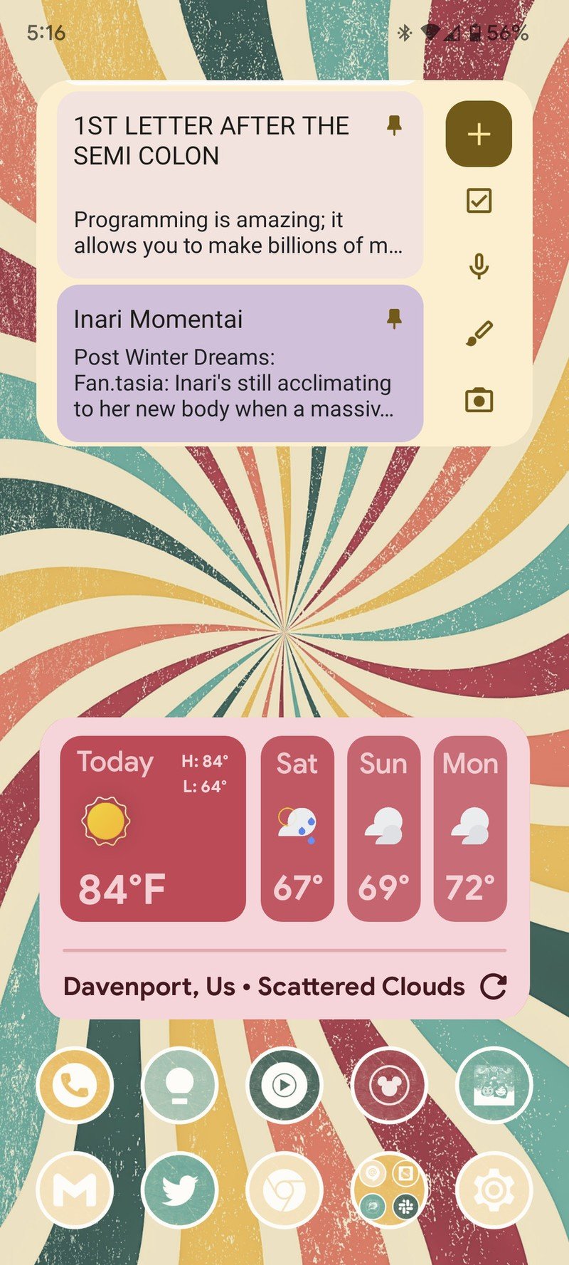
Source: Ara Wagoner / Android Central
I've been mostly using widgets from Kombine Widgets pack by TVeloper. On top of the dozens of widget styles and sizes to choose from, Kombine allows you to pick between two colors extracted from the wallpaper or set whatever custom color you want. They also scale incredibly wonderfully, and many of the widgets are interactive, changing sizes or popping up different items based on what you want to see.
Whether you stick to the default options in One UI Home or Pixel Launcher, go custom with your widgets, or just try out some adaptive-colored icons, Material You makes it ridiculously easy to try something new. So, please, for me, try something new this week with your home screen!
In other news, the Galaxy S22 arrives this week, and I'm cautiously optimistic it'll be a worthy upgrade from the S22 — even if a currently $500 Galaxy S21 FE will definitely (rightly) appeal to the budget-conscious crowd. I've loved my Galaxy S21, so the bar for this year's model will be higher, especially after the Pixel 6 came in and stunned us at the $600 price point.
This will also be my last week at Android Central before I move on to a new opportunity within this field; if you know me, you might have an idea where I'm headed. Android Central is the only website I've ever professionally written for, and I'm proud of the voice and reputation I've built here since Phil invited me to freelance back in 2014. I've been delighted with my opportunities to spread my love for Chromebooks, cases, and theming. Thank you for your support (and your tough love) these last few years, and don't worry, you'll still find me bounding around Walt Disney World and on Twitter at @AraWagco.
Ara Wagoner was a staff writer at Android Central. She themes phones and pokes YouTube Music with a stick. When she's not writing about cases, Chromebooks, or customization, she's wandering around Walt Disney World. If you see her without headphones, RUN. You can follow her on Twitter at @arawagco.
