Google's new design language is Material You, and it breathes new life into Android's tired aesthetic
Once upon a time, Android was a very dark place, seeped in shadow and Holo Blue highlights. Then Google I/O 2014 came along and dragged Android screaming into the light with Material Design, a white canvas covered with colorful title bars, hamburger menus, and floating action buttons. In the following years, the Android team has continued to refine and further hone the Material Design UI that it used across Android — and beyond on Chromebooks, Google's web services, and iOS apps — but it was a very slow, calculated process.
In other words, Android design stagnated.
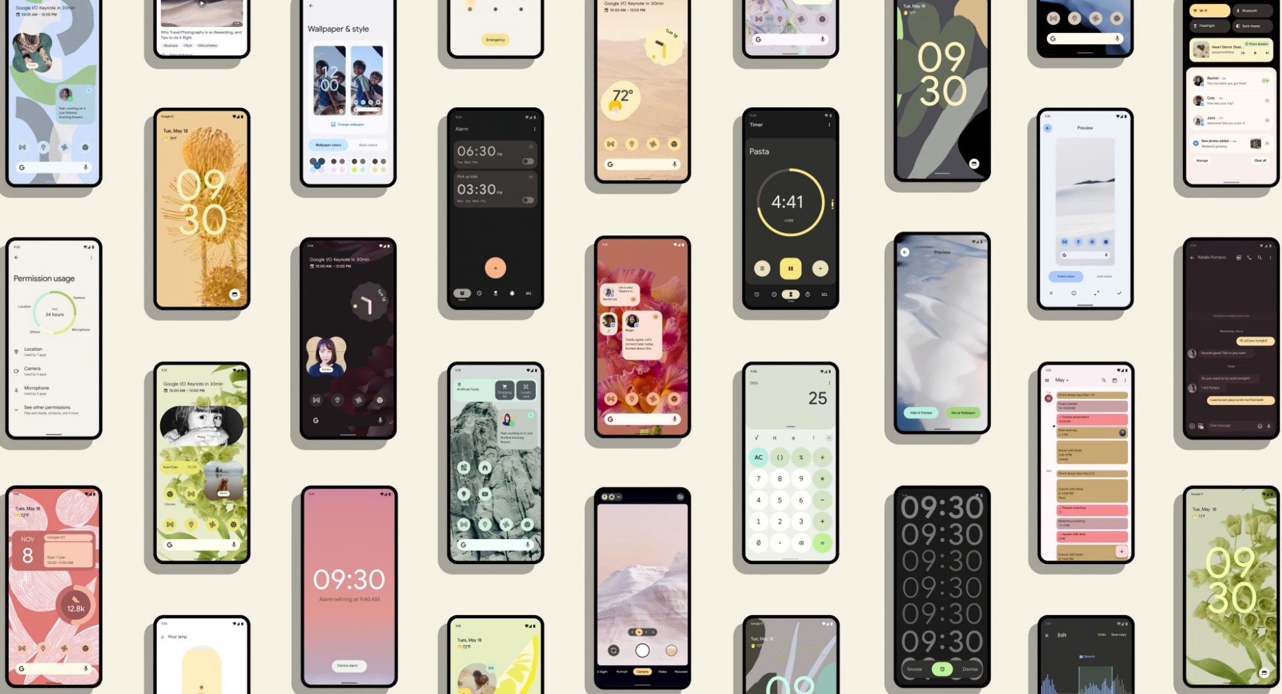
At last, Android 12 has unveiled itself to the world today at Google I/O, and with it comes another huge update for Android's look and feel, precipitated by months of close collaboration with the Android and Material Design teams. Material You is the next generation of Material Design, and it's (almost) everything I hoped it would be when it was first leaked back in February.
Material You: What it is and how it's laid out
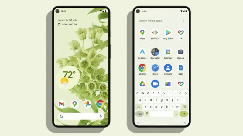
Material You can automatically re-color its accents and elements based on the colors in your wallpaper. We'll come back to color in a minute — because some of that looks Pixel-exclusive — but first, let's focus on the other visual changes that accompany the newfound vibrance: the biggest change visually is to Quick Settings. Quick Settings are swapping from round toggles with a text label underneath to rectangular toggles with the text label inside.
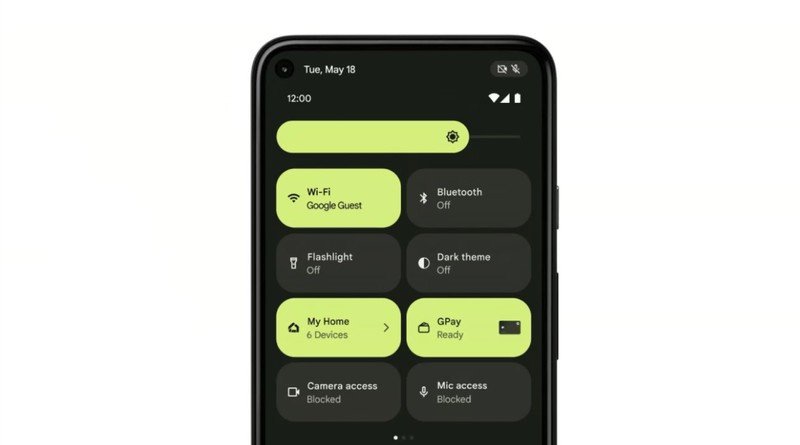
The result is that you'll have fewer toggles on a single page, but the quick toggles pop more when on or off, and users who aren't as intimately familiar with what each icon means can read what a toggle is in and what state it's in. It's a tradeoff that advanced users probably won't enjoy, but newer Android converts will.
The developers I spoke with predictably weren't too happy with this change. Author of one of the best Android launchers Action Launcher and SwirlWalls, Chris Lacy lamented the reduced functionality of Quick Settings on the notification panel:
"I don't like the change to using 4 larger Quick Setting tiles, and the user and developer in me would love the opportunity to change that look to something else."
The brightness and volume sliders are fatter, matching the thicker Quick Settings tiles. Fonts across the board are thicker, too, helping make them easier to read when you're dealing with a dark green font on a light green background, for example, or white text on a very busy wallpaper.
Be an expert in 5 minutes
Get the latest news from Android Central, your trusted companion in the world of Android
Android 12 as a whole plays with thickness and thinness, just as it plays with color, bringing a sense of fun and whimsy to a system that in recent years had felt boring and flat. Android/iOS themer Colorwallies said, "For the past few years, we have observed a minimalistic trend being followed, which though preferred by some, looks a bit plain in my opinion."
"Finally, Android has received the massive overhaul in looks that fans have been desperately hoping for."
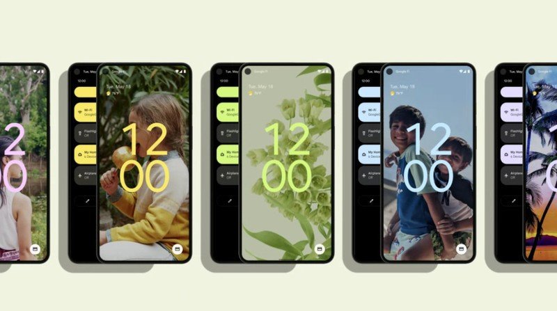
The lock screen features that ridiculously oversized clock, but being matched to the wallpaper colors, that clock never looks out of place. It's got a wonderful balance, even if it isn't quite as practical when we all have a billion notifications constantly barraging our phones.
The home screen possibilities for Android 12 are so vast, but what was even more eye-catching from this smorgasbord of examples from Google was that no matter the wallpaper, no matter the color scheme, each home screen looks cohesive, from the vastly diverse but always color-coordinated widgets to the perfectly uniform, softly-tinted icons — which are reminiscent of Smart Launcher 5's Icon Pack Studio. The Pixel-exclusive At a Glance widget doesn't get a colored background, but it is shifting from centered to left-adjusted, so it looks the same on the home screen and the updated lock screen.
The rest of the improved Android 12 widgets aren't limited to a single shape, like iOS 14's widgets that put Android to shame last year. Instead, Google has come back and brought color-matched widgets in oblongs, clovers, and some adorable, squiggled clock widget that looks like it came out of a spirograph.
It's more colorful, playful, and it better reflects Google's personality.
We've only seen a small sample of the widgets so far, but I'm hopeful that Google saw its widget report card and updated them across the board. Well, even if Google didn't take that initiative, just give it a few days, and I'm sure the KWGT community in r/kustom will pick up the slack.
The new home screens — and the possibilities they offer, are incredibly exciting, especially for the themers and launcher developers who are always pushing the envelope of Android to make something new, fresh, and fun. The developer of Nova Launcher, Kevin Barry, recognized the knife's edge Google had to walk to make all this work:
"Currently, it's very difficult to make a cohesive home screen with widgets from different apps because each looks like its own world. But with widgets being outside of the app itself, hopefully app designers can more easily embrace a different color palette, especially when it will be displayed on top of the wallpaper that the palette is likely based on and next to other widgets of the same palette. Personally, I'm already digging into Android 12 and Material Now to figure out how to best apply it to Nova Launcher."
The palette itself helps tie everything together, and it's time to dive deep into the colorful new world of Material You.
Material You: Dynamic palettes and system theming
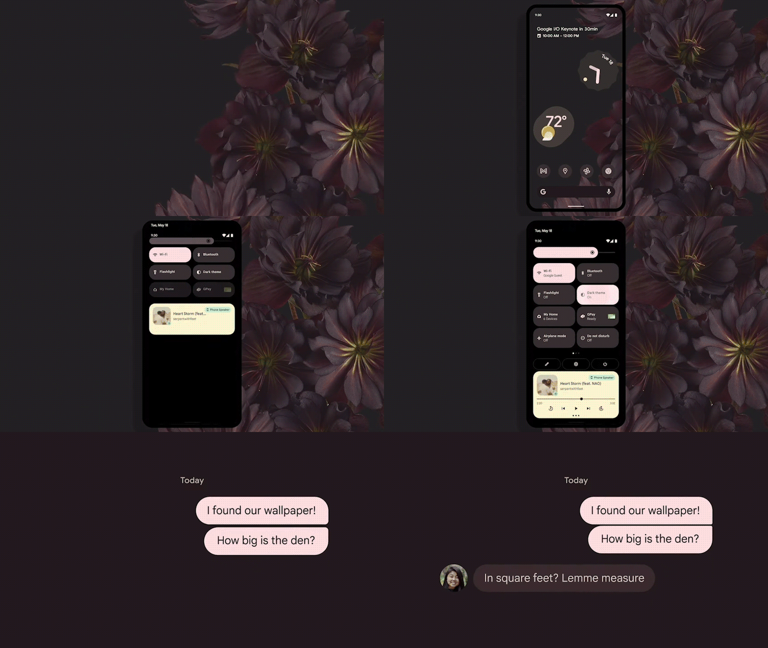
The first thing you're struck by when looking at Android 12 is that it's colorful without being garish. Everything is measured and balanced, and nothing goes too bold or too pale to offer the proper contrast and pop needed. This is critically important not just from an artistic perspective but also from a very practical one: accessibility.
Because the system will automatically pull a color palette from your wallpaper — you can also set a "basic palette" of yet-to-be-determined colors, if the dynamic palettes don't appeal to you — the algorithm that pulls and picks those colors had to be meticulously written and trained to ensure that all colors are still easily legible for those with impaired vision.
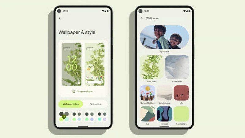
"One of the hardest parts of this whole color palette thing has been making sure it's accessible."
Dan Sandler, Principal Engineer for System UI, spoke of the difficulty in reconciling color with readability, " A11Y contrast requirements preclude most vibrant colors." He also spoke of the joy of the Android and Material Design teams working again so closely, "Material You has been a really exciting collaboration with the Material team. Genuinely, just super fun, like Material Design 1.0 in 2013-14. We've been working hand in hand like the old days."
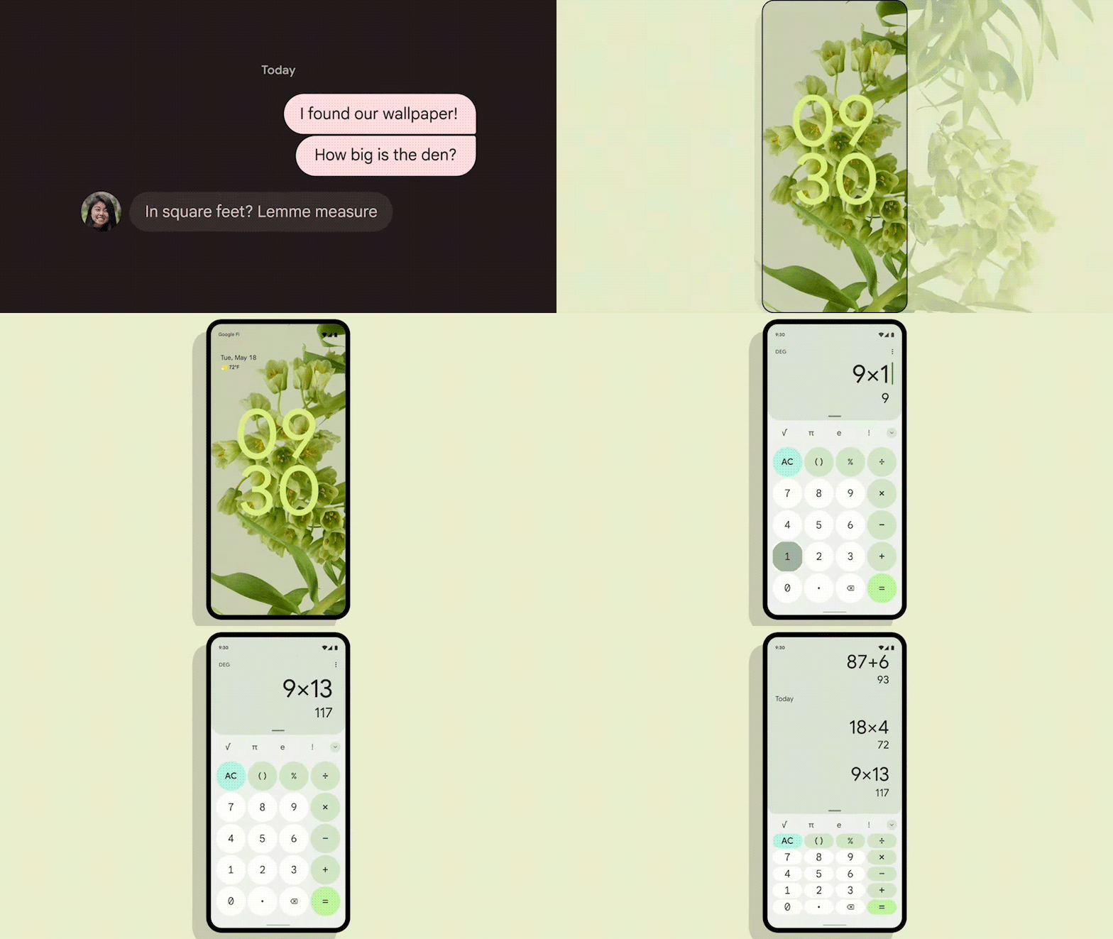
Color plays a massive part in Material You's cohesive look — especially on the home screen with those new icons and widgets — but the system theming itself here is also quite the step forward. In Android 10/11, the system accent colors were used very, very sparingly, but now they shape much more, from the home screen to most system apps. It appears even core Google apps like Google Calendar and Google Messages get in on the fun.
Android 12's system theming will reshape much of your Android experience, but system theming is a space where the manufacturers outside Google are all fairly set in their ways. Samsung has Samsung Themes, Good Lock, and Theme Park; Xiaomi has MIUI themes, OnePlus's OxygenOS has a simple but effective theme matrix, and Oppo's ColorOS Universal Themes were majorly updated last year.
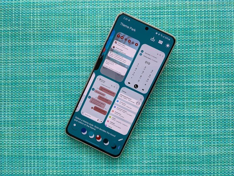
I'm not sure how much of this new Material You system theming we'll see implemented by other manufacturers, especially in the first year. Samsung, in particular, tends to take its time mulling over major changes before implementing them in One UI. Kevin Barry expressed similar concerns:
"For the user experience, there needs to be a balance between how much the user can change versus how much work it is for the user, and the Android 12 palette system looks like a good balance. But it will also be challenging for Android as a platform to get OEMs and app developers to actually use these colors."
We'll have to wait for the fall (or, more realistically, the winter) to see exactly how that shakes out, but whatever the case, Material You is making a splash and is energizing both users and developers. Smart Launcher 5's developers are among the many praising the new design.
"The clear message behind "Material You" is that you can finally express your personality through your phone. It's a fresh design for Android. It's more colorful, playful and it better reflects Google's personality. We loved the fluidity that you can feel looking and interacting with the new UI elements."
We'll be digging into all of the tweaks and changes Material You brings all summer as the Android 12 beta develops. For right now, though, I'll be off in the corner building new home screen themes and trying to keep my customization-happy heart from bursting.
Ara Wagoner was a staff writer at Android Central. She themes phones and pokes YouTube Music with a stick. When she's not writing about cases, Chromebooks, or customization, she's wandering around Walt Disney World. If you see her without headphones, RUN. You can follow her on Twitter at @arawagco.
