How to make the most of an extra-tall home screen on the Galaxy S8 or LG G6
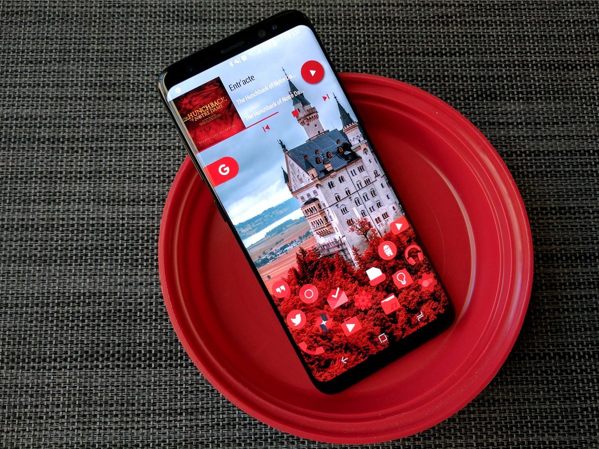
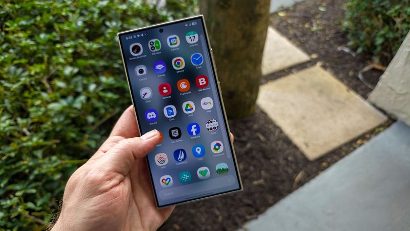
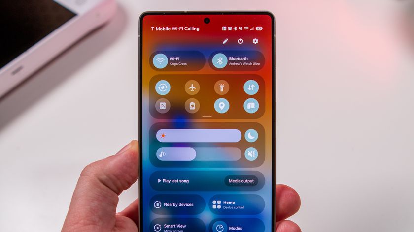
The tall screens on recent flagships like the Samsung Galaxy S8 and the LG G6 offer up a lot of options for building and theming home screens. You can mix things up and lay your icons and widgets out differently — matter of fact, you sort of have to. Using the same layout on an S8 as you did on a Google Pixel will leave your fingers stretching, your layout wonky, and some of your space wasted.
Let's fix that.
Add more rows
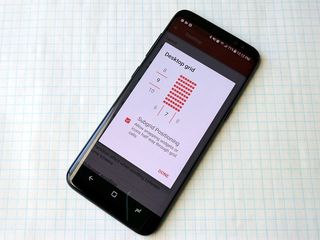
The standard home screen grid has been 4x4 or 5x5 on most home screens for a while, and while that used to turn out good home screens when screens were under 5 inches, on tall screens, that just doesn't cut it anymore.
If you like the simplicity of a 4-column desktop, try bumping up the number of rows to a 4-column by 6-row grid. I've found something of a sweet spot for tall home screen desktops around six to eight columns by seven to nine rows, give or take a dock or persistent search bar (more on those in a minute). By adding more rows, you can fit more icons on your big, tall home screen, or you can better space things out.
Move your search bar
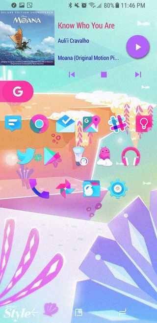

Pro-tip: Assign the pull down gesture on your home screen to Search.
If you're used to having a Google search bar on your home screen, you don't have to get rid of it, but if it stays at the very top of your home screen, it's going to be harder to reach and less likely to be used. In an age where we can all summon Google with a quick command word, the search widget is less useful than in years past, but it's nice to have a shortcut sometimes, and they can add a pop of color to your home screen.
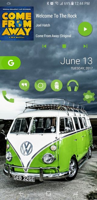
Rather than having the search bar perched on the highest shelf of your home screen, consider moving it down where it'll be a little easier to reach. Placing the "pill" Google search widget available in Nova Launcher about a third of the way down the screen puts it near where my left thumb naturally gravitates to on the home screen, so bringing it down has helped me use it more.
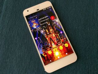
If you employ a launcher with a persistent search bar at the top of the screen like Evie Launcher or Action Launcher's Quickbar, theme them well and get ready to reach. You should also consider a gesture shortcut many launchers like Evie use to make it easier to use that high search bar on tall screens: assign the pull down gesture on your home screen to Search.
Be an expert in 5 minutes
Get the latest news from Android Central, your trusted companion in the world of Android
Creating balance
Now, just because it's harder to reach the top of your screen doesn't mean it should be empty while everything sits at the bottom like cement shoes. You need to create balance in your home screen. Rather than placing items you'd tap regularly like app shortcuts near the top of the screen, place a widget that you're more likely to glance at and move on, like weather or calendar appointments.
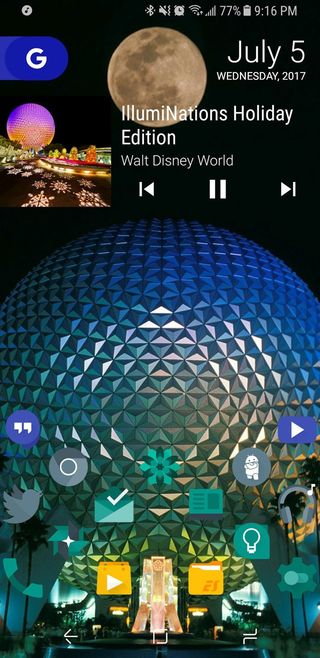
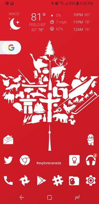
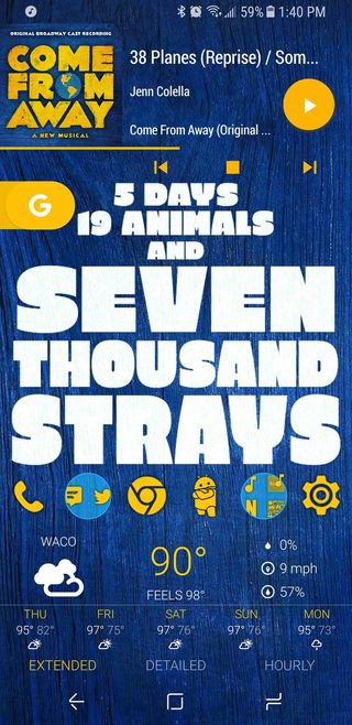
Towards the bottom of the screen, you can take advantage of the extra space and spread out your icons, or add a widget or two that you interact with frequently. For some themes recently, I've even disabled the dock to allow myself even more room to spread things out and arrange my icons diagonally rather than boring straight lines (thank you, subgrid positioning).
This leaves the middle clear for gesture shortcuts, also letting your wallpaper shine through and helping your home screen look tidier than it may actually be.
Go vertical
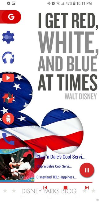
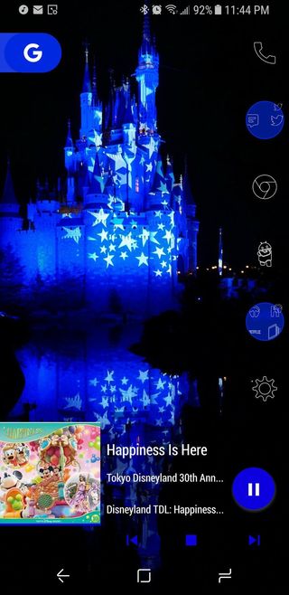
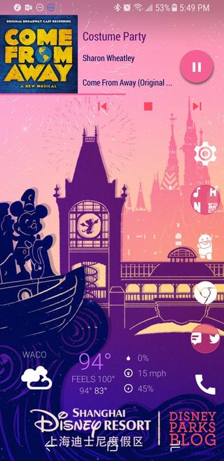
If you tend to use your phone with one hand, rather than arranging your icons around the bottom of the screen, place your icons along the side of the screen. This should keep everything in reach of your thumb, decrease stretching for icons, and leaves more room at the top and bottom of the screen open for widgets, should you so desire.
Going vertical on a tall screen can make your home screen seem even taller, but when combined with an off-center wallpaper, a vertical dock can create a unique and refreshing look to your home screen.
Have fun with it
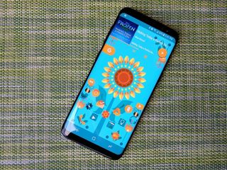
You've got more real estate to work with now, so just play around with it. You might find a new style you like going forward, you might find that you don't really need a widget you've had on your desktop forever, or you might just find that your old style works just as well with a tall screen as it does with a short one. The only way to find out is to play around with it, so what's stopping you from finding a new, happier home screen?
Ara Wagoner was a staff writer at Android Central. She themes phones and pokes YouTube Music with a stick. When she's not writing about cases, Chromebooks, or customization, she's wandering around Walt Disney World. If you see her without headphones, RUN. You can follow her on Twitter at @arawagco.

