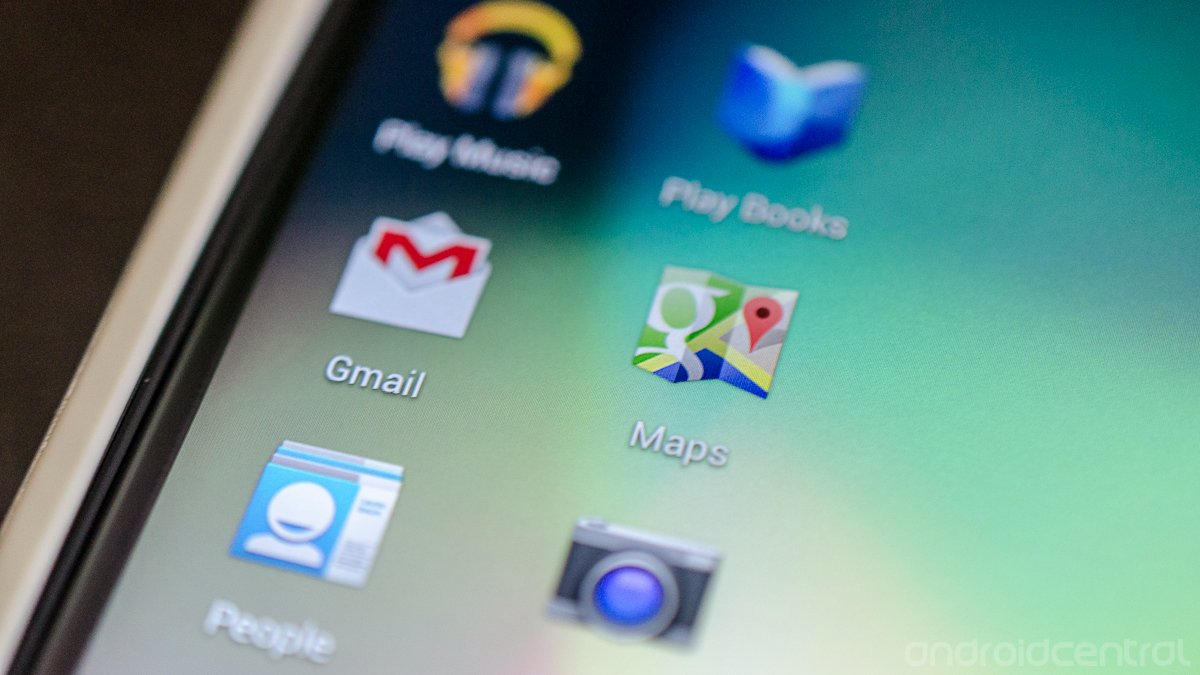
Making apps beautiful: The icons

Google's Android developers are constantly working with the growing community of application developers and designers to help makes apps that not only do great things, but look lovely while doing it. Building responsive and unique apps is only half the battle, because you and I aren't going to install them -- let alone recommend them to others -- if they don't look good.
In today's segment, they focus on the app icon itself. It's the first thing we see when we install an app, and it's important that it make a good impression. The blog posting lists all the important things to consider when designing your application icon, including the various sizes and formats that will make it look great on every Android device.
Android has taken the world by storm, and a big part of the reason is the rich app catalog. You want to make apps that stand out, and using tips like this will help. It's a must-read for any developer, and worth reading for the curious layman as well. Follow the source link and have a look.
Source: Android Developers
Be an expert in 5 minutes
Get the latest news from Android Central, your trusted companion in the world of Android

Jerry is an amateur woodworker and struggling shade tree mechanic. There's nothing he can't take apart, but many things he can't reassemble. You'll find him writing and speaking his loud opinion on Android Central and occasionally on Threads.
