Make your home screen look good, even without an app drawer
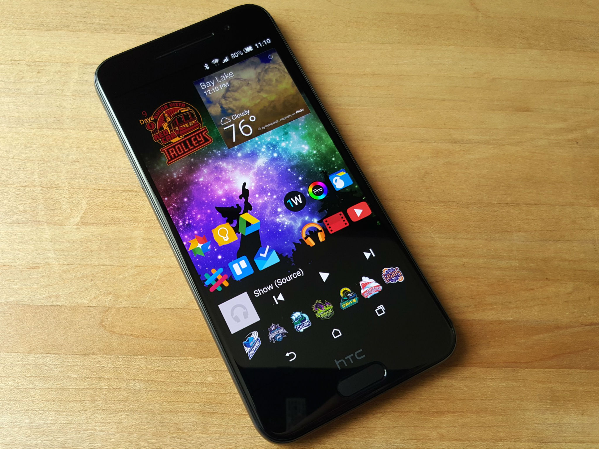
There's been a lot of talk about app drawers of late, particularly with more phones not using them by default. But what if you like not having to go to another screen to find all your apps? What if you don't want to hassle with learning a new launcher? What if you like the themes or features of the one you have, except for not having an app drawer?
Here's how to handle having all your apps on your home screen.
Folders are your friend
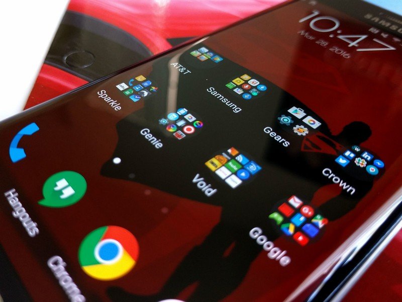
When you don't have an app drawer one thing becomes very apparent: all those app icons take up a lot of space. The first thing you can do to start clearing up the clutter is to put some of those apps into folders. In most launchers, dragging one app over another and dropping it adds them both to a new folder. You can drag all the games into a folder, all your work-related apps in another, and a folder for all the apps that came with your phone… the possibilities are endless.
This may seem like you're swapping one folder for another — and you're not entirely wrong — but having folders pop up on your home screen rather than going to an entirely different page can save a little time. Also, by using individual folders for categories or personal grouping of apps, there's less to sort though.
Read more: Folders and better ways to use them
Managing home screen pages

You don't need 10 pages for your apps, especially after you stick a lot of them into a few folders. If your launcher doesn't delete empty pages automatically, pinching in often brings up the edit screen that will allow you to delete them. Press and hold your empty home-screen and drag it to the trash can.
You also don't want five pages with a single row of app shortcuts on it. Unless you like scrolling and scrolling and scrolling to find your apps, that is. If you want your primary home screen to look a little neater than the pages hosting the majority of your apps, you can also add a primary page for widgets and more important apps, then pinch in and make that the primary screen (usually denoted by a home or star icon at the top of the that page).
Get the latest news from Android Central, your trusted companion in the world of Android
Use search instead of hunting for apps
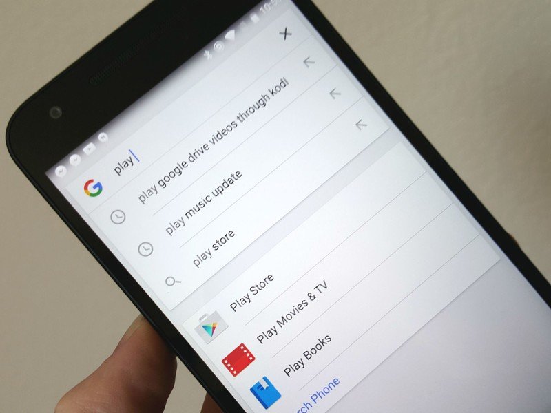
Because our phones are amazing and all have search engines on them, we have another way to find apps besides digging through pages of icons for them: Google search. By default, Google Now can search through your phone for apps and present them in your search results, but if you somehow turned it off, you can access it in the Google app by selecting Settings in the slide-out menu, and making sure Apps are checked in Phone search.
You can now tap the search bar — or the microphone that's likely on that search bar — and search for your app by name. You can also use Google Now on Tap to search and open another app without going back to the home screen at all.
The LG G5 — the latest to forgo a traditional app drawer by default — actually recommends this method during setup.
Hide space-wasting apps
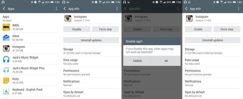
I mentioned having a folder for all the apps that came with your phone before. Some manufacturers even start off their apps in pre-made folders to save you the trouble of rounding them up. And while you can hide them in a folder, you do have other options for hiding the apps you're never going to use.
Some launchers allow you to hide an app from the app list when you press-and-hold an app as if you were going to move it around on your screen. But even if your launcher does not, we can take another step to hide it: disabling the app completely.
This is for apps you're not going to use, apps that you do not want to look at, apps you do not need to let run in the background on your device. So we can go into Settings and down to Applications. Here we have a giant list of every single app that's running on our phone. We do not want to touch any of the ones here we do not recognize, as system apps that don't have icons on our home screen are here too and disabling them can affect performance.
When you find the app that you don't want to waste space and resources on your phone, you can tap it to bring up the app's information. This will display how much memory and space the app is taking up, and it will also give you the option to disable it if you can't un-install it. There will be a warning pop-up when you tap disable telling you what we said in the last paragraph about how disabling an app can cause other apps to not work properly. Once you tap through that, the app will be disabled, and when you return to the launcher, its icon will be gone.
It's worth noting that some system apps are not able to be disabled, and for those, if you can't hide them in your launcher's setting, you'll still have to stick them in a folder to get them out of the way. And if you disable an app that actually was being used in some important way, like the myAT&T app, you can always go back to the Applications list in Settings to re-enable it.
Give yourself more space with a bigger grid
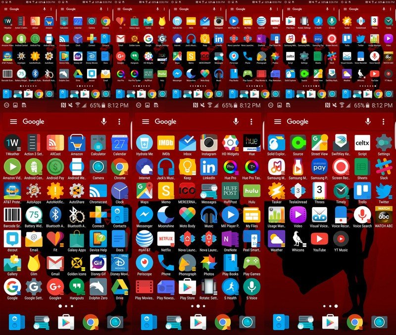
Once upon a time, the launchers that came with our phones wouldn't let us change the home screen grid size, meaning we were limited in how much we could fit on one page. We're still limited in a lot of launchers, but some are getting better about offering a large grid option. If it is an option for you, changing your grid size means instead of fitting 16 apps on a page, you could fit 20, or 25. As you can see, that can make quite a difference when having to find space on your home screen for all your apps.
Read more: how to change the grid size on Samsung devices
When all else fails...
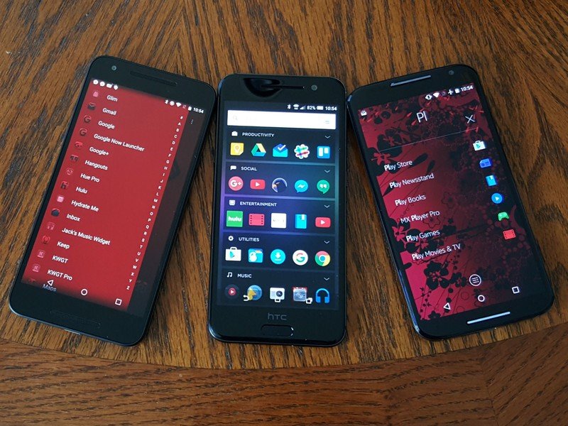
If you still don't like the way your home screens look with all your apps on them, even with the dreck hidden and your apps organized into folders, you have a few options, and they're called replacement launchers. However, there are several kinds of launchers that you could switch to for different takes on app organization.
- Action Launcher has a regular app drawer, but the app drawer its users use most often is the Quickdrawer, which slides in from the left of the screen.
- Aviate supplants your traditional app drawer with a page of customizable categorized folders between your home screen and the full app drawer.
- Z Launcher Beta takes the search concept we talked about earlier and takes it to the next level. Instead of having to tap on a search widget or use 'OK Google', you doodle a letter on the screen to search for apps with that letter. Swipe and M for Maps and Google Play Music.
Or when all else fails, you can download a more traditional launcher like Google Now Launcher or Nova Launcher with a traditional app drawer. You may lose some of the bells and whistles from your phone's built-in launcher but there are launchers out there that give you more than enough features to make up for it!
Ara Wagoner was a staff writer at Android Central. She themes phones and pokes YouTube Music with a stick. When she's not writing about cases, Chromebooks, or customization, she's wandering around Walt Disney World. If you see her without headphones, RUN. You can follow her on Twitter at @arawagco.
