How to make your Galaxy S9's software look like a Pixel with a simple theme
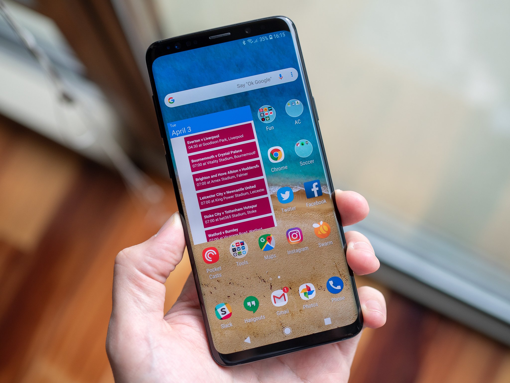
You may want all of the hardware, specs and power that come with a Galaxy S9 or S9+, but perhaps you aren't the biggest fan of how the Samsung Experience software looks. If you prefer the Google Pixel look instead, there is actually something you can do to bring your Samsung closer to that style. And it only takes a few minutes.
Big time fans of Android customization know that Samsung has a built-in system-level theme engine that lets third-party companies and individuals design complete themes for its phones. And these themes go way beyond just changing the launcher — they can change the colors across the entire interface, tweak the lock screen, change the navigation buttons, swap out icons for all of the system apps and even change coloring for the system apps like Phone, Clock and Messages.
How to theme and customize your Galaxy S9
The best Pixel-style theme I've found yet is one called "Pixelize" by developer Cameron Bunch. It attempts to replicate the Pixel interface through changes in the launcher, notification shade, settings, navigation bar and a full set of Google icons for stock apps. On the whole, it does a great job — the launcher and navigation bar in particular are great, and of course the Google icons really add to the authenticity. The same developer also makes a "dark" version of the Pixel theme as well.
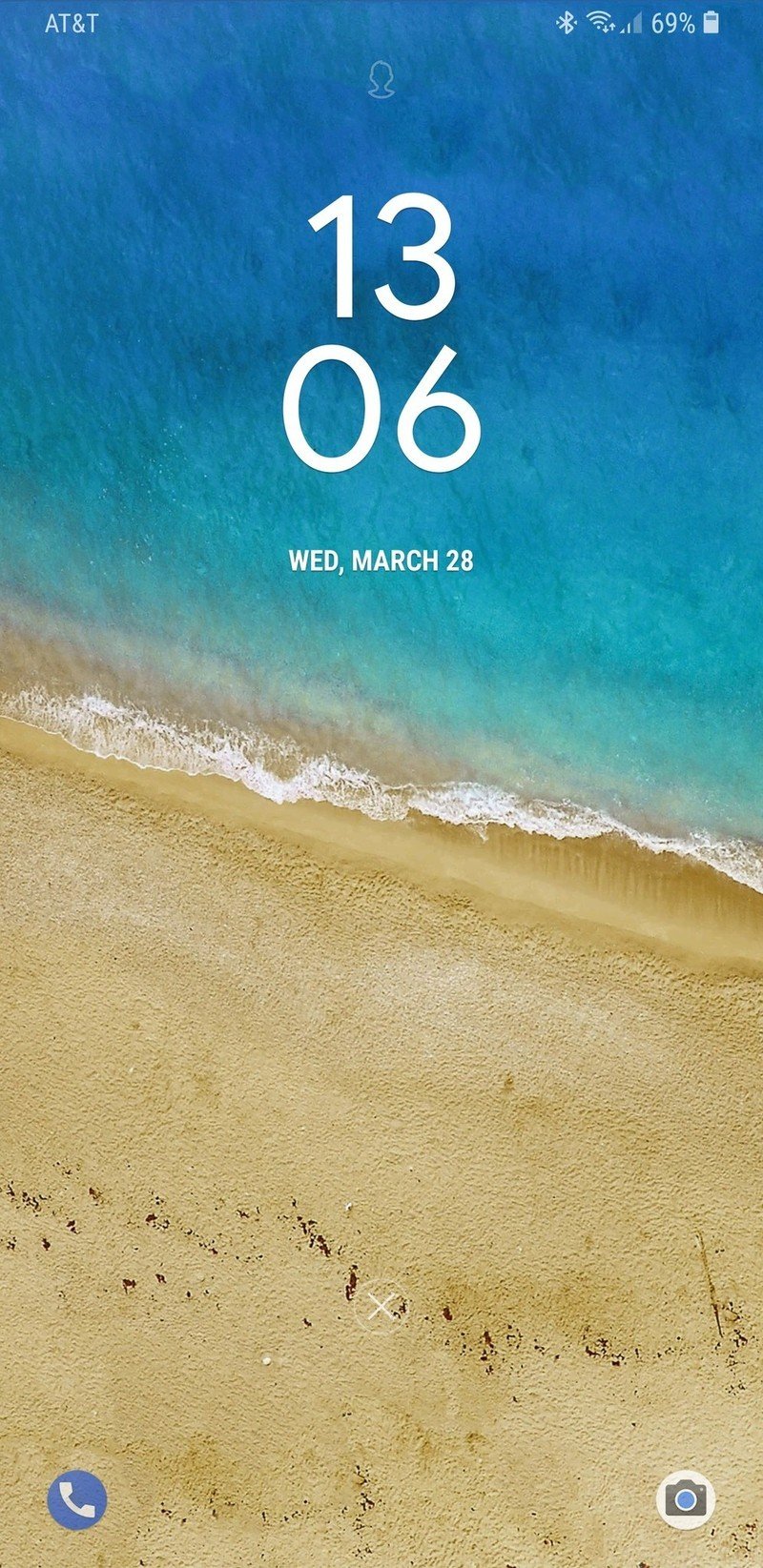
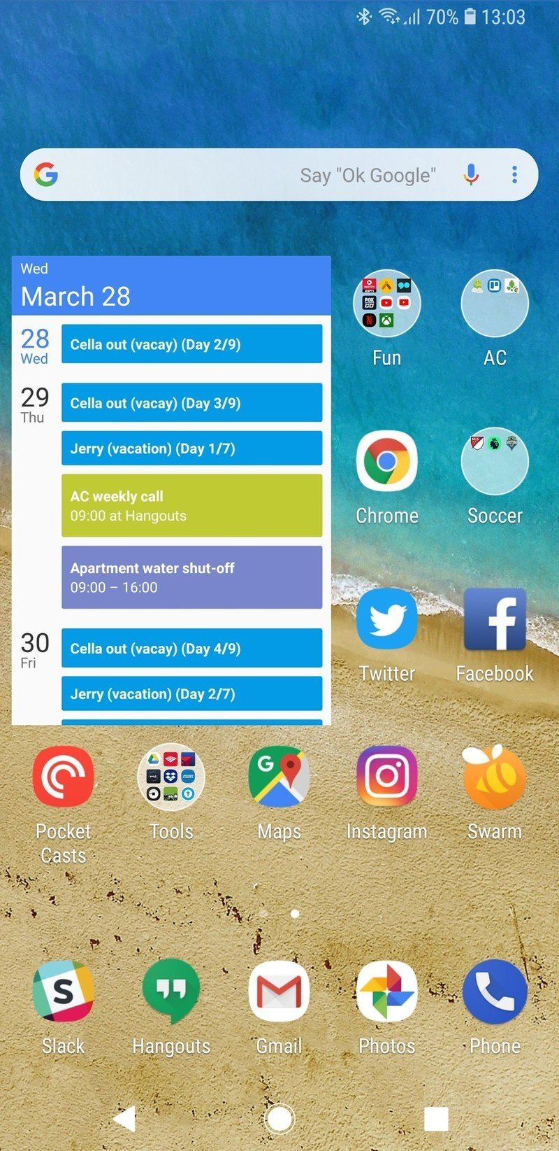
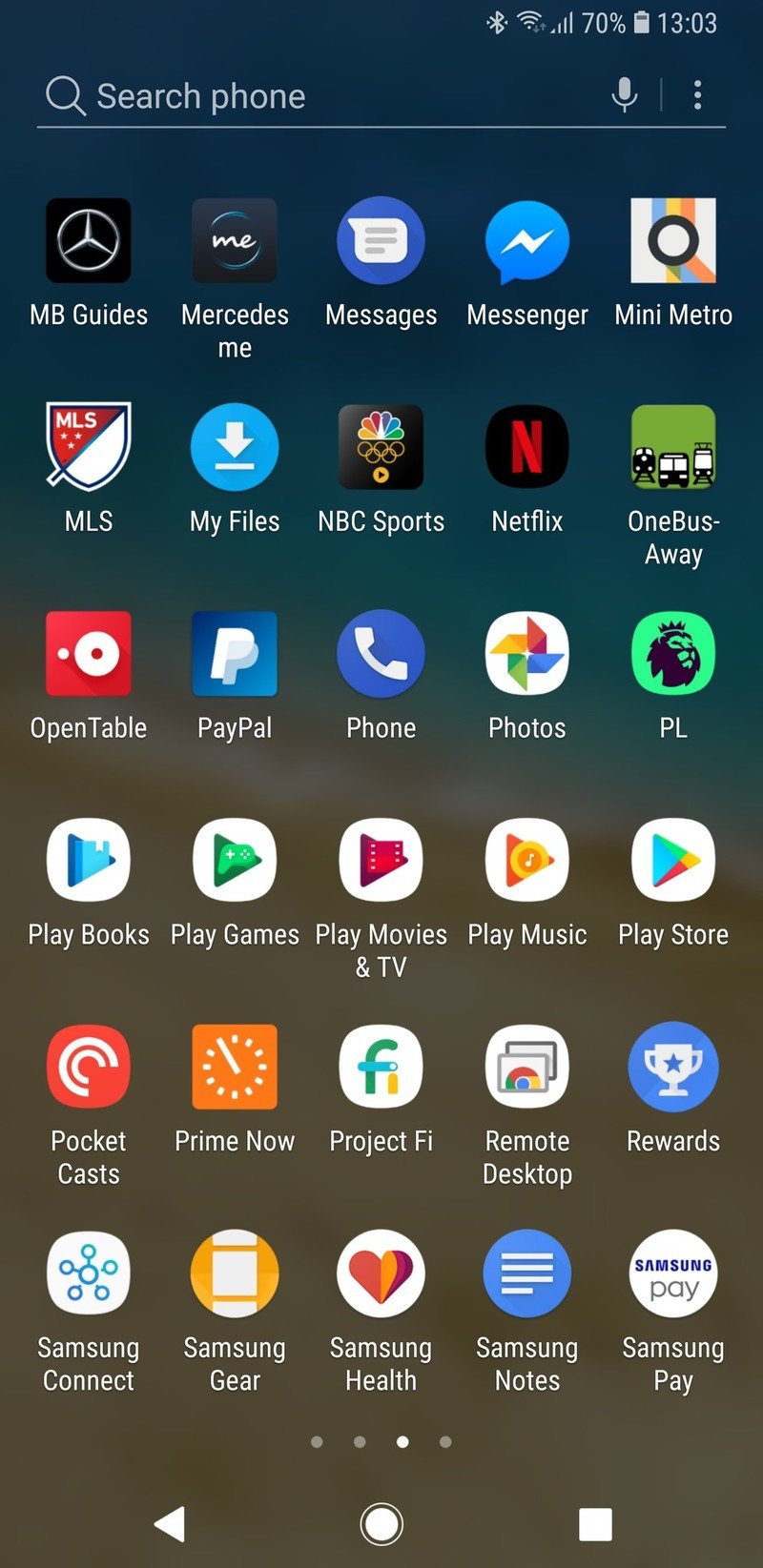
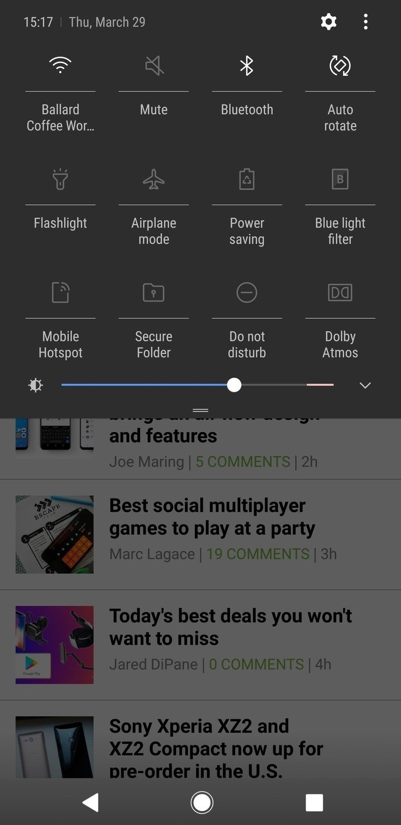
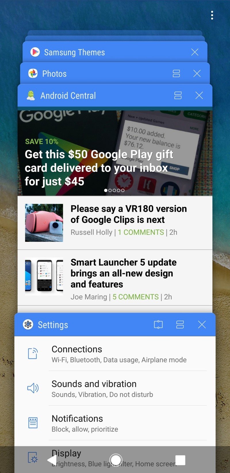
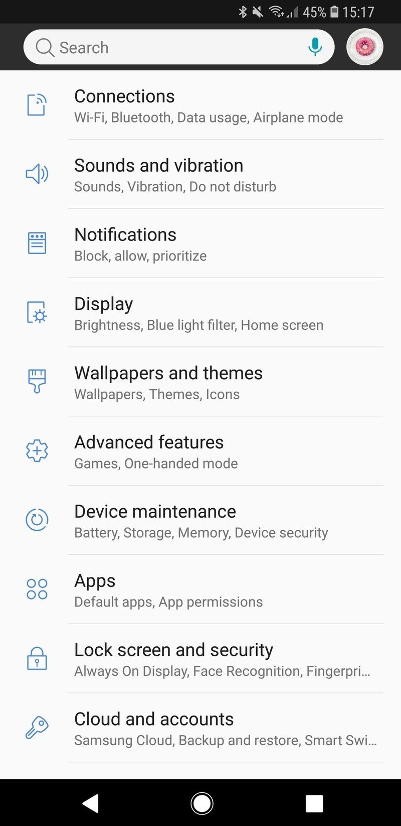
If you want to put this "Pixel" theme on your own Galaxy S9, the process is dead simple. Just click this link to the theme when reading this on your phone, which will launch Samsung Themes to its page. (If you're not on your phone, copy the link from your computer or search for "Pixelize" in the Themes store.) Once open, all you have to do is tap once to download and again to apply the theme, and a few seconds later your entire phone's theme will be changed.
This theme includes an icon pack, changing the system icons where possible, but if you want to swap it out all you have to do is go back to the Samsung Themes home page, tap on "Icons" down at the bottom and restore the stock ones. The same steps, but in the "Themes" tab, will let you revert your entire phone back to the default Samsung theme.
Samsung themes can't be a complete re-skin of the interface, but it gets close enough for most people.
Now, this theme (or any other) won't make your Galaxy S9 look exactly like a Pixel — there are inherent limitations to the theme engine that make that impossible. The notification shade can change icon styles and colors, but it's still the same layout and configuration as before. Same goes for the settings panes, though a color tweak is mostly what's needed to make it "Pixel" like anyway. The multitasking view is the same, albeit with a different top bar color. And most annoyingly of all, themes cannot theme the actual notifications themselves nor the bottom "notification settings / clear all" bar. This really makes dark themes look incomplete, but it's a reality of theming on Samsung phones with its built-in engine.
Be an expert in 5 minutes
Get the latest news from Android Central, your trusted companion in the world of Android
Even still, switching themes feels like a win. Though this is just a basic change to colors and a few design elements, I think it has a far cleaner feeling to it than Samsung's default interface. And because it's a deep system-level theme, there are very few places where it doesn't feel "right" as you use the phone. Overall, it's great, and maybe it will help fight your nagging desire to switch to a Pixel phone for its software design.
Andrew was an Executive Editor, U.S. at Android Central between 2012 and 2020.

