Magazine Home review
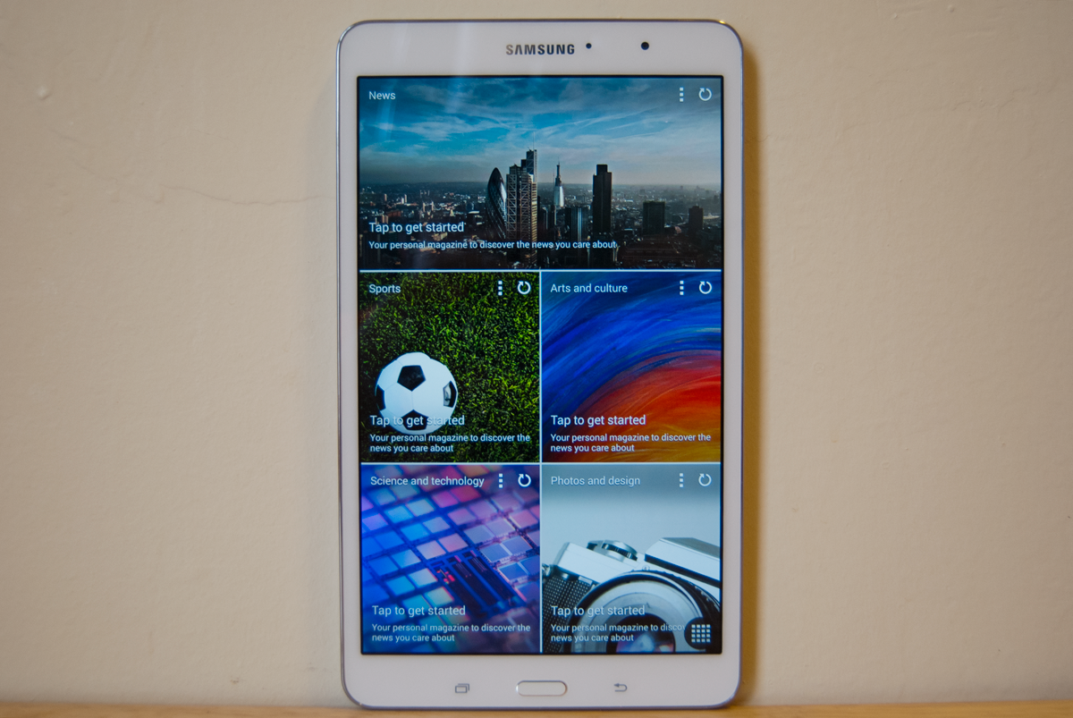
Samsung's built-in newsreader has grown up, but still has room for improvement
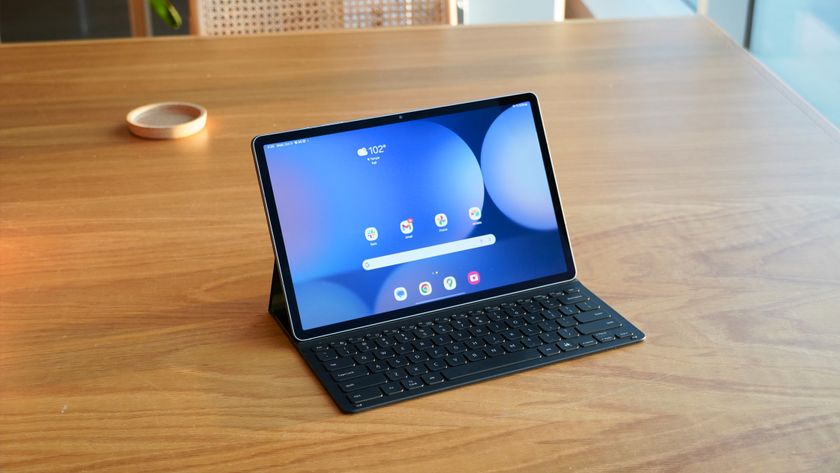
When the Galaxy Pro line of tablets was first introduced in January, all eyes were on Magazine Home, Samsung’s brand new UX that fans and critics alike were dubbing the TouchWiz killer. Likened to a Google-ized version of Windows 8, Magazine Home was said to be a major shift away from TouchWiz as we knew it.
That assumption proved false.
In reality, as we learned at last month’s unveiling of the Galaxy S5, Magazine Home is simply a new element of TouchWiz, baked into the UI but short of a total replacement. But despite it falling short of critics’ and fans’ expectations, for better or for worse, it does indeed mark a major shift for Samsung.
I spent the past several weeks getting to know Magazine Home on the Galaxy line of tablets. Here, we’ll take a look at what the new user interface is, what it isn’t, and why it’s an important step in Samsung’s evolution.
What is Magazine Home?

First, a bit of background: Magazine Home is something that Samsung has been toying with for a while now, and it first came to fruition on the Galaxy Note 3. There, in a less mature version, it was tucked away, accessible by a long press of the home button. It was hidden, in a way, and Samsung saw it as a footnote rather than a major marketable tool.
Magazine Home has matured from its earlier version.
Since then, Magazine Home has evolved into a core part of TouchWiz, baked directly into the UI and dwelling right within your home screen.
Be an expert in 5 minutes
Get the latest news from Android Central, your trusted companion in the world of Android
At its core, Magazine Home is powered by Flipboard, the aggregator that centralizes news, entertainment, and other content into an easy-to-read, interactive UI. Here on Galaxy devices, Samsung has taken Flipboard and given it the old TouchWiz treatment – its core functionalities are largely untouched, but this very much a Samsung product rather than just a third-party app.
Out of the box, Magazine Home is located to the left of your default home screens, similar to the Google Now launcher’s position on the Nexus 5. Swipe over and you’ll be met with a customizable patchwork with content categories like News, Entertainment, Style, Photography, and Science, among others. These panels will aggregate content from a seemingly endless supply of RSS feeds.

But Magazine Home isn’t limited to just news – you can also throw in applications like your Calendar, Email, Gallery, Music, and Samsung’s WatchOn, as well as social streams from LinkedIn, Twitter, YouTube and Flickr, to name a few.
The good

If you've used other newsreaders, you'll probably be OK here.
While the idea of aggregated content isn’t exactly novel (Flipboard, after all, has been around for awhile), Samsung has done a nice job integrating the process into TouchWiz. Navigating the content is a breeze, and customizing your panels to your own personal tastes is relatively simple and straightforward.
Those fans of Flipboard are going to feel right at home, with the hundreds of high-quality feeds and sources now living right in your operating system rather than in the app itself. Flipboard’s content sources are unmatched in terms of quality and reliability, and there really is something for just about everyone here.
The bad
The common gripes about Flipboard are amplified here due to its prominence within the UI – feeds can be slow to refresh, and offline access is at times a futile effort. Magazine Home works well when it works, but when it stumbles, bringing your feeds back up to speed can be trying.
There's still plenty of room for improvement, however.
The other downside to Magazine Home is that it’s simply unavoidable. You’ll need to have at least one panel active at all times, living and breathing in your home screen carousel. Perhaps in the future Samsung will add more user control, but for right now, there’s no disabling Magazine Home.
The other gripe with Magazine Home is with its unmet hype: As Galaxy S5 leaks turned into streams, many were looking forward to a totally revamped TouchWiz, one that shifted away from the typical layout and navigation and toward a experience wholly rooted in customizable, user-specific content. For them, Magazine Home proves yet again how Samsung tends to toe the waters when its customers — some of them, anyway — really want a canon ball.
The bottom line
What’s remarkable about Magazine Home is that it marks a sharp shift for Samsung, who has historically focused on creating tools to further its own brand. Here, Samsung has learned that the most impressive bells and whistles are those that allow users to feel like they’re in control – this is the first piece of software we’ve seen come out of Samsung’s labs that place the emphasis on the user rather than the technology.
Magazine Home is a nice step in a new direction for Samsung -- it’s not the next version of TouchWiz, nor is it the dramatically redefined user experience some were expecting, but it’s progressive enough to keep us wondering about what else Samsung has up its sleeve. It’s a great piece of software that fits beautifully into Samsung’s tablet experience – now lets keep an eye on how Samsung uses it on its smartphones.


