A look at the Android Central editors' homescreens
Home sweet home
On Android, your homescreens are so much more than a grid of icons. Whether you want to keep things sparse and tidy, or file every app you would ever need to use in it's own comfy folder, you'll find plenty of ways to make your homescreen the perfect homescreen. We love that. None of us are the same, and none of us want to be the same.
We wanted to share how our homescreens look, and since we all have access to a great Android blog we got together and are gonna share. You'll find our homescreens are as different as we are, with some boring (guilty) and some busy. And each is just perfect for us.
Have a peek, then hit the comments to analyze us — you can probably tell a lot about a person from his or her homescreen. Then we want to see yours, so click or tap the forum link below and show off your homescreen!
READ NOW: A look at the Android Central editors' homescreens
Phil Nickinson
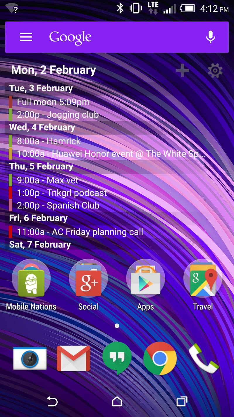
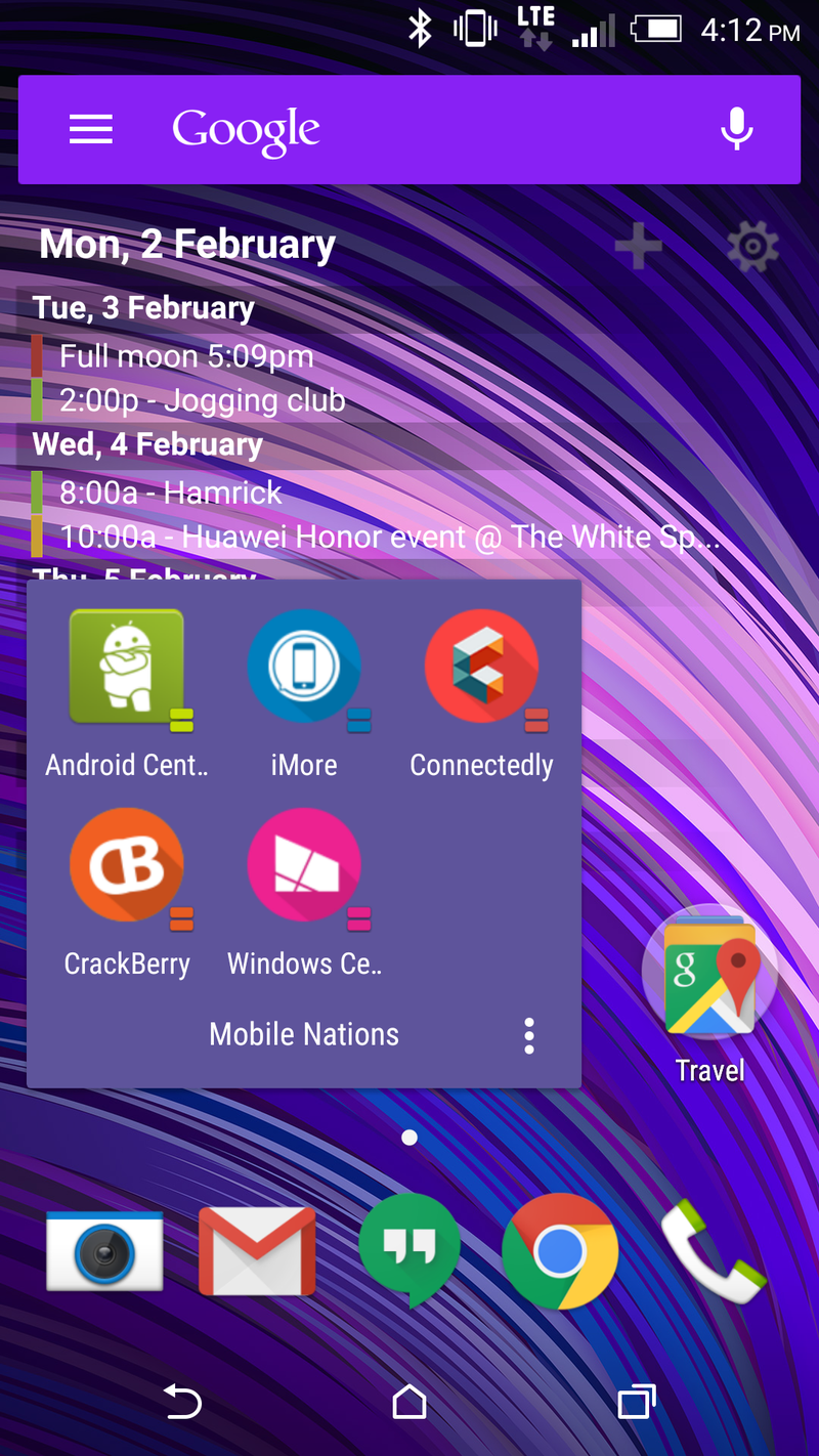
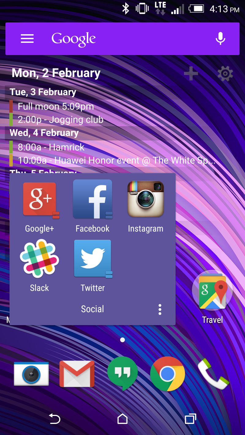
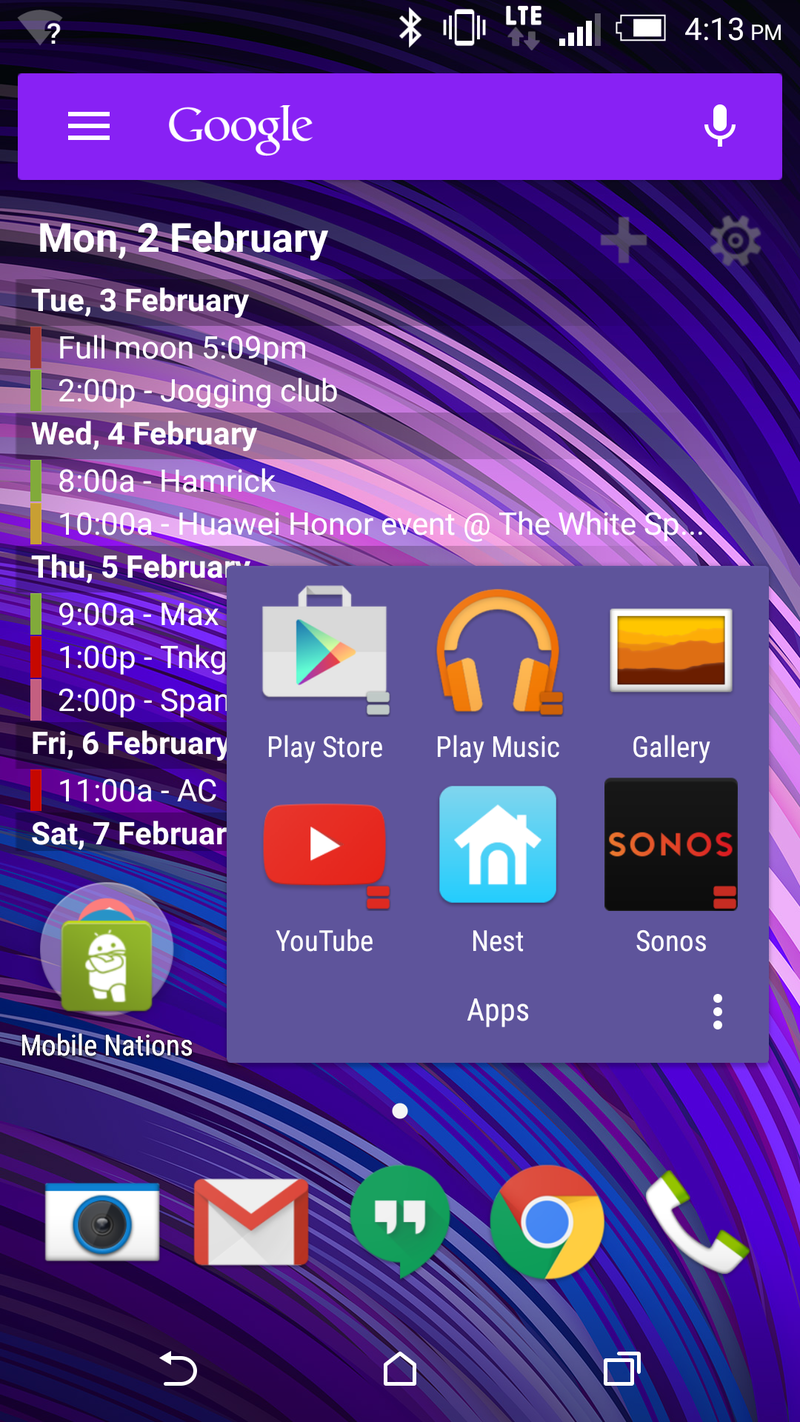
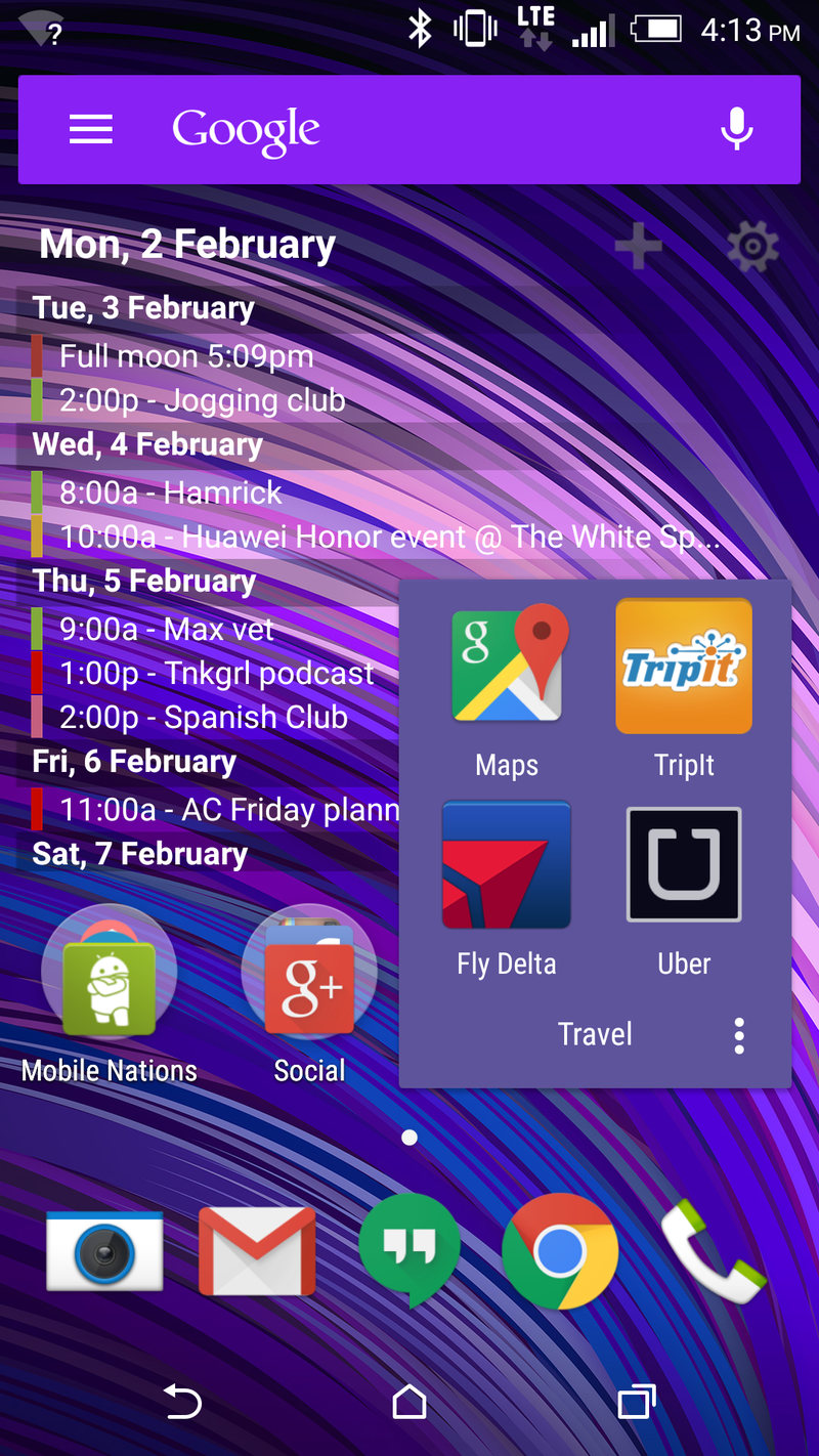
Like me, my home screens aren't particularly exciting. They also haven't changed all that much in quite some time. In fact, I only need a single screen. I'm still using Pure Calendar Widget for the bulk of the screen. It's especially useful when we're at events, and so I just leave it there all the time, usually with a transparent background so it's pretty much just text on the screen. In fact, I'm really not a huge fan of widgets, since they're all designed differently and never really seem to play together all that nicely. Other than that, it's folders, labeled by function. I've got one for all the Mobile Nations apps. Another for the social apps — Google+, Facebook, Instagram, etc. Another for apps I use fairly often. And finally one for all my travel apps — Delta, Tripit, Uber and Google Maps.
And really that's it. Everything else is relegated to the drawer — I'm still using Action Launcher 3, so it's really a very fast list.
Ara Wagoner
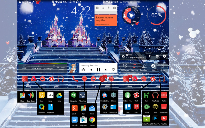
My homescreen looks kinda busy, but in my defense, I did hide as much as I could. I have three homescreens and two dock screens that scroll independently. On the actual homescreens, I have music, Timely, and Keep on my main home screen. To the right is my more utility-centric screen with my toggles, Drive, battery widget, and weather. The left screen was empty for a long time until I got my Hue lights, and I mostly use it when I need to drag something out of my other screens for capping purposes.
Get the latest news from Android Central, your trusted companion in the world of Android
My dock has eight spots on two pages, and only one of those icons is actually an app rather than a whole folder: the dialer. Next to the dialer are my other frequent communications apps: Hangouts and Falcon Pro 3 (finally replacing Carbon). Next is a folder of Google apps, or it was until QuickPic replaced Photos. Next are my quick shortcuts for my most-used tools. The secondary dock page has apps divided into four folders: on-the-go, office, work, and entertainment.
And because I have Nova, there are gesture shortcuts hidden throughout my homescreen. Double tap the wallpaper to open Play Music, tap the home button on the homescreen for Google+, double-finger swipes up and down to connect/disconnect from Bluetooth sources, and swipe up from the entertainment folder to deactivate my Tasker-made driving mode.
It's full of tricks and secrets, but my homescreen helps me get in and out quickly and helps keep me from opening tons of apps and settings for basic tasks.
Andrew Martonik
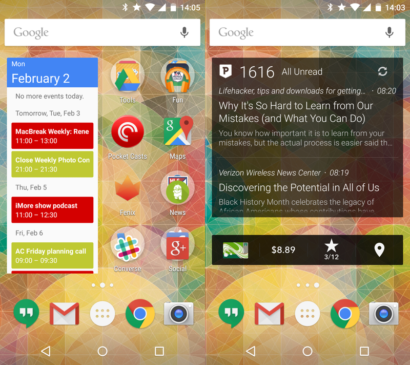
First and foremost I'm using the Google Now Launcher, which fits in with my relatively simple two-page homescreen setup. My main page is where I spend 90 percent of my time, with the Google Calendar widget taking up the left half of the screen for a glance at the most appointments, and the right with individual apps and folders. I hold my phone most often in my right hand, so for me lining things up on the right side makes sense for reachability. I group my folders by function, but keep the most-used apps in the dock and outside of a folder. Quick access to Hangouts, Chrome, Gmail and the Camera are important. My second homescreen (right of center) is really more of a throwaway — a Press RSS widget and my trusty Starbucks widget. I could probably condense those two apps into a folder on the main screen and not skip a beat.
Derek Kessler
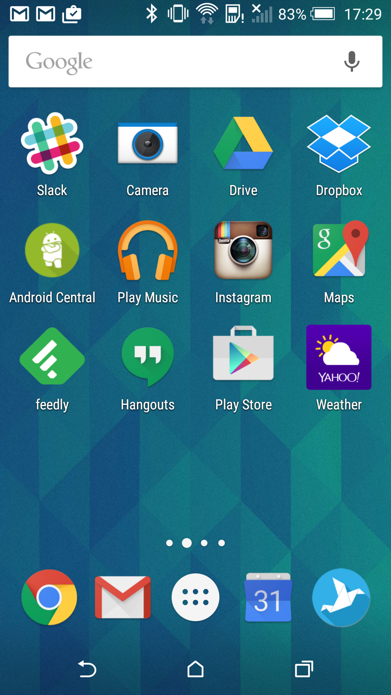
What is on my HTC One M8's homescreen is very simple: it's what I use the most. Obviously. I actively use three parts of the launcher — Google Now to the left, the first screen of the home page, and the app drawer for everything else. I've tried using widgets, but it just doesn't seem to work for how I work. And because I'm that weird sort of mild OCD, I arrange those apps in alphabetical order — helps to find them faster. The dock at the bottom is home to the apps I used most often, especially since they're accessible from the M8's lock screen.
Russell Holly
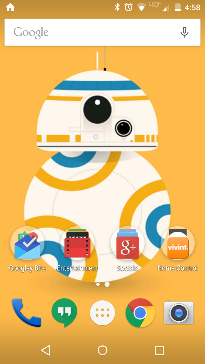
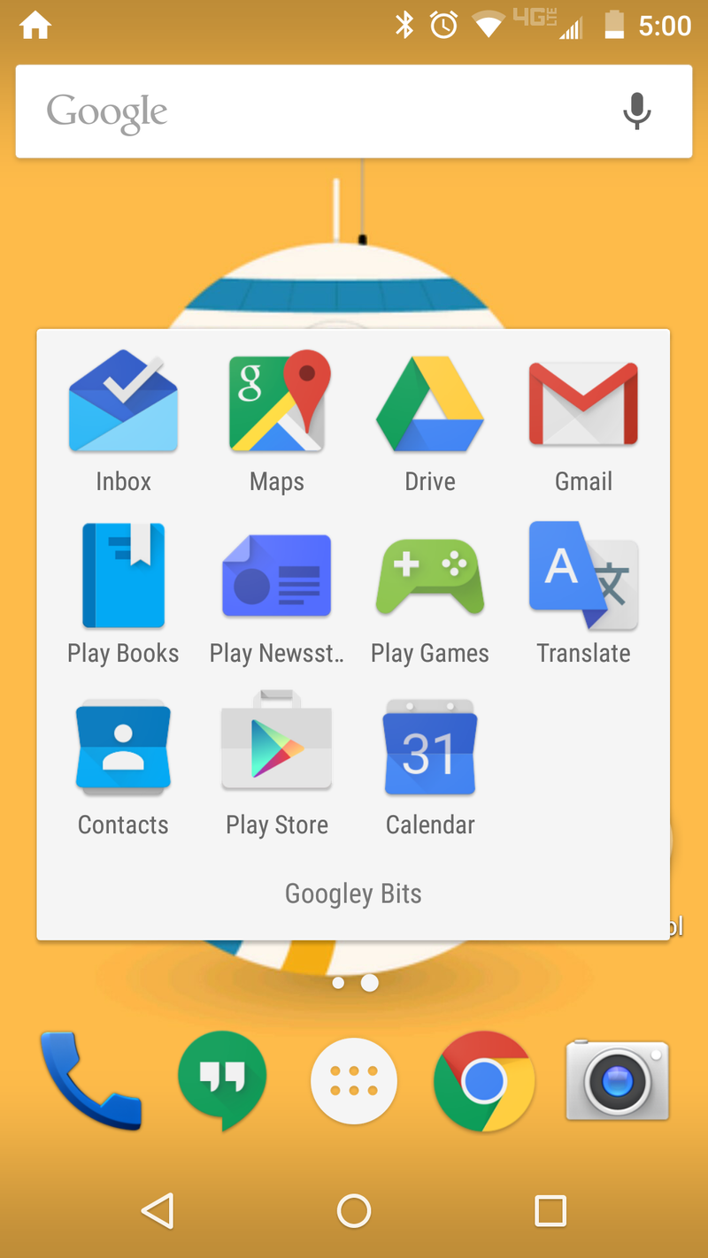
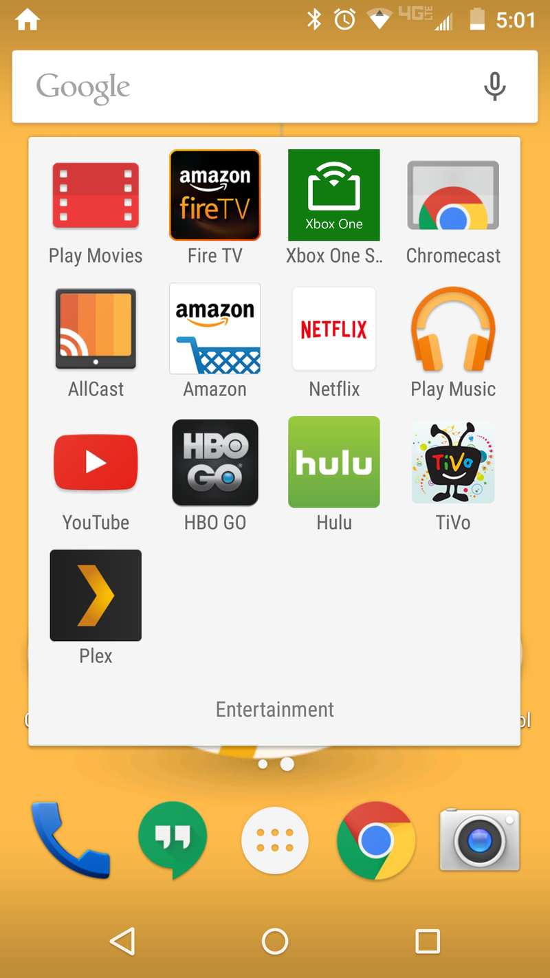
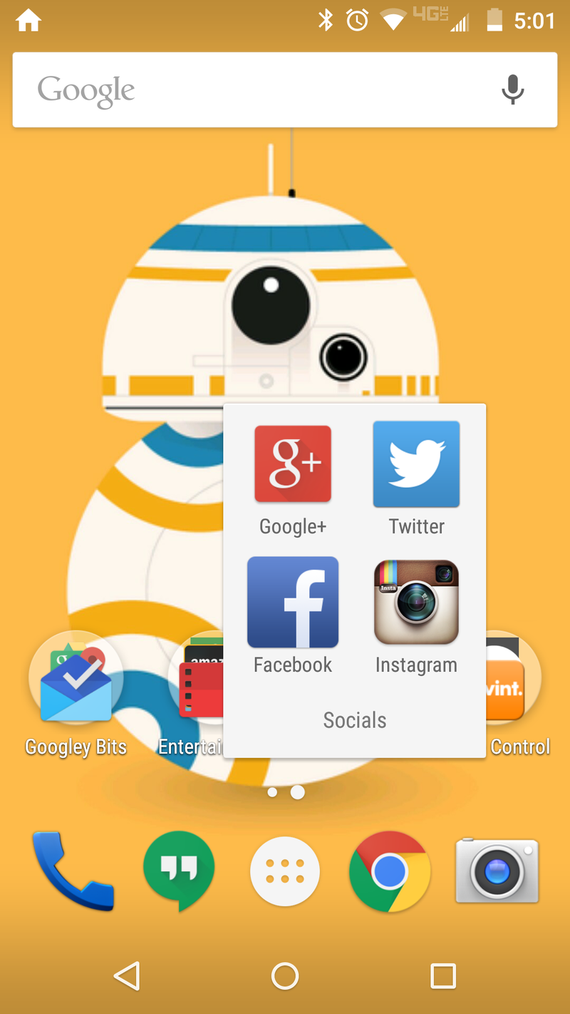
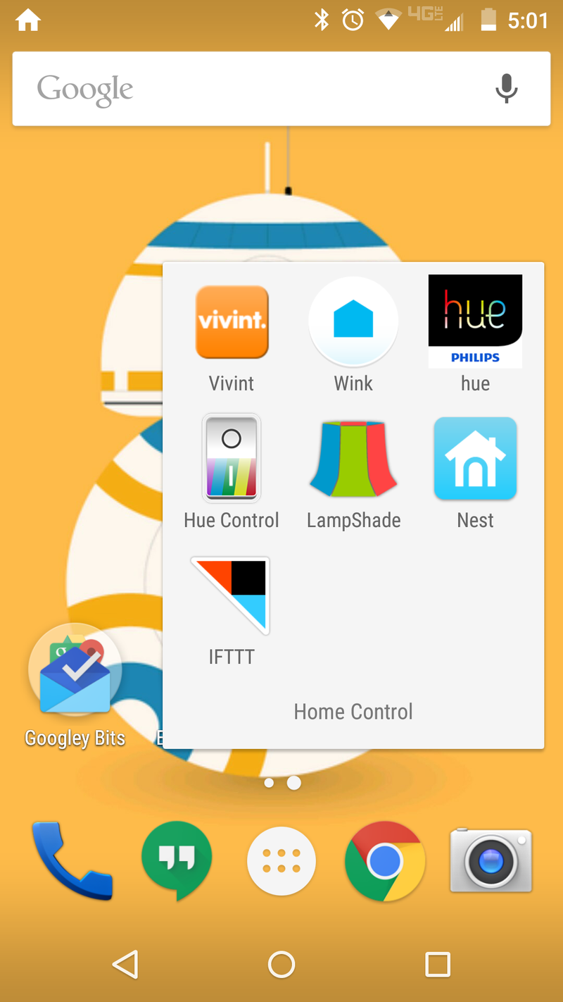
I keep things pretty boring, as this is my one and only home screen. My four folders are hubs for whatever I'm doing at the time, with exception to the Googley Bits folder. That's just there because three folders would have driven me bananas and I don't play games on my phone enough to need a separate folder for those apps.
As for the wallpaper, let's just say I'm holding out hope that someone is working on a BB-8 droid that I'll be able to drive around Sphero style.
Jerry Hildenbrand
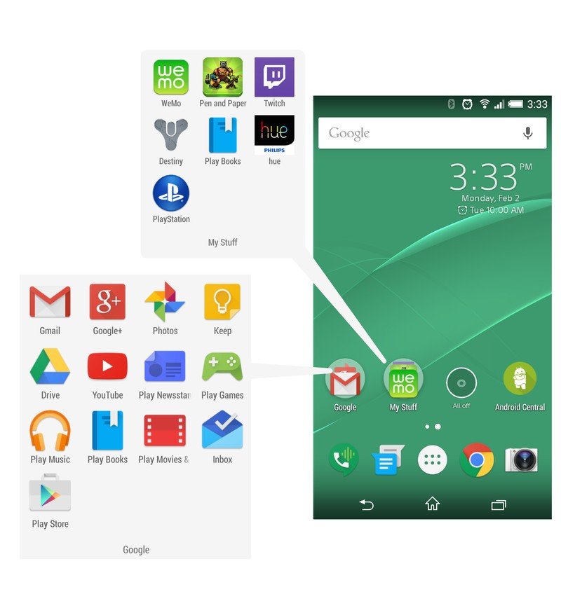
Welcome to the land of the bland! I crave order and simplicity, and the screen on my Xperia Z3 Compact is one of the few places where I can make both happen. I use the Google Now Launcher, one of the bundled Sony wallpapers, and just a few folders and icons with the things I find myself looking for in the app drawer the most. Since I use Hangouts for my Google Voice number, I've got it in the tray along with the Messenger app (family still uses the SIM card number to text and call), Chrome and the camera.
The Google folder is pretty self-explanatory, and the rest of my stuff — some entertainment, some home control and some PlayStation second-screen apps — sits in a folder all it's own. An all-off widget for a handful of Hue Iris lamps gets it's own spot so I can find it in the middle of the night, and the AC app is there so I can check and see what's going on at work with just a tap.

Jerry is an amateur woodworker and struggling shade tree mechanic. There's nothing he can't take apart, but many things he can't reassemble. You'll find him writing and speaking his loud opinion on Android Central and occasionally on Threads.
