Let's talk about the weird new Google search bar

When a company like Google (or in recent days Verizon) makes a major branding change, a lot of ink gets spilled. That's what's happened this past week as the new Google, under freshly-minted CEO Sundar Pichai, showed off its new logotype to the world. Flatter, serif-free and colorful as ever, the new Google logo represents the friendly face the Internet giant wants to show to the world. Some like it, some don't. Personally, I'm in the former camp.
Over on Android, many of Google's apps have already been updated with the new logo, including the main Google app itself, which handles Google Search, Google Now and the Google Now Launcher. And Google Now has been overhauled as part of this latest update, with new card layouts and a refreshed design.
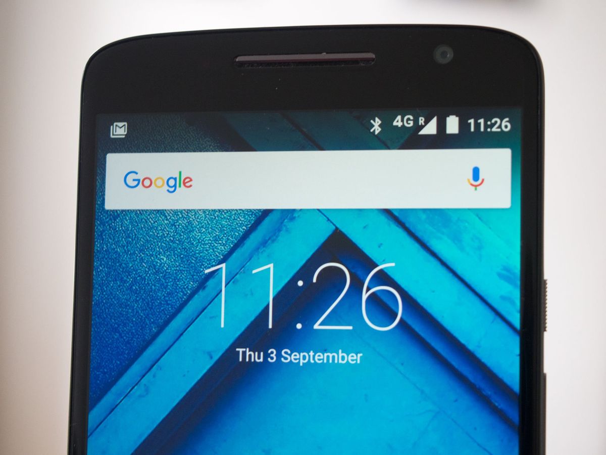
But... There's one overwhelmingly negative change, and it's one that'll affect just about every Android phone going forward. We're talking, of course, about this:

That weird multicolored search bar.
It's a relatively minor change, sure. But the Google Search widget's prominence in the Android world — it appears on the home screen of every Google-certified Android phone — makes it a big deal. Assuming this isn't some temporary change tied into the new Google logo announcement, expect to see the new and much more colorful search bar on a ton of new Android device renders before the year's out.
In the "pure Android" world, meaning Nexus and Moto phones, and the handful of others using the Google Now Launcher by default, it's even more significant. That's because it's given prime real estate on every home screen panel in the bundled launcher.
Expect to see the new, colorful search bar on a ton of promotional renders before the year's out.
This may be an entirely subjective thing — but right, in my opinion, now it just looks bad. On the Moto X Play, for instance, my home screens went from looking relatively normal and minimalist to almost clownish in the space of one app update.
Be an expert in 5 minutes
Get the latest news from Android Central, your trusted companion in the world of Android
The Google search bar has been a relatively benign part of Android for years, sitting the background and acting as a neutral element on what might otherwise be a very colorful or icon-packed home screen. The new colors — particularly in the strangely partitioned mic icon — make the bar more noticeable, and perhaps touchable. For Google, that's a good thing.
But on just about every phone I've seen it on so far, the splash of primary colors clashes with the rest of the home screen, giving it an unfortunate Fisher-Price kind of vibe. It's a jarring change from the neutral greys used in the old widget, and has the potential to turn an otherwise classy looking smartphone into almost an object of fun.
Considering the vast reach of this particular widget, it's a significant design change for the entire Android ecosystem. A glance at Twitter reveals that online opinion is split down the middle.
Maybe our opinions will change over time. Maybe the change won't be permanent. Or maybe we'll just just a different widget, or switch launchers. Either way, it's a bigger change to the public face of Android than it might seem at first, and it'll be interesting to track the public reception to it over time.
In the meantime, we want to hear what you think of the new and very colorful Google search bar. Love it or hate it, hit the comments and share your thoughts!

Alex was with Android Central for over a decade, producing written and video content for the site, and served as global Executive Editor from 2016 to 2022.


