Lenovo's clever hardware is a great deal more functional than you'd think it could be, but have Android apps grown up enough to handle tablets and convertibles?
Pros
- Unique design
- Highly functional pen interface
- Quality stereo speakers
Cons
- Mediocre battery life
- Lenovo's additional software is of inconsistent quality
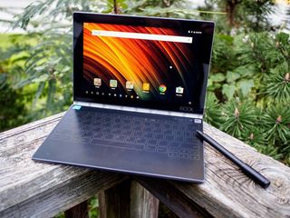
The best Android tablet there is
Lenovo Yoga Book Full Review
Android tablets suck. Sorry, that's not quite right. Using an Android tablet in 2016 sucks. The vast majority of apps in the Google Play Store never grew to support larger screens, and Google hasn't done nearly enough to encourage that development over the years. Instead of dealing with the problem three years ago when Apple was revving up the iPad, we got a pair of Nexus 7 tablets that were cheap enough people would buy them and small enough that you weren't constantly frustrated by the way apps were stretched to fill the screen.
Android tablets became permanent content consumption machines that year, and now here we are in 2016 with several examples of great hardware ruined by an app ecosystem entirely disinterested in supporting the experience. And again, instead of dealing with this by approaching developers, Google added features in Android 7.0 Nougat so apps can be run side by side and avoid being quite as visually offensive on large displays. The demo device for this experience, Google's Pixel C, continues to float in this weird in-between space that isn't quite comfortable enough to use as a laptop and just a hair too heavy to enjoy using as a tablet. Outside of this, you have Dell's repeated attempts to Make Android Tablets Great Again from last year, and now a truly unique take on the tablet convertible world from Lenovo.
If there's one thing the most profitable laptop manufacturer on the planet knows, it's how to make something thin and light and beautifully mechanical. Following the long and successful like of Yoga laptops running Windows, we now have the Android-powered Yoga Book. Put simply, it's what happens when you take an ultra-thin laptop design and say "you think we can put Android on this thing?" in a room full of engineers. Yoga Book stretches the definition of Android tablet in the most delightful of ways, and it couldn't be more clear that nearly everything wrong with this machine comes from using immature Android apps.
About This Review
I (Russell Holly) have been using the Lenovo Yoga Book (YB1-X90F) for six days all around Maryland. This review, as well as several thousand other words across Mobile Nations, was written with this Android convertible. It's running Android 6.0.1 with July 1, 2016 security patches.
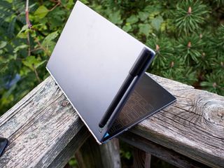
Thin, sturdy, and damn pretty.
Lenovo Yoga Book Hardware
Nothing about this machine is ordinary. From the moment you slide Yoga Book out of its long white box it's clear you're using something special. The metal casing is cool to the touch, and it's not immediately clear which side is up. Digging your thumbs into the seam and pulling doesn't make this any clearer at first, since both halves of the inside are flat black glass. Sunlight pouring in from my office window hits the faint outline of the Holo Keyboard, and it finally clicks that this side lays on the table.
| Category | Features |
|---|---|
| Operating System | Android 6.0.1 (Marshmallow) |
| Display | 10.1-inch FHD IPS (1920 x 1200) @ 400nits |
| Processor | Intel Atom x5-Z8550 Processor (2M Cache, Up to 2.4GHz) |
| Storage | 64GB |
| Expandable | microSDUp to 128GB |
| RAM | 4GB LPDDR3 |
| Rear Camera | 8MP |
| Front Camera | 2MP |
| Charging | micro-USBFast charging |
| Battery | 8500 mAh |
| Dimensions | 256.6mm x 170.8mm x 0.96mm |
| Weight | 690g |
Curiously, the side of the keyboard is also where the power and volume keys are. The Micro-USB and Mini-HDMI ports on the other side of the keyboard edge make a little more sense, and as this laptop powers up everything comes to life. The faint lines on the glass nearest my fingertips lights up and reveals a full keyboard and trackpad just under the glass. The spacing on the keys looks to be just a bit wider than your average 3/4 keyboard, but it's still a flat piece of glass. For someone who types all day every day on a CODE mechanical keyboard, who has also used every virtual keyboard on just about every tablet ever, it's difficult to imagine typing on this will be enjoyable.


The star of this tablet, on the outside anyway, is the hinge. Lenovo's watchband hinge is without equal, allowing the display to not only flex around from one side to the other without any issue but almost lock in place when you stop applying force. This hinge should be an industry standard. It's beautiful, functional, and allows this tablet to fully transform from laptop to tablet and function in spaces few other devices can function. Because the weight on this tablet is balanced between the two halves of the hinge, Yoga Book comfortably sits in your lap at any angle.
At 1920x1200 resolution with 400 nits of brightness, the display is just shy of great. If you're using this machine like a laptop, the resolution is more than enough to get things done and look nice. If you're using this like a tablet, maybe flipped over in "A" position in your hands on an airplane, the resolution is noticeably lower than some other out there. Lenovo also doesn't do much with auto-brightness on the Yoga Book, so that 400 nits will catch you in the eye real quick in a dark room.
All told, there's very little about the design of this Yoga Book that doesn't scream premium.
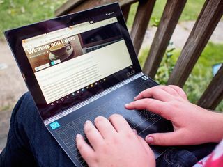
Almost as important as the existence of a keyboard is the existence of a trackpad. Not needing to reach up and touch the screen for anything is a big deal. This pad is a little unusual, making you press and hold to scroll instead of two finger swipe like you'd see in a traditional desktop environment. That's cool though, because this isn't a traditional desktop environment. The rules are different, which is why there are special buttons on the keyboard for Home and Menu and Launcher. This is a keyboard between worlds, and a trackpad that has to follow along. The only real issue with this design is how close the edge of the trackpad is to the space bar, which causes frequent misfires.
This keyboard has the ability to completely disappear, turning the entire surface into a digitizer for the included pressure-sensitive stylus. Lenovo's stylus tech easily matches your average $200 zero-point stylus from Wacom, and it's baked right into the tablet. You can hold the Yoga Book however you feel comfortable and draw. The stylus is fine as far as comfort goes, and the metal clip on the cap magnetizes to the back of the display should you decide to bring it with you everywhere. If you lose the stylus or would prefer to write with your favorite pen, you can enable that feature and write or draw on a piece of paper against the glass. This mode is slightly less accurate and not at all pressure sensitive, but amazing for combining real pen and paper feel with digital interaction.
All told, there's very little about the design of this Yoga Book that doesn't scream premium. The 1.52-pound body is incredibly light when you consider what you're getting, and it's noticeably thinner than the Pixel C or Dell's 10-inch Android tablet when their keyboards are attached. Speakers that fire from the left and right sides of the body are loud, crisp, and clearer than you get from most tablets in this class. Lenovo has delivered something that is a genuine pleasure to hold and use for creators and consumers alike.
Skinned Marshmallow
Lenovo Yoga Book Software
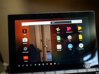
Since Yoga Book clearly isn't getting any help from Google when it comes to reasonable software for 10-inch tablets, Lenovo had to jump in and create some tricks of their own. What you get is Android Marshmallow with some clever add-ons. There's a dock system that feels like it cam straight out of a desktop OS design class, a floating window system designed so you can use apps side by side, and some included apps that play nice with Lenovo's stylus system. There's also a special software keyboard system for auto-correcting words coming from the Holo Keyboard. These aren't huge changes to the Android UI, which in some cases turn out to be a bad thing for Lenovo's overall goal.
Android apps in floating windows sounds like exactly what everyone wants, right? You can get the smaller UI experience, multitask, and come dangerously close to feeling like you're being productive if everything worked the way Lenovo intended. You get a window you can pin wherever you want, click or tap anywhere in that window to interact, and enjoy the multi-app experience. Unfortunately, none of Google's included apps play by these rules and many other apps break shortly after you try to actually use them in this windowed mode. Netflix, for example, freaks out as soon as you start playing a video in this windowed mode. Few apps work from beginning to end, which is a shame. The forced perspective in Android 7.0 Nougat really is the only way to consistently enjoy multi-window in Android.
Typing on Lenovo's Holo Keyboard is greatly enhanced by its virtual component. You can tap on numbers corresponding to auto-correct options that float on the screen, and in many cases the text will correct for you as you type. It's a great system, as long as the app behaves. Several messaging clients for Android, including Slack and Hangouts, don't respect the existence of a return key. Tapping return doesn't send the message like you'd expect, it drops down a line instead (yes I know this is the actual purpose of a return key). This means you have to tap or use the touchpad to click the send button each time, and when you start typing the next line the auto-correct software applies the last word to the new line, which is frustrating. The easiest answer is to disable this keyboard mode, which removes a feature that works well nearly every other time you use it.
We still have apps that force portrait orientation to log in, apps that only send messages when you hit the send key, and no shortage of apps that just plain look bad when not on a phone.
Lenovo's best idea is the dock. When you open an app, it gets a spot on the bottom bar, between the navigation keys and the clock. You can quickly switch between open apps by tapping these icons, and can dismiss apps when you're done using them. It's a fairly simple UI change that makes a huge difference in how quickly you jump between tasks, something that becomes an even bigger deal when you're trying to use this computer like a full laptop.
This is usually the point in which I hold Lenovo accountable for not having the latest version of Android on this tablet. Honestly, though, I don't think it matters in this situation. While split screen would be more functional than what Lenovo currently has, the current custom dock is more useful for switching between multiple apps. Most of the problems here have little to do with functional multi-window, and everything to do with Android apps being entirely inconsistent in how they function on large screens. We still have apps that force portrait orientation to log in, apps that only send messages when you hit the send key, and no shortage of apps that just plain look bad when not on a phone. Sure, Lenovo should get Nougat on Yoga Book as quickly as they can, but only once all of their own ideas work well and continue to create this great unique experience.
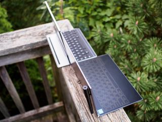
I'm not mad at you
Lenovo Yoga Book Experience
Historically, deciding to leave the house with only an Android tablet to work in a library or coffee shop has not gone well. Google's Pixel C got close, especially after Nougat, but the mobile-first UI of Android is a challenge in many situations and those carry onto the Yoga Book. Chrome, for example, fills the top inch of the screen with quick-swap tabs and the top bar of the app instead of using the whole screen to give me as much space to browse as possible. Chrome for Android is absolutely powerful enough to act as my only browser throughout the day, but it's still not particularly well optimized for this screen size.
The real question, the thing all of the Android Central editors have discussed and doubted and marveled at, is whether you can actually type at length on this Holo Keyboard. The answer is yes, mostly. On the fancy mechanical keyboard at my desk, I average 57 words per minute. Not bad for a guy who can only use eight of his fingers, but not super amazing either. On the 3/4 keyboard you get for the Pixel C, I average 42 words per minute. That's reasonable for a smaller keyboard, even one that nice. Lenovo's Holo Keyboard has me typing an average of 45 words per minute, with a mistype rate about 10% higher than either other keyboard. That means I type just slightly slower on this keyboard than I do either of the other keyboards since I have to stop to make corrections more frequently, but it's still damned impressive for glass.
It's hard to not feel like Google has given up on tablets.
Typing on this keyboard isn't uncomfortable, either. It's certainly not as comfortable as using a mechanical keyboard, but it works. My most frequent mistake is hitting the M just above the space bar when trying to space, which used to happen to me a lot on netbooks when those were all the rage. After about an hour of typing on this keyboard my fingers are a little more tired than they would be on a mechanical keyboard, but it feels like I'm getting plenty done in the mean time.
It didn't take me long to wish I was using the Windows version of this computer, or one made with Chrome OS like Jerry suggested back when Yoga Book was announced. It's hard to not feel like Google has given up on tablets, and it's also not hard to see why that is. Android tablets have never sold well, and apps just plain don't support the tablet experience. There will never be a situation in which every app I install plays nice with Lenovo's ideas here, and that's a shame.
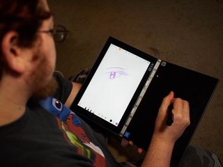
I'm not an artist, and type faster than I write, but I love watching people who can actually draw use the stylus on Yoga Book. Everyone I handed this tablet to loved the drawing experience, and were shocked by the $500 price point for this experience. Knowing the hardware works well with more than what Lenovo has included is just as awesome, and being able to use Yoga Book in portrait with the display right next to the drawing surface is incredible.
Yoga Book averages eight hours of consistent use for me, split between watching movies and typing and playing games. That's great for a laptop, but mediocre for a tablet. Granted, there's a lot more going on with this machine when using it like a real computer, but overall it'd be nice if that battery could be stretched to 10 hours on a single charge. Fortunately, the quick charging power adapter in the box makes it easy for you to get that extra couple of hours with a few minutes connected to power.
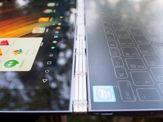
Did you hear this comes in Windows?
Lenovo Yoga Book the bottom line
It's not hard to say this is the best Android tablet you can buy today, but recognizing what a low bar that is and how many things are still not ideal with this experience is frustrating. Our friends at Windows Central recently reviewed the Windows 10 variant of the Yoga Book, and I found myself regularly wondering how much better this already great piece of hardware would be if it weren't running Android.
Lenovo might be able to force a few more apps to behave with software updates, and Android Nougat may be able to extend battery life a little, but at the end of the day most Android apps are just plain not great for tablets and frankly I'm tired of creating excuses for why that is. Android is awesome for phones, and Yoga Book makes it painfully clear the same can't be said for tablets.
Should you buy it? Probably not.
Make no mistake, this is an amazing piece of hardware. Lenovo has clearly outdone themselves in design. If you really want Android to run on your laptop and don't care that apps are going to misbehave left and right, this is without a doubt the machine for you. If you're in love with this hardware and want an OS that actually makes sense in this form, the Windows Yoga Book is available right now and is a lot easier to recommend.
