'Lawnchair' is the best new Android launcher you (probably) haven't tried yet
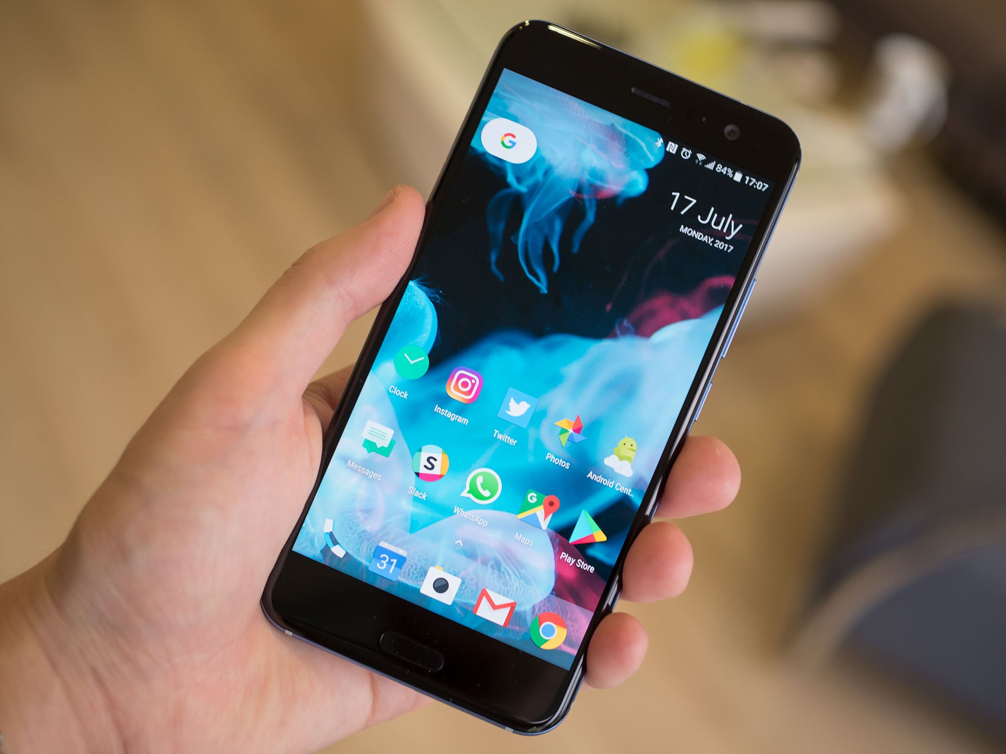
I'm usually pretty lazy when it comes to customizing my home screens. For the most part, I tend to stick with the stock launcher on whatever phone I'm using, and I don't go over-the-top tweaking absolutely every setting on my home screen.
Yet with the discontinuation of the Google Now Launcher, I've been on the lookout for a replacement, because so few third-party launchers include support for the Google Feed. (And for those that do, hacky workarounds are required.)
Enter Lawnchair which started out as an effort to bring Google Feed support to the Google's basic Launcher3 — the home screen app included in open-source Android. After gaining momentum on XDA, this curious little side project has become surprisingly polished, growing a bunch of new features from the Pixel, Android O and beyond — and porting over many Google Pixel design elements in the process.
And although Lawnchair, with its slightly goofy name, currently exists as a test release, outside the Google Play Store, it's well worth checking out. Developer Deletescape recently posted build 818 — a significant update with many performance enhancements and new capabilities.
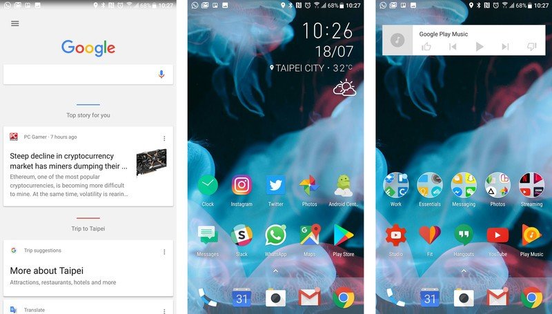
At the heart of Lawnchair is Launcher3 — the open-source base from which the Pixel Launcher is built. On its own it's pretty barebones, giving you a basic home screen layout and swipeable app tray. Lawnchair faithfully recreates almost all of the features of the Pixel Launcher from scratch, with the only major exception being the weather widget opposite the Google pill button.
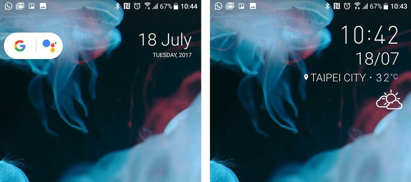
The Pixel features that are included can be easily customized, or removed entirely if they're not your cup of tea. That includes the Google button, rounded icons and even the Google Feed (aka Google Now) panel over on the left.
By default, Lawnchair is a faithful recreation of the Pixel Launcher — but you can customize just about everything to your own liking.
Like any modern launcher, you can endlessly customize the way Lawnchair looks, if the standard information density and visual style isn't to your liking. Icon packs are supported, there's a full "dark mode" to pare back the whites of the app drawer and menus — and of course the size, shape and grid layout of your home screens can be tweaked too.
Be an expert in 5 minutes
Get the latest news from Android Central, your trusted companion in the world of Android
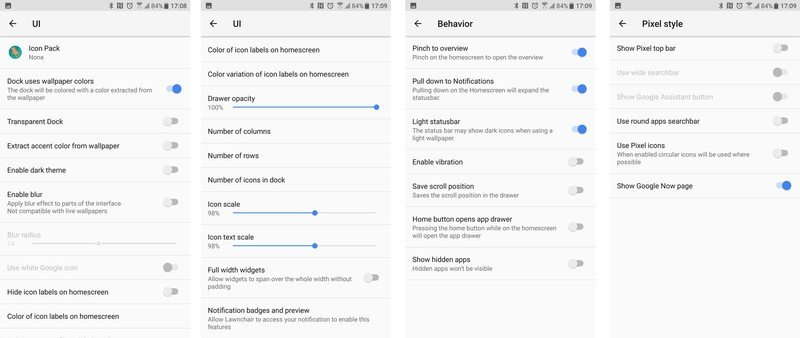
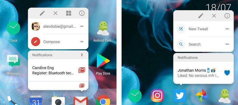
Lawnchair even uses notification access to display Android O-style notification badges next to your app icons. And elsewhere, the developer has implemented O-style context menus for jumping to specific areas of apps, adding widgets, or renaming shortcuts.
Other handy gestures are included too, some borrowed from other launchers. OnePlus's swipe-down shortcut for the notification shade is enabled by default, and there's also an option to toggle the app drawer with a tap of the home key.
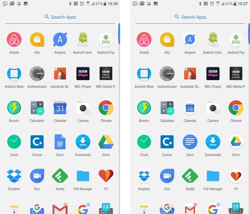
All of this adds up to a launcher with the slick performance and clean aesthetics of the Pixel launcher, with the added customization you get from many of the bigger names in Android launchers — plus support for new launcher features even on older versions of the OS.
It's early days, but this new launcher is off to a very promising start.
It's still early days for Lawnchair, but what I've seen so far is promising. And if you don't mind manually juggling APKs every week or so, what you'll find is a very capable, very pleasant home screen experience.
Lawnchair is available to download from Github and XDA Labs right now. You'll need to enable "unknown sources" to manually install the APK... at your own risk, of course.

Alex was with Android Central for over a decade, producing written and video content for the site, and served as global Executive Editor from 2016 to 2022.
