Android Central Verdict
Bottom line: If you love the look and feel of Google's Pixel Launcher but wish it was fully customizable, that's exactly what you get with Lawnchair 2. It's impressive how much this looks and feels like the real deal, and when you add that attention-to-detail together with virtually endless ways to customize your experience, you end up with one of the best launchers the Play Store has to offer. Oh, and it's completely free.
Pros
- +
Looks and feels just like the Pixel Launcher
- +
Robust theming tools
- +
Customizable At a Glance widget
- +
Seamless Google Feed plugin
- +
100% free to use
Cons
- -
Not as innovative as some other launchers
Why you can trust Android Central
A few years back, I used to be crazy about third-party launchers. I'd regularly scour the Google Play Store for new options I hadn't yet tried and would often switch back and forth between a select few to constantly give my phone a new look and feel.
In recent years, however, I've felt this urge less and less. First-party launchers from Samsung, OnePlus, and Google have become really good, to the point where I'm no longer compelled to seek out a new one the minute I take a phone out of its box.
Even with that being the case, there is one launcher that's continued to find itself on my Android handsets at one point or another — Lawnchair. Lawnchair is essentially Google's Pixel Launcher cranked up to 11 with heaps of theming and customization tools. The big Lawnchair 2 update recently dropped on the Play Store with a design overhaul and new features, and after rocking it on my Pixel 4 XL, I can't wait to throw it on all of my phones.
Lawnchair 2 isn't the most technically impressive third-party launcher the Android landscape has to offer, but it strikes an incredible balance of stability, smoothness, and customization that I cannot get enough of.
Lawnchair 2 What I love
Over the years, I've found myself becoming quite fond of the Google Pixel Launcher. Going back to its debut on the first Pixel in 2016 (and even before that when it was known as the Google Now Launcher), I really enjoy Google's home screen experience. It's easy-to-navigate, free of unwanted clutter, and having easy access to Google Search and the Google Feed are valuable to me. On top of that, I've found that the Pixel Launcher offers a smooth, reliable experience that's missing on most third-party options.
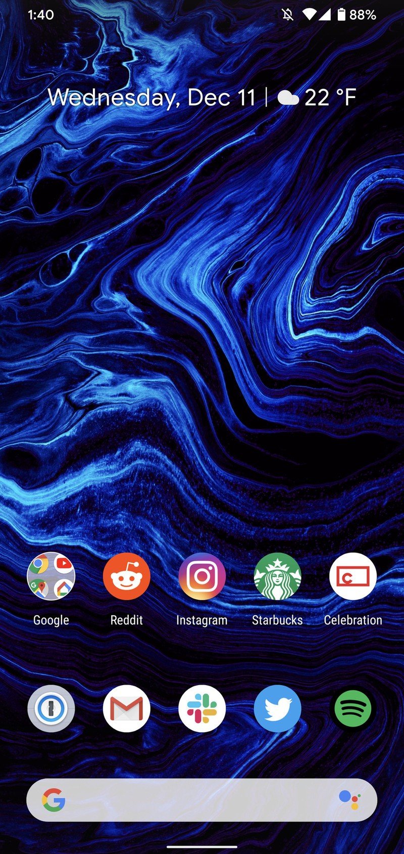
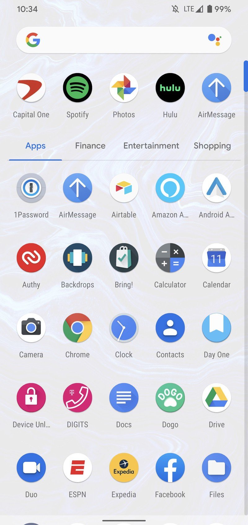
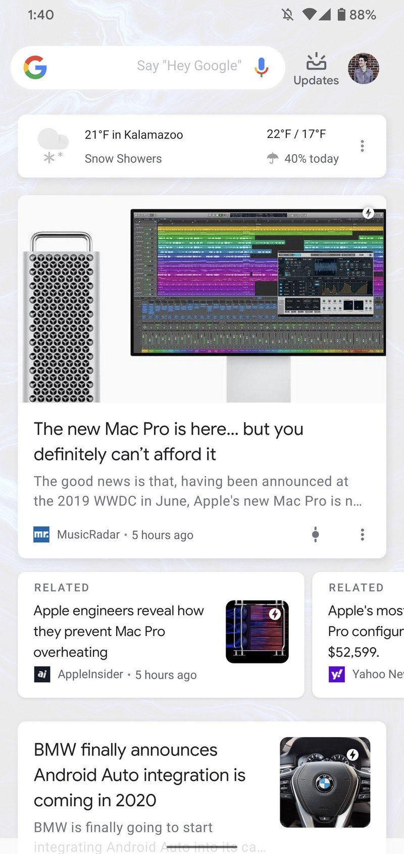
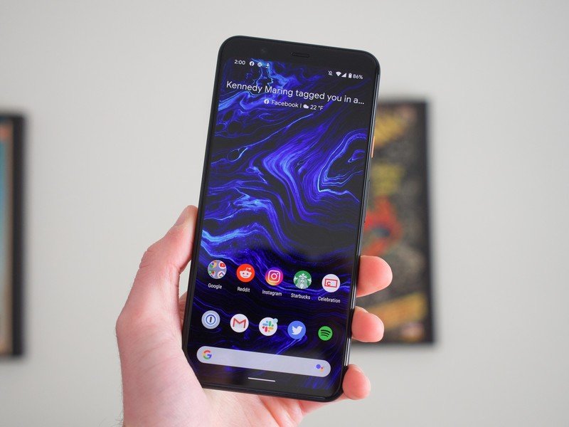
At its core, Lawnchair 2 is virtually indistinguishable from the Pixel Launcher. It's every bit as fast and snappy, the At a Glance widget works as you'd expect, and you can easily add the Google Feed as your left-most page.
Source: Joe Maring / Android Central
The aesthetics of everything are also on-point. The app drawer animation looks just like it does on the Pixel Launcher, the Google Search bar seamlessly moves up to the top of your screen as you swipe up to see all of your apps, and there isn't any extra fluff on the home screen to remind you you're using a third-party app. It's a small thing, but as someone that loves that Pixel experience, the care that went into crafting this side of Lawnchair 2 is greatly appreciated.
Lawnchair's commitment to mimicking the Pixel experience is unmatched.
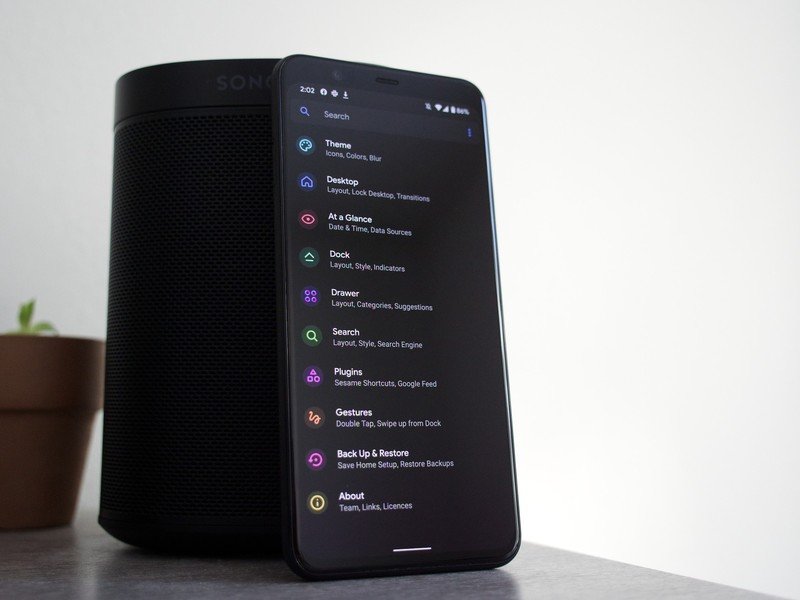
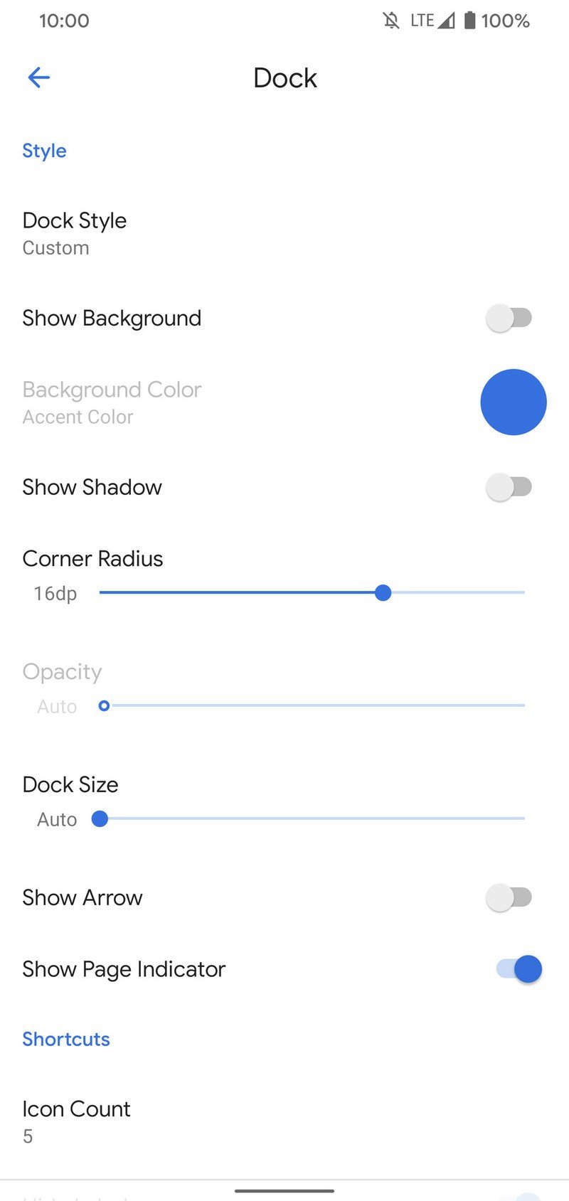
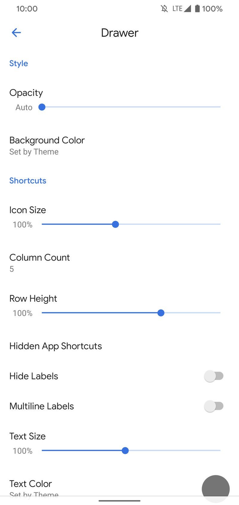
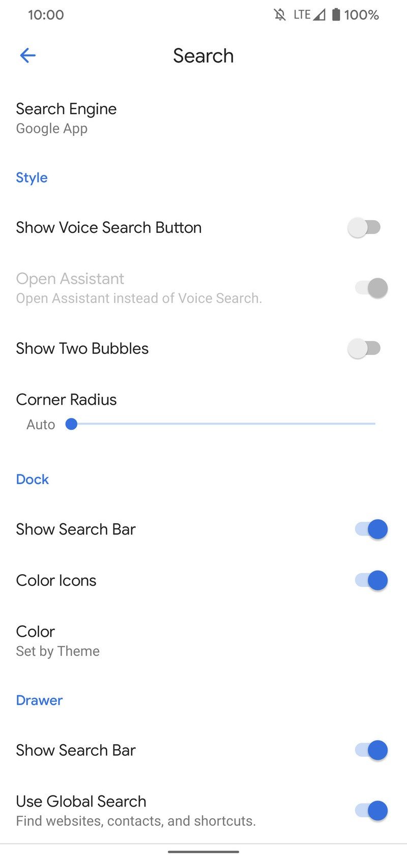
You could just download Lawnchair 2, not mess with anything, and be happy with a stock Pixel setup, but a quick look at the launcher's settings quickly reveals that you have a lot at your disposal.
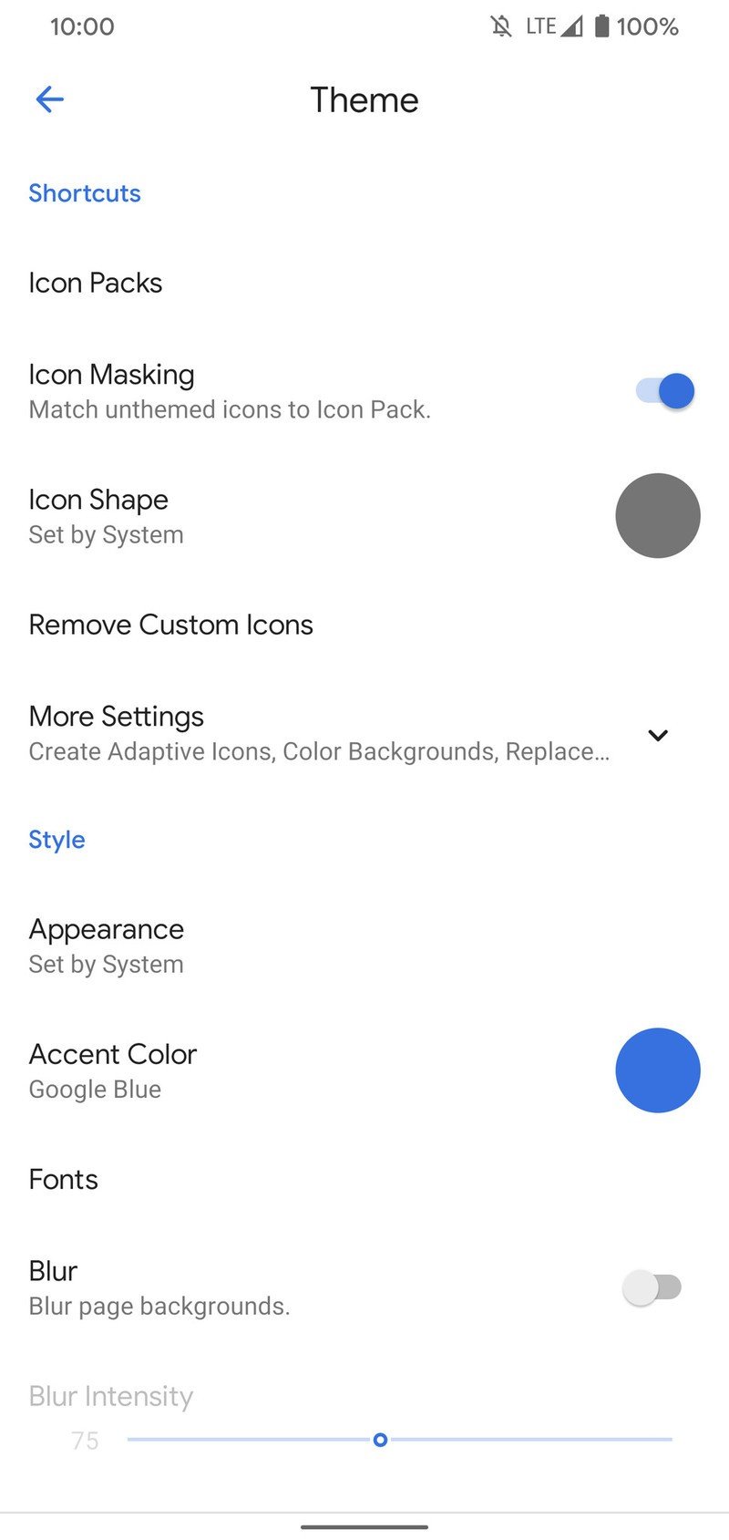
In regards to theming, you can apply custom icon packs, change the shape of app icons to pre-made options or create your own custom one, choose your desired accent color, font, and whether you want a dark or light theme. I like that Lawnchair 2 automatically creates adaptive icons for you right out of the gate, giving all of your apps a streamlined look with no extra work required on your end.

Source: Joe Maring / Android Central
Source: Joe Maring / Android Central
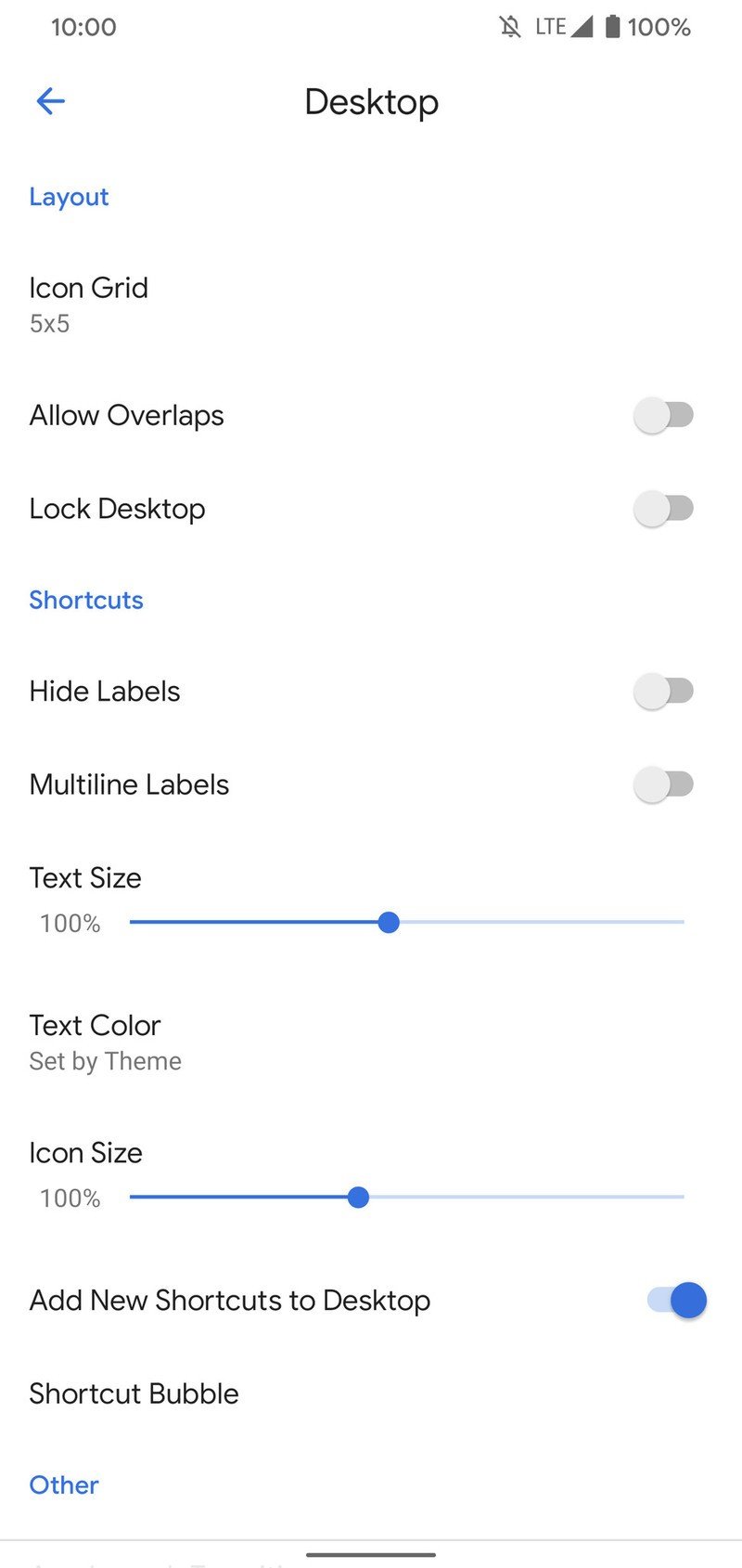
There are a host of other customization tweaks to mess around with, with some of the highlights being:
- Desktop icon grid
- App launch animations
- Notification count by app icons
- Dock background
- Dock size
- Dock app count
- App drawer background color
- App drawer icon size
- App drawer categories
- Search bar style
I like to keep my home screen simple, mostly just customizing app icons, accent colors, and the app drawer, but there's plenty to sink your teeth into if you really want to fine-tune everything about your setup.
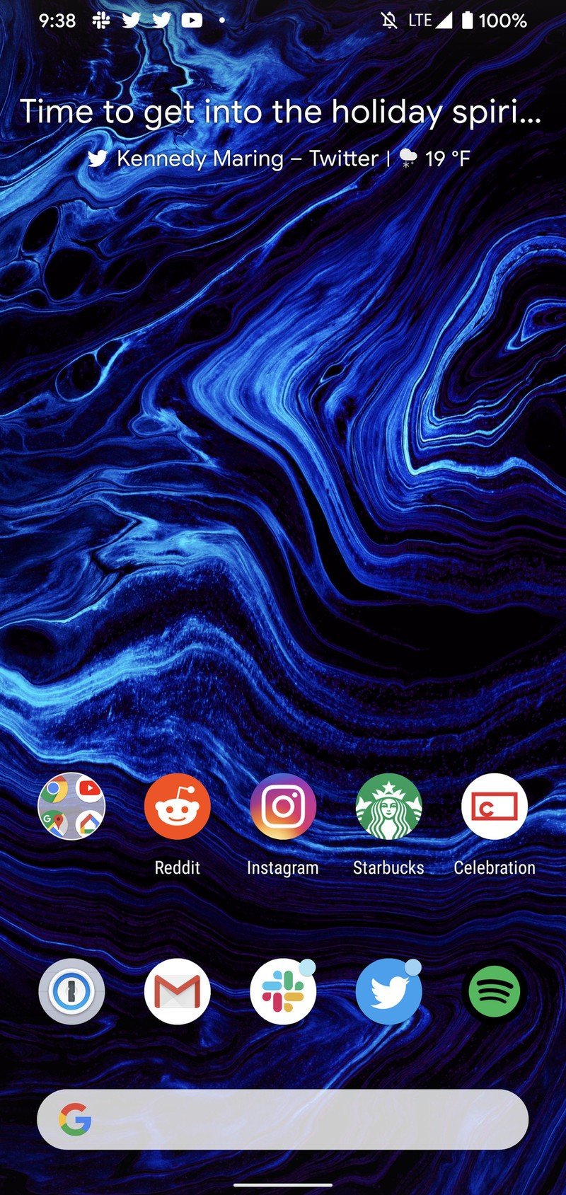
One of my favorite settings in Lawnchair 2 is for the At a Glance widget. It's essentially the same one found in the Pixel Launcher, but souped-up like never before. You can have it show the time, change the temperature unit, and choose which weather app it pulls from. The information it shows is also expanded beyond the normal At a Glance widget, with Lawnchair's able to display notifications, your battery status, a little greeting telling you to have a good day, and more.
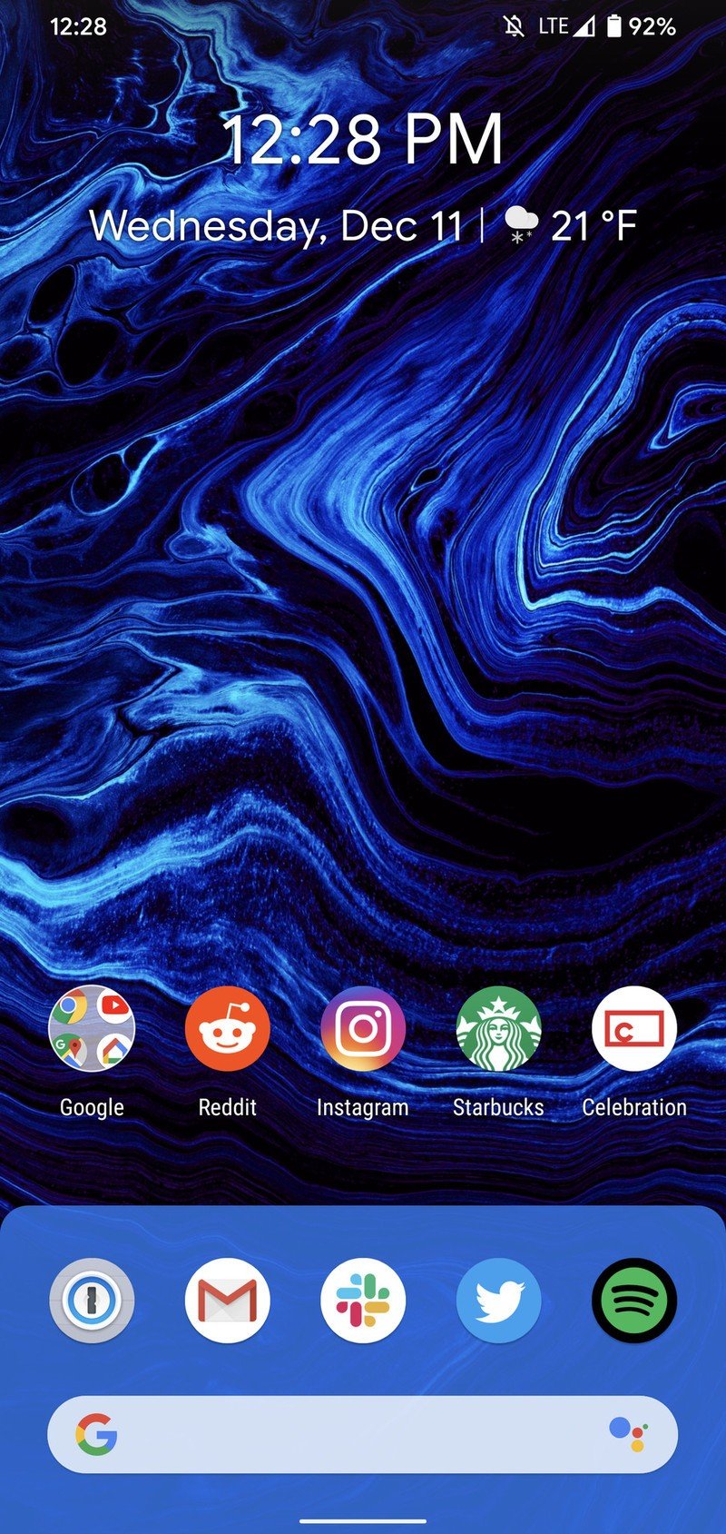
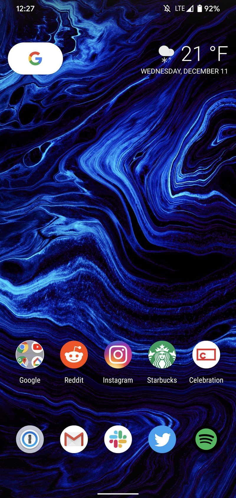
Source: Joe Maring / Android Central
Something else I love about Lawnchair 2 is its Google Feed plugin. After downloading the free Lawnfeed app via the launcher's settings, you get the Google Feed added to your left-most home screen. It works just like it does in the Pixel Launcher, showing you a feed of recommended articles Google thinks you're interested in.
Tying all of this together is the cherry on top — pricing. Lawnchair 2 is completely free to use with no paid upgrades of any kind. I'd happily pay a few dollars to support further development of the launcher, but I'm also not going to argue with something this great being offered at no cost.
Lawnchair 2 Why you may not like it
As smitten as I've been with Lawnchair 2, I do think some folks will complain about how simple it is compared to other launchers that are out there.
This isn't a complete home screen redesign the way Evie Launcher or Smart Launcher 5 are, and you don't get unique tools like the Quickbar and Shutters found in Action Launcher.
The best Android launchers you can download
I can understand those complaints, but I don't want that to take too much away from Lawnchair 2. If you want something to really give your phone a completely new look and feel, there are other launchers that do just that. Lawnchair 2 was designed to be as faithful to the Pixel Launcher as possible while adding tools to customize your experience with it, and in those regards, it soars.
Lawnchair 2 Download it right now
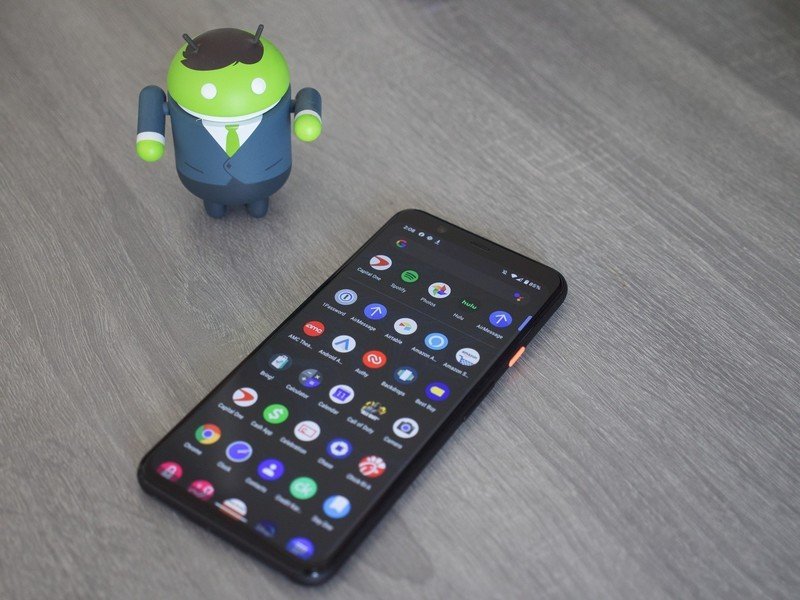
As you can see by this point in the review, I'm a big fan of Lawnchair 2. I've been using it for a while when it was in an Alpha state, and now running it as a finished product, I'm overwhelmingly pleased with everything it brings to the table.
For someone like me that appreciates a simple Android setup while still having access to customization tools, Lawnchair 2 is sort of perfect. It mimicks the Pixel Launcher feel better than any other launcher I've ever used, and when you add that polish together with the wealth of customization options that are available, it results in something pretty special.
5 out of 5
This is a premium Android launcher as far as I'm concerned, so the fact that Lawnchair 2 is free to download makes it that much better. You don't have anything to lose by checking it out, so you might as well go ahead and download it. If Lawnchair 2 ends up not being for you, you aren't out anything — though I think you'll end up falling in love with it the same way I have.
Smooth, customizable, and 100% free
If you love the look and feel of Google's Pixel Launcher but wish it was fully customizable, that's exactly what you get with Lawnchair 2. It's impressive how much this looks and feels like the real deal, and when you add that attention-to-detail together with virtually endless ways to customize your experience, you end up with one of the best launchers the Play Store has to offer. Oh, and it's completely free.
Joe Maring was a Senior Editor for Android Central between 2017 and 2021. You can reach him on Twitter at @JoeMaring1.
