Gboard just got a new look, and we aren't sure how to feel about it

What you need to know
- Google has recently been tinkering with the Gboard's design.
- The changes are now rolling out to all beta users.
- Both the default font and default theme are seeing subtle revisions.
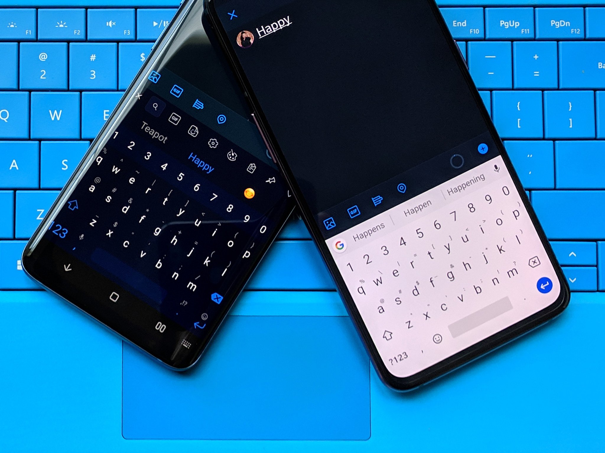
Beautifying Gboard is a top priority at Google, it seems. Just a few months after it improved light and dark theme switching, the company is now in the motions for making a couple more changes to the Android keyboard's design. Though subtle, they should make the Google ecosystem just that bit more cohesive.
The first of these changes is a new font, though you may not notice the change unless you're a typography expert. Thankfully, the folks at 9to5Google were kind enough to spot the difference for us. The font also more closely matches the Google Sans typography you'll find on Pixels phones, so it's definitely a nice touch.
The second is a change to the default black and white themes. Again, the changes are quite subtle, but you can always rely on the eagle-eyed hawks of Reddit to catch even the slightest of changes. The dark theme's top bar has been slightly recolored, while the white theme offers a better contrast between the keys and the keyboard background.
The changes are now rolling out to all Gboard beta users after a couple of months' limited testing, so we should expect to see the changes becoming more widely available very soon.
While the changes aren't significant enough to get too excited about, we are sticklers for a consistent design language, so...nice going, Google. Now, if only it'd bring the fancy new Assistant-powered voice typing experience for Gboard to non-Pixel phones; that'd definitely get the ball rolling.
Be an expert in 5 minutes
Get the latest news from Android Central, your trusted companion in the world of Android

