Kyocera Milano review
I've got to hand it to any carrier (and manufacturer) for continuing to make and sell entry-level Android phones. Without them, a whole swath of people would miss out on the coolest mobile OS around and might not get the green fever everyone around here seems to have.
What we have in the Kyocera Milano is a tasty cookie just that: a pretty decent, entry-level Android for the (probably) first-time smartphone owner. If you're a power user and rooter extraordinaire, keep walking. If, however, you're looking to get your first shiny, new smartphone (or know someone who is), dive on deeper with me and we'll sort this whole thing out.
| It's small, brisk for it's size, and has a hard keyboard (great for messaging). It's also about as stock as you can get without going Nexus. | The small screen isn't as sharp as it should be and it's thicker than most über-phones out on the market today. |
| Row 1 - Cell 0 | |
| Sprint and Kyocera have definitely developed a phone for a particular audience, and for that audience, it definitely fits. For everyone else, keep moving right along. |
| Video walkthroughHardware reviewSoftware reviewCamera tests | Kyocera Milano specsKyocera Milano forums |
Initial video hands-on
YouTube link for mobile viewing
The hardware
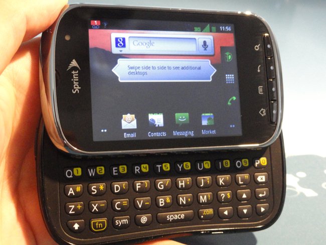
The Kyocera Milano is certainly unique. With a shape and thickness accurately resembling a bar of soap, you couldn't mistake it for anything else. The muted blacks that color it don't scream "look at me!" but the thick silver bezel certainly does.
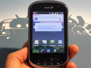
Seeing as how the Milano isn't the biggest or baddest phone around, it's no surprise that it's only packing a 3-inch screen. Those three inches get you a full 240 x 320 pixels, which basically is a resolution that probably shouldn't exist anymore.
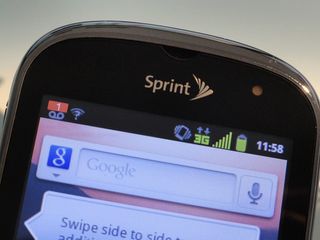
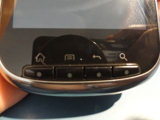
Colors are mostly muted compared to the bigger, costlier screens out there, and that makes sense. I see no good reason the screen isn't very sharp though, although maybe that's just the standard on QVGA screens. Everything looks as though a nearly transparent cloth has been perpetually draped over the screen, adding fuzz and keeping things from being truly in focus.
The pixel density is only 120 DPI, and that could be a factor, too.
Be an expert in 5 minutes
Get the latest news from Android Central, your trusted companion in the world of Android
The front of the phone (sans the screen, of course), is a pretty straightforward affair. Physical buttons down bottom and a light sensor up top. I know, physical is a strange departure from the otherwise capacitive-dominated handsets on the market, but they don't hamper the experience and it's actually nice to be able to feel a button once in a while.
There's no front-facing camera on this bad boy, but that's fine. We should've all been expecting that. That light-colored circle just to the right of the Sprint logo is a notification light, so at least there's that much.
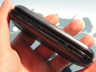
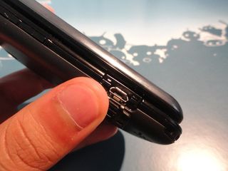
The rest of the Milano comes off like any other phone out there. The volume rocker is on the left bezel, with an indentation in the middle, so you know where up becomes down and down becomes up. Further down, on the same bezel, is the micro-USB charging port that is, unfortunately, covered by a little door.
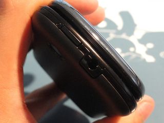
On the opposite bezel is a dedicated camera button, which is definitely a nice touch. After seeing a dedicated button on the EVO 3D and the Photon 4G, I'm beginning to hope this becomes a trend on phones.
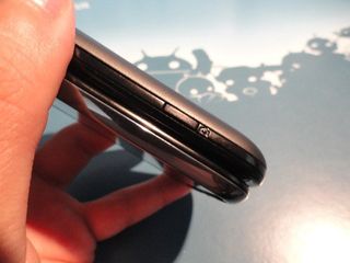
Up on the top bezel is the power button and 3.5mm headphone jack. All the buttons on the bezels are thin (which is strange considering how thick the phone is) but not really easy to miss, either.
The bottom bezel is rocking that little lip to pop off the battery cover, and that's it. The bottom-left corner of the phone has one of those little loops for a charm or wristband (think HTC Rhyme) so you can truly personalize your phone. I haven't seen one of these since I had my Samsung Moment, so maybe it's a slider thing.
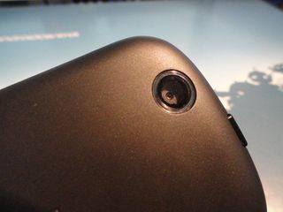
The back of the Milano sports a 3.2MP shooter without a flash, the Kyocera logo in the center of the battery cover, and the speaker. There's also two little bumps on the speaker side, maybe to act as feet for the device to keep the speaker from becoming totally muffled if its face-down on a surface.
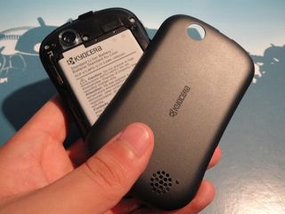
And that's it. Well, except for the hard keyboard.
The keyboard's sliding mechanism feels like it was built Ford Android tough. Sliding it open and closed yields a satisfying clicking sound when it locks into place, and when I tried pulling both halves apart, there was very little give.
The keyboard is a typical four-row keyboard (boo for no fifth row), so you've got loads of function keys to type out everything you need. The buttons are relatively flat, but curved in the middle, so there's still enough material to come up and meet your fingertips.
There's more satisfying clicks with each button press and the rebound is quick. My only complaint is the location of the space bar in relation to be the B button. When I first picked up the phone, I kept hitting B when I meant to be hitting space. I'm sure that's just a new user problem, but it bugged me enough I thought it was worth mentioning.
What's under the hood
The processor inside the Milano is clocked at a steady 800 MHz, but before you go lighting the torches and brandishing the pitchforks, remember that it's only got to fill up a 3-inch screen. If this was say, the Bionic, that'd be justified, but for the Milano, the processor suits it quite well.
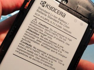
There's 512MB of RAM and 150MB dedicated to application storage. There's no additional internal storage, but Kyocera or Sprint were nice enough to toss in a 2GB microSD card so you can store more than what the phone gives you. The microSD slot also supports cards up to 32GB.
Hiding underneath the battery cover is a whopping 1490 mAh battery, which is huge for a phone so small. Yes, it's still got to power the hard keyboard (oh no, more battery drain!) but there's still a huge offset with a processor clocked at under 1 GHz and a screen that barely registers at 3 inches.
The battery life on the Milano is nothing short of excellent. I expected as much from a smaller, budget-line phone, and it delivers, without fail. Even if you're keeping the screen on often, playing tiny Angry Birds or checking your email inbox, the battery is disproportionally large to the phone, and that's a win for the user in the end.
You'll be able to get a whole day (at least) on this battery. That's really what you need to take away from this.
The software

Surprisingly enough, the Kyocera Milano ships with Android 2.3.4. Even more surprising, the Milano also ships with an unskinned version of Android. Straight out of the box, this thing is about as vanilla and stock as you can get. Yes, there's Sprint ID, but you're not obligated to use any of those services, and if you don't, you can just enjoy how good regular Gingerbread looks on a phone.
There's really no visual tweaks to speak of, not even when you open the app drawer. The app drawer simply fades in and the universal system color is a nice Android green, from your signal bars to your check boxes on a settings menu.
There's not even a lot of bloat on the phone, although that might just be due to the limited internal space to begin with. At any rate, on a fresh boot, outside of the small handful of Sprint apps (hotspot, ID, mobile wallet, battery use, or eco mode), there's nothing but the stock, baked-in Android apps waiting to be used.
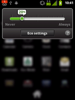
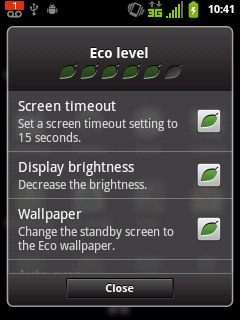
Speaking of Eco Mode, it's an interesting feature on the phone where you can set a minimum battery level, and when your battery reaches that level, certain things are disabled. By default it's set at 20 percent, and when you go into the settings, there's a list of options the app can disable, denoted by leaves. The maximum "eco level" is six leaves, while the worst is obviously zero.
The homescreens are set up just like the picture up there when you first turn on your phone, and as you can tell, it's pretty bare. This is stock Android on its finest, and it's a shame we have to see it on a budget phone, not on something more powerful and mainstream (Nexus phones notwithstanding).
Because there's no skins (and the screen is small), the phone is pretty snappy. Swiping between screens is actually faster than some Motorola phones I've used as of late, and opening menus or the app drawer happens just as quickly as you'd expect it to.
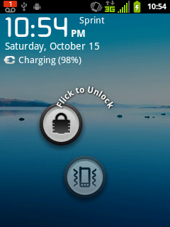
The Milano also has a pretty cool lockscreen, almost reminiscent of what we've seen from ICS. There's a circle for the lock and a circle for the sound, and you simply flick one of them away to use their function.
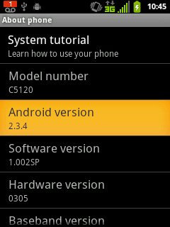
Software-side, the Milano gets it right. It comes with Android 2.3.4 (like it should) and doesn't have any skins dragging it down. The performance is better than I'd anticipated, and Kyocera/Sprint should be proud of what they've done with such an inexpensive phone.
The camera
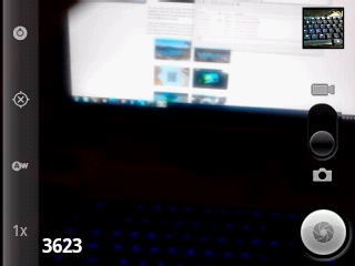
This is the stock Android camera app, no enhancements, no improvements. You've got the settings, flash, and zoom on the left and the virtual shutter button on the right. Fortunately, the dedicated camera button the bezel renders the virtual button useless. The camera takes shots at 3.2MP, but I'm less concerned with size as I am with quality.
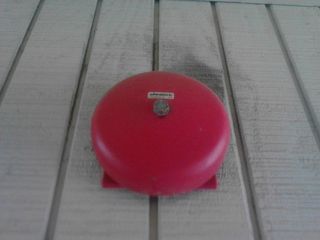
As you can see, the camera isn't horrid, but it's not great, either. Pictures look sort of dull in medium light situations, and if you get somewhere that's too bright, the whole picture gets washed out because of it.
Light reflecting off of things wreaks havoc on the rest of the picture, too, so don't expect the Milano's shooter to be preserving life's memories in great detail. It'll come through in a pinch, but not at night (remember, no flash!).




For video, the rear camera can do 480p. I'll let the video speak for itself.
YouTube link for mobile viewing
Other odds and ends
- The Milano comes loaded with two keyboards: The Android Gingerbread keyboard, and Swype.
- GPS, Bluetooth, and Wifi work like a charm. Google Navigation works well, too
- The speaker is unexpectedly loud for such a small phone. It's not booming, crazy loud, but it puts out some good sound.
- The battery cover feels nice, but despite its matte finish, still becomes fingerprint-laden in time.
The wrapup
If you're looking for an inexpensive Android phone on a budget, the Milano is pretty much the bee's knees. It's quick, built pretty well, and runs the latest version of Android. Sure, it's no superphone (what does that even mean, anyway?), but for the price it's packing, you shouldn't be expecting one.
If you're just looking to get your feet wet, look no further than the Milano. It'll be able to do most of what you need it to do, last all day long, and save your pocketbook all at the same time.

