Kyocera Echo review
Get the latest news from Android Central, your trusted companion in the world of Android
You are now subscribed
Your newsletter sign-up was successful
If there ever was a phone you shouldn't buy without doing your homework, the Kyocera Echo is it. It brings something new and different, but that doesn't always mean something new, different and good. There's a lot of general disdain out there for the poor Echo, and it's understandable, because without trying it out it's hard to visualize just how it will fit -- or not fit -- into your lifestyle.
The fine folks at Sprint sent us one to use and abuse, so I spent a week or so carrying it around to see exactly what I think of it. Now it's time to put those thoughts into words, in the hopes it helps you see if the Echo just may be the phone you're looking for. Move on past the break and have a read.
Kyocera Echo Specs | Kyocera Echo Forums
Article continues belowHands-on
YouTube link for mobile viewing
Yeah, it's different. You can't help but think it's different, because the Echo is pretty darn unique. It brings a portable tablet experience, or at least attempts to, and does some things really well. There's also a bit that I just wasn't feeling, and a week or so using it didn't change my mind. Let's jump in to it.
The Hardware
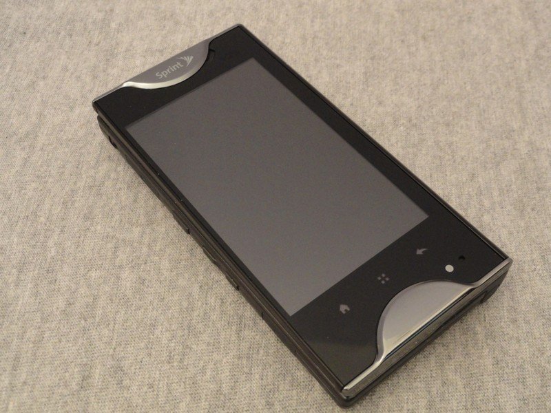
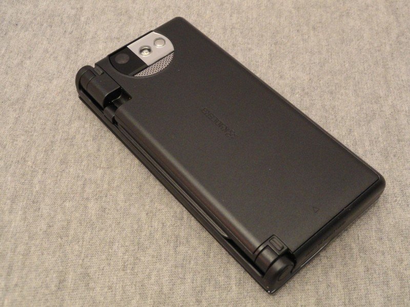
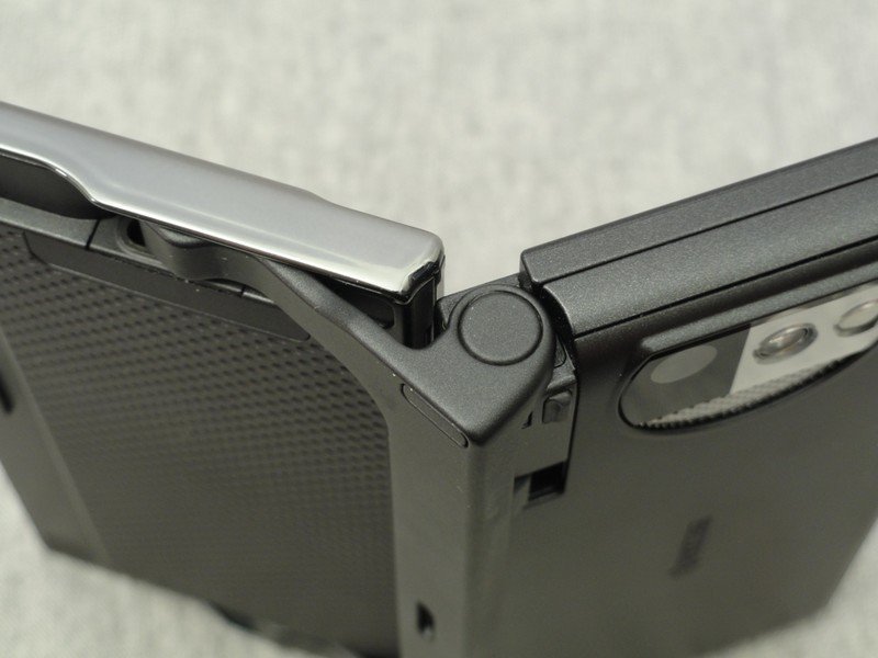
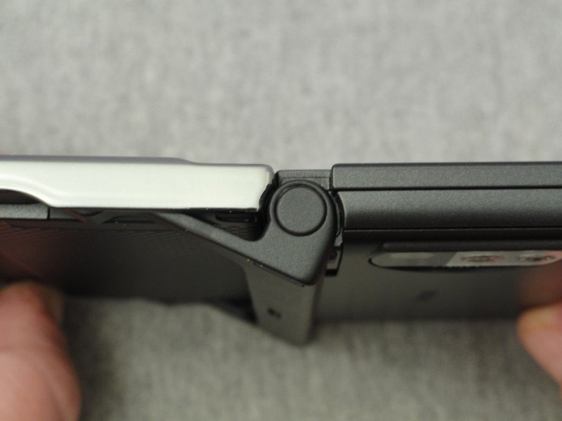
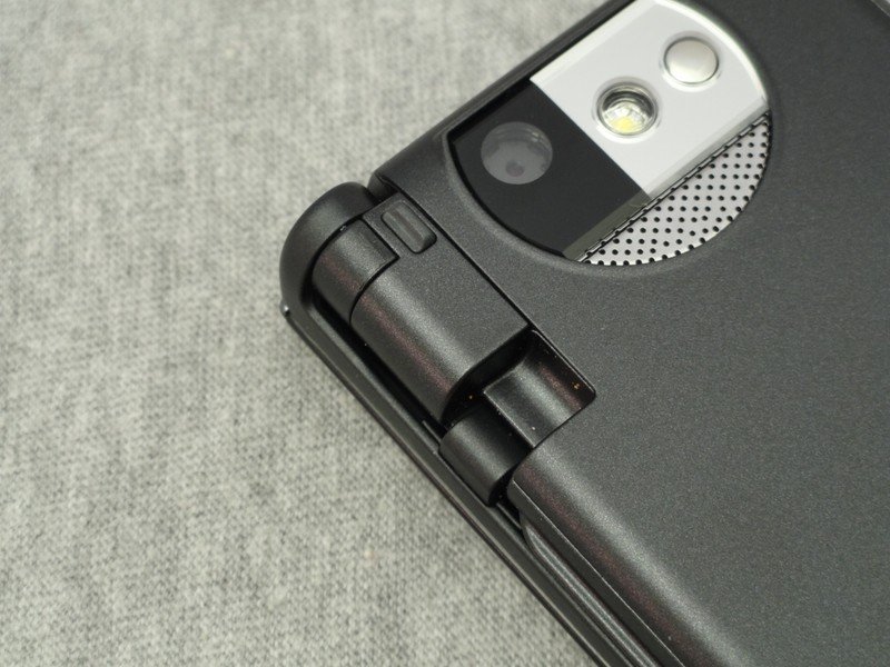
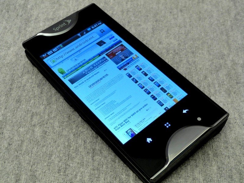
To put it simply, the Echo feels very solid. With all the moving parts I expected things to be a bit flimsy and janky, but they're not. The screens and hinge move pretty fluidly, seem built of quality materials, and stay in place well once you engage or disengage the folding mechanism. The phone body is plastic with chromed plastic accents (that actually look rather nice) and the hinge itself is made of metal. After a week in my pockets and banging around on my desk, the unit held up well, and the hinge and sliding/folding still works smooth and things snap together with a healthy click.
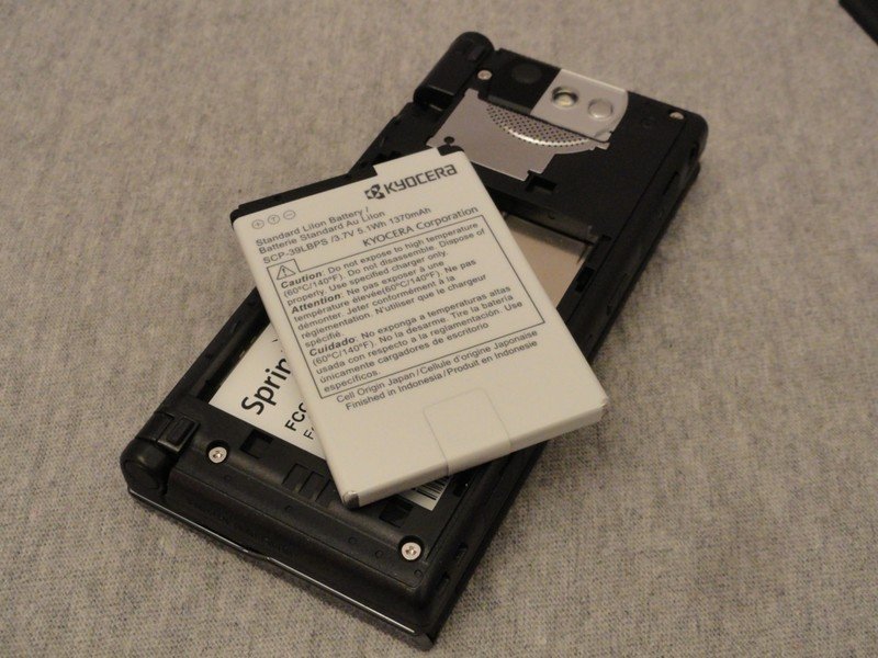
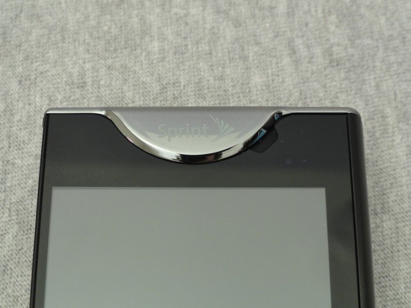
Just because it's made of plastic doesn't automatically mean it's going to feel plasticky. I'll admit, when I first saw the Echo I immediately imagined two Kyocera Zio's stuck together with some bailing twine or duct tape. That couldn't be further from the truth. In fact, while it's closed, the Echo feel like a chunky (17.2 mm thick) version of a quality smartphone. Even the silver plastic trim looks and feels good, lending the Echo a bit of a futuristic look, dare I say it, like something you'd see from the Droid line. The only thing that is reminiscent of the Zio is the flimsy battery door. And since you'll be opening that battery door more than usual, that may be an issue. We'll have to reserve judgement until reports of it breaking start rolling in, or don't start rolling in.
Get the latest news from Android Central, your trusted companion in the world of Android
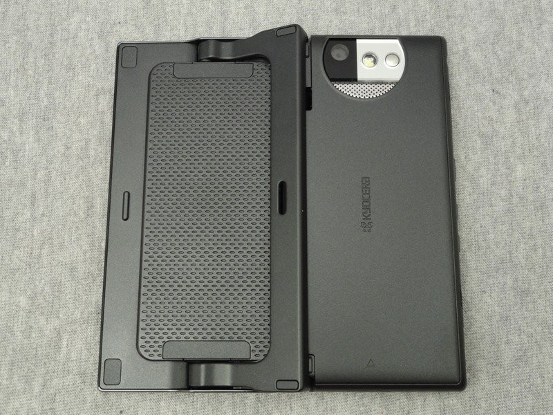
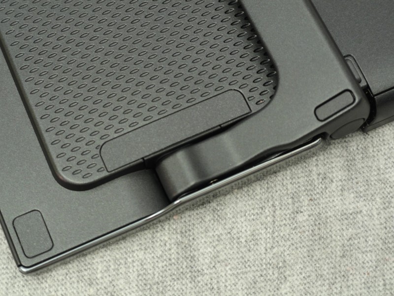
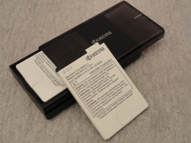
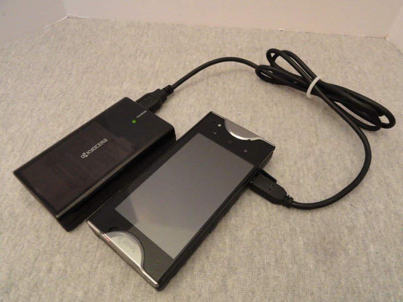
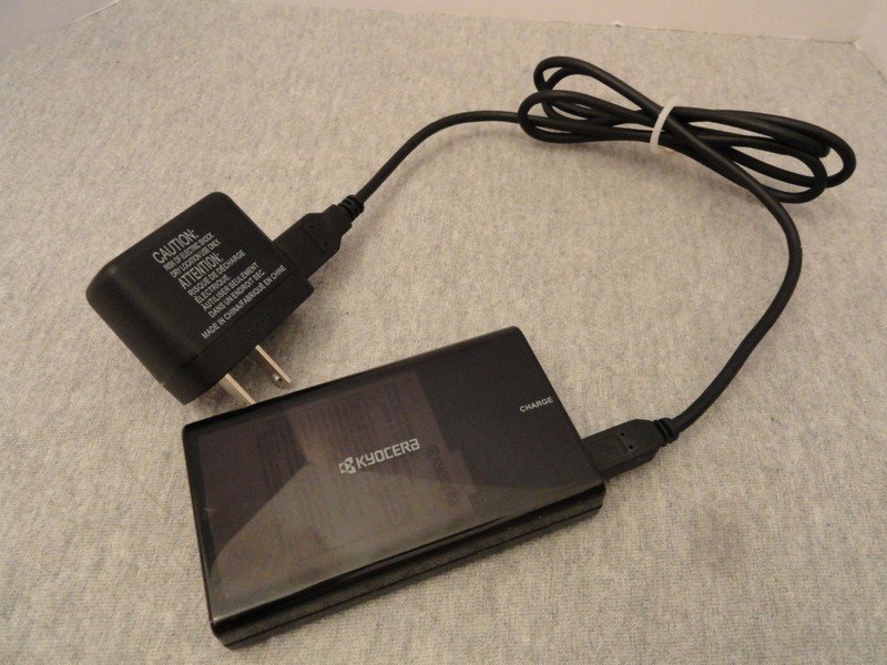
Speaking of batteries, the Echo comes with a spare, as well as a stand-alone charger that doubles as an external battery pack. That's not a good sign for battery life, but at least Sprint and Kyocera are up front about it.
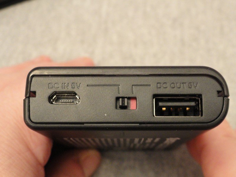
With the included USB to microUSB cable, you can charge the battery in the charger, or with a quick flip of a switch and moving the cable you can use it as a sort of emergency charger to power and charge the phone without turning it off. While it sounds awkward in theory, it works really well. It's a good thing it does, because the Echo likes the juice. We'll get into that in a bit. One tip here, make sure you have access to another charger and USB cable, because the included set is going to be busy charging the battery pack all the time.
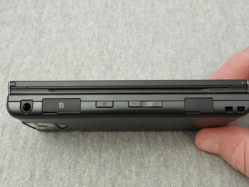
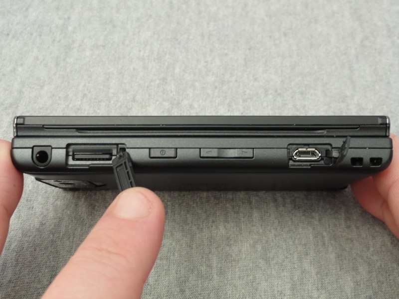
As for the rest of what's on the outside, the Echo is laid out nicely. The controls are all lined up on the left side of the phone (perfect for right-handers), and both the micro USB port and microSD card slot have rubber flaps to keep out the grime that comes from riding around in a pocket or purse. They're easy to get to whether the phone is folded or open, and the setup is absolutely perfect for those who use horizontal holsters. There's three (yes, three) capacitive buttons -- home, menu and back. Of course this takes some getting used to if you use the search button often. A couple other small gripes are the power button above the volume switch and the 3.5 mm headphone jack is a bit close to the bottom edge of the phone. You won't believe how hard it is to train your thumb to hit the bottom button to change the volume until you try it, and if you use headphones with an oversized or shielded plug the phone won't rest flat while they're inserted. Minor, but worth a mention.
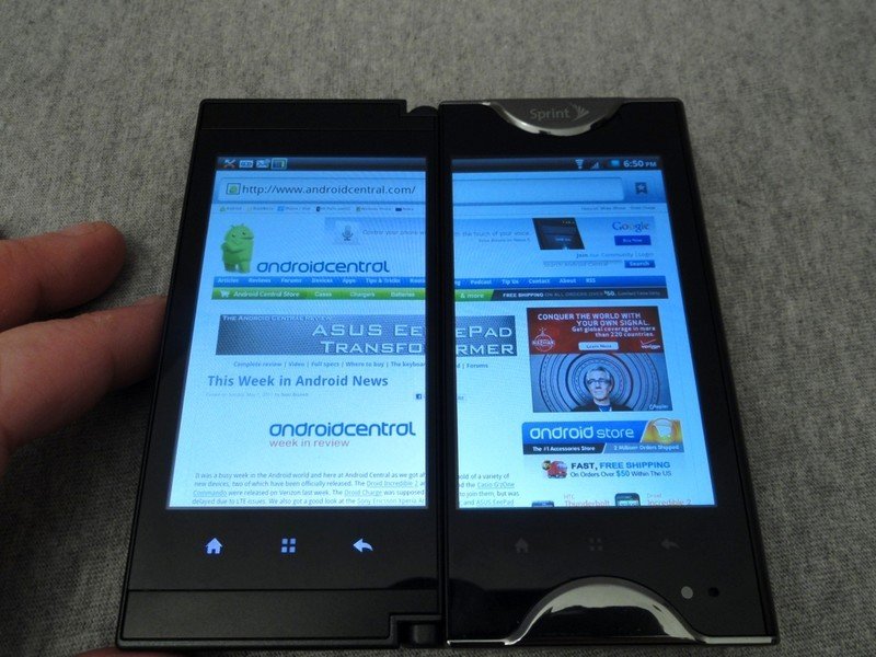
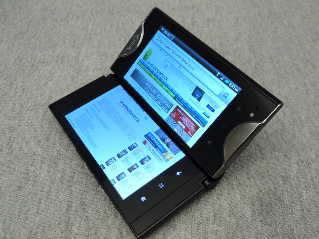
There are two very nice things about the Echo -- the software (yes, I'm serious) and the screen(s). We'll talk more about the software in a bit. The screens, both of them, are great -- both visually and in operation. They are bright and crisp, both indoors and out. The specs list them as normal LCD displays, but they have an excellent viewing angle can easily hold their own against any other phone available today -- even without fancy tags like "super" or "ips." At 3.5 inches with a standard resolution of 800x480 the pixel density is just fine (240 dpi), and you will be pleased with the way each screen looks. But looks aren't everything, so how the touch digitizer performs is important, too. The Echo is also top of the heap here. It's almost too sensitive, and until you learn to shut the screen off you'll do all sorts of crazy things when you flip the Echo open and your thumb or pinky brushes against something. But once you get that burned in the noggin, you'll enjoy a screen that responds to the lightest touch. This makes typing a breeze, and I'll come right out and say that it's one of the few times I didn't wish for a physical keyboard anytime I'm banging out an email or text. All this translates well when the Echo is flipped open, and you'll enjoy the same bright responsive 4.7-inch display as you will with the single 3.5-incher.
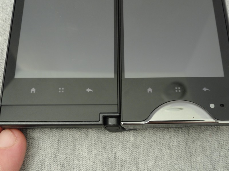
Except for the "big black line."
I tried to ignore it. I tried to work around it. I tried rotating the phone every-which way. I even tried beer -- but I can't get past the big black line between the screens. Maybe you can, I won't judge you, but it just ruins the "tablet" experience for me. It also breaks the nice smooth screen response, into two distinct panels. There wasn't a single instance when I had the Echo folded open that I didn't end up "simul-tasking" (more in the software section) or just closing it and using it like a normal single screen phone. I understand that there's no other way to do this, and the bezel is thin on both sides, but it's there, in your face, and you'll have to deal with it if you can.
The specs
- Dual 3.5-inch LCD WVGA (800 x 480 pixels) capacitive touchscreens (4.7 inches diagonally and 800 x 960 pixels when opened)
- Android 2.2 with Wifi hotspot capability
- 5MP camera with flash, autofocus and 2x digital zoom and 720p HD camcorder
- Stereo Bluetooth 2.1 + EDR
- Digital compass, accelerometer, proximity sensor, light sensor, GPS
- Expandable memory: 8GB microSD card included; supports cards up to 32GB
- 1GHz Snapdragon processor (QSD 8650 Android)
- Dimensions: 115.0 x 56.5 x 17.2mm, Weight: 193g (6.8 oz.)
- Removable 1370mAh battery; includes spare battery (1370 mAh) with portable charger that can also tether to the phone as an external power supply
- 1GB ROM/512MB RAM
A few notes:
- Our review unit didn't have the hotspot enabled, and a quick call to Sprint confirmed that the standard tethering fees will apply
- 530 MB of internal storage is available for applications
- At boot time, you have 387 MB free RAM
- Applications that provide information about the hardware do not detect a compass. The function is available for application use, however.
So, how does it all work?
We'll start with the good -- call quality is just fine, nothing spectacular, but nothing to complain about over the average cell phone. Bluetooth worked very well, with a nice range and clear, static free sound for both calls and other audio. Zero issues with Wifi, but not the extra range you have with the Bluetooth radio -- call it normal.
Now for the not-as-good -- If you've ever used a Sprint Blackberry Curve, you're probably familiar with the signal bar jump bug. The Echo has one of it's own. It's not signal attenuation, it's just, well, weird. The signal display out of the blue starts jumping from full bars to none, with no rhyme or reason. Not once did this actually affect calls, and I was never able to catch the actual dBm number in the settings bounce, so I'll call it a display bug and hope I'm right. It's just a bit concerning to see it and I hope whatever the issue is gets corrected in the future.
Now for the bad.
Two screens mean twice the power draw. There's no way to get around that, and to their credit, Sprint and Kyocera don't even try to -- instead they include a spare battery and a nifty power pack thingy. The deal maker or breaker is going to be your willingness to keep a battery plugged into the wall all day, or just not use the phone in dual-screen mode. I use the heck out of a phone, because I use it as a notifier for messaging even while sitting at a computer. That means I have everything syncing at very short intervals, and if I spend anytime playing games or using the Echo like the mini-tablet it wants to be, I have to switch batteries twice a day. I understand not everyone keeps things connected as often, so your mileage may be different, but for me it just doesn't work without a bit of micro management. That being said, if it weren't for the big black line I'd shrug this off in a New York minute and buy another battery and charger. The Echo is fun to use.
Benchmarks
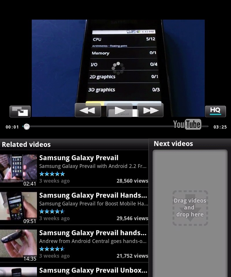
YouTube link for mobile viewing
If you're expecting a 3D gaming powerhouse, you'll be disappointed. The Echo still uses the first generation Snapdragon, and while the CPU itself is up to snuff (running Android 2.2 Linpack scores are about the same as the G2X or the Atrix), the graphics performance suffers. For everything else, it does just fine though. Something to keep in mind, depending on what you're looking for in a phone. And ignore my concern about cut-off pixels in the video. Sure enough, that's an issue with Quadrant and not the Echo as pointed out by several of you guys on Youtube -- thanks for that.
The Software
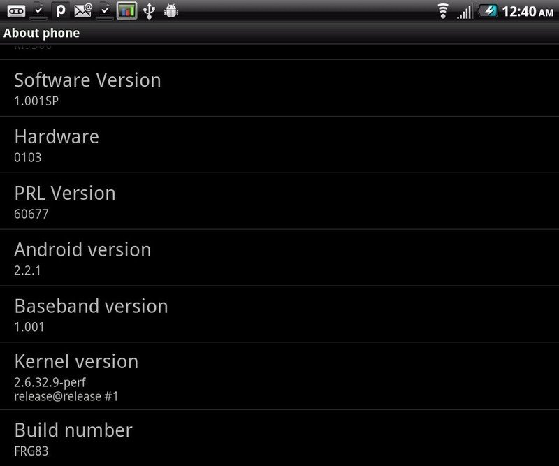
The Echo runs Android 2.2.1, and for the sake of argument we'll call it stock Froyo. We'll get into "tablet mode" and simul-tasking in a bit, but the OS is unskinned vanilla except for the cyanogen highlights. Fans maybe? The OS is responsive, scrolling is smooth, and I found a grand total of zero showstopping bugs. Yeah, zero. Nice work, Kyocera. Of course Froyo has been out a while, so they've had plenty of time and things should run smoothly. On that note, there may be a small wait for any OS updates, but a contact at Sprint assures us that a Gingerbread update is in the plans. More important, a bump to at least Android 2.2.2 needs to come ASAP, if only for the critical security fixes. Shipping a new phone with a known security issue is almost unforgivable, especially since the code has been out for damn near a year.
Tablet Mode
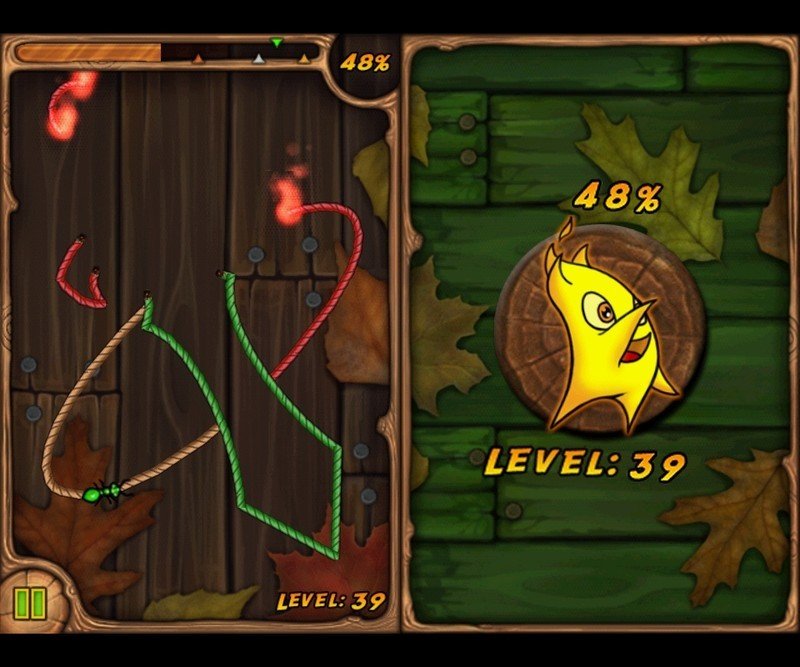
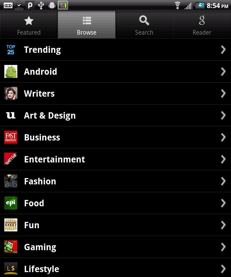
Kyocera has also made quite the push for development, publishing a dedicated Echo SDK and providing a full website dedicated to Echo application and software development. You'll find a shortcut to a page full of apps that take advantage of the dual screen setup, including some names you'll recognize, like Pulse and several Gameloft games.
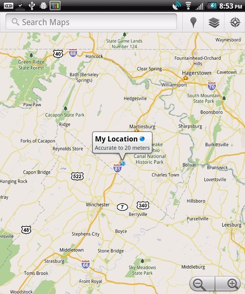
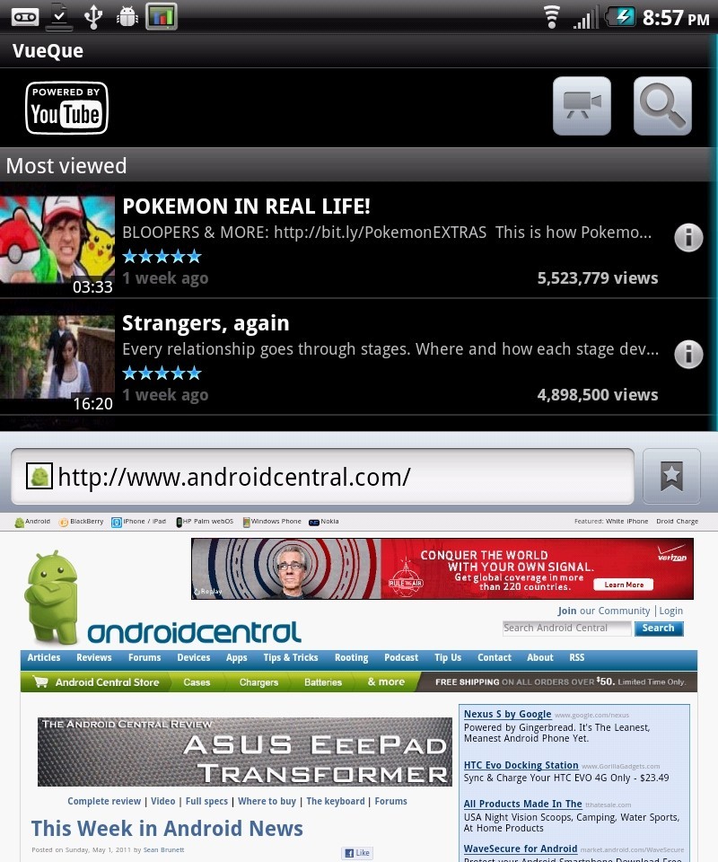
These apps take full advantage of the screen real estate, either by expanding and resizing, or by using each screen for a set purpose, treating each panel as a separate, but connected, display. As you can see, both landscape and portrait are supported. It works very well. Yes, you read right -- while not many apps are set to take advantage, the ones that have are actually made better by doing so. This goes for third-party apps, as well as the smattering of apps included by Sprint. Most just rescale and resize controls and content (though they do it nicely), but a few are real standouts, for example the Vuecue application for YouTube.
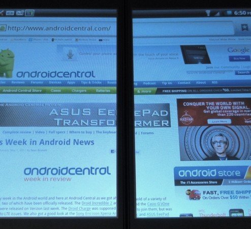
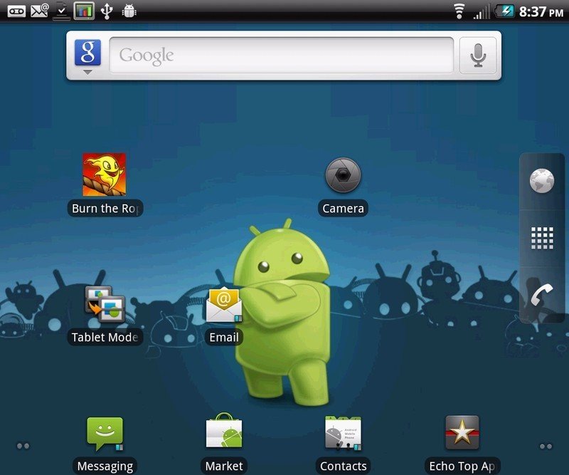
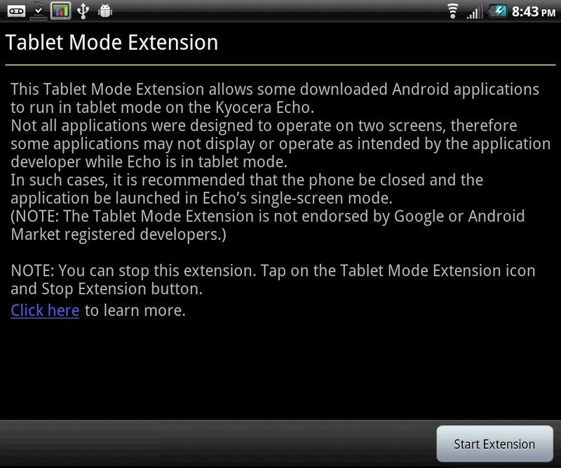
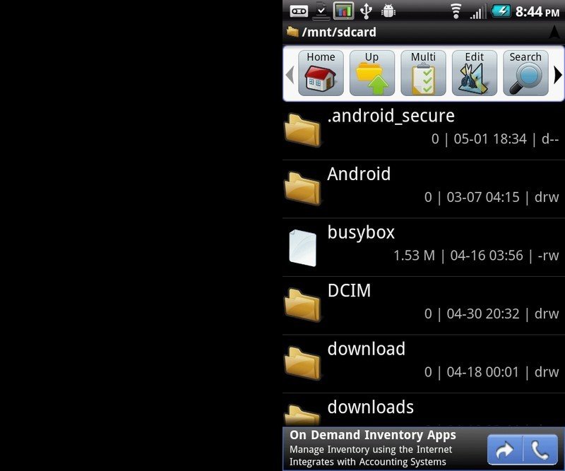
Yes, VueCue rocks. It's perfect for a tablet, but what about "normal" and not "certified dual-screen compatible" apps? Sprint gives us Tablet Mode to take care of that. Tablet Mode uses some sort of black magic to resize most apps (To quantify -- every app I tried worked. YMMV) so they spit across both screens. And again -- it works well. Starting to see a surprising trend here, one that makes us happy. Tablet Mode is an app you run once in the background, and forget all about it. It's unobtrusive, and I didn't see any indication that it was using too many resources. See the difference for yourself:
Notice the toolbar. Notice the size of the text and icons. This isn't just pixel doubling, it's an app that adheres to Android standards, being told it's running on a 800x960 display. That's why all the screenshots come out so seamless -- the OS uses both panels as one. It's very cool to see this on a smartphone, and there's no time spent editing config files or math involved. Just tap the button. It's a simple solution, and Android could use more simple solutions.
Simul-tasking
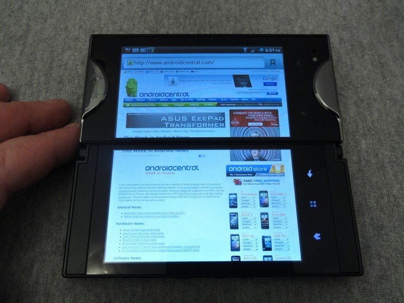
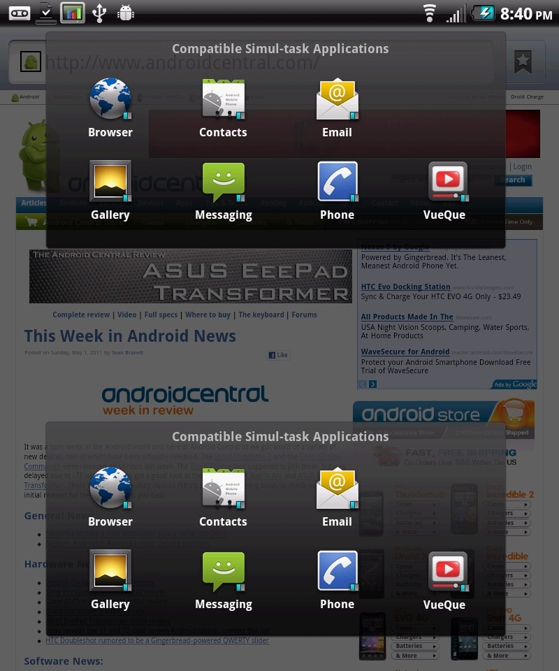
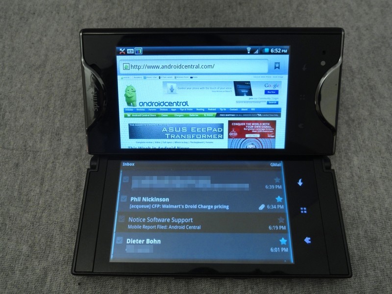
We saw a bit of this in the hands-on video. Sprint has included seven applications that can be run independently in a single screen, one in each. The seven are:
- Browser
- Contacts
- Email (not Gmail)
- Gallery
- Messaging
- Phone
- VueCue
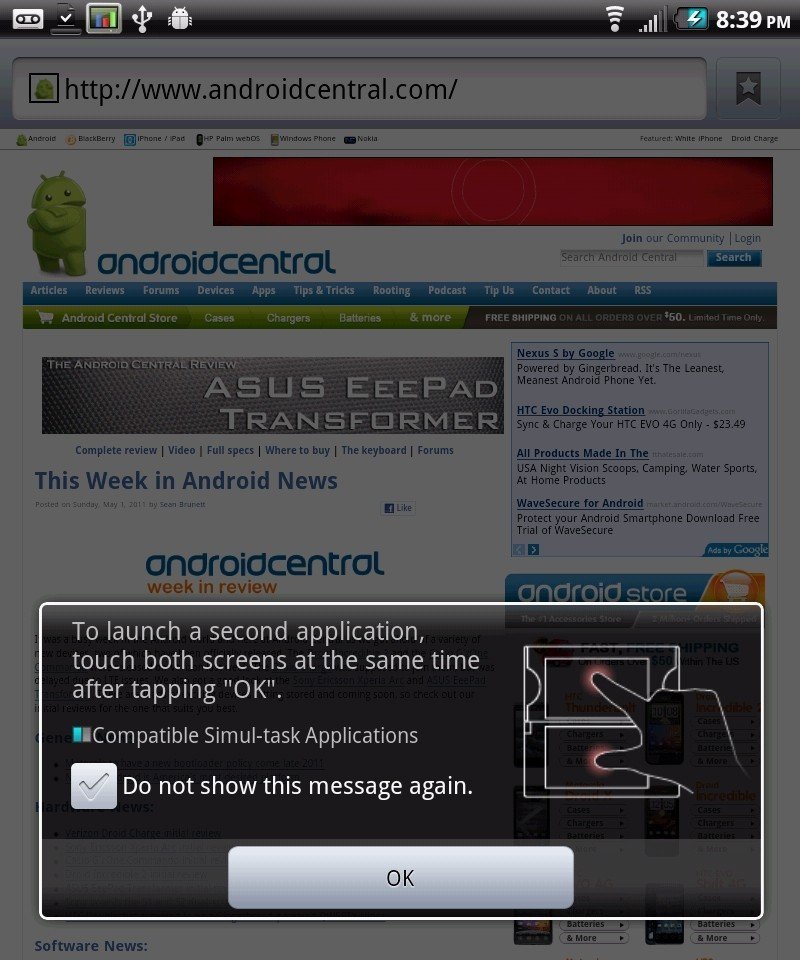
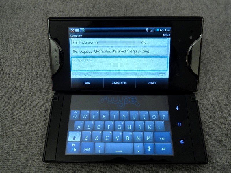
All very often used, and staple applications. Like Tablet Mode, there's no set-up. When you open the hinge and enter dual-screen mode you'll see a dialog that explains how it works, and a couple quick taps will have you Simul-tasking.
A couple shots of it in action, showing both the content as well as some user interaction in the Mail app. The way it pulls the app to the top pane and loads the keyboard in the bottom is pure genius. Tiny laptop FTW.
The Camera
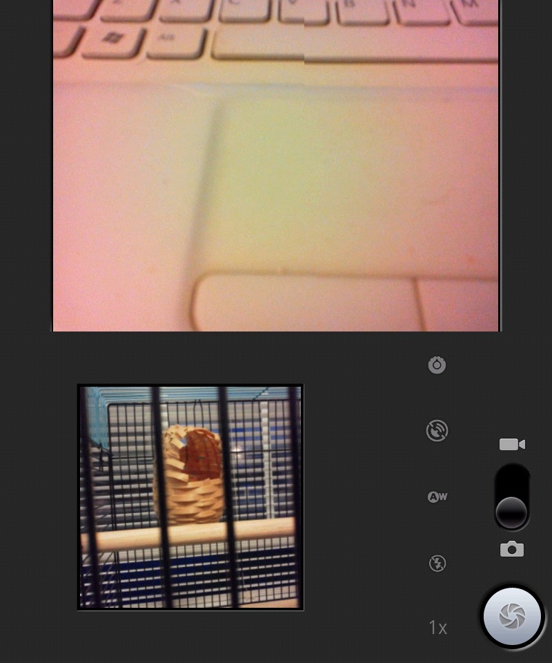
As is usual for a cellphone, the camera looks better on the spec-sheet than it does in real life use. It's easy enough to operate, it is the stock Android camera app after all, and it also works well with Tablet Mode if you wanna look like a goof while you take pictures. Yes, some of us do :) Here's a few examples.
Hacking
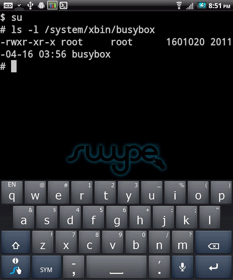
The Echo is easily rooted, and there are no silly hardware locks of any kind in place. I would go as far as call it hacker friendly, but the simple fact is that there will be little of that sort of development for this one. That's a shame, but understandable when you look at the specs and the possibly difficult task of working with the dual-screen setup.
If you like to tinker and do it yourself, there's no issue -- just a quick couple commands and dive right into an unlocked system. But if you are more interested in the result, and would rather let others enjoy the fun of doing it, look elsewhere. Hopefully someone out there proves me wrong.
The wrap up
I had a lot of fun playing with and reviewing the Echo. I'm a sucker for things that bring something new, and I got my fill with this one. I can deal with active battery management, and I can deal with the little things. I just can't deal with the big black bar. You can't help but want to use the Echo as a tablet, and it does a great job at it, but I think I've had my fill of bezels. That's what you'll need to ask yourself, provided the little things don't turn you off, will the bar down the middle of the screen ruin the experience for you? I suggest you walk into a Sprint store and put the Echo in your hands and see for yourself. If you can get past that, and understand the battery situation, you'll probably find the Echo to be a very nice phone. Err, tablet. Err, phone.

Jerry is an amateur woodworker and struggling shade tree mechanic. There's nothing he can't take apart, but many things he can't reassemble. You'll find him writing and speaking his loud opinion on Android Central and occasionally on Threads.
