Kobo Arc 10 HD review
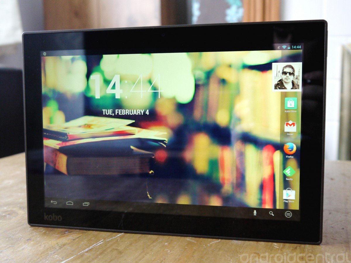
A decent 10-inch tablet that, sadly, few will purchase
When Kobo launched its first dedicated Android tablet back in late 2012, I have to admit to being taken by surprise. The e-reading specialists first foray beyond dedicated readers was the Vox, and it ran Android. But as a tablet it was a distinctly sub-par experience. Even Google Play access couldn't save the Vox. But, when it came back with the Arc, Kobo had something much, much different. It had all the reading stuff, but was a perfectly capable Android tablet as well.
Fast forward 12 months, and Kobo again caught us off guard a little by announcing a step up to a 10-inch Android tablet. Sitting atop the lineup, the Arc 10 HD is still positioned as a premium reading device, but it still brings more than enough to the table to make us take notice of it. So, will it impress as much as its smaller predecessor did?
Inside: Hardware | Software | Camera | Battery life | Bottom line
The video walkthrough
The Hardware
The first Arc tablet from Kobo packed hardware that in some areas rivaled or even bettered Google's own Nexus 7. Kobo has shown once more that it can run with the best by filling the Arc 10 with high-end specs and producing a tablet with a premium looking design and quality finish. Gone are the raised bezels of old, with the Arc 10 having edge to edge glass. Round the back Kobo has carried across some of the design language found on its Aura HD e-reader; a series of angles that should make it more pleasant to hold for long periods of time while reading.
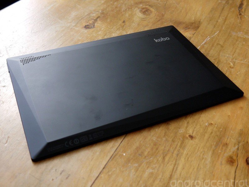
To some extents it works. Holding the Arc 10 is definitely more comfortable than holding something this size which is just flat. The added bonus of a soft touch finish just enhances this, but two handed use is still the way to handle the Arc 10. It's heavier than the competition – about 27 grams heavier than the Galaxy Note 10.1 – and holding it in one hand for an extended amount of time will still leave you with at least a mild wrist ache. It's a bit of a chunk.
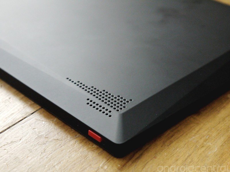
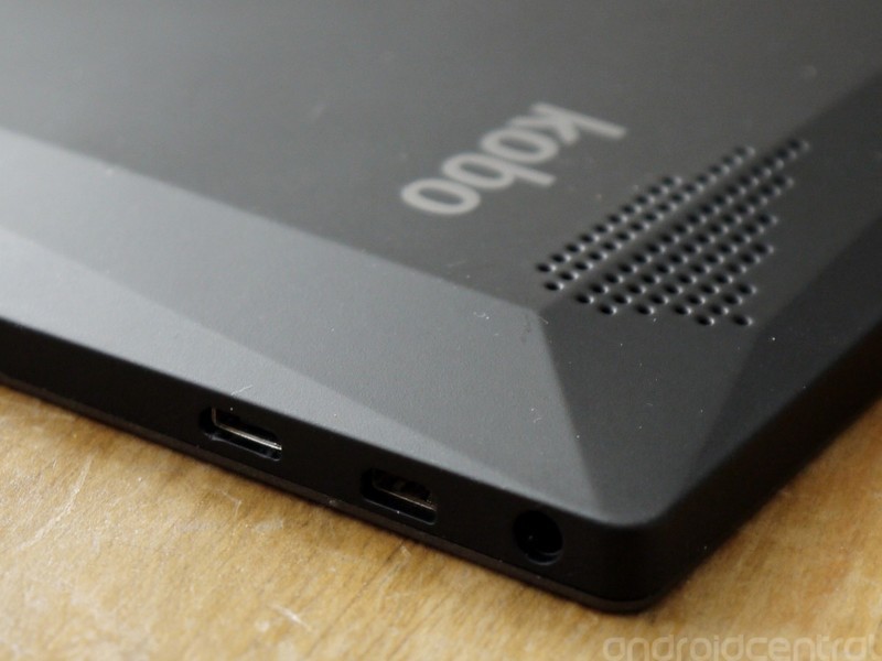
Despite the angled nature of the back, the Arc 10 is still plenty slim enough for a 10-inch tablet. Taking a look around the rest of the exterior, we find the usual suspects; volume rocker on the right side, HDMI out and charging port on the left side and power switch on the top. And switch it is, with Kobo opting to use a slider to turn the power on and off instead of a push button. The only inconvenience this presents really is when taking a screenshot. The power and volume down combination as standard in Android remains, but it's far more awkward to execute on the Arc 10.
Be an expert in 5 minutes
Get the latest news from Android Central, your trusted companion in the world of Android
Camera-wise, we only have the one – we'll take a closer look later on – and it's on the front. A 1.3MP front facer is about par for the course, and will shoot video at 720p. No rear camera – which honestly, I don't miss on a tablet at all – but when you consider the reasonably high asking price, you'd almost expect one out of courtesy.
So, the outside is nice, but what about underneath? Well, for the Arc 10 Kobo has gone with a Tegra 4 CPU clocked at 1.8GHz paired up with 2GB of RAM. Onboard storage is a pretty disappointing 16GB – of which you get about 12.9GB to use – but there isn't a higher capacity model on offer or a microSD card slot either. 16GB is all you get, take it or leave it. Keeping everything powered up is a 6550mAh battery, and then we get to what you actually look at.
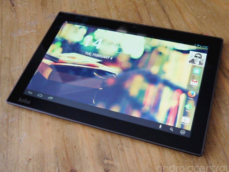
The display is where the Arc 10 really shines. At 2560x1600, Kobo has packed a delightfully high-resolution panel into the Arc 10, and it's generally a joy to feast your eyes upon. At 300ppi the Arc 10 is absolutely perfect for the reading that Kobo proposes you'll use it for. Text looks crisp and clear, and when you move from reading to watching videos its a similarly enjoyable experience. The color balance is a little off in places though, with some over saturation, but for most of the people, it'll be just fine. Well, actually, it's better than fine. It's pretty darn nice. It's a shame the glass that sits over it is such a reflective, finger print magnet, because that's the only thing that spoils the viewing experience.
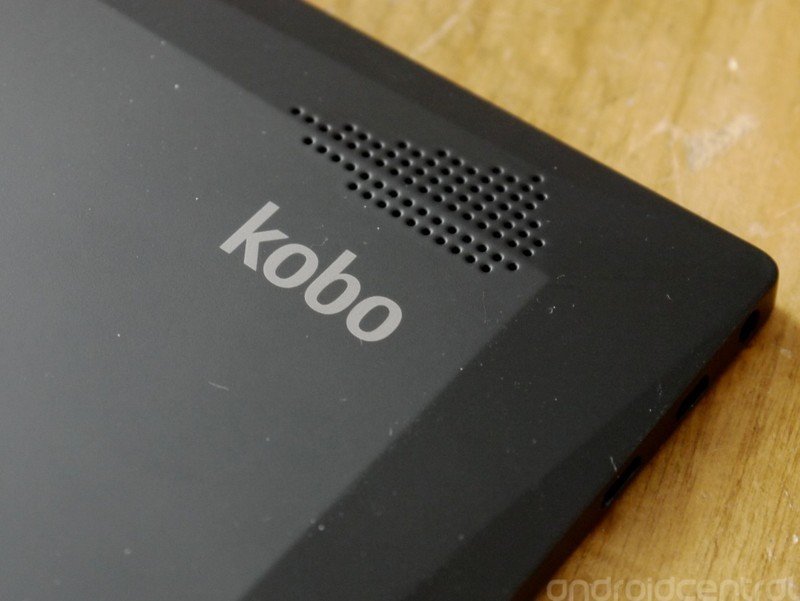
Audio isn't quite the same when it comes to quality. The twin rear speakers may offer stereo sound, but the first issue is that they're on the rear. Sure, designing a tablet to incorporate front facing speakers requires some concessions as with the original 7-inch Arc, but it's still something I'd like to have seen carried over. But beyond that, sound quality is average, and while it will suffice for occasional music or movie sessions, for prolonged use you're still going to want to plug in your headphones.
So all in all, the Kobo Arc 10 is a pretty decent piece of hardware. Nothing earth shattering, but it still looks and feels like a quality product.
The software
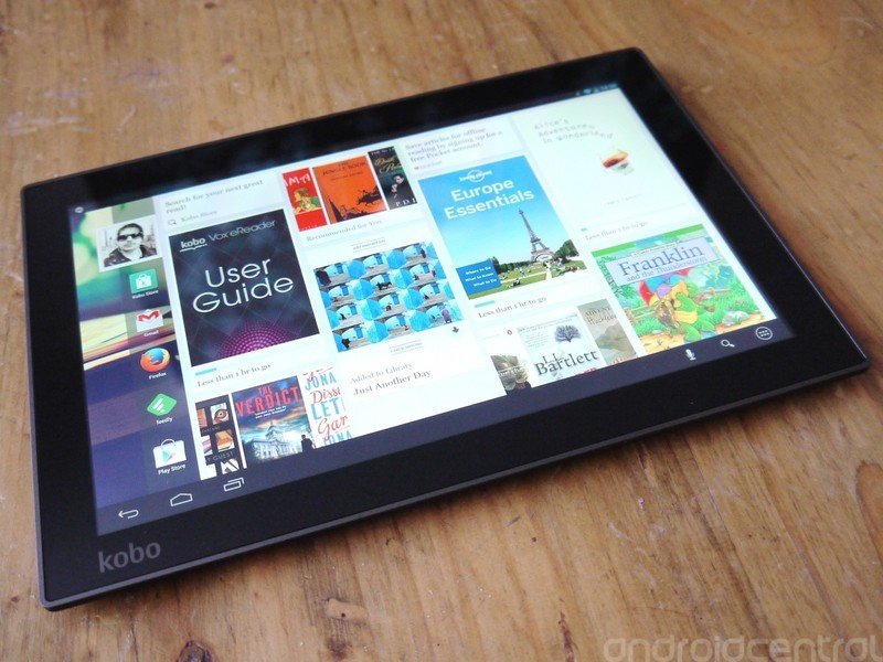
Kobo's first proper attempt at an Android tablet brought with it the Tapestries UI, and a content focused approach to managing your homescreens. The Arc 10 takes the concept and expands upon it under the new moniker of Reading Life, and it leaves a mixed taste in your mouth. On one side you're left looking at a pretty normal tablet, and on the other it's a case of content overload.
It's understandable that Kobo wants to put books front and center, after all; reading is its bread and butter, its main source of income. But where Tapestries managed content in a way that grouped content into folders, the first thing you see in Reading Life is a ton of books. The Kobo Homepage shows "your literary life," or in other words every single book you own, are currently reading, special offer notifications and suggested reads. With the white background it's pretty in your face, and honestly it feels more like a store front than a content library.


Scrolling further presents the Collections view, which also contains all of the books you own that were displayed on the Kobo Homepage. This doubling up is unnecessary, and adds further to the feeling that the previous view is designed more with a view to get you buying more books. And that's not a feeling I want every time I turn on my tablet. What Collections does do is closer mimic the previous Tapestries UI; it's essentially a group of content focused folders that you control.
Collections is more pleasing on the eye, than the Kobo Homepage. The black background with subtle color highlights is far easier to look at. But your non Kobo content is now further away from the main homescreen than anything else. And that doesn't feel right. Your own content shouldn't feel second best.
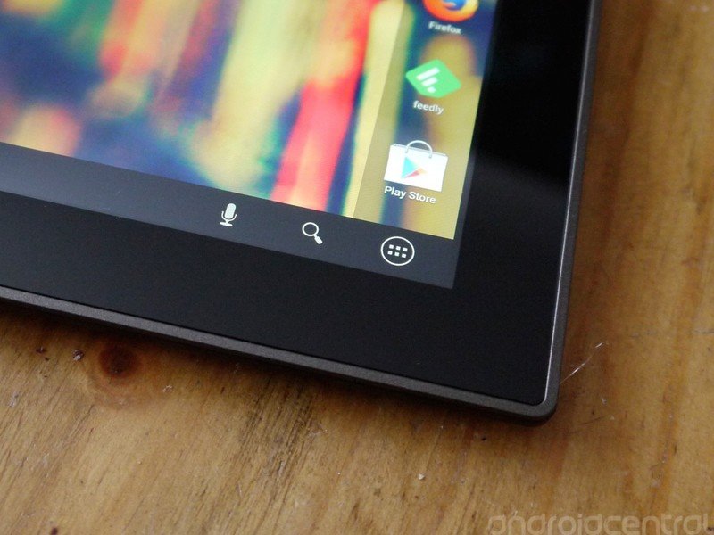
The good news is that like Tapestries before it, Reading Life is basically a launcher laid atop a pretty vanilla flavored Android experience. And as it happens, Kobo has made one tweak that is actually really good for a 10-inch tablet. Rather than going with the centered back, home and task switching buttons, they're back in the bottom left. In the bottom right we have the app drawer, search and voice search buttons. On a large tablet this is the way to do it, and I'd love to see more of it. On a 7-inch tablet reaching into the middle is easy, but on the 10-inchers it's just not so comfortable. Since you're holding it likely with two hands at the base anyway, why not put the main buttons within easy reach? Nice work, Kobo.
The Arc 10 comes with Android 4.2.2 out of the box. While not the latest version of Jelly Bean – and remember this was launched around the time of IFA 2013 in September – it'll do. At this point I'd be much happier to see Kobo focus on what comes after Jelly Bean, and skip 4.3 entirely. So there's not much that much to talk about underneath the custom Kobo stuff, but it is nice to see Miracast support onboard the Arc 10. Perhaps being forgotten about of late with Chromecast stealing the headlines, but we'd always take the option over not having it at all.
Kobo has included some pre-loaded apps with the Arc 10 as well, including Firefox. Add in Chrome and the standard Android browser, you're left with a confusing mess. Three browsers is too many. Oh, and two Play Store apps. Well technically only one Play Store and Kobo's own "Get Apps" which is nothing but a link to the Play Store. Unnecessary and confusing. Then of course, there's Kobo's content store, but that's to be expected.
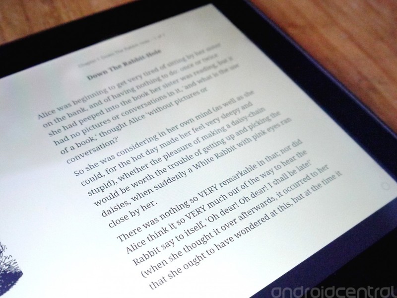
Specific to reading – a heavy focus of course – Kobo has included a Reading Mode. In the settings you can customize what it entails, but the simplest description is that it will turn off your WiFi and notifications, hunker down into power saving mode and give you as much time to dedicate to reading as possible. Pocket integration is also baked in to the Arc 10, and it's a nice touch that it integrates into your Collections for offline use.
Generally though, all positive on the software front. Kobo has always been good at leaving Google's work largely untouched, and that trend has happily continued here.
The camera - there's only one and it isn't that hot
With no rear camera, you're not going to be spending too much time focusing on photos with the Arc 10. Sure, there's a front facing camera for all the video calls and selfies you can handle, but it's actually pretty bad. Sound is even worse, so if you're needing to make an important call you'd be advised to use a headset. Comparing to the first 7-inch Kobo Arc, there's no improvement at all. In fact, I'd go so far as to say it's actually worse.
Video is about good enough for that impromptu hangout or Skype call, and that's about all that needs to be said. It's there, use it if you need to.
Battery life - Getting through a day but not many more

Kobo claims 9.5 hours of battery life from the Arc 10, but honestly if you're using it for much other than reading or some light web browsing you're not getting close to that. More concerning is the claimed up to 25 days of standby time, because that doesn't seem at all likely. During testing I've had to keep a pretty close eye on the battery, and sat on my desk overnight in standby can drain 10% of the battery with WiFi still connected. Cranking out a movie or a gaming session just seems to sap the power.
The bigger problem is that during testing I've not been left feeling like I could get two full days out of the Arc 10 if I were to be using it regularly. By regular we're talking web browsing, streaming music, checking mail, Google Hangouts, stuff which I do on a daily basis using other mobile devices. Without turning it off at night, it didn't leave me with much confidence to get through the following day as well without recharging it. There are onboard power saving options that can help you eek as much out of it as possible, but on the balance setting I've not been left overly impressed.
Of course, if you buy into the Kobo Arc primarily as an extravagant reading device, then you won't struggle nearly as much. But honestly, if reading is your thing there are much less expensive, and smaller devices that will serve you better. Kobo has plenty.
The bottom line
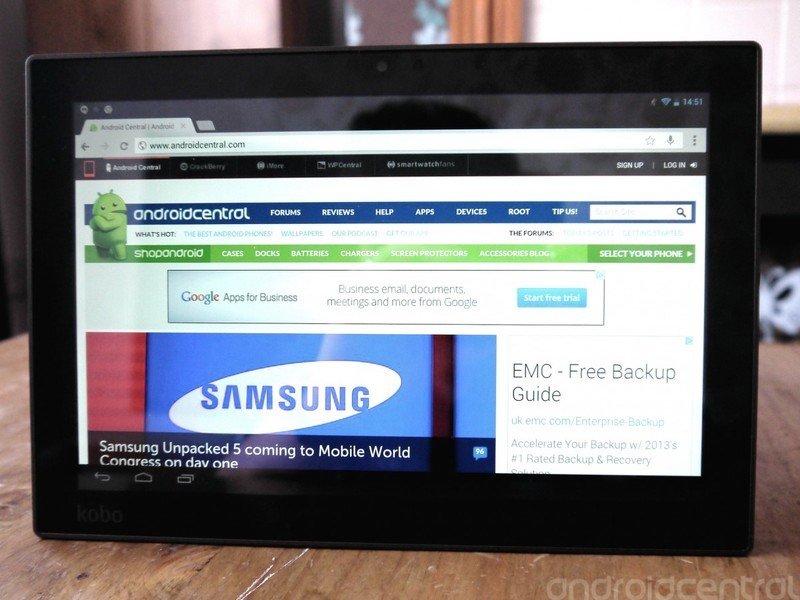
The Arc 10 is a nice Android tablet. Sure, it's a little heavy, the battery life isn't that great, the custom bits of the software are a bit hit and miss and onboard storage is low. But Kobo should be commended for a genuinely good quality tablet. It's got the power underneath and shines with that good looking, high resolution display out front. Here in the UK it currently sells for £299.99, but regardless folks looking for a large Android tablet probably aren't going to be convinced to take a punt on this. Not over a recognised brand like, say, Samsung. It's a shame, because it is better than the similarly priced Galaxy Tab 3, but the brand awareness is considerably less.
So Kobo gets an "A" for effort. The Arc 10 is a good product, and the step up since its earlier efforts is noticeable and leaves us looking forward to what's next. If I were in the market for a 10-inch Android tablet, this would be high on the list. But sadly this is probably the best Android tablet that few people will actually be buying.

