It looks like Android 12 is going to copy One UI's best feature

What you need to know
- The first developer preview for Android 12 is now live.
- With some digging, a new "Silky Home" interface can be enabled.
- Similar to One UI, Silky Home appears to be designed to accommodate large phones.
It's a big day in the Android world. Why? The very first developer preview for Android 12 has officially landed 🙌. Most of the user-facing changes are pretty small right now, but there is one thing that stands out as a potentially massive shift for Android design as we know it.
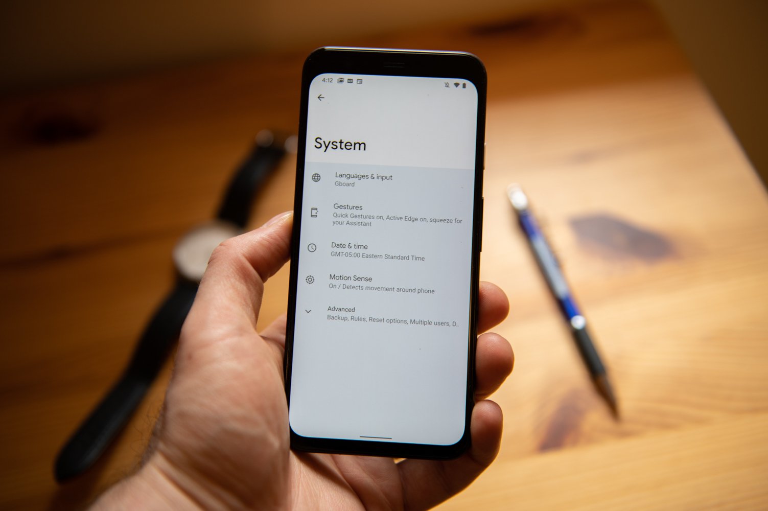
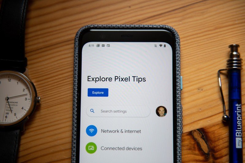
First spotted by Mishaal Rahman over at XDA Developers, there's a feature flag in Android 12 called "Silky Home." Once this flag is enabled, you're presented with a completely new interface for the Settings app.
BIG change: If you enable the "Silky home" feature flag that I previously mentioned, you'll get a DRAMATICALLY changed Settings UI that's MUCH more one-handed friendly. Here are a few screenshots: pic.twitter.com/EcwqnU0LlBBIG change: If you enable the "Silky home" feature flag that I previously mentioned, you'll get a DRAMATICALLY changed Settings UI that's MUCH more one-handed friendly. Here are a few screenshots: pic.twitter.com/EcwqnU0LlB— Mishaal Rahman (@MishaalRahman) February 18, 2021February 18, 2021
Silky Home introduces large header text at the top of the screen and pushes all of the buttons/toggles further down — making it considerably easier to navigate the Settings app if you're using a large phone. And, yes, it sure does look a whole lot like Samsung's One UI. It's a big design shift from what we've come to expect with the Google/Pixel Android experience, and right now, I'm not entirely sure what to think.
On the one hand, I'll always appreciate anything that makes it easier to use large phones. If we end up getting a Pixel 6 XL later this year, the new UI is bound to come in handy! But at the same time, I enjoy using Pixels partly because I prefer Google's software design over Samsung's. And as such, the idea of Google copying some of Samsung's design language does give me pause.

This Silky Home UI is currently limited to the Settings app, and again, requires a feature flag to be enabled before you can even see it. But assuming it keeps getting worked on with later developer previews, one would assume that it eventually extends to other system and Google apps. And if that happens, it'll be really interesting to see what kind of impact this could have on Android app design for the rest of the market.
If we live in a world where Google, Samsung, and OnePlus all have this One UI-esque design language, it's possible app developers will be encouraged to tweak their own apps to adopt similar guidelines. Or — and more likely — this new UI will continue to be limited to system applications and nothing more.
Regardless of how this changes in future iterations of Android 12, what's important right now is that Google is clearly tinkering with core Android design elements. Combine this with the leaked mockups we previously saw of even larger Android UI changes, and it's evident that Google has big things in the works.
Be an expert in 5 minutes
Get the latest news from Android Central, your trusted companion in the world of Android
We'll be keeping a close eye on all of this over the coming weeks and months, so stay tuned for more info soon.
Have you listened to this week's Android Central Podcast?

Every week, the Android Central Podcast brings you the latest tech news, analysis and hot takes, with familiar co-hosts and special guests.
Joe Maring was a Senior Editor for Android Central between 2017 and 2021. You can reach him on Twitter at @JoeMaring1.

