This isn't the Android 12 theming system, but it shows us how hard system themes are to get right
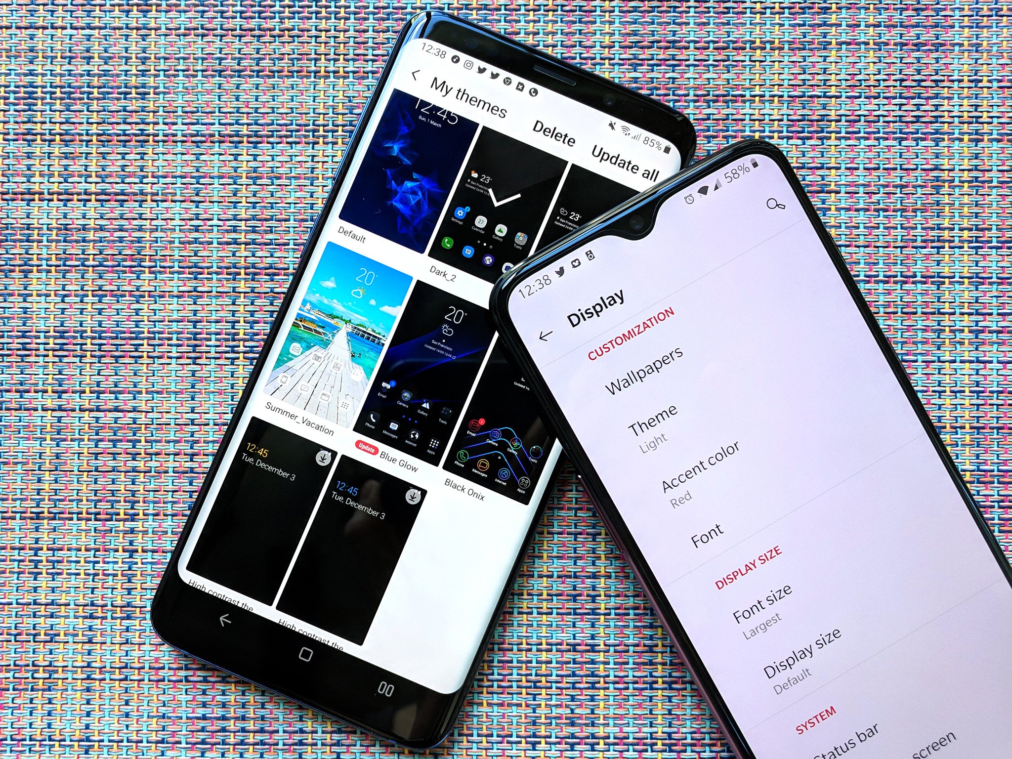
There are few things more liberating than being able to take your phone and make it look completely and utterly new. From adding new widgets and wallpapers to trying out new Android launchers, there's a lot of ways to jazz up a phone, but all of them pale in comparison to the all-encompassing roulette wheel that is system theming.
System theming is an area where Google's core Android has lagged behind Android manufacturers for years and years. From Samsung's One UI — and TouchWiz, may it rot in pieces — to Oppo's Color OS to Xiaomi's MIUI to OnePlus's Oxygen OS with its colorful accents and wonderfully simplified options, manufacturers have always been willing to build over what Google gave them in a desperate effort to inject some personality and pizzazz over the "stock" Android UI that Google's own Pixel line is famous for.
I don't begrudge manufacturers for picking up the ball and running with it, because as the leaks we're seeing right now remind us: system theming is so incredibly easy to screw up, which is why Google crawls rather than runs with any theming changes.
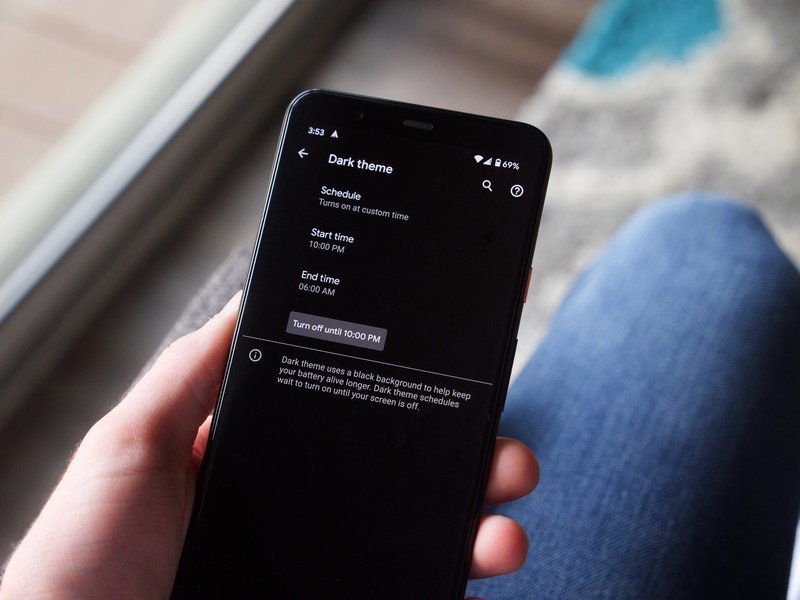
Let's take the last major advancement in Android theming for example. Adding a system-wide dark theme in Android 10 took half a decade. Google would slip it into the developer preview, tinker with it for the summer, then yank it away from us like Lucy with Charlie Brown's football.
Themes have to be accessible, clearly legible, and beautiful.
The reason it took this long was that Google had to make sure dark themes wouldn't break apps' readability or usability, as well as ensure it didn't interfere with anything on a system level. It took time for Google to re-design its apps for dark theme and even two years later, we're still seeing apps just adding dark themes because they take a lot of work.
Now take all that testing and troubleshooting and multiply it by a magnitude of 50, and that's how hard it is to build a system-wide theming engine that "just works" and won't break the second someone slides in a psychedelic wallpaper. And that work doesn't just have to be done by Google, which is why we have these leaked Android 12 mock-ups to dissect.

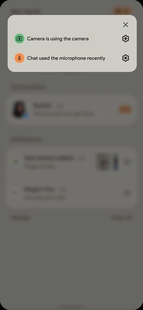
Source: XDA-Developers
Be an expert in 5 minutes
Get the latest news from Android Central, your trusted companion in the world of Android
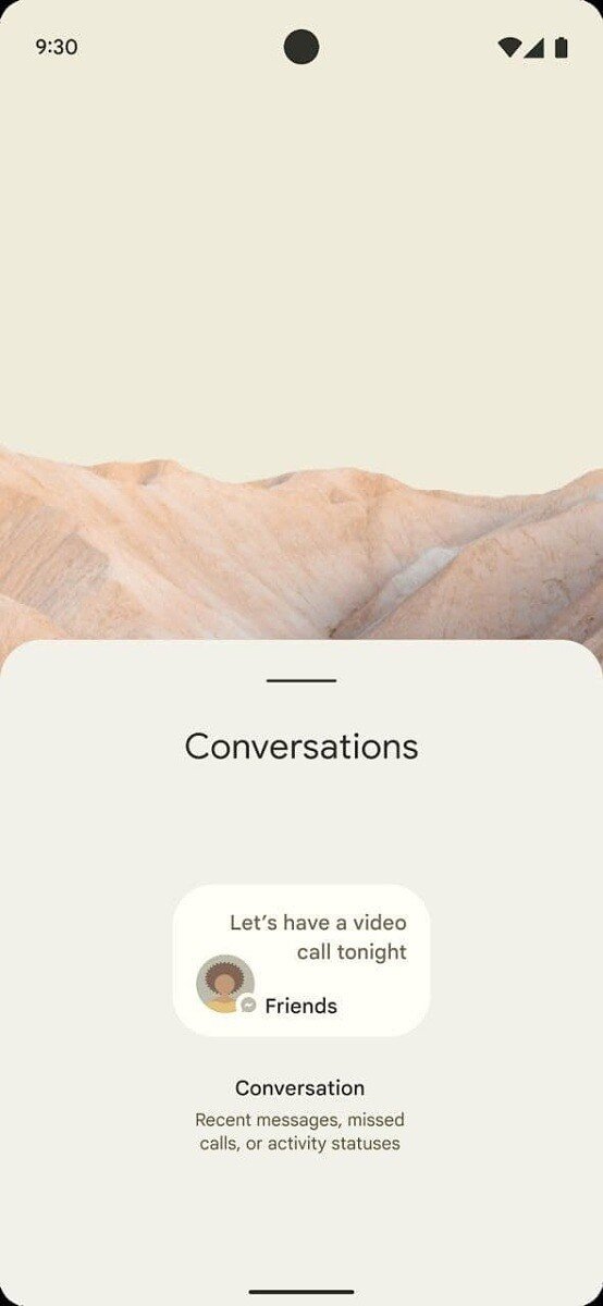
(No, they're not screenshots, they're mock-ups in material to some third party — likely either Facebook or Oppo, given the similarity to Color OS with that theme — about some upcoming Android 12 features, which we'll get to in a minute.)
System themes impact a multitude of menus, pop-ups, and iconography across the system. The ColorOS-type system theme in these mock-ups has the launcher and the system theme extract element colors based on the wallpaper and it is ... not great. Again, this is not the actual Android 12 theming system, so I'm not going to get down and dirty with all the ways I hate the washed-out colors, lack of contrast, and the poor imitation of adaptive Icon Pack Studio icons. However, it does give us an insight into the possible overhaul of the Android widgets guidelines through the look of this new system-level Conversations widget.
Part of Android 11 was Conversations and Chat Bubbles. Conversations is a separate section of the notification panel dedicated to the messages that matter most in our lives, and while it can be a pain to set it up, it will be much more worthwhile to do so if Conversations appear on your home screen, too.
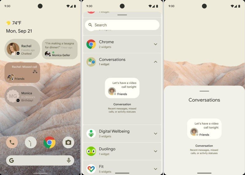
While the implementation isn't 100% clear, you'll be able to set more than one Conversations widget on your home screen. There are at least two Conversations widgets here — given that two are differently rounded, I'm not sure if that's a variation because the final design isn't set or if the design will vary by Conversation type — showing missed calls and the most recent texts with friends. I'm not sure I'm thrilled by the super small format on these, but considering how abysmal the state of messaging widgets is on Android right now, I'll take what I can get.
The dynamic coloring of the widget based on the wallpaper helps soothe the irritation of having to put multiple widgets down on the same home screen, though as you can tell by the Birthday widget, automatically selected colors don't always provide a neatly legible experience.
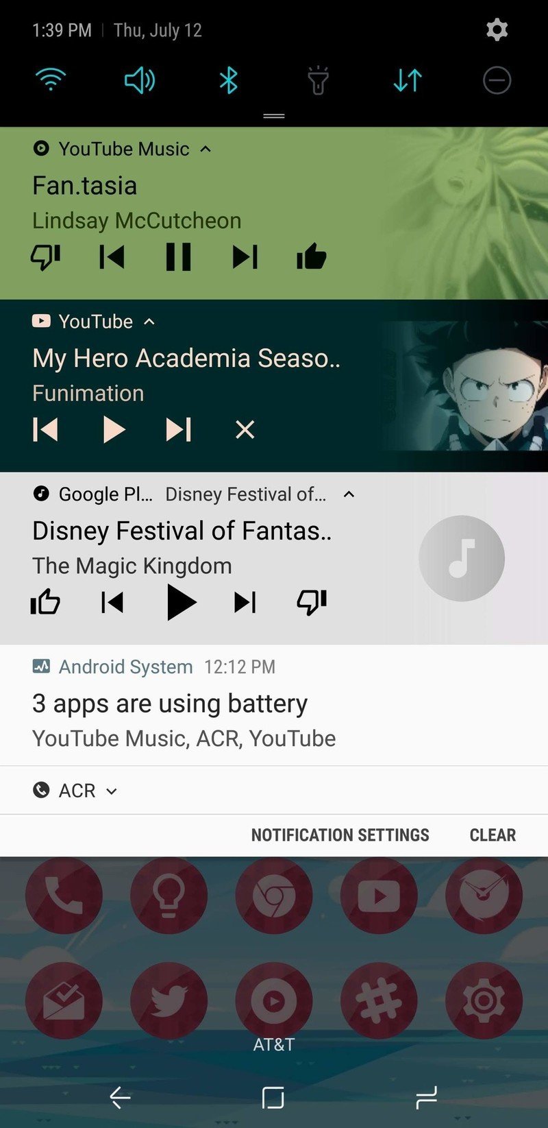
This is a lesson Google has been taught many times over the years: a few versions ago, music notification would pull colors from the artwork and feature a gradient shift towards the artwork. Most of the time it looked great, some albums would come up ugly as sin or almost unreadable, which is why in Android 11, when playback notifications shifted up to the Quick Settings panel, they also dropped the gradient for a solid, easier to read color. Launchers have dealt with the same issue when it comes to label text and loud or noisy backgrounds.
I'm not completely against themes that adapt automatically from your wallpaper; Action Launcher's Quicktheme is almost magical, but there's still times where the suggested colors just fail. And failure is not an option for a system-wide setting. Your phone needs to "just work" no matter what theme you set, so Google has to get every single one of its ducks in a row before it even considers putting it into a stable release.
After all, we've seen firsthand what happens when Google half-asses an Android feature: you get the Android 10 gesture navigation nonsense and you get buggy, inconsistent, and generally useless Chat Bubbles. We're now six months into the stable release of Android 11 and Chat Bubbles are only on a handful of messaging apps — and even fewer actually deliver a consistent, good experience.
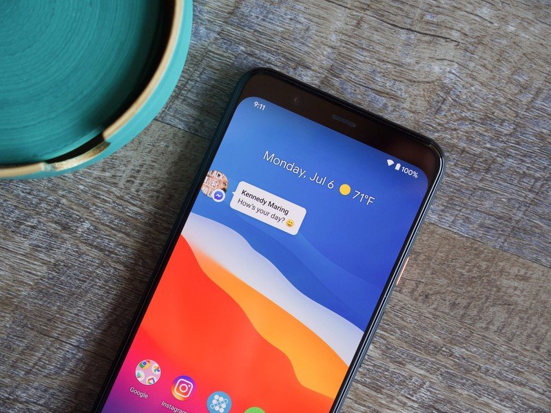
Of course, when Chat Bubbles don't work, you just shake your head, disable them and move on. When the system theme doesn't work because your new wallpaper just made all your icons illegible, you curse the heavens and hope you can fumble your way back to your old wallpaper to get things back to normal.
We've had a few mentions of adaptive and more expansive system themes in Android 12, and while I'm more than excited to play with them in next month's Developer Preview, take it from someone who spent four years pining for the dark theme we finally got in Android 10.
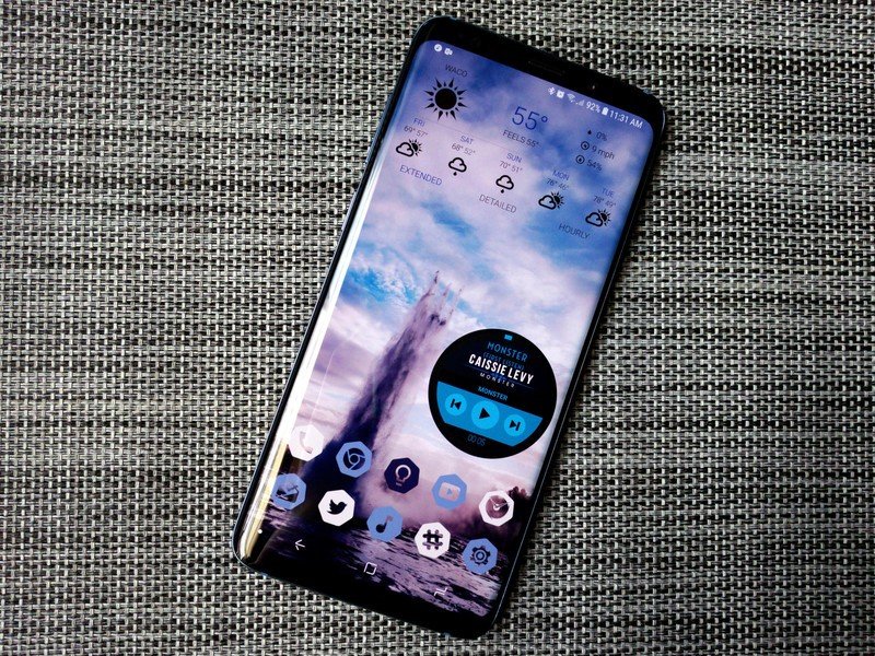
This theme system may be cool for the summer, but it'll be back in Google's secret toy box before September. And if you want the Android 12 look right now, go check out the Best Android Launchers. Smart Launcher 5's Icon Pack Studio can pull colors from your wallpaper to give you perfectly matched icons, and both Smart Launcher and Action Launcher both have options for automatically theming the launcher around the wallpaper's colors.
Ara Wagoner was a staff writer at Android Central. She themes phones and pokes YouTube Music with a stick. When she's not writing about cases, Chromebooks, or customization, she's wandering around Walt Disney World. If you see her without headphones, RUN. You can follow her on Twitter at @arawagco.
