Pixel 2 vs. iPhone X: Which does the best portrait selfie?

Portrait Selfies are my favorite thing happening in smartphones right now. I can feel your eyes rolling as you read this, but hear me out for a moment. On a technical level, we're seeing a massive push to improve the quality of the front-facing camera while applying depth maps and color correction so a photo can be instantly transformed into something new. It's fascinating and fun, and in the early days of this feature existing on smartphones there are two massively different ways of creating this effect being used.
Apple's True Depth camera features multiple sensors to create a depth map in real time on the iPhone X. Google's solution relies entirely on machine learning and an impressive single camera to accomplish the same effect on the Pixel 2. Here's a look at how these two methods compare!


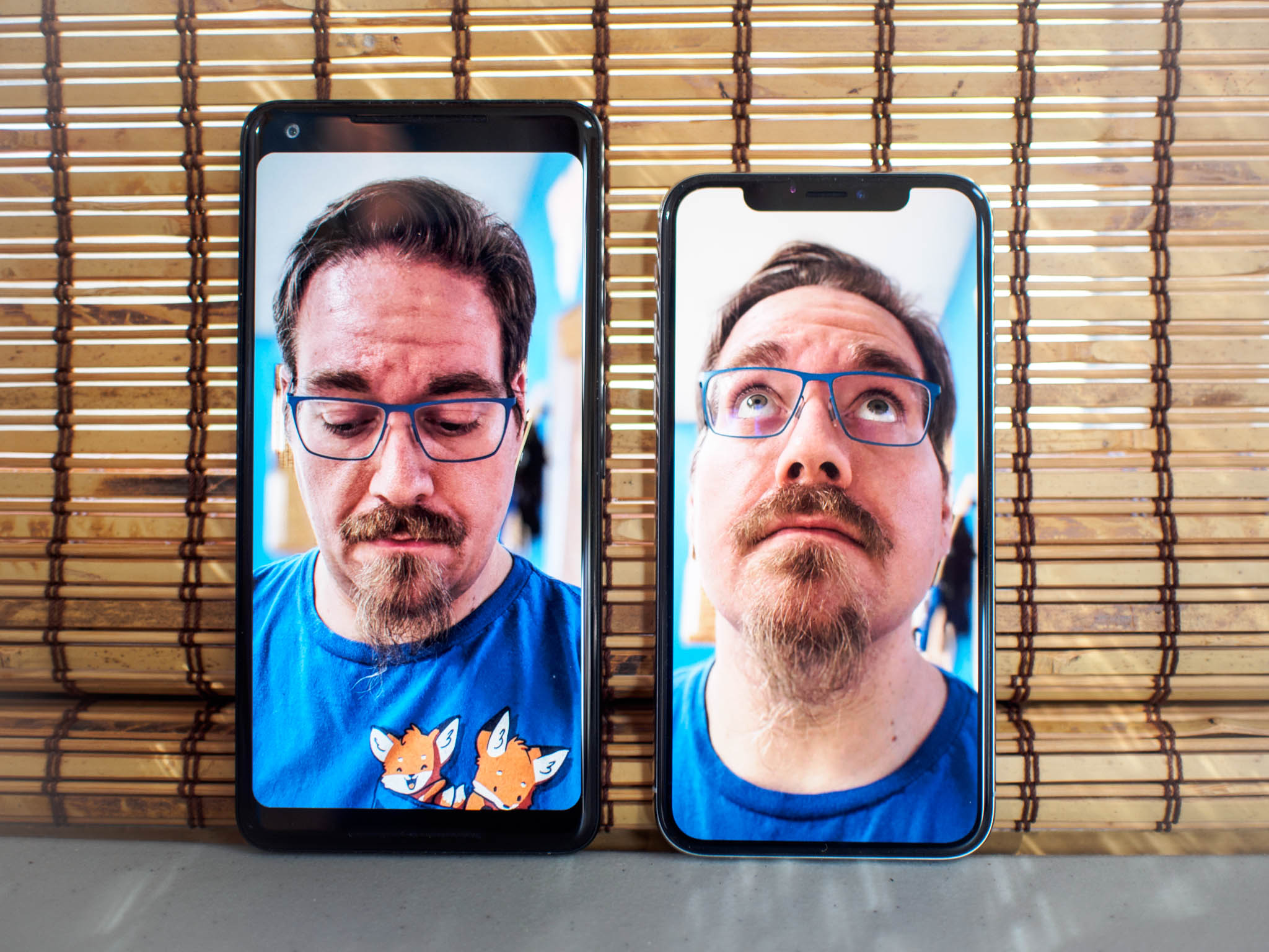
Left: Google Pixel 2 Right: Apple iPhone X
The first thing you need to understand when comparing these cameras is where Apple and Google are placing priority when it comes to the photos being produced. We know on a technical level these two phones have the best photo capabilities in the world right now, with the only read difference for most people being what parts of the photo and what features are taking priority.
In these shots, two things become quickly apparent. The background in the iPhone X shot is blown out in an attempt to make sure my face is well lit and properly colored. The background in the Pixel 2 shot is better balanced with the rest of the photo thanks to Google's HDR+, but as a result, my face is noticeably darker and takes on a slightly reddish tint you don't see in the other shot.
There are also substantial differences in that blurring effect used to create Portrait Selfies. Google's software applies a more aggressive blur, and it makes imperfections in the depth map stand out quite a bit. It almost looks like a cut-out sticker of me has been applied to this photo. Apple's blue is a little more natural looking right until you get to my hair and parts of me start to look a little out of focus. Neither shot really "nails" the picture due to their respective faults, but the flaws are subtle enough that you have a pair of fun photos.
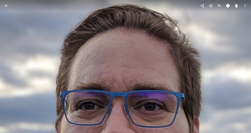
Here's another example, only this time it's an outdoor shot zoomed in 100%.
Be an expert in 5 minutes
Get the latest news from Android Central, your trusted companion in the world of Android


This pair of shots offers a lot of the same conclusions. Apple better lights my face, in particular, my eyes, while Google better lights the background and makes the whole photo feel richer. Apple's blurring extends too deep into my hair and makes part of me look out of focus, while Google's blur is so severe it actually edited out some of my hair that was sticking out of place. Without the Portrait Mode it's clear the iPhone X took the better photo, but with that photo mode enabled it's easier to appreciate the effect of Google's software.
Apple and Google seem to be approaching this photo technique from opposing directions, and it seems likely what we'll see in the not-too-distant future is some kind of meeting in the middle.
There are some natural limitations to both of these photo modes, especially in these early days. The iPhone X will flash warnings in Portrait Mode if the background is too bright or if objects in the background are too far away to grab a proper depth map. Google's algorithm has a nasty habit of editing out corners of prescription glasses or objects in the foreground that aren't attached to a person. There's a bit of trial and error in getting both to work correctly, which in theory gets less frequent over time as Apple and Google continue to improve this tech.
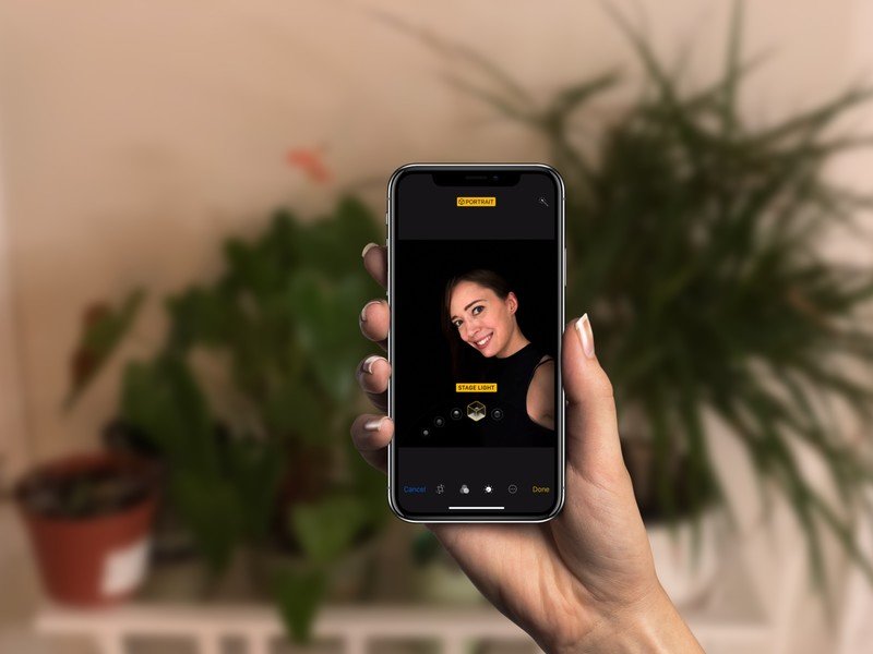
The biggest thing Apple has over Google in this Portrait Mode right now has to be Portrait Lighting. Being able to see the possible edits to the photo in real time as you go to take the picture is a big deal, and the ability to continue editing Portrait Lighting after the photo has been taken is incredible. It's a very hit-or-miss feature right now, especially when you start looking at Stage Lighting, but nothing but the iPhone has this right now.
When editing the photos, Google has something Apple currently doesn't and probably should. When you take a Portrait Mode photo with a Pixel 2, you get a pair of photos. One photo is edited with the blurred areas, and the other is just a plain selfie with the front camera. This gives you the ability to edit both photos and see which you prefer. Apple keeps everything as a single photo, which in my opinion is a little less convenient to see edits between the two modes. On the other hand, it's one fewer photo in your Camera Roll, so this is probably just personal preference.

There's a lot to be said about the "right" way to take a photo, and even more to be said about the virtues of color accuracy and feature effectiveness. Apple and Google seem to be approaching this photo technique from opposing directions, and it seems likely what we'll see in the not-too-distant future is some kind of meeting in the middle. Right now, it's not immediately clear that Apple's hardware-based approach is measurably better than Google's software-based approach to Portrait Selfies. All of the things that make the iPhone X camera take a great selfie already exist on the iPhone 8 and 8 Plus. At the same time, it's not clear how much better Google can make its photo editing software with a single camera and a lighting preference for the whole photo instead of the face.
One thing is absolutely clear — we're nowhere near the end of Apple and Google giving us more and better selfie features.

