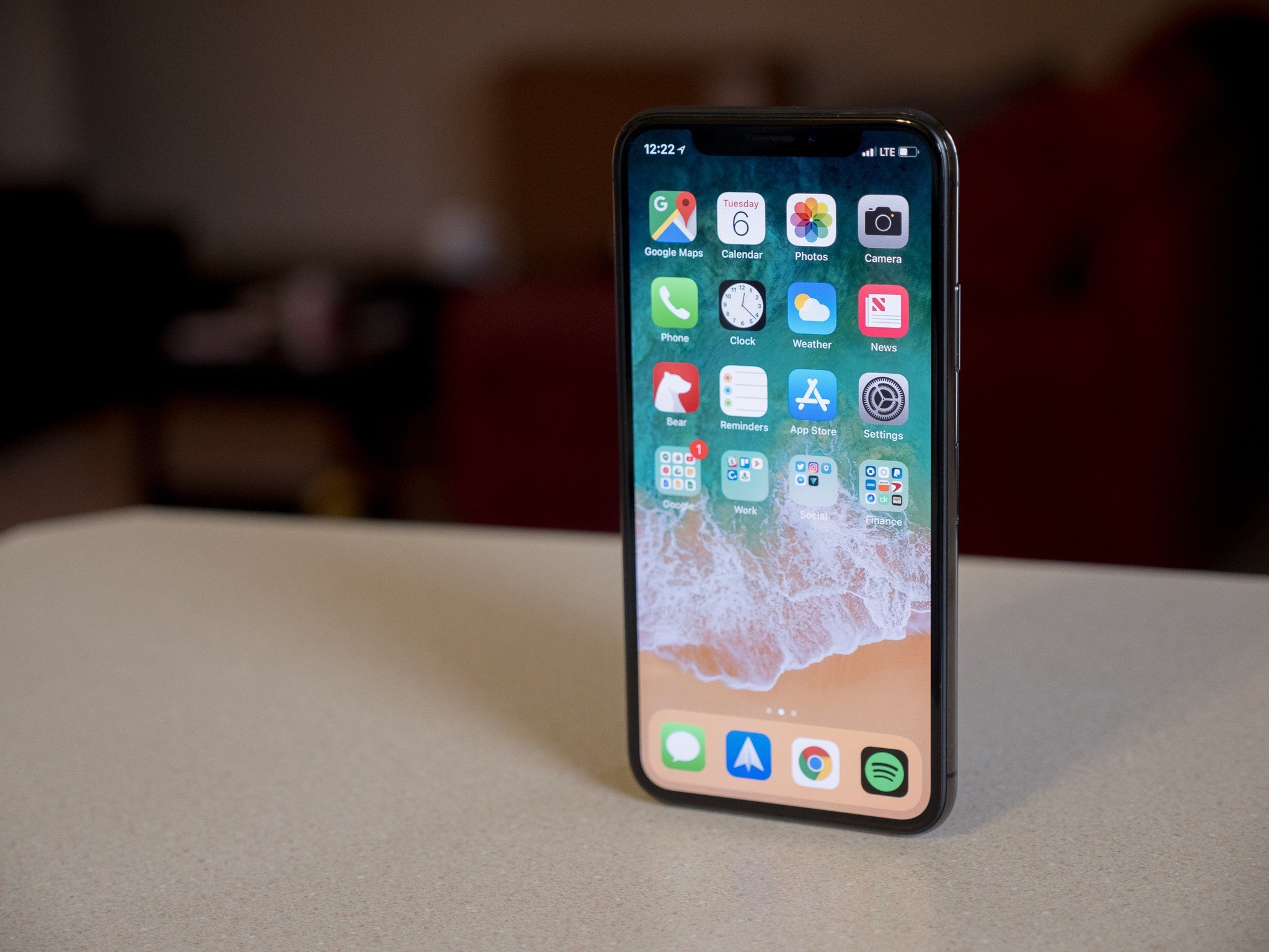
The iPhone X has been out for a few months now, and if you haven't heard, it's one of the biggest shifts in iPhone design since ... well, the very first iPhone. Gone are the bezels, the home button, the headphone jack, and the fingerprint sensor — all that's left is a glass slab of screen that, as it turns out, makes for a pretty great phone.
But what's an iPhone review doing on Android Central? Well, just as Daniel found in his review, the iPhone X has basically all of the same Google apps and services available that an Android phone would, so we figured, why not treat it like one?
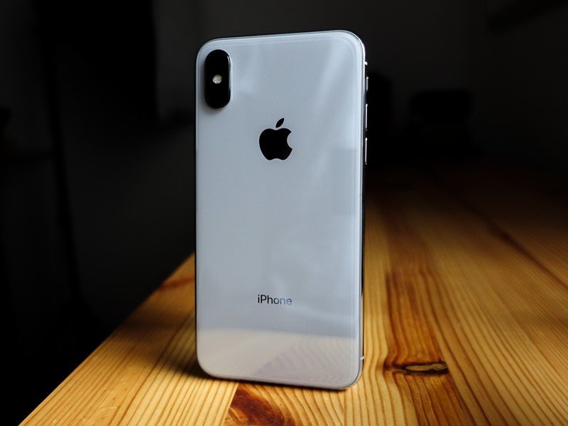
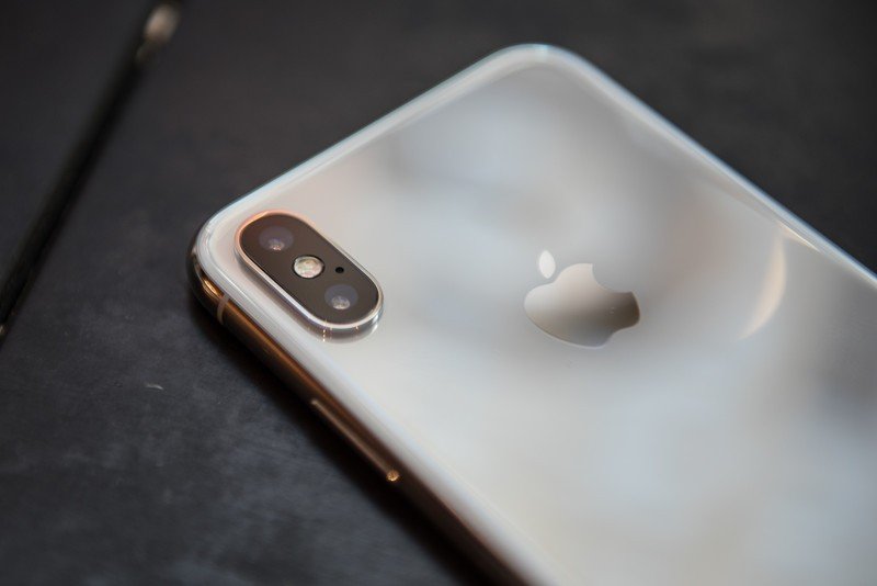
By now you've probably seen the iPhone X a time or two before. Like a lot of other iPhones, the X features a glass front and back, but this is the first time we've seen Apple use a stainless steel frame since the 4S — with its polished finish, it's grippier than the more commonly used aluminum, which is nice, but it's not really that different otherwise.
The iPhone X is fairly hefty at 174 grams, and a bit thicker than other recent iPhones at 7.7mm. It's different from the industry's usual "the thinner, the better" attitude, but I actually like this added mass; it makes the phone feel more substantial, like I could drop it and it would be just fine. Apple seems to think so, too — it claims that the iPhone X uses the most durable glass ever on a smartphone — but glass is glass, and this phone still breaks like any other with enough impact.
I still miss the feeling of the matte aluminum from the iPhone 7, but the glass back does allow the iPhone X to support wireless charging. Since this phone uses Apple's Lightning connector, and my apartment is entirely outfitted with USB-C, this has quickly become the only way I charge the phone. As with any other phone, charge times aren't quite up to speed with a fast charge wired connection, but you might not even notice since Apple doesn't include a fast charger in the box. Ridiculous, I know.
While we're on the topic of missing features, the iPhone X obviously has no 3.5mm headphone jack. It still sucks, just like carrying the included analog-to-Lightning adapter still sucks, but apparently this is the future we signed up for. At the very least, Apple also includes Lightning-native EarPods in the box, which sound fine but literally only work with iOS devices.
So let's get into the real meat and bones of the iPhone X. As far as build quality and materials go, the iPhone X isn't that different from the iPhone 8 and others before it — but you already know the big differentiator.
The notch is there, but you probably won't notice it most of the time.
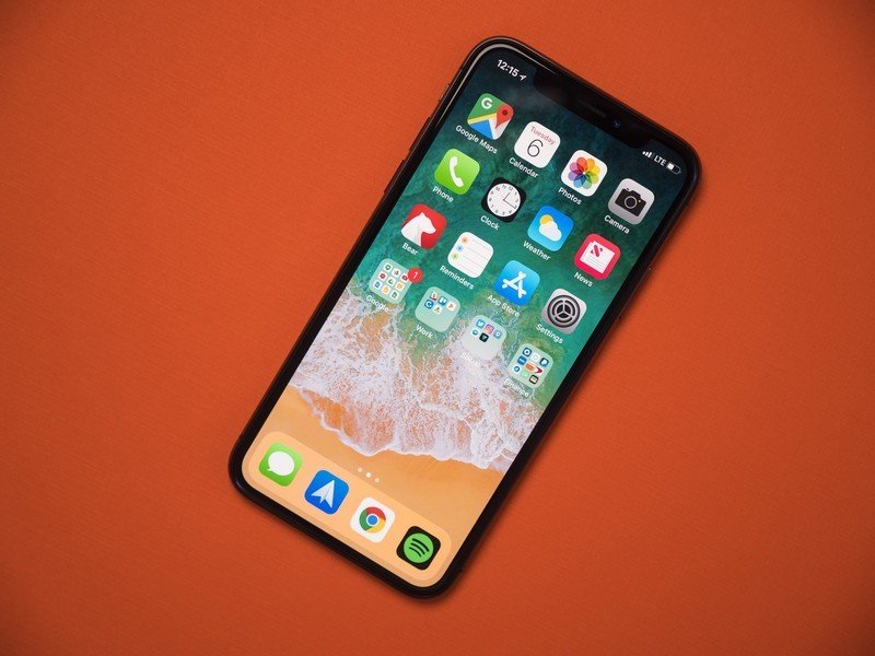
Yep, it's that notch. This is the first iPhone to feature a nearly edge-to-edge display, trimming away nonessentials like the large bezels and home button. Because the face of the phone is almost entirely screen, the front-facing camera and other sensors had to be condensed into a notch that occupies part of the display at the top, and love it or hate it, it's one of the iPhone X's most identifying characteristics. If you ask me, it's a fine compromise in exchange for minuscule bezels (some Android OEMs agree!), but it's not perfect — more on that later.
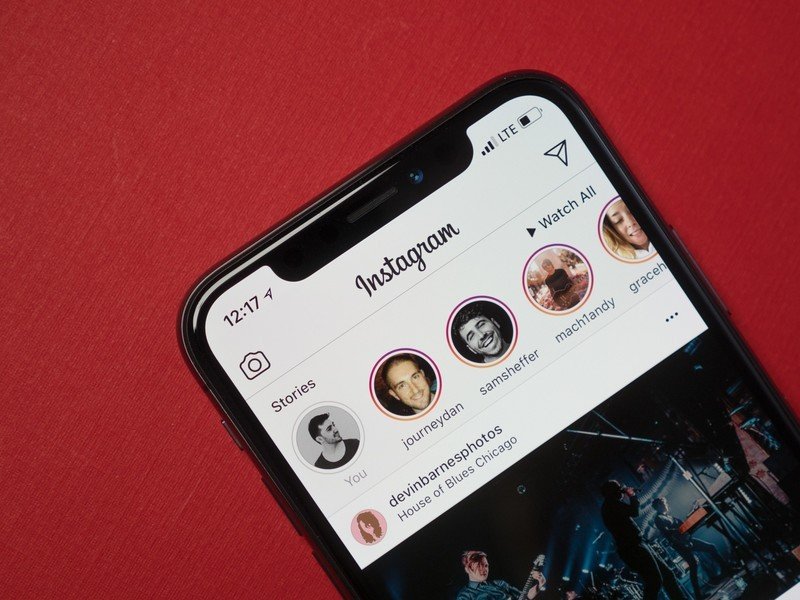
As for the display that notch dips into? It's a 5.8-inch Super AMOLED panel with a crazy 19.5:9 aspect ratio and what Apple calls "Super Retina" resolution — that's 1125 x 2436. This is the first time Apple has moved away from LCD in an iPhone, and it's a stunningly good panel, with terrific color reproduction and great outdoor visibility. It isn't nearly as bright as the Galaxy Note 8 or S9, but it also isn't nearly as cool-toned — especially thanks to Apple's True Tone technology.
The iPhone X also features 3D Touch, which allows the display to measure different levels of pressure for various actions throughout the software. Pressing with a bit of force on a home screen icon, for example, opens a contextual menu with shortcuts to key functions of that app. It works in tandem with one of my favorite parts of using the iPhone X, Apple's Taptic Engine, to reinforce your interactions with precise "clicks" and vibrations.
Oh, and before I move on to software, can we talk about how incredibly convenient the iPhone's mute switch is? It's been around since the original iPhone, and I simply don't understand why more Android manufacturers aren't copying this wonderful feature, rather than the notch.
Now it's time we had a talk about the software. The iPhone X is running Apple's iOS 11 (more specifically, mine is on iOS 11.2.6) platform, and it probably isn't your favorite software experience if you're a regular here at Android Central. As an Android user of seven years, I'm right there with you, but there's still a lot to love about the way this phone operates.
Despite a modern hardware design, the iPhone X still sticks with the same static grid of icons we've seen on the last decade of iPhones. You can rearrange the icons and group them into folders, but that's about as far as home screen customization gets here. Notifications are still an absolute disaster on iOS, and you still can't change default apps. Something that's completely different on the X, though, is how you navigate that interface.
Since there's no more home button, all of the usual navigation controls have been delegated to swiping gestures along the bottom of the screen. You can swipe up from any app to go home, or swipe left or right to quickly switch between apps. It takes a bit of getting used to, but if you've ever had the pleasure of using a webOS device, this will quickly feel like second nature.
There's a learning curve to the new gestures, but they mostly feel natural after a short time with the phone.
Unfortunately, the gestures within the recent apps list are a bit less intuitive. You can access your recent apps by swiping up and leaving your finger on the screen for a second or two, or speed up the process by swiping up and over to the right. Once you're there, you'll probably try to close an app by swiping up on the corresponding card — except, that just takes you back home. Instead, you have to long-press the card first, adding a minus button to the top-left corner, at which point you can finally start swiping active cards away. The whole process is slow, frustrating, and overly complicated — and a reminder that this phone is still very much in its testing phase months after its release.
Oh, and another growing pain — while I've been mostly unbothered by the notch in the display, it does annoyingly cut into the available space in the taskbar. As a result, you can't see important information like your battery percentage unless you jump into Control Center by swiping down to the right of the notch.
Control Center is great in theory; it's a hub for all sorts of shortcuts, just like the Quick Settings tray on Android. I love the large vertical sliders for volume and brightness, and the fact that you can 3D Touch them to open more toggles like Night Shift and True Tone. But that's sort of the problem — most of these are just toggles. 3D Touching the WiFi or Bluetooth buttons does nothing; the only way to change networks or devices is to open the Settings app.
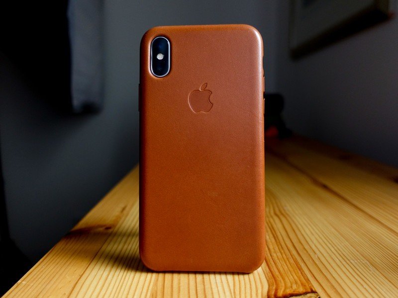
iOS isn't all bad, though. App support is, unsurprisingly, fantastic, and there's an enormous selection of games and useful tools available for the iPhone X, many of which don't have Android counterparts. Even cross-platform apps often work better — especially social media apps. Instagram, for example, has a number of features exclusive to iOS, including switching cameras while recording video to your Story.
Using an iPhone also has a lot of benefits if you're a Mac user. Handoff is an extremely useful tool that lets you quickly and wirelessly transfer files from your Mac to your iPhone, and I use it all the time. I also appreciate being able to make iTunes backups if need be; iCloud works fine for the most part, but a local copy won't eat up my online storage, and the optional encryption keeps me from having to retype all of my passwords in the event of a restore.
iOS isn't always convenient or intuitive, but it's rewarding if you own a Mac.
There's also iMessage, which is actually a lot more than just being able to text from your Mac or iPad. With iMessage, you can send your blue bubble friends full-res media (yes, even video), play games, send those ridiculous Animoji, and even send and receive money through Apple Pay. Of course, you can also see when someone has read your text, as well as when they're typing a response.
Oh, and since there's no home button anymore, there's also no fingerprint sensor. You'll need to get used to using Face ID instead, which means you won't be able to sneakily unlock your phone during class or meetings anymore. It isn't quite as fast as Touch ID on the iPhone 8, but it still works extremely well, even in complete darkness. Just be mindful that, like Samsung's iris recognition on the Galaxy S8, it runs into trouble in direct sunlight, at which point you'll likely need to revert to your PIN.
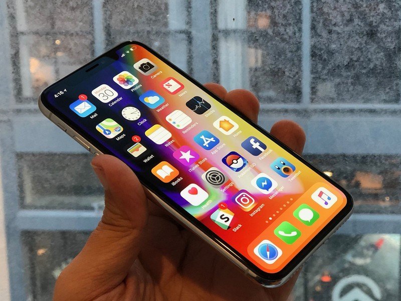
Aside from the notch, the easiest way to identify an iPhone X over older models is by looking at the dual camera module, which has shifted from a lateral to a vertical orientation. As for the cameras themselves, you're looking at a 12MP f/1.8 wide lens and a 12MP f/2.4 2x zoom lens. Both lenses feature OIS, providing stability for handheld photos and videos, you can even shoot in 4K at a whopping 60fps.
The iPhone X produces warm, beautiful photos — as long as you're not shooting in Portrait Mode.
The camera software is pretty basic, without any form of manual controls. Just a few shooting modes to choose from, including Photo, Video, Slow-Mo, Time-Lapse, Portrait, Square, and Panorama. You can toggle flash, Live Photos, and a three or ten second timer, but that's about the extent of your options. That's sort of okay though, because the iPhone X takes some pretty stellar photos on its own.
The Pixel 2 still takes sharper, cleaner photos, but I really love the warm natural colors out of the iPhone X, and I don't seem to get them from any Android phone. The 2x lossless zoom is also great for getting closeup shots without having to physically move closer to the subject, but I know a lot of people will prefer the ultra-wide angle approach that LG has taken with its dual camera phones.


One thing that's just consistently bad with the iPhone X's camera, at least in my experience, is Portrait Mode. In a vacuum, it does okay, and it's probably enough for the occasional selfie or product shot. But compared with the Pixel 2's Portrait Mode, the iPhone X has horrendous separation between the subject, foreground, and background, and even worse, because it primarily uses the zoom lens you have to step far back away from your subject. The secondary lens's slower aperture also means that Portrait photos are darker than shots captured in the default shooting mode.
For the last couple of weeks, I've been trying to determine whether the iPhone X's battery life is good, or just acceptable. I think it's somewhere in between. On paper, the 2716mAh cell is absolutely tiny, especially when compared to the 3500mAh battery on the Galaxy S9+, or the 4000mAh battery on the Huawei Mate 10 Pro. And yet, it's usually enough to last me through even a heavy day of use — though just barely. For the most part, I'd say that unless you're constantly playing high-end games, you'll probably have pretty good results with the iPhone X, but it's not quite the battery champ that I found the iPhone 7 Plus to be.
We're getting to the last bit of the review, where I'm supposed to tell you whether or not you should buy this phone, but it honestly feels next to impossible to give a one-size-fits-all answer — and not just because this is an iPhone review on an Android-focused site.
There's a general rule of thumb when it comes to tech that you shouldn't buy the first generation of a new product line, and instead wait for the second model to work out the bugs. I wish I'd heeded that advice when I bought my 2016 MacBook Pro, which has been plagued with the growing pains of Apple's new Touch Bar and #datdonglelife, and there's already a small laundry list of issues with the iPhone X's usability. Even if you're okay with essentially beta testing for Apple, though, there's a second hurdle when buying the phone: the price.
With a starting price of $999.99, the iPhone X is one the most expensive phones on the market, alongside the Galaxy Note 8, and with other great phones available for less like the Pixel 2 and Galaxy S9, it's hard to swallow that kind of cost. Still, if you're a dedicated iPhone fan with deeply lined pockets, or if you're willing to add $30-$40 in financing to your monthly phone bill, the iPhone X is a hell of a phone that I've certainly enjoyed using.
Hayato was a product reviewer and video editor for Android Central.
