iPhone X: The Android Central review
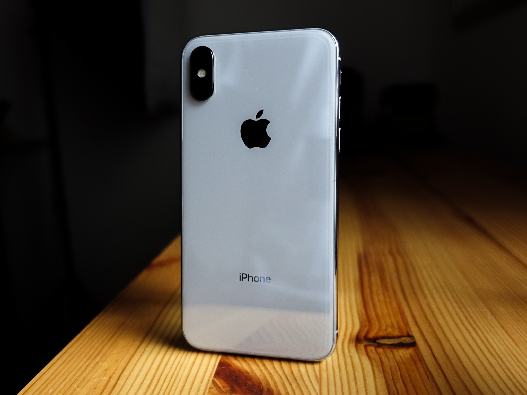
It's a well-known refrain: Apple releases a new product and half the world claims it's the best thing ever, while others claim it's the equivalent of refried beans.
Apple calls iPhone X the future of the smartphone, and after using it for a week — coming from months of Android use — I can comfortably say that it's a really great phone. In fact, it is the best iPhone to date, and I've had a tremendous time with it, but it doesn't drastically change my opinion of the iPhone as a product, nor of iOS as an ecosystem.
That's not to say Google and its hardware partners can't stand to learn a few things from the iPhone X.
Let's cut to the chase.
Face ID
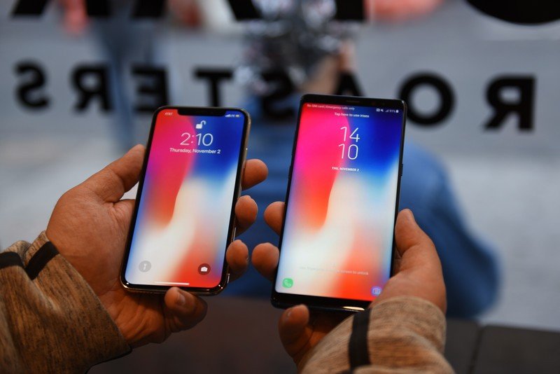
Face ID is awesome. I disabled my fingerprint sensor on the Note 8 to see whether Samsung's iris scanner (which approaches the same security level as Face ID) could compete, and it just couldn't. And while Samsung's Face Recognition feature is indeed faster than iris scanning, it's also much less secure.
Here are the major differences: Face ID combines the best of iris scanning and face recognition. It creates a three-dimensional map of the face, so it has more planes of data to work with than just the iris, and uses infrared to match the data stored in its secure enclave against the person standing in front of it.
Face ID is so good and so consistent, you don't even need Touch ID. Until Android manufacturers can get there, they should stick to fingerprints.
With the Galaxy S8 or Note 8, you must choose one or the other; iris scanning, which is far more finicky and requires the phone to be close to the face to work (although it works great in the dark); or face recognition, which is faster and more forgiving, but uses the front-facing camera, which makes it fail more often in the dark.
Be an expert in 5 minutes
Get the latest news from Android Central, your trusted companion in the world of Android
I was admittedly skeptical of Apple's decision to remove the fingerprint sensor from the iPhone X — other than aesthetics (and perhaps cost), what reason did it have for not putting a Touch ID sensor on the phone's back? — but the adjustment has been relatively seamless.
Face ID works faster and more consistently than the Note 8's iris scanning.
The reliability has been close to perfect for me; whether indoors or in bright sun, the screen turns on as I take it out of my pocket, or I tap it once to turn on the display, lift it slightly towards me, and it unlocks. I've gotten into the habit of turning on the screen and swiping in one motion, and only a handful of times it hasn't caught up with me. Face ID also has the added benefit of working when I'm wearing gloves which, as I've recently discovered in a spate of cold Canadian days, is very helpful. Neither of Samsung's facial biometric solutions works reliably enough outside for my liking.
Moreover, Face ID APIs use the same biometrics hooks as Touch ID, so apps like 1Password, which I open dozens of times a day, just work out of the box. Android doesn't have that luxury; Google added cross-platform fingerprint APIs in Marshmallow, but there's no equivalent for iris or face recognition, so unless I use the fingerprint sensor on the S8 or Note 8, I have to manually enter my not-fit-for-human-consumption password every time.
I've spent a lot of time trying to make the S8 and Note 8's combination of biometrics work for me over the past months. Neither iris scanning nor face recognition is consistent enough for me to use by themselves (and remember, you can only use one at a time), and the fingerprint sensor is very poorly placed.
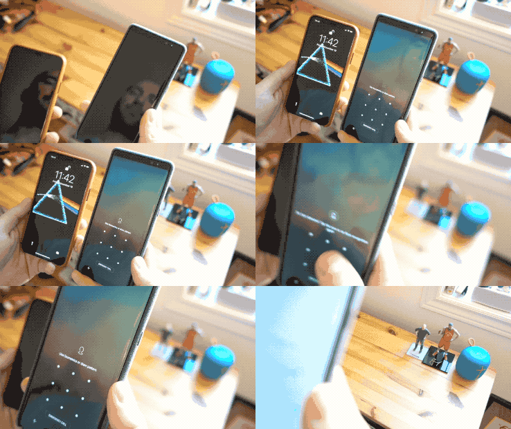
Smart Lock does help, especially if you're connected to a wearable or in a trusted environment like a home or workplace, but for security reasons, it only works in four-hour stints. The dissonance is just enough to put me off; you have to be so close to the screen and so deliberate that every time it fails I just want to disable it completely.
On the other hand, though, I dislike having to swipe up to unlock the phone every time; Face ID should let me bypass the lock screen altogether as Samsung's pressure-sensitive home button facilitates. Just tap the screen, authenticate, and let me in.
The upside is this: Apple nailed biometrics on the iPhone X, and Android manufacturers are going to have to think about whether they can and should try to compete, or just stick to the tried-and-tested rear or side fingerprint sensor, which is working well for them so far.
The size, weight, and materials
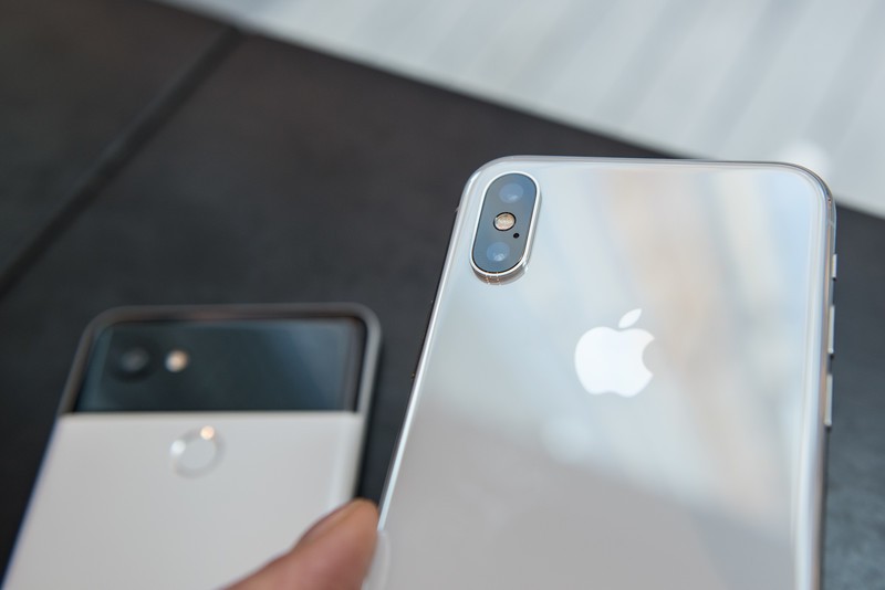
Apple calls the Gorilla Glass substrate covering the front and back of the iPhone X "the most durable glass ever made in a smartphone," but it's still glass, and it still scratches. I haven't dropped my unit yet, but judging from some tests it's not unbreakable, either.
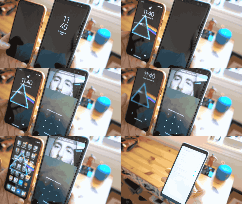
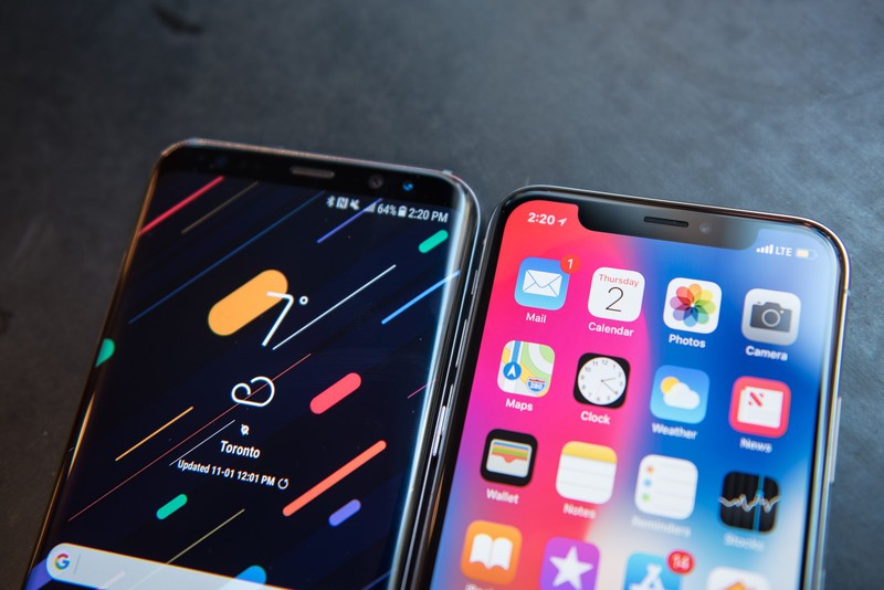
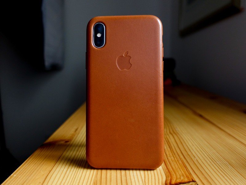
That said, I really do like the overall design of the phone. It's slightly shorter and wider than the Galaxy S8, which also advertises a 5.8-inch bezel-less OLED display, but the stainless steel frame (shiny and chrome on my silver unit) looks expensive and feels distinctive. Given the $1000+ price, though, I'm not about to use this thing without a case, so I won't be seeing much of that chrome, for better or worse.
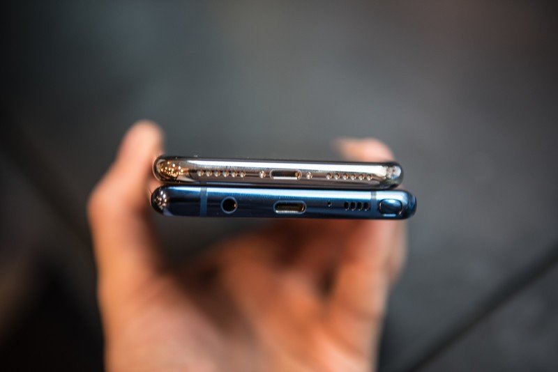
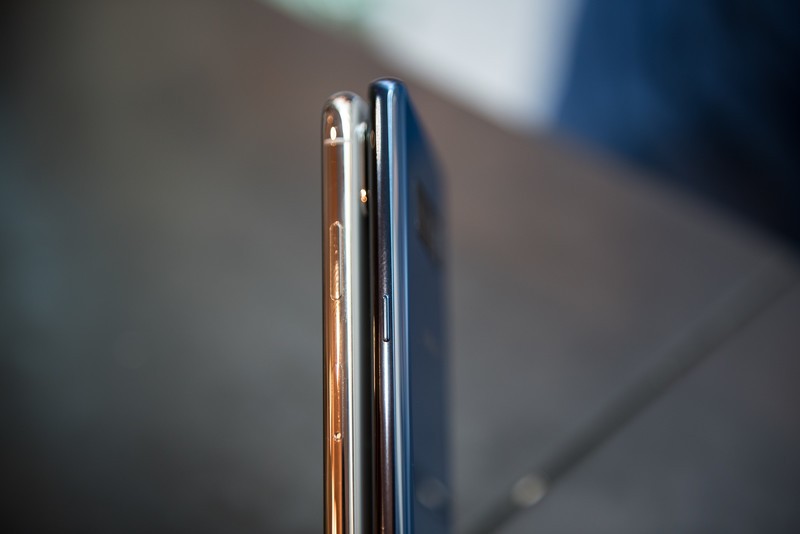
The iPhone X is also substantial — kind of like the Essential Phone in that regard. It's 174 grams, some 19g heavier than the Galaxy S8, and nearly identical to the much-larger S8+. Apple knows how to build a solid phone — it's been doing so for years — but the industrial design here doesn't feel worlds ahead of, say, Samsung or HTC. It's a luxury product that looks and costs the part, but doesn't feel considerably more so than the similarly-priced (and unapologetically aluminum) Galaxy Note 8.
What is does offer is a "Plus" set of features in a standard-sized body. I'd love to see Samsung offer a dual camera on its smaller Galaxy S9 flagship next year, because that size — the iPhone X, Galaxy S8, Essential Phone — hits the sweet spot for media consumption and one-handed use.
The screen and the notch
OLED is a big point of discussion right now, but the reality is that there's nothing particularly special about the iPhone's Samsung-made OLED screen. Like the latest displays on flagship Samsung phones, it's both incredibly sharp and vibrant, with near-perfect calibration, while also butting up against the limitations of modern OLED technology. Even Samsung hasn't figured out how to make an OLED display with an RGB stripe, so the iPhone X's sub-pixel array forms the same diamond shape as its Samsung rivals.
Blue shift is a thing, though not nearly to the same extent as the Pixel 2 XL, and even though the iPhone X's 2436 x 1125 pixel display is some 57 ppi denser than the iPhone 8 Plus's, you're still dealing with all the inherent properties, good or bad, of OLED. I like the screen and think it's probably among the best out there right now, but it's also Apple playing catch-up in a big way.
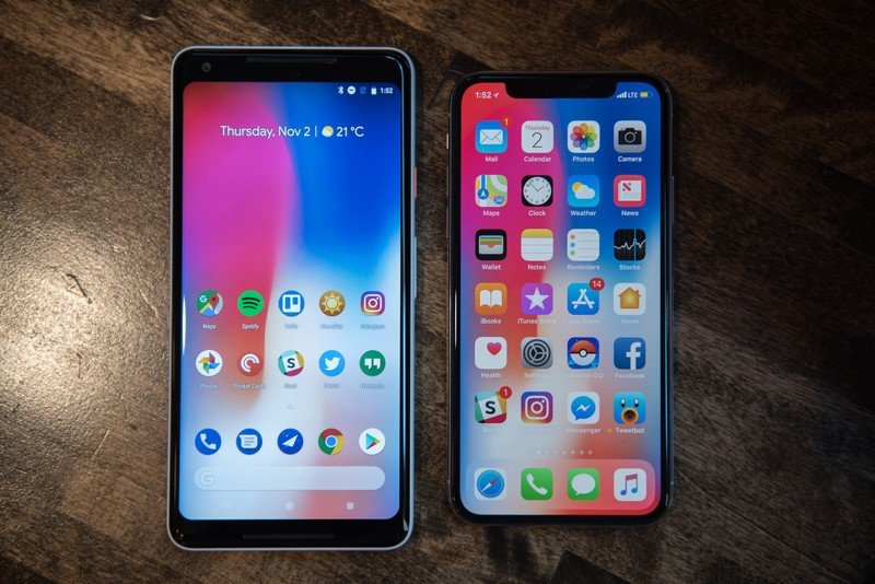
The notch, on the other hand, is interesting. A lot of early reviewers said that it "disappeared" into the experience of using the phone, but there I have to disagree. I see the notch, and am occasionally distracted by it, but here's what I've found: when an optimized iPhone app understands how to work within the confines of the notch, it's great. Google Photos, for instance, works beautifully by using the notch area as an accent; everything important — tabs, search bars, dialog boxes — are all below it.
There are still far too many apps that either haven't been optimized properly, and are therefore pillar-boxed, or haven't had enough time to really embrace the UX changes the iPhone X necessitates. Instagram, for instance, asks you to swipe up from the bottom to open a link in Stories — I've given up trying that move because it takes me home every time.
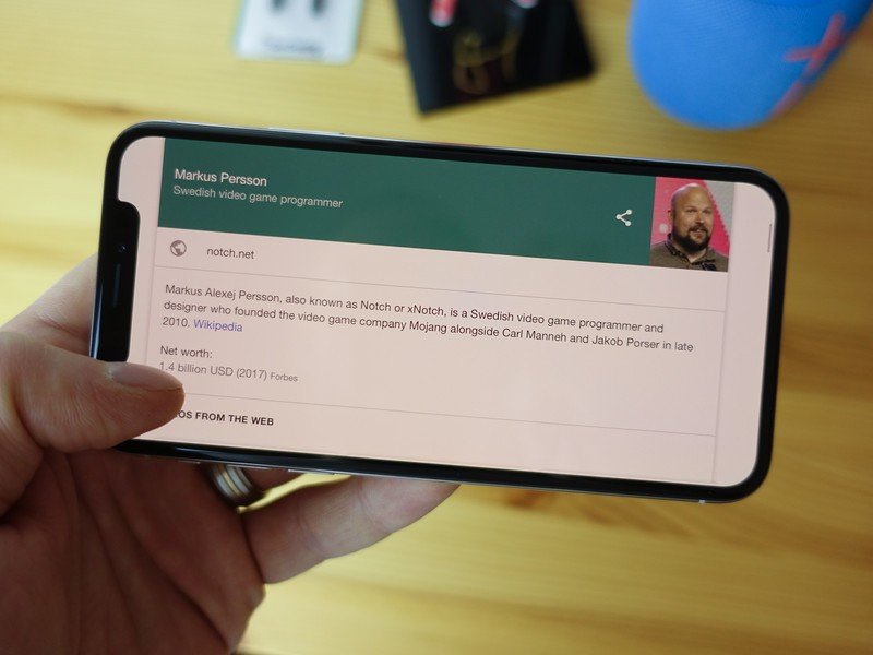
Even with its quirks, the notch is relatively innocuous in portrait mode. Switch to landscape, though, and nearly every situation looks odd. Safari doesn't wrap the design around the notch, which makes sense, while some games and video apps just ignore it altogether, so a portion of the content just isn't there.
It's inevitable that Apple will try to shrink the notch area until it disappears altogether, but until then we're stuck with a landscape experience that is truly problematic.
The gestures
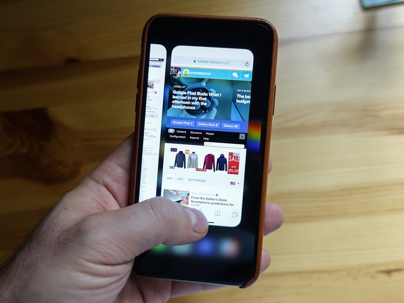
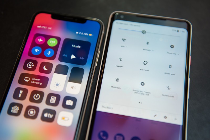
The iPhone X's gestures are fine. I still think swiping down from the right side of the screen to access Control Center is a mistake, but given the way iOS is programmed, I don't see much of an alternative.
Android users will actually prefer the new system-wide gestures that return to the home screen with a swipe up from the bottom or switch quickly between apps with a horizontal flick of the thumb. There's still a learning curve, but it's neither insurmountable nor unintuitive; it took me a day or so to get used to.
In fact, the ability to quickly swipe between open apps is my favorite part of the new UX, since that's something I've been utilizing to great effect since Android 7.0 Nougat implemented the ability to tap twice on the multitasking button to switch between the last two active apps.
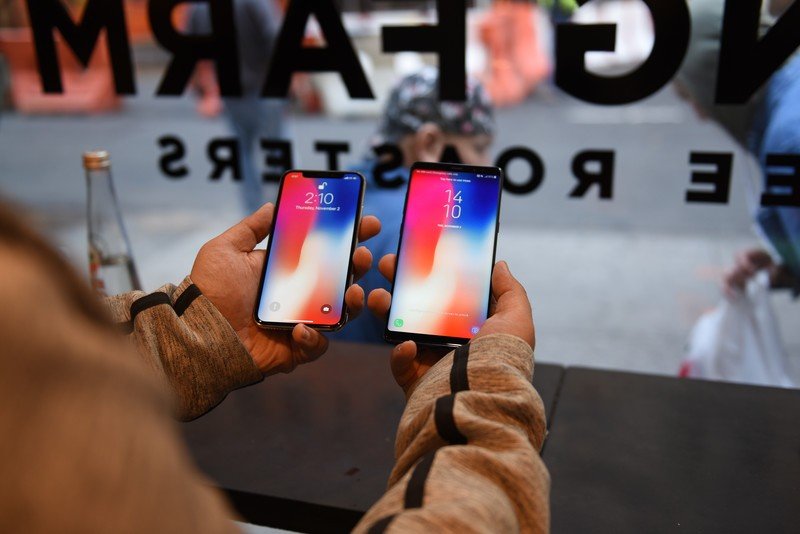
I've often wondered if Android will ever move away from a dedicated navigation bar and, if so, how it would work. Companies like Huawei and Motorola are moving in that direction with virtual or physical gesture areas that negate the need for static keys, but I've yet to find a solution that's reliable enough to switch to full-time. If and when Google decides to address this, I'm sure the solution will feel more natural for the platform.
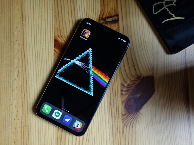
The haptics
Haptics don't get a tremendous amount of attention, but they should: Apple's Taptic Engine is awesome, and should be fiercely emulated by every Android manufacturer. LG did a good job with the V30 — its haptics are precise, subtle and extremely satisfying.
I don't love the way iPhone X conveys notifications, but if left on a desk, incoming pings don't vibrate my coffee mug off the table; instead, it's more directional and therefore more effective. Given that Android uses haptics for so much of its OS-wide interaction, I'd love to see a company like Samsung spend more time on this.
The cameras
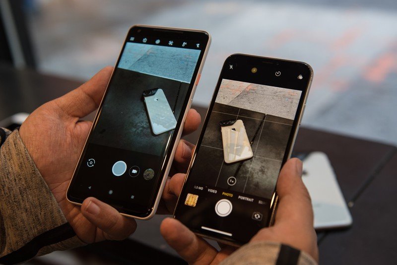
I'm pleased that Apple managed to fit a second stabilization module inside the iPhone X's secondary camera, because telephoto shots benefit from the additional gyro data, but it's clear to me, despite what DxOMark says about the phone's still photo fidelity, that it can't compete with the Pixel 2 for sheer delightful output.


iPhone X (left) | Pixel 2 (right)

What the iPhone X offers, as most iPhones have since 2010's iPhone 4, is consistency. Every photo taken with the iPhone X is usable — realistically grainy in low light, or properly exposed in bright, harsh sun — if not spectacular.


I also think it's interesting, and kind of hilarious, that Apple got beaten by Google in the race to the selfie portrait; even with all of the miraculous Kinect-like tech inside the notch, portrait selfies don't look any better — and in some cases are notably worse — than those transmuted by Google's tiny little front-facing camera and machine learning algorithms.

As I found with the Note 8's secondary telephoto lens, I appreciate its presence, but rarely use it. That it's stabilized, with a slightly wider ƒ/2.4 aperture, should help with the occasional video I shoot — the fact that the iPhone X can deliver 4K video at 60fps is one of the few standout features of the A11 Bionic chip, which is close to twice as fast as Qualcomm's flagship platform these days — but I haven't noticed an appreciable boost in quality over the iPhone 8 Plus.
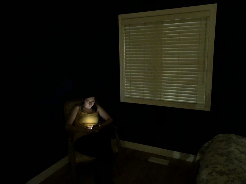
In low light, the Pixel 2 is better, but not by much — Google is doing a better job with post-processing, since the above photo, taken in almost total darkness and lit only by the street lights and my wife's phone screen, is ISO4800 on the Pixel 2 but not as grainy as the iPhone's ISO2000.
I want to like the new Portrait Lighting modes that avail themselves of both the front and rear cameras. I almost always prefer the "Natural Light", or default, version of a photo, but I have also come across a few examples that really impress me.
As for Animoji — well, I'm having fun with them.
Battery life
I find Apple's descriptions of iPhone battery life to be confusing at best and frustrating at worst. On its specs page for the iPhone X, Apple claims that it "lasts up to 2 hours longer than iPhone 7," which is not helpful to me at all considering the iPhone 7 runs completely different silicon and, when it was released, was priced more than $300 less.
I'm getting all-day battery life, but an iPhone 8 Plus this isn't.
Instead, I want to be able to judge the iPhone X compared to the iPhone 8 and 8 Plus, and the only useful metric Apple gives me is something called "Internet use," which is neither specific nor helpful.
I've learned that despite claiming "up to 12 hours" of internet use on both the iPhone 8 and X, and 13 hours on the iPhone 8 Plus, the iPhone X falls somewhere in the middle of those legacy designs. I usually get to sleep with 10-15% battery left, which is what I'd have remaining from a Galaxy S8, and slightly less than from the Pixel 2. In other words, larger Android flagships still wipe the floor with the iPhone X for longevity, but I've yet to find an Android phone other than, say, the Huawei Mate 9, that can compete with the iPhone 8 Plus.
iOS and the ecosystem
I spend a lot of time these days going between phones — between phones running "stock" Android and others running stock Android, and others still running versions of Android you wouldn't wish on your worst enemy (but fewer of those every year, thankfully), and iOS.
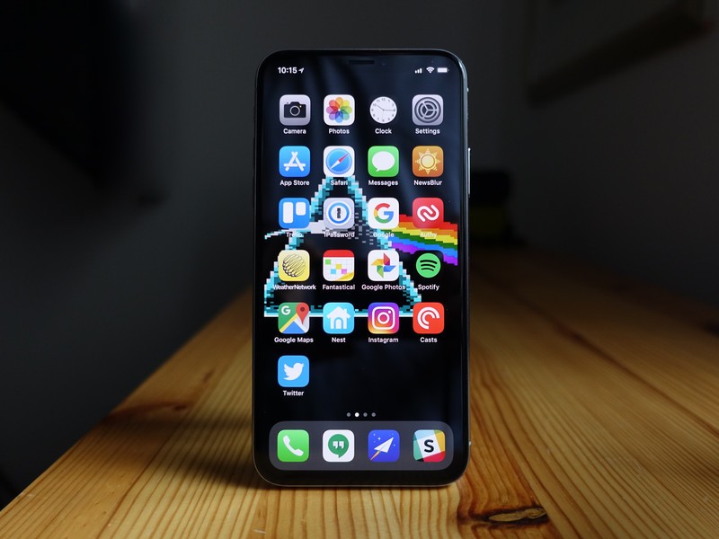
iOS still feels like a static mess in some ways, full of stolid, uncaring icons, red badges shouting at me to clear them, and a home screen completely unwilling to work with my aesthetic sensibilities.
But it's also, like, so fast. Android could only dream of maintaining the touch responsiveness and consistent frames per second that iOS so effortlessly achieves. You may think your Galaxy or Pixel is buttery smooth, but compare it to the flawless movement of the iPhone X home gesture and you'll be quickly humbled.
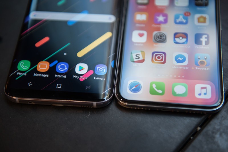
Those apps, too, are still better. I want to believe, now that we're in 2017 and not 2012, that developers care as deeply about feature parity on Android, but they don't: the best indie apps still don't come to Android (although one can argue, and I'd agree in some cases, that the indie app scene is extremely vibrant on Android — just in a way that doesn't make them much money); games arrive months late, if at all; and beloved products, especially camera-based networks like Instagram and Snapchat, lack specific features or optimizations that drive me crazy.
It's 2017 and you still can't count on Android apps to be of the same quality as their iOS counterparts.
My banking app, for instance, brought Touch ID (and, thanks to transferrable APIs, Face ID) support to its iOS app two years ago; the Android version forces me to enter my password like a chump every time. My favorite writing app, Bear, has no intention of building an Android version, and my formerly favorite meal-planning app, Grocery King, hasn't updated its Android app in over two years.
Of course, given that I spent the vast majority of my year with Android, I have come up with viable cross-platform alternatives — Google Docs is pretty good, and Mealime is great, too — but it still feels like Android apps play second fiddle to their iOS counterparts.
Apple deserves a lot of credit here, too. Android creation is known to be more cumbersome, both in app development due to Java, and in maintenance thanks to the sheer number of devices in use, but Apple has built an extraordinary ecosystem of dedicated developers that want to try to eke out a living on iOS. Apple's curation services are pretty great, too, especially with iOS 11: I always feel like there are great new apps to check out in the App store, but with Google Play I never know what the algorithm is going to feed me.
But Android is still better in these ways...
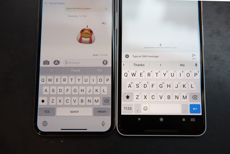
After spending any length of time with iOS, a few things really stand out to me: notifications are still much better on Android; the typing experience is more enjoyable on Android; using Android is much more flexible; and the variety of Android hardware is breathtaking.
Notifications are among the most critical details in any operating system today, and Android nailed it years ago and only continues to get better with every iteration. Google's lead in this regard is so absolute it might as well as insurmountable. In contrast, I loathe dealing with notifications on the iPhone.
Android and iOS are now very similar, but Google's platform has a couple of important advantages.
Typing, too, is considerably more enjoyable on most Android phones, mainly due to Gboard, which (ironically) started out as a third-party iOS app and brought its best features to its own mobile OS. Gboard's autocorrect is smart and reliable and its performance is near-perfect even on older hardware. And like Android itself, you can modify it to look and act the way you want. Apple added a bunch of that stuff to QuickType in iOS 10 and 11, but I always prefer to peck out long-form emails on my Pixel than my iPhone X.
I also love spending time with new Android phones, from the no-nonsense metal chassis of the $229 Moto G5 Plus to the mesmerizing light shifts of the Solar Red HTC U11. Android's openness has facilitated a revolution of smartphone construction and deconstruction, and Google's OS continues to allow practically anybody, at any price point, to get on the internet.
Should you buy an iPhone X?
Apple deserves a lot of credit not just for pushing the envelope of smartphone hardware innovation — look at iFixit's teardown of the iPhone X to see just how elegantly the whole interior is laid out — but for creating an ecosystem where, once you're in, you don't want to leave.
And while I know it's gauche to want us all to live in harmony, in my ideal world I'd have every devoted Android user try the iPhone X for a few days, and every devout iPhone addict use, say, a Galaxy Note 8 or Pixel 2 for the same amount of time. There are lessons to be learned from exploring the differences between the two and, in the end, realizing that they're not so different.
Android devotees probably have little interest in buying an iPhone X, especially one that costs $1000. That's fair: this is a very expensive phone. But if you're aghast at the presence of this review on Android Central, you're exactly the person who should try it, both to see what you hate and what you like.
Daniel Bader was a former Android Central Editor-in-Chief and Executive Editor for iMore and Windows Central.

