Inside Opera and Opera Mini
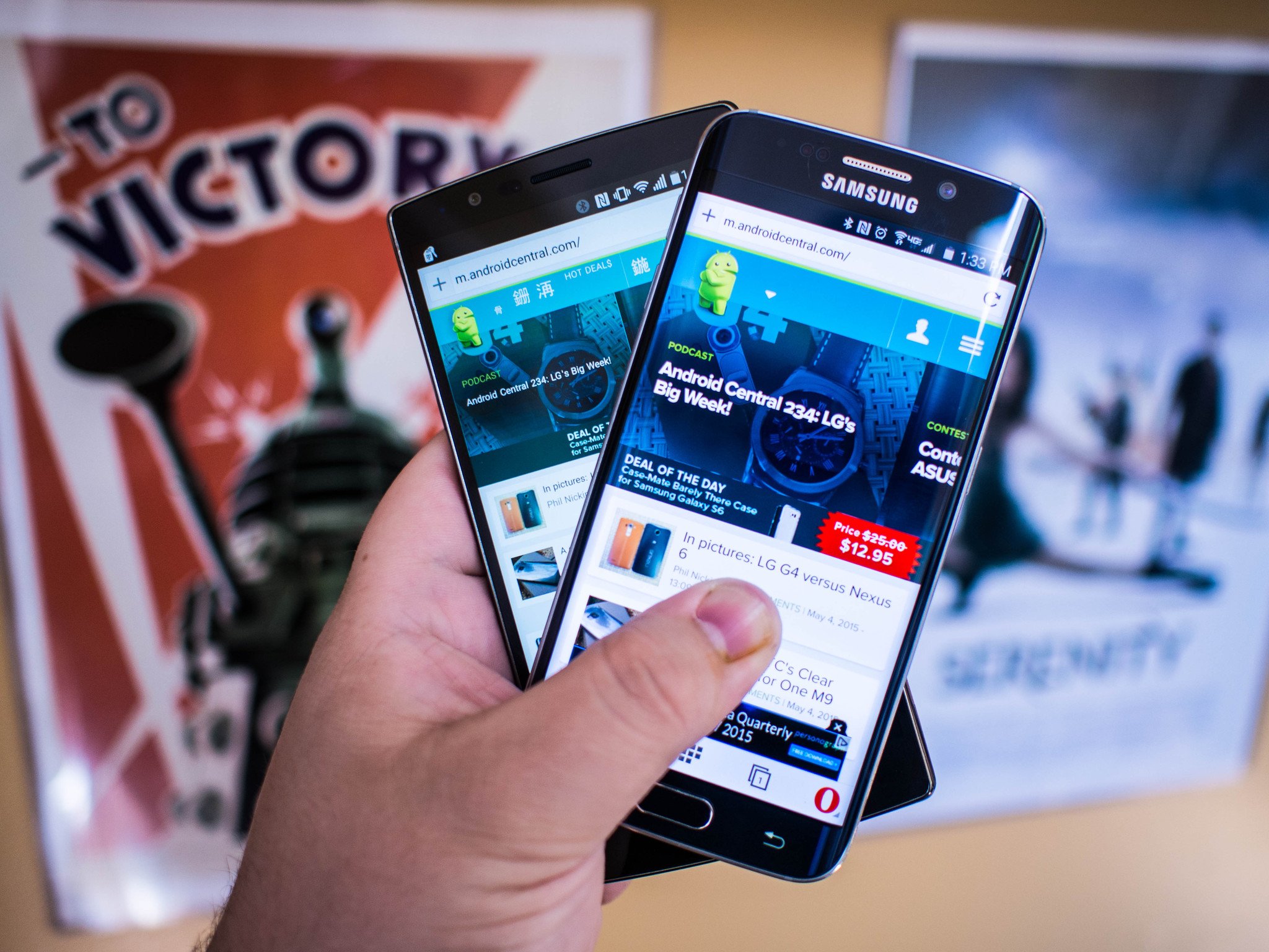
Most people have used a version of the Opera browser without even realizing it. The company has been responsible for embedded, white-label browsers in hundreds of devices, and Opera has had that business sewn up for years because they are so good at building products that run on next to nothing when compared to the powerhouse smartphones and tablets so many of us rely on nowadays. With that in mind, there's a reasonable chance a company that can squeeze every drop of performance from a Nintendo DSi could make an amazing browser for the average Android device.
In point of fact, they make two. Opera and Opera Mini look and work similarly, but the underlying software targets two very different types of users.
Let's take a look.
The Opera browsers have most of the same buttons you expect from every other Android browser, and in just about the same places too. You can switch between search engines, sync with Opera for the Desktop, and it looks nice on phones and tablets alike. The Speed Dial acts as a pin board for your frequently traveled or bookmarked websites, you can access tabs and flip back and forth between tasks at will, and you can open private tabs for those sites you don't want to be tracked on. Where Opera and Opera mini truly differ is how websites behave when you navigate to them, which is a much bigger deal than you may think.
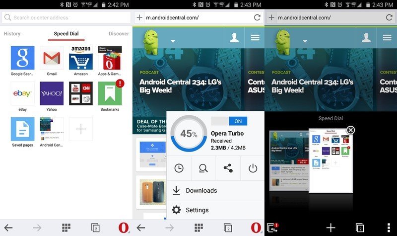
Opera Browser for Android offers the complete experience. Your browser history and and Discover page sit on either side of the Speed Dial homepage, and can be accessed with a quick swipe in either direction. The Discover page is a news aggregation of sorts, offering current events and occasionally an app suggestion or two. You have to swipe into the Discover tab to ever see any of the information here, so even if you see it as a nuisance instead of a value add you can easily ignore it. The tab switching menu splits the screen in half, allowing you to flip through entire screenshots of the tabs you left behind without taking you away from the tab you are currently using. It's a fast, intuitive interface that places just about everything a single tap or flick away from the home screen.
On its own, Opera is plenty fast.
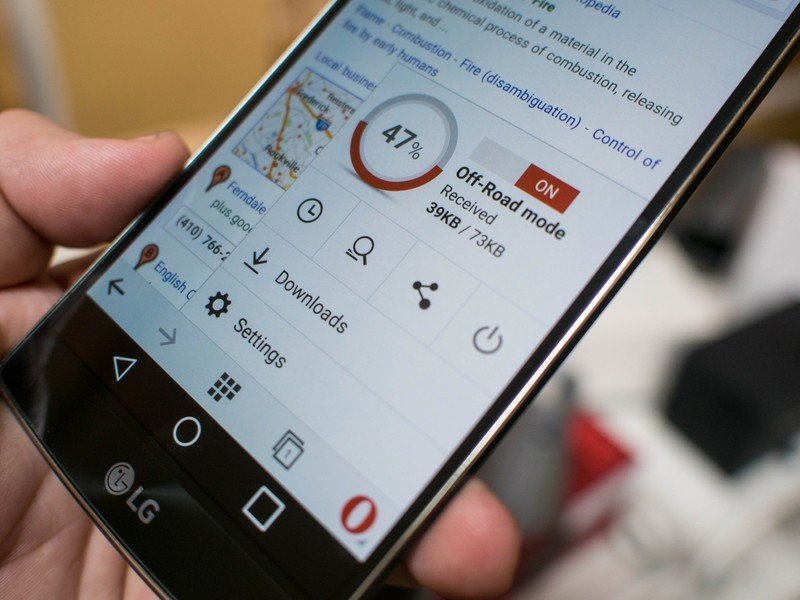
On its own, without anything extra enabled, Opera is plenty fast. If you'd like to go even faster, or if you'd like your regular browsing experience to use less data, you can activate Opera Turbo. With this mode enabled, Opera Browser passes all of your connection information through an Opera server before passing it along to your smartphone or tablet. In doing so, the server optimizes the images and compresses whatever it can to deliver a smaller overall site to your device. In many cases, smaller images means less loading time for the same website, which makes navigating from page to page faster with less data consumed. It also means your website has at least one extra stop on the way to you, which could reverse any potential performance benefits if the site isn't full of images.
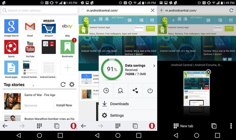
Opera Mini exists for users who know they are going to be in areas with connections that are either unstable or very slow, and based on that information works to crunch images and remove as much as possible to get you the content on the page as efficiently as possible. This is all about using less data to access the same sites, which means some sites are going to look a little broken and others will be nothing but text. You can see how much data is saves through the same readout used in Opera Turbo, but this service is on by default in Opera Mini and is one of the biggest reasons this version of the browser exists.
Be an expert in 5 minutes
Get the latest news from Android Central, your trusted companion in the world of Android
It's not hard to see the differences between a a site loaded in Opera and Opera Mini.
The rest of the Opera experience has been crunched a little as well. The Discover page now sits directly below the Speed Dial, and browser history has been moved off of the home page entirely. The app is slimmer, and often loads sites just as fast as full Opera, but it's not hard to see the differences between a a site loaded in Opera and Opera Mini. Sometimes the ads are in wildly different places, and every once in a while the site will fail to load and require a refresh, but ultimately this is one of the slimmest browsing experiences out there.
And there you have it. Opera's browser platform is simple, straightforward, and it works. There's no way to refute the data savings and performance benefits of the software being used here, which separates Opera from the other Desktop/Mobile combinations. Even if you've never considered using Opera on your Desktop, the mobile experience is something worth having even if all you use it for is a fallback when you find yourself in an area with next to no data. Opera is a great tool to have in your app drawer either way, and if you've never taken the browser for a spin there's never been a better time.

