I tried Amazon's new Fire TV experience and now I can't leave the sofa

Amazon's Fire TV OS and the various Fire TV Edition sets and streaming devices are already among the most popular streaming platform in the U.S. and much of the world. More than 50 million monthly active users rely on Fire TV for their entertainment needs, and this number has continued to climb as more and more people have been forced to stay at home during the COVID-19 pandemic.
The Fire TV user interface hasn't seen an update of this magnitude in its six-plus year existence. At its fall 2020 hardware event, Amazon announced that a newer, more intuitive user interface (UI) would be coming later this year. True to its word, the company began rolling out the update over the past week to customers with the new Fire TV Stick (3rd Gen) and Fire TV Stick Lite devices.
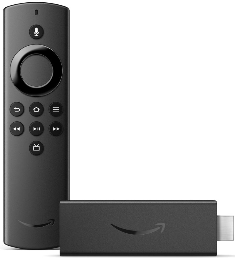
Amazon sent me one of the new Fire TV Sticks to try out the all-new Fire TV experience, and after spending just a few hours with it, I can honestly say that I'm in love, and I'll be parked in front of it on the couch for the next few days. So without further adieu, here are my favorite things about the all-new Fire TV experience.
User profiles

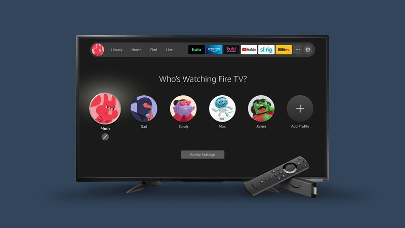
Fire TV OS has had the ability to create user profiles before, but now it's more useful than ever. With the update, users can create up to six unique user-profiles and easily switch back and forth between them. It is now easy to see which profile you are in because the profile name and avatar/icon are front and center on the main menu bar.
Users can choose from twenty or so different icons for their avatar (I chose a basketball player), and their content, recently watched shows, and apps are displayed below. Parents can create kid profiles with age-appropriate content and restrictions. Kid profiles even look visually distinct from adult profiles, taking on a more colorful background as with the Amazon Kids Edition Fire Tablets.
Improved navigation and customization
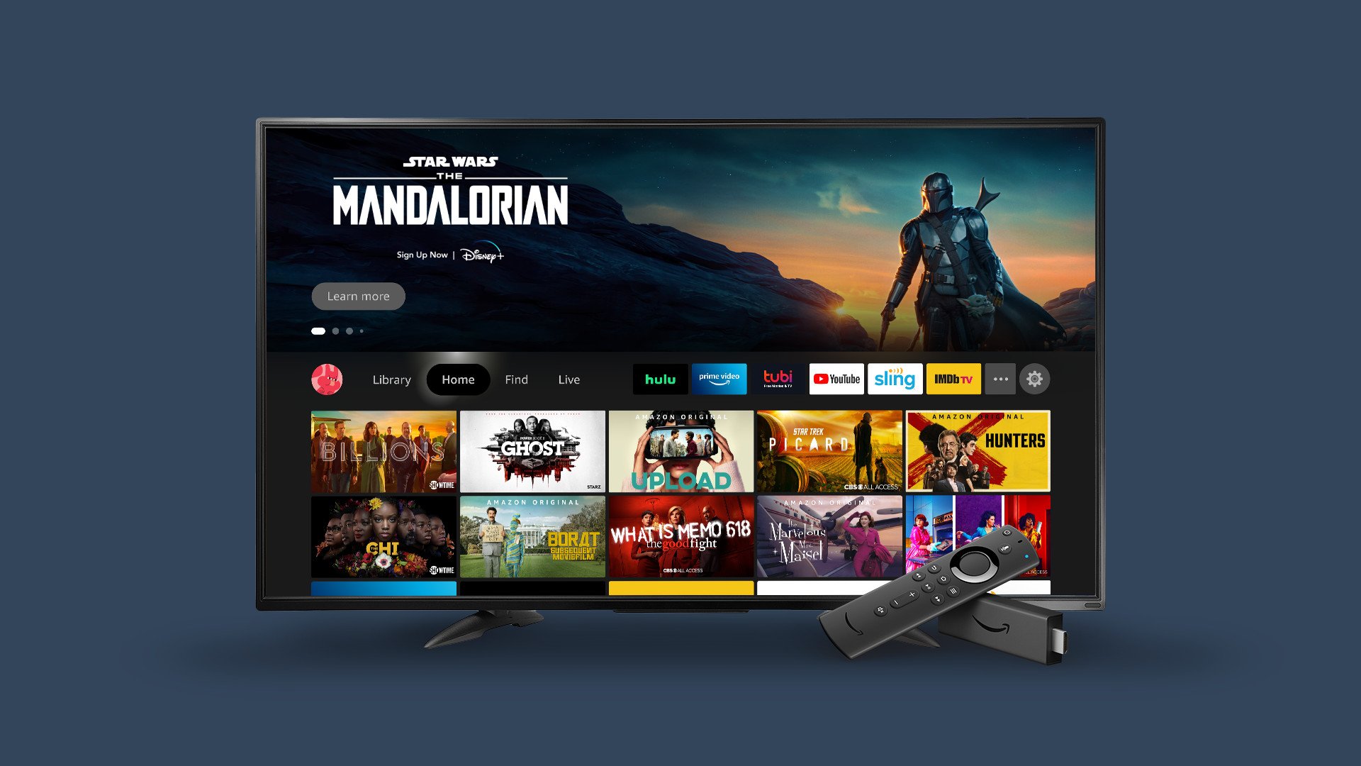
My biggest gripe with the previous design of Fire TV OS was that it was very easy to get lost in the content, but I'm happy to say that this update has dramatically improved the navigation experience. The main menu bar has moved from the top of the screen to the middle for starters, and the options have been simplified from eight to just four primary links.
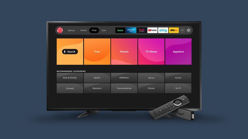
From the left side, you start with the profile switcher. Next comes the Library tab, which shows your watchlist and purchased or rented content, and is much cleaner than the previous Your Videos section. Following that is the Home menu, which features intelligent recommendations for movies, shows, and apps based on your viewing history. The Find tab is perhaps the best of the bunch, as it neatly organizes content by type, and it leads off with free content (very smart during these tough times!). Finally, you have a link to take you into Live TV services.
Be an expert in 5 minutes
Get the latest news from Android Central, your trusted companion in the world of Android
Also in the new main menu bar are your most used and favorite apps and services. You can customize the order of their appearance to suit your preference by clicking on the three dots to the left of the settings gear icon. And speaking of the settings, clicking on that gear brings up the various device and system settings in a card format below the main menu bar that looks just like the cards under the Find tab. It also keeps you anchored below the home screen, which is much preferable to the older way that took you down a rabbit hole of menus and submenus.
Better recommendations and discoverability

I touched on this briefly in the section above, but under the Home tab, Fire TV now recommends content that it thinks you'll like based on your past viewing habits. Even better, this is customized per user profile, so as long as your kids or partner are watching shows from their profiles, their recommendations won't corrupt or influence yours.
Recommended shows will appear in the first row under the Next Up For You section, with recommended apps and services in the rows below. Thanks to the cleaner design and the card UI, it's easier than ever to search by TV shows, movies, or specific genres. And with the enhanced Alexa integration, you can even do so with just your voice.
As I mentioned at the beginning of this article, this new Fire TV experience is currently rolling out to users with the Fire TV Stick (3rd Gen) and Fire TV Stick Lite, and from there, it is expected to come to other Fire TV devices after that.
What else is new with Fire TV
While the favorites I highlighted were certainly tentpole features of the new user interface, they were not the only updates to Fire TV OS.
Amazon says that it wanted to really feature Alexa access and controls with a new voice-first navigation. Users can navigate through the interface entirely by voice or request specific content or information through Alexa. This is possible through the Alexa Voice Remote, but you can also pair an Echo speaker with your Fire TV and control the entire experience with just your voice, or you can pair two Echo speakers for TV stereo sound.
Earlier this month, Amazon added support for video calling through the Fire TV Cube (with supported webcams), as well as picture-in-picture support for video doorbell and security camera feeds, like those from Ring and other brands. That way, you can see what is going on around your house without being pulled away from the content you're enjoying.
Finally, Fire TV devices will now carry on-demand local news. This is rolling out in 12 U.S. cities right now, including New York, Los Angeles, Philadelphia, Chicago, Dallas, Atlanta, Houston, Miami, Tampa, Boston, San Francisco, and Seattle, and it is expected to expand to nearly 90 cities in 2021 and beyond.

Jeramy was the Editor-in-Chief of Android Central. He is proud to help *Keep Austin Weird* and loves hiking in the hill country of central Texas with a breakfast taco in each hand.

