Huawei MediaPad M2 10.0 review: The B-team tablet

The quick take
The Huawei MediaPad M2 10.0 is a product of the old, weird Huawei, not the promising top-tier manufacturer responsible for great phones like the P9. As a media playback slate it works well enough, partly thanks to the harman/kardon-certified speakers. But overall performance is average at best, and EMUI features bugs unfixed from the company's 2015 phones. And to top it all off, it commits the cardinal sin of shipping on Lollipop in mid-2016. Like most Huawei products, the hardware is solid, and the bundled accessories are a welcome touch. But the overall package is mediocre, and that's mostly the software's fault.
The Good
- Quick, accurate fingerprint scanner
- Decent audio capabilities
- Camera not terrible
- Good battery life for video streaming
The Bad
- Mediocre performance
- Low resolution display
- Notification glitches with some Google apps
- Shipping on Android 5.1
Huawei MediaPad M2 10.0 Full Review
The Huawei MediaPad M2 10.0 is a tablet with a 10.1-inch screen. It says so right on the box. Yet it's the Huawei MediaPad M2 10.0. Not the Huawei MediaPad M2 10.1. In fact, I've had to correct myself twice writing those last two sentences. It's a bit of a mess.
That was the first little bit of logical dissonance that confronted me in this product. The second was the setup process, during which the tablet referred to itself as a "phone." We weren't off to a good start.
This is a tablet that doesn't really know what it wants to be. A 10.0 10.1-inch slate with optional pen input, a bundled case and software scaled up from Huawei's smartphones. It's running an old version of Android and an older version of the EMUI interface, with software bugs first spotted more than a year ago on the Huawei P8, still unfixed.
Are you ready for another Huawei review where the hardware's nice but the software's kind of a dumpster fire?
Be an expert in 5 minutes
Get the latest news from Android Central, your trusted companion in the world of Android
Read on.
About this review
We're publishing this review after 2 weeks with the Huawei MediaPad M2 10.1 (Premium Edition, model M2-A01W) in white and silver. Our review unit was the "Premium Edition," with 3GB of RAM and 64GB of storage built in, bundled with a free flip case and "M Pen" stylus. (There's also a standard edition with 2GB of RAM and 16GB of storage, and no bundled accessories.)
Our device updated at first boot to software version M2-A01WV100R001C100B005, based on Android 5.1.1 Lollipop, with the January 2016 Android security patch.
Metal and plastic
Huawei MediaPad M2 10.0 Hardware
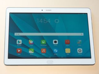
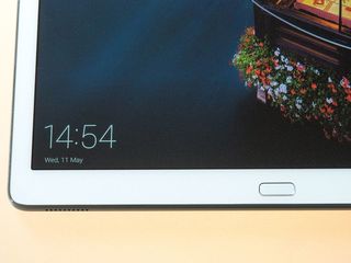
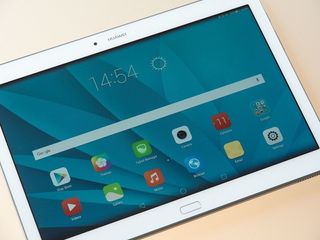
If we had to describe design the Huawei MediaPad M2 10.0 in a word, it'd be "generic." It doesn't particularly stand out in the sea of mid-level Android tablets. If anything, its front-mounted fingerprint scanner brings echoes of a pair of ancient Samsung tabs.
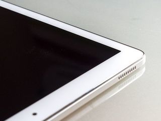
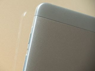
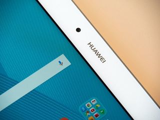
But its metal-backed frame is sturdy and well-built, borrowing one or two design cues from the Chinese company's Android phones. A metallic-effect plastic trim surrounds the 10.1-inch screen, with has a white bezel in the version we're using. And around the back it's mostly just metal, except for the camera bump and plastic section up top for antenna visibility.
Well-built but entirely generic.
Weighing in at 500 grams, the MediaPad M2 is reasonably hefty, but still easy enough to hold with one hand. If you were expecting something as unnaturally light as an iPad Air or Galaxy Tab S2, however, you'll be disappointed.
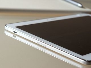
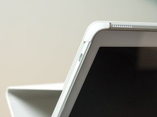
The outer trim houses a predictable array of ports and buttons — power and volume on the right edge, micro-USB and micro-SD (behind a SIM tray-like enclosure) on the left. And on the top and bottom you'll find four harman/kardon certified speakers.
The speakers are a big selling point for the M2, and they're pretty good — up to a point. At half volume they're impressive, putting most tablets (especially in the mid-range) to shame. But distortion creeps in beyond around 75% volume, where the lack of decent bass reproduction becomes apparent. They're above average speakers for a tablet, don't get us wrong. But equally don't expect them to replace a quality Bluetooth setup.
The display too is a mixed bag. It's a 1920x1200-resolution panel, which at 10.1 inches gives a disappointing 224 pixels per inch. Aside from its resolution deficiency, it's actually not a bad panel, with reasonable daylight visibility and vibrant colors that don't appear over-saturated.
The decision to stick to 1080p (or thereabouts) likely has to do with the MediaPad M2's processor. It's running Huawei's Kirin 930 CPU, a relatively old chip first seen in the Huawei P8 last year, paired with 3GB of RAM in the "Premium Edition" M2 we tested.
Kirin 930 is basically pushed to its limits on a Full HD display.
General tablet performance isn't exactly slow, but we're definitely seeing some slowdown in relatively mundane tasks, such as app switching, scrolling in Chrome, and firing up apps that aren't already in memory. Nevertheless, the built-in 64GB of internal storage (again, Premium Edition only — the standard edition has 16GB) coupled with micro-SD expandability, means you shouldn't run out of storage space anytime soon.
And the M2 also benefits from Huawei's excellent fingerprint scanner, front-mounted in this case, which reliably unlocks the tablet about as quickly as any Android phone. EMUI also brings some additional software tricks to the sensor, allowing you to swipe left to go back, or right to open the recent apps menu. It's a nice touch, if not entirely necessary. (After all, the on-screen keys are often right above the fingerprint sensor.)
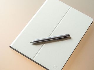
This tablet's accessories are its most interesting hardware feature.
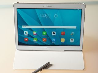
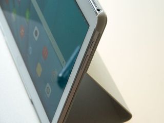
The tablet's most interesting hardware features are its accessories. The version we're reviewing comes with a leather Huawei flip case, which the M2 easily clips into. In addition to protecting it from knocks and scrapes, a magnetic sensor can power on the slate when it's opened, and a groove in the middle of the case allows you to stand it upright. It's not as elegant as Apple's (highly patented) magic covers, but it does the job.
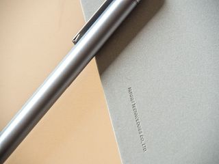
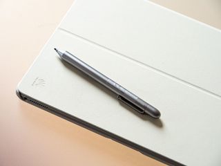
More impressive is the optional "M Pen" stylus bundled with our unit. It's powered by a single AAAA battery, which hasn't needed replacing during our two weeks with the MediaPad, and offers Galaxy Note 5-like levels of pressure sensitivity (2,048 levels) when used with compatible apps. The only problem is there aren't a whole lot of apps to use it with. The preloaded Bamboo Paper app offers an enjoyable writing and drawing experience, with palm detection that's generally accurate.
And you can also press one of the pen's two function buttons to launch a shortcut menu, similar to Samsung's Air Control window on the Galaxy Note. The only problem is these are hard-coded to display shortcuts to Huawei's apps for Email and note-taking.
While the stylus doesn't dock into the tablet anywhere, it's easy to clip it to the side of the flip case when not in use.
Bitter Lollipops
Huawei MediaPad M2 10.0 Software
We've had a love/hate relationship with EMUI over the past year. Some Huawei phones, like the P8 and Mate 8, launched with versions of the company's software interface that were literally broken. Others, like the excellent P9, offered a more functional, far more enjoyable experience.
The MediaPad M2 10.0, unfortunately, is lumbered with the old and somewhat busted EMUI.
Lollipop on a new tablet in mid-2016 is bad for a wide range of reasons.
It's version 3.1 of Huawei's software, atop Android 5.1 Lollipop, with the January 2016 Android security patch. Aside from the fact that being four months out of date on security patches is worrisome, there's basically no excuse for shipping a new product on Lollipop in mid-2016. The first Marshmallow code drop happened in October 2015, and Huawei has been shipping Android 6.0 on phones since December of that year.
The lack of Marshmallow on a media-centric tablet like this is particularly disappointing. M2 owners will miss out on Android 6.0's "doze" feature, which can dramatically improve battery life when devices are idle — as a "coffee table" tablet like this might well be for hours or even days at a time.
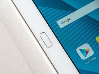
EMUI doesn't quite feel at home on such a large display.
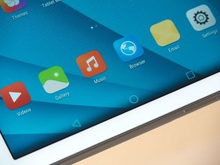
As for Huawei's software, it looks and works much the same as on the company's phones. (In fact, as previously noted, the slate incorrectly refers to itself as a "phone" during initial setup.) That means you've got an iOS-like home screen with no app drawer, and icons that get customized according to the theme you're using. (And there's no end of options available through the Huawei Themes app.)
As you might expect from EMUI, there's an almost endless rabbit hole of settings to explore, including options for tweaking the on-screen buttons, or sliding them to one side for easier use with your thumb. There's also a useful dual-window multitasking feature, though precious few apps are actually supported — mainly just Huawei's own apps and a handful of Google apps.

The iOS influence extends to notification shade, where alerts are shown based on arrival time. And Huawei has its own system for deciding which notifications gets to appear on the lock screen, which is as confusing as it is frustrating and unnecessary.
The tablet version of EMUI scales reasonably well to the larger display, with dual-panel lists in the Settings and a home screen view that re-arranges itself as well as can be expected in landscape mode. But there's a lot about EMUI 3.1 that just doesn't seem like it was designed around a 10.1-inch screen. In the Calendar and Tablet Manager apps, for instance, there's a lot of awkward dead space. And in the Contacts app, entries are displayed in one very wide list when in landscape. It's pretty clear most of this stuff was ported over from a smartphone UI.
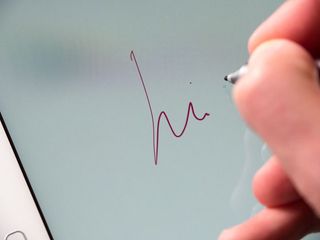
Year-old bugs continue to plague EMUI 3.1. And that's not okay.
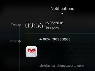
Nagging EMUI bugs persist elsewhere, too. In Gmail for instance, it's almost impossible to see details of individual messages, because they're displayed in black on a black background. (See the image on the right.) And many Google apps are excluded from the lock screen notification panel, because they're not listed in Huawei's notification manager. And we still have to take issue with app icons being hard-coded into EMUI's themes, so you're presented with ancient graphics for many bundled Google apps, like Gmail. (Again, see the image on the right. That's the pre-Material Design Gmail icon. In 2016.)
These are issues affecting bundled apps from the operating system provider that we've been seeing for over a year on Huawei devices. It's staggering that Huawei is still shipping software that is borderline broken in this way. (And given that the firm has fixed these bugs in some EMUI 3.1 devices, like the Honor 5X, why is it still shipping new products affected by year-old glitches?)
"Paint the back of the fence" is a mantra often attributed to Steve Jobs' father, enapsulating the idea of taking pride in the minor, often unseen details of your work. I mention it here as a point of contrast — because it's the antithesis of what we've witnessed in EMUI on the MediaPad M2, where we're confronted by lack of attention to detail at every turn.
To take that metaphor a bit further, Huawei might start by painting the front of the fence.
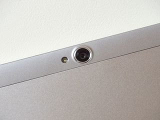
You'll still look like an idiot
Huawei MediaPad M2 10.0 Camera
Tablet cameras are often an afterthought, especially on larger models. And yes, you'll still look like an imbecile taking a photo with a 10.1-inch tablet.
A surprisingly competent camera for a mid-range tablet.
But when it comes to actually taking pictures, the MediaPad M2 actually isn't bad at all. It's got a rear-facing 13-megapixel shooter that's surprisingly capable in daylight, and even moderately lit indoor conditions. Fine detail is a little mushy, and low-light performance is patchy at best, but it's absolutely usable a snap. What's more, the handy quick-launch shortcut on the lock screen means you'll be able to launch into the camera app faster than you can track down a stray smartphone to take your shot.
There's also a 5-megapixel camera for selfie duties and video calls, which is fairly basic, but does benefit from all the beauty options present in Huawei's "Perfect Selfie" mode, if you're into that sort of thing.


The MediaPad's camera app is another holdover from the company's Android phones, with a handful of options making their way across from Huawei's high-end shooters. These include manual shooting options (for ISO, white balance, exposure and so on) hidden away in the Settings menu, and more standard features like HDR, Panorama and "Best photo" modes in a top-level menu.
It's about as much as you could hope for from a tablet camera at this price point.
But yes, people are still going to judge you for taking pictures with a 10.1-inch piece of metal and glass.
All juice, no doze
Huawei MediaPad M2 10.0 Battery Life
Huawei quotes battery life of 10 hours in video playback from the MediaPad M2's fixed 6,600mAh battery, and that matches our experiences using the tablet for playback from Netflix and YouTube in our time with the device.
Battery life is decent, but you'll miss out on Marshmallow's power-saving features.
Web browsing through Chrome depleted the battery at a similar rate, about matching the quoted 9.5 hours of Wi-Fi browsing per charge. Naturally, you can expect to take an additional hit there should you opt for the LTE-equipped model.
Because of the sheer size of the battery, it's that screen, not the relatively power-efficient processor, that's going to be your main battery drain. Hence we've found battery life heavily tied to screen-on time in most use cases.
Again, we have to note that it's disappointing to see this tablet shipping without Android 6.0 Marshmallow as that large battery could surely extend its standby time considerably with the benefit of the new "doze" capability.

The Bottom Line
Should you buy the Huawei MediaPad M2 10.0? No
Software bugs aside, the Huawei MediaPad M2 10.0 just doesn't feel like a complete thought, and is beaten by others in this category when it comes to performance, weight and display quality. Considering the hefty price of £329.99 for the Premium Edition, we'd go for the larger of Samsung's Tab S2 devices instead.
The cheaper standard edition, at £249.99, may be a more tempting proposition. But you'll miss out on the bundled accessories, as well as coming away with a lower-specced tablet. And again, Samsung also offers a more complete, less buggy experience at this price point, with the Tab S2 8.0.
What really cripples the MediaPad, however, is the the lack of attention to detail in the software. Once again we're left wondering whether anyone at Huawei actually used this device with core Google apps like Gmail before shoving it out the door. That's before you get to the fact that launching with not just an old version of Android, but an old version of EMUI as well.
Did anyone at Huawei actually use core apps like Gmail on this device before shoving it out the door?
Maybe Huawei will eventually develop a tablet that matches the fantastic P9 in design and software quality. That phone shows the company can do great things when it applies itself. By comparison the MediaPad M2 10.0 feels like a product developed by the Huawei B-team.

Alex was with Android Central for over a decade, producing written and video content for the site, and served as global Executive Editor from 2016 to 2022.
