The quick take
Huawei has finally come of age — the Chinese company's enormous new flagship phone is a huge leap ahead in software terms — backed up by top-notch hardware and epic longevity.
The Good
- Top-notch build quality
- Big, attractive screen
- Fast performance throughout
- Great battery life and super-fast charging
The Bad
- Lower screen resolution than rivals (regular Mate 9)
- Camera not quite effortless as GS7/Pixel
- Finicky capacitive buttons (PD Mate 9)
Big deal
Huawei Mate 9 Full Review
With the spectacular failure of the Samsung Galaxy Note 7 comes an opportunity for everyone else with a big-screened Android phone to sell. A major competitor in the world of "phablets" has been taken out of the game, and China's Huawei stands to benefit handsomely from Samsung's misfortune.
The company's long-running Mate series — itself a reaction to the success of the Note line, back in the day — has carved itself out a niche among consumers who appreciate its metal construction, enormous displays and long battery life.
The new Mate 9 continues the family line — a slightly slimmer, smarter version of last year's Mate 8, with upgraded internals and a new dual camera setup courtesy of imaging partner Leica. Just as important as any hardware upgrade is the new EMUI 5 software, which is the biggest overhaul to Huawei's UI in years, bringing with it Android 7.0 Nougat.
But there's more than one Mate 9 model this time around. Alongside the vanilla 5.9-inch Mate 9 (with 4GB of RAM and 64GB of storage), Huawei will release a limited edition Porsche Design Mate 9, with a 5.5-inch curved AMOLED display, and a capacious 6GB of RAM and 256GB of storage.
Get the best price on the Huawei Mate 9
We've had a little over a week to get to know both the sensible and ludicrous Mate 9 models over the past month. And while it's easy to dismiss the "PD" model as an expensive sideshow, the regular Mate 9 shines through as the best big-screened Android phone of 2016.
About this review
Update: This review was originally published on November 15, 2016, and updated with impressions from finalized software — and our video review — on December 13, 2016.
We're publishing this review after around six weeks with the regular Huawei Mate 9 (dual-SIM, MHA-L29), and the Porsche Design Huawei Mate 9 (dual-SIM, LON-L29). We used both devices on the EE and Vodafone UK networks while in the UK, and on Telekom.de and Vodafone Germany networks while roaming in Germany.
For our first month with the Mate 9, both phones were running pre-production software (build B109SP02). On November 30, we received an over-the-air update to B126 on the regular Mate 9, and B124 on the Porsche Design model, bringing them up to retail-quality software. As promised, we're updating our review to reflect the changes in the final Mate 9 firmware. Before we begin, a few main points on what's changed and what hasn't:
- Low-light performance in the camera has been significantly improved.
- The software issues surrounding the notification area (and notification icons) have been fixed.
- "Ghosting" on the capacitive buttons of the PD model has improved, but we're still seeing occasional missed taps on the home key.
And with that, on to the review!
Press play
Huawei Mate 9 Video Review
It's big
Huawei Mate 9 Hardware
There's nothing unexpected or particularly extravagant about the Mate 9's external design. Most of what makes up the outside of the device hasn't changed a whole lot since last year's Mate 8. However, Huawei has worked to make the phone a little bit more compact and ergonomic — and given the fact that we're still dealing with a gigantic display here, that kind of attention to detail is important.
The Mate 9 is big, but not unreasonably huge.
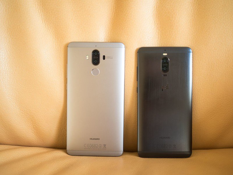
The Mate 9's slim profile and equally svelte horizontal bezels combine to make for a 5.9-inch phone that doesn't feel particularly huge. Compared to the Nexus 6P, a 5.7-incher, the Mate 9 is fairly easy to wrangle one-handed. This is a big phone, but not anywhere near as unwieldy as some of its predecessors. (2014's Mate 7 feels comically huge, by comparison.)
The basic physicality of the phone draws from Huawei's established design language. There's a curved unibody, furnished in soft-feeling matte aluminum, broken up by relatively discrete plastic antenna cutouts at the top and bottom.
The top, bottom and sides have a subtle polished effect to them, along with a barely noticeable brushed pattern, and a very slight curve of their own. Despite this, the front and back chamfers make the Mate 9 easy to grip onto, even with its relatively large footprint.
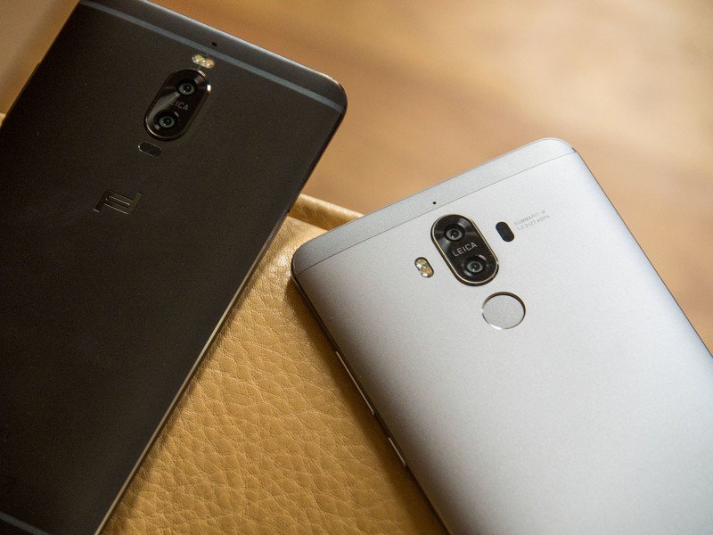
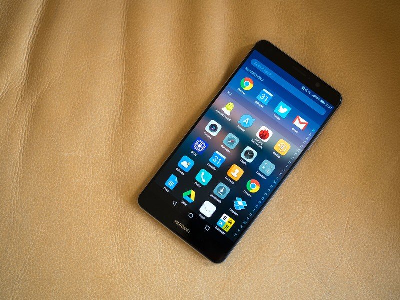
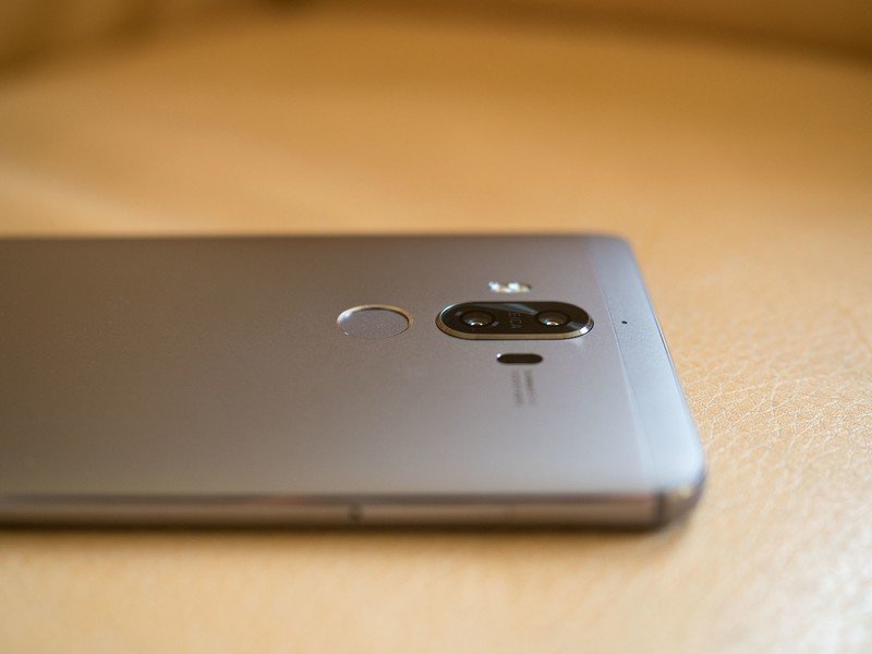
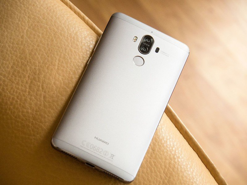
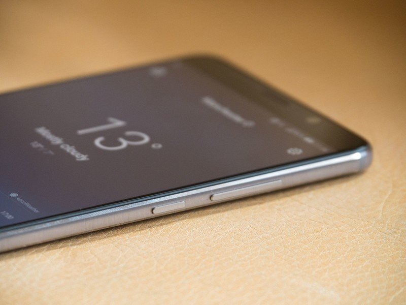
The combination of lustrous chamfers, subtle brushed patterns on the sides, and a softer matte back give just enough visual flair to what might otherwise have been a dull design.
Located right in the middle of that metal unibody is the Mate 9's fingerprint scanner, which is just as fast and accurate as we've come to expect from Huawei. Setup takes around half a dozen taps per finger, and the fingerprint sensor also comes with some neat shortcut gestures, like swiping down to open the notification shade.
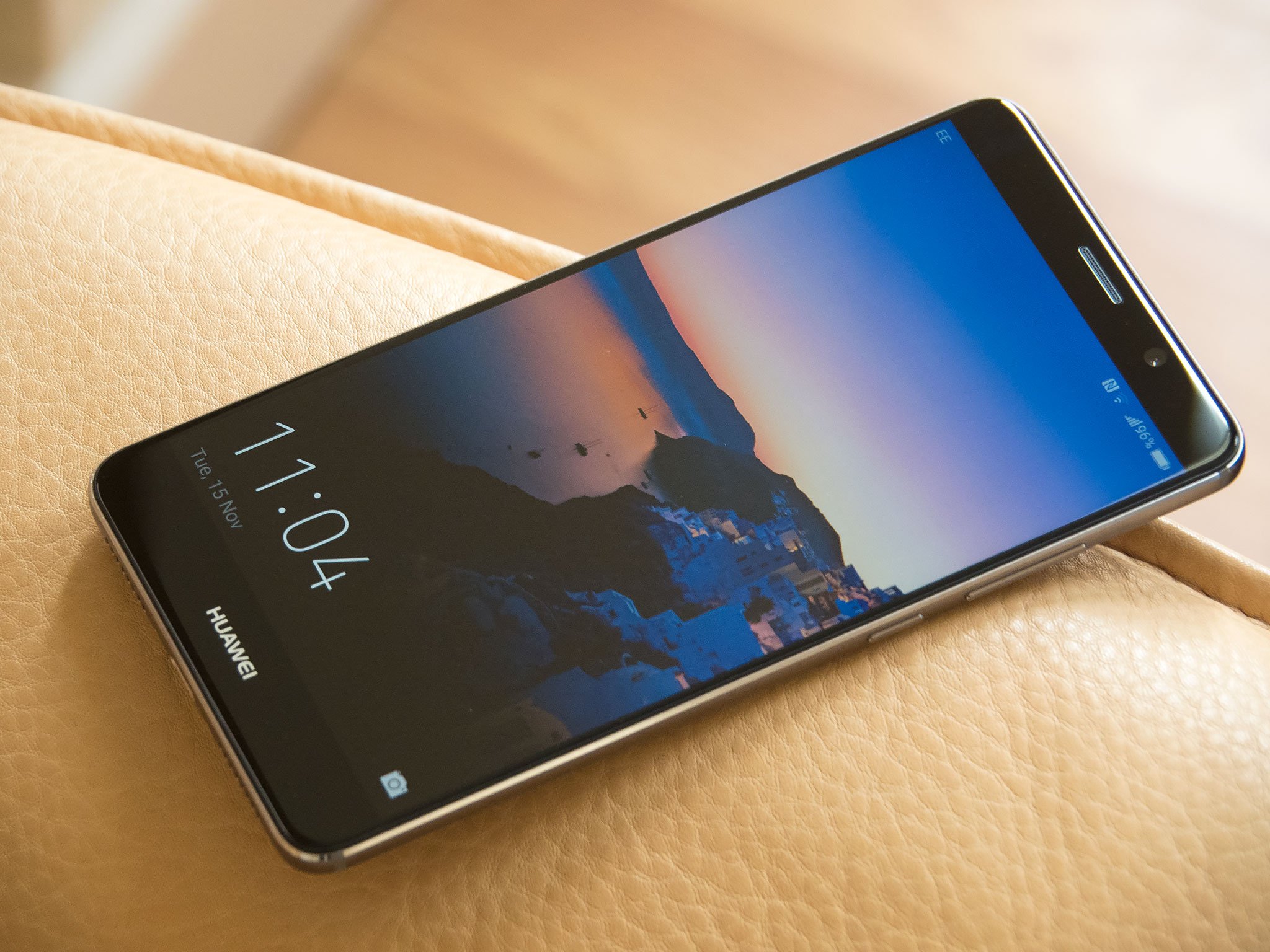
Around the front, there's little going on besides a 5.9-inch sheet of 2.5D glass, which tapers into the metal unibody, giving it an organic quality. Despite its mere 1080p resolution, it's actually a fantastic looking panel. Colors appear a little on the cool side by default, however that's easily remedied in the Display settings menu.
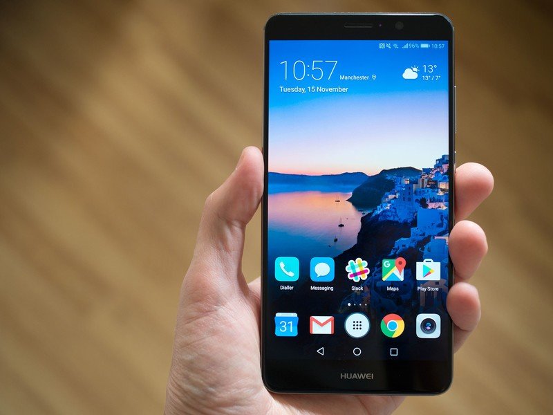
Don't worry too much about 1080p at 5.9 inches.
Ideally, I would've preferred Huawei make the jump up to Quad HD here, especially as the smaller Porsche Design Mate 9 manages this resolution without breaking a sweat. But faced with the reality of a 1080p panel at 5.9 inches, I can't say I'm too disappointed. It looks just fine.
The Mate 9's audio capabilities are equally beefy — up to a point. The phone combines a rear-firing loudspeaker with the main earpiece in a dual-speaker setup, similar to the HTC 10 or Huawei P9 Plus. At max volume level, the output is louder than you'd ever want it to be, which is great if you're showing someone a video in a crowded bar. But above around 50 percent volume, playback becomes increasingly tinny, with some distortion creeping in.
Fortunately, we've found that wired audio output is excellent with this phone. The 3.5mm jack (yep, it has one of those) is capable of driving demanding studio headphones with just as much power as the HTC 10.
| Category | Huawei Mate 9 | Porsche Design Mate 9 |
|---|---|---|
| Operating System | Android 7.0 with EMUI 5.0 | Android 7.0 with EMUI 5.0 |
| Processor | Huawei Kirin 9604x A73 @ 2.4Ghz, 4x A53 @ 1.8GhzMali-G71 MP8 GPUi6 co-processor | Huawei Kirin 9604x A73 @ 2.4Ghz, 4x A53 @ 1.8GhzMali-G71 MP8 GPUi6 co-processor |
| RAM | 4GB | 6GB |
| Display | 5.9-inch 1920x1080IPS LCD2.5D glass | 5.5-inch 2560x1440AMOLEDcurved glass |
| Rear Camera | 20MP (monochrome) + 12MP (color)f/2.2OIS | 20MP (monochrome) + 12MP (color)f/2.2OIS |
| Front camera | 8MP, f/1.9 | 8MP, f/1.9 |
| Video | 4K capture | 4K capture |
| Battery | 4,000 mAhNon-removable | 4,000 mAhNon-removable |
| Charging | SuperCharge3.5-5V / 5A9V / 2A | SuperCharge3.5-5V / 5A9V / 2A |
| Connectivity | USB Type-C, Bluetooth 4.2 | USB Type-C, Bluetooth 4.2 |
| Fingerprint sensor | Yes, on rear | Yes, on front |
| Storage | 64GB | 256GB |
| Expandable storage | microSD | microSD |
| Dual SIM | Yes, dual nano | Yes, dual nano |
| Colors | Space Gray, Moonlight Silver,Champagne Gold, Mocha Brown,Ceramic White | Graphite Black |
| Dimensions | 156.9 x 78.9 x 7.9 mm | 152 x 75 x 7.5 mm |
| Weight | 190 grams | 169 grams |
| Price | €699 | €1395 |
As you'd expect from a Huawei flagship, the Mate 9 is packed to the gills with the latest high-end internals from the Chinese manufacturer. The centerpiece is its new Kirin 960 processor, which is the first mass-market chip to use ARM's new Cortex-A73 core design. (A step up from the Cortex-A72s used in the Mate 8 and P9 in terms of both power and efficiency.) The Mate 9 pairs four of these A73s — running at 2.4GHz — with four lower-power Cortex-A53 cores for less demanding tasks. (Once again, Huawei's using a 16nm manufacturing process, same as its Kirin 950-series chips.)
Huawei's also the first big phone maker to ship ARM's new Mali-G71 8-core GPU, with the Mate 9 using the next-gen graphics processor that's expected to feature in the Galaxy S8 next year.
The Mate 9's cutting-edge internals power an experience that's flawlessly smooth.
Between the speedy new CPU, lightning-fast UFS 2.1 storage and an upgraded GPU, the Mate 9 absolutely flies. Performance has been flawlessly smooth during our first week with the phone, whether browsing the web, juggling photos or doing a bit of casual gaming. Even more demanding titles like Asphalt Xtreme were silky smooth.
Huawei was keen to promote its performance optimization tech at the Mate 9's Munich launch event. A combination of machine learning (to work out which apps need the most power) and intelligent resource allocation is supposed to keep the phone running smoothly even after years of use. Obviously we're not in a position to make any kind of judgment after just a month or so, but it's enough to say we haven't noticed any slowdown at all thus far. Everything's been flawlessly smooth, as we'd expect from a high-end Android phone in late 2016.
So far it's a very promising start.
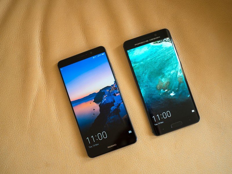
Porsche Design Mate 9 hardware
The 'Porsche' model really is a completely different phone — at least on the outside.
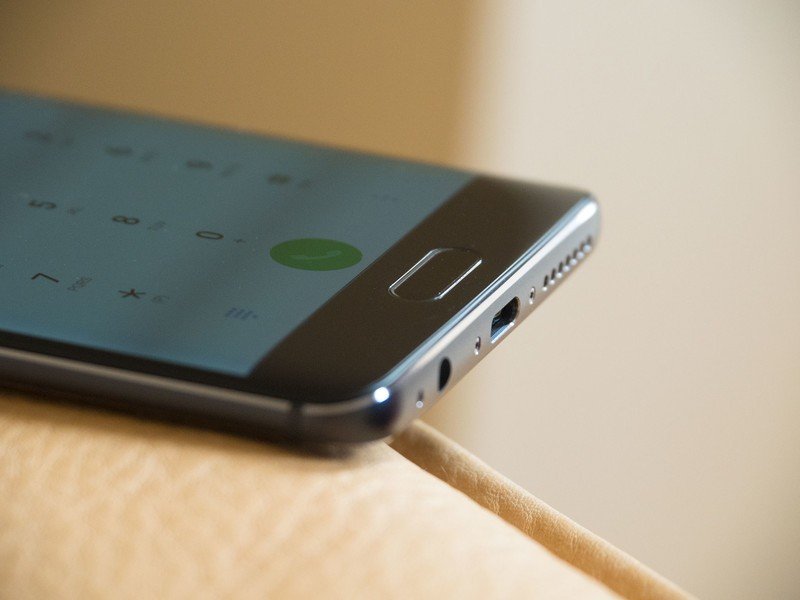
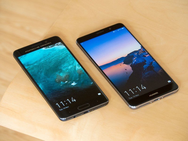
For all their other hardware similarities, the Porsche Design Mate 9 really is a completely different phone on the outside. The smaller form factor, curved display and pitch-black anodized metal, together with the front-facing fingerprint scanner and capacitive buttons, make it look more like one of Samsung's recent efforts than any previous Huawei design.
But this is more than a Galaxy S7 edge copycat. The left-to-right curve of the display is incredibly subtle — intended to mirror the curve of the metal rear. And the sharper edges of the Huawei device stand in contrast to the GS7's soft corners.
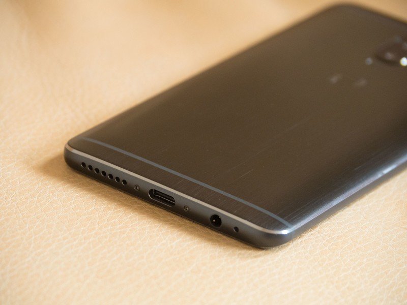
The Porsche Design model's extremely dark anodized paint job also gives it a significantly different in-hand feel. It's a little more fingerprinty than the regular Mate 9, while the surface itself is less slippery in-hand. At the same time, the sharper chamfered edges add not only visual flair, but help by giving you a harder edge to hold onto. Personally, I prefer how the regular Mate 9 feels in my hand, but there's something to be said for the darker aesthetic of the Porsche variant.
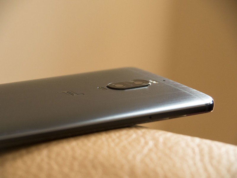
The camera modules have also been juggled about a bit too. And around the back, the rear-mounted fingerprint scanner has been replaced by a large embossed Porsche Design logo. (You'll also find some fairly prominent Porsche branding around the front.)
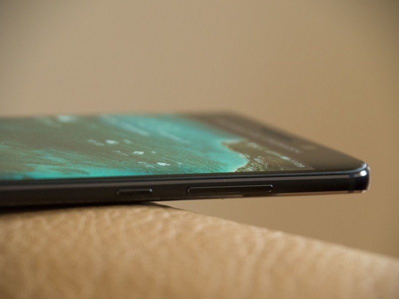
This isn't as much of a Samsung clone as you might think.
Like the regular Mate 9, the screen in the Porsche Design variant has a fairly cool hue by default. (But just like that phone, you can easily tweak white balance to your own preference.) Aside from that one minor complaint, the curved 2K display looks great. Colors aren't noticeably punchier than the Mate 9's LCD, but the bump in pixel density is appreciated. And it's more than bright enough to see clearly outdoors.
The Porsche Design Mate 9 manages to package all of the Mate 9's cutting-edge tech into a much smaller (or, to put it another way, more "normal-sized") handset. Does it feel like it's worth the €1395 asking price? That's debatable. In a world where attractive metal phones like the OnePlus 3 sell for €450, it's a tough ask. But then, you're missing the point if you think a phone like this has anything to do with value for money. You're also paying for the exclusive Porsche brand, and the jump up to 6GB of RAM and 256GB of storage.
More: Making the Porsche Design Huawei Mate 9
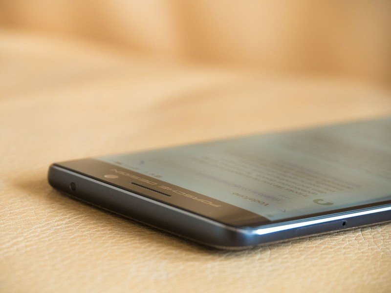
EMUI 5.0
Huawei Mate 9 Software
Phone software has long been Huawei's Achilles' heel. If you've read any of our previous Huawei reviews, the whole "great hardware, crap software" thing will be a familiar refrain. With the new EMUI 5.0, based on Android 7.0 Nougat, Huawei promises a brighter, refreshed UI. And with that new version of Android, there's the chance to overhaul traditional areas of weakness for EMUI, like notifications and the recent apps menu.
As mentioned in the intro, the few issues we ran into with notifications in the pre-release software were fixed in the retail firmware, which is great.
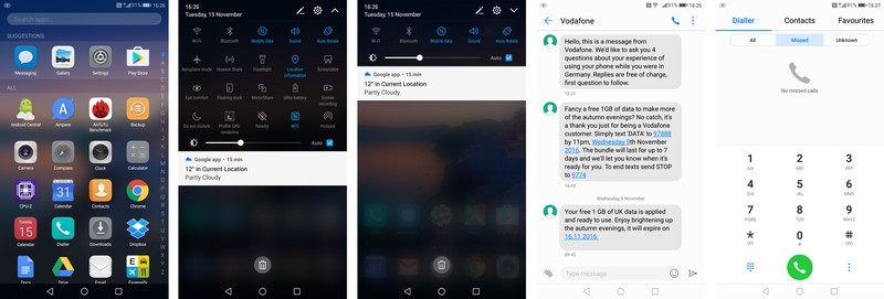
EMUI 5 is a breath of fresh air. It looks — and acts — more like it belongs in the modern Android ecosystem.
With that out of the way, EMUI 5.0 is, for the most part, the huge improvement it needed to be. Most of Huawei's own preloaded apps have been given a complete visual overhaul, with white backdrops, light grey accents and blue highlights. Apps like the dialer, messages app, calendar and settings look more like they belong in the modern Android ecosystem, as opposed to seeming like weird not-quite-right-looking iOS clones.
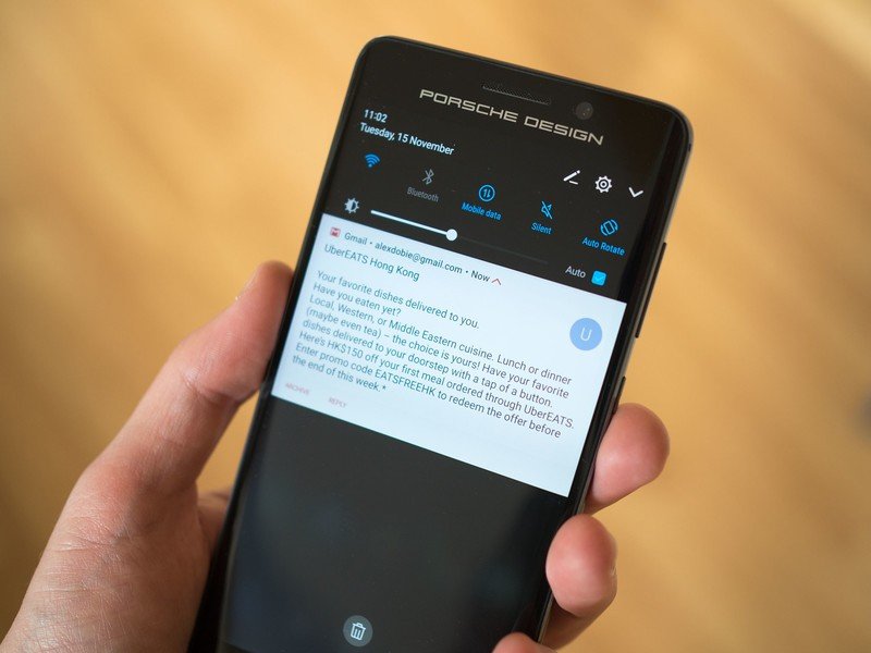
And the new, darker notification shade, is more customizable than ever, with more icons shown at once than the old grid setup of old.
Aside from the new, optional app drawer (finally!), Huawei's home screen launcher hasn't changed a whole lot. Folders still look a lot like they do on the iPhone, and there's a similar swipe-down shortcut to search apps and other content on the phone. But at least the launcher is fast, feature-filled and highly customizable.
Speaking of which, you can still theme EMUI to your heart's content, only now there are few more limits to what skins can do. For instance, Huawei's own apps, with their new blue-and-white hues, are off-limits. That said, it's a strange point of discontinuity that the default icons for Huawei's own apps don't really seem to fit with its new, flatter, cleaner aesthetic. (In the default "bridge" theme, you're still looking at a lot of embossed, rounded rectangles, which looks a little out of place.)
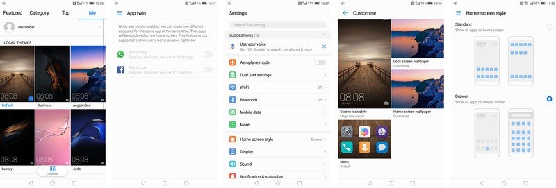
The way EMUI looks may have changed, but its expansive feature set hasn't gone anywhere. In fact, finding your way around all that stuff has become a lot easier, with a redesigned settings menu that puts more than 90 percent of features just three taps away. And when you've drilled down into a specific settings menu, a slide-out "hamburger" menu easily lets you hop to another area of the app.
Get the best price on the Huawei Mate 9
The battery settings menu is significantly easier to jump to in EMUI 5 — it's now a top-level item, as opposed to being buried three layers down in EMUI 4. And here there've also been some significant improvements. EMUI no longer kills off most apps when you power off the screen. Instead, you have the ability to blacklist individual apps that might be using too much juice in the background, and have them killed off when the screen's powered down. And EMUI will help you track these down by notifying you — though these notifications are a far cry from the constant "power consumption" nags in earlier versions.
EMUI's expansive feature set no longer comes at the expense of a whole bunch of broken stuff.
That's on top of a standard loadout of power-saving options, including ultra power saving mode (for limited functionality only), a regular power-saving mode (which reduces performance) and a low-res mode for additional power savings on longer days. It's a more sensible approach to battery management in a phone which, as we'll discuss later, already has plenty of juice in the tank.
Also new in EMUI 5 is the ability to use multiple accounts with WhatsApp or Facebook through the Twin App feature — something that's achieved by basically running two identical instances of the app at once. It's a niche feature in the West, but something that's sure to be useful in markets where dual-SIM phones are popular.
All in all, EMUI 5 feels more balanced — both visually and in terms of feature set — than previous versions, while also being less at odds with Google's preloaded services. This is by far the most polished software suite we've seen from Huawei.
Porsche Design software differences
For the most part, the software experience on the more expensive, speccier, Porsche-branded Mate 9 is completely identical to that of the regular model. The biggest difference in day-to-day use has to do with the button setup. The Porsche Mate 9 uses capacitive keys (right now, the home button is a little hit and miss in the current firmware), and thanks to the fact that neither the back nor recent apps keys are labelled (both are just white dots), you can easily swap the order in the Settings menu. It's also possible to disable both buttons and control things by swiping the home key, but we wouldn't recommend doing this.
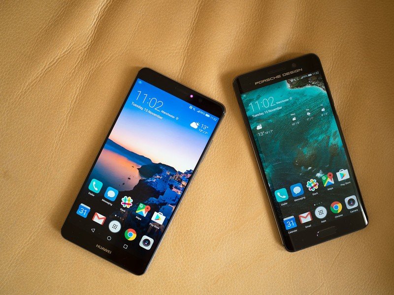
The two preloaded themes on the Porsche model look tacky. Fortunately, it's easy to download the standard themes from the regular Mate 9.
There are some visual differences too, but these are largely isolated to the Porsche-inspired themes preloaded on the phone as standard. You'll need to grab the regular EMUI themes from Huawei's theme store — and trust us, you'll want to, because the chromed-out Porsche icons used in both preloaded themes are pretty gross.
There's also a "dark mode" under the Battery settings menu, allowing you to save a little juice by switching to an almost completely black UI in Huawei's own apps. (AMOLED screens like the Porsche Mate 9's consume less power when displaying darker colors.)
And elsewhere, the smaller Porsche-branded Mate 9 benefits from slightly higher information density, although UI scaling can also be controlled through the Display settings menu.
So mostly you're just dealing with the same software on a smaller screen, without on-screen buttons.

Leica camera, v2.0
Huawei Mate 9 Camera
Huawei's partnership with camera maker Leica continues, with a new and improved camera setup in the Mate 9. Like the P9's Leica-branded shooter, it's based around a dual-lens, dual-sensor setup, with an RGB sensor for capturing colors, and a monochrome sensor for enhancing detail.
In the Mate 9, the RGB sensor is a 12-megapixel unit behind an f/2.2 lens — the same as the P9, on paper — with OIS (optical image stabilization). And it's backed up by a 20-megapixel black-and-white sensor, also behind an f/2.2 lens. This setup, Huawei says, allows it to capture clear low-light shots while also picking up enough fine detail to implement a "hybrid zoom" feature.
That's not quite the same as the iPhone 7 Plus's true 2X optical zoom, but it does let you eke a bit more detail out of your shots when shooting at the default 12-megapixel resolution.
A higher-resolution secondary sensor also allows the Mate 9 to generate more realistic bokeh effects in its "wide aperture" mode. We've been seriously impressed with some of the effects we've been able to create thanks to the new camera setup — which includes Kirin 960's new dual ISP, specifically designed to help manage input from two sensors. (It's particularly neat that you can now preview these software bokeh effects in real time through the viewfinder.)
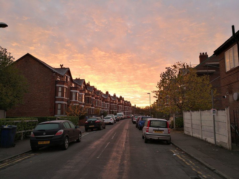
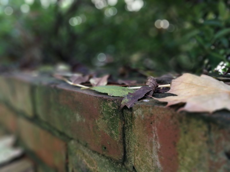


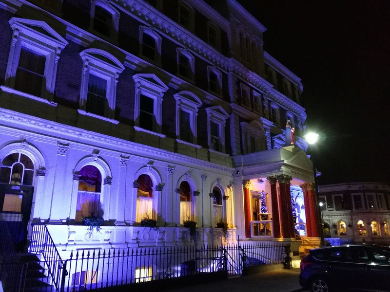
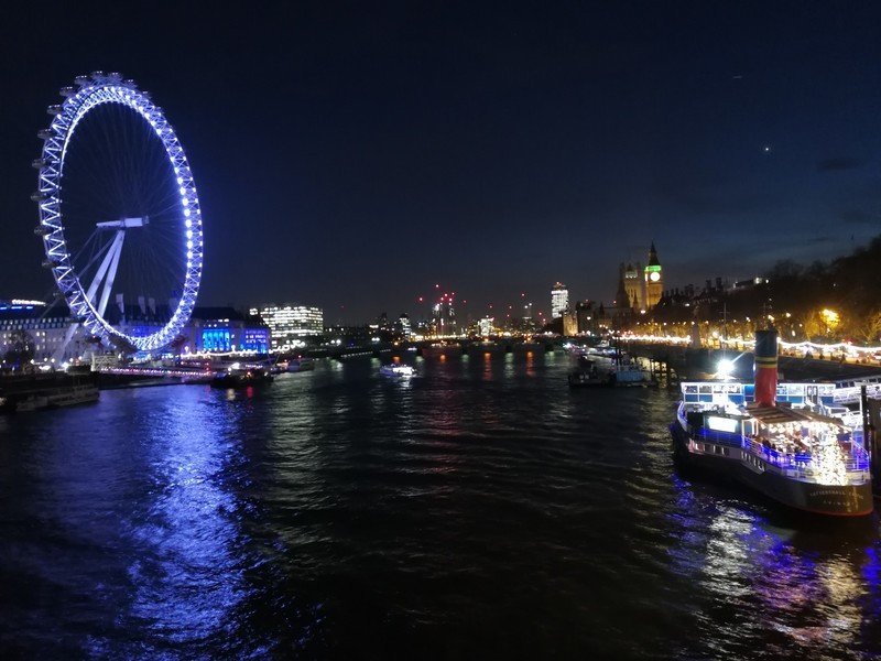
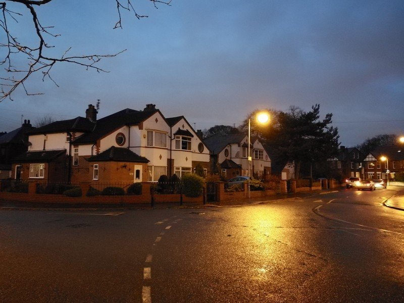
Overall image quality from the Mate 9's unique camera setup has generally been good across the board, with one or two caveats. Photos taken in daylight are usually superb, with colors that appear more muted, but also more realistic than output from Samsung's cameras. In challenging lighting conditions, an auto-HDR mode appears to kick in, significantly boosting dynamic range and producing photos with plenty of detail in both light and dark areas.
Huawei's camera app gives you the option of "smooth colors" or "vivid colors," both of which crank up the saturation to varying degrees. Unfortunately this is accompanied by a weird vignette effect, and as such you'll want to use them selectively. (There's an independent "saturation" slider in the settings menu.)
Update: We noted in our initial review that low-light performance was a little wonky, and as expected, this has been fixed up in the retail firmware. Photos in the dark now approach the level of the Galaxy S7, though Huawei's camera still seems more susceptible to movement in low-light shots than Samsung's. "Pro" mode, which is always a swipe away, lets you manually adjust settings for longer exposures, and using this feature it's possible to get some truly stunning shots.
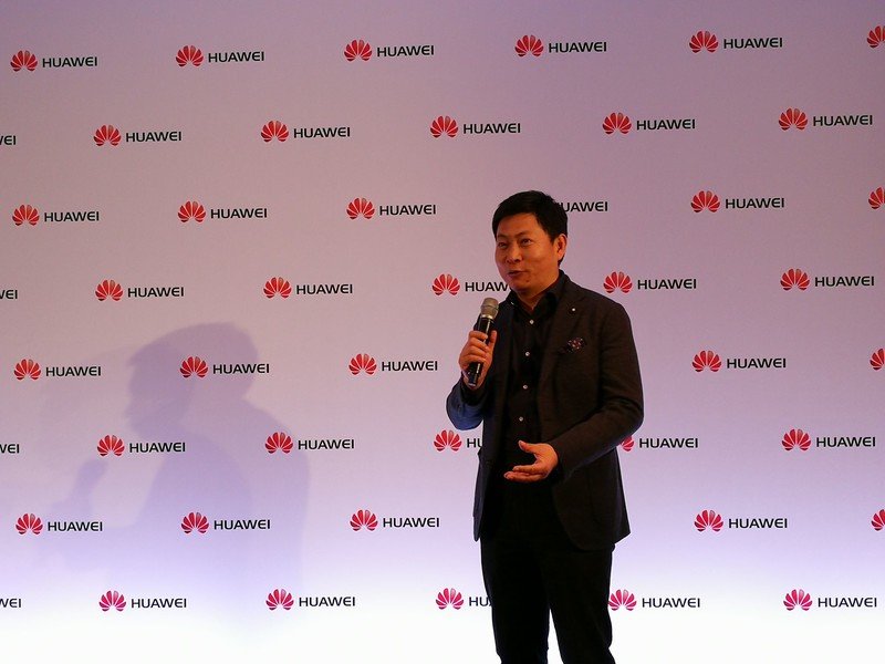
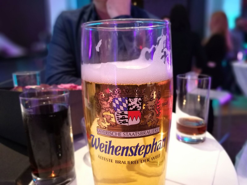


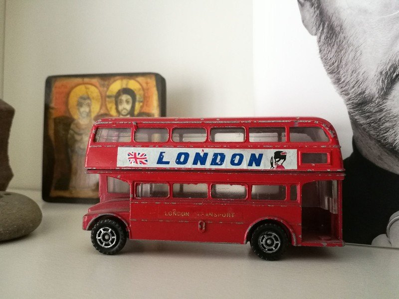


As far as video goes, it's a similar story — good dynamic range and lifelike colors in daylight, becoming disappointingly grainy in the dark. The Mate 9 can shoot at up to 4K resolution using the h.265 codec — though this comes with the trade-off that very few services know what to do with h.265 footage right now — including the likes of YouTube and Google Photos.
Scaling down to a more reasonable 1080p resolution gets you the option of 60fps recording, along with software stabilization. The Mate 9's stabilization works (and feels) like that of the Google Pixel, with a cropped-in viewport and a tendency towards sometimes jarring pans when moving the camera around. While it was able to smooth out the motion from walking, it doesn't do so as effortlessly as Google's phone.
Epic longevity
Huawei Mate 9 Battery
Huawei's Mate devices have always excelled in battery life, and with a 4,000mAh cell in both Mate 9 models, the spec sheet alone suggests formidable longevity.
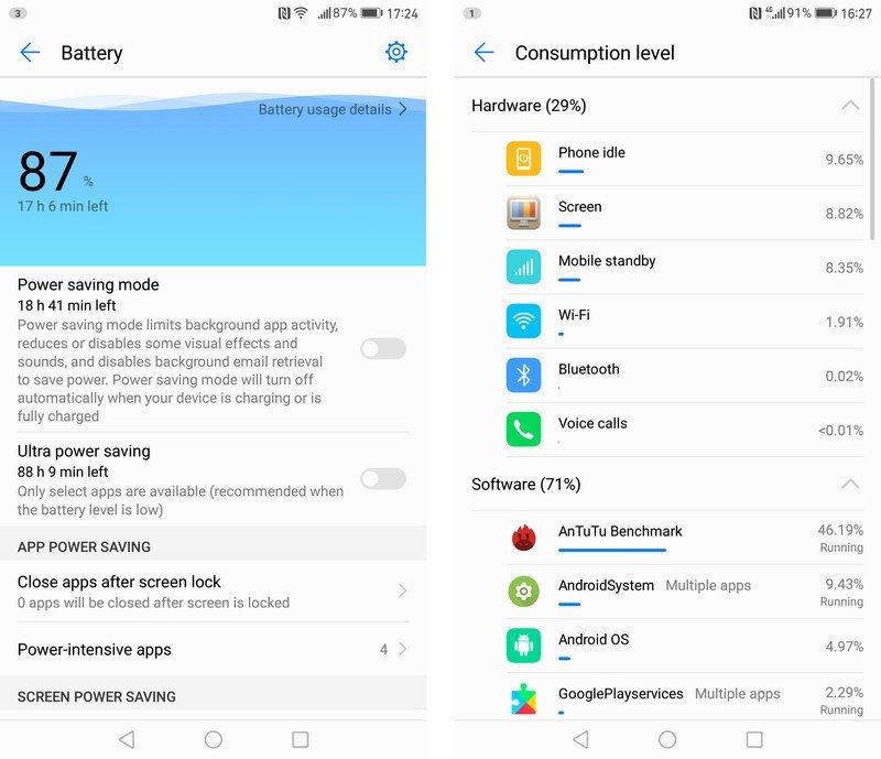
For the most part, that's exactly what we've experienced in our first week with the Mate 9. The phone never failed to get us through a full day of mixed use on LTE and Wi-Fi, often with more than 50% in the tank by the evening. Even pushing the phone really hard with lots of photography and a little wireless tethering, we never came close to experiencing battery anxiety.
When it comes to numbers, our usage equated to around 25 hours per charge on an average day, with between seven and eight hours of screen-on time. (That's with around a 50-50 split between Wi-Fi and LTE, in areas with reliable LTE coverage.) Of course it's easier to kill off the Mate 9 when using LTE exclusively, especially when juggling between SIMs in areas with patchy cellular coverage. When traveling in areas with less reliable coverage, screen-on time dropped to around 5 hours.
That's still impressive for a modern Android phone — comparable to many of the energy-sipping Snapdragon 625-powered mid-rangers we've tested lately. (Except obviously the Mate 9 is a powerhouse compared to those phones.) For what it's worth, the Mate 9 never skipped a beat even while juggling two SIMs and and constant switching between HSPA and LTE.
You're basically guaranteed a full day of use. And when it's time to charge, the Mate 9 is lightning fast.
As far as the Porsche Design model is concerned, we haven't noticed any major difference in battery life compared to the vanilla Mate 9. It seems any extra battery cost involved in pushing a Quad HD display is offset by the fact that the screen itself is smaller.

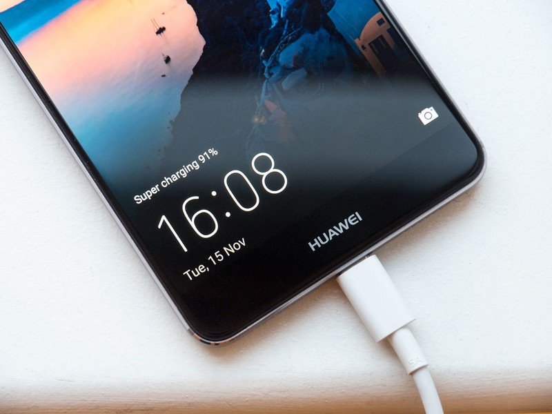
Huawei also has a new trick up its sleeve when it's time to charge. SuperCharge is the manufacturer's proprietary charging method, for which you'll need to use the bundled SuperCharger and cable. The firm claims its new 4.5V/5A charging tech is cooler than rival 9V standards (like Qualcomm QuickCharge), and while that comparison depends on a bunch of other factors, we can't argue with the sheer speed of charging.
Below 50 percent, you can practically watch the percentages tick up every minute or so, even while using the phone. Above 70 percent, things slow down somewhat. And above 85, you'll be charging at a more conservative 1-1.5A. As with most quick charging standards, the main benefit is being able to restore a dead phone to a serviceable battery level in a very short space of time. By that measure, Huawei's SuperCharge absolutely delivers. It's just a shame about the proprietary cable requirement.
For what it's worth, we were able to charge at "fast charging" speeds (as indicated on the lock screen) with the Google Pixel's USB-PD brick, as well as the older Huawei 9V fast charge plug. (The Mate 9's lock screen tells you whether it's charging at standard speeds, "fast" speeds, or "super" speeds.)
Great big phone
Huawei Mate 9: The Bottom Line
The Huawei Mate 9 is great big phone in every sense of that term. It delivers the strong performance and epic battery life we've come to expect from the Mate series, in a slightly more compact form factor, with trailblazing internals. EMUI 5 is a big, meaningful upgrade, doing away with many of our pet hates from previous versions of Huawei's software layer. The fact that the Mate 9 launches with the latest version of Android available (to non-Pixel phones, anyway) is also important, meaning buyers won't be waiting months for additional updates.
Huawei finally delivers a software experience that's worthy of its top-notch build quality and silicon.
Huawei has managed to nail performance and build quality just as it has with previous flagships. What's new this time around is a software experience which, for the most part, is worth of the hardware on which it's running. And it should come as no surprise that a 4,000mAh battery guarantees you exceptional battery life, to the point where multiple days per charge are a real possibility.
With the latest software update, the camera can take some great photos, but across the board it's not quite as effortless as the competition. This is the sort of thing you expect when you're paying $700+ for a smartphone. Huawei is almost there, but not quite at the tip-top level of the Google Pixel and the Galaxy S7 when it comes to imaging.
The big question
Should you buy the Huawei Mate 9? Yes
In a world without the Samsung Galaxy Note 7, the Huawei Mate 9 is now the best big-screened Android phone you can buy. The fact that Huawei can put out phones of this quality underscores just how far it's come in the past year. Most of that is thanks to the new EMUI 5, which provides a far superior user experience to anything we've seen in earlier Huawei phones. And because the UI is so much improved, the rest of the phone shines through.

Alex was with Android Central for over a decade, producing written and video content for the site, and served as global Executive Editor from 2016 to 2022.
