The quick take
Different phone, mostly the same story from Huawei. We're looking at some really good hardware in the Mate 8, powered by some really good (and new) internals. But the software. Oh, boy, the software. EMUI 4.0 is improved in some ways, and still very much broken in others. At least it's all sitting atop Android 6.0. And another bright spot is overall performance, with battery life that should impress most folks out there.
The Good
- Excellent build quality
- Large battery capacity
- Very good performance
- Decent camera
The Bad
- Huawei's EMUI skin a turn-off for many
- Power-use nags are annoying
- Disappointing speaker quality
- EMUI still breaks Google notifications

Frustratingly decent
Huawei Mate 8 Full Review
We've come to know two versions of Huawei over the past few months. There's the new Huawei that makes the Nexus 6P, which we've anointed as our current best Android phone available. That's not the real Huawei, however. The real one has sold millions and millions of phones worldwide via its Mate and P lines, as well as with its Honor sub-brand, mostly outside of the U.S. The real Huawei is quite capable of producing some impressive hardware — which those of us in America finally got to experience with the 6P — while pairing it with some downright frustrating software. And we're not just talking about a matter of taste.
Huawei's biggest problem is that it continues to make really good phones with a less-good user experience. Some standard features are broken. Some may be missing. Some haven't been fixed across multiple releases. And that's a shame, given the potential we've seen time and time again.
The Mate 8 is not a bad phone. In fact, it's a darn good one. It just could have been so much better, a tune we've had to sing too many times when it comes Huawei, particularly when it also implements Google's proprietary services.
- 6-inch FHD IPS-NEO LCD display
- 1920x1080 resolution (368 ppi)
- Corning Gorilla Glass 4
- 16MP rear camera
- Sony IMX298 sensor, ƒ/2.0, OIS
- 1080p resolution video; Slow Motion: 720p video at 120fps
- 8MP ƒ/2.4 front-facing camera
- 4,000 mAh fixed battery
- microUSB charging
- HiSilicon Kirin 950 processor
- 4xA72 cores @ 2.3GHz + 4xA53 cores @ 1.8 GHz
- Mali T880MP4 GPU, i5 co-processor
- 3GB RAM with 32GB storage
- 4GB RAM with 64 or 128GB storage
- Dual SIM slots
- microSD storage with 1 SIM in use
- Android 6.0 Lollipop
- EMUI 4.0 user interface
The details
About this review
We're reviewing this Huawei Mate 8 (as provided by Huawei) after a little more than two weeks of full-time use. It's running Android 6.0 out of the box, including the December 2015 security patches, and is build NXT-L29 C900B116. This is a 32GB model, meaning it has 3GB of RAM. (The 64- and 128-gigabyte models will come with 4GB of RAM.)
We've been running the Mate 8 — which is world-banded — on T-Mobile primarily in Pensacola, Fla., and for a brief time in Las Vegas. It's been connected off and on to a Huawei Watch during our review time.
The software we've been using on our review unit is not a finished retail build. In addition to some obvious debugging software being present, a few conspicuous features are missing — most notably Google Now on Tap, one of the tentpole features of Android 6.0 Marshmallow.
Watch and learn
Mate 8 Video review
A bigger Mate S
Huawei Mate 8 Hardware
Look and feel
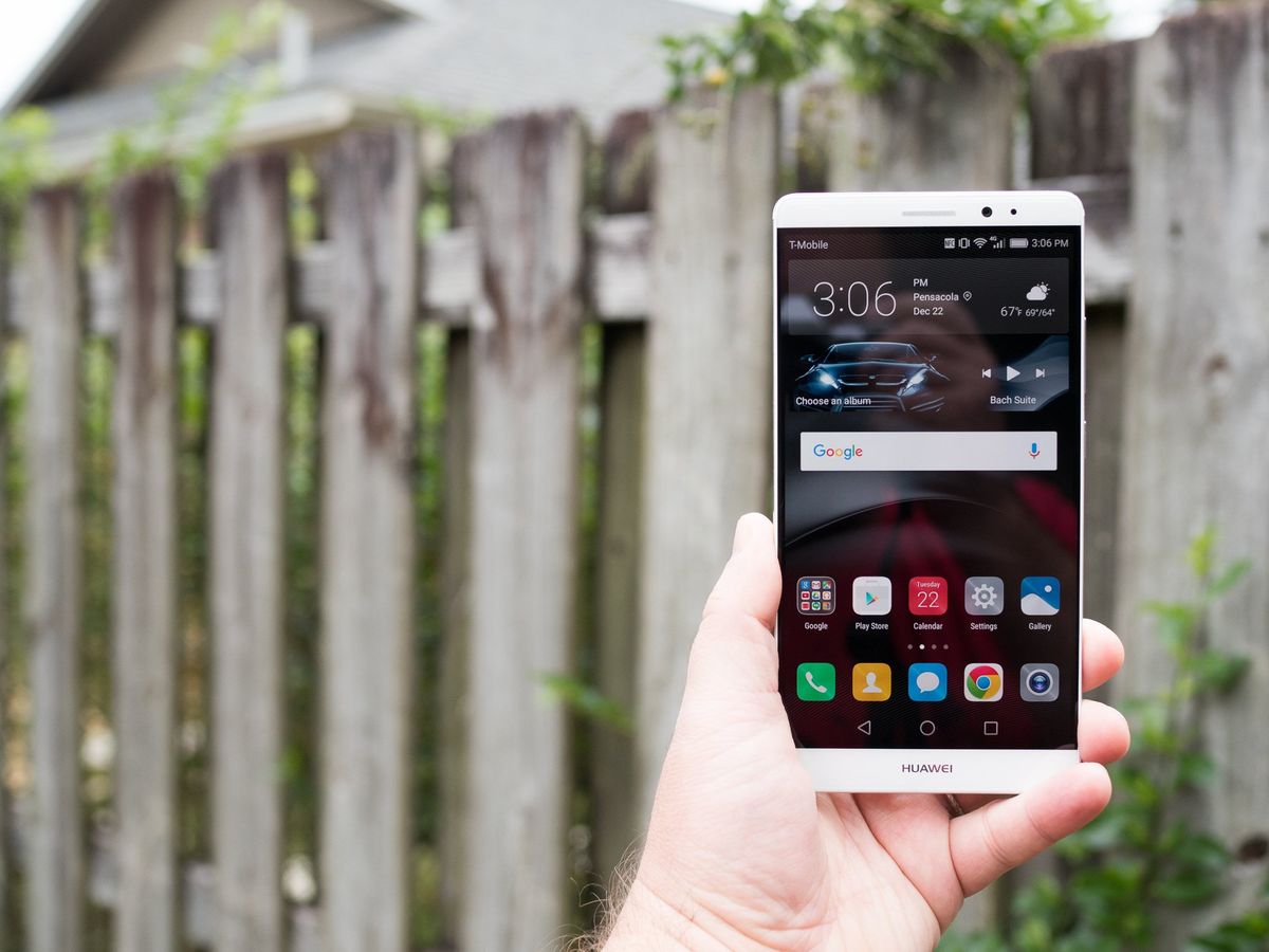
The Nexus 6P — along with LG's Nexus 5X one of two Google phones in 2015 — was for many in the U.S. the first up-close look at what Huawei is capable of when it comes to smartphones. But if you've been following the company for a while, you'll mostly see iterative design in the Mate 8. It takes the sheer size of the Mate 7, marries it with the metal and design of the Mate S, and, well, there you have it.
And that is to say that this is a very nicely designed large phone.
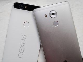
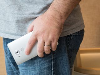
The Mate 8 is a tad wider and a wee bit shorter than the Nexus 6P. (And certainly a good bit bigger than the 5.5-inch Mate S.) At first that may sound like a cause for concern, as additional width tends to affect the overall feel more than height. But when you're already at the size that the 6P is at, it turns out the Mate 8 doesn't feel any more unwieldy. That is, once you're using a phone that big anyway, the Mate 8 isn't an awkward step up, and with that additional size you get a larger display, and a much larger battery.
Overall it feels like a bigger Mate S (which was excellent in its own right), and a slightly larger Nexus 6P. And that's right down to the beveled edges.
Other than the size of the Mate 8, and the fact that it's solid both in form and aesthetics, there's nothing about the design that really stands out. All the pieces are in their usual places. The only questionable decision — and this is one we could still argue either way at this point — was that Huawei went with microUSB and not the newer USB-C for charging and connectivity. But given the market and the cost of the Mate 8, that's one of those critiques that's easy to make in a vacuum but doesn't really stand up when you consider the real-world ramifications.


The display
We're in a world in which smartphone displays at 4K resolution are a thing. The Huawei Mate 8, meanwhile, chugs along with a practically quaint 1080p display. When companies seem to compete on every pixel crammed into every square inch, the Mate 8 (as the Mate line has been prone to do) instead keeps things old school. And with about 368 pixels per inch, it's not as if the Mate 8 is low-resolution or anything. In fact, not once in our time with this phone has the resolution of the the display bothered us in the least.
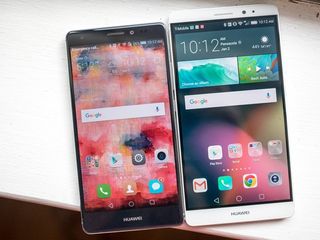
What you do have to get used to, however — particularly when coming from a phone with a higher resolution and pixel density — is the scale of what's on the screen. Most everything looks bigger on the Mate 8, text in particular. That affects how much you see on the screen at any one time. Whereas you might get three tweets or so on a 2K display, you'll only be able to see two tweets on the Mate 8 before scrolling. That sort of thing. It's not the end of the world by any stretch of the imagination — it's just different, particularly if you're going "backward" in resolution.
The trade-off, of course, is that you save a significant amount of power and processing by using a 1080p display. This wasn't an accidental decision on Huawei's part, even if it does seem particularly low-spec'd by today's standards.
Beyond that, the display is usable. Certainly not in what we'd call the "great" category. It's got a bit of a blue tinge to it, and you'll notice some shimmering as the phone twists a bit in your hand. Not a deal-breaker by any means. Just not spectacular or anything. For most folks, this should be fine.
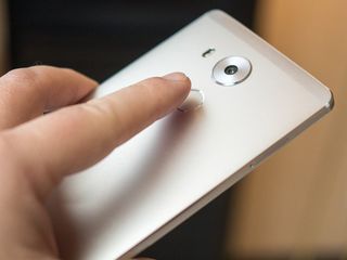
Fingerprint scanner
As has been the case going back to the Mate 7, and continuing with the Mate S and Nexus 6P, Huawei has an excellent fingerprint scanner on its (ahem) hands — if not the best in Android.
Huawei's implementation of fingerprint security is as close to perfect as you can get.
This continues with the Mate 8. Externally, the rear-mounted fingerprint sensor — perfect for the index finger on either hand — is nearly identical (if not the exact same component) as is on the Nexus 6P, right down to the shiny beveled edge on the inside of the circle. It looks good, it feels good — and, goshdarnit, people like it. A half-dozen or so presses will enroll a finger, which can be used to unlock the phone, or lock down specific files or applications.
Not once have I had an issue with the fingerprint scanner on the Mate 8. It works as perfectly as you'd expect this sort of thing to work, especially given Huawei's performance over the past year or so.
Speaker(s)
The Mate 8 has what looks to be a couple of speakers tucked into the bottom bezel, with the same sort of rounded rectangles we've come to know. We say "looks to be," however, because once again we're actually looking at just a single speaker, inside the grille on the right.
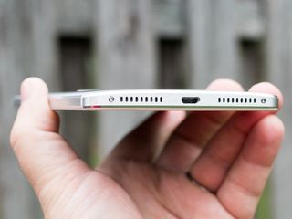
To call the sound muddy would be quite generous, especially as you approach the midpoint of the phone's volume range. Just shy of that isn't awful. But beyond halfway the highs there are are drowned out by the mid-range, with just a twinge of low-end every now and then, and everything sounds awfully overdriven. It's definitely not what we'd consider to be "good" by any stretch of the imagination, especially in a phone this size.
The only advice we have on this front is to look at the volume level. When you get close to halfway, stop. Anything at or beyond the midpoint will start to sound like a 1980s era mono tape deck.
Internals & battery life
There's a good bit to be said about what's powering the Mate 8. That'd be a HiSilicon Kirin 950. And because we've got a model with 32 gigabytes of storage, we've got 3 gigabytes of RAM available. But the problem is that we'll not see this phone with these internals in the U.S. Kirin-powered phones aren't sold here.
But that doesn't mean we can't enjoy the experience. Kirin 950 is made up of four low-power ARM Cortex A53 processors running at 1.8 GHz, and four high-power A72 processors at up to 2.3 GHz. That's paired with another coprocessor referred to as "i5" for all all the things that can be offloaded from the application processor as part of the "Sensor Hub." Toss in a Cat. 6 LTE modem, a Mali T880MP4 graphics processor, and more for imaging and voice processing, and you've got yourself a system on a chip.
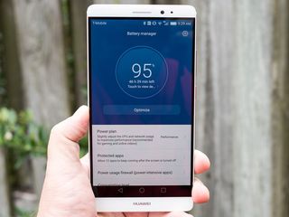
It's all about better power consumption and performance, really. Here's how we put things at the Kirin 950 launch event in Beijing in early November:
The other big leap in Kirin 950 comes from using flip transistors and FinFET — the short, short version is that it has to do with power consumption, or, specifically, consuming less power without sacrificing performance, building transistors vertically instead of only horizontally. Huawei's saying a 40 percent increase in performance, with power consumption down by 60 percent. And that ultimately adds up to an additional 10 hours of "normal" use on a device with a 3500 mAh battery.
So what's that mean for real-world use with the Mate 8? Well, first you've got to consider that you're using a phone with a 4,000 mAh battery. That's some 33 percent greater capacity than the Nexus 6P. But you're also pushing fewer pixels thanks to the 1080p display. So there's the additional savings there. But we're also using a world-banded phone on T-Mobile, so there's a little bit of radio wonk.
Still, this thing's been pretty impressive. Toss in the Doze feature in Android 6.0 — which all but shuts down the phone if it's not in use — and it's very possible to go a number of days (I'm on four as of the time of this writing) with very light use.

Inside the Kirin 950
We were in Beijing, China, in early November 2015 for the launch of the the HiSilicon Kirin 950 processor. And it's a rather remarkable chip, if only for the fact that we're never going to get it in the U.S.
Kirin 950 promises better performance and lower power consumption, as well as improved processing for photography.
Check out our preview of the Kirin 950 for a better look at this processor.
Inside Kirin 950
While we might not be getting this model in the U.S., that doesn't mean it's not a worldly phone. And the dual-SIM NXT-L29 model we've been using is banded out the wazoo insofar as radios go. Here's what's up:
- 4G TDD LTE: Band38/39/404G
- FDD LTE:Band1/2/3/4/5/6/7/8/12/17/18/19/20/26
- 3G UMTS: 800(B6,Japan)/800(B19,Japan) /850/900/AWS/1900/2100MHz (Band6/19/5/8/4/2/1)
- 2G GSM: SIM1:850/900/1800/1900MHz | SIM2:850/900/1800/1900MHz
EMUI 4.0
Huawei Mate 8 Software
The Mate 8 is the first from Huawei to run Android 6.0 Marshmallow out of the box. It's also running an updated version of its EMUI software (formerly known as the Emotion User Interface). It's version 4.0, to be exact. If you've never been exposed to it, EMUI is a strong skin of Android, filled with brilliant animations and lots of features that go beyond what stock Android can accomplish.
And, yes, it still exacts emotions from us — many of them not good.
As has been the case for years now, EMUI is a mixture of interesting software design that shows flashes of brilliance, combined with maddening implementations that either are not ideal — or that tend to have unexpected consequences, particularly when married with Google services.
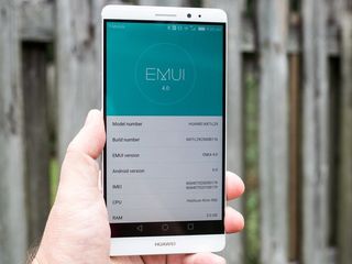
The look and feel of EMUI 4.0
If you've in fact seen EMUI before, you'll still be right at home. You've got home screens and notifications and settings, and that's it. No app drawer. Every app you've got ends up on the home screen, not unlike the Springboard in Apple's iOS. That's the biggest difference between EMUI and just about everything else. (It also still means unchecking the "Add icon to Home screen for new apps" option in the Google Play Store is worthless.)
You can still make folders, of course, and Huawei makes use of them in the default layout. Apps inside a folder are represented by a 3x3 grid, and EMUI has a nice fly-in animation as you "open" a folder. But you'll notice that Huawei makes sure to fill every folder you see at first. If you don't have at least nine apps in a folder, that 3x3 grid is incomplete and very much looks unfinished. (That's why virtually every other UI and launcher you'll find stacks apps somehow in preview form.)
Then you've got the fact that every non-Huawei app icon is altered turned into a rounded-off square, with EMUI applying its own background. Circles become rounded squares. Figures with transparencies behind them receive shaded backgrounds, to varying degrees of success. Sometimes it doesn't look horrible, even if we're still not crazy about the idea. Other times the result is just awful, and you'll end up with a mixture of full-bleed icons (with colors smartly reaching the boundaries), and smaller figures with white backgrounds that very much look out of place.


Then there's what happens if you uninstall an app. Instead of neatly rearranging all the icons like you're used to in an app drawer, you're left with a sucking chest wound for you to heal the best you can. Or not, if you don't mind gaping holes in your home screens.
Third-party launchers can help with all this a bit. But even icon packs can't fix the madness that is Huawei's icon scheme.
Other items of brokenness
Unfortunately, the issues with the home screen are just scratching the surface.
Huawei's notification area is highly customized as well. You get a sort of timeline of notifications, which in and of itself isn't unpleasant. That is, until it starts breaking things. A number of apps end up with dark gray text as part of the notification, which is all but unreadable if you're using a dark wallpaper, or if you open the notification shade while in a dark app. For Gmail, you'll struggle to see the sender — kind of an important thing. For Hangouts its the whole damn message — and that's a double whammy if you happen to use Hangouts for SMS.
And this one isn't a new problem. It was the same in the Mate S on EMUI 3.1, and other phones before it. Yet Huawei still hasn't fixed things.


But, hey. At least the Mate 8 is launching with Android 6.0. The P8 lite launched in mid-2015 with Android 4.4.4 KitKat, so we're forgiven for not assuming the Mate 8 would have had Marshmallow out of the box.
App permissions have changed in Android 6.0 Marshmallow as well, allowing the user to approve (or not) permissions at runtime, instead of when the app is installed. And Huawei has changed the way these dialogs look, too. And it's not completely awful, though we do take issue with Huawei asking if you want to "Go to settings and enable them" and then presenting an "Enable" button in the same dialog. It's confusing.
Is there anything good about EMUI then?
It's not that EMUI is inherently awful. You might not like the idea of a Springboard-esque home screen, but the fact is it's functional, and it's fine for many, even if it's not really what you think of when you think of Android.
EMUI's color palate isn't awful. (That's not counting the iconography, of course.) The animations throughout the UI are quite nice.
For as many things as EMUI does really well, it gets as many little things very, very wrong.
And we haven't even touched on the myriad software additions (both good and bad) that Huawei includes. The voice recorder app has some seriously smart directional microphone management. There's an FM radio. A compass. All sorts of power and memory management options that you probably don't need to use, but are there if you want them. (Present, too, are those silly "This app is using power — do you want to continue using this app that you're currently using?" notifications.) Certain apps can show notification counts, which also show on folders. There's built-in theming.
Huawei also has added in a split-screen feature. Long-press on the multitasking button to activate that. And like every other implementation we've seen, only a limited number of apps can take advantage of it.
Swype is on board as the keyboard, and it's pretty usable. Though whomever decided the voice control button needed to be next to the period on the keyboard needs to be taken out back.
And on the no-longer-broken list is Android Auto, mostly. It actually works on the Mate 8, which is something we couldn't say of the Mate S. We have seen occasional connection issues, however.
Huawei's doing a lot with software on the Mate 8. Some of it has a decidedly different feeling that what you're likely used to from Android. That's by design. And some of it still needs work. But you can't accuse Huawei of not putting effort into its software. Maybe that's what makes the broken parts so frustrating. There's a lot of good going on. But things like the icon take likely will still put off many.
An OK shooter
Huawei Mate 8 camera
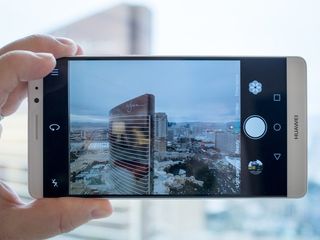
Another major feature in the Mate 8 — one one very much attributed to the Kirin 950 inside it — is the camera setup. The rear camera is a total 16 megapixels, shooting at a 4:3 aspect ratio. The camera app is as full-featured as you could hope for, including a manual "professional" mode that'll shoot up to ISO 1600. (Though it saves as a .jpg and not as RAW, which is disappointing.)
The Mate 8 camera is decent, but it definitely didn't blow us away.
Other modes of note include panorama, super night, HDR, all-focus, watermark, slow-mo, audio note and document readjustment — all things you'll find in other high-end phones.
But Huawei's had an impressive camera app for a while. If we had to pick one thing to gripe on here, however, it'd be the loading time from a cold start. Once the camera app is in memory it's plenty snappy. (Huawei's aggressive memory management likely is the culprit here.)
This isn't quite a top-shelf camera — video tops out at 1080p at 30 frames per second. But for more people, it'll suffice.
Proof is in the pudding, though. And we've gotten mostly decent shots out of the Mate 8. Low-light in auto mode isn't all that impressive, so you're going to want to explore the options available to you in the app. And take a lot of pictures.


Video seems to be a touch better. Again, everything tops out at 1080p. And that should be fine for most folks. A higher resolution certainly offers more flexibility, but 1080p is the minimum of what you should expect. And the microsphones do surprisingly well on the windy streets of Las Vegas.
Here, a quick sample:
A good phone with software issues
Huawei Mate 8 The bottom line
It seems like we often come to the same conclusion about Huawei phones. There's a lot to like here in the hardware and performance. There's a lot to loathe in the software.
It's absolutely possible to get things to a usable state with third-party launchers and some icon packs, and then a good amount of grimacing whenever the UI does something silly — like making notifications from certain apps unreadable. You can convince yourself that this is a phone that you can, in fact, use. And Huawei is certain to sell a good many of them — you don't reach its place in the global smartphone market by not doing so.
But for all the good in the Mate 8, and for what good there is in the software department, there still remain some rather dubious choices.
But you can use the Mate 8 and be relatively satisfied with it, particularly with the performance and battery life. But with as good as Huawei's become with hardware, we need to continue to press the company to improve its software.
The big question
Should you buy it? Sure, if only for the battery
The Mate 8 does a lot of things pretty well, and it can do them for a long time. It just feels like it's working really hard to do a few basic things not so well. For a lot of folks it'll be just fine. But it's one we'd call "tolerable," and that manages a somewhat grudging recommendation from us.
