Huawei Ascend Mate 7 review
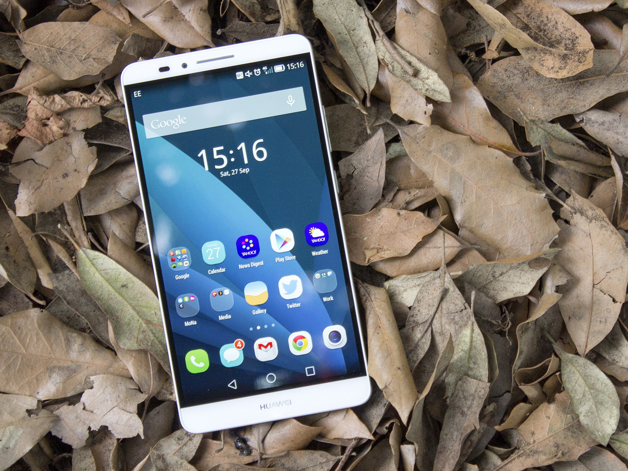
Huawei is back with another crack at the oversized smartphone, and it might be the Chinese manufacturer's best device yet
Huawei has been stepping up its game of late, with modern Android devices that are significantly better than its earlier offerings. The world's No. 3 smartphone vendor is more of a household name in Asia than in Western markets; nevertheless it's shown it's serious about making inroads in Europe and North America.
The Ascend Mate series, it's fair to say, hasn't dazzled us yet, and it takes more than a "me too" approach to make a great oversized smartphone. Earlier in 2014 the Ascend P7 arrived and was the best Huawei device to date, with a premium design and high-end specs. Then the Ascend Mate 7 landed at IFA 2014 in Berlin. And as we've discovered in recent weeks, it's actually pretty good. Read on to find out why.
About this review
We're publishing this review after two weeks using a pre-production, European-spec device in the UK on the EE carrier using a mixture of HSPA+ and LTE. While our Mate 7 is running the latest EMUI 3.0, the final software could change between the time of review and general availability. Our review unit has 2GB of RAM and 16GB of storage, a higher-specced version with 3GB of RAM and 32GB of storage will also be available.
Video walkthrough
Huawei Ascend Mate 7 hardware
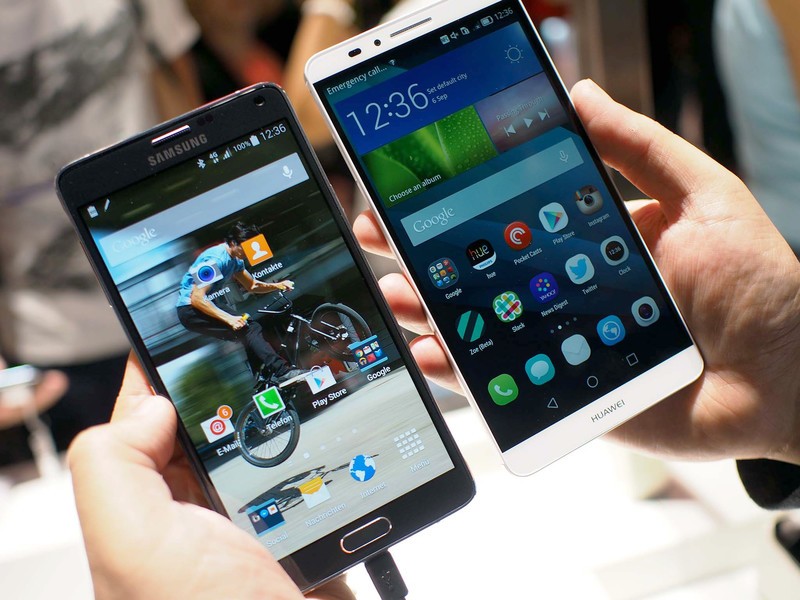
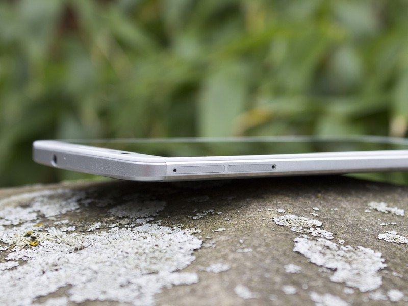
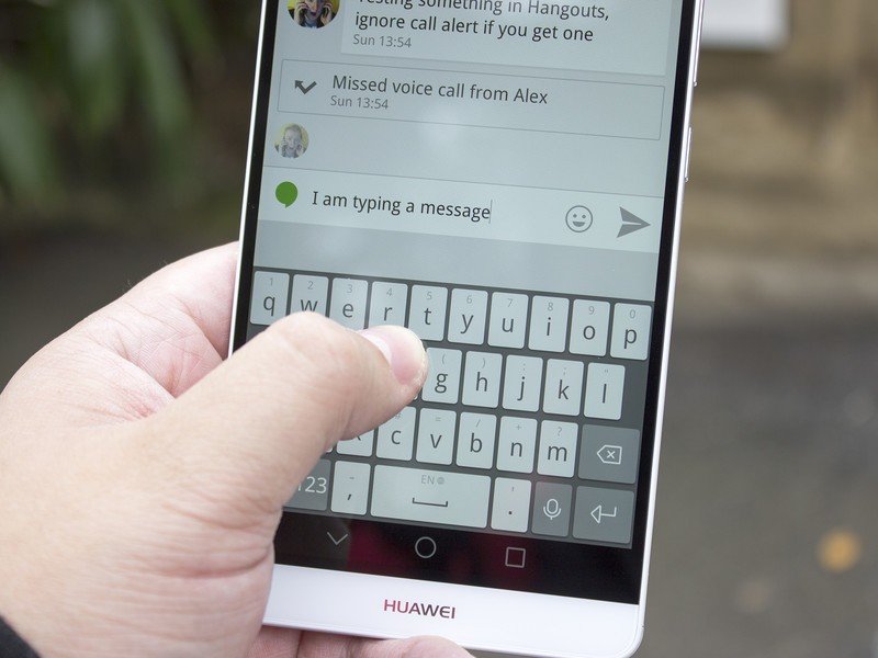
The Ascend Mate 7 is a big phone, make no mistake. Given the colossal 6-inch display it was impossible for it not to be so. However what Huawei has achieved is an overall package only a smidgen larger than a Samsung Galaxy Note 4 — and an iPhone 6 Plus, for what that's worth. Large screen, large battery, slim metal body. It's relatively light, too. Coming in at just 185g this 6-inch all metal phone is a mere 13 grams heavier than the iPhone 6 Plus as well as carrying only a slightly larger frame.
Be an expert in 5 minutes
Get the latest news from Android Central, your trusted companion in the world of Android
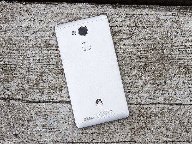
The housing is constructed of aluminum with chamfered edges, with plastic sections along the top and bottom for RF visibility. The back of the phone doesn't feel slippery to hold like the HTC One M8 (or at least, the gunmetal HTC One M8) and there is a slight lip around the edges where the front of the phone meets the metal.
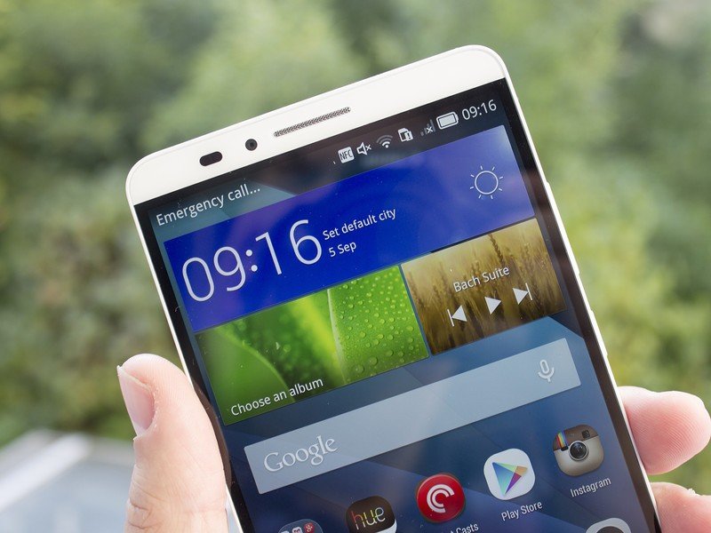
So it's another winner from Huawei on the design front. Besides the metal construction, the Ascend Mate 7 boasts an 83 percent screen-to-body ratio with super skinny side bezels. It's edge-to-edge glass with the bezels, however slim, settled beneath the glass. With only white (on this model) trim above and below the display you do get an illusion of edge-to-edge screen, though that's not quite the case.
It's another winner from Huawei on the design front.
But what about the display itself? We're seeing a trend towards Quad HD displays elsewhere, but Huawei's sticking with "just" a Full HD 1080p IPS display at 6-inches with 368ppi. And it's fine. In fact, it's better than fine. The display was one of the high points of the Ascend P7 earlier this year and the same applies to the Mate 7. It's bright, clear, has great color reproduction and importantly you can see it well enough outdoors. And it sits so close to the surface of the phone that it feels like you're actually touching it, not dragging your finger across a piece of glass.
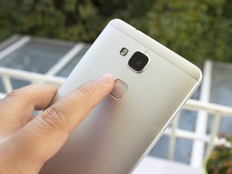
Besides the slim profile and high screen-to-body ratio, one of the other defining features on the hardware front — or on the outside, anyway — is the fingerprint scanner. With no physical home button like you'd find on Samsung or Apple hardware, the Mate 7's scanner resides on the rear of the phone. However, unlike Samsung and Apple, Huawei has opted for a single-touch activation fingerprint scanner. And that makes a little bit of difference when it comes to actually using it.
Apple's Touch ID requires a press of the home button before unlocking, while Samsung requires a swipe down over its home button. By contrast, Huawei has possibly the best implementation of the three — just place your finger on the scanner to unlock. At the event Huawei claimed that its fingerprint scanner is faster than Touch ID, but during our testing that didn't exactly pan out. However we're on a pre-production unit — and in any case, it's absolutely fast enough.
Perhaps more impressive is its positioning. Much like LG has accomplished with the placement of its rear facing buttons, Huawei has nailed the position of its rear facing fingerprint scanner. The Mate 7 is a large phone, but somehow — at least in our testing — whether picking it up right or left handed, the fingerprint scanner is always within easy reach of your index finger.
The best fingerprint scanner on an Android phone right now
But, what about the fingerprint data — where and how is that being stored? Well, like Apple's TouchID the Mate 7 doesn't actually store an image of your fingerprint, it records data based on your fingerprint and stores it securely on the CPU. This is an advantage of its homegrown octa-core CPU, the company tells us, and we can't argue with the results.
Our Mate 7 review unit is the 16GB storage and 2GB RAM option. In selected markets there will be a 32GB/3GB version that also comes in a gold finish. Aside from storage and RAM, the two variants are identical. Both have a microSD card slot to expand whatever internal storage you get, as well as the same 13-megapixel rear and 5-megapixel front camera combination. The rear camera does protrude slightly from the rear of the phone, with the slightest of lips protruding from the smooth metal back. We'll look at the camera in more detail a little further on.
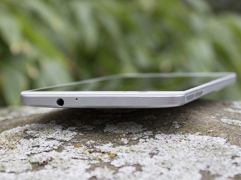
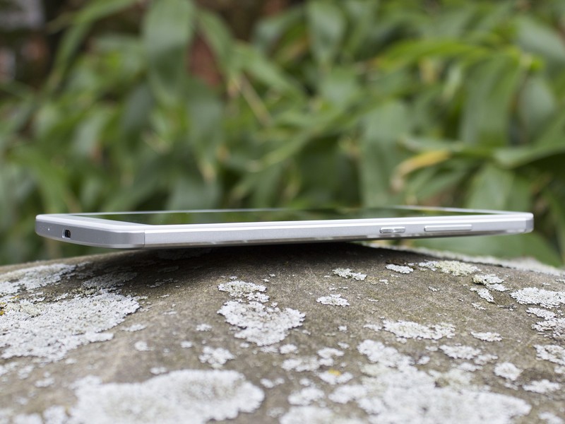
On the whole, it's a win on the hardware front for the Mate 7. The design and construction isn't just good for a Huawei phone, it's good by any standards. It ticks all the "premium" boxes on the outside and there's enough horsepower inside even the 2GB RAM option to cope with most everyday tasks. The fingerprint scanner — while still something of a novelty — is probably the best implementation on an Android phone so far. We've already seen Huawei step up its game with its hardware over the past 12-18 months and the Ascend Mate 7 continues that trend. It may not be as popular as something like the Galaxy Note 4 when all is said and done, but it's just as well-built.
Huawei Ascend Mate 7 specs
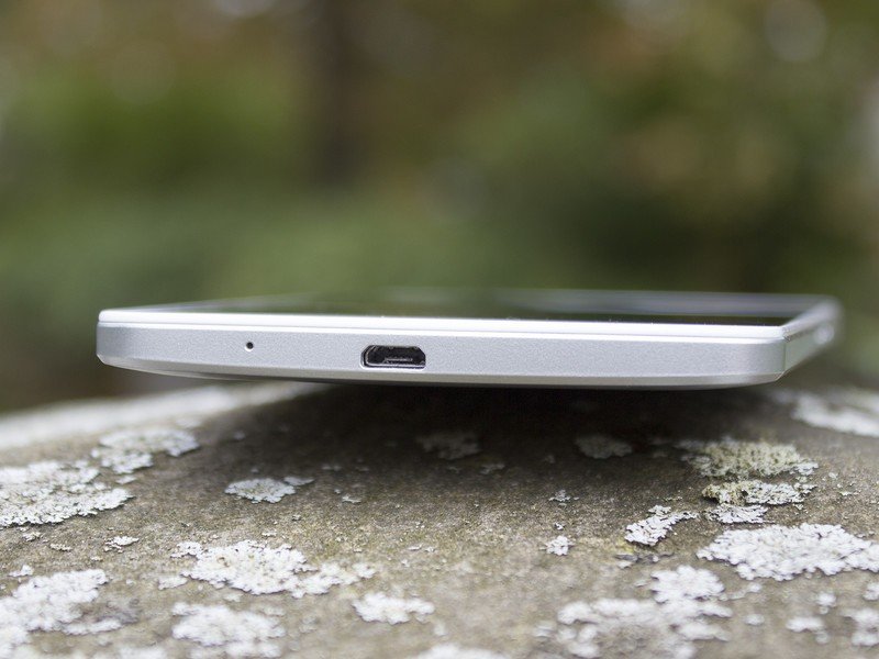
Want the full specs? Of course you do.
| Category | Features |
|---|---|
| OS | Android 4.4.2 KitKatEMUI 3.0 |
| Chipset | Hisilicon Kirin 925 octa-core (quad-core 1.8 GHz Cortex-A15 & quad-core 1.3 GHz Cortex-A7) |
| RAM | 2GB |
| Display Size | 6-inches |
| Display Resolution | 1920 x 1080, 368ppi |
| Cameras | 13MP AF BSI F2.0, with Flash5MP Front |
| Internal Storage | 16GB |
| External Storage | microSD |
| Radios | LTE B1/B3/B7/B8/B20 / HSPA+ / GSM |
| Connectivity | Wifi, GPS, Bluetooth 4.0, NFC |
| Dimensions | 157 x 81 x 7.9 mm (6.18 x 3.19 x 0.31 in) |
| Weight | 185g |
| Battery | 4100mAh |
Huawei Ascend Mate 7 software
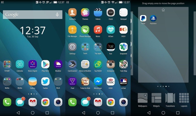
On previous Huawei devices the software has been one of our least favorite areas. As time passes, the Emotion UI — now referred to simply as EMUI — has evolved, improved and gained new features, but it hasn't necessarily become any more compelling. With the launch of the Ascend Mate 7 we're up to EMUI version 3.0, and from the word go there are some pretty significant visual upgrades.
It's based on Android 4.4.2 KitKat, though the overall look and feel is a far cry from stock Android. EMUI brings a complete visual reworking and while anyone familiar with Android will soon know their way around, there are no visual cues to suggest you're looking at KitKat. That's not necessarily a bad thing, it's just very different to what you might be used to with Samsung, HTC or one of the other big-name OEMs. Huawei has spent a lot of time and money developing its software, and while it may not suit every taste, at least they're putting the work in.
There are no visual cues to suggest you're looking at KitKat.
Eagle-eyed readers will have noticed the back, home and app switching buttons, taking inspiration from the forthcoming Android L release, not KitKat. One of Huawei's exec told us the decision was made in preparation for the future, presumably taking away any confusion over the one obvious visual change that would come with any future update.
As with previous versions, EMUI 3.0 doesn't have an app drawer. (Yes, like the iPhone.) So if you like running off one screen and tucking the rest out of sight in the app drawer then it'll take some adjustment, but for the most part it's pretty inoffensive. Also, as with previous EMUI versions, there is a healthy selection of themes to download for further customization. Huawei ran a competition to get some of its users designing themes, and you'll find the winners and a whole bunch more available in the Themes app. Some actually look really nice, but the one critique from a personal standpoint is how themes affect app icons. They all get made to be a uniform shape, which is great, but it results in ugly boxes being drawn around non-square icons. (What's more, there's no way to go back to the default Android icon style.)
Another area given heavy customization is the notification tray, and in turn the settings menu. One nice touch is that pulling down the left side of the notification bar will show you notifications, pulling down the right side will show you a whole mass of quick settings. The notification area was a hot mess on the Ascend P7, so it's good to see Huawei has fixed what didn't work. A minor point of note though is the background color: white. As such you can't see the media control buttons on any music player widgets that you might want to use in there. Not earth shattering, but it's the little things that count sometimes.
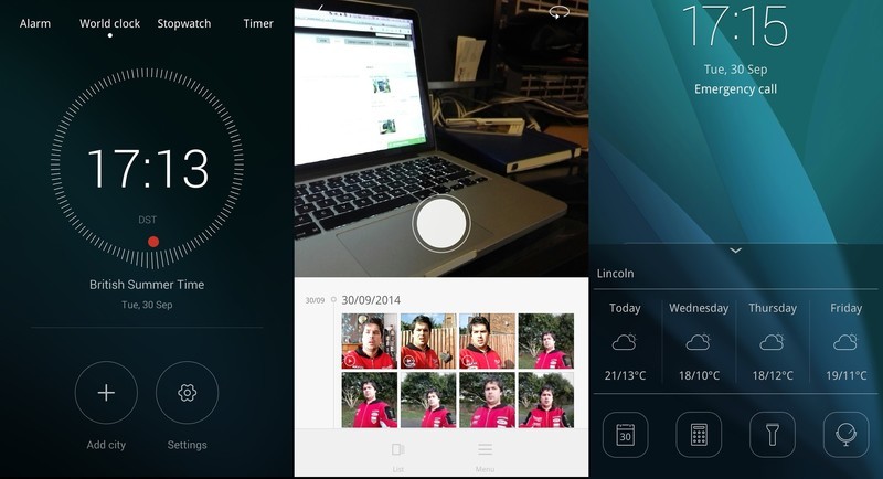
The concept for EMUI was space, dots and lines, and this is evident in the range of stock apps on offer on the Mate 7. What it leads to are minimalistic, yet still feature filled applications. It's a simple principle, really. The apps have different panes of content that are accessed via directional swipes across, or up and down. For example in the Gallery app pulling down from the top presents you with the camera. In the clock app you swipe through panes for alarm, world clock, stopwatch and timer.
The theme of circles and lines pervades the entire UI. The weather app sees the temperature move around a large circle as it increases where you are, the clock app sees a red circle move around a much larger circle – in turn made up of lines – as the seconds tick by. Likewise in the FM Radio app, a red dot moves around a circle as you chance the frequency.
While it's a simple design principle, it looks pretty good. It's actually a big step forward from whatwe saw on the Ascend P7. Again, it's something of an acquired taste, but it's certainly not unpleasant to look at.
It's still too easy for lag to creep in
One area that definitely isn't quite there yet is overall performance. The phone has plenty of horsepower, and on the whole software performance is good. But it's still too easy for lag to creep in. The stock Weather application is a great example. Almost without fail when opening it it grinds to a halt while it's refreshing data to the point where scrolling is the loosest possible term for what you're doing.
It's often the same story when pulling down the notification tray, too, and when you're inside some third-party apps. Granted, third-party apps aren't all Huawei's fault, but it's still there. What is important is to note that the issue is a lot less significant than on the Ascend P7 from earlier this year. It's going in the right direction, it just needs a little further fettling.
We should mention, however, that setting the power management mode to "normal" from the default "smart" mode does seem to make things smoother across the board, presumably at a small battery life cost.
Other points of note, some of which carry over from the Ascend P7:
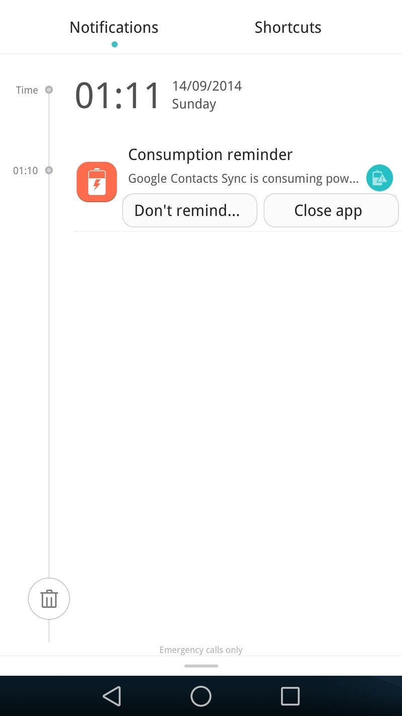
- The software constantly prompts you to close apps that are consuming battery in the background. It's pretty aggressive. But if you close an app it isn't working in the background, and do you really want to start randomly killing background apps? More informed users may be able to ignore this, but what about those who aren't? This happens in the default "smart" battery mode.
- No Android phone should prompt you — ever, ever, ever — to close things like Google Contact Sync or worse, Google Play Services. Regular readers of this site should know better, but not everyone is a smartphone nerd? If you're told these things are sucking your battery and the phone suggests you close them, the phone knows what it's doing, right? This is possibly the biggest, most frustrating issue with the entire phone.
- The Mate 7 has a notification manager. When you first use an app that wants to notify you of something be sure to allow it to send them in the notification tray. If you don't, you won't get any.
- Setting default apps seems to need doing manually in the settings. For example, you don't get a prompt to use something like Nova Launcher as default after you download it. You have to go into the settings and tell the phone that you want to use it when you press the home button. Again, another confusing divergence from stock Android.
There are some other nice touches Huawei has included on the Mate 7 that we've seen before, designed to help out users of all levels of expertise. The simple home screen style is back with big, colorful icons and an absence of widgets. Like many other current phones the Mate 7 also has an Ultra Battery Saving mode but honestly, you're not likely going to need it with a 4100mAh power bank on hand.
The Phone Manager app — while partly responsible for the some of the issues above — does have useful features such as a harassment filter and an easy way to clear cache and large, unwanted files. It too has been updated with the new look of EMUI 3.0, and it looks great, but it makes it too easy to close things that you really shouldn't be closing.
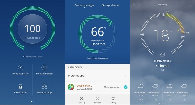
From the lockscreen you also get a drawer that slides up from the bottom with a swipe that shows you the weather and shortcuts to Calendar, Calculator, Flashlight and Mirror. It's similar to the iOS 8 Control Center but with fewer features and accessibility options.
So the software is a marked improvement on anything Huawei has done before. If you don't like the launcher you can make it go away — even if you need to go looking for it — and while there are still issues with performance it's so much less of an irritation than the Ascend P7. What Huawei needs to do next, desperately, is to retune its power saving notifications. Don't tell people to close background services, just don't. And let's get the last of those performance kinks ironed out too.
Huawei Ascend Mate 7 camera
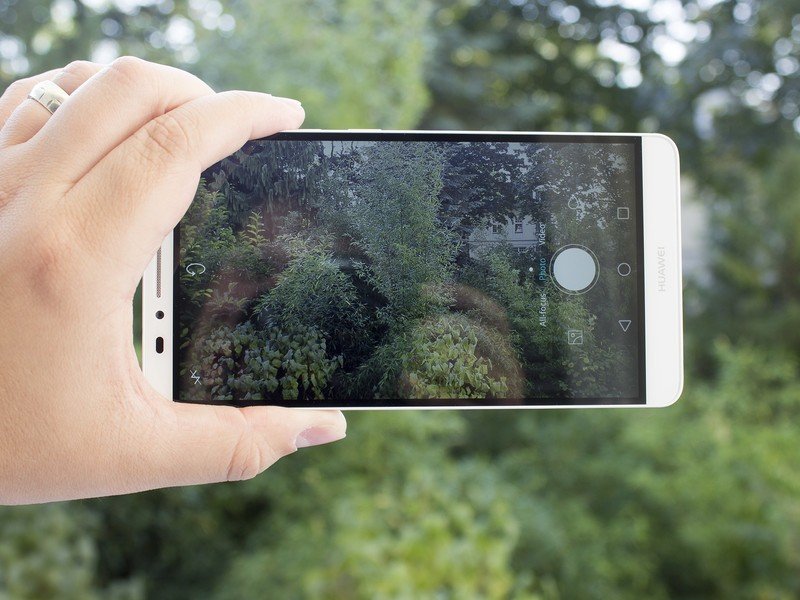
Since the camera was one of the standout features on the Ascend P7 we had high hopes going into the Mate 7. Again we're looking at a 13MP rear/5MP front combination and again they're both pretty impressive.
What it offers is good all round performance
It's not that the Mate 7 is a class leader in any particular area with its camera, but what it offers is good all-round performance. The HDR feature adds subtle but noticeable improvements where it needs to and in good light images are crisp, bright and pretty natural looking. There's no evidence of over-saturation and it's pretty quick to focus and take pictures.
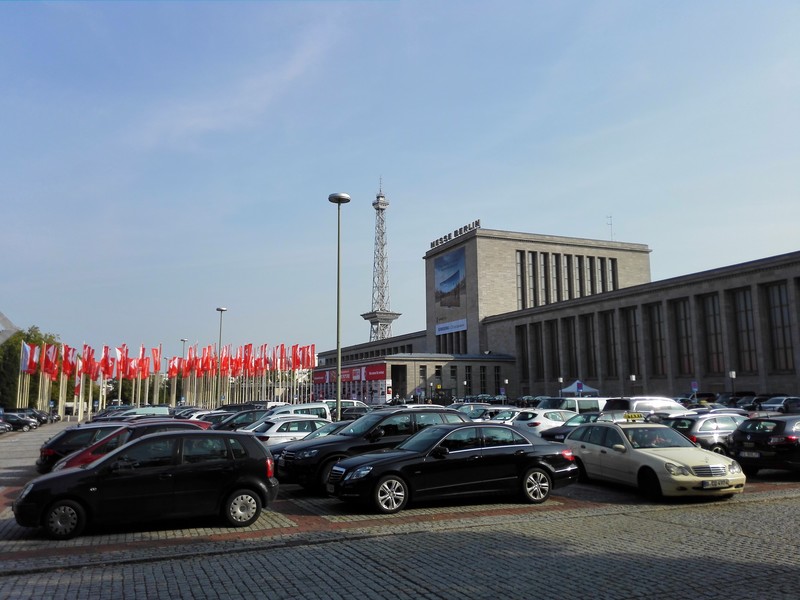




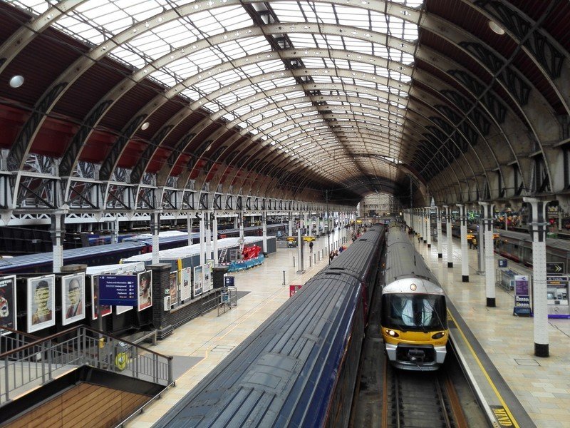
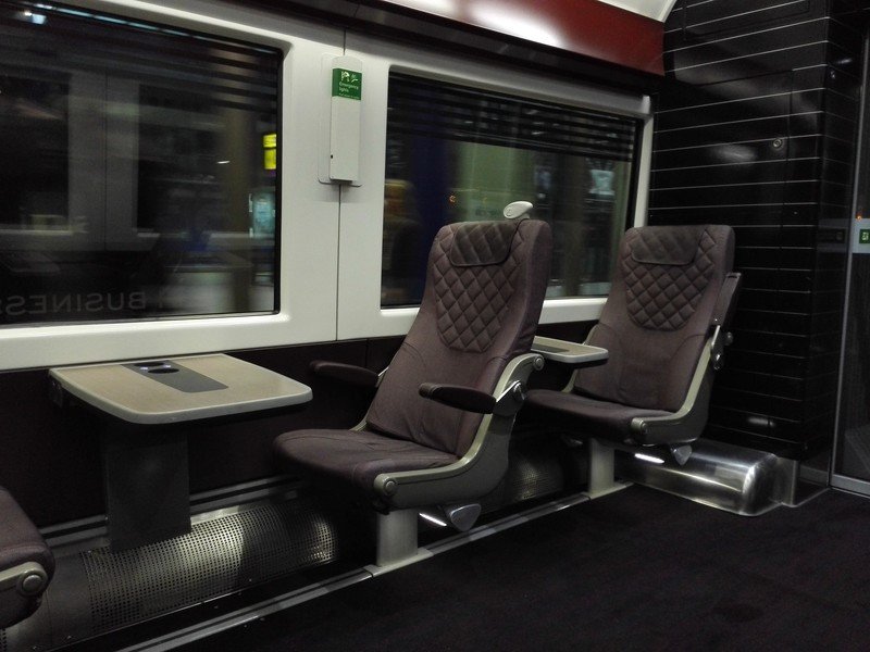
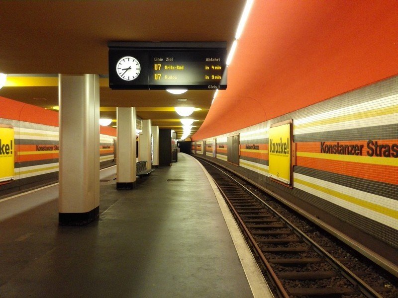

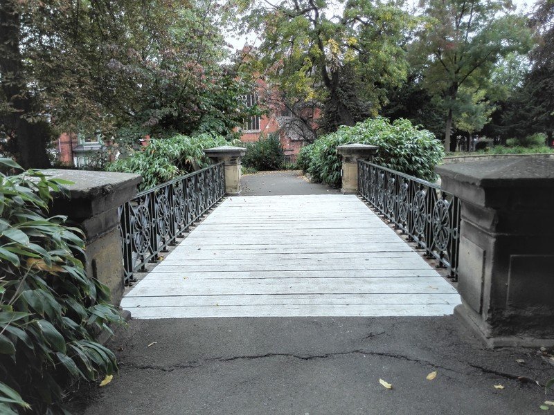
When it comes to video, the device does OK. Nothing spectacular, no 4K recording — if that's even really that important yet — but it's certainly less impressive than the still photos.
The front facing 5MP camera comes complete with Huawei's beauty filters — which totally don't make you more beautiful, but instead smooth out your face and the previously introduced "Groufie" (sigh) feature. That's a front facing panorama, if we're not being fancy.

It's a decent enough camera for what it does and if you're into taking selfies, Groufies or just do a lot of video calling, it's going to be pretty good for all of those. The biggest issue is the size of the phone. Taking a selfie one-handed with this thing is a challenge. Or at least it is if you don't want it to slam to the floor every time. At least when you're doing a Groufie you get an automatic 3 second countdown so you can use your other hand then steady yourself for the shot. It's the same three shot panorama as on the Ascend P7, and it does a good job. There's no real evidence of stitching and the on-screen prompts guide you through it with ease.
It's a good camera once again from Huawei. It doesn't completely fall apart when the light gets lower and it's capable of taking some fantastic looking shots in good, regular daylight conditions. The app is generally well designed — if a little too reminiscent of the iOS 8 camera app — though there are some points of irritation. Needing to turn a phone this size from landscape to portrait just to use the settings isn't the best user experience, for instance.
The Ascend Mate 7 camera isn't class-leading in any area, but nor is it completely terrible at anything. It's a good all rounder that can, and will take good photos when you want it to.
Battery life — size does matter
Sometimes, size does matter, whatever you may have heard.
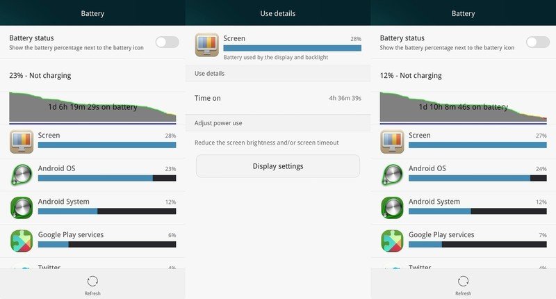
The battery inside the Ascend Mate 7 is beastly. There's no other way to describe shoehorning a 4100mAh battery — larger than the battery of the current Nexus 7 tablet — into something as slim as this. Sometimes size does matter, whatever you may have heard. In our eyes there's no such thing as too big when it comes to a smartphone battery, and Huawei has delivered an impressive amount of power. But how does that size translate into how much you can get from it in your daily cycle?
One advantage already is the display that is 'only' 1080p. Quad HD screens may well be the new hotness, but pushing more pixels often comes at the cost of battery life. Sure, the Mate 7 has a 6-inch display, but sticking to 1080p means there're fewer pixels to push, fewer numbers to crunch and less energy to be spent.
Perhaps the best thing we found during testing was 2 days of actual, real world use before needing to find a charger — with approaching 6 hours total screen on time. Not every single day, and whether it was used for tethering or any extended gaming or video sessions would bring that down, but it's perfectly possible to get through 2 full days of use before you're hunting for a charger. And that's impressive.
It's more than good enough to get through even the heaviest of days.
Under no situations has the Mate 7 struggled to get through a day of use and abuse, and after the first day the next milestone to hit is two days. (After all, it's no good needing to find a charger half way through the day.) Huawei has some software additions like its ultra power saving mode that seriously restricts what the phone can do if you're cutting it really close, but it's likely you're not going to need it all that often.
You can't swap the battery, either, it's sealed in. But it's so large that it shouldn't let you down throughout the day. It's more than good enough to get through even the heaviest of days.
The noise cancelling earbuds
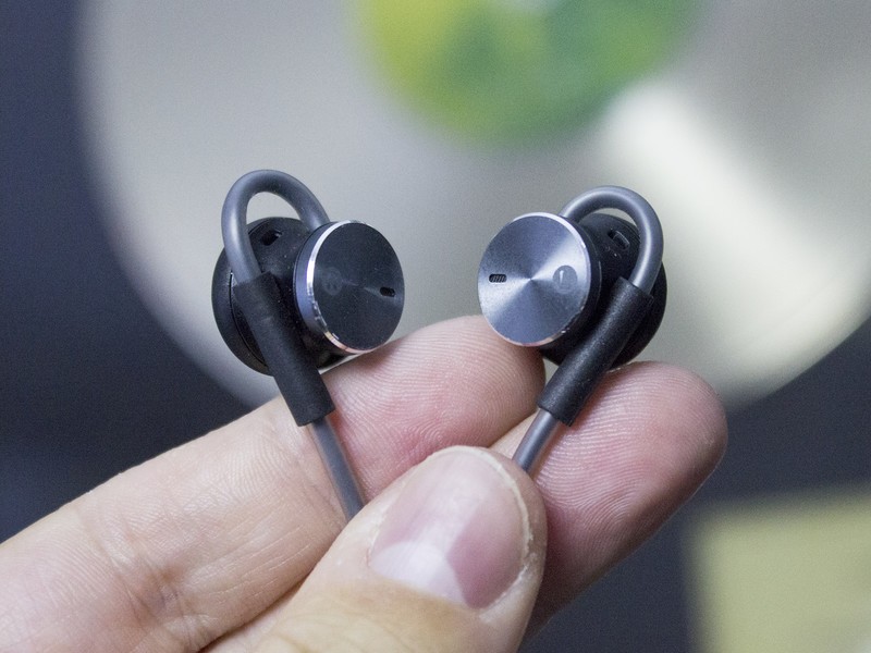
Alongside the Ascend Mate 7, Huawei also announced a pair of noise cancelling earbuds that work with the phone in a very special way. The battery that powers the noise cancelling in the earbuds is charged via the phones 3.5mm headphone jack. If you use them with the Mate 7 you get unlimited battery life, which drops down to 2 hours when used with another device. There's also an included USB adapter to top them up away from the phone.
They're not included in the box with the phone, they are a separate purchase. But if you're picking up the Mate 7 they're certainly worth considering. They're comfortable to wear, have a pretty good, solid sound quality and the noise cancelling aspect works extremely well.
We've tested that in three different scenarios: On a plane, on a train and at the Sony booth at IFA. Quite remarkably when listening to music at the Sony booth in particular, there was no real evidence of the background noise. Just the music. A similar story on planes and trains, though if you swap music for something like a podcast then some of the background noise does creep in. But overall they're very good, and a very good partner for the Mate 7. Sadly no price or availability was announced at the launch of the phone.
The bottom line
Our own Alex Dobie made the point possibly as well as anyone ever could:
Huawei in particular is one the big Western OEMs should ignore at their peril.
He's absolutely right — referring to those of course with success in the West, not based there. 2014 has been a big year for Huawei with some pretty significant devices — first the Ascend P7 and now the Mate 7. When you listen to CEO Richard Yu, speak at events such as IFA, it's clear what the target is. Moving up into the top 2 and eventually topping the list of the biggest smartphone vendors on the planet.
Huawei has its eye on the number one spot.
The Mate 7 is more than just a good phone by Huawei standards, it's a good phone, period. There's no one feature that stands out as being significantly better than the competition, but the sum of its parts puts it up there with some of the best we have to choose from. We've got the premium aluminum construction, a fantastic display, impressive internals and a good all-round camera. The software's still a point of relative weakness, but there's been some movement in the right area.
It's a device buyers looking for a big-screen smartphone should definitely consider. Or at least, it is if you're somewhere you'll be able to buy it. For Europe and Asia that won't be a problem — the Mate 7 is due to go on sale in October. There are no immediate plans to bring the phone to the United States, though an executive did tell us at IFA that it's something they're working towards. When it does go on sale it will cost €499 for the 16GB/2GB version we have here, and €599 for the extra-fat 32GB/3GB version, which also comes in gold. The Mate 7 doesn't have a unique appeal like the Galaxy Note, but it's still an enticing extra-large phone. And we're looking forward to seeing what's next from Huawei in 2015.

