The launch of HTC's new "U" series of phones came with a flagship-sized hole in the middle of the lineup. The U Ultra was too big and too expensive, while the U Play was underpowered and short on value for the money.
With the launch of the U11, HTC is not only filling that flagship spot in the 2017 U series but also trying to create a proper successor to the HTC 10 to be the leading device of the year. Just a couple months after the U Ultra launched, the U11 arrives with a faster processor, improved battery life, a more compact body, better camera and perhaps most importantly a proper price.
With the big improvements, not only does the U11 make you wonder why the U Ultra exists — but it also makes you start considering it right alongside the flagship competition of 2017. That's something that happened only briefly with last year's HTC 10, and we're going to see if the HTC U11 has what it takes in our full review.
About this review
I, Andrew Martonik, have been reviewing a Taiwanese SKU of the HTC U11, running on T-Mobile in both Mountain View, CA and Seattle, WA for 9 days. Due to radio band limitations, I did not have complete network coverage that would normally be provided by a proper U.S. phone. The software is version 1.03.709.4 with the April 1, 2017 security patch, and was not updated during the review period. The phone was provided to Android Central for review by HTC.
A recap
HTC U11 Video review
For a concise recap of everything you need to know about the U11, be sure to watch our video review above. When you're done, you can see my complete thoughts on the phone in the written review below!
Historic beauty
HTC U11 Hardware
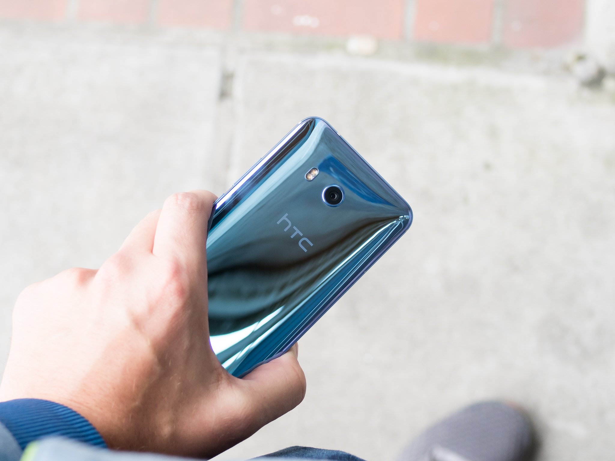
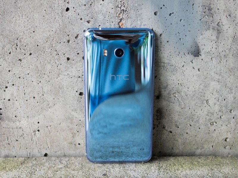
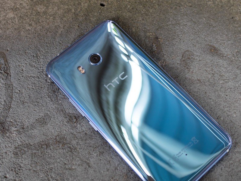
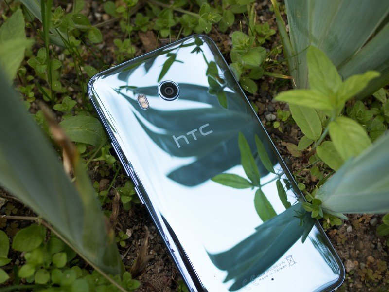
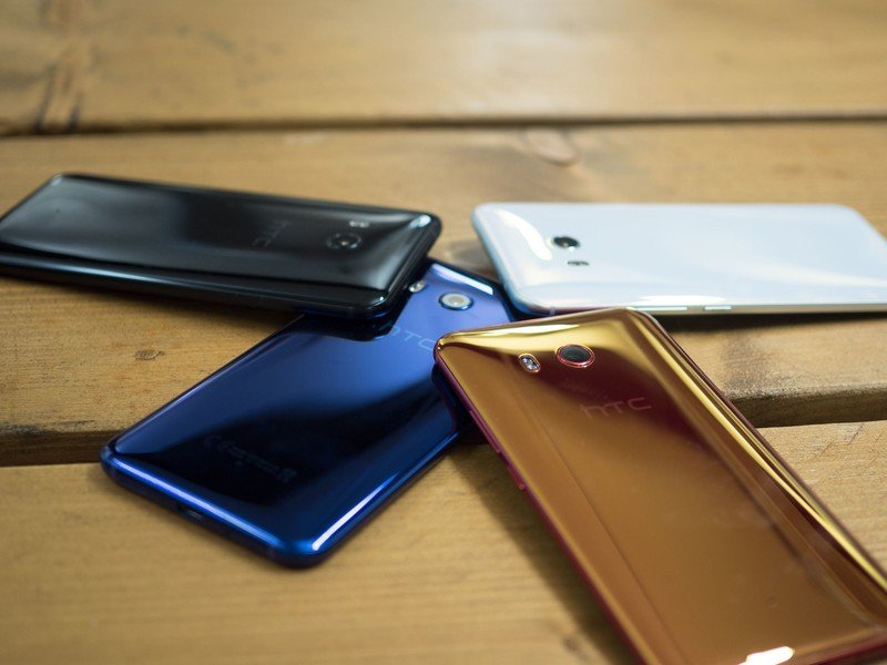
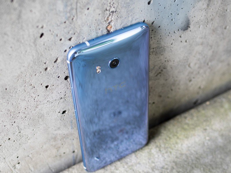
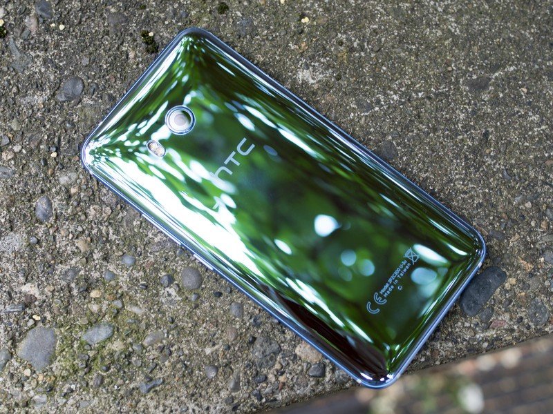
Time after time, HTC shows how to execute its hardware designs perfectly. The "liquid surface" glass on the back stands out like no other glass-backed phone, coming down to the way it curves off of the edges and how the color is embedded in the glass rather than coated on the inside. No matter which of the five colors you pick up (the "amazing silver" is shown here), the colors shift and change as you move it around — it's a striking and unique design that stands out.
More: HTC U11 specs
The entire phone is beautifully crafted and assembled, with a satisfying heft you get from few phones — but expect from one with "HTC" on the back. That continues into the perfect curve of the glass on both sides of the phone, the way the buttons click and how solidly the haptics vibrate. These are things that are so often overlooked in order to achieve mind-bending designs, but HTC sticks with as important parts of the experience. HTC has also arrived fashionably late to the party with IP67 water resistance, which is a welcomed addition nonetheless.
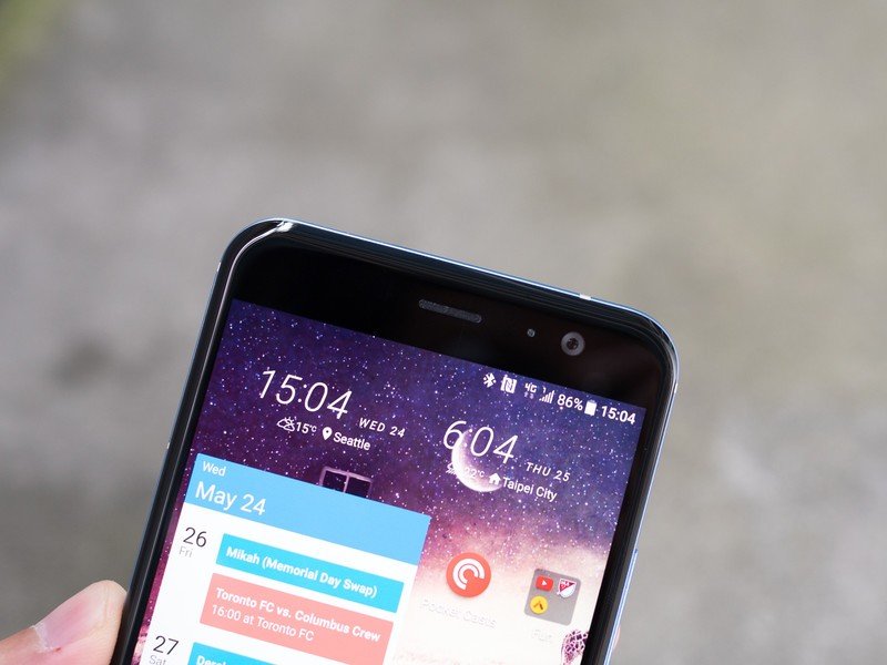
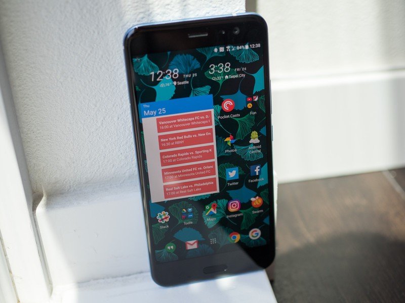
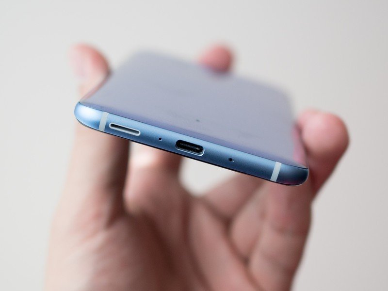
From the front, the U11 feels like a phone from last year ... or even 2015.
For as beautiful as the U11 is, you don't look at the back of your phone all that often — you interact with the front every single day. Up front, the U11 feels like a phone of yesteryear. The display is surrounded by above-average bezels, punctuated by capacitive navigation keys on the bottom (whyyyyyyyy). Front-on the U11 looks the same as any generic phone released last year — if not in 2015. There are real usability concerns around a phone that's wider and taller than it "needs" to be, but importantly to snagging sales it also gives a weaker first impression than the Galaxy S8 or LG G6.
The 5.5-inch display itself is definitely up to modern standards, though. The latest Super LCD 5 panel at QHD resolution is at the top of what you can get from an LCD today, even though it comes up a bit short of Samsung's AMOLED panel (which I regard as the top of the industry). Everything is amazingly crisp and colors are great, and surprisingly for an LCD it's even manageable in bright direct sunlight. The screen doesn't quite get as dim as I'd like at night, but that's a small complaint about an otherwise great screen.
How the HTC U11 was made
There's an amazing amount of work that goes into making a phone like the U11. From the research and design up to final assembly, we were able to see inside the buildings where the U11 was built — be sure to read our first-hand account of the process.
Made in Taiwan: How HTC designs, manufactures and tests its new U11 flagship
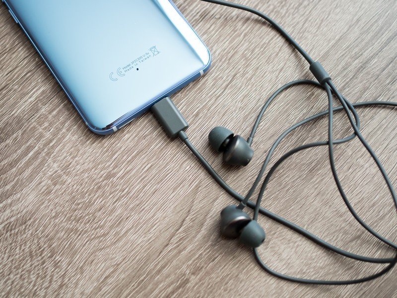
You shouldn't look at an HTC phone today expecting it to have a standard 3.5 mm headphone jack. What you will get in return is an audio experience that's a step above the competition. That starts with the in-box USonic headphones, which sound better than your typical bundled earbuds and now include active noise cancellation powered by the phone. It's a nice treat to actually get good, feature-filled headphones in the box (along with a USB-C to 3.5 mm adapter), but it's still baffling to me that they aren't actually standard USB-C headphones that work on any other phone, tablet or computer I've plugged them into. These are headphones for the U11 only (well, or the U Ultra / U Play) ... and for some people that's just an added frustration on top of not having the 3.5 mm jack.
HTC's new BoomSound speaker setup is also here, which combines both the front-firing earpiece speaker and down-firing loudspeaker for a better sound stage. Despite the complaints from longtime HTC fans that prefer the full-on dual speaker approach, the U11 sounds better than your typical phone — not only does it get louder than anything else on my desk, it sounds better through the full range. I don't see this as a big drop-off from the "proper" stereo speakers of older HTC phones.
Maintenance mode
HTC U11 Software and experience
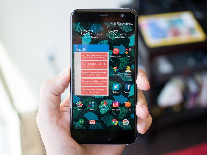
HTC Sense feels like it's in maintenance mode at this point. For better or worse, the interface on the U11 isn't far removed from what you see on a One M9. At its core that's not really a bad thing, because HTC has long had a relatively clean interface that has removed a whole lot of cruft, duplicate apps and bloatware.
Much of what remains is a lightly tweaked version of Android 7.1.1, with some default apps replaced by HTC's consistently (albeit a bit tired looking) designed offerings. This is very much a "light touch" approach to shipping Android, with large swaths of the interface unchanged from what you'd see on a Pixel today.
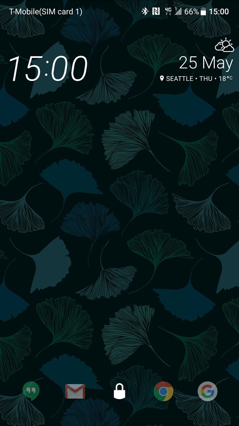
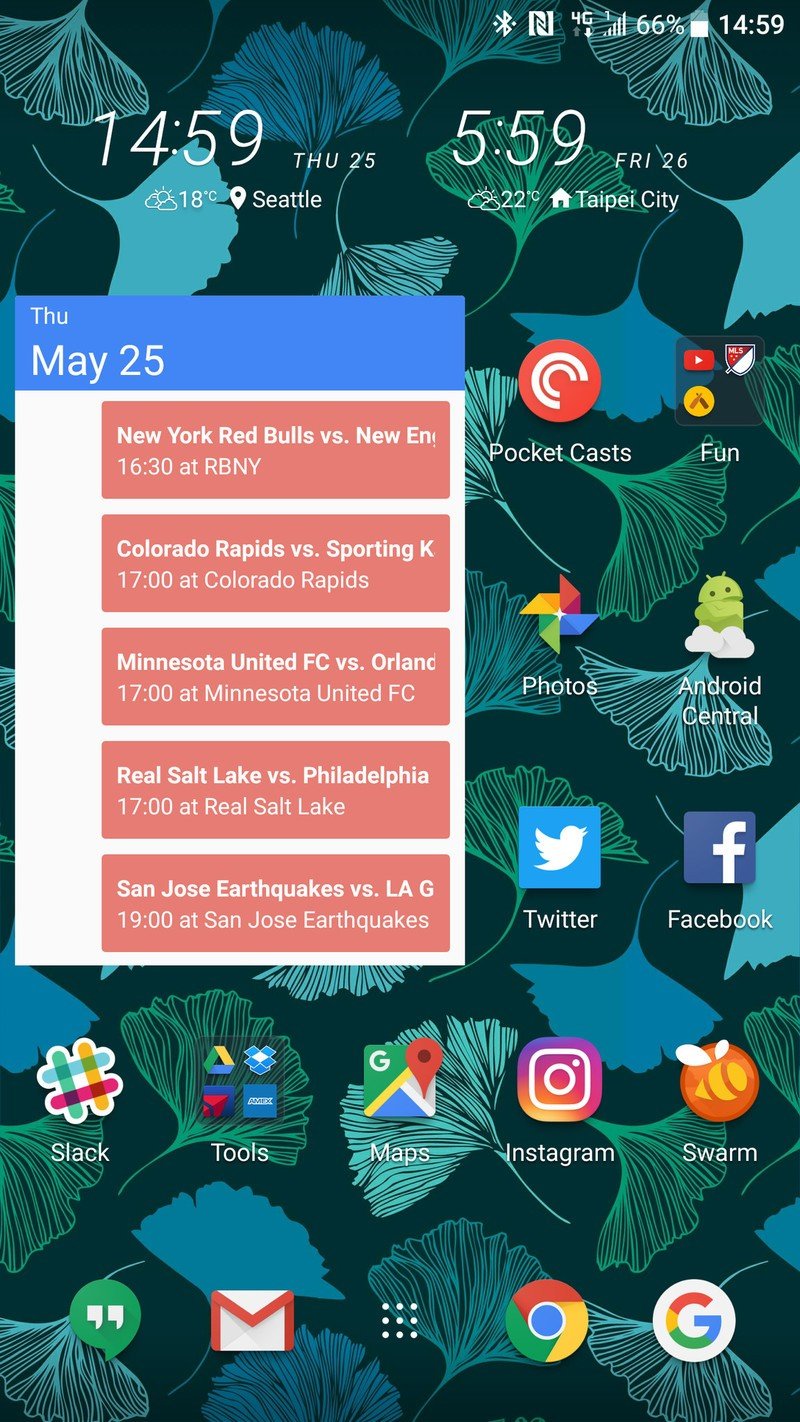
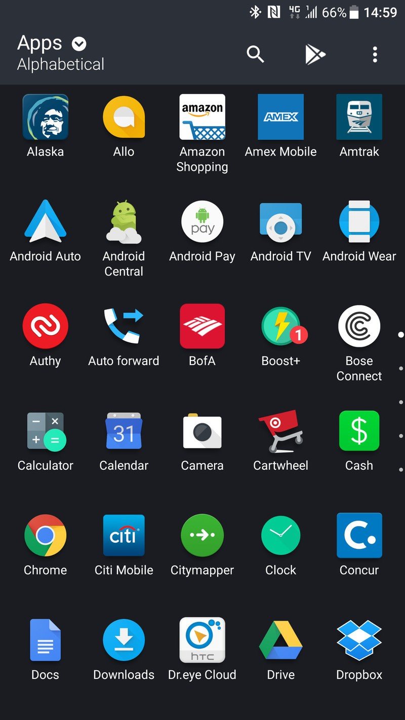
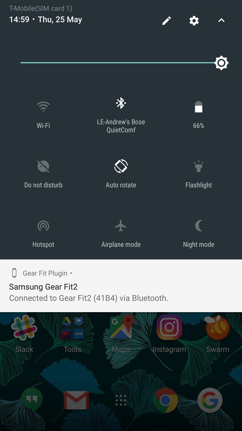
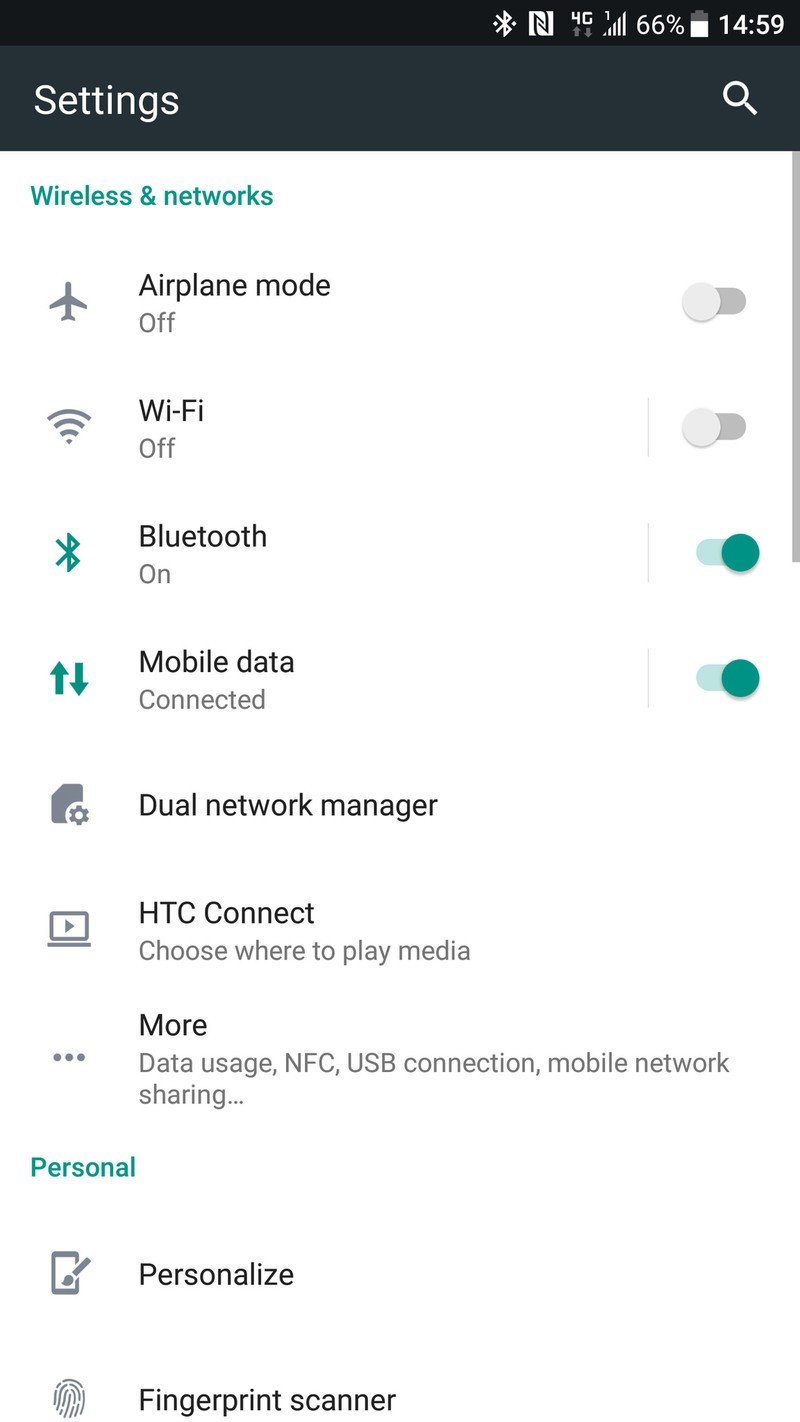
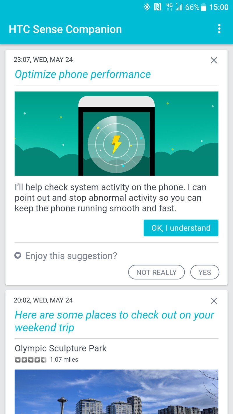
Some people, particularly those coming from a Samsung or LG phone, will say "where's the rest of it?" — because HTC chooses not to pile a ton of features on its phones. You'll simply find some subtle, helpful tweaks — like its audio tuning, the new "edge sense" squeeze feature and its camera app.
For me, the lack of extra features is actually a good thing. Loving the software experience on my Pixel XL, I want software as close to that as possible — and the U11 isn't far off. I don't have to go through the interface and turn off all of the things I don't want or wade through features I'll never touch. I installed a different keyboard on the U11, and that was it — I could just use it as is and be happy. Every basic feature I want is here, and it's executed properly; anything more I want I can get from Google Play.
Edge sense: Just squeeze your phone
The one big feature (or gimmick, perhaps) of the U11 is its "edge sense" technology, which has been at the core of HTC's marketing for the phone — that's why you're seeing the word "squeeze" so damn often. Yes, when you squeeze the U11 things happen, and HTC's positioning it as a new way to interact with your phone that's better than just an extra hardware button or two.
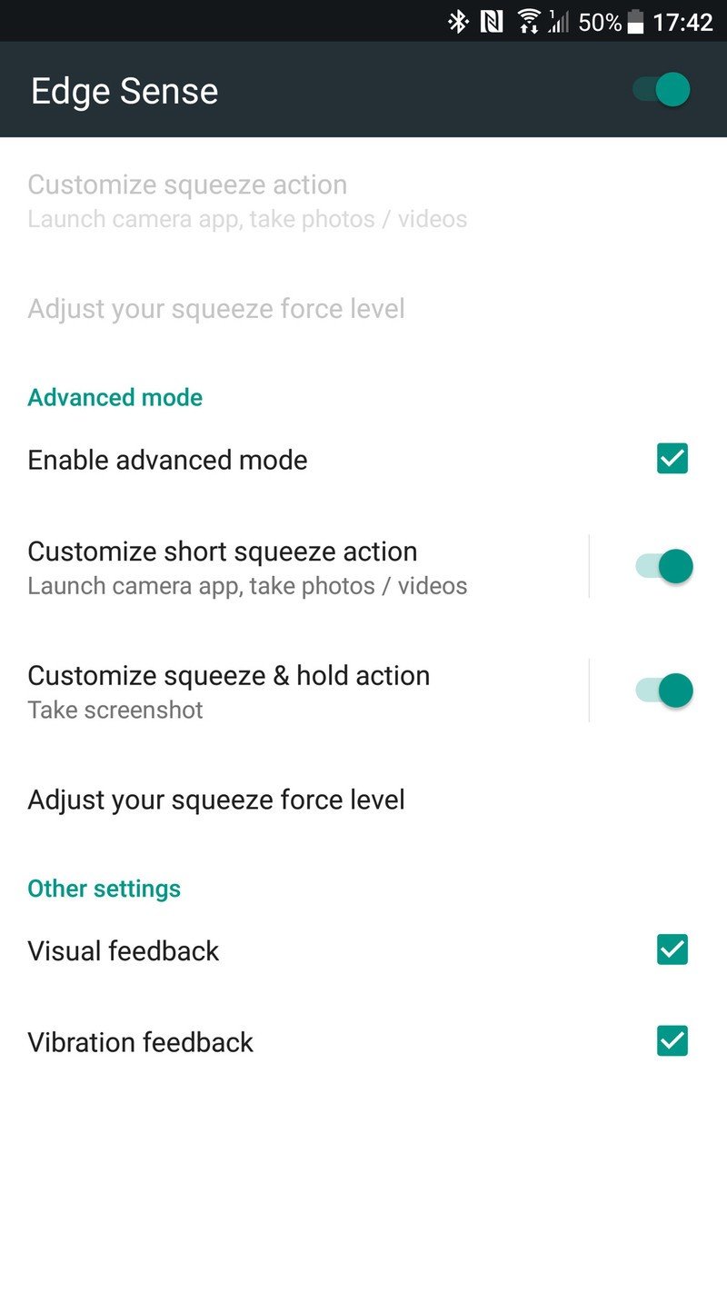
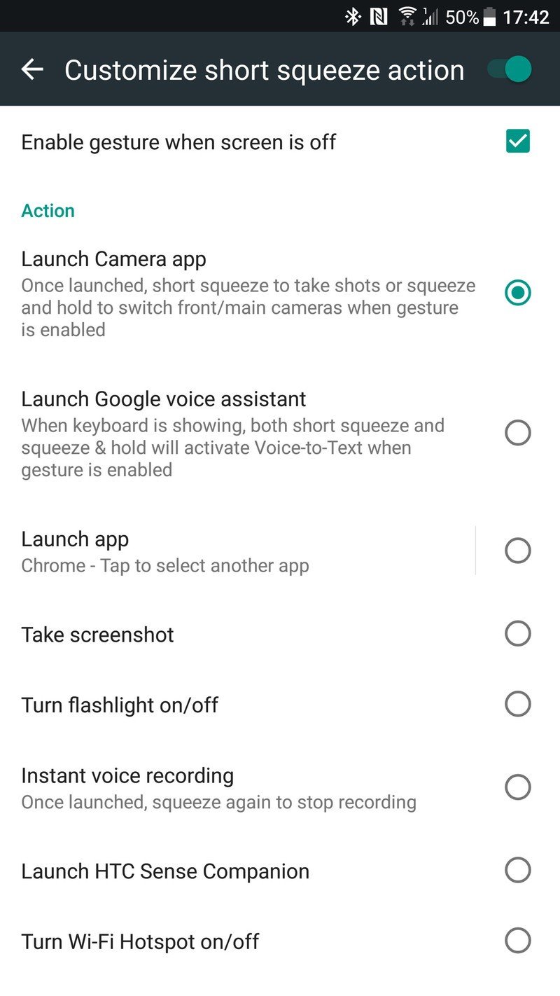
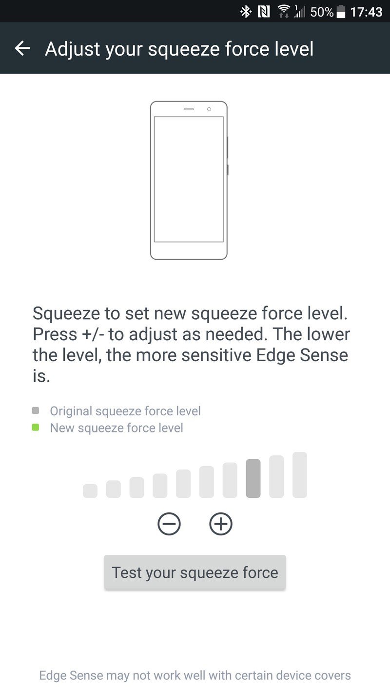
The feature works simply enough: just tell the phone what you want to happen when you squeeze it, and then what happens when you squeeze it a bit longer (not to be confused with squeezing harder). You can configure and test until you hit a squeeze level that works for your hands, and adjust it at any time.
Squeezing your phone is not unlike Moto's gestures or BlackBerry's convenience key.
I left the short squeeze on its default setting of launching the camera, and changed the long squeeze to a screenshot. You can make either one launch Google Assistant, take a screenshot, toggle the flashlight, turn on the voice recorder, launch the Sense Companion or toggle the Wi-Fi hotspot — if you don't like any of those options, you can have it just launch an app of your choice.
Being able to squeeze your phone to launch an app or toggle a system function isn't much different than Motorola's set of hand gestures or BlackBerry's convenience key. It's a neat thing that works well but isn't going to completely change the way you use a phone — and if you don't like it, you can even turn it off entirely.
Performance
HTC continues to offer the smoothest, most consistent software performance outside of a Pixel or Nexus. Through what is surely a combination of obsessive software engineers and plenty of licensed technology, the U11's interface performance is immaculate. It's a sort of subconscious fluidity that's tough to describe. Touch response is perfect, scrolling feels just right and apps are blisteringly fast. No stutters, no hiccups, no issues at any point — no matter how smooth my other phones are sometimes, they're never this consistently perfect.
This is Pixel-like performance and fluidity.
So long as a phone performs like that I'm not particularly bothered by what's inside, but HTC knows people care about specs and delivered accordingly. The latest Snapdragon 835 is inside running the show, supported by 4GB of RAM and an ample 64GB of storage plus an SD card slot. Those specs are right in line with the competition, and should serve the U11 well for a good 18 months — let's hope HTC keeps its software updates rolling accordingly.
Battery life
A 3000mAh battery wasn't exactly acceptable on the massive U Ultra, but is a more appropriate cell size in the 5.5-inch U11. When paired with the power savings of the Snapdragon 835 processor, battery life on the U11 is solid. The phone could easily handle my typical day that involves lots of Wi-Fi time, keeping up with email and social networks and roughly 3 hours of screen-on time — all with about 20% battery to spare.
I only once had to dip into the "power saver" mode before bedtime, and it was on a travel day where the phone eventually lasted just over 12 hours after over 5 hours of screen-on time and just as many hours playing podcasts over Bluetooth. That's really good, and it's tough to expect much more from a flagship today — I've had plenty of phones die well before that point when I travel.
Speaking somewhat selfishly as someone who was really getting used to wirelessly charging their Galaxy S8 every night, I do wish that the glass-backed U11 integrated at least Qi charging. I know it's a rather niche feature, but for a high-end phone with a glass back you sort of expect the feature. Luckily Quick Charge 3.0 is here for when you plug in over USB-C, and that 3000mAh battery charges fast.
A nice rebound
HTC U11 Camera
As a side effect of the HTC 10's overall lack of traction in the market, we generally forgot that it had a pretty good camera. Thankfully the U11 not only one-ups the U Ultra's camera, but steps beyond the HTC 10 at the same time. A new "UltraPixel 3" camera offers 12MP of resolution, 1.4-micron pixels, an f/1.7 lens and switches from laser to phase detection "UltraSpeed" auto focus.
HTC is very proud of this camera, and is happy to tell you it has the "highest ever" DxOMark Mobile score of 90, but more important than any number is how it actually holds up in real use. When I spoke with HTC's camera engineers ahead of the launch, they said they like to aim for "true to life" photo reproduction, then kick up the punch just a little bit — and I found that to hold true.

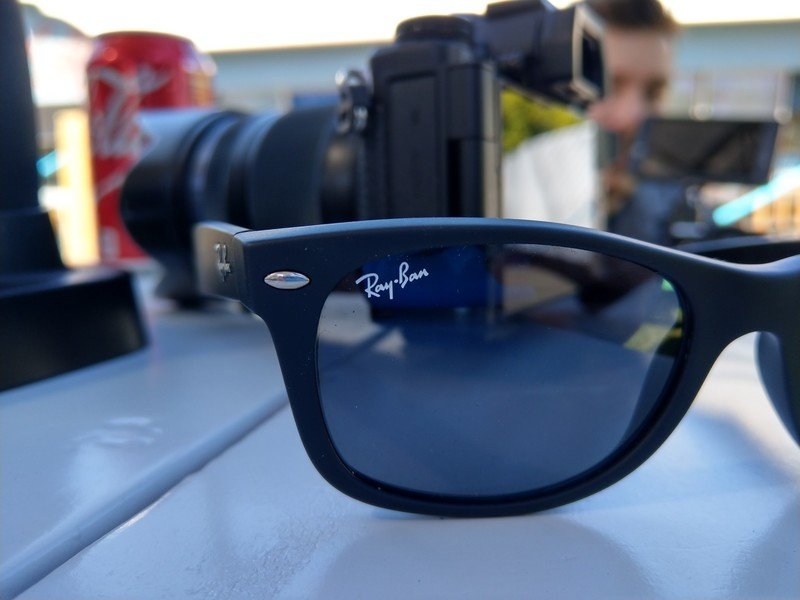



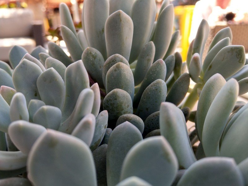





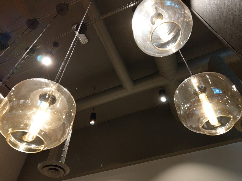



The U11 takes really good photos, and they indeed lean toward real-life reproduction with just a little extra pop and contrast to make them pleasing to the eye. Leaving the phone in HDR Auto, as I typically do, I didn't run into the same sort of low dynamic range issues that I typically have on HTC's phones. It was good enough that I didn't even turn on the tap-to-expose option in the settings, though in a few situations I felt HDR didn't do enough to brighten up dark portions of scenes — but of course that would've been unnatural looking, which isn't what HTC wants its cameras to do.
HTC is back in the discussion with the top smartphone cameras out there.
In daylight, photos were just about pristine and right on par with the Galaxy S8, Pixel XL and LG G6. Colors were just right, edges were sharp and there was plenty of contrast available. When the lights got dimmer, things weren't as perfect, but no phone is in these situations. The dynamic range was again good enough to handle most scenes with mixed lighting, and I think HTC makes good decisions in leaving some grain in dark areas and not over-sharpening lines to the point of making them soft. In low light, where shutter speeds were sometimes a little on the dangerously low side, optical image stabilization (OIS) compensated just fine.
This camera is miles ahead of the U Ultra's, thankfully, and I have no issue setting it right alongside the top-tier competition in 2017. Having so many flagships just in the first half of the year offer great cameras is wonderful.
On the right track
HTC U11 Bottom line
When I reviewed the U Ultra, I could see the potential in the design and hardware execution — that phone was just unfortunately saddled with multiple issues including its size, a couple bad internal spec choices, a subpar camera and a far-too-high price. HTC has remedied nearly all of those issues just a couple months later with the U11. It has a more manageable size, ditched the second screen, improved battery life, overhauled the camera and lowered the price to $649.
If the U11 doesn't sell well, it will have nothing to do with the outright quality of the phone itself.
With those issues out of the way you can appreciate what a beautiful phone the U11 is, with a design that's truly unique to look at and solid to hold. You can also appreciate the ridiculous speed, fluidity and consistency of the software that beats everything but Google's own phone. And if you're a fan of the spartan approach to features and apps as I am, you'll like what HTC is doing here. Even if the interface isn't demonstrably changed from two years ago, at least the design is solid and you're not saddled with tons of cruft that's constantly in your way.
I don't think anyone was expecting HTC to come out swinging with a flagship smartphone that can steal a large number of sales from the big names out there, particularly in North America and Western Europe. But if the U11 doesn't sell well in 2017, it will have nothing to do with the outright quality of the phone itself. It's a really great phone that does so much right with so few missteps along the way. HTC has just lost so much ground in market share and brand awareness that it's fighting an uphill battle no matter what it puts out.
The U11 has everything it needs to be a challenger to the top crop of phones in the market today — now HTC just needs people to get to the point of giving its phones a chance again.
Andrew was an Executive Editor, U.S. at Android Central between 2012 and 2020.
