The quick take
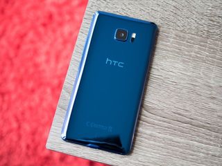
HTC continues to get the basics right with flagships. The U Ultra has a great screen, amazing build quality and stunning design. You get just about every spec inside you'd expect, and the day-to-day performance as a result is fantastic with a super-smooth software experience. Unfortunately, HTC's camera performance once again lags behind the pack, its secondary display is all but useless and there's no headphone jack or waterproofing — all in a phone that's charging a premium price of $749.
The Good
- Fantastic performance
- Great screen
- Stunning hardware
- Unlocked and bloat-free
- Absolutely nails the basics
The Bad
- 2016-level camera performance
- No headphone jack
- Second screen lacks utility
- No water resistance
- Too big for most hands
U Question why
HTC U Ultra Full review
In 2017, the number of people who think of HTC in terms of nostalgia rather than as a leading smartphone company is growing. If you've been following the company's dwindling market share (and mind share) over the past three years, you'll know why. The company has lost ground particularly heavily in the U.S., where the market is split between Apple and Samsung at the high end, and a trove of low-cost phones at the other. HTC can't compete in either, and perhaps fittingly is barely emphasizing its brand new $749 U Ultra in the U.S.
It's a far cry from the substantial marketing pushes we saw with the HTC One M9, HTC 10 and even HTC One A9, but it makes sense considering the company's position. HTC hasn't made deals with any U.S. carriers for the U Ultra — choosing instead to sell unlocked directly to consumers — and isn't even bringing its mid-range sibling, the U Play, to North America as a counterweight.
Despite the diminished marketing emphasis for the phone in the U.S., HTC has gone decidedly high-end with the U Ultra — and not just in price. It's a big, beautiful, powerful phone with the latest HTC software tricks on top of just about every other feature we're looking for in a phone in this price bracket. The worry, as is far too often the case with HTC, is whether or not the execution is there — and in a world where you have a shoestring advertising budget, the phone has to be great. We put it to the test in our complete HTC U Ultra review.
About this review
I (Andrew Martonik) am writing this review after 8 days using the HTC U Ultra on T-Mobile in the greater Seattle, WA area. The phone arrived on software version 1.09.617.12 (Android 7.0) and was not updated during the course of review. The HTC U Ultra was provided to Android Central for review by HTC.
Simply stunning
HTC U Ultra Hardware
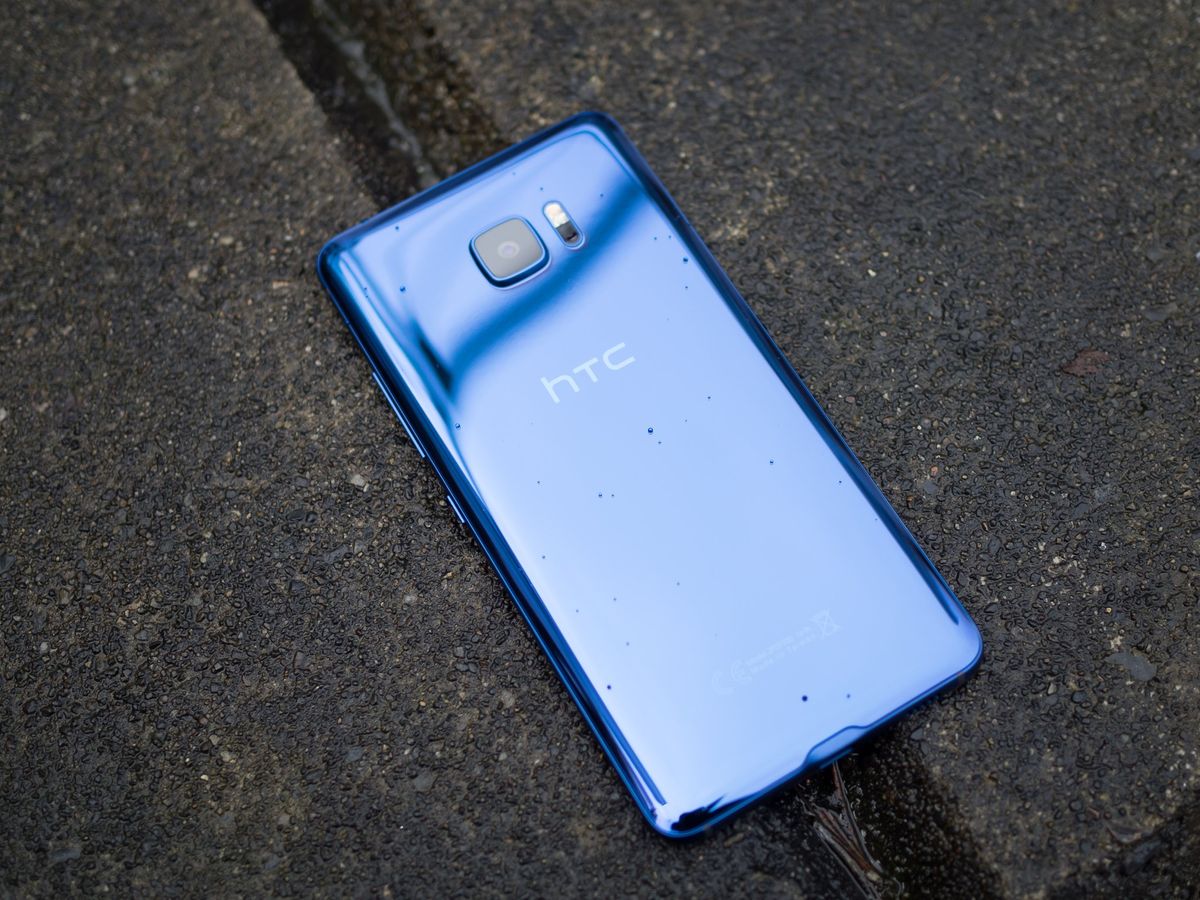
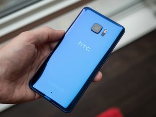
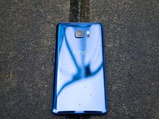
I had the opportunity to see the HTC U Ultra and U Play back at the beginning of January, and since then I still light up every time I come across a photo of that pristine shiny exterior. Holding a fresh blue HTC U Ultra in my hand today, I still get that great feeling. This thing is gorgeous — and not in a generic design sense, but with a very strong HTC vibe. And that's not just the case in this excellent blue color, but also in the pearlescent white and inky black varieties.
A beautiful piece of technology you just want to stare at.
The back is a finely-sculpted piece of glass, technically, but it doesn't look like any other glass-backed phone — distinctly different from the LG G6 and Galaxy S7. HTC calls it "optical spectrum hybrid deposition," and it's the culmination of two years of development on the process. The end result is a glassy exterior that has the color embedded inside the glass, rather than simply coating the underside of clear glass. It's beautiful and I can't take my eyes off of it — and it's sure to catch some attention when you use it in public.
More: Complete HTC U Ultra specs
The mirror-like finish is gorgeous and minimalistic, perfectly curving off to the edges where it meets a color-matched metal frame that doesn't have all that much texture to it. The front of the phone is a pristine black panel of glass that is of course perfectly assembled, and it frames a very large 5.7-inch display that also has an extra 2-inch display on top of it. The bezels on all four edges of the display aren't exactly small, and it leads to a very large overall footprint: 80 mm wide, and 162 mm tall.


I can't tell you what sized phone to buy, but the U Ultra is going to be too big for most people.
Far be it for me to tell you what sized phone you want, but the U Ultra is too big for my hands. I can manage a Pixel XL, or a OnePlus 3T, but the U Ultra is substantially larger than those phones — in fact, it's even bigger than the LG V20 and Huawei Mate 9 ... which I personally couldn't manage either. Looking at the U Ultra beside the LG G6, for example, and you just chuckle at how unwieldy it is. Yes some people will want the most screen possible no matter what it does to usability, but I prefer a bit more balance — and the U Ultra doesn't seem to attempt any sort of balance.
If you're that person who wants "more screen at all costs" you'll absolutely enjoy this display. The 5.7-inch QHD Super LCD 5 is clear, bright and accurate — I really can't find anything bad to say about it. This is a display befitting of a $749 phone, and it's covered in Gorilla Glass 5 for good measure. That same group will also likely enjoy the capacitive navigation keys below the display that don't take up any screen real estate — despite the majority of the market going toward on-screen keys.


Despite espousing that it is a top-level phone in every other way, most notably in its price, the U Ultra has two feature omissions that will rub people the wrong way. Just like the Pixel XL — which is nearly the same price and also made by HTC — the U Ultra isn't waterproof. Now HTC does offer its "UH OH" protection program (for free!) that covers one replacement of the phone, including water damage, but the average buyer would far prefer to just not have to worry about water damage at all. And unlike the Pixel XL, this is one of multiple stumbles rather than a single flaw with the phone.
No, I won't hear your arguments for removing the headphone jack.
The far more puzzling — and polarizing — exclusion on the U Ultra is the headphone jack. Just as we guessed when HTC rolled out the Bolt late last year, this looks to be the new direction for the company: skip the headphone jack in favor of USB-C audio, despite having very large phones that seem to have the room to accommodate the port. HTC's USonic headphones are comfortable, sound good and are designed to tune sound that's appropriate for your ears ... but I want to use different headphones sometimes. I want to plug into a speaker or a friend's car stereo now and then. And that's not possible with the U Ultra. I know this is A Thing™ now, but it really doesn't have to be and it goes against what most consumers want.
HTC includes those USB-C headphones I mentioned in the box, but charges you an extra $12 for a USB-C to 3.5 mm headphone adapter if you want to plug in something else. (C'mon, even Apple includes an adapter in the box.) Better yet, the headphones that come in the box don't work with other USB-C devices, so these really are headphones only for your U Ultra. No matter how good they are, that's annoying.
Downright fast
HTC U Ultra Software and performance
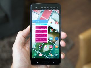
HTC's take on Android hasn't changed much in the past year in terms of design and interaction. It has a clean, dark look with splashes of white, grey and green — and compared to the bright and overly colorful options from some manufacturers I'm a fan of HTC's choices. It still paints over the whole interface with a heavy brush, but its changes aren't so far out of touch with the way modern apps and Google's guidelines look.
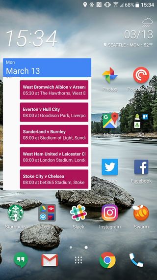
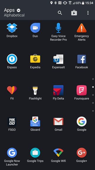
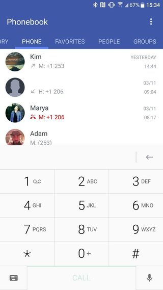
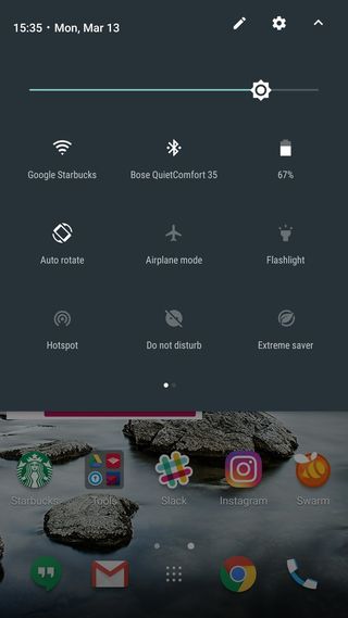
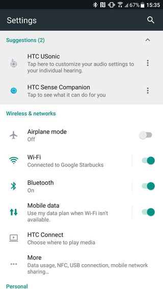
HTC's built-in apps for phone, messaging, email, clock, etc. all follow a consistent design as well, and thankfully it does a nice job of not doubling up with Google's own apps — for example, Google Photos is your only gallery app, and Google Calendar is your default calendar. HTC unfortunately still includes some of its most annoying "features" like the spammy, low-quality News Republic app that likes to push crummy "news" at you, and the quite useless Blinkfeed area of the launcher. Thankfully you can disable News Republic, and turn off Blinkfeed or replace the launcher altogether.
I didn't receive a single Sense Companion notification that was useful.
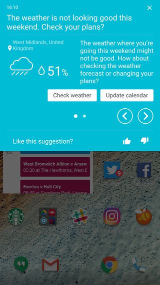
More in the head scratcher camp is HTC's oddly named "HTC Sense Companion" app, which was originally billed as a full-on artificial intelligence system but then dramatically scaled back for launch. What it basically comes down to now is providing you with recommendations for places to eat, bad traffic around you, changes in weather and suggestions for other ancillary content. The notifications arrive on your lock screen or second screen, and aren't actually useful in any way — after over a week with Sense Companion turned on, I didn't receive a single notification that was interesting to me. I turned it off.
Beside its questionable usefulness, the thing making Sense Companion completely unnecessary is the fact that Google Now and Google Assistant are here. Google Now provides me with better recommendations and notifications throughout the day, and the U Ultra's excellent microphones and software performance make Google Assistant very useful.
Aside from the Sense Companion, which I don't think anyone will actually use for more than a week, the second screen provides a pretty basic set of features. Just as you'd expect, it almost perfectly mirrors what the LG V20 can do: show you a generally static read-out of weather, calendar, contacts, a music player, an app launcher or a reminder. I used the weather display most often, and while it's neat to see at a glance I don't see a reason to waste battery life or overall device size in order to have it.
It feels tacked-on and distracting, particularly with the odd implementations of certain panels like the music player only working for Google Play Music, and the contacts launcher only working for on-device contacts. Perhaps design time and component costs could have been better utilized elsewhere in the phone.
Performance
The U Ultra continues HTC's well-deserved reputation for having lightning-fast and responsive software, where everything you do on the phone happens now with no hesitation or slowdown. Scrolling is silky smooth and transitions are quick, not unlike the experience of using a Google Pixel XL. I didn't have a single crash, slowdown or stutter on the U Ultra in my review period — it's impressively fast, and I love seeing phones that perform like this.
It isn't just fast, it's top-notch impressively fast.
Performance of this level isn't just because of the Snapdragon 821 and 4GB of RAM inside, but having the latest internals (for the time) definitely help. You can just tell that HTC has done plenty of optimization in this hardware, and it bodes well for the future as well. Further to that point, 64GB of base internal storage — plus an SD card slot — means you aren't as likely to run into update jeopardy after you've used your phone for a year and loaded it up with apps and media.
One more "performance" note that doesn't really have anywhere else to live: the speakers. HTC is using the same "BoomSound lite" type of setup here with a small speaker at the top of the phone (it's just the earpiece speaker) and a bigger speaker that plays a majority of the sound at the bottom. And it sounds good — albeit not at the super high volumes you expect from BoomSound of yesteryear with two dedicated full-sized speakers. I'm fine with this compromise, especially if dual front-facing speakers would've made the U Ultra even taller.
How about updates?
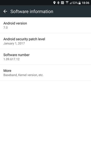
Completely skipping the carrier channels and selling unlocked directly to consumers is an overall win for everyone, and one of the benefits is not having any sort of extra restrictions or carrier bloatware in the software. This should theoretically let HTC update the software on the U Ultra more often as well, though at the time of writing this in mid-March my U Ultra has Android 7.0 with the January 1 security patch.
Looking back at HTC's history of security and platform updates, things haven't been fantastic. Some phones have done really well with getting one big platform update quickly, only to quickly trail off and get dramatically slower support or no security patches. Let's hope HTC can do right by its loyal customers, who have stuck around for a long time, and keep updates rolling.
At least we know going forward that any shortcomings in software updates land squarely on HTC and not a carrier.
Battery life
As I've already covered, the U Ultra is an unashamedly large phone — and despite being filled with lots of solid specs, it's small in one area: the battery. With just 3000 mAh inside, it's one of the smaller capacities out there in a top-end phone, coming in underneath the Pixel XL, LG G6, (expected) Galaxy S8 Plus, Mate 9 and ... you get the idea.
Full-day battery ... in a huge phone you expect a bit more from.
Longevity is actually pretty good on the U Ultra — I was able to get through a full day without hitting the battery saver (which triggers at 15%) on most days. But spending a little extra time browsing apps and listening to streaming music for a while throughout the day, I was able to kill it off in about 15 hours. That's good, but not great — and for a phone this big, most people are expecting "all day no matter what" kind of battery life.
You do get Quick Charge 3.0 here, with a compatible charger in the box, and perhaps that's enough to ease many people's worries about having just 3000 mAh inside. But being able to get better battery life each and every day out of a smaller phone from a different company makes this a tough sell for HTC.
Solid for last year
HTC U Ultra Camera
The glory days of HTC having industry-leading, captivating camera experiences are behind us. The HTC 10's camera was strong in 2016 but didn't challenge for the "best of the best" designation, and HTC has only slightly tweaked things for the U Ultra. A 12MP "UltraPixel 2" sensor, which has large 1.55-micron pixels, sits behind an f/1.8 lens with optical image stabilization and focuses with phase-detect and laser auto focus. That's everything you ask for in a smartphone camera in terms of hardware.
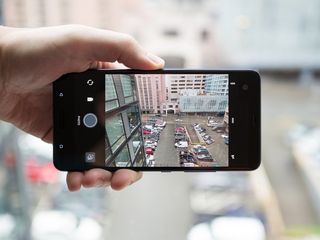
HTC's camera interface is slick and offers quick access to other modes — including a full manual "Pro" mode — but understandably focuses on the main point-and-shoot function. I appreciate the toggle to quickly switch between HDR modes and big buttons to shoot video and switch to the front camera.
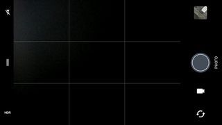
Thanks to all of the solid specs listed above, right out of the box you'll be impressed by the general quality of the U Ultra's camera. Just like most smartphone cameras today (to say nothing of $749 flagships), the U Ultra's can put out 12MP shots that are in focus, crisp and consistent from shot to shot.
It's only once you shoot with the camera for a week or more that you start to notice the few quirks that tell you the U Ultra is going to perform along the line of previous HTC cameras. Just like its predecessors, the U Ultra fights you in two main areas: a general lack of dynamic range, and hit-or-miss low-light performance.


For daylight shots, the U Ultra does well — where it struggles is in its dynamic range not being high enough to properly capture all parts of a less-than-ideal scene without something being short of your expectations. Even with HDR turned on, the U Ultra's pictures will leave some portion of a mixed-light scene blown out or too dark. Turning on "touch autoexposure" in the settings is necessary so you can get proper metering for the actual subject of your photo, so at least that will be exposed properly and look good. Colors in general are just fine, but this low dynamic range leaves many photos coming out bland or improperly exposed to the point of being disappointing, particularly when you just point and shoot.
Fighting to be the best camera of March 2016.
At night, the U Ultra again is very capable thanks to its high resolution, OIS and large pixels, but some of the processing seems a bit off at times. The biggest issue I found is the U Ultra's willingness to go for really slow shutter speeds in dark scenes — as slow as 1/5 second — to try and brighten things. The issue with dropping to 1/5 second is it introduces lots of potential for hand shake and blur, which combined with over-processing of grainy areas leads to very soft and blotchy results. Even when the shutter speeds are a bit quicker, around 1/20 or so, the U Ultra hesitates when taking low-light shots, making it easier to introduce hand shake that requires re-taking a photo.
When I stabilized the U Ultra and took a few shots to pick the best from the bunch, it can take great low light photos — you can only start to quip at little issues when you zoom in and notice soft edges. But the shot-to-shot performance at night can vary considerably, and that's just a problem that high-end smartphones of the last year don't struggle with.
The U Ultra would have a very competitive top-end camera if it were launching at this time last year. Its daylight performance is good, and if you know how to use it you can overcome issues with its lower-than-most dynamic range. Even though the low light performance is tougher to manage, it can capture solid shots But when you combine those two main issues that are likely to be present in photos you'll take on a weekly basis, you get a camera that is very much befitting of a $500 phone rather than a top-tier flagship commanding a 50% higher price.
This camera doesn't go toe-to-toe with the LG G6 or Pixel XL — it's basically just a step above the the OnePlus 3T or Honor 8, at double the price.
Too many flaws
HTC U Ultra Bottom line
HTC made about 80% of a great flagship smartphone, but is choosing to sell it for 100% of a flagship price. Time after time, HTC continues to absolutely nail the basics: excellent design, perfect hardware execution, a top-notch display, great internals and fast software are all here. But then there are odd stumbles: no headphone jack, puzzlingly weak low-light camera performance, a small battery and distractingly tacked-on "artificial intelligence" software.
HTC made 80% of a great flagship smartphone, but is selling it for 100% of a flagship price.
Even some decisions, like skipping waterproofing and including its little second screen, wouldn't seem so bad if the rest of the phone was great. But add these small issues to an already-flawed phone and you wonder what the thought process was for the whole device — that once again is commanding a top-dollar price tag of $749 where the competition gets just about everything right.
To have sales figures that actually move the needle, HTC can't get by on its hardware design and software performance anymore, as great as both aspects may be. There's plenty here to get HTC fans to buy a U Ultra purely for its great design, strong performance and big display — but those sales will be overshadowed by the overwhelming majority of people who will go for the better overall phones on offer from big-name companies at the same price or less.
Andrew was an Executive Editor, U.S. at Android Central between 2012 and 2020.
