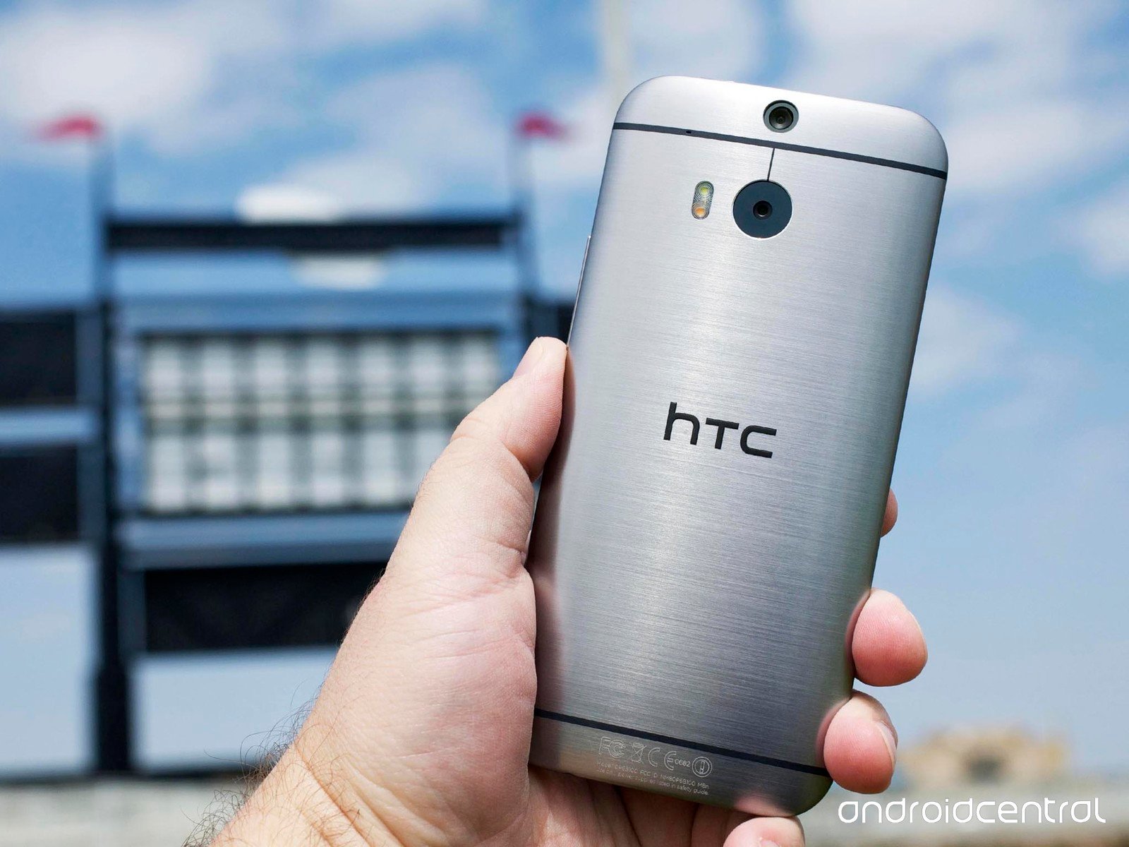
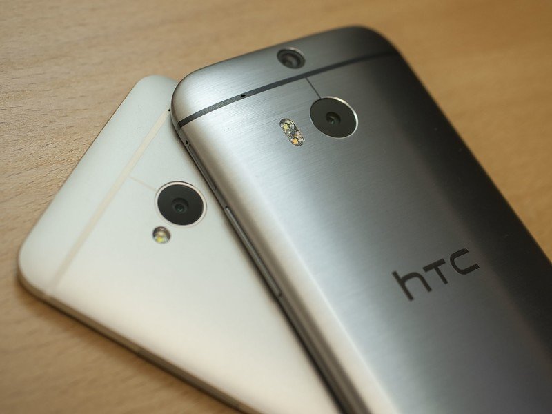
But time is ticking for that original HTC One, also known by its codename, M7. Today, it's been replaced by a new HTC One. A sleeker, more powerful, slightly larger HTC One. The M8.
And what's more — it's available for purchase today.
The original HTC One was the company's first major push into an all- (OK, mostly) metal construction, milling out a single block of aluminum for what was a pretty striking phone. But the new HTC One? Downright futuristic. More metal. A more impressive design. A bigger display. And the best software HTC's ever put together, with HTC Sense 6 and its wealth of features running atop Android 4.4.2 KitKat.
The new HTC One is, quite simply, the best smartphone HTC has ever made.
But it's not without a few quirks. Join us as we walk you through the new HTC One, as only Android Central can do.
About this review
Some background on this review: As always, we're trying to be as thorough as we can here. The new HTC One is a hell of a phone and deserves as such. But a little context is in order. We've used the phone for a week now. That's plenty of time to get a really good feel for it, kick the tires, crawl around and see what's hiding where. But there may still be some gremlins lurking about that might not be evident in the short-term.
We've got a UK model here in the United States. As is the case when that happens, we don't get a full feel for real-world battery life (which is the kind we care about) because we don't get LTE data. And while we do have HSPA+ connectivity on AT&T, the radios still act up a little. That's not unexpected, but it's also not quite ideal. We'll revisit that once we've got U.S. carrier versions available. It also means we'll see slightly different software in the United States, thanks to carrier additions. (OK, OK. Bloatware.)
There also will be some relatively minor tweaks to the internals depending on what region of the world you're in, specifically the clock speed used by the processor. We'll touch on that here but don't expect it to affect things too much.
HTC One Hardware
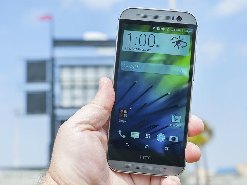
The broad strokes on the new HTC One: Usually we'd call a phone with a 5-inch display a "5-inch phone." That doesn't quite apply to the new HTC One (or the old one, for that matter) because of the front-facing speakers above and below the display. So it's a 5-inch phone in a larger body, but one that's beautifully designed. (Warning: There's some serious gushing going on in the next section.)
Technically speaking, we're looking at a Super LCD3 display at 1080p, covered by Corning Gorilla Glass 3. Nothing really to say here other than it looks great — just like before. It's decent in direct sunlight, has great viewing angles, and there's virtually no gap between the display and the glass. Top marks here.
We'll talk more about BoomSound in a bit. The short version is it's back, and boomier than ever. HTC didn't mess with an already great thing, except to make it better.
Processor? Some of the latest from Qualcomm. Cameras? Three lenses, actually. HTC tried something new with the 2013 HTC One, and it's trying more this year while in improves on the previous model.
Look and feel: So metal
It's evident that HTC knows what it's doing. It's got the metal down.
Think back to the original HTC One. Both on and off the record, we quickly learned that the M7 was a difficult phone to produce. Milling out all that metal. Injecting a bit of plastic. That HTC was able to do it at all — especially in something as sleek as the finished product — was probably a minor miracle.
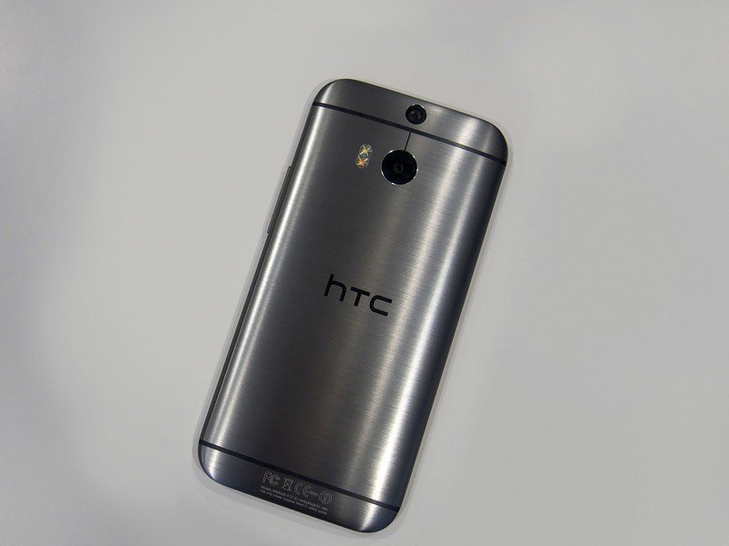
With the new HTC One, it's evident that HTC knows what it's doing. It's got the metal down. That's not to say that it's gotten any easier — chance are it hasn't — but this much is clear: The new HTC One may well have the best look and feel of any phone the company has produced, and that's saying something.
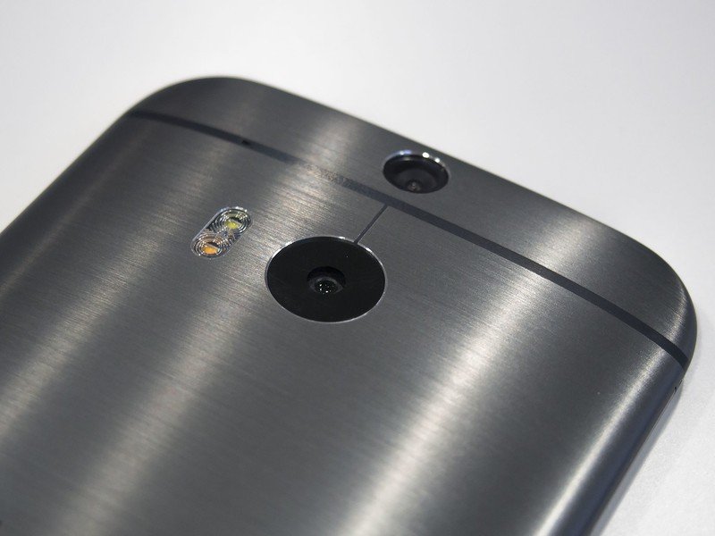
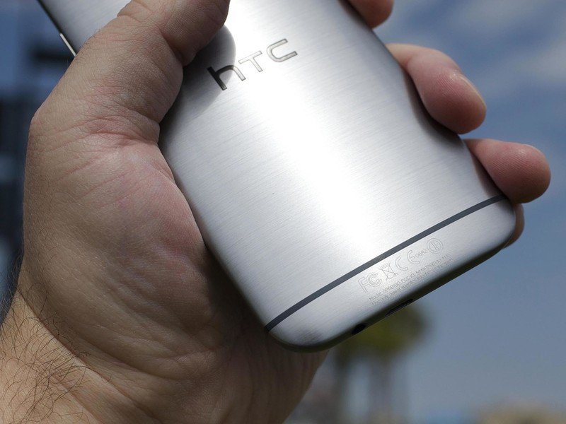
The new HTC One is a tad bigger than the old HTC One. It's nearly a full centimeter taller, a couple of millimeters wider and just about as thick, though that's tempered by the slope to the sides. You notice the difference mostly in the height — but the way HTC's done the buttons minimizes that a bit.
You'll also find you're using the power button a lot less, thanks to the new "Motion Launch" and double-tap to wake. Yes, HTC borrowed LG's baby here. Tap a sleeping HTC One twice to wake it. (There's no tapping again on a home screen to put it back to sleep, though.) Or, better yet, use one of the gestures to wake directly into something more useful. More on that in a bit.
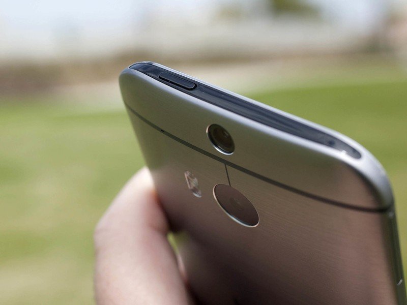

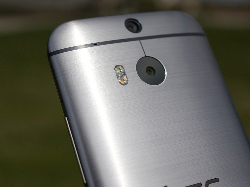
A lot of the improved look and feel comes down to the way the back of the phone curves up and over and into the side.
By the way, the power button's still up top, still a little hard to reach, and it's moved from the left hand-side to the right. That actually makes it a little easier to hit, since you're already on that side for the volume buttons. But it can still be a stretch to get all the way up there. So remember to tap your screen, m'kay?
A lot of the improved look and feel comes down to one thing — the way the back of the phone curves up and over and into the side. Gone is the beveled edge that, while stylish, very much broke up the line of the phone. Now it's just a gentle curve that rolls over onto the back. It's still a pretty sharp angle to the vertical, but the transition in no way feels like a sharp edge.

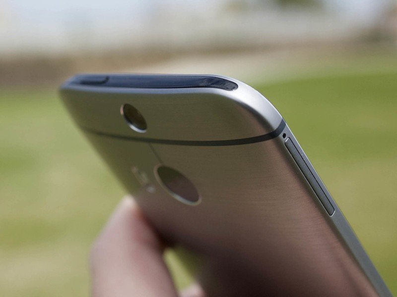
HTC's attention to detail is very much still in effect, though, from the beveled front edge as it meets the display to the top edge, which houses the power button and IR port and any other magical device. The brushed finish on the gunmetal gray — easily our favorite of the three — is a wonderful touch. It's possible to put pits in it, of course. It's is metal, and try not to drop your phone. (Any phone, for that matter.) It's also just a wee bit slick to hold, thanks to that smooth finish.
But let's just put it this way: the new HTC One looks and feels like a smartphone from the future.
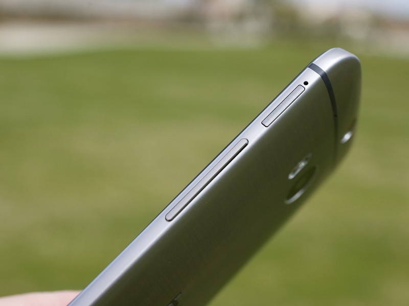
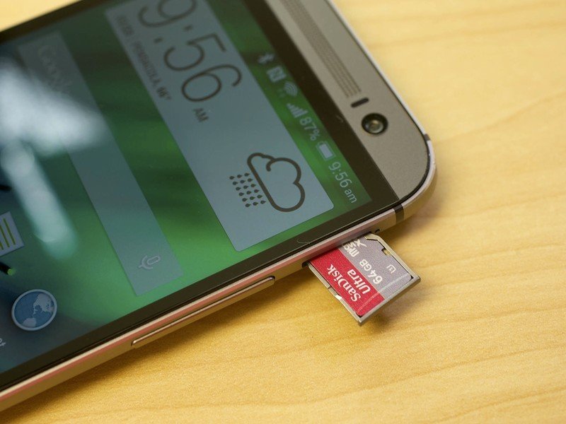
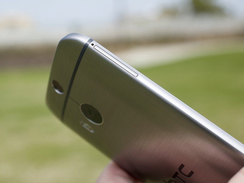
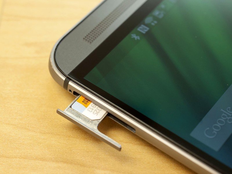
Cards, of the Nano-SIM and microSD variety
It's worth mentioning that with the new HTC One, we've moved to a nano-SIM card. It's likely smaller than what you've had before, so you might need to swap yours out. (Or, if you're brave, just cut it down yourself.)
And once you go down in size, you'll need a SIM-card adapter if you ever need to size back up.
Also new is the addition of a microSD card. It's back after a couple generations on the sidelines — and it comes at an interesting time for external storage. The new HTC One supports cards with up to 128 gigabytes of storage, or roughly 21 times what I took with me in my computer when I went to college in the late 1990s.
BoomSound and those speakers
Behold, the awesome power of BoomSound! For those who haven't had the pleasure, BoomSound is the name HTC's given to its front-facing speakers along with the software that powers them. Back in the day, that was Beats. Now? It's just … algorithms. (The Beats logo in the system bar has been replaced with some sort of "b" by the way.) And it truly does change the way you experience games and videos and, yes, music on your phone.
Back in the day, that was Beats. Now? It's just … algorithms.
If you thought the old HTC One was loud, wait till you hear the new one. HTC says total output is about 25 percent louder, thanks to a new amplifier and some extra space carved out behind the speakers. Sound also is slightly more full. You've got a whole new sound palette to play with as well. Notifications seem to be a little less harsh this time around. (Or perhaps we're just used to their level, finally.)
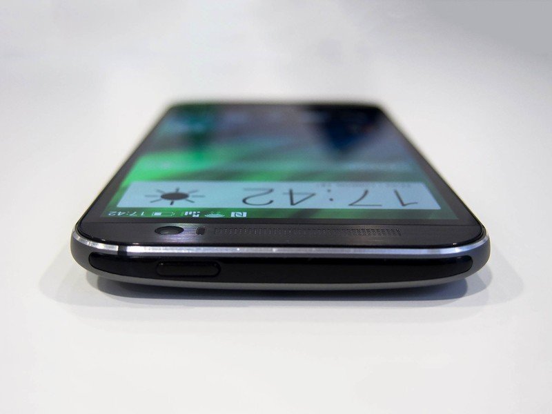
BoomSound isn't just a name, though. It's also a setting. You can't toggle it unless you've got headphones or another speaker plugged in, but its effect is basically the same as Beats'. Turn the BoomSound setting off, and music sounds a little more muddied. Turn it back on, and things are more crisp (the high end stands out much more), but also more compressed.
Fun fact! The speaker grilles on the new HTC One are part function, part facade. On the M8, it's a little easier to see where the actual speaker is (about the first third of the space), and the holes for the microphone. This was true on the M7 as well, but not as visible.
Bezels and buttons
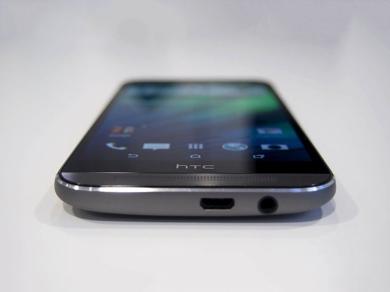
So yeah. HTC has finally moved to on-screen buttons, getting rid of the awkward back-home scheme and with that that big black band with the HTC logo and — oh, wait. The buttons have moved, but the band is still there. What the hell?
For what it's worth, HTC says there's still a good bit of functionality (some of it having to do with the display) tucked back there. So what if it looks a little funny. It's certainly smarter than anyone who cries "Dat bezel." We got over this plenty fast and suggest you do, too.
But here's the thing: Put the capacitive buttons from the original HTC One next to the on-screen buttons of the new HTC One, and it's just about a wash. You end up with a little extra real estate for apps that use immersive mode.
HTC One Internals
Faster, better, stronger
As you'd expect, the new HTC One packs in some of the fastest smartphone internals available in early 2014. Most markets will get a 2.3GHz Snapdragon 801 CPU (MSM8974AB), one of the latest and greatest from Qualcomm. But China and some other parts of Asia will get a slightly faster 2.5GHz model — still a Snapdragon 801, but the top-end MSM8974AC variant also found in Samsung's Galaxy S5. We're reviewing the 2.3GHz model, which numbers aside is blazingly fast. Some will fixate on the minor differences between the two M8 flavors — but we're not losing any sleep over that errant 200MHz, and neither should you.
Some will fixate on the minor differences between the two HTC One flavors — but we're not losing any sleep over that errant 200MHz.
Whatever speed processor your HTC One (M8) uses, it'll be backed up by an ample 2GB of DDR2 RAM, and 16 or 32GB of internal storage. There's no 64GB model this time around, which is unfortunate for those wanting a massive helping of built-in flash. But at least you're able to plug that gap with up to 128GB of microSD storage, which can be used for the two major smartphone memory hogs — photos and music.
HTC One Battery life
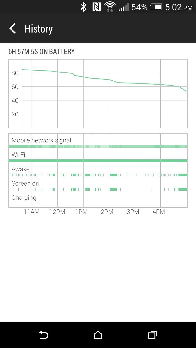
As we mentioned at the outset, it's a little tough to get proper real-world testing done on a UK device here in the United States, if only because we don't get the opportunity to use it with LTE data. But that's not to say we haven't been impressed by battery life on the new HTC One.
Capacity this time around hasn't increased all that much, up 13 percent to 2,600 mAh. But you can really see the difference the Snapdragon 801 system on a chip has made, and how much it, along with software optimization, has affected overall use.
Put it this way: That we're seeing 15 hours of use — and this during a testing week as well, in which we're taking a lot of pictures and using the phone more than we might otherwise, just trying to figure things out — all while on a device not optimized for the network we're using points to pretty damn good battery life.
It's safe to say we're easily getting another 5 hours or so (give or take) over the original HTC One. HTC says that we should expect 40% more battery life over its predecessor.
Charging the phone should be a little less of a pain this time around, too. The original HTC One was purposefully slow. But the M8 supports Qualcomm's Quick Charge 2.0, which combines technology in the phone itself along with technology in the wall charger for extremely fast charging times.
There's a pretty big catch here, however. The 1.5A wall charger that comes with the M8 doesn't actually support the quick charging. HTC says it'll offer a charger later this year that outputs at 1.67A and supports Quick Charge 2.0.
That we're seeing 15 hours of use during a testing week on a device not optimized for the network we're using points to pretty damn good battery life.
Extreme power saving mode
While the 13 percent increase in battery capacity is nice to see, it's not all that great in the scheme of things. And HTC's done some work on the software side. New in the new HTC One is "EXTREME POWER SAVING MODE!!!" (Don't judge. That's what it sounds like in our collective head.)
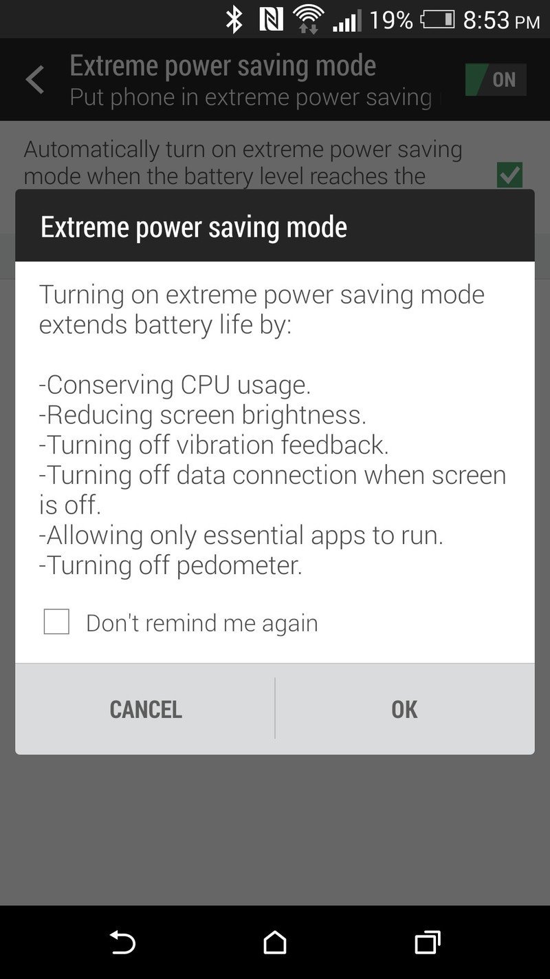
Basically it shuts down all connections but still allows phone calls and texts to come through. You can manually refresh e-mail if you want — but only in HTC's e-mail app. Your smartphone essentially is turned into a dumb phone. And to make sure you don't cheat and try to actually make it do things, the M8 gets a new home EXTREME home screen, with shortcuts to the Phone, Messages, Mail, Calendar and Calculator apps. To exit EXTREME mode, you'll need to hit the dedicated "Exit" button.
HTC says that with only 5 percent battery remaining, you can eke out 15 hours in this EXTREME mode. On a full battery? It'll last something like a dozen days. We'd consider this to be more of an emergency mode than EXTREME, however.
The actual results? Yeah, it lasts a long time. Not actually using your phone will certainly extend battery life. Again, we'd treat this more as an emergency mode.
There's a secondary power management feature as well. It's a more subdued "Power saver" that gives options for conserving CPU usage, reducing the screen brightness, turning off the vibration motor, and turning off the data connection when the screen is off.
The new HTC One software
The sixth Sense
The new HTC One launches with Android 4.4.2 KitKat — the most recent version available, for those of you keeping score at home — and a new version of HTC's custom user interface — Sense 6.0.
As is usually the case, there's not much of the Android user interface that HTC hasn't gotten its hands on.
As is usually the case, there's not much HTC hasn't gotten its hands on. From the new on-screen buttons to the menus to the lock screen and quick settings, app drawer and, well, just about everything. The notification pulldown appears to be mostly unaffected, though. (The notifications are as Google intended, though the timestamps are done in HTC's font.)
The good news is that it's not a huge visual shift from Sense 5, and even smaller if you've been using Sense 5.5. That's not to say it's not improved — because it is — it's just that you shouldn't have to relearn too much. The biggest improvements come in BlinkFeed and the camera app, but there are plenty of smaller tweaks to be enjoyed as well.
Homescreens and the app drawer
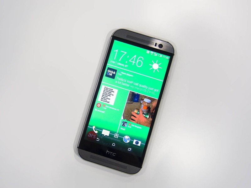
Once again, HTC's gone simple here, with a three-pane home screen as the default. BlinkFeed (more on that in a minute) is still anchored to the far left. You can still remove it if you want (we do recommend at least trying it for a bit, though), though HTC's removed the simple BlinkFeed on/off toggle switch it added in Sense 5.5 and now requires you to drag it to the "Remove" button, just like any other panel. (Less simple, perhaps, but more consistent.)
You can remove BlinkFeed if you want, though we recommend trying it for a bit.
The main home panel sports HTC's 4x1 Weather Clock widget — yes, the old-school 4x2 Weather Clock is still alive and well, if you choose to add it — the Google search widget (not embedded into the home screen as on other phones), and the app dock. Our UK model also has a folder of Google apps, but we'd expect that sort of thing to change depending on your region and carrier.
The third panel is blank, left for you to do as you will.
Adding and removing panels is simple. You can either pinch two fingers together to get to the mini view (along with the widgets drawer), or go to Settings>Personalize>Manage home screen pages. From either one you can remove existing panels, or hit the + button to add more, for a maximum of five (plus BlinkFeed).
Simple and effective. Of course if you prefer, you can always install a third-party launcher. But do give this one a shot first.
BlinkFeed is back and better than ever
The basic premise of BlinkFeed is the same as a year ago — it brings news and social information to your home screen in the form of one of those "flip" type layouts. It was a bit controversial at first because it took up a home screen spot, with no easy way to remove it. HTC added the option to remove it in a later version.
But by most accounts, BlinkFeed was a surprising success, in part due to the layout, and also because of the back-end work from Mobiles Republic (you likely know them through News Republic or AppyGeek, which makes BlinkFeed easy to set up and easy to use.
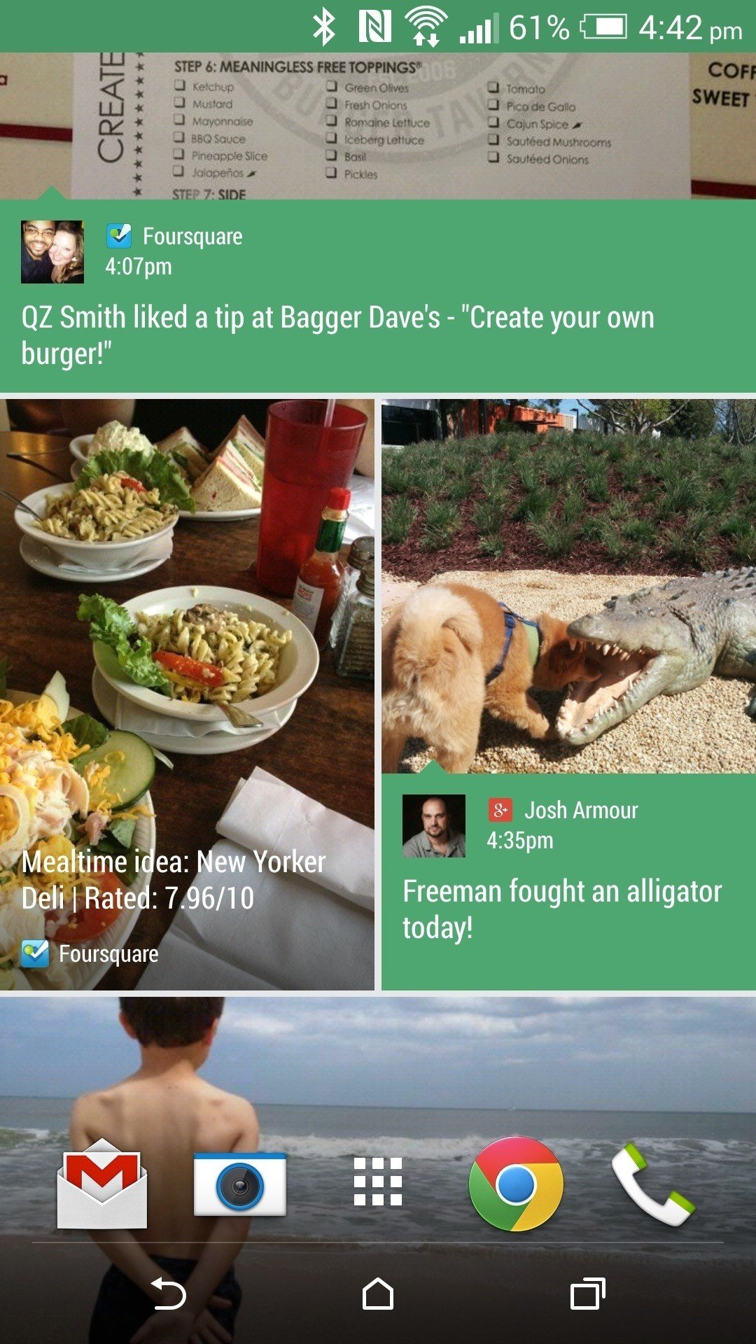
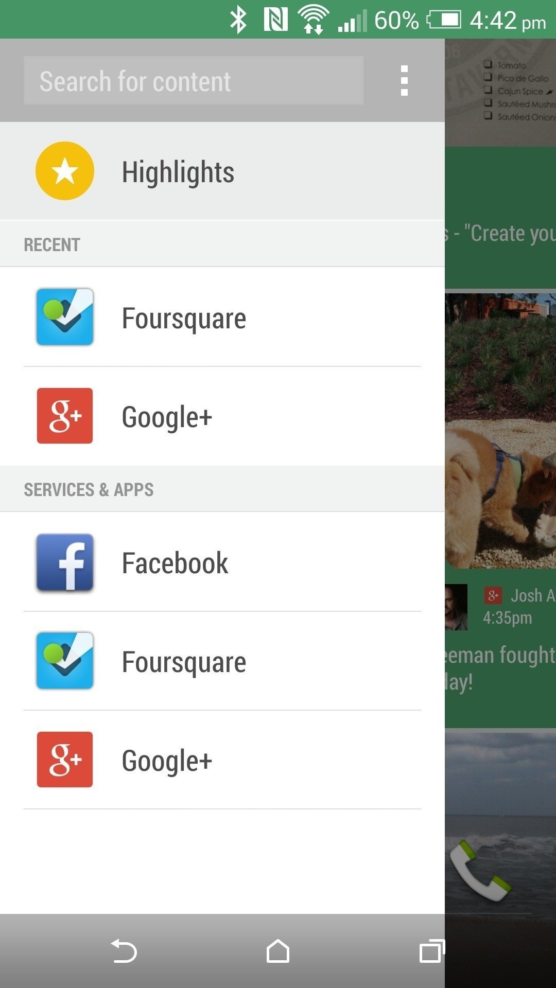
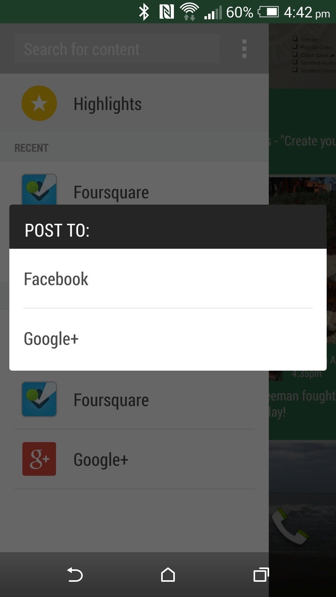
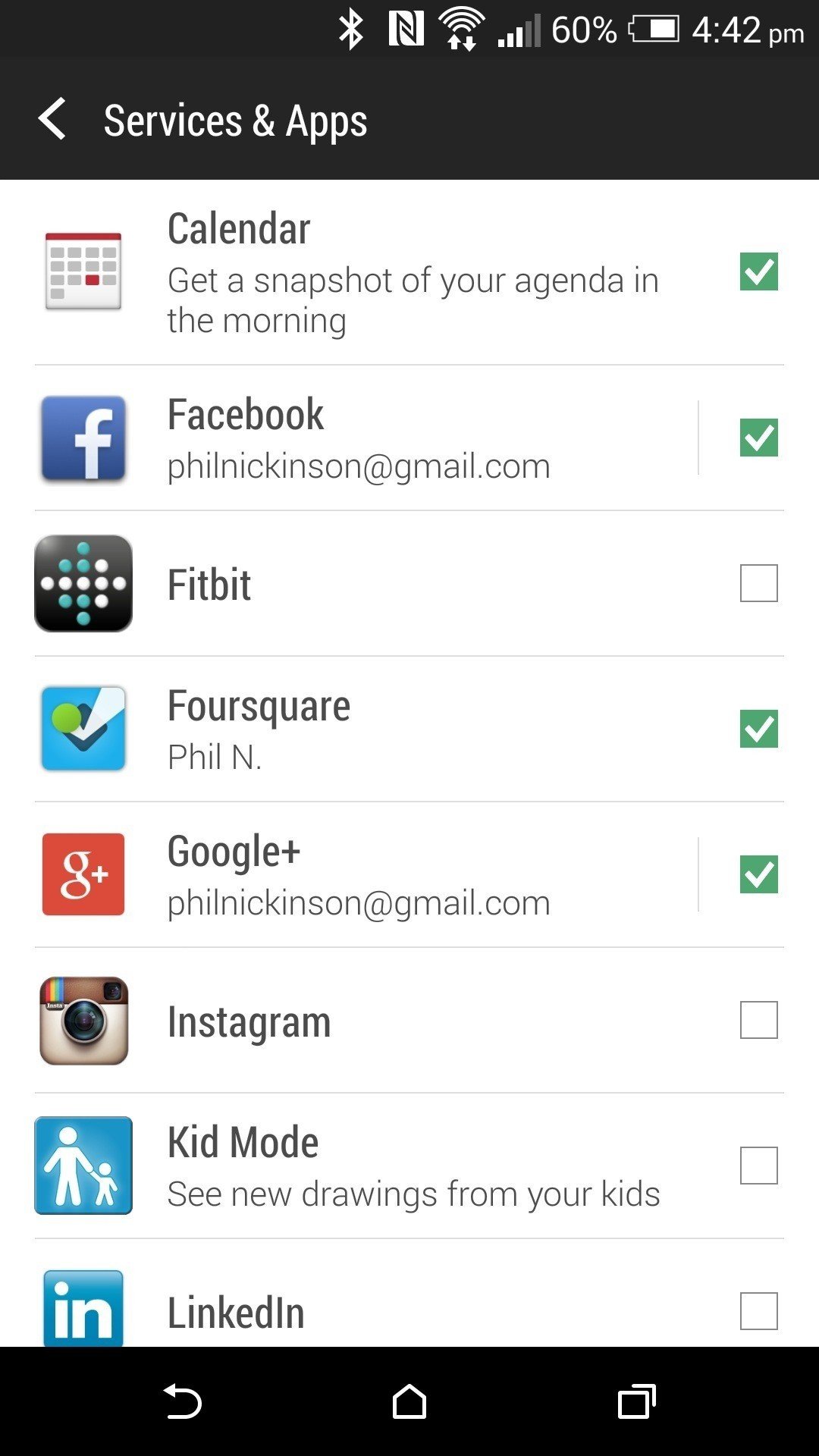
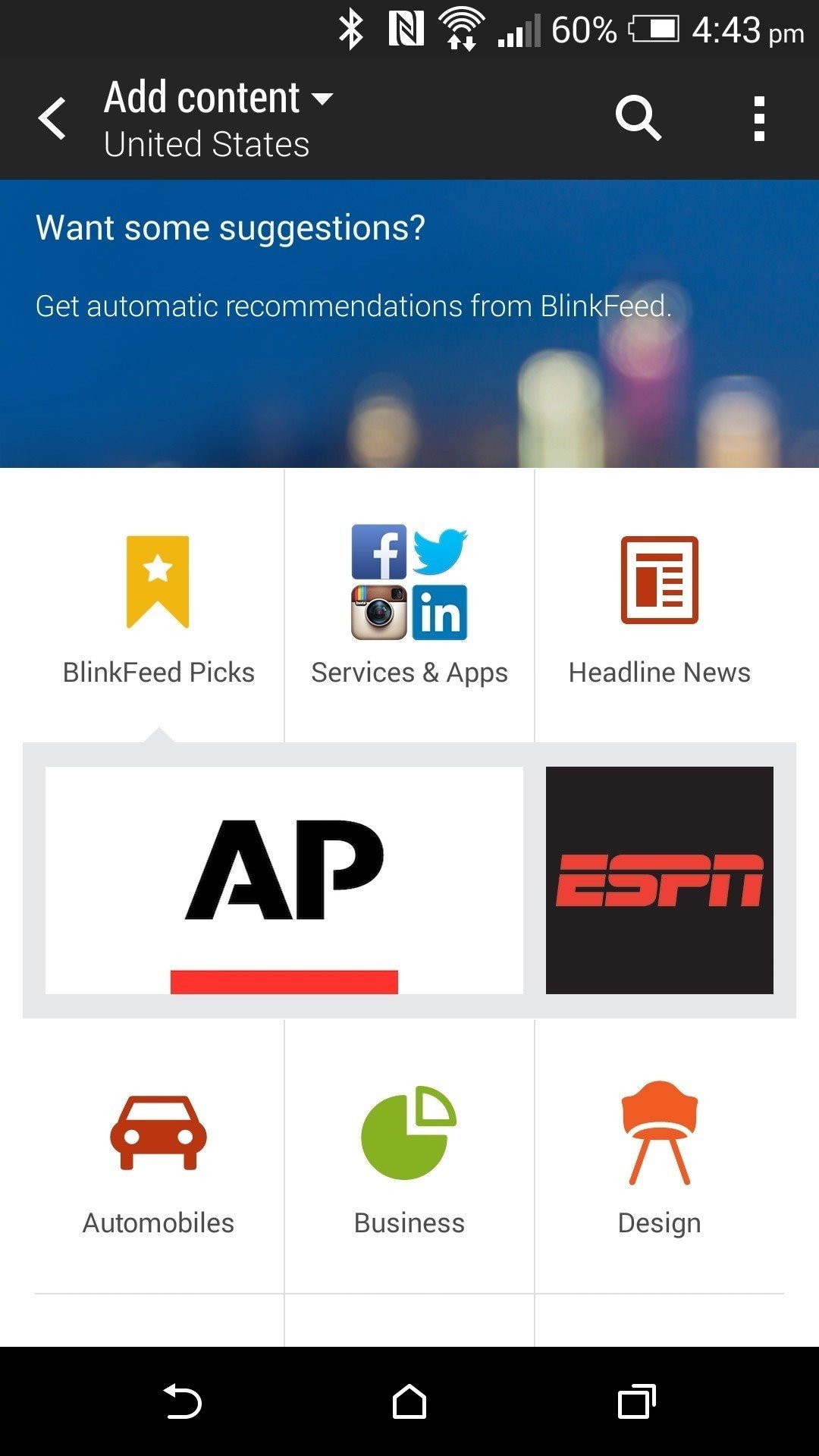
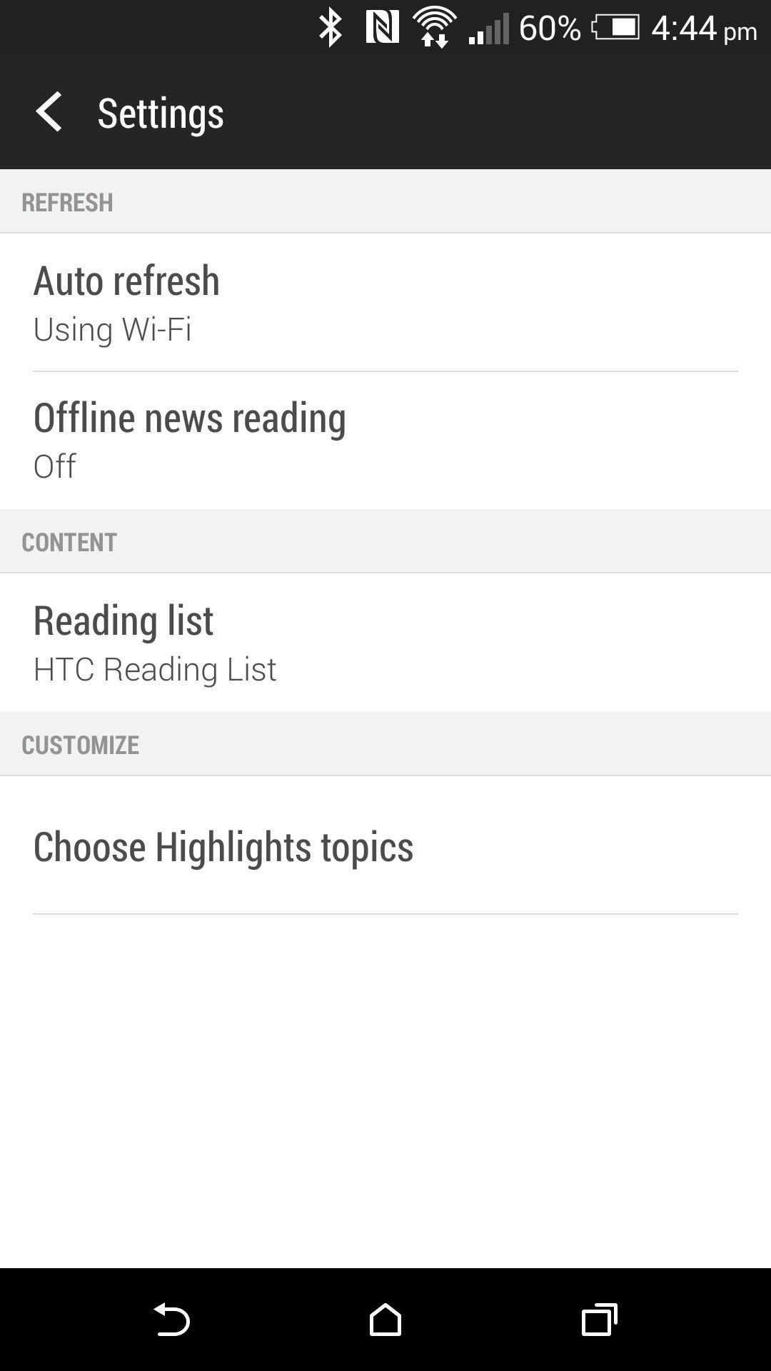
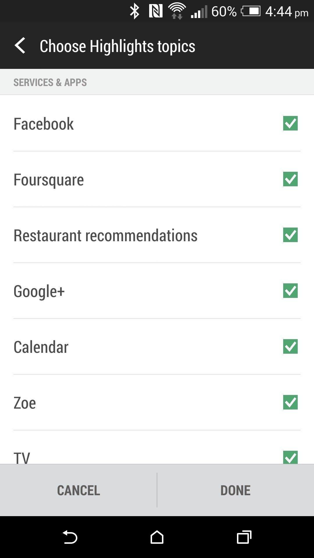
The big differences this time around are a slightly new design and a new exploration option. BlinkFeed uses the same colors as the theme you have selected (more on that in a minute) and allows more color to come through, giving everything a flatter look. You've still got more options than you probably should use — BlinkFeed loses some of its power when you overload it, we think — but a powerful new option is restaurant recommendations from FourSquare. (We'd prefer to be able to add Zagat or Urbanspoon, perhaps, but partnerships are what they are.) Those results will vary, of course, depending on what's around you.
All in all, if you loved BlinkFeed before, it's even better now. If you're trying it for the first time, give it a good look — it'll probably surprise you. Just remember that it's for more casual browsing of what's going on. Don't treat it like a full RSS reader. And perhaps most important — remember that you can get the latest from Android Central and all of your favorite Mobile Nations sites in BlinkFeed. (End plug.)
Quick settings
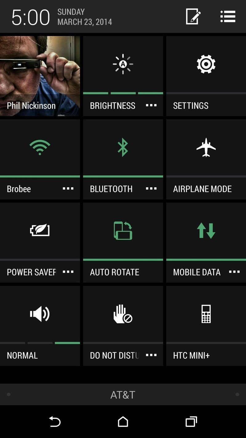
HTC's quick settings largely remain unchanged from Sense 5.5. The new HTC One has a full deck of a dozen quick settings, which you access by pulling down on the notification bar and then tapping the icon in the top flight to "flip" over. Tap a quick setting to toggle it on or off. To enter that setting's respective menu, hit the "…" button.
If 12 quick settings seems like too many, you can pare them back. Tap the Edit button (it looks like a rectangle and a pencil) in the system bar there, and you can disable or swap out any of the quick settings. You've got another 12 from which to choose, by the way.
Lock screen shortcuts and Motion Launch
HTC has added some additional functionality to the lock screen in Sense 6. You've got the usual app shortcuts — by default they're phone, HTC text message app, HTC's browser and the camera — which you can open directly from the lock screen.
That's old hat, though. Motion Launch is the new hotness, and it comprises five actions that will wake the phone:
- Double tap the display to wake the phone. (Yes, just like what LG's been doing for some time.)
- Swipe left to "wake the widget panel," which means open to the home screen.
- Swipe right to wake the phone and launch BlinkFeed.
- Swipe up to simply unlock the phone and return to whatever you were doing when it went to sleep.
- Swipe down to wake the phone and turn on voice dialing.
Note that these all only work when the phone's in portrait mode.
There's one other shortcut you can use when the phone's asleep. To quickly wake the phone and open the camera app, just hold the phone in landscape (horizontally), and hold either volume-up or volume-down. (You can also set the volume button to serve as a shutter button or zoom in/out key, if you like.) It's not quite as fluid as the wrist-flick on the Moto X, which we've ended up using far more than we thought we might. But it's still a nice shortcut.
If you don't like the gestures, you can turn them off at Settings>Display & Gestures>Motion Launch gestures. You also can chose to have the Quick Call (voice dialing) bypass lock screen security, if you wish.
By the way, the app shortcuts on the lock screen are slaved to whatever you have docked in HTC's launcher. If you use a third-party launcher, be sure to set these however you want them first.
Sound profiles and do-not-disturb
Our smartphones tend to make a lot of noise. And they vibrate a lot. And most of us don't want that happening all the time, particularly at night. HTC's made it super easy in Sense 6 to shut your phone up.
Just like in Sense 5, you've got sound profiles in the quick settings, with options for silent, vibrate and normal. It's a great way to quickly silence your phone, since it seems nobody's ever going to go back to having a proper physical switch for that. (You old-school HTC fans know what we're talking about.)
HTC has made it super easy in Sense 6 to shut your phone up.
But for even greater control, HTC's got a proper do-not-disturb mode. The easiest way to get to it is to use the quick-setting shortcut — just tap the three dots — but you also can find it in the "Sound" section of the settings menu. This one will block incoming and calls, turn off sounds and vibration, and kill the LED notification light. You can whitelist groups or individual contacts whose phone calls you want to let through, and there's an option to always play alarms and timers. (That's something we've seen third-party apps squelch, so it's a good option to have.)
For occasional use, you can set a timer for DND automatically turn off — from 30 minutes to 12 hours. For for regular use, hit the "Schedule" setting at the bottom. (A setting that inexplicably was missing in Sense 5.5) You can set multiple schedules, which is nice, as well as choose whether you want to allow calls from your exceptions, or from everyone, or from no one — all for each schedule.
It's not quite as intuitive as the do-not-disturb that's built into, say, the Moto X, but DND is a feature that must be included in every new device from here out, and it's good to see it in the new HTC One.
Personalize and theming
It's worth taking a trip through the "Personalize" section of the settings menu. HTC's set this up to serve as a bit of a one-stop shop for a lot of the usual things you'll want to tweak, including your wallpapers, ringtones, notification sounds and alarm ringers. It's also an easy way to get more apps and widgets onto your home screens.
When in doubt? Check the Personalize section.
It's also where you'll find the "Themes" section. HTC's no stranger to theming, but in past iterations of Sense (pre-Sense 5, actually) it's included completely different home screens for different use cases — one for home, one for work, one for play, etc.
This time around, theming is much more subtle, changing the wallpaper and the color used in the quick settings and settings menus, as well as in BlinkFeed. There are three color options at launch, and a black setting if you're feeling dark.f
The new HTC One camera
UltraPixels are still UltraPixels
Cameras are one of the most important parts of a smartphone these days. We document everything. And for all the talk about how revolutionary the camera was in the 2013 HTC One, with its "UltraPixels" letting in way more light, never mind the relatively low 4-megapixel resolution — well, it was a little bit of a let-down.
The 4-megapixel resolution quickly shows its limitations if you zoom into a picture at all.
That's not to say we didn't get some rather spectacular shots with it. It's just that it wasn't a great all-around camera. It struggled outdoors, almost like it couldn't help itself in areas of bright light Low-light was a bit of an issue, too.
HTC's been working on it, though, and it shows in the cameras for the new HTC One. It handles outdoor shots better. Low light is still sort of hit-and-miss. And the 4-megapixel resolution (in addition to being a hangup for the specs-at-all-cost crowd) quickly shows its limitations if you zoom into a picture at all.
For some of us, it'll be a deal-breaker. Others of us will explore the myriad options and effects and come up with some truly compelling shots. Video Highlights — the combination of still images and video "Zoes" — remain a great way to share your experiences, and HTC has made them both more customizable and easier to manipulate. So, as always is the case in the mobile world, it's a trade-off. The new HTC One has a bit of a finicky camera that has a number of really cool features, but it occasionally struggles where other smartphones would just shoot the shot and move on.
The new camera app
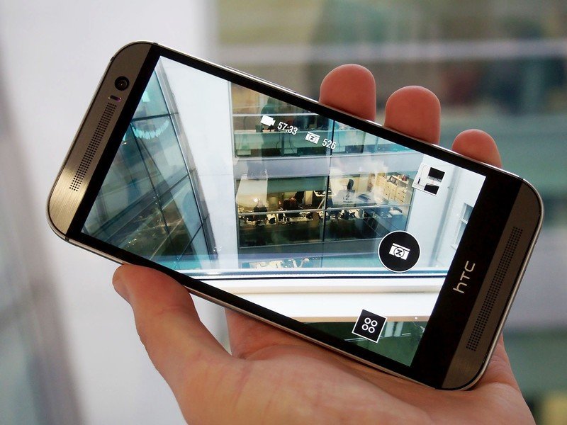
For as interesting as the original HTC One (M7) camera was, with the introduction of the UltraPixel, the app was a bit of a jumbled mess, with far too many important features tucked behind multiple menu layers. Fortunately, things have greatly improved in the M8's camera app. (Including being able to launch it without waking the phone first by holding it in the landscape orientation and hitting the volume button.)
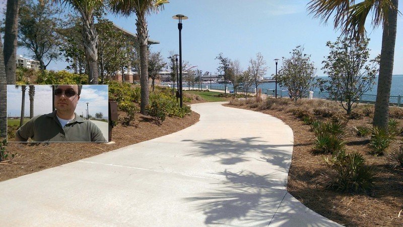
The new HTC One's main camera functions have been broken out into their own top-level section of the camera app, which you get to by tapping the four circles. That's where you'll find the shortcuts to the main camera app, selfie shots (ie the front-facing camera), dual capture (which uses both the front and rear cameras at the same time, video mode, Pan 360 — Photospheres on HTC, finally! More on that in a minute. — and Zoe camera.
There's still another layer of menus that you'll need to visit frequently — hit the three-dot overflow button — and that's where you'll find another wealth of options. You'll need this to switch from Auto mode to night mode, or HDR, panorama, anti-shake, manual, portrait, landscape, backlight, text or macro modes. Yeah, there's still a lot going on here, but it's less text-based and a lot easier on the brain.
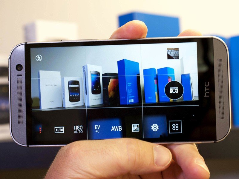
For even greater control, you can now set ISO levels yourself (200, 400, 800 or 1600). You can control white balance and exposure values. You can set filters. Change the crop from the default 16:9 to 4:3 or 1:1. Change contrast, saturation and sharpness.
And that's just the start. HTC has taken what we've usually had to run to third-party cameras to find and crammed it all into the default app on the new HTC One.
And the really cool part? Once you have things customized just how you like them, you can save that camera profile for easy switching.
The rear camera(s)
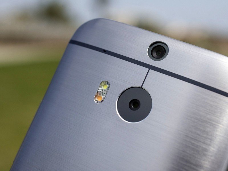
With the new HTC One, you technically don't just get a single rear-facing camera. There actually are two of them making up this new generation of UltraPixel technology. Of course the last time we saw two shooters on the rear end we ended up with half-baked 3D technology that fortunately didn't last more than a single generation. This time around, the second lens — and that's a better way to think of it, instead of as a second camera — is used to get depth information, and that opens up a wealth of new features.
The last time we saw two cameras we got half-baked 3D. This time around, the second lens gets depth information that opens up a wealth of new features.
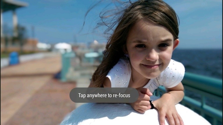
Being able to defocus part of an image is all the rage these days — basically every manufacturer is doing it. HTC's implementation is called "UFocus." Just tap on an area of an image, and it'll focus on that spot, and defocus on everything else. If you've used a DSLR, it's the same bokeh effect you get by manually setting a low aperture, where you isolate the subject of the image and defocus everything else. It works pretty well here, but you can't help wonder if we're not going to see this feature abused on every phone for the next year, until we all decide we're tired of using it.


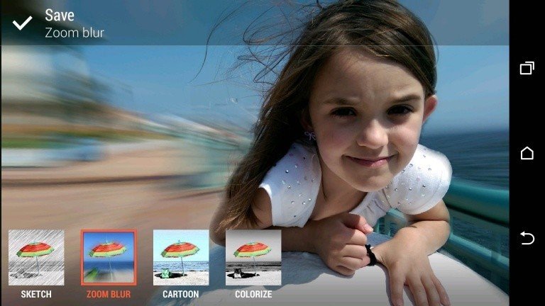
There are other fun backgrounding effects — think of all this as the new filters, by the way — which work to varying degrees of success, depending on how hard a line you have between the focal image and the background. "Sketch" turns things into a sort of "Take on Me" background (ask your parents, kids, or watch this video). "Zoom Blur" is a little cheesy but makes it look like the focal point is "zooming" out of the pictures. "Cartoon" sort of does a rough cartoony effect, and "Colorize" attempts to suck all the color out of everything but the focal point. Again, these all work better with hard lines between the foreground and background. Whispy hair will throw it off, for example.



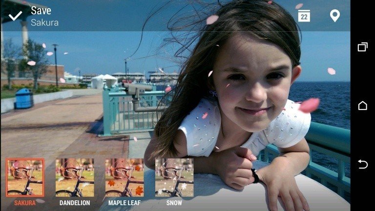
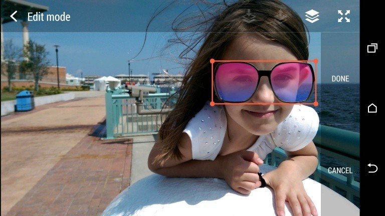
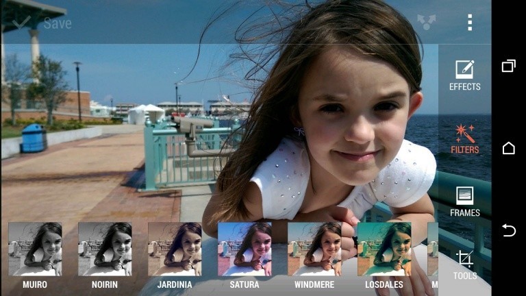
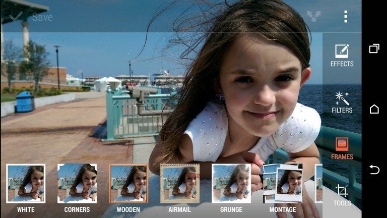
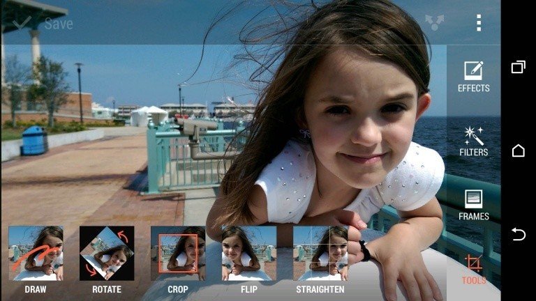
Then there's the "Seasons" effects, which will add animated foliage or snow or even dandelions to your picture, much in the same way that Google+ has done, with snow for winter and hearts for Valentine's Day. It's cheesy, for sure.
"3D Dimension Plus" is kind of fun, however, and it really stands out in Video Highlights. Tilt (or swipe, if you prefer) to see the foreground image sort of pop out from everything else. It's sort of like those old-school holographic images, only with a picture you actually want to look at.
The front-facing camera
You gotta love how HTC is embracing the "Selfie," going as far as naming its front-facing camera mode after everyone's favorite narcissistic pastime. And you'll get some great shots from that angle, thanks to the 5-megapixel camera. In fact, that's a higher resolution than you'll get out of the rear camera, albeit without all the bells and whistles.
You'll still be able to get wide-angle shots from the front as well and can even shoot in HDR mode. Speaking of wide angles, the default setting for the front camera is a 16:9 aspect ratio, which is cut down from the physical 4:3 ratio of the sensor. So go ahead and switch to 4:3 so you can use all of the pixels you've got — you can always crop it down later. (The rear camera, however, is physically 16:9, so switching it to 4:3 means you'll be losing pixels.)
It's pretty apparent that HTC decided you can't fight the selfie. So you might as well take a good one.

Zoes and Highlights
Zoes are largely unchanged from their previous iterations, though you now have more control over them. For the uninitiated, a Zoe is a short video clip from which you also can extract still images, and they're used as source files for Video Highlights. They've lost a little of their initial mystique as moving pictures, especially now that HTC's changed the way you take them.
There's not really a difference between a Zoe and a video — the end result is a video file — but now you get a little more control over the start and stop.
In Sense 5 there was a Zoe button in the camera UI. Tap it, then hit the shutter button, and you get a 5-second .mp4 file. In Sense 6 and the new HTC One, you have to enter the dedicated "Zoe Camera" mode. But once you're there, things get interesting. Tap the shutter button once, and you get a single still image. Hold it down, and it starts recording a "video Zoe." (For want of a better term.) Keep holding down the shutter button, and it transitions into a full-fledged video recording. There's not really a difference between a Zoe and a video — the end result is a video file — but now you get a little more control over the start and stop. That's good and bad — it requires you to first use the Zoe Camera mode, and then worry about starting and stopping things manually. On the other hand, you get more control.
Video Highlights are great in Sense 6. The Gallery app (not to be confused with Google's own Photos app, which still lives alongside it) still automatically creates Video Highlights, piecing together images and videos of proximate time and space. (Same day or time, same location.) It's far more simple to choose what you want to appear in a Video Highlight now, though. Hit the edit button (paper and pencil icon, remember?), and uncheck anything you don't want to appear. Or add other images and videos. HIt the "..." overflow menu button to get more options, including remixing the video, restoring the pieces to chronological order, adjust the music, and save the highlight to the phone's storage. Swipe over to the "Themes" tab and choose one of a dozen themes. Hit the "Music" tab and switch to your own soundtrack, if you'd prefer.
Here's what the 12 themes look like:
HTC's also got its own Zoe app on the way for sharing and collaborating with friends. It's not expected to be available until this summer, but you'll be able to share your Zoes through the cloud and combine them with others for the ultimate Video Highlight. And with the app, you'll be able to explore others' Highlights as well. We'll have more on that app once it's available later this year.
Photosphere! (aka Pan 360)
Let's not mince words here: HTC's finally gotten Photosphere — those cool 360-degree panoramas we first enjoyed on the Nexus 4 and later on phones from LG and Sony — and it's done so with the best implementation we've used thus far. The end results? Well, after a week of test shots, the results are decent. (It's sometimes tough to tell what's a stitching problem and what's user error.
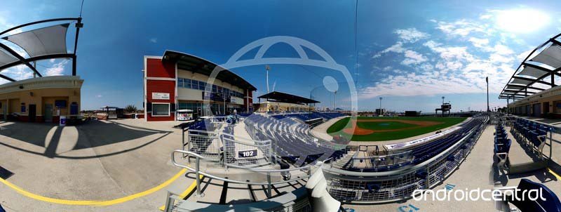
The trick with Photospheres has always been trying to keep the camera in one spot, one fixed point in space, and rotating it around that point. The user interface leads you waypoint to waypoint. HTC uses a large orange rectangle to guide you along those waypoints, and it's the simplest implementation we've used. And more important, those blocks are easy to see when you're squinting into the sun, trying not to move the phone off that fixed point in space any more than you have to.
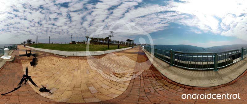
HTC's got its own interpretation of viewing Photospheres, too. View one and you're immediately thrust into a pretty immersive experience You can tap and pan around, of course, but by default you can also just move the camera to look around. You're even able to flip the world upside down, though we've no idea why you'd want to. There's no "Tiny Planet" option, but you do have the ability to take a still from inside your Pan 360 shot.
HTC One (M8) — the rest
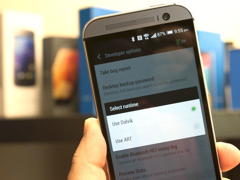
A few other tidbits we've found with the new HTC One:
- You can accept a call by simply holding the phone up to your ear in the normal manner. It works pretty well.
- The slick Dot View case, which uses the display to shine information through its Swiss Cheese protective cover, will run $49 and be available from HTC.com. You can get it in any color you want at first, so long as it's gray.
- The usual bootloader unlocking programs remain in effect, so long as your carrier doesn't have other ideas about that.
- Or, skip the carrier altogether and buy a SIM-unlocked or developer version. They'll run $649 on HTC's website.
- HTC's keyboard is usable, though we definitely prefer the prediction available from third-party downloads.
- We've had nary a problem with Bluetooth, Wi-Fi or GPS.
- Phone calls have worked fine for us, even with the UK version on U.S. networks.
- The camera UI rotates properly in portrait mode, but the on-screen back-home-recent apps buttons do not.
- It's worth mentioning that HTC didn't include a system-level file manager, so KitKat's new restrictions on SD cards are going to be magnified a bit.
HTC One: The Bottom Line
The new HTC One is better than ever
HTC has been noticeably excited about the HTC One for some time now, and rightfully so. It's a hell of a smartphone. It's an imperfect one, sure. The camera still trades resolution for features, but the features tend to be pretty compelling, and it's not like you aren't able to take some beautiful shots. That's probably our single complaint about the new HTC One.
The new HTC One has been made available for purchase the same day of its announcement — nearly unheard of in the Android smartphone world.
And don't dismiss the business side of the HTC One launch. It's available for purchase the same day as it's announced — nearly unheard of in the Android smartphone world. In the U.S., it's available in Verizon stores today. Online today on the other carriers, and available in stores April 11.
And if you don't want to go the carrier route — and this is a direction we'd recommend at least looking at if the frequencies and finances make sense — you can buy unlocked versions directly from HTC. For those who prefer a more "stock" experience, a Google Play edition is available. (And it'll still be able to take advantage of that secondary camera.)
HTC over the last year retired its trademark "Quietly Brilliant" mantra. It did so at a tumultuous time — the company (and those of us who cover it) aren't ignorant to the fact that it still faces some pretty serious financial questions. But HTC has become bold, and without (too much) bombast.
And, above all, it continues to do what it does best: Bring us the best smartphone it possibly can.
