HTC One, one year on
Get the latest news from Android Central, your trusted companion in the world of Android
You are now subscribed
Your newsletter sign-up was successful
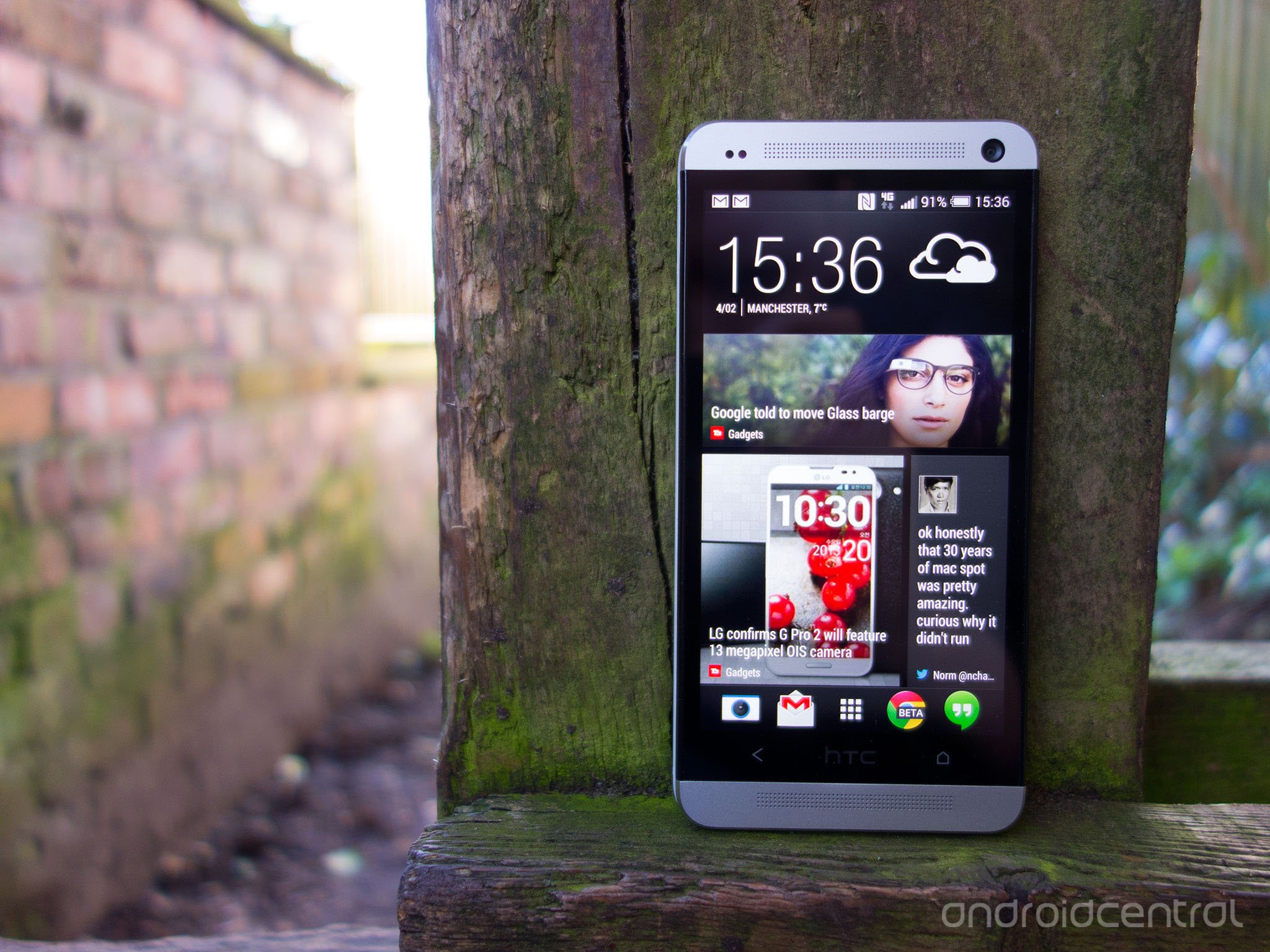
It might not seem so long, but it's been almost a full year since we first met the HTC One at announcement events in London and New York in February 2013. It went on to be one of the most significant Android phones of the year, and for most of 2013 it was our top Android smartphone pick. HTC had raised its game and delivered a device that excelled in many areas, from the 4.7-inch 1080p screen to the gorgeous aluminum unibody, to the speed and responsiveness of its software.
The HTC One also introduced some polarizing software and hardware features. It abandoned the quest for more megapixels in favor of an "Ultrapixel" camera with only 4 megapixels, but a much larger sensor. HTC BlinkFeed — always-on at launch — was a new approach to Android home screens unlike anything we'd seen before, and its inclusion proved controversial. Regardless, HTC had a phone about which critics were raving, and its name was on the tip of every Android enthusiast's lips for most of early 2013.
So a year later, where do things stand? The One might not have reversed HTC's fortunes in the short-term, but nevertheless it deserves one last once-over before the arrival of its successor, expected in the coming months. Android Central editors Phil Nickinson, Alex Dobie, Jerry Hildenbrand and Andrew Martonik have all used the phone over past year, and we've reflected on our time with the it to bring you our thoughts on the HTC One, one year on ...
Article continues below 
It's been almost a year since we first met the HTC One, and we've all had most of 2013 to get to know the device. How have you been using yours in the past 12 months?
Alex Dobie
I miss the One's excellent build quality and ergonomics when I'm using another handset.
I have to switch phones a lot, but the HTC One was probably the device I used the most in 2013. For much of the past 12 months there was no better Android phone out there, and that made the One my daily driver for a large portion the year. Only in recent months have phones like the Nexus 5 and Xperia Z1 torn me away from the HTC One. That's mainly because smartphone technology quickly moves on, and I need to keep track of the latest stuff. Nevertheless I still miss the One's excellent build quality and ergonomics when I'm using another handset.
Phil Nickinson
I don't have the luxury of using one phone for more than a few months before the next big thing comes out. But the HTC One occupied my pocket for the better part of 2013, until the Moto X came out in early fall. Part of that switch was ergonomics — the Moto X just fits my hand better. And part of that was the little things Motorola added — Trusted Bluetooth, Touchless Control, Active Display, etc. When my eldest daughter's 7th birthday rolled around in August, however, down went the Moto X and out came the HTC One. Zoes and Video Highlights are still top-notch, even if they were confusing at times, and poorly explained by HTC.
Get the latest news from Android Central, your trusted companion in the world of Android
Andrew Martonik
I have a European model of the One so it hasn't been my primary device since the Nexus 5 came out because it lacks U.S. LTE bands — but it has had my secondary SIM in it for regular use. It's charged up and is my go-to device if I don't mind running on HSPA+, and I have a feeling I'd be carrying it out of the house more often if I had a proper U.S. model.
Jerry Hildenbrand
I haven't. While I think the HTC One is a very nice phone, and I can see the allure (I agreed with our best phone picks that gave the nod to the HTC One) it's not exactly for me. When Google added auto-awesome effects into Google+ Photos, the one feature that kept me using the HTC One — the integration of Zoes and stills into highlights — was now available in a device that suits me better.
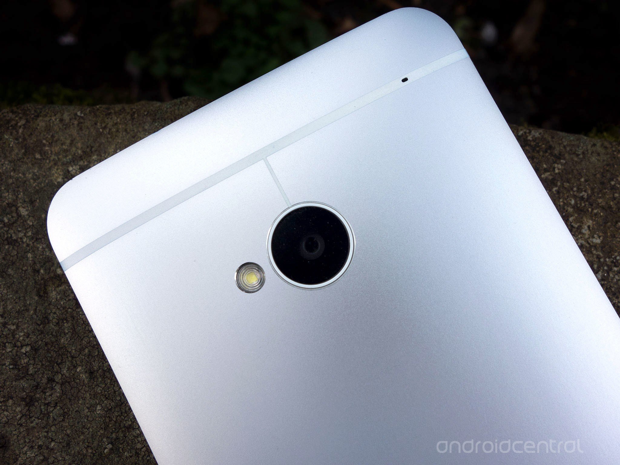
No handset is perfect. What are your least favorite parts of the HTC One?
Alex Dobie
The "Ultrapixel" camera was probably the biggest letdown for me. HTC's 4-megapixel shooter was way overhyped, and the hardware we eventually got sadly underdelivered. The camera's low-light performance was great, as were HTC's Zoe and Video Highlights features. But the camera suffered from visible oversharpening and a narrow dynamic range, particularly in daylight scenes, and it's been blown away by most of its high-end competition. The other area of (slight) disappointment for me was battery life, which was OK but not outstanding.
Phil Nickinson
Innovative pictures and videos should have been HTC's marketing message. Instead, we got Robert Downey Jr.
The capacitive buttons weren't a deal-breaker, but they just seemed legacy. And as much as I love Zoes and Video Highlights, it took me quite some time to wrap my head around them. That should have been HTC's marketing message for 2013. Innovative pictures and videos. Instead, we got Robert Downey Jr. That's not the phone's fault, of course, but that failure still reflects on it. The camera itself was either really good, or not so great. There wasn't a lot of middle ground, never mind the hype.
Andrew Martonik
The biggest faults I find in the HTC One are physical design decisions. The non-conventional navigation button layout just takes too long to get used to and doesn't make a lot of sense when Android is well-rooted in the three-button navigation paradigm. The top-mounted power button also makes little sense on such a large device. The curved back, while good for ergonomics, makes the device unstable when its sitting on a flat surface and has the added downside of making notification vibrations insanely loud.
Jerry Hildenbrand
I can't get past the button layout. I'm fully prepared to rail against Samsung for not following guidelines and delivering a consistent experience here, so I'll do the same for HTC, which has nowhere near the market share needed to "shake things up." I don't mind that the buttons are capacitive, and I don't fault HTC for the black-bar issues from developers who refuse to update their apps, but the two-button scheme is bad.
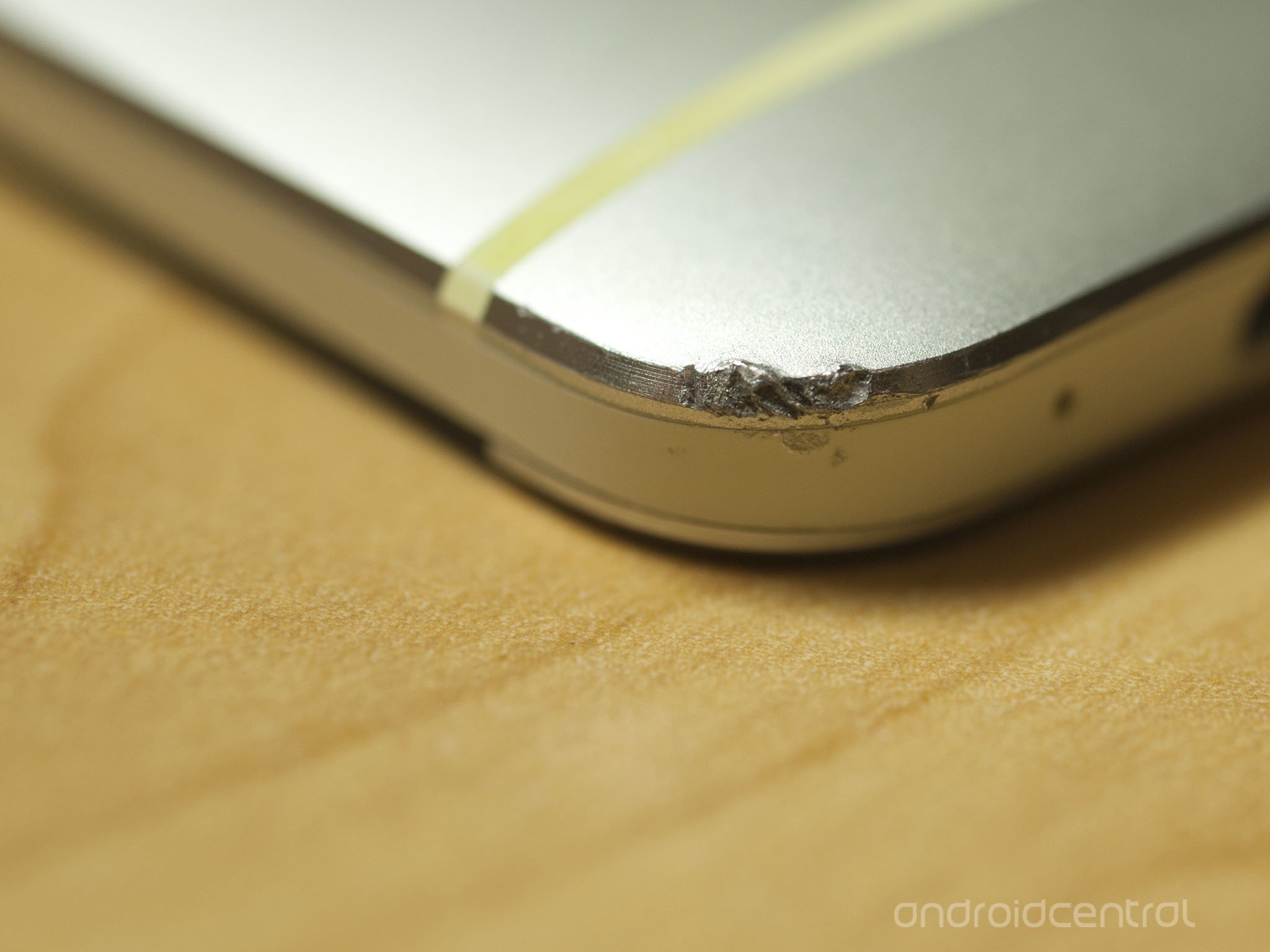
The HTC One is famed for its high-quality aluminum chassis, but daily wear and tear can take its toll on a phone. How has yours fared through day-to-day use?
Alex Dobie
Considering how much use it's seen — and heavy use at that — my HTC One has held up pretty well. It hasn't been dropped from any great height — instead, the dings I've picked up on the metal chassis have come from it knocking and scraping against things, mainly around the chamfered edges. That said, the metal body of the HTC One has aged much better than most plastic phones I've owned — even with its knocks and imperfections, it's probably the best-looking phone I've used.
At the same time the screen has developed a few mystery scratches — difficult to see most of the time unless under bright light, and I've no idea how I managed to pick these up. Elsewhere, the white plastic trim can get discolored over time, but a few minutes with an eraser will clean these right off.
Phil Nickinson
I don't use cases, and I've been lucky when it comes to not dropping phones. That said, I did let my HTC One slip from my fingers onto a concrete driveway, taking a couple chunks out of its corners. Fun thing about aluminum, though — you can file it down a bit. Not quite as good as new, but it got rid of the burrs. I had a weird discoloration of the plastic inserts. I'm told a scrub with soap and water would help — but that's not really something I should have to do to a smartphone.
Andrew Martonik
It's safe to say that the One ages very well compared to other phones.
Even with hardly ever using a case on my One, daily dings and scratches just haven't shown up in any of the usual places like on many plastic phones. The thickest part of the back and the edges have kept their smooth lines even after several months of use. The corners do show the smallest bit of wear from a couple of drops (gasp) onto the ground, and that's the one place where the relatively soft aluminum material shows its weakness. It's safe to say that the One ages very well compared to other phones.
Jerry Hildenbrand
It might be because it has sat unused for the better part of the last 12 months, but mine looks pristine. Zero scuffs or marks on the unibody, the plasticised middle layer is still nice and white, and no issue with tiny hairline scratches on the screen that I see on other phones that spend all day in my pocket with no case or screen protector.
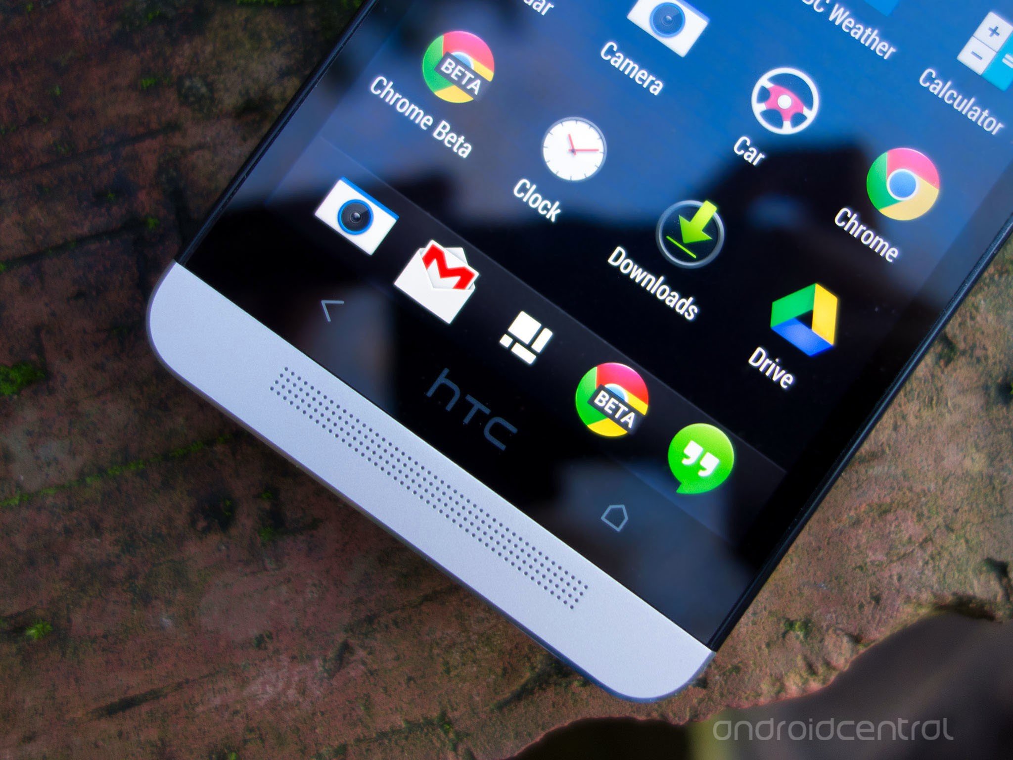
Moving onto software, let's talk about HTC Sense 5, which was was a radical new approach to the company's smartphone UI.
Alex Dobie
Sense is probably my favorite third-party Android UI — I say third-party because the look and feel (and sheer speed) of stock KitKat on the Nexus 5 is also a favorite. HTC has done its own thing with Android in a way that's faster than stock — seriously, try it side-by-side with a Google Play edition HTC One running stock Android 4.4 — that also adds value and is unique without being visually overwrought.
While the phone's camera hardware underwhelmed, video highlights remain the most elegant execution of this kind of feature. Sense 5.5 brought some welcome additions to BlinkFeed too, greatly expanding the feature and plugging some of the main holes as far as connected services go. It's also commendable that HTC's been able to maintain all these features while still pumping out quick OS updates.
Phil Nickinson
I love the idea of BlinkFeed. It's not for me — after 16 years in the publishing business, I just digest content differently — but I was pleasantly surprised at how many folks immediately fell in love with it. And we've seen so many other companies move that direction. From Samsung's "Magazine" UI and the newer Facebook Paper app, everyone's doing it. (It's fair to say BlinkFeed was born from Flipboard-type app, of course.) I used Sense 5 for the first couple months on the HTC One, but ultimately went back to my usual third-party launcher. For me, it was a matter of spacing. Few outside of stock Android have gotten that right, and I too often feel like there's wasted space on my home screen.
Andrew Martonik
Coming from someone who primarily spends their time on a Nexus device, I think that the overall feel of Sense 5 is the best of any version to date. It has a cohesive and modern design that you really don't find from other manufacturers, even today. The HTC One is one of the few devices I can use as-is and be completely happy with without a third-party launcher (at least now you can turn BlinkFeed off) or any additional tweaks.
Jerry Hildenbrand
What it may lack in crazy features, it makes up with subtlety and style.
Sense 5, especially the newer versions, is the only OEM software I could live with. What it may lack in crazy features, it makes up with subtlety and style. It's phone software for an adult, not a child's clown-painted bedroom.
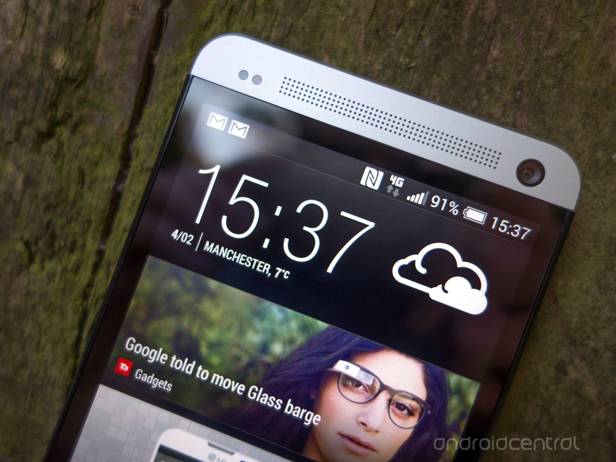
BlinkFeed, HTC's home screen reader, was somewhat controversial in the early days. Now that there's an optional toggle for the feature, are you still using it?
Alex Dobie
BlinkFeed is a reader for normal people, not journalists and bloggers and news obsessives.
BlinkFeed has been a polarizing feature for some, but I'm mostly neutral towards it. I use it if it's there, and when I do, I find I'm tapping on content that I might have otherwise passed by. But it's not a feature I particularly miss when I switch phones. At the same time there's no way it's ever going to replace my RSS reader of choice, Feedly, which is fine. BlinkFeed is a reader for normal people, not journalists and bloggers and news obsessives.
I also feel like introducing a toggle for BlinkFeed was probably the right thing to do, for the sake of giving users control over their devices. That said, I wonder if the now optional BlinkFeed would be used by as many if it weren't originally always-on or on by default.
Phil Nickinson
Not having a toggle for BlinkFeed, at first, was the right thing to do. It was a brand-new paradigm for home screens — you don't want to let people turn it off. You can always add it in later and gain some goodwill in the process — and that's just what HTC did. No, I'm not using BlinkFeed, for the reasons stated above — but I'm a fringe case. I just digest too much information and long for the days of the green-screen terminal. That's not a reflection at all on BlinkFeed.
Andrew Martonik
The novelty of using BlinkFeed quickly wore off after a couple days of using the HTC One, and I just haven't gone back to it since. Now that there's a simple option to turn BlinkFeed off altogether I've gone back to using the stock Sense launcher rather than a third-party one, but I have yet to find a compelling reason to use the feature itself.
Jerry Hildenbrand
My wife uses BlinkFeed and loves it. I think it's geared more towards someone who casually consumes news, and not a person who reads RSS feeds as one of the main functions of his smartphone.

There are lots of different flavors of HTC One out there — carrier, unlocked, developer and Google Play edition. Let's reflect on which ones we've been using and some of the pros and cons of each.
Alex Dobie
I hopped between Sense 5 (and 5.5) and the Google Play edition ROM on a European HTC One before eventually settling back on Sense. And it's funny — having an easy and (somewhat) official way to run stock Android on the One gave me a new appreciation of HTC's software features — mainly the ones focused around the camera and gallery. It's also telling that Sense seems to perform faster on the One than stock Android — especially in areas like touch input and scrolling — likely due to HTC's homegrown software optimizations.
Phil Nickinson
The HTC One is supposed to have Zoes and Video Highlights and BlinkFeed and customized menus. Stripping them out just felt weird.
I initially had a Euro version until AT&T released its branded model. There's not much difference, save for having proper LTE data. I dabbled in the Google Play edition model, but it just felt … wrong. Some of that's probably just in my head, of course. The HTC One is supposed to have Zoes and Video Highlights and BlinkFeed and customized menus. Stripping them out just felt weird.
Andrew Martonik
I've been using the unlocked European version of the HTC One. This means I don't have the proper band support for LTE here in the U.S., and that's obviously the biggest downside. You can somewhat justify it by seeing the unlocked model get great software update support ahead of the U.S. models, but nothing really makes up for having those LTE data speeds. I spent a good amount of time with the Verizon One when it was released and was very impressed by it.
Jerry Hildenbrand
The only one I've used is the unlocked Developer Edition. Other than the lack of carrier apps, it's identical to the AT&T or T-Mobile version, and even required a little input from AT&T to get its updates approved. I consider the carrier versions and the unlocked versions the same phone at heart.
The Google Play edition on the other hand, that puzzles me still. Why would anyone want a phone with the wrong number of buttons, lose the camera features of the HTC One, and pay twice as much for it as they would for a Nexus 4?
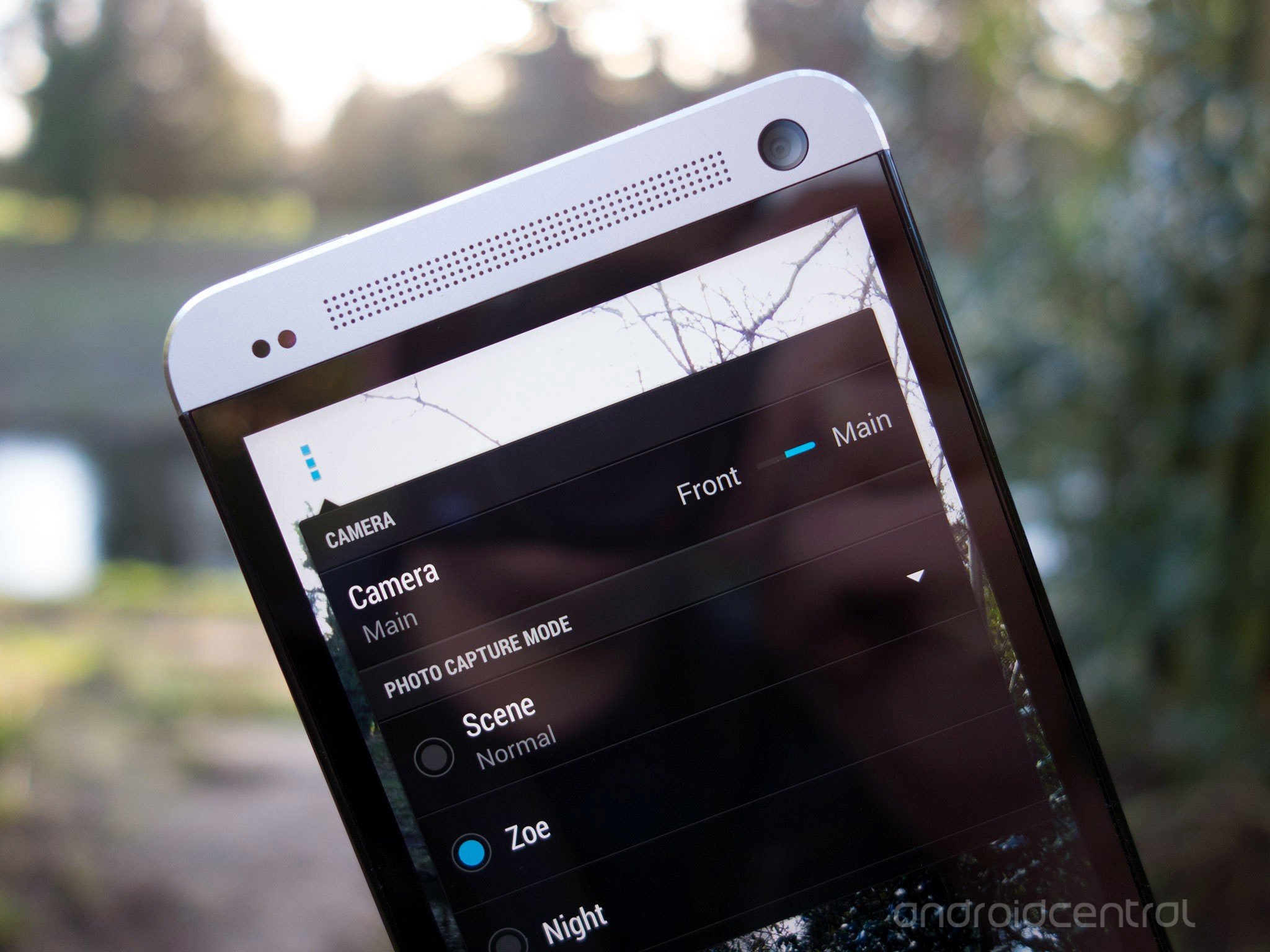
A year is a long time in the smartphone world. How does the HTC One hold up against the current crop of high-end phones?
Alex Dobie
The HTC One has probably held up better than any of its Android contemporaries. Mine always has a SIM in it and is usually charged and switched on, even if it's not my daily driver that week. In my opinion it's still unsurpassed in a couple of important areas — build quality and display. The HTC One's camera hardware is starting to show its age, however, and there are a lot of Snapdragon 800 phones out there offering superior battery life and charging speed. That said, it's probably going to take another HTC flagship to permanently tear me away from the One.
Phil Nickinson
The HTC One stands up surprisingly well. When I switched back to the HTC One after using the Moto X, it was the difference in battery life that I noticed straightaway. It's not a huge difference, mind you — but those extra couple hours made a difference. They're vastly different platforms, of course, and in the spring of 2013 we were all singing the praises of how long the HTC One lasted. Hardware tends to improve later in the cycle is all. The display is still among the best available, and nothing compares to the dual BoomSound speakers.
Andrew Martonik
Compared to anything released in 2013, the HTC One holds up very well in terms of performance, screen and design — with the one exception being the camera quality.
We're in a very weird place right now in the smartphone world where many of the big flagships are getting rather old in their lifecycles. Compared to anything released in 2013, the HTC One holds up very well in terms of performance, screen and design — with the one exception likely being the camera quality. It will of course be a good notch below devices released in the next couple of months (presumably including a new HTC device) as the One reaches a year old, but that's not out of the ordinary for any device.
Jerry Hildenbrand
I stopped using mine a while ago. Compared to early 2013 phones like the Galaxy S4, I think the HTC One was a solid choice. Later phones like the G2 or the Moto X offer more, and do it better.
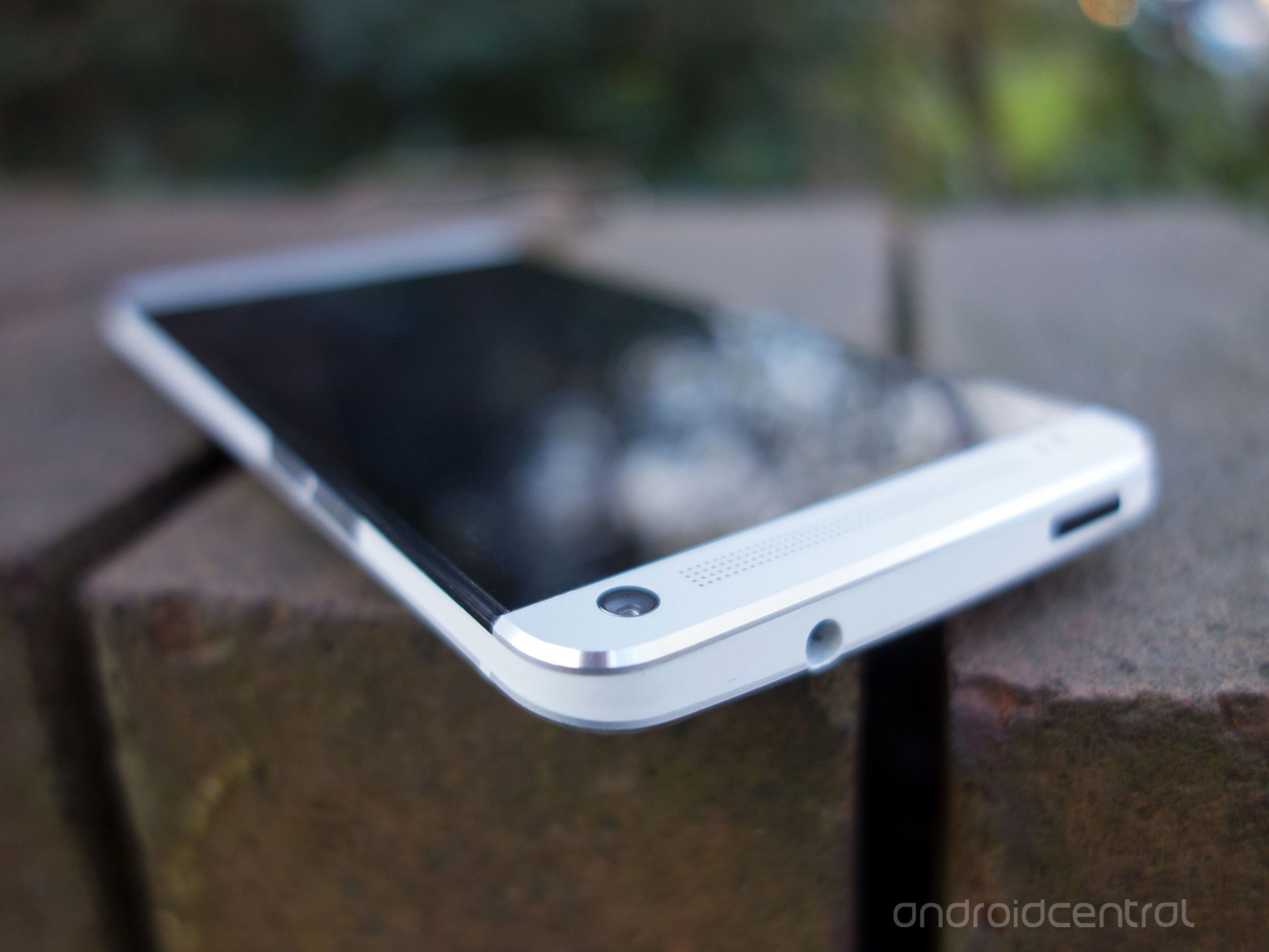
We're pretty sure to be getting a new flagship HTC phone in the months ahead. What are your hopes for the successor to the HTC One?
Alex Dobie
The one thing I'm not going to tolerate on a smartphone in 2014 is crappy battery life, so I hope HTC pays close attention to this area in its follow-up to the HTC One. At the same time, I think we can all agree that HTC needs to up its game in terms of camera hardware if it wants to stay competitive for a full twelve months. On the software side, it's going to be interesting to see how twelve months of customer feedback and development will be incorporated into Sense 6. There's a lot of good stuff in there that doesn't need a complete overhaul, so hopefully HTC's next Android UI will be all about refining the main pillars of the 2013 HTC One.
Phil Nickinson
More refinements on the design, of course. (Design can always get better.) If the rumors of on-screen buttons are true, that'll be a good thing. A continuation of the "Ultrapixel" camera would be a good thing — again, it needed improving but wasn't horrendous for a first-gen product. But more than that is a clear, consistent marketing message that'll stand out among all the others. (OK, among the billions of dollars Samsung spends.) It'll be interesting to see how these rumors of a secondary lens pan out.
Andrew Martonik
A follow-up to the One should keep the high-end look and materials and not sacrifice great build quality for profit margins.
I hope that a follow-up to the One keeps the high-end look and materials of its predecessor, and doesn't sacrifice any of that great build quality for profit margins. We know that Sense is already a very solid platform, so I want to see HTC keep the software streamlined and simple, just adding a few useful features and improvements that it can come up with. One of the biggest improvements I'd like to see is in the camera department, which ended up being a relative disappointment on the original One.
Jerry Hildenbrand
No SD card to compromise my security, follow Android guidelines for button placement, and promise me you'll never go back to a green battery icon. My opinion may be unpopular, but I think HTC should follow Apple and not change a thing that faces the user. Beef up what you can't see, get the software nailed, and deliver it all in the same package.
Only with better buttons.

Alex was with Android Central for over a decade, producing written and video content for the site, and served as global Executive Editor from 2016 to 2022.
