There's a great exchange in an episode of The West Wing in which a political operative played by the late Ron Silver explains the delicacy involved in removing a piece of kelp from a perfectly shaped racing boat. There's a fine balance between removing what's dragging you down and causing even more drag in the process.
There's a sense that we're seeing a bit of that in the new HTC One M9, the latest flagship smartphone from the Taiwanese manufacturer. On one hand you've got the continuation of a product line that for the previous two generations has been lauded as a shining example of what can be done in a five-inch space. Great hardware. Great software. Excellent performance. And one pretty major sticking point.
And in a nutshell that sums up the M9, and our M9 review. There's a lot here you're going to find familiar. (Especially if you read our epic M9 preview.) And some of the new stuff has us scratching our heads a little and in fact raises questions that we might not be able to answer without more long-term use. Let's get into it.
HTC One M9 hardware
One of the best-designed smartphones just got even better
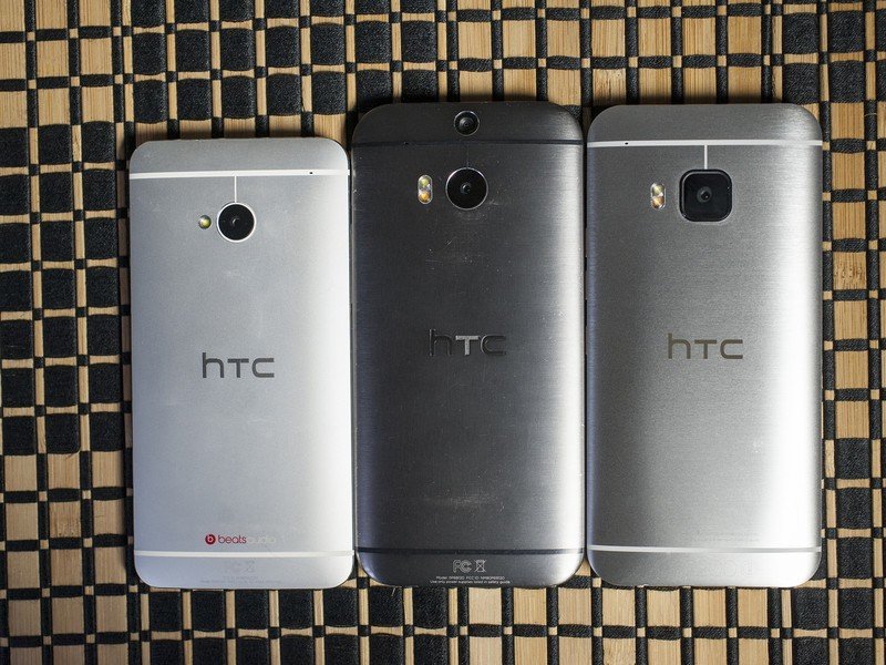
It's a little weird to pick up a newer version of a phone and have it actually be smaller than its predecessor. To be easier to hold. To not leave you thinking "Why on earth did they do that?" But that's exactly what you get with the HTC One M9. Even if you're not familiar with the M8 — which spent a good deal of 2014 at the top of our Best Android Phones list — the M9 is going to attract your attention.
The M9's design is a nice refinement of the M8. Why mess with a good thing?
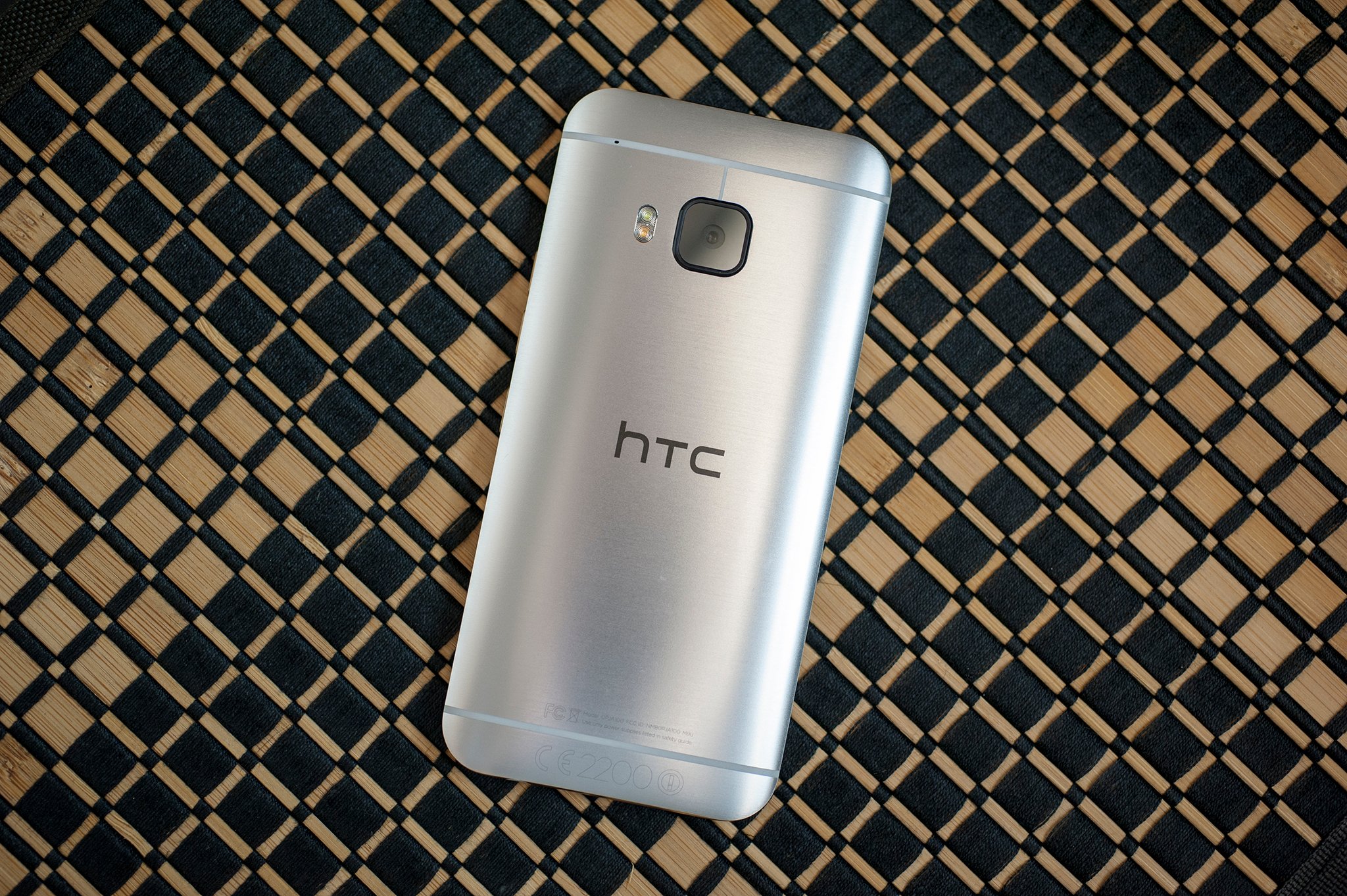
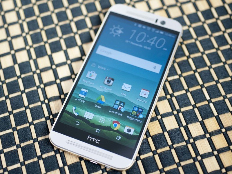
The M9's physical attributes aren't a departure from the previous model. The short take is that you've got a milled aluminum body — a metal phone — with gorgeous curves and continued attention to detail that few do as well as HTC.
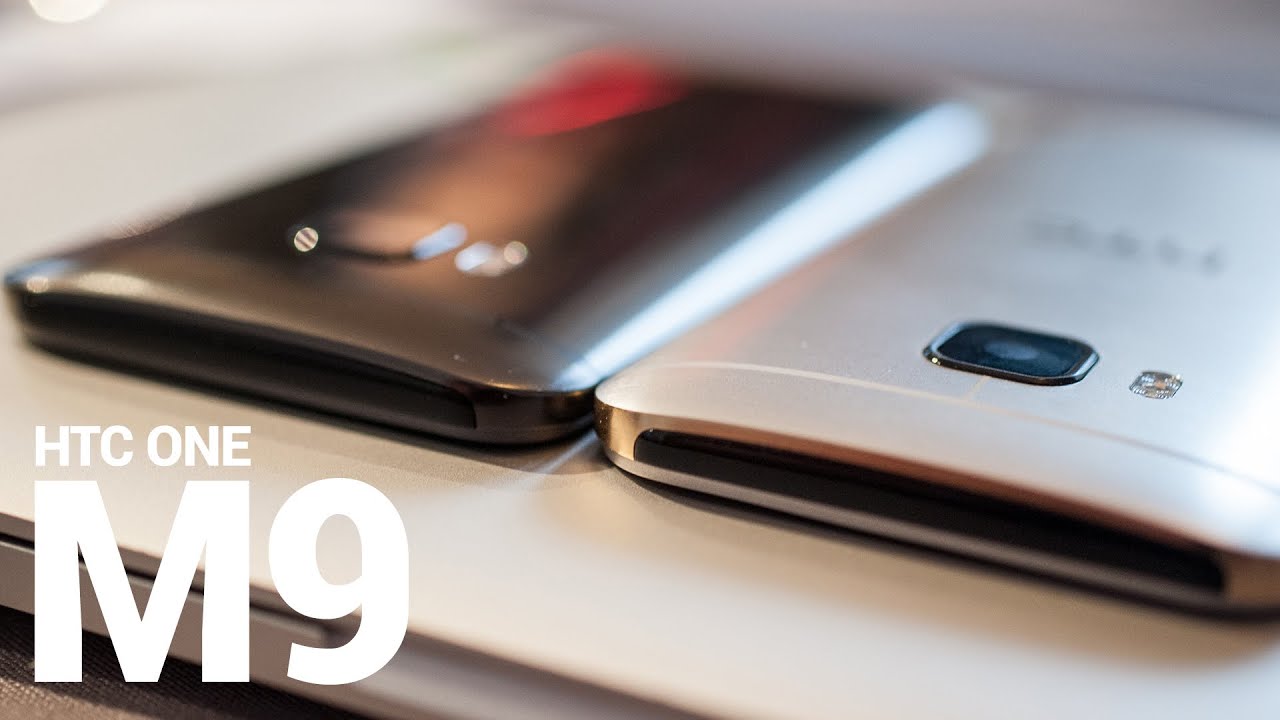
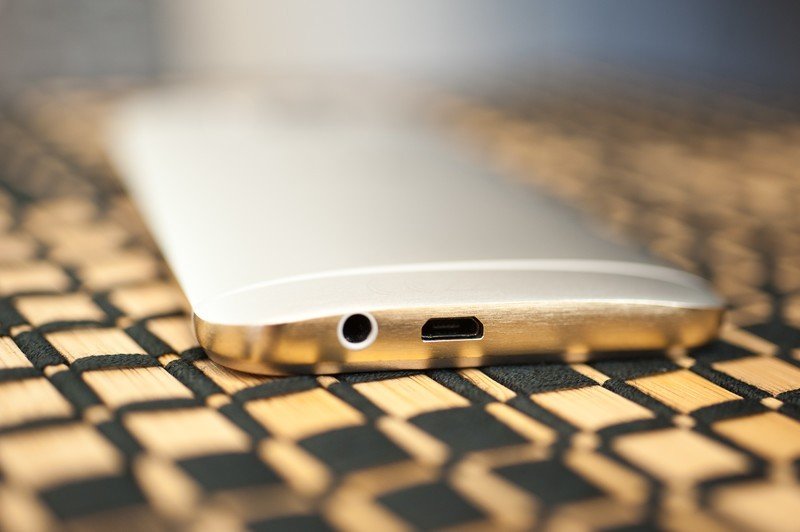
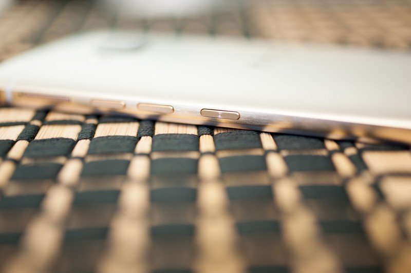
The most noticeable change is that the phone has actually shrunk just a tad. A few millimeters have been shaved off the height and thickness, with just a smidge removed from the width. Add to that the new "shelf" that's been milled into the edges of the phone plus a more matte finish on the metal and the M9 addresses one of our chief complaints of the M8 — that it was too hard to hold. It's a sort of subtle but also very important difference. The shelf feels just a tad different depending the color scheme you get. Silver and gold — which is what we've used — feels a little sharper than the gunmetal. Maybe not a deal-breaker, but noticeable.
Get the latest news from Android Central, your trusted companion in the world of Android
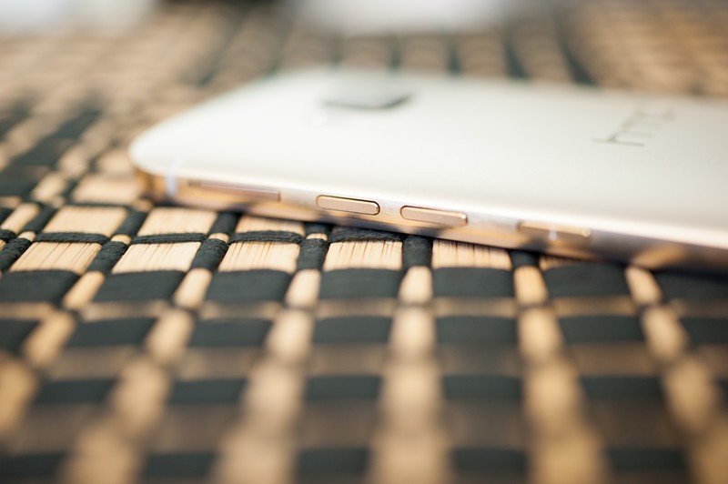
Another subtle but important change is the power button having moved from the top of the phone to the right-hand side, below the (now separated) volume buttons. You'll no longer have to adjust your grip on the phone to reach the power key. (You're still able to double-tap the display to wake the phone — though it still has to sense some movement first, and in any case that option isn't turned on by default.)
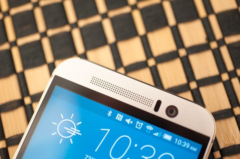
The hallmark of the M series — the front-facing "BoomSound" stereo speakers — have been refined just a tad as well. If you twitch at a lack of symmetry, well, we don't have good news for you here. But the important part is that they still sound better than just about anything else out there (though Sony and Motorola are creeping in on that corner). The M9 is, however, definitely a bit quieter at full blast than the M8. (Perhaps because of a slightly smaller cavity, or possibly the new Dolby customization?) In any case. BoomSound remains one of those features that you have a hard time living without once you've experienced it.
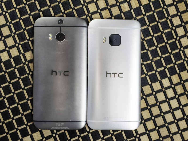
Put the M8 and M9 side by side and you'll see that HTC has refined the entire front just a bit. The metal is now continuous around the Gorilla Glass-covered display, making it look and feel even more seamless. It's a small but important distinction.
As for the display itself, we're looking at a 5-inch, 1080p IPS display. Pretty much same as in the M8, though this one's definitely got a little more of a greenish tint to it. It's one of those things you're more likely to notice side by side with another phone. It's also worth noting that this one's got a different polarization than the M8, so I can actually see the display when wearing sunglasses. No sunnies? It's still really good in directly sunlight. But it does feel like the auto-brightness tends to keep things a little dark.
The back of the M9 retains that gorgeous curve. We normally don't pay too much attention to how a manufacturer puts its logo onto the phone, but that's changed from the M8 to the M9 as well. One to the side effects of Qualcomm's new Quick Charge technology — which lets you juice up your phone much more quickly — is heat. And that led to the HTC letters coming loose on some M8 models (including ours). This time around, the letters are a part of the metal itself. Cool little upgrade.
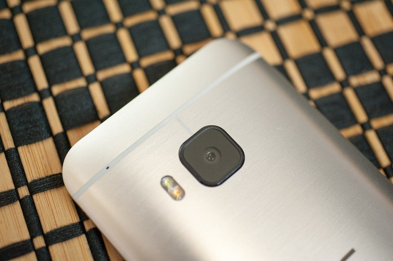
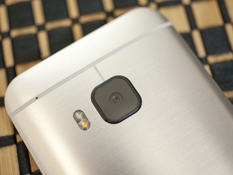
The bigger change out back, of course, is the removal of the secondary camera and a switch to a single, 20-megapixel shooter. We'll get to that in a bit, but the physical difference is obvious — and in fact the camera mount does extend from the body just a tad. And it's gone from a circular shape to a square with rounded corners. That's all covered by sapphire glass. But why squarish when the lens itself — the really important part — is round? HTC says it's to better approximate the actual shape of the camera sensor. So, for aesthetics. (And probably also because it's just a cool design, stands out more than a single circular module and definitely doesn't look like the M8.)
It's tempting to say the hardware almost feels a little boring this time around, because it really is so close to the look and feel of the M8. That's not to say there hasn't been a lot of work done. Look closer. Such is the conundrum of someone who uses phones for a living, I suppose. But what if there'd been no M8? On its own, the hardware of the M9 stands up against anything else we can think to put beside it. Don't downplay all the little changes. The slightly smaller size. The shelf on the edges. The new finish. The moving of the power button. All of those things make the M9 much more enjoyable to hold.
Internals and specs
After nearly two weeks of use, concerns over the M9's Snapdragon 810 processor prove unfounded
A lot has been said about Qualcomm's new Snapdragon 810 processor and supposed heat problems. Talk is cheap, though, and what really matters is what happens when the phone is in your hand. Alex touched on it in his LG G Flex 2 review, and here are my findings with the M9:
I spent a day with the M9 playing games that I usually play on the HTC-made (but NVIDIA Tegra K1-powered) Nexus 9 tablet. Sky Force 2015. Clash of Clans. Plants vs. Zombies 2. Riptide GP 2. Games that all make a tablet with more than three times the physical footprint of the M9 heat up to uncomfortable levels.
The result on the M9? Pretty much nothing. I could feel the phone heat up some, but not to anywhere near what anyone would reasonably call uncomfortable, let alone dangerous. It simply did not happen under what is considered normal, if not solid, use. Not even enough cause for concern to even worry about taking its temperature.
That's not to say I haven't ever felt the phone get hot before. The first M9 I used ahead of Mobile World Congress (with way early software) was set up over roaming mobile data, bouncing between HSPA+ and LTE. Pulling down all that account data indeed did make that phone — and, again, on prerelease software, for what that's worth — uncomfortably hot for a few minutes. But I've set up more phones than I care to count and can safely say that's hardly a unique phenomenon.
If you're looking to eke out even more battery life from your M9, we've got some helpful tips for doing so.
The heat of the phone and any "throttling" of the CPU are pretty much the last concerns we've had with the M9. They just haven't been an issue.
"But what about benchmark apps?!?!?!" Well, what about 'em? Against my better judgment I ran a few. They made the phone hotter than any of the games I played. Again, not anywhere near hot enough to burn me, but definitely hotter than the games, which is exactly what you would expect from these two very different types of apps. We'll update with more testing once we've got a proper U.S.-banded LTE model, just to be on the safe side.
But the short answer, at least in my testing: Don't want a warmer phone? Don't waste time with benchmark apps. The M9 can get hot, just like with any other phone. And metal conducts heat better than plastic. But I experienced absolutely nothing that caused me any sort of concern or seemed out of the ordinary, or anything that would send me scrambling for a thermometer. And this was before the March 19 software update that was supposed to curb thermals during benchmarks even more. And any software-implemented "throttling" — wherein the CPU is told to slow the hell down before it does get dangerously hot — led to no real-world slowdown in performance, and any change in benchmark numbers (which still aren't anything but a number) was negligible.
Is it possible to crank the M9 up to unsafe levels? Someone undoubtedly will do it. But I didn't experience anything like that during normal usage, nor when running benchmarks. And while I'm not at all against testing the limits of something, it's worth remembering that just because a car can run at 10,000 RPM doesn't mean it should at all times. Nor is it how most folks drive. Same goes for CPUs.
Storage & RAM
The M9's 32 gigabytes of on-board storage is (at the time of this writing) the only option you have. And of that, you start with about 22GB available. HTC's left the SD card slot intact, and you'll get some free Google Drive space, too. So there's that.
Since full-disk encryption has been a topic of late, here's the deal on the M9: It's optional.
The M9 comes with 3GB of RAM. And as has been the case with the last couple of generations of Android smartphones, we've not once been tempted to worry about what's in memory at all.

HTC One M9 software
Like the hardware, Sense 7 isn't a total revamp either
The HTC One M9 is running Android 5.0.2 Lollipop — as close to the source code version (that's Android 5.1 at the time of this writing) as you could expect at this point. And along with that comes Sense 7. Really, though, it's more like Sense 6.5 — while there are a few new and important features, it's not a total revamp, and you're not going to really have anything to relearn. (And that's not a bad thing.)
The lock screen is still the lock screen. You've got the Lollipop-style notifications, of course, as well as HTC's customizable shortcuts flanking the unlock button. Biggest change here is that the clock is now in italics, which is a great change if you're really into italics.
BlinkFeed is back, of course, at the far left position in the launcher. And in addition to serving up heaping helpings of news and social updates, it'll also serve up suggestions for places to eat nearby thanks to a new integration with Yelp. (I haven't seen those yet, either due to a non-final software thing, or the fact that my phone believes I should, perhaps, lay off the grub. Supposedly they'll appear on the lock screen, too.) Regardless, BlinkFeed is as excellent as ever. If you loved it before, you'll love it now. If you've yet to try it, definitely give it a go.
Overthinking the home screen — again
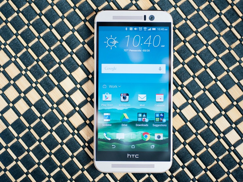
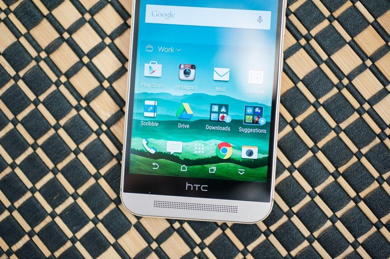
The home screen perhaps brings the biggest change in Sense 7. (And the home screen is accurate — by default there's just BlinkFeed, and a single home screen, though all you have to do to get more is drag drag something to the far right.) The clock's at the top (italics!), with the Google search widget (removable) beneath it. At the bottom you have the four docked app spots (you can make folders down there, remember) that also serve as the lock screen shortcuts.
And in between you have this new widget. The Sense Home Widget. And it does what we've seen a number of third-party launchers do — try to predict the apps you want to use at a particular time or place, and serve 'em up. Sort of.
If you're keeping track in your head (or, ya know, looking at the pictures here), you'll have noted that of the 4-by-4 grid on the main home screen, eight of the spots are taken up by the clock and search widgets. Sense Home Widget uses the other eight. But two of those spots are used by "Recent downloads" and "Suggestions for you" folders. We spoke of our concerns for the Suggestions folder in our initial preview. And after a couple of weeks of use, this much is clear:
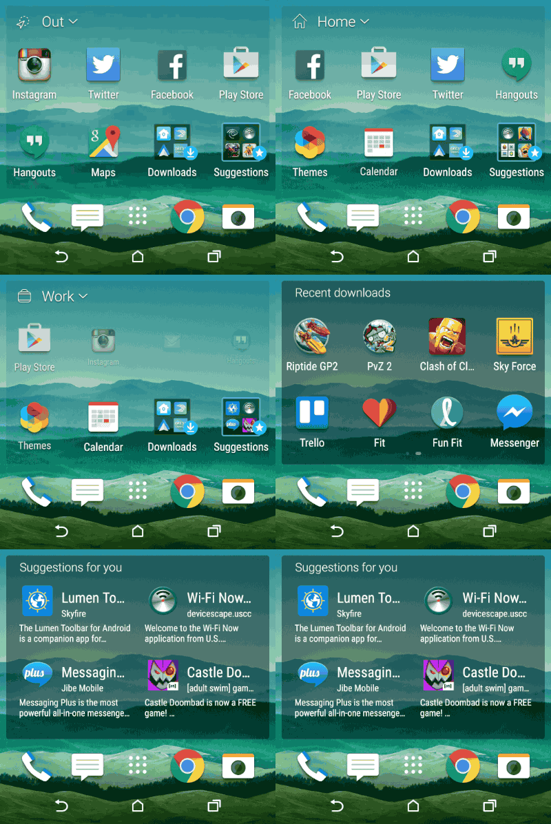
You definitely should remove the Suggestions folder immediately. And probably the Downloads folder as well. The Suggestions folder is, well, just crap. That's not to say it might not suggest apps you might want to try. Lots of folks will enjoy Subway Surfers and Candy Crush and Madden and any of the other apps it recommends — and it changes over time, apparently based on (at least) location and what you already have installed. And I'm even willing to ignore the fact that I've seen it recommend some utility apps (like, say, Clean Master) that I would never recommend someone install.
Delete these folders because they're simply not good. The mere fact that there's a folder that first appears as "Recent dow..." and another that shows as "Suggestion..." is a stark departure from the (mostly) pixel-perfect nature that has been HTC Sense year after year. And that continues into the cursed Suggestions folder, in which even the names of the suggested apps, as well as their descriptions, are truncated.
The "Downloads" and "Suggestions" folders are in stark contrast to the usually pixel-perfect HTC Sense. And they need to go.
Not to belabor the point, but the Suggestions folder is beneath HTC, plain and simple. I don't care how much the added revenue paid for. (And I'm still curious where the recommendations are coming from.) As for the Recent Downloads folder, it comes down to this: The widget and its six visible apps already are changing depending on whether you're at home, work or "out," and also changing as you use certain apps more often. Then the Recent Downloads folder — and its 16 app spots therein — changes as you download new apps. So that's a total of 22 app spots that are changing around on a fairly regular basis. And I'm still seeing apps that I've never used surface to the top. So after a week and a half I've found myself just going into the app drawer because at least then I knew where things were. (That is, after I changed it from the custom view to alphabetical. )
This isn't the first time we've seen HTC overthink the home screen. The good news is that those two folders are easily removed. (Look for the overflow menu in the widget.) And you can nuke the entire Sense Home Widget if it's just not for you. I like the idea — so many "normal" users never customize their home screen at all. But the execution just feels a bit off. At least HTC did the right thing by making it a widget, so you can delete (or add it again) with ease.
New, more powerful themes in Sense 7
Sense 7's theme community is excellent. You're going to want to take some time exploring it.
And then there are themes. Personalizing the look and feel of Sense isn't exactly new — HTC's had that capability for some time, including basic support for themes. But it's taking things to a whole new level in Sense 7.
There's now a dedicated application and web-based community for theming your HTC One M9, with dozens of themes from which to choose. And we're not just talking menu highlight colors. We're talking colors, fonts, sounds, widgets and even icons — and the on-screen buttons as well. And once a theme is applied you can edit it even further, and then save it to your phone. Mix and match all you want.
There's some fun and crazy stuff out there. And, more recently, there's a new Coke theme, which opens up more sponsorship opportunities. It'll be interesting to see what happens there. It'll also be interesting to see how HTC moderates the themes, which tend to take a turn for the scantily clad sooner rather than later.
The HTC One M9 cameras
UltraPixel moves to the front, a new 20MP shooter is out back — and the results are mixed ...
HTC's had a bit of a checkered past when it comes to cameras. The M7 brought forth the age of the UltraPixel, in which you trade a lower total resolution for a sensor with larger pixels, and a better capability for capturing light. (And light, folks, is everything when it comes to photography.)
But that lower resolution — 4 megapixels — could well be a bit of a bottleneck. Zooming in on a smartphone shot is always dicey, but that lower res meant no oversampling, and just less information for the imaging processor to work with.
This time around, we've got a more traditional 20-megapixel sensor. And only one lens on the back of the phone, so we're also giving up that secondary depth information for post-shooting defocusing and the like. (Fake bokeh, if you will.) That's not to say you can't still add that effect, it's just different now. (More on that in a second.)
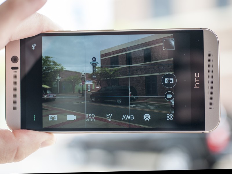
The camera app itself has been tweaked a tad. You still swipe left and right to switch between the front and rear cameras ("camera" versus "selfie"), and this also is how you get to the panorama mode. (We might also like to see HDR moved here.) By default those are the three main modes, but you can add others. At the time of this writing, there are options for "Bokeh" (the aforementioned defocusing), Photo Booth (wherein you have four images arranged in a grid) and Split Capture (simultaneous front-back shots). It's a little odd that those aren't there from the start, but they're easy enough to add in. (Perhaps HTC thought three swiping options was enough for starters.)
You'll be shooting at a 16:9 aspect ratio by default, at a default resolution of 5376x3024, or about 16 megapixels. Switching to 10:7 changes things to 5376 x 3752, or the full 20 megapixels. The default video resolution is 1080p, but you can crank it up to 4K if you want.
There are plenty of other bells and whistles tucked away as optional settings, including using the volume button as the shutter, or triggering the shutter by tapping anywhere on the screen. Or you can use your voice. You can even do auto-selfies by smiling. Again, you'll want to spend some time in the settings here.
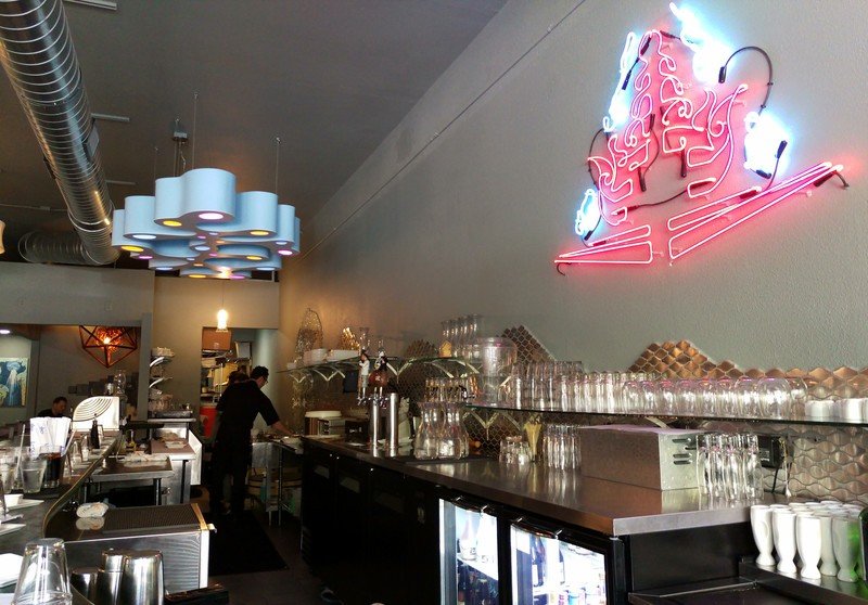
So all that said, the million-dollar question: How do images look? At this point it's worth another reminder that we received a software update on March 19 that addressed image processing. Everything you see here was taken after we received that update.
(You can see the full-resolution sample pictures here.)












A few other odds and ends
Some of the more sundry things when it comes to smartphones ...
A few other thoughts on the M9:
- We've had no issues with GPS or Bluetooth, so far as we can tell.
- Making calls over T-Mobile worked just fine. Same goes for AT&T. (Again, remember, we're using the Euro/Asian model of the M9 here in the U.S. for this review.)
- We mentioned Quick Charging earlier — it's available on the M9, but HTC does not include the quick charger in the box. And that's no bueno.
- HTC has traded out its own custom-ish infrared TV remote app for Peel Smart Remote.
- The Zoodles-powered Kid Mode is still on board, and still a good option for parents.
- HTC's keyboard is pretty good, layout-wise. But I'm very much missing my third-party prediction.
- We sort of left out HTC's gallery app and new photo effects. There are new photos effects that you probably won't want to use all that often. We've touched on the updated gallery before, and it smartly pulls in content from other services, including Facebook and Flickr.
- But there's a little hesitation between when an image first loads in the gallery view and when it's finally sharpened and made presentable. And it's really annoying after the second time you see it.
- Video Highlights — erm, they're called Zoes now — are still here, and they're still excellent.
The bottom line
The M9 is a better M8, but the cameras still need work
What is there to say about the HTC One M9 that we haven't said before, in previous generations and in previous years? In a sea of imperfect phones — and make no mistake, we can (and will) find fault in any and all of them — HTC makes devices that stand out, and stand on their own. And that continues with the M9.
At some point, however, we the people of the Internet apparently decided HTC needed to do something different. That the M8 needed to be cast aside, and something completely new milled from that block of aluminum. Instead, we got an improved physical form, a refined version of what so many of us declared one of 2014's most beautifully designed phones. It'd be stupid to mess with that. Complaints that the M9 should have been something "different" stem from boredom and Internet overload.
If you want to have the best smartphone, you have to have solid hardware, software and camera quality. HTC's still struggling some with the latter.
While the software on the M9 is solid as a rock, the user interface is, for me, a bit of a letdown. A week and a half of use with the Sense Home Widget didn't bring it any closer to reaching a balance between what it thinks I want to use, and what it is I actually want to use. I still know what I want, and where I want it to be. But it's also important to remember that that widget isn't for me. It's for my mom and dad. It's for the millions of people who don't actually change their home screens. And it might well not be perfect for them, either. But I do like the idea.
The more we've used the camera on this more final software, the more we get the same feeling we've had the past couple of years. The M9 is going to be capable of taking some perfectly fine pictures. It's not not as impressive as we'd like it to be all of the time. Backlighting continues to pose problems. And it almost feels like it gets a little confused when trying to focus on images in the distance. Or maybe it's like the imaging software is struggling to figure out what to do with the extra data the 20-megapixel sensor gives it. (The old ImageChip 2 used by the UltraPixel system isn't in the M9 anymore, even with the UltraPixel lens on the front facing camera.)
The HTC One M7 was the company's best phone. The M8 also was its best phone. Both had flaws. The M9 does as well. The question we have to ask ourselves year after year is about the sum of the parts. The M9 is mostly familiar, both in form and function. But HTC still has some serious work to do in the camera department. It's perhaps a little overdramatic to say that it's an anchor pulling the ship down, but it's definitely an oar stuck in the water. And with all the advances from its competitors over the past we've just about reached that point in which it's extremely difficult to overlook that compromise.
Should you buy the HTC One M9?
If you're an HTC fan, you'll want this phone. And you'll love this phone. But for a lot of folks, maybe this time the sum of the parts just isn't good enough, given what else is out there, or will be out there soon. The other smartphone manufacturers are finally catching up with HTC in terms of design, and they're not that far behind on software. Meanwhile, they're all making great strides in the camera department, while HTC seems to be fighting to keep up with itself.
The M9 is a pretty great phone. If you're coming from an M7 it's a pretty easy upgrade. From the M8? Maybe not. The M9 is still a big fish. But there's a big sea of great phones out there this year, and more are coming.
