HTC One M9 hands-on preview
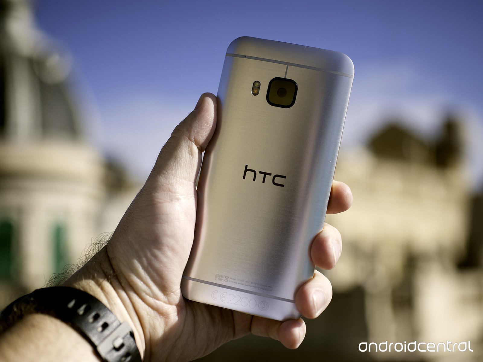
It's hard not to have high hopes for the HTC One M9. Its immediate predecessor and the first phone in this rebirth of the HTC's flagship line — that'd be 2014's HTC One M8 and 2013's M7 — were fan favorites, and highly regarded by those of us who critique phones for a living.
But those phones were not without their flaws. And as we've seen HTC slowly address its devices' shortcomings (while growing and innovating in other areas), it's been difficult to not expect it to finally get things — all the things — right.
At least that's what we've been hoping, especially when it comes to its one tragic feature: The inconsistent performance of its UltraPixel camera.
And that brings us to this. The HTC One M9. We've spent a little time with HTC's latest, and this is what we've found thus far.
About this preview
This preview comes to you after spending about 36 hours with the HTC One M9 as our main device in Barcelona, Spain, ahead of Mobile World Congress. While the software we used looked and acted final, it indeed was not final. This is a preview. (Albeit far fancier and longer than a normal hands-on.) Our opinions may well change some as we get more time with the retail M9 in the coming weeks. And while we will give quick peeks of a few pictures taken with the M9's camera, its software in particular is not finalized, and so we're holding off from forming any concrete conclusions about it.
We liked a lot of what we saw. And we still have questions about a few other things. And much more is still to come.
Be an expert in 5 minutes
Get the latest news from Android Central, your trusted companion in the world of Android
HTC One M9 hardware
HTC improves upon a solid design
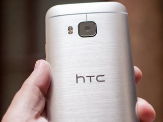
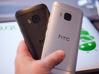
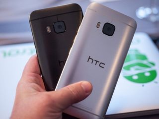
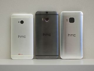
If you were a fan of the HTC One M8 you're going to enjoy the look and feel of the M9. We wouldn't blame anyone for mistaking one for the other. Sure, the duo cameras are gone and instead there's a large, single lens housing on the back. And the trim's a little different. But the overall shape remains the same, with that excellent curved backside.
The M9 is just a hair smaller than the M8. It's a tad more narrow, and just a wee bit shorter.
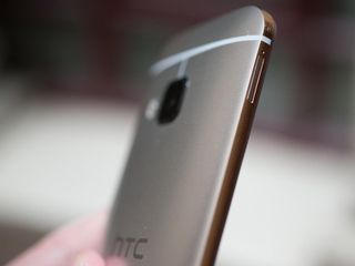
And if you want to talk about HTC making a big difference with little improvements, the body is where we'd start. The M9 is actually just a hair smaller than the M8. It's a tad more narrow, and just a wee bit shorter. There's also a different finish on the edge trim, and it's created a small shelf on the sides of the phone. And that — in addition to what feels like slightly different coating on the metal itself — makes the phone feel a little bit smaller and a lot less slippery than the M8.
So our biggest pain point of 2014's flagship phone has been addressed, and nicely at that. And a fun fact: The body has fewer seams and fewer individual parts, but it takes nearly twice as long to produce as the M8. And that dual-tone anodized finish isn't easy to do, and the end work is carried out by hand, but HTC says it's gotten good at it along the way.

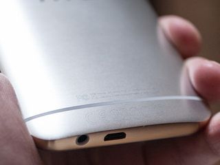
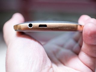
All that said, it's not that we don't have new things to get used to. We'll get to the camera in bit. Another obvious change is that the power button has moved from the top edge to the right, just below the volume controls, have have been separated into two distinct buttons. And the power button is spiral-etched, so you can theoretically get a better feel for where it is. In our brief use, however, it's been easy enough to know it's at the bottom of the three. For many of us it'll be a welcome change, as it was a bit of a stretch to get over the display and the front-facing speaker to to the top of the phone.
Other than that, things are going to look very familiar.
You do get some new color schemes to play with. The M9 comes in the familiar "Gunmetal Gray" with black trim. But you'll see silver with gold trim being pushed as the mainstream product. There's also a gold-on-gold version for those who like that sort of thing. And, yes, there's pink. (At the time of this writing it's unknown what the U.S. carriers will go for, and this being HTC we wouldn't be surprised to see exclusive color options at some point.)

The new edges and the different coating make a huge difference to the in-hand feel.
We were a little worried upon seeing the gold-on-silver model in pictures. But in actuality the gold accent is pretty subtle and is a nice touch. That's mostly cosmetic, though. It's really the slightly smaller size, the new edges and the different coating that makes a huge difference. The M9 isn't as small as the M7, but it's definitely better in the hand than the M8.
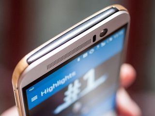
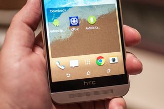
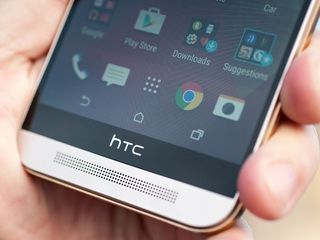
If you were hoping for HTC to do something about the massive grilles that are part of the (ever excellent) BoomSound speakers — like the way they've been hidden away in the HTC Desire EYE — well, you're going to be disappointed. The holes are as present as ever (though they're less obvious of a facade this time around). The black band with the HTC logo is still here as well, and there really wasn't much of a chance of it going anywhere, as it hides physical components needed by the screen. Same goes for the added height for the speakers. Slim down the bezels all you want but you'd still need room for the baffles, the empty space behind the scenes that (as any audiophile will tell you) is what gives a speaker its oomph.
How's it sound? Maybe just a tad quieter than the M8, but also maybe a little more clear.
But, again — and we really can't stress this enough — it's the little changes that have made a big difference in feel, and thus define the in-hand experience.
HTC One M9 specs
Snapdragon 810, and some other things ...
The HTC One M9 is the second phone we've used with the new Snapdragon 810 processor. Nothing really stood out as a showstopper in our very limited use — but again we'll need more extensive use to be able to say that definitively.
The M9 as it stands as of the time of this preview will only come in a 32GB model, about 21GB of which is actually available to the user. It still supports external storage, however, accepting up to a 128GB microSD card. It'll also come with complementary Google Drive Storage.
HTC One M9 software
Meet Sense 7 (or as we call it, Sense 6.5)
Welcome to Android 5.0.2 and Sense 7. Much like with the physical parts of the M9, we're not looking at a total redesign of the software. And that's not a bad thing, as HTC's continued to pare things down over the past few years. And while we might not have fallen in love with every single software feature along the way, there's no denying that HTC's produced one of the fastest total packages for anything that you wouldn't call "stock Android." (And that's even more impressive given some of the headaches we've seen as the other manufacturers have made the transition to the Lollipop era.)
Sense 7 for the most part looks and feels a lot like Sense 6. Same overall color and font scheme. BlinkFeed — HTC's home screen newsreader powered by Mobiles Republic (which you more likely know from services like Appy Geek) — is ever present, serving up highlights from your social networks as well as other recommend sources. (You can add Android Central directly. And you should.)
One big change is that HTC's teamed up with Yelp for what it calls "Meal Time Bundles" — recommending places to eat on your lock screen. Updates later this year will add a "Morning Bundle" that'll serve up the latest news on your lock screen a few times a day. We'll have to wait to check that one out, though.
HTC's taken a pretty big leap in how it handles the default home screen.
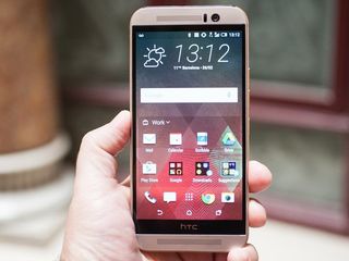
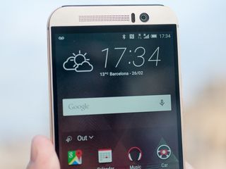
HTC's also taken a pretty big leap in how it handles the default home screen. Start things up and you'll see the clock-and-weather widget (and yet again you'll have this giant clock and the clock in the top bar, just in case, apparently), the Google Search widget, and a new "Sense Home" widget.
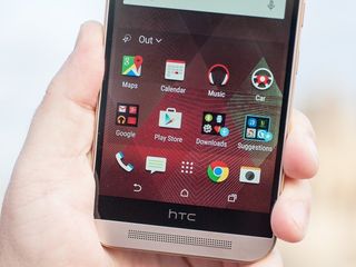
This last one borrows a page from a number of third-party launchers that attempt to predict what apps you're going to use at particular times of the day. In this case we've got three scenarios — "out," "home" and "work." The meaning should be pretty obvious. You have to opt in to all this learning stuff, and if you'd like you can let Sense try to figure things out for you, changing from one category to the other, and deciding what apps belong in each. Or for a shortcut you can tell Sense where you work and where you live, or change those categories manually at any time, and you can pin individual apps to each of them if you find Sense just isn't getting it right. (Or just don't want to wait for it to figure things out on its own.) We'll have to spend more time with the M9 to get a better feel for how it handles this over the long term.


Sense also adds a couple of "smart folders" to the mix. Any app you download from Google Play goes into a "Downloads" folder in the Sense Home widget, and they float to the top the more you use them. If you use just a handful of apps that'll probably work pretty well. We'll have to see how it handles our full suite, though. (And I, for one, am not crazy about apps changing positions on me. I know where I like my stuff. But for most normal folks, who rarely — if ever — customize their home screens, this could be a great feature.)
More controversial is the "Suggestions" folder. We've recently seen a third-party launcher take some heat for recommending app downloads on the home screen, and chances are HTC's about to take a bunch as well. The "Suggestions" folder is styled differently than other folders on the home screen, showing names, developers and a brief summary of eight applications that you might want to download. And it's entirely possible that you'll find something useful in there.
On the other hand, we've also seen the likes of the scareware "Clean Master" (which we took to task on a recent podcast) as well as other security-type apps that you probably don't actually need.
The simple fact is that this sort of thing seems like it should be beneath a major manufacturer. And the Suggestions folder isn't even particularly well designed, with longer app names being cut off, and incomplete summaries the norm. It's not really a deal-breaker for us because you can easily remove this folder, as well as the downloads folder or the entire Sense Home widget if you'd like.
We're not mad, we're just more than a little disappointed.
Navigation buttons get some new life
If you're tired of having the same old back-home-recent apps buttons on the bottom of the screen — or if you're one of those sadists who prefers things in a different order — HTC's got you covered this time around. You can now reorder those on-screen buttons — and add in a few new ones.
Back, home and recent apps are still mandatory. But you can now add options to turn off the display, open the notifications shade, hide the navigation bar and go full-screen, open the quick settings menu, or lock down auto rotation. It's entirely up to you, and the default is the basic back-home-recent apps scheme.
A few other software features to look out for:
- Glove mode, for those who experience winter.
- Motion Launch gestures have returned (but are off by default, at least in the build we used), allowing you to wake the phone with a double tap, swipe down to turn on voice dialing, swipe up from a sleeping screen to unlock, hold the volume key to turn on the camera, swipe left to open to the home screen, and right to open BlinkFeed.
HTC One M9 cameras
UltraPixel business in the front, megapixel party in the back
And now we come to what's been the weak spot for HTC's phones of late — the camera. And as expected, HTC has shifted away from the low-light but also low(ish)-resolution "UltraPixel" sensor for the main rear camera, instead opting for a 20-megapixel model.
UltraPixel isn't dead and gone, however. It's moved to the front of the phone for all your selfie needs. And it should make those late-night bar shots look a little better.
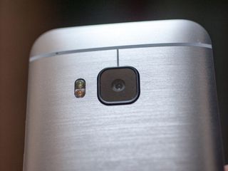
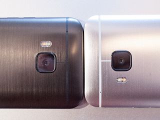
The rear camera is the big departure, though. Gone is the "Duo Camera" setup, along with the secondary lens to capture depth information. And with it goes some of the post-processing effects that were on the M8. In its place we have a much larger camera housing, about the size of small fingerprint, square with rounded corners. It's covered in sapphire glass that HTC says should help alleviate pesky scratches. (But you know someone out there is going to find a way to muck it up.) It's got autofocus, has a backside-illuminated sensor and an f/2.2, 27.8mm lens, with 4K video recording.
UltraPixel moves around the front, and the main camera switches to a 20-megapixel sensor.
The front-facing UltraPixel camera is f/2.0 at 26.8mm, also has a BSI sensor and does 1080p video recording.
It's all tied together by an improved camera app that in some ways has been simplified (swiping between camera modes is quicker) but remains stubborn in others. (Some settings, like HDR, are still buried deeper than they should be.) You start with just three main modes — Camera, Selfie and Panorama — and can add (and delete) others like Bokeh (for that defocusing fun), Photo Booth and Split Capture. Those aren't new features for HTC, they've just been decoupled a bit.

Post-processing has gotten a nice makeover, too. You've got quick access to HTC Zoe for putting highlight videos together (and it seems like HTC's finally getting Zoe the attention it's long deserved). It takes just a couple touches to use a photo as the basis for a new theme. And those fun effects have been retooled into an easier-to-use "Photo Editor" application.
So we asked for more megapixels. Did we get what we hoped for? The proof's in the pudding. While we definitely want to spend more time with the M9 camera — and, again, with final shipping software — we've seen somewhat mixed results.
It's a little early to make a definitive call on image quality just yet.
We've gotten some pretty good pictures in good lighting. The biggest change perhaps is that you can now zoom in before taking the picture and actually come away with something usable. Same goes for cropping in later. That just wasn't the case with UltraPixel. We were, however, underwhelmed when in less-than-ideal lighting conditions. It's tough to take pictures in the dark. And in giving up UltraPixel we're giving up some of that ability to collect light.
It's a little early to make a definitive call just yet. We want to spend some more time with this camera, chasing kids and snapping sunsets and doing all the things we normally do. In some ways it's definitively better. In others, the jury's still out. We're neither blown away nor left devastated. So we'll see.

HTC One M9 — the bottom line thus far
It's a better M8, and there's nothing wrong with that
The HTC One M8 was nearly universally heralded as one of the best-designed smartphones of 2014. The M7 before it also deserved every word of praise. That's not to say those phones were without fault. And nor is the M8. But in what rational world would HTC be expected to blow up the platform it's been building the past two years?

The simple fact is that for the most part the M9 isn't a radical departure from the M8. It doesn't have to be. And it probably shouldn't be. And it perhaps shows that there's still a bit of navel gazing to be overcome. In swapping the rear UltraPixel camera for a more traditional 20MP sensor, HTC's opening itself up to a mountain of second guessing. We'll know for sure once we have final software and retail units to play with. And perhaps HTC's focus is being pulled away from smartphones as it delves into other electronics categories.
