HTC Inspire 4G retrospective review: My first Android desire
I've been reviewing smartphones and mobile tech professionally for close to seven years now, but long before I was ever getting paid to, I was swapping phones every chance I got, because I just wanted to try as many different experiences as possible.
I've already written plenty of times about my on-again-off-again relationship with my first phone on the Android side, the HTC Inspire 4G, but this time I finally bit the bullet and ordered one off of eBay. It's been fun revisting what Android used to look like, and how HTC's unibody design still (mostly) holds up today.
The glory days of HTC
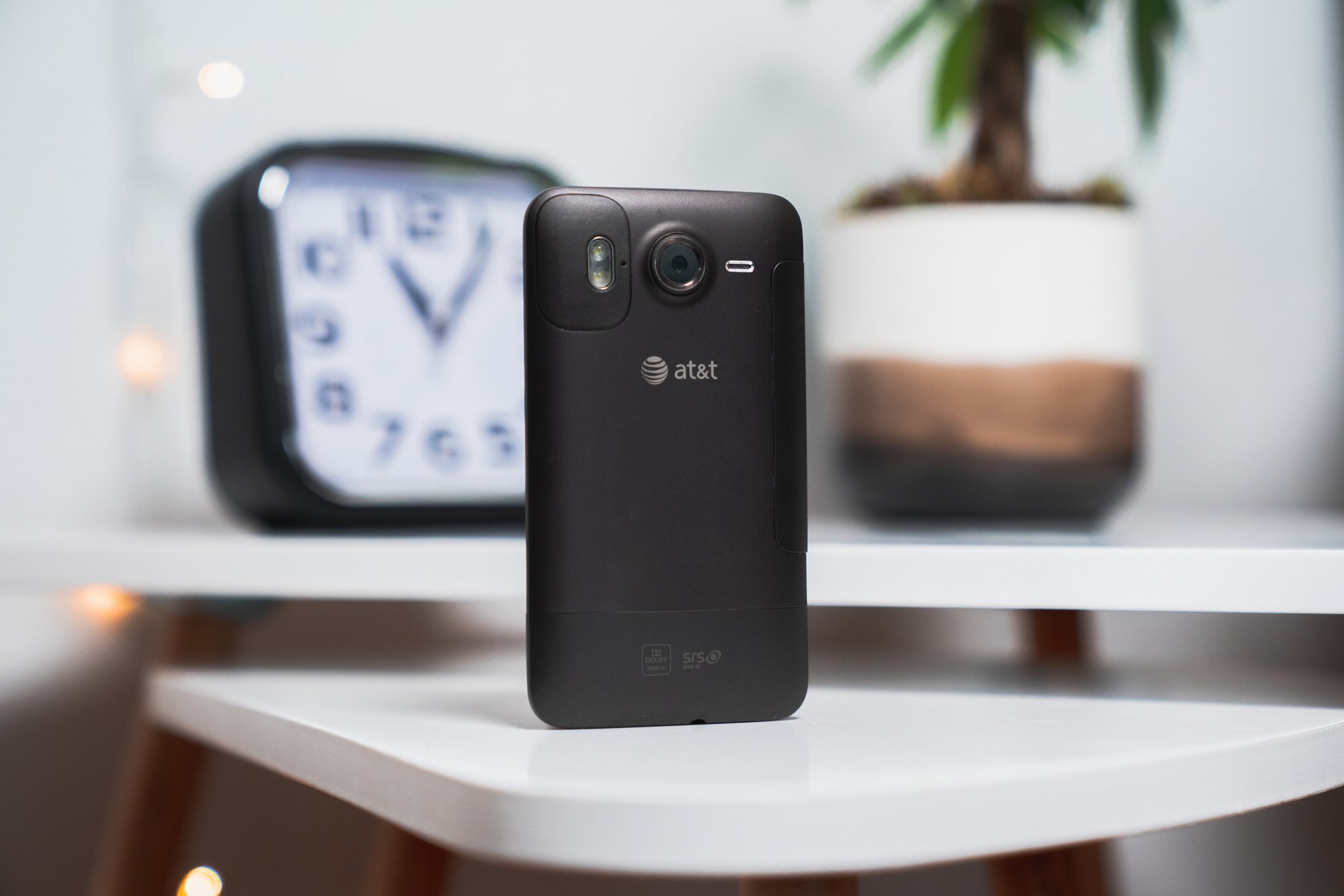
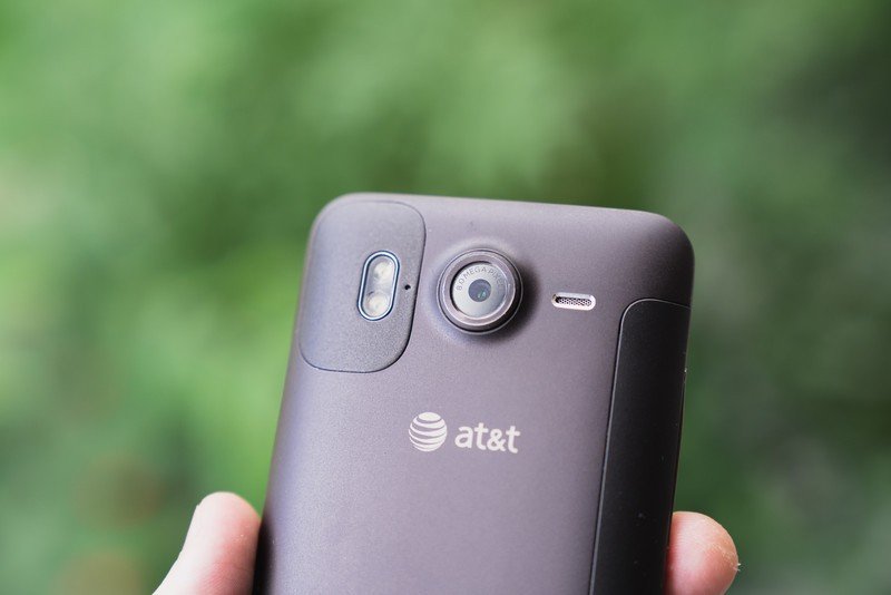
Where do I even start with this thing? The Inspire 4G was actually a rebranded U.S. variant of the Desire HD, with a big AT&T logo on the back to remind you of exactly what network it was intended for — remember when carrier exclusives were a big thing? The 4G part of its name was important branding at the time, because this was actually the first phone on AT&T's lineup to support the HSPA+ 4G network.
| Category | HTC Inspire 4G |
|---|---|
| Operating System | Android 2.3 Gingerbread |
| Display | 4.3 inches, 5:3 aspect ratio, 480x800 (217 ppi) resolution, S-LCD |
| Processor | Qualcomm Snapdragon S2 |
| Graphics | Adreno 205 |
| Memory | 768MB |
| Storage | 4GB |
| Expandable Storage | microSD |
| Rear Camera | 8MP |
| Front Camera | None |
| Connectivity | Wi-Fi 802.11 b/g/n, Bluetooth 2.1, FM radio |
| Battery | 1230mAh |
| Dimensions | 122.9 x 68.1 x 11.7mm |
| Weight | 164g |
The Inspire 4G launched right around the same time as the HTC Thunderbolt, which similarly served as the launching point for Verizon's 4G LTE network. Of course, both phones were riding off of the wildly successful EVO 4G that helped kick off Sprint's WiMAX network. Needless to say, HTC was a big deal back in the early days of Android.
For me, the Inspire was my first real exposure to Android after flashing a few extremely buggy and outdated builds onto my iPhone 4. The hardware was stunning, even coming from what I still think was one of Apple's most impressive designs.
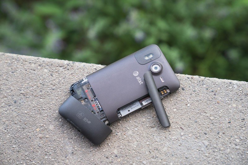
During a time when just about every other phone on the market was made of cheap, flimsy plastic, the Inspire came in a soft-touch aluminum unibody casing. The only plastic used on the exterior was to boost signal strength and give you access to the microSD and SIM trays on the bottom of the phone, as well as the battery compartment on the side.
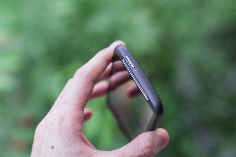
My only complaints with the design today are exactly what they were nine years ago. The power button is on the top-left of the Inspire's frame, and far too recessed, making it hard to reach and even harder to press. There's also the matter of the battery door, which was nearly impossible to remove without either ripping your fingernail clean off or shredding the phone itself, should you try to wedge a coin into its tiny notch.
Be an expert in 5 minutes
Get the latest news from Android Central, your trusted companion in the world of Android
The one I got from eBay is a little rough around the edges; the volume rocker is literally hanging on by a thread, and the screen creaks quite a bit if you put pressure near the bottom. But it's kind of remarkable how much this phone blends in with even today's flagships, with regards to the build quality and design.
Of course, the specs are a different story. The Inspire 4G ran on a 1GHz Snapdragon S2 processor with a whopping 768MB of RAM. That's one-sixteenth of the RAM in the OnePlus 8 I use currently, and we're not even gonna talk about the Inspire's 4GB of internal storage — thankfully, it at least came with an 8GB microSD card.
I remember it feeling fast at the time, but the Inspire chugs along by today's standards; browsing the web or scrolling through the image gallery is enough to choke up Android 2.3 Gingerbread, though to the phone's credit, I was surprised by how smoothly (for the most part) the pre-installed games like Asphalt 5 and Teeter ran.
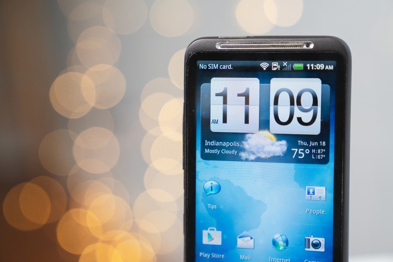
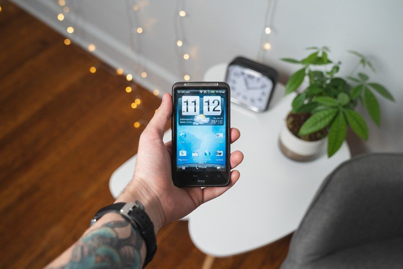
It's been a fun trip down memory lane relearning how Android used to work; I had almost forgotten about the long-antiquated Menu and Search buttons in the capacitive function row, and HTC's Sense UI 3.0, while comparatively beautiful next to stock Android 2.3, is full of redundant settings like the Personalize page, which you could access by either tapping the dedicated icon in the dock or long-pressing on the home screen.
It's been fun relearning how Android used to work.
But during a time when manufacturers were clamoring to slip their own traces of identity and personality into their phones, Sense was fun. You could use that Personalize page to completely change the look of your interface with just a few taps, and the HTC Hub was home to countless user themes. The News and FriendStream widgets on the home screen were useful too (the latter was a hub for all of your social media), and who could forget the gigantic weather/clock widget that we all installed on every new phone for years?
Funny enough, when my new Inspire came in earlier this week, I actually had to sign into a long-abandoned Gmail account of mine that's older than the phone itself, because Android 2.3 doesn't support Google's two-factor authentication — that led to a whole other nostalgia trip that I, ahem, won't be writing about any time soon (you don't need access to all of those Linkin Park AMVs). Unsurprisingly, very few of my daily apps still support Gingerbread, and even the ones that were visible on the Play Store (actually, the Android Market before I updated it), like Instagram, would crash on launch every time.
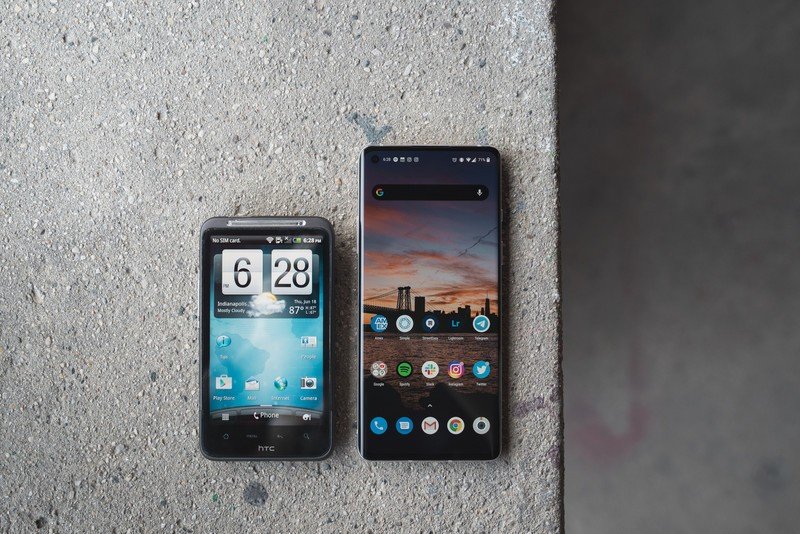
Battery life is also exactly as bad as I remember. The 1230mAh capacity already sounds hilariously small by today's standards, but even in 2011, it was well below par. The Motorola Atrix that I would eventually trade my Inspire away for had a comparatively large 1930mAh battery, and the Galaxy S II sat in the middle with 1650mAh. Thankfully, this was back when batteries were easily swappable, because even in the time I've been writing this article, my Inspire is sitting at 40% on its second charge of the day, with virtually zero actual use.
There are some other hilarious signs of its age, like the complete lack of a front-facing camera. Both of the aforementioned phones were released within a few months of the Inspire and came selfie-equipped, but the Inspire worked around this oversight with a Self-Portrait mode that let you use the rear camera, loudly beeping when a face was detected and eventually taking a photo automatically.
Those beeps came from the extremely tinny, small speaker situated on the back of the phone next to the camera, whose placement made ringtones and music sound distant and pretty terrible. Oh, and that camera is slow. It's difficult to take a shot that isn't overtaken by motion blur, since the phone takes so long to capture and process an image after you've hit the shutter button. I managed a few okay shots, but even in 2011, this wasn't a particularly great camera.
I'm obviously not going to swap my SIM card into the Inspire (though I'd be lying if I said I hadn't thought about it), but it's been a blast revisiting the phone that truly sparked my love for Android — the same enthusiasm that's since landed me this incredible job where I get to do exactly what I did during my first bout with the Inspire: talk about every new gadget I can get my hands on.
That nostalgia isn't mine alone, either. I tweeted a few photos from this review over the weekend, and the replies are filled with fond recollections of the HTC that used to be. I'm happy to see the company getting back into the mobile space with its (admittedly drab) new 5G phone, but it's hard to imagine any sort of return to glory.
The Inspire may have been flawed, even during its heyday, but I'm endlessly grateful for the path it paved for me and the fun we had along the way.
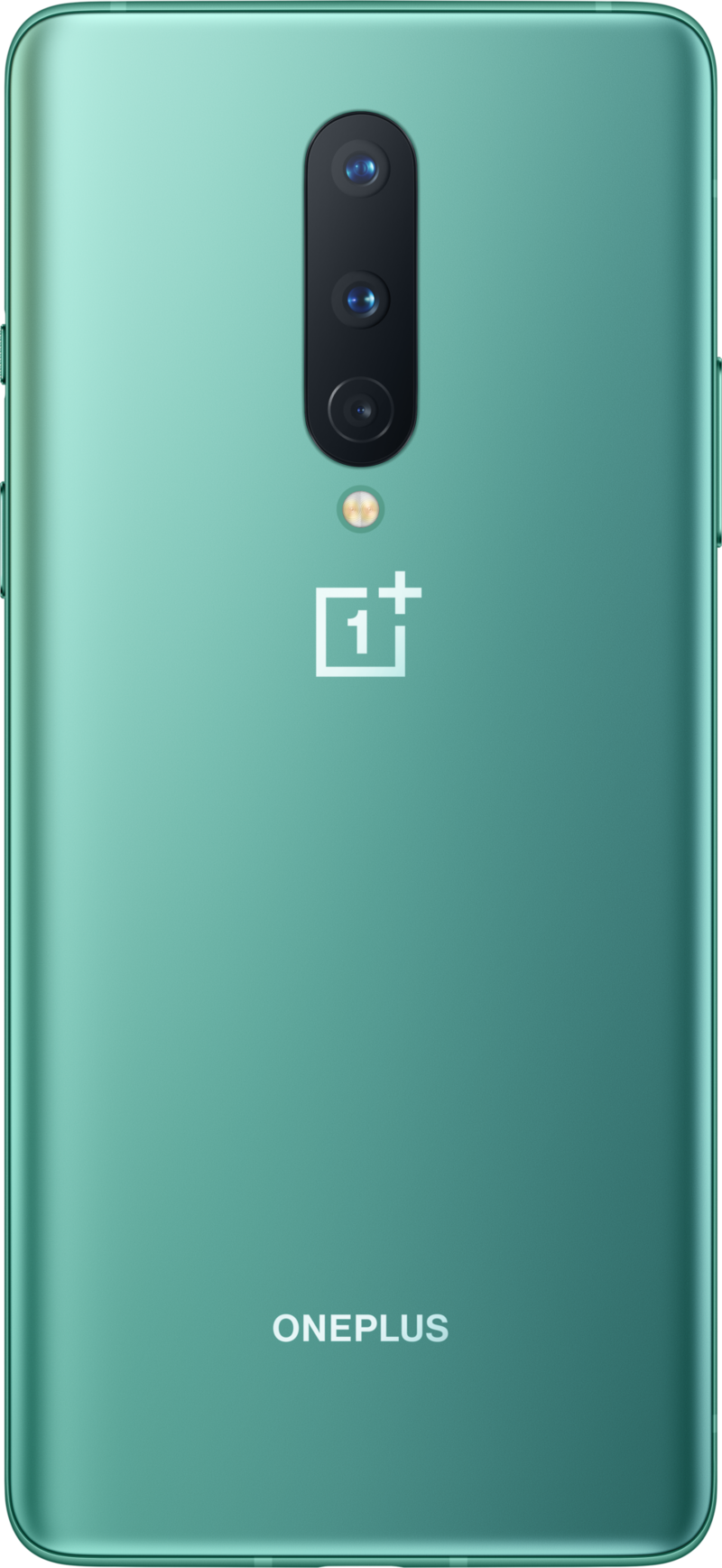
It isn't the Inspire, but it's great nonetheless
The OnePlus 8 certainly isn't as captivating to me as my beloved Inspire, but it's an incredible phone at a fair price with a Snapdragon 865 chipset, 5G connectivity, and three cameras around back. The display is absolutely gorgeous, and OxygenOS is one of my favorite implementations of Android.
Hayato was a product reviewer and video editor for Android Central.

