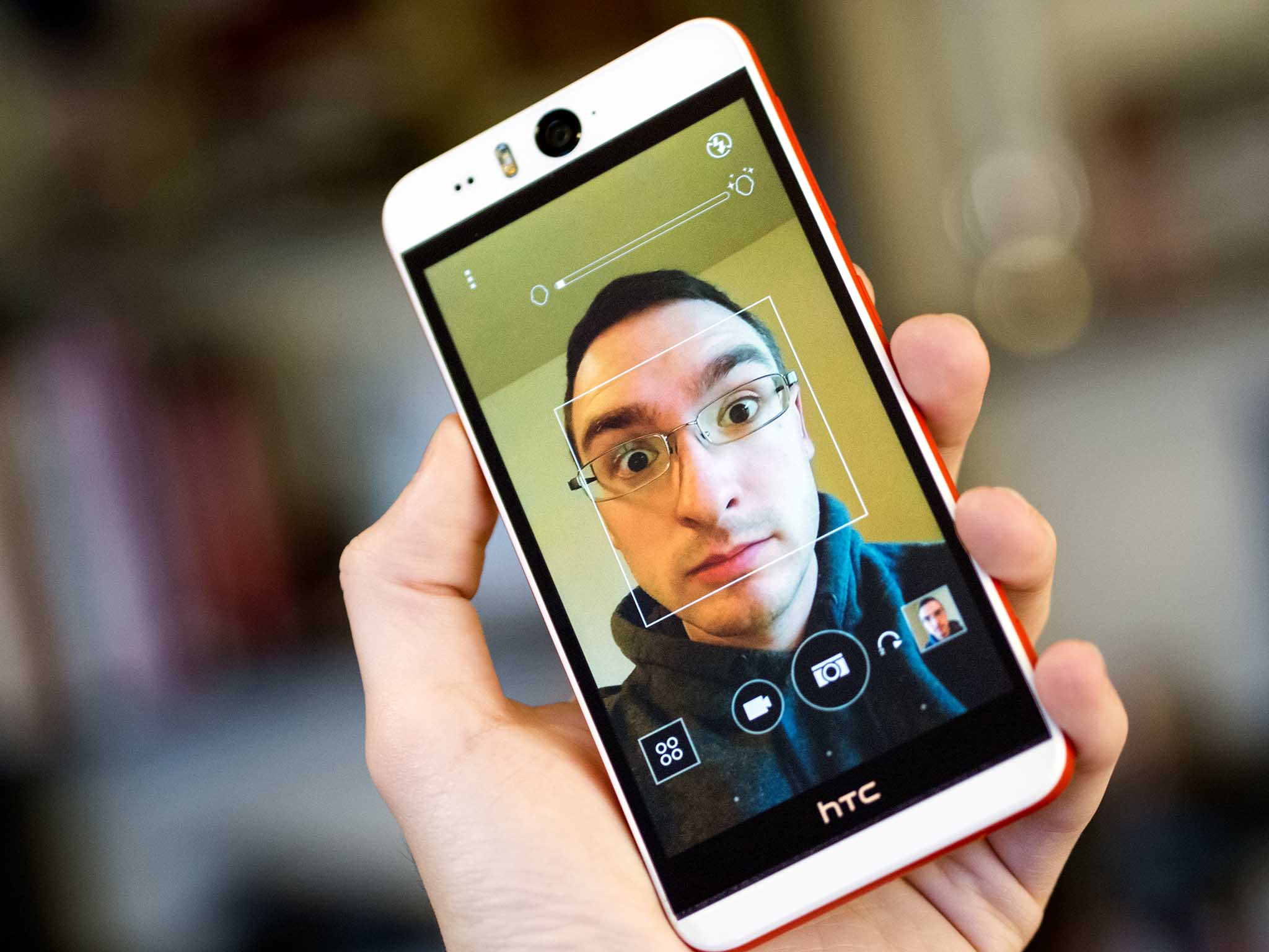
Selfie. The first time I heard the word I paused. Do we really need a term for taking a photo of yourself at arm's length with a crappy front-facing camera? (I may have used stronger language). That was a few years ago. Today the term has exploded in use, and smartphone cameras aren't quite so little and crappy anymore, but I still hate even reading the word, much less using it. It's spawned dedicated social networks, a horrible (and blessedly short-lived) ABC sitcom, and now the HTC Desire Eye smartphone. There's more than the front-facing 13-megapixel camera at play here, but it's the defining feature on the face of this device.
It's a sign of the times that a manufacturer like HTC would feel compelled to release a phone with what should be a high-quality, high-resolution a camera dedicated to taking pictures of the user. But that commentary on the state of our society is probably for another day. Seeing somebody taking a selfie today isn't a surprising thing. Walking through Times Square or the Champ de Mars you'll see selfie-taker after selfie-taker. It might prompt an eye roll or two, but it's not a crazy, narcissistic thing anymore.
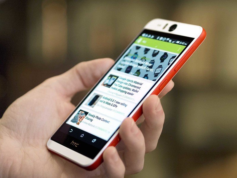
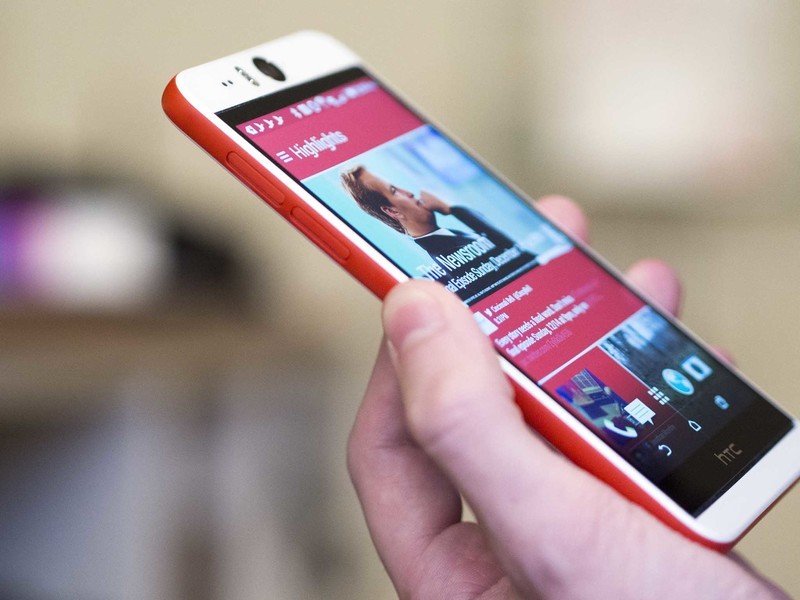
The HTC Desire Eye, however, is a surprising and kind-of crazy phone. The big center-mounted circular lens at the top dominates the face of the phone, like the eye of a cyclops. It's so dominant that you don't even notice that the phone's ringed in red, or how the the speakers are artfully hidden, or that there's a dual-LED flash up with that front-facing camera. For better or worse, the HTC Desire Eye is the selfie phone.
About this review
The HTC Desire Eye used for this review was provided by HTC, and we've been using it for the better part of three weeks now. It's running Android 4.4.4 KitKat with the HTC Sense 6.0 layer overtop with HTC's visual customizations, launcher, and other tweaks. As this is an AT&T-branded phone, we've used it exclusively on AT&T during this time, in both the Cincinnati and Columbus, Ohio, regions. This phone's also been connected to an Android Wear smartwatch (the Moto 360) for most of the review period.
HTC Desire Eye hardware
A big white cyclops phone
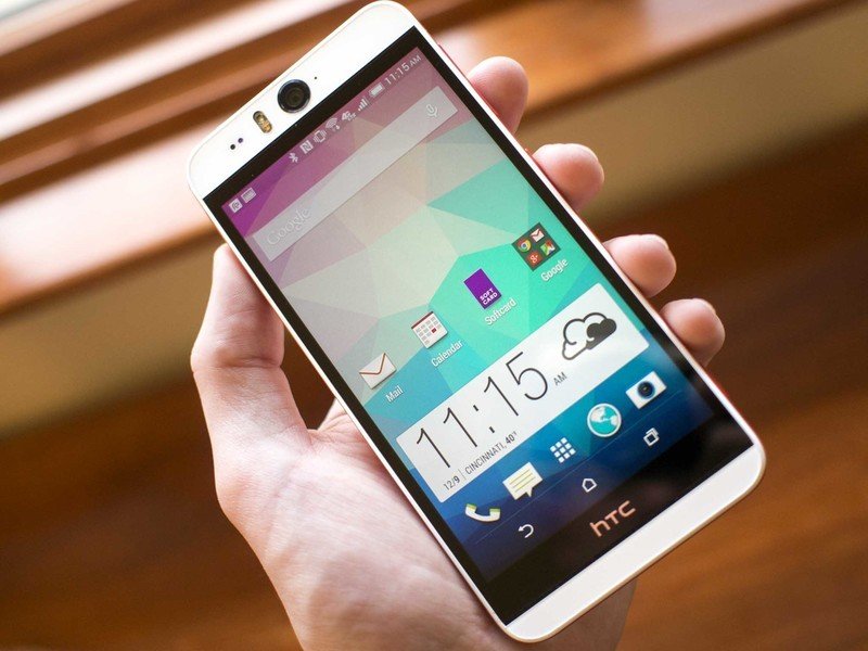
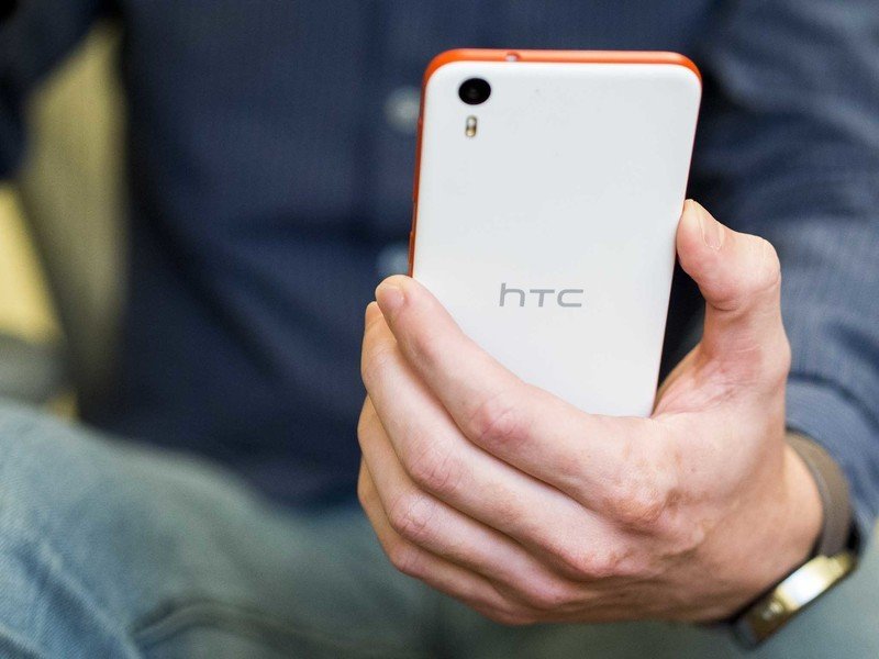
The HTC Desire Eye is not a subtle phone. It looks unlike anything on the market today. Where the HTC One M8 has a body made of smooth and curving aluminum that fits nicely in the hand, the Desire Eye is a big, white, plastic slab of a phone. There's also a blue version with a navy blue black and lighter blue slides, but that's not available from AT&T or directly from HTC.
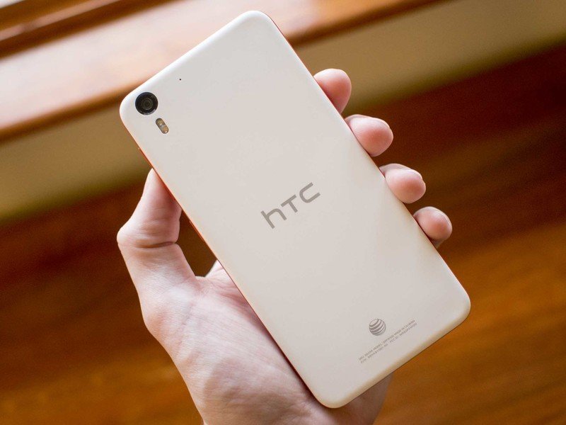
But to call it "plastic" is to downplay how solid this phone actually feels. This plastic isn't some thin, flimsy sheet that flexes or creaks when you push on it. If anything — or at least for those of us here in the U.S. who don't get to see HTC's Desire line too often — we'd say the manufacturing design is similar to the first-generation HTC One M7, feeling like a solid hunk of polycarbonate that's been machined out to create a cavity for the internals and openings for various parts that must protrude, as well as a ring of red plastic (it's more scarlet or vermilion if you want to get specific on your color palette) around the sides.
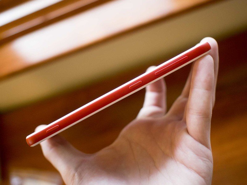
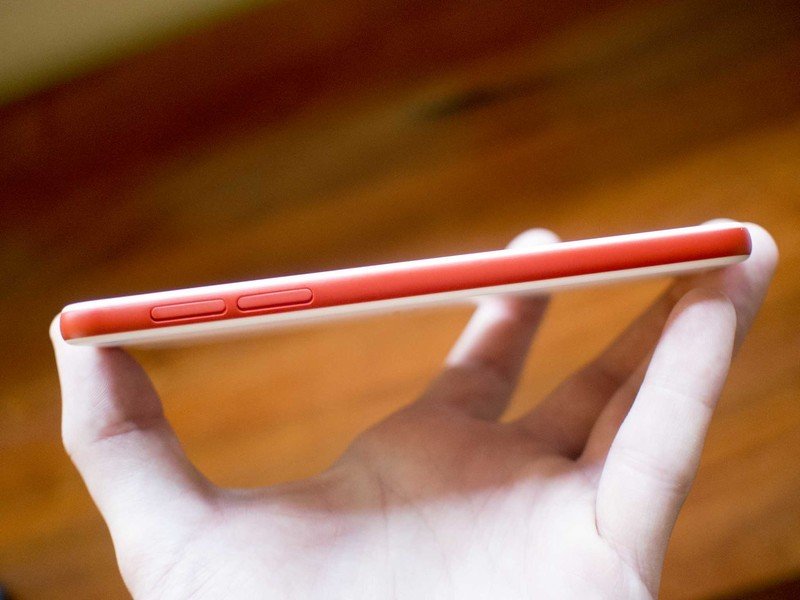
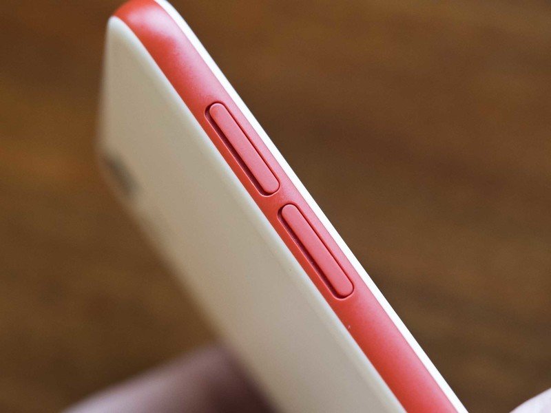
The Desire Eye does take a welcome break from HTC's layout for the M-series phones, moving the power button to the right-hand side with the volume buttons and a camera shutter button (more on that later). Sadly, the power button has the exact same texture and feel as the flat volume rocker just a quarter-of-an-inch to the north. In three weeks of using this phone I never got to the point of being able to consistently turn it on or off without absently pressing the volume down button a few times first.
Thankfully, HTC Sense includes the same Motion Launch wake gestures as its higher-end companions, and just like those others it still demands that the phone's motion-detecting bits have been at least lightly jostled before it'll start noticing gestures on the screen. That's meant to been triggered by picking up the phone, pulling it out of your pocket, or what have you, but it's a tad bit irritating when the phone's just sitting on your desk and the same gesture does nothing without you having moved it first.
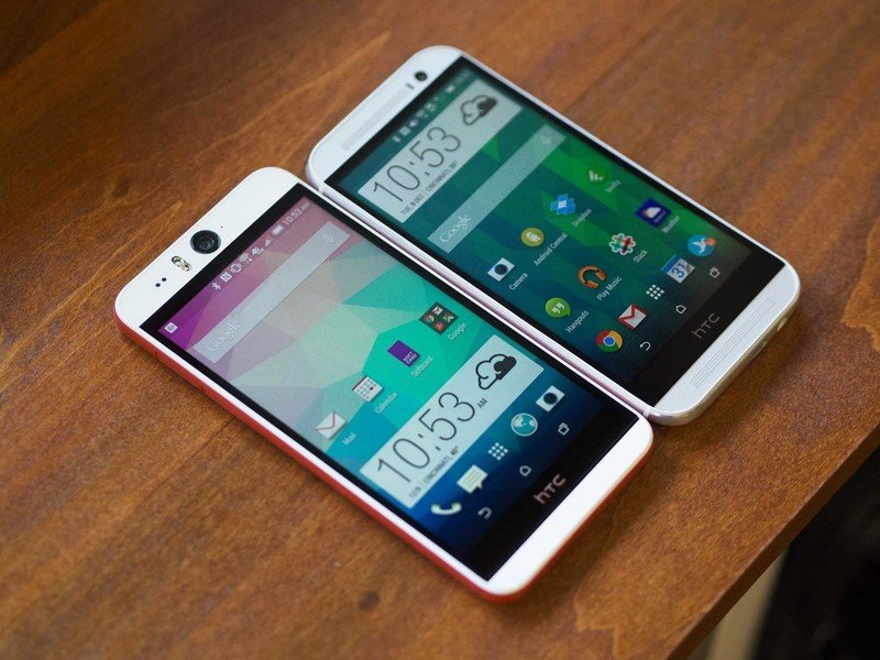
That screen that you can swipe is a 5.2-inch 1080p IPS LCD display. That's slightly larger than the One M8, but still well within the size range where the pixels are so small they disappear. It's an excellent screen, on par with what we've seen in HTC's flagship smartphones. It's bright, has excellent color reproduction, wide viewing angles, and in our time with it never exhibited any perceptible flaws.
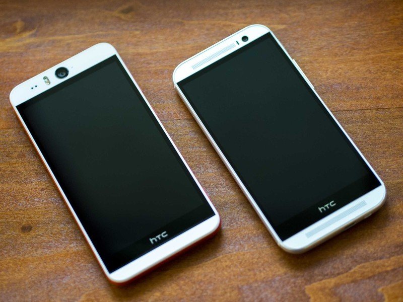
Initially glancing at the Desire Eye you don't notice any speakers. In fact, it wasn't until I started playing music out of it to check out the speaker power (I'm an unabashed fan of the BoomSound speakers on the One M8, even if the name is silly) that I had to ask where the sound was coming from. It turns out the sound is pumped out of slits just 1/16th-an-inch tall on the top and bottom of the display. With the black bezel around the screen and a black inset grill for the speakers flanked by the soft white of the phone's chin and, uh, forehead, the speakers simply vanish into the design.
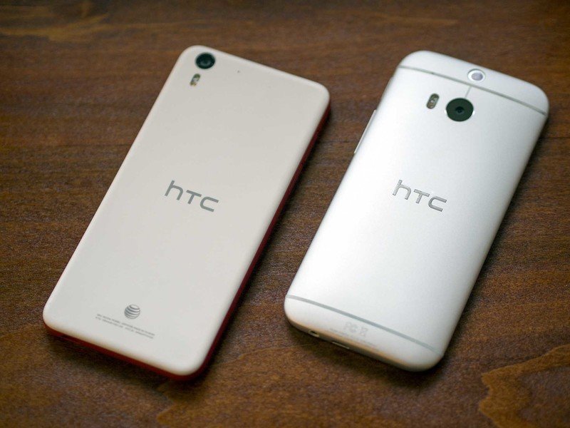
More than just about any other phone on the market these days the Desire Eye is a slab of a device. The cameras don't jut out at all and the back is a perfectly-flat expanse of white soft-touch plastic. The only curves you'll find are right near the edges of the phone, with a narrow bend wrapping up to the sides, and then a sharper corner wrapping around onto to the front face.
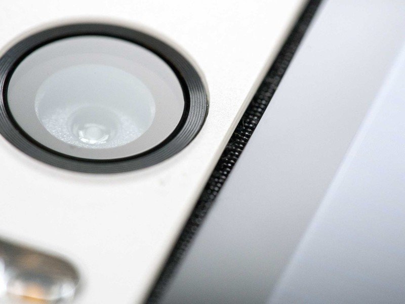
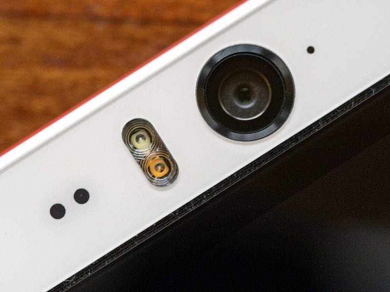
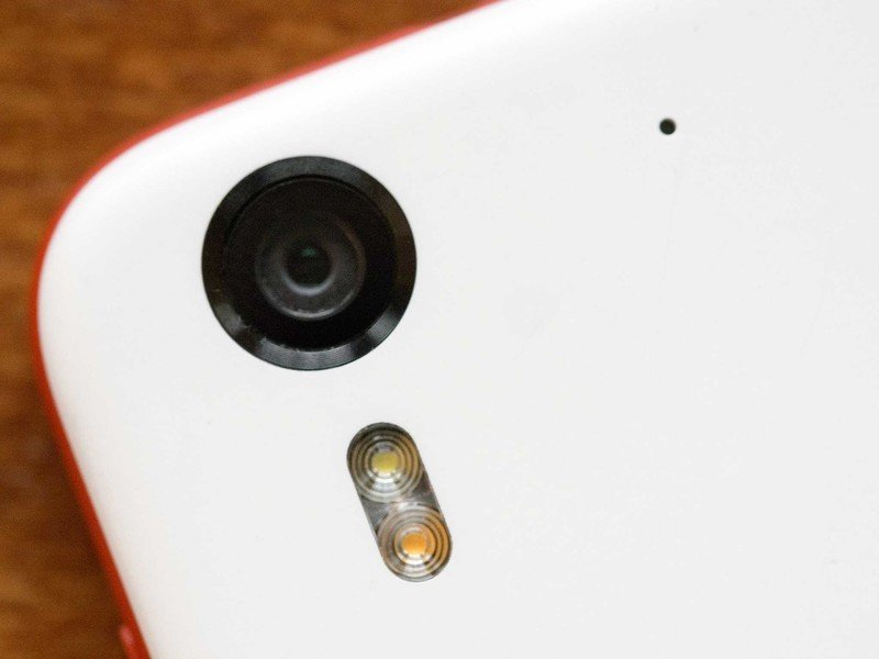
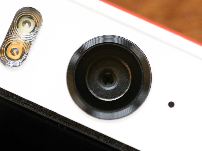
The chin at the bottom is a bit shorter than the One M8, though it's also not housing a large speaker grille. Conversely, the top of the phone is taller to accommodate the large lens of that 13-megapixel front-facing camera. That camera's flanked on the right by a bright little multi-color notification light, and on the left by a dual-LED flash and two holes for the ambient brightness and proximity sensors — all lined up along their center axes. It looks decent, but also it stands out like one of Margaret Keane's big-eyed paintings.
All of this combines to make a phone that both feels and looks large. We're talking about a device that's fractions of an inch taller and wider than the One M8 and actually even a hair thinner and barely lighter, but it just looks and feels massive in comparison. And the One M8's already a fairly large phone. The feel aspect can be attributed to its slab design — the flat faces mean it isn't nearly as ergonomic as the One M8's gently-curved aluminum, although that's not to say it's an uncomfortable phone by any means. Visually, the offsetting of the rear camera into a corner and the screen-printing of the HTC and AT&T logos onto the back opens a tall expanse of unbroken whiteness, and the white spans on the front make the phone appear wider than it actually is. The HTC Desire Eye isn't really that big of a phone, but it certainly feels that way.
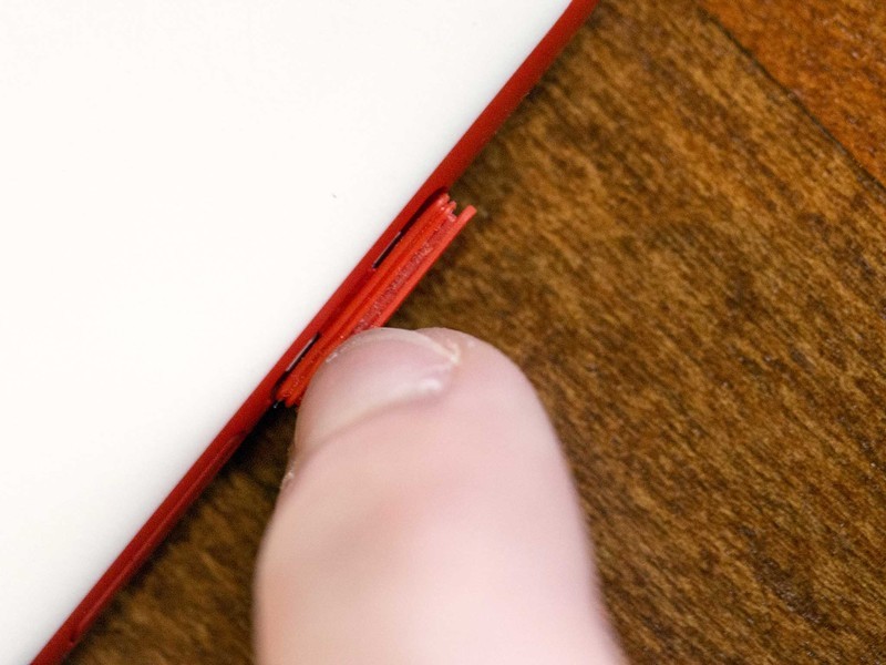
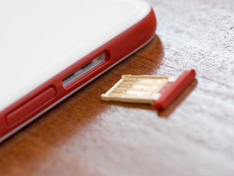
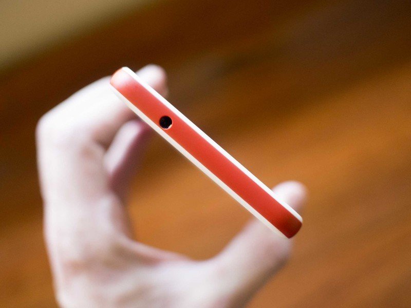
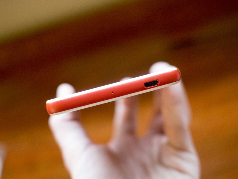
There is one very nice design touch here, though, and that's the trays for the microSD and SIM cards. Instead of requiring a pin or removal tool to poke into a little hole to eject the tray, HTC opted for trays with flaps that you can hook onto with a fingernail and pull right out. In typical HTC fashion, the Micro USB port at the bottom is reversed with the flat side facing forward, and is located off towards the bottom right corner.
Beating inside the Desire Eye is a 2.3Ghz quad-core Qualcomm Snapdragon 801 processor. It's the same chip found inside the One M8, and with matching 2GB of RAM and 16GB of storage. It offers microSD expansion of up to 128GB for those so inclined (those 13MP selfies will quickly fill up the space remaining after Android, HTC Sense, and the pre-installed AT&T apps have had their say).
Frustratingly, despite being a larger phone, especially in the volume department thanks to its blocky design, the Desire Eye has has a mere 2400mAh battery — a full 200mAh less than the more svelte One M8. That said, even with the slightly less-capacious battery I was still able to get a full-day's use and then some out of the phone. Even on days spent traveling while entirely off Wi-Fi I still went to bed with about 20% of the battery remaining.
Wrap it all together and you've got a solid offering for a flagship phone of early 2014. But we're heading quickly into 2015, and the Desire Eye's specs aren't terribly impressive in an age of mobile devices with 64-bit processors and Quad HD displays. The Desire Eye has at least been priced accordingly, ringing in at $149.99 on a 2-year contract with AT&T, as little as $18.34/month, or just $549.99 outright.
HTC Desire Eye software
Sense 6, through and through
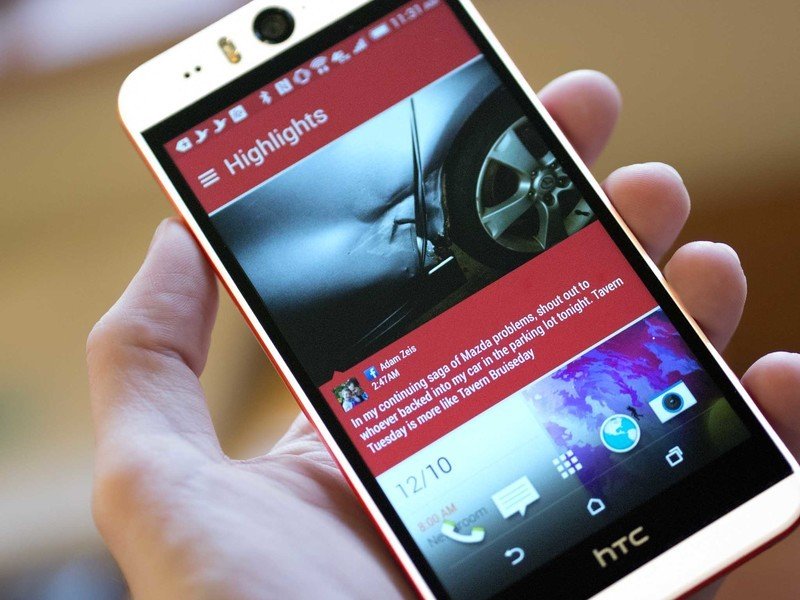
If you've used an HTC product in the past year, the Desire Eye's software experience will be quite familiar. It is running HTC Sense 6, after all, with everything that comes as part of that package. There's the custom launcher with its compact back/home/multitasking buttons, HTC's signature clock and weather widget, and a swipe from left to right to bring up HTC BlinkFeed. As always, BlinkFeed automagically aggregates content from your disparate social media accounts, calendar, and more to give you a clean and imagery-focused casual browsing experience.
The vertical-page-scrolling app drawer is also HTC's, and the out-of-the-box setting is a very spacious 3x4 icon grid. It's almost amusing in the amount of empty space it creates on the 5.2-inch display. As with other Sense devices you can change the spacing (I quickly opted for the 4x5 layout that increases the number of icons per page by 66%) as well as the sort order with options of alphabetical (the default), most recent, and custom (which also allows you to have folders within the app drawer).
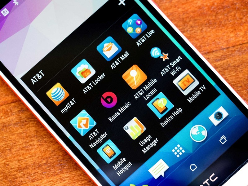
There's the typical assortment of HTC's own apps alongside Google's required apps, so you end up in awkward situations like having two apps named Calendar. Most of HTC's pre-installed apps are innocent enough, with entries like FM Radio, Music, Stocks, and Weather. It's the AT&T apps that really bring out the bloatware, with the carrier-backed Softcard mobile payments app (formerly unfortunately-named ISIS snagging one of the 8 default app slots on the front page.
Also from AT&T you'll find installs of AT&T FamilyMap, AT&T Live, AT&T Locker, AT&T Mail (which makes for three mail apps out-of-the-box), AT&T Mobile Locator, AT&T Navigator, AT&T Ready2Go, AT&T Smart Wi-Fi, Beats Music, Caller Name ID, Device Help, Drive Mode, For Kids!, Games, Keeper, KeyVPN, Lookout, Mobile Hotspot, Mobile TV, myAT&T, Uber, and YP.
Some of these are relatively innocuous — Device Help is merely a shortcut to the Desire Eye help page on AT&T's website. Others are downright annoying — along with the first few calls you receive you're nagged by Caller Name ID to sign up for their $2.99/month paid service (and this service is from a company called Cequint, not AT&T). None of these apps can be uninstalled to free up some valuable space, but you can at least disable them to hide their icons and stop the notifications. The letters "AT&T" also appear on the left side of the notification bar for 3 seconds every time you unlock the phone, just in case you forgot who you were paying every month for service.
Otherwise, it's Android 4.4.4 KitKat and HTC Sense 6. The only notable change comes in the form of the new "HTC Eye Experience" camera app, which has been made available for the rest of the HTC lineup (never say that HTC keeps the new toys only for its new phones).
HTC Desire Eye Cameras
13 megapixels in the front, 13 megapixels in the back
You might say that most smartphones are mullets when it comes to their cameras. They're restrained and conservative with the front-facing unit (the One M8 has a 5MP camera on the front, for example) and then go wild and crazy with the rear-facing sensor (see: the One M8's dual-sensor depth-of-field-enhancing UltraPixel camera). Business in the front, party in the back.
Most smartphones are mullets when it comes to their cameras — business in the front, party in the back. Not the Desire Eye.
Not so with the Desire Eye — it's a full-time all-around camera party monster. Turn the camera around and you'll find what are at first glance practically identical shooters on the front and back, seated in wide black circles in the phone's white plastic expanses. They even have the same dual-LED flash units. Yes, there's a dual-LED flash on the front of the Desire Eye. Not only will your selfies be bigger than ever before, they'll be better illuminated too.
There are some slight difference between the cameras worth noting, however. While they both have 13MP sensors, the rear camera has a larger ƒ/2.0 aperture versus the ƒ/2.2 on the front (meaning the front lets in about 3/4 as much light). The front camera also has an 88-degree wide-angle lens on it, making it so you can either hold your arm closer to take that selfie, or push your arm out a bit to fit in more of the scenery and/or your posse.
The proof is, as they say, in the pixels. Or is it the pudding? Regardless, the Desire Eye captures large images from the front and the rear. Unlike with the frustrating 16:9 rear-facing sensor in the One M7 and M8, HTC's opted for a more-traditional 4:3 set-up (though the settings still default to 16:9). Photos taken with the full sensor register at 4208x3120 pixels, while the cropped default 16:9 measures 2368 pixels across the shorter dimension.
A new thing on the desire Eye is the addition of a dedicated physical camera button, located at the bottom right corner of the device (or the top right corner when you turn it to landscape). This isn't the first HTC smartphone with a camera button (hello, Evo 4G, Windows Phone-powered HTC 8X, 8XT, and a few others), but it is the first in a few years to sport that particular button. Sadly, it's a disappointing button (and how strange it is to be disappointed by a button).
When it comes to camera buttons, there's only one acceptable type, and that's the two-stage button. With a two-stage button there are two levels to which you can push, with the first locking focus and exposure, and then the second actually taking the photo, with both levels having a well-defined tactile feedback as you push through. With these buttons you can give it a half press to the first level to get your lighting balanced and focus sharp, and then move the camera so that the photo's framed how you want (perhaps the subject you want properly exposed and in-focus, but not in the center of the frame) and then press the rest of the way to capture. You can also in a snap just push down all the way to quickly snap a photo or even use that button to wake the phone straight into the camera app.
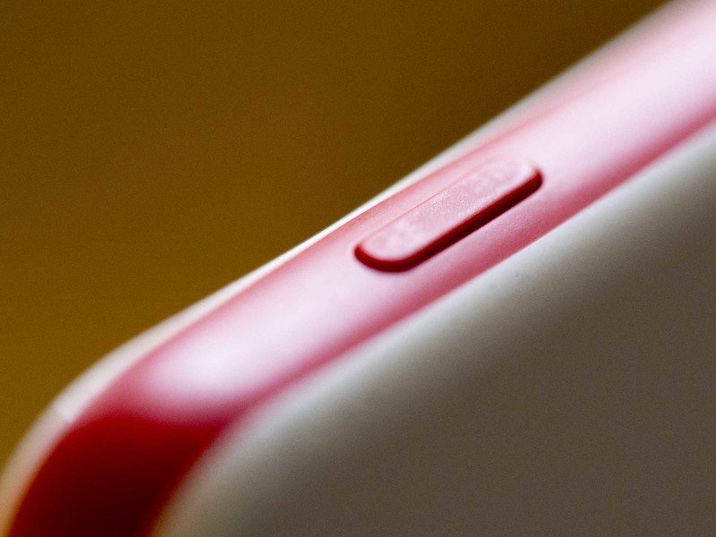
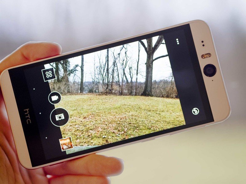
Normally I'd dedicate only a line or two of a phone review to a camera button, but in the case of the Desire Eye I've had to state how it should work to set the stage for how it actually works. It's not good.
The camera button on the Desire Eye in fact is a two-stage affair, with the expected behavior of a half press locking focus and exposure, and then a full press capturing the photo. The problem comes from there being precisely zero tactile feedback. As you travel to the halfway point the screen will alert you that AF has locked, and once you reach the bottom it starts snapping rapid-fire photos until you release. But getting to the point of actually firing off photos takes pressure — I felt like I was squeezing the phone, and with no "clicky" feedback as the button depresses, you don't really know what's happening until the screen starts to react.
It didn't have to be this way. The power button and both ends of the volume rocker are clicky, even barely audibly so. Previous HTC phones had nice tactile feedback in their two-stage camera buttons — I picked up an old HTC 8X I had around just to refresh my memory and it responded just as I would have hoped. But taking photos using the camera button on the Desire Eye was a labor.
After fighting with how much pressure it took just to activate the camera, I eventually gave up trying to use the camera button and just used the onscreen controls. Including the camera app as one of the default icons in the launcher's dock meant that I was always a swipe and a tap (swipe to unlock, tap to open camera) or a double tap and a swipe (wake the phone, swipe up the camera app from the lock screen to launch straight into the camera) away from being in the camera app thanks to Motion Launch. And I knew that if I pressed the shutter button on the screen, regardless of if I lightly tapped it or hammered at it, it would take a photo. It was a pain to use the button for selfie photos as well, requiring a less stable grip in order to apply enough pressure, which invariably meant vibrating the phone (thankfully the default settings included a 2-second delay for front-facing photos).
This might be how future generations look at photography, with physical camera buttons being anachronous to physical keyboards on smartphones. Some people set in their ways might want them and swear by them, and many old timers will look back on them with fond memories, but still embrace the ease of just tapping a screen. Or maybe we'll just get future smartphones with proper two-stage camera buttons.





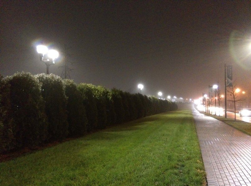
But what about the actual photos?
They're okay, but at least consistently so. The quality over quantity equation is a hard one to balance out. Having more pixels does result in larger images, yes, which can help to disguise some of the noise that's inherent in smartphone cameras with microscopic sensor pixels. So while we might complain about the meager 4 megapixels that you'd find in the One M8's camera, we find ourselves on the opposite end of the camera spectrum still mildly disgruntled with the results.
Where the M8 was supposed to give us photos that were amazing in low light with great depth of field and mostly delivered (although low-light was never as spectacular as we would have hoped), the Desire Eye should be delivering detailed photos in spades. The problem is that when you zoom in on that detail, you wind up with a noise-induced disappointment. Unrelated to the pixel count, the photos tend to either be bright to the point of nearly being blown out or dim and muted, with very little in between. HTC's editing software is nice, but the adjustments focus almost solely on faces, and if there are none to be seen in the scene, there's no magic allowed to be wrought.


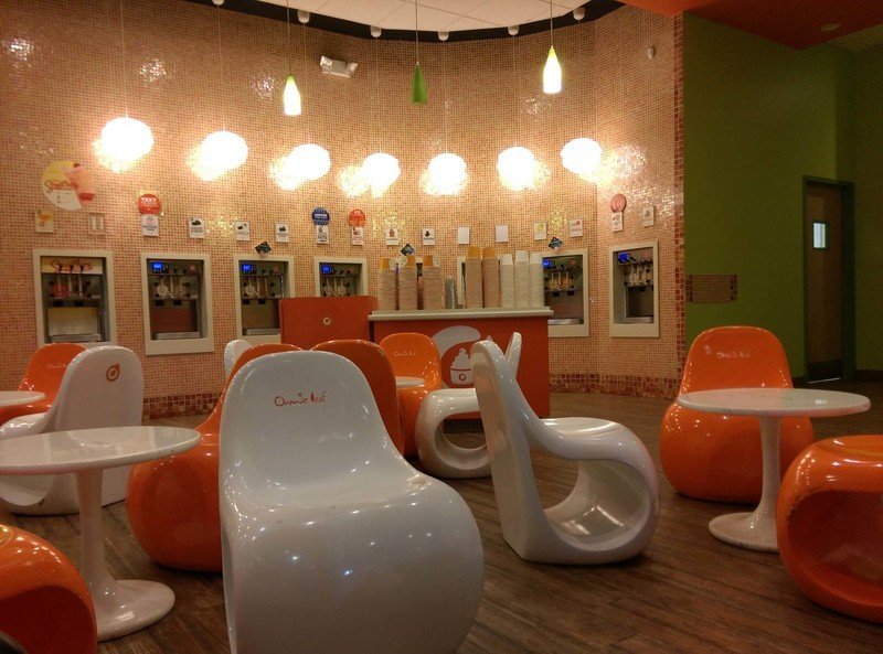


Like I said, it's hard to balance. And we have to wonder why exactly we need 13 megapixels on the front camera. The vast overwhelming majority of the time (we'll go out on a limb and say 99.9 percent of the time), that camera is going to be no more than three feet from its subject. You know, arm's length. And that's really stretching (literally). Maybe you'll get a selfie stick and go a bit further out. Regardless, 99.9 percent of the time you're going to be viewing that photo through a social network, be it Facebook or Twitter or Instagram. You're not going to see it at full resolution and you're not going to have to zoom in and crop to just your face because your face is going to be filling the frame to start.
Aside from the sheet size of the image, we're not sure what benefit is actually offered here. Even the 5MP front shooter in the One M8 can shoot 1080p video, and the Desire Eye's 13MP cameras don't shoot 4K video. For a camera that's aimed at taking selfie photos, the Desire Eye really takes just very large just-okay selfies.



And that front-facing flash? You'll never want to use it. At 2-3 feet away it's blindingly bright for night time photos and will completely wash out and flatten the faces you're wanting to capture. I had hopes it might help a bit as a fill light for evening shots, but there's a very narrow range of ambient illumination where it's actually useful. Like all cameras with built-in flashes, be it a smartphone or a full-size DSLR, it suffers from the same problem — the flash is too close to the lens to be good for anything other than providing illumination for utility photography.
The HTC Desire Eye in real life
Surprisingly inconspicuous
Perhaps it comes from my history as a smartphone enthusiast, but I tend to notice what phone a person is using, and it's fairly rare that I don't recognize a smartphone (although I was briefly thrown for a loop the other day by a cased HTC Droid DNA). It's with that skewed perspective that I look at the HTC Desire Eye and see a phone that's conspicuous in its design among my collection of devices. But to the average person it's just another phone — it might look a little different, but I imagine it's something like my reaction if I'm ever found on a golf course. Sure, your club looks swanky, but seeing as I know next to nothing about golf and don't really care about golf, I really know if that's something unique or special, or muster the willpower to care.
So using the HTC Desire Eye in public I didn't get the kind of reaction I'd anticipated, and certainly not the kind of reaction I got when I had an iPhone 6 for the first months of availability — "Is that the iPhone 6? Can I hold it?" — and still do occasionally today. With its big white slab back, red sides, and giant cyclops camera, I thought this phone would stand out. It still does to my eyes, but to the public at large it's just another anonymous slab phone. I did have one person as me if it was the new Galaxy; what a difference marketing dollars makes.
The Snapdragon 801 processor and 2GB of RAM was up to any task I threw its way, and in all the time I used the phone I can't recall running into a single moment of lag or glitchiness. When it comes to being a phone, the HTC Desire Eye works. Only when I ventured into known weak signal areas did I see issues with connectivity, and it performed as well as any other AT&T phone I've taken there has. Wi-Fi, GPS, LTE, and Bluetooth all worked as expected.
As I mentioned earlier, this phone packs a 2400mAh battery. HTC quotes a battery life of 20 hours 3G talk time and 538 hours of 3G standby time. These are pretty much meaningless stats, though, as the average smartphone user barely spends 15 minutes a day talking on the phone, nearly that long reading and sending text messages, and an increasing amount of time using apps, browsing the web, and other data-intensive activities. Talk time as a metric is hardly useful to the modern smartphone user.
In my own mixed usage, which consisted of browsing the web with Chrome, checking Twitter via Tweetings, and frequently diving into Hangouts, Feedly, Gmail, plus the occasional dalliance with Google Maps for navigation, a rare phone call, and, of course, taking a bunch of photos of myself, I saw pretty decent battery life. Unplugging at 8 a.m. and spending an entire day away from Wi-Fi I still had about 20 percent left on the battery when I connected to a charger at 1 a.m., a full 17 hours later.

The Bottom Line
Getting down with your big selfie
The Desire Eye isn't getting a big marketing push from HTC or AT&T right now, but I can imagine how it would look: 30 seconds of people taking selfies. Teenage girls, grandpa, a couple at a nice dinner, a race car driver, an astronaut, and Robert Downey, Jr. The HTC Desire on AT&T: Share your inner selfie.
That 13-megapixel camera is the main selling point of this phone. Compared to the HTC One M8 it has the same processor, RAM, and storage, the same speakers, and a slightly smaller battery balanced by a slightly larger display. The big difference comes down to the cameras, where the Desire Eye bests the One M8 sheerly on the specs count. But where the rubber meets the road, these cameras aren't terribly impressive. The pictures they produce are fairly underwhelming for being the focus of this phone.
But despite this being the "selfie phone," there's more to the HTC Desire Eye than just the cameras. It boasts an excellent screen, great stereo speakers, decent battery life, and a design that though blocky, is unique and rock solid. The software is stable and generally intuitive, and HTC's Sense customizations are inoffensive at their worst, and in many cases actually somewhat useful.
But I can't help but feel that the marquee feature of the Desire Eye is little more than a gimmick. The flash on the front-facing camera is overpowering and the sensor itself seems to be being sold more on its specs than its actual quality. When the selfie I'm taking is heading to the 640-pixel squares of Instagram, what good are 13 megapixels?
The very nature of the selfie is that it's a personal photo. The person taking the photo is its subject, even if there are other people or a background visible, it's about saying that I am here doing this. You don't need thirteen megapixels and an ƒ/2.2 aperture to tell that story. Whether you're in front of the new Google billboard at Times Square, duck-facing with the Eiffel Tower in the background, or crowding in with Ellen DeGeneres, Brad Pitt, and Jennifer Lawrence at the Oscars, 13 megapixels just seems like overkill. A selfie is about capturing the moment and the emotion, not the fine details.
That said, if selfies really are your thing, there's a case to be made for the HTC Desire Eye. By capturing those finer details your selfies can be the sharpest in town, with all that noise and artifacting eliminated once the huge image is scaled down to social sizes. And with the right lighting and possibly a bit of tweaking of the photo with the included software you might just be able to make a selfie worth printing, framing, and hanging on the wall. Whoever thought that someday we'd be saying that about the front-facing camera of a smartphone?
Derek Kessler is Special Projects Manager for Mobile Nations. He's been writing about tech since 2009, has far more phones than is considered humane, still carries a torch for Palm (the old one), and got a Tesla because it was the biggest gadget he could find. You can follow him on Twitter at @derekakessler.
