HP Slate 7 Review
Get the latest news from Android Central, your trusted companion in the world of Android
You are now subscribed
Your newsletter sign-up was successful
A titan of Silicon Valley, HP has seen more than its fair share of struggles over the past few years. The company long has grappled with the tablet formula, though often at the mercy of whatever Microsoft pushed down from Redmond. They've launched several Windows XP and Windows 7 convertible tablets, and most recently launched a pair of Windows 8-powered tablets.
But they've all been more PC than mobile device. The most spectacular of HP's consumer failings in recent years came in the form of a mobile-derived tablet: the webOS-powered HP TouchPad. Unveiled in February 2011 and launched in July of the same year, the TouchPad was generally well-received by the technology press but failed to catch on with consumers. Of course, one could easily argue that given its cancelation 49 days after launch it didn't have a chance to catch on. But all that is in the past, and after two years of turmoil, HP's dipping its toes back into the tablet waters.
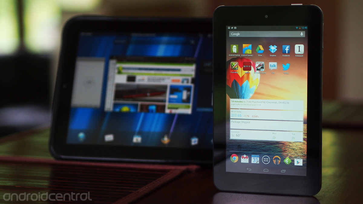
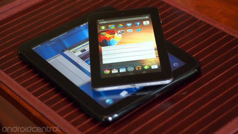
Where the TouchPad ran webOS 3.0, had a 9.7-inch screen, and carried a $499.99 price tag at launch, HP's newest tablet offering tacks in a different direction. It's the HP Slate 7; it runs Android 4.1.1 on a 7-inch screen, and it's priced at an affordable $169.99. Unlike the Google-financed Asus Nexus 7 and Amazon's Kindle Fire tablets, HP doesn't have a software ecosystem to be supported by selling the Slate 7 at or below break-even. Even so, it looks like it should be competitively spec'd for its price bracket - but how does it really measure up?
Article continues belowPros
- The Slate 7 ships with nearly "stock" Android 4.1.1 and offers (in theory) better sound quality thanks to Beats Audio integration. Additionally, the tablet is well put together, with a metal band around the edges and a nice soft-touch backing.
Cons
- But for all the goodness that comes with practically unadulterated Android, the tablet is a massive letdown. The screen is just awful. And so are the speakers. And the cameras. And despite internals that should compare favorably to older tablets like the Nexus 7, the Slate 7 just feels so much slower.
The Bottom Line
| HardwareSoftwareCamerasBottom line | HP Slate 7 ForumsHP Slate 7 initial hands-on |
HP Slate 7 Hardware
For just $169.99, the HP Slate 7 comes with a decent set of specs. It starts with a dual-core 1.6GHz ARM cortex A9 processor, 1GB of RAM, and 8GB of storage. Thankfully, that paltry storage can be augmented by the addition of a microSD card into a slot on the tablet's top, though you'll be limited to 32GB for that card. The front is dominated by a 1024x600 screen, but it's easily one of the worst we've seen (at least since the last 1024x600 tablet we looked at) with poor viewing angles and a screwy aspect ratio (much more on that later). It's all wrapped in a case that seems more reminiscent of an HP laptop than a modern tablet, though that might be what HP's going for here.
Get the latest news from Android Central, your trusted companion in the world of Android
Build quality
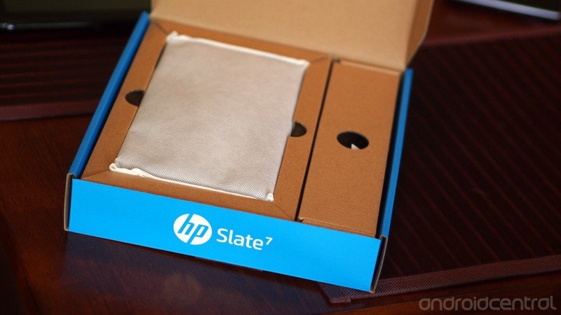
The box that the Slate 7 comes in might take you by surprised. Bucking the trend towards more compact packaging, the Slate 7's box is mere millimeters smaller than the box for the old 9.7-inch TouchPad. The outside of the box is nice enough with a clean design and a relative dearth of specs and logos, but as soon as you open the lid the experience quickly veers away from the premium look of the box.
The tablet is wrapped in a papery mesh fabric sleeve and nestled in a nude cardboard tray. Under that is a large space for a few pages of mandatory advisories and a quick-start guide. Filling up empty space on the right side is a bulky and cheap-feeling AC-to-USB adapter divided into a USB block and the AC plug (as if to imply that there are swappable international plugs) and a short Micro USB cable. Normally we don't really cover packaging here, but the size of this box and the empty space inside seems to imply that the Slate 7 might be the first in a series of Android tablets from HP, with plans for larger screens that would make better use of the space inside this box. Though we have to wonder how much money would be saved by using the same box (not to mention the consumer confusion from a 7-inch and 10-inch tablet coming in the same size box).
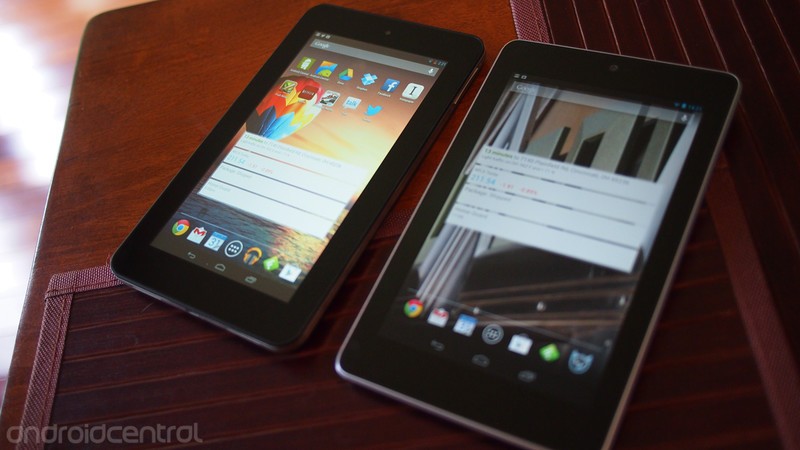
Lifting the Slate 7 out of its cardboard tray, we were surprised by its heft. The Slate 7 is a hair thicker than the Nexus 7 and weighs a smidge over an ounce more (13.05 oz vs. 12 oz), but somehow it feels much heavier than that (at least until you compare each one flat in both hands). The apparent difference comes down the the build - where the Nexus 7 is nicely tapered and rounded right from the edge of the display, the Slate 7 has a squared-off lip around the screen that drops vertically for about a quarter of an inch before angling back to a slightly-rounded backside.
The design feels and looks more like a cheap laptop than a tablet. At least the Slate 7's back plate is coated in a nice soft-touch material, and it comes in both red and gray (though the front will continue to be black glass and the sides a ring of matte-finish metal regardless of the back color you choose). Those square sides also give the Slate 7 a thick appearance, which certainly isn't going to help its shelf appeal when its set up next to an iPad Mini or Nexus 7.
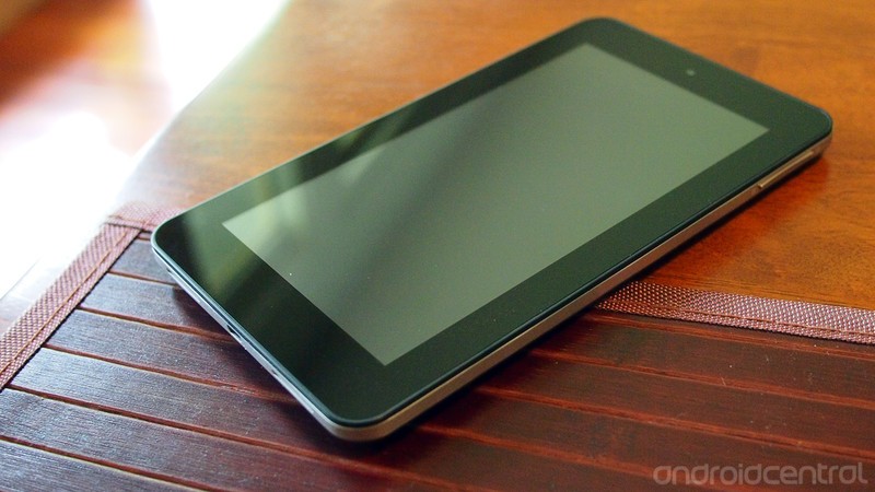
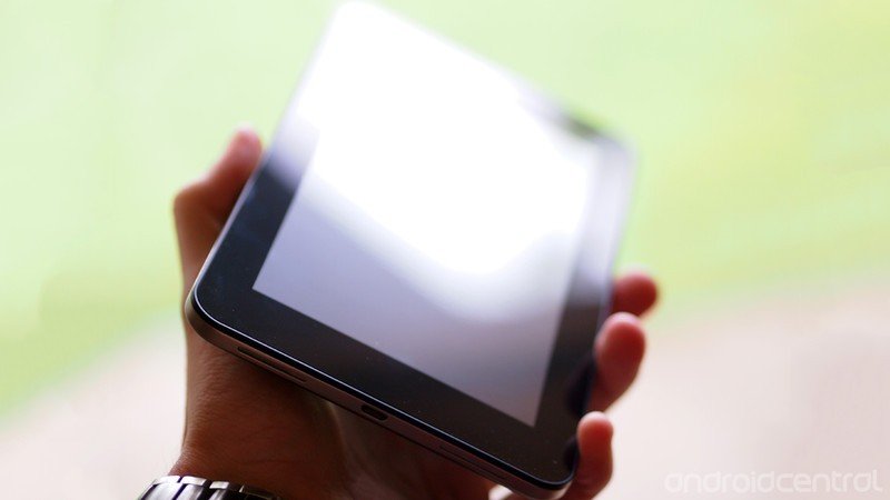
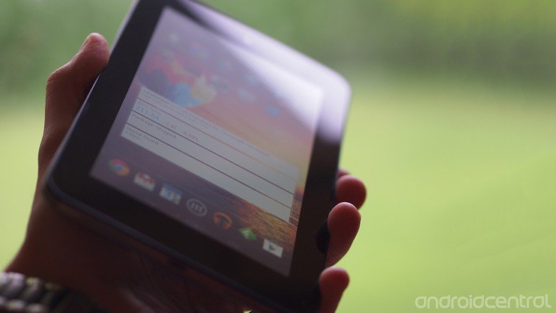
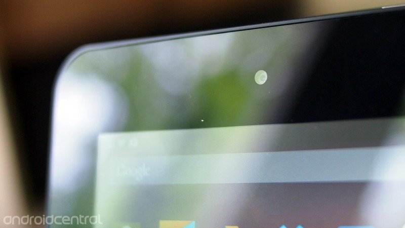
Giving the tablet a tour, the front is as so many tablets are these days: a sheet of glass over a screen and rimmed in a black bezel (here about half an inch on the sides and three-quarters on the top and bottom). A lone VGA camera sits at the top center of the screen. The screen itself is a 1024x600 affair. It's close to 16:9 in landscape, though a little taller than the favored widescreen cinema format. To be accurate, it's 16:9.375. But we'll touch more on this screen later on in the review. The black glass of the screen is ringed by a thin black plastic band that both protects and holds in this front panel.
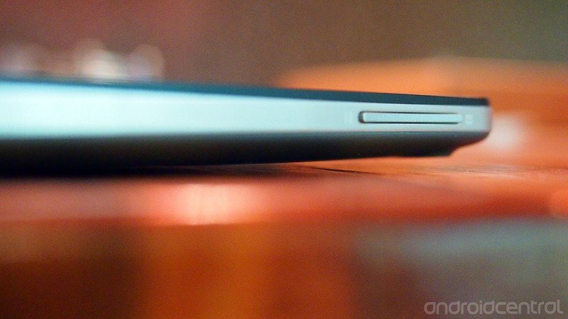
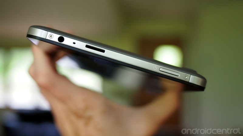
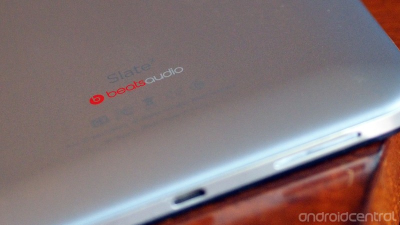
The top of the Slate 7 plays host to a 3.5mm headphone jack, which in accordance with its Beats Audio designation is physically isolated from the rest of the tablet's internals, as well as the single pinhole microphone, an exposed microSD card slot, and a rectangular power button. There's a silk-screened power symbol next to the requisite button, but oddly HP opted not to put one next to the microSD slot, which is far more ambivalent in appearance than the power button. Contrary to the usual unibody-style design of modern tablets, the Slate 7 also sports a pair of small Torx screws holding down the discrete metal top plate, and presumably also holding together most of the rest of the tablet. The ends of the metal ring that wraps around the other three sides actually curve in slightly at the top, one of the few fit-and-finish issues we've had with the Slate 7.
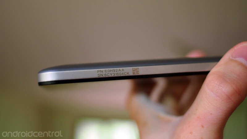
The right side holds a one-piece volume rocker with silk screened + and - icons. The rocker and the power button both have a good feel to them, depressing distinctly with our pushes but not making noticeable noise in the process. Towards the bottom of the left side one finds the product number and serial number, again silkscreened onto the metal band along with a tiny scannable code of unclear purpose. Their location and size here on the metal band makes us think more of an internal prototype than a production device.
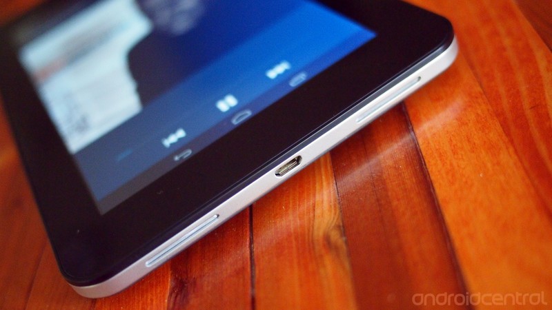
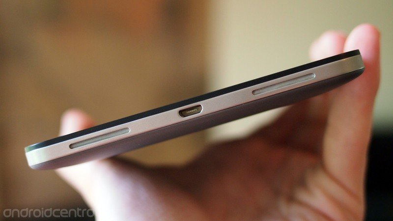
The bottom of the Slate 7 is punctuated by three openings. In the center is a Micro USB port (inverted). It is flanked by a pair of slots that comprise the extent of the openings for the Slate 7's speakers. A fine mesh sits between the outside world and the speakers inside, which are frankly of just poor quality.
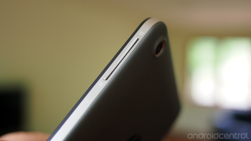
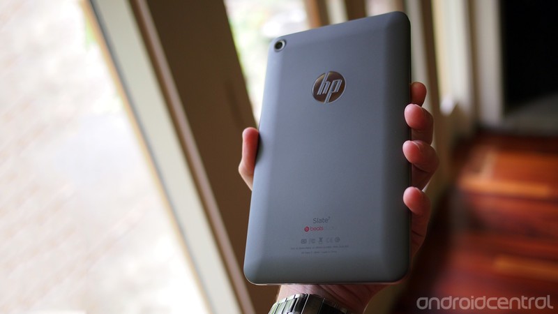
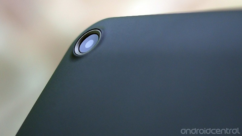
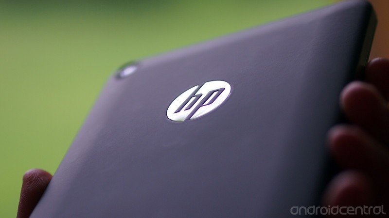
The back of our Slate 7 is a soft touch medium gray. It's a welcome change of pace compared to the typical raw metal or slick plastic that so many other manufacturers build their tablets out of these days. Under that soft coating is plastic, which flexes in the middle of the back with barely a push. A reflective silver HP logo sits towards the top of the back, ready to receive a fine brush coating from real world use. At the top right (with the screen facing towards you) on the back is the Slate 7's rear-facing camera. It's a 3 megapixel unit and is set down inside a raised ring - something like a crater - on the sloped edges of the back. Moved half an inch towards the center of the tablet and all that would have been required would be a simple circular hole instead of a raised protective ring, but we're not the hardware designers here.
Display
While the build quality of the HP Slate 7 seems decent for its pricing, the same cannot be said for the screen. At 1024x600, the Slate 7's screen is one of the lowest resolution screens we've ever reviewed on a tablet. In fact, it's the same resolution as the original Samsung Galaxy Tab… from 2010. The Slate 7's screen is decently bright, but the contrast it provides is so poor that ramping up the brightness results in blacks become a noticeable gray. On the subject of brightness, the Slate 7 does not have an ambient illumination sensor, so there's no automatic brightness control available. At lower brightness levels the screen exhibits a visible and distracting flicker.
The viewing angles on the Slate 7 are also poor, with colors starting to wash out the instant you get more than a few degrees off center. Supposedly the LCD display here comes with an IPS-based tech called "Fringe Field Switching" that's meant to help viewing angles, but we struggled to find the benefits in real world use.
Text on the Slate 7 is generally rendered as well as it could be for the low resolution. By throwing Android 4.1 onto the tablet with minimal alterations, in many places the out-of-the-box text size is too small to be rendered cleanly. This is especially evident in the launcher (again, it's stock Android 4.1 here), where the labels on app icons are inscrutably tiny and pixely. It might be our poor eyesight here, but things were markedly improved by ticking off the 'Large text' option under Accessibility in Settings. Of course, that means that then all your text (or at least in apps that obey the large text accessibility command) is going to be bigger.
The poor quality of the LCD means it's also susceptible to burn-in. The first signs of this showed during the initial set-up, when the Slate 7 displayed the on-screen keyboard for account log-in, and when it was dismissed the ghost of it remained for several seconds on the medium gray background while our log-in was processed. After getting everything set-up we hopped online to test if what we had seen was an anomaly, and sure enough after trying out a set of web-based burn-in tests we were repeatedly greeted by the ghosts of burn-in. Considering the static aspects of the Android interface, namely the top bar with your notifications and status icons, having burn-in kick in after just a few minutes doesn't bode well for the long-term viability of the display.
But low resolution, poor contrast, narrow viewing angles, burn-in, and no auto brightness are far from the worst sins committed by the HP Slate 7's display. No, the Slate 7 commits a sin so unforgivable with its display that we simply can't recommend anybody purchase it: the pixel grid isn't square.
The Slate 7's display is a 7-inch number that is 600 pixels wide and 1024 pixels tall, a ratio of 1:7.066. But the actual real-world dimensions of the Slate 7's display are 4.4375" (112.7 mm) wide and 6.0625" (154 mm) tall, giving an aspect ratio of 1:7.636.
What this works out to is a screen that's been stretched by 4% along the vertical axis. Instead of filling the space with more pixels (or, you know, just making the device fit the 5.86" inch-tall screen that the 4.4375" width would dictate at that resolution), the screen seems to have been stretched to fit the available space. Given the flat 'Holo' nature of the Android 4.1 user interface, the stretched pixels of the Slate 7 screen immediately become obvious when one looks at a circle or square or other shape that should have predictable or constant ratios.
When the Slate 7 is held vertically, everything is 4% taller than it should be, and when in landscape it's all 4% wider than it should be. While 4% might not seem like a huge deal, it means that everything displayed on the Slate 7 isn't true to reality. Photos are skewed, text is stretched, and circles are ovals. It stood out to us from the instant we booted the Slate 7 - HP's circular logo was noticeably stretched taller in its boot animation. While testing the Slate 7 we tried to ignore it, swore that it must be our eyes playing tricks on us (even if they never had with the Nexus 7 or any other device we've tested), but in the end we found ourselves busting out a ruler to measure the display and on-screen elements. Sure enough, everything was distorted.

This is a tablet being produced in 2013 by a company that comes to us with decades and decades of experience in consumer electronics. We can forgive poor contrast ratios and viewing angles as simply the compromises one has to make in order to buy a tablet for as little as the Slate 7 costs. We can deal with inaccurate color and dim backlights. But to ship a tablet with a display so poorly thought out as to have pixels that aren't arranged in a square grid, well, that's not something we can forgive. You might think it unimportant, but know that you're not going to want to use the Slate 7 to show off any photos from Google Plus or Facebook, as they're going to make faces like yours and your friends' look all fat. Yeah, we thought you wouldn't like that.
For $169.99 we expected the Slate 7 to not have a fantastic display. But we didn't expect that we would be scraping the bottom of the discount reject barrel with this display. It's just plain awful.
Radios and battery life
The Slate 7 has a handful of sensors and radios available to customers. There's an accelerometer, and that's all you're getting in the form of sensors. Radio-wise you get two: Wi-Fi 802.11b/g/n and Bluetooth 2.1. No GPS, no Bluetooth 4.0 or even 3.0. Both radios performed up to the standards we expect in this day and age, with nothing standing out about their performance. Which is all well and good. The accelerometer also works as expected, rotating the tablet from landscape to portrait and coming into play in a handful of games.
The Slate 7 packs a 3500 mAh lithium polymer battery into its chunky case, which HP quotes as good for five hours of video playback. We saw no reason to doubt that number - watching some videos on YouTube and playing some light games like Fruit Ninja for two hours lopped off about half our battery life. Of course, your results will vary based on your use - just reading stuff off the web won't kill the battery as quickly as streaming music from Play Music while blasting through racing circuits in the latest installment of Need for Speed. Just know that if you plan on using the Slate 7 all day, the battery simply isn't going to make it.
Beats Audio
While HTC has secured the rights for Beats Audio on smartphones, HP has for several years held the rights to Beats Audio enhancements for laptops. By some quirk of the contract, that means that HP also holds the rights to Beats Audio for tablets. The HP TouchPad two years ago sported Beats Audio integration and a pair of the best speakers we've ever heard from a tablet, even today. The gist of Beats Audio is a special bit of audio processing that ends with both volume and bass getting boosted (there are people that like that, and you might be one of them, though we tend to prefer more true-to-life audio output) and the headphone jack being electronically isolated from the rest of the system.
The Slate 7 carries on the tradition of Beats Audio integration, but unlike the TouchPad, it's hardly noticeable. The speakers on the Slate 7 are no better than the Nexus 7's. And yes, that is plural - the Slate 7 does have two speakers. But since they're separated by less than two inches on the bottom of the tablet, there's absolutely no discernible stereo separation between the two drivers.
The 3.5mm audio jack on the top of the Slate 7 is supposed to be where the real Beats Audio magic happens. After all, it's got a special equalization going for it, and it shouldn't have any static or distortion induced by interfering electronics (because that's suuuuuch a problem with other smartphones and tablets). But, in our testing with everything from basic headphones to home theater speakers, the only noticeable difference from the Slate 7 to the other Android tablets out there was a tiny bit of a boost to the bass ranges in music and videos. Supposedly you get the best benefit from pairing the Slate 7 up with a set of Beats Audio headphones, but we're not going to spend the hundred-plus dollars for just earbuds with even more trumped up bass, let alone the $200 or more that a pair of full-on Beats headphones will cost you. If you're listening to music with a pair of headphones that cost more than the device that's outputting said music, you might be doing something wrong.
Thankfully, Beats on the Slate 7 is easy enough to turn off. In one of the handful of modifications HP's made to Android 4.1 on the Slate 7, a Beats Audio page has been added to Settings under Device (nestled between Sound and Display). It gives you the option to toggle Beats Audio on or off, as well as select your style of headphones: Beats On-Ear, Beats In-Ear, or Beats Passive. Being the purists that we are, we'd say "Turn it off!", but honestly you're not likely to notice a difference. For the one logo other than their own that HP put on the front of the box for the Slate 7 and the tablet itself, Beats here turns out to be a massive letdown.
HP Slate 7 specs
- Android 4.1.1
- 7-inch 1024x600 LCD display
- Dual-core 1.6GHz ARM Cortex A9
- 1 GB DDR3 RAM
- microSD slot
- 8GB internal storage
- 3MP rear camera
- VGA front camera
- Wi-Fi 802.11 b/g/n
- Bluetooth 2.1 with EDR
- Micro USB 2.0, 3.5mm audio port with Beats Audio
- Accelerometer
- 3500 mAh lithium polymer battery
- 7.76 inches (197.1mm) x 4.6 inches (116.07mm) x 0.42 inches (10.66 mm)
- 13.05 oz (369.96 g)
HP Slate 7 Software
Launcher and interface
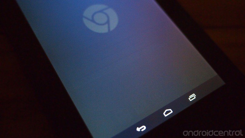
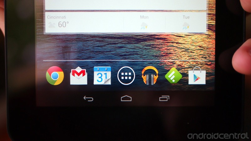
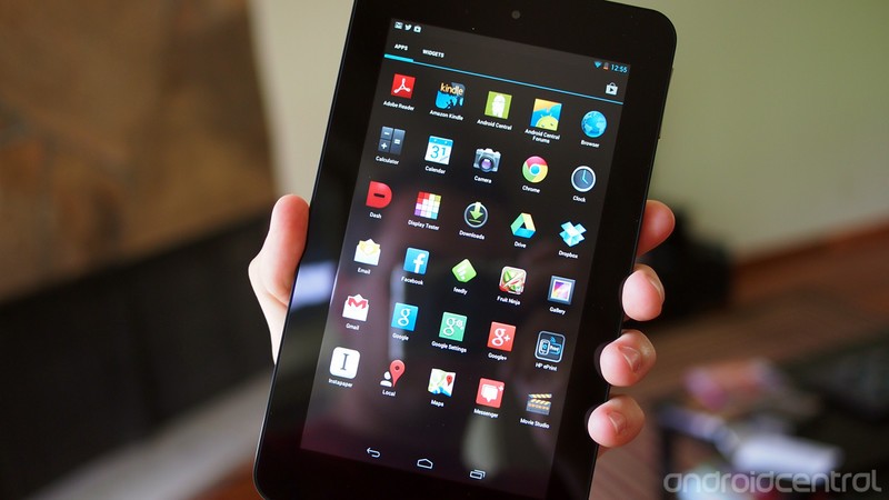
When we say that Android 4.1.1 on the Slate 7 is almost entirely unadulterated Android 4.1.1, we mean it. There's no skinning of the launcher, the on-screen navigation buttons are just as they are from Google, and the app launcher works just as it would on a Nexus device.
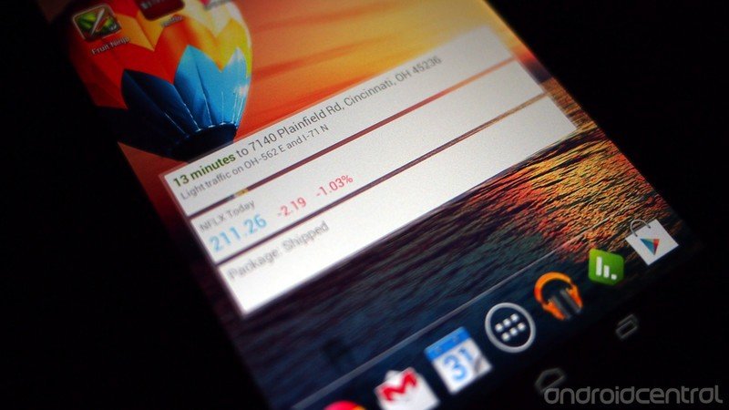
HP's made so few modifications to Android for the Slate 7 that we can count them on one hand. There's (1) the Beats Audio control panel, (2) switching to an annoying (but still easily-disabled) typewriter-derived set of sounds for the keyboard, (3) a default background image of a hot air balloon over a body of water in front of a setting sun with lens flare (oh, the poor Photoshopping at work here), and (4), well, that's it.
HP took basic hardware and threw Android 4.1.1 on it with minimal changes. Why they had to change the keyboard sounds to something so grating is beyond us. Guess HP had to put their mark on this one way or another. We won't say anything about what using the sound of an extinct technology like a typewriter says about HP.
Bundled apps
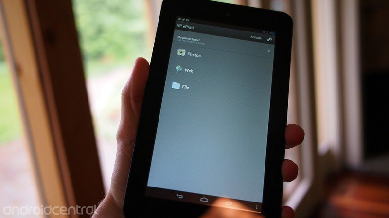
Like the light modifications to Android itself (and if we're being honest, a default background hardly counts as one), HP's taking it easy the bundled apps. If we discount the standard set of Google apps (Gmail, Calendar, Chrome, Play, etc), there's just one: HP ePrint. If you happen to have a networked HP printer or one that supports HP ePrint, then you're in business for wireless printing. If you don't, then you'll have to figure out how to put words and images onto dead trees like every other schmuck.
Performance and usability
With a full gigabyte of RAM and two 1.6GHz Cortex A9 processing cores rocking away between the awful screen and plastic back and pushing Android that's not carrying the overhead that comes with a custom skinning job, you might think the HP Slate 7 would rock right along. If you thought that, then we've got bad news for you, for it most certainly does not. The no-name processor in the Slate 7 can't seem to keep up with the demands of Android 4.1.1. Even with the high frame rates of Project Butter working behind the scenes, the Slate 7 randomly stutters on even simple things like rotating while in the launcher.
While the 1GB of RAM in the Nexus 7 seems to usually be up to the task of doing what needs to be done, somehow that same RAM on the Slate 7 doesn't seem to be enough. Apps constantly need to reload when switching, even if you've only been gone for a short time. Lag is evident in games as simple as Fruit Ninja, and while more intensive ventures like Need For Speed were functional, playability suffered horribly as soon as too much started to happen on the screen. The same happened when trying to play back video - it was watchable whether from YouTube or locally loaded, but as soon as things got crazy on the screen (as it happens to do in the new Man of Steel trailer), visible stuttering reared its jaggy head.
For as good as the specs seem to be on paper for how little the Slate 7 costs, those savings come at the cost of actual performance. The Slate 7 just isn't up to the task of anything beyond basic gaming, web browsing, and media playback.
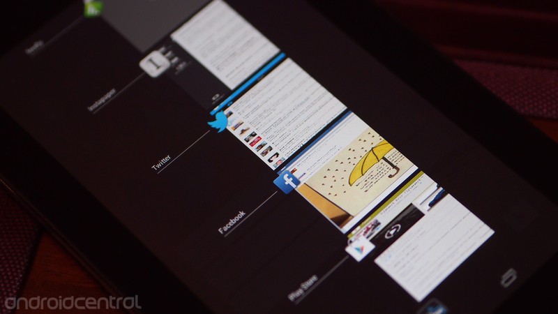
We also encountered a handful of odd visual artifacts just in using the Slate 7 as we normally would. The Gallery app exhibited a weird flicker along the top of the screen whenever we tapped to bring back the controls. But more grating was the app switcher, which vertically squished the app previews of must every app as if they're overcompensating for the inexcusably-stretched screen.
HP Slate 7 Cameras
Rear camera
The HP Slate 7 has two cameras, which is one area where it stands above the Nexus 7. The rear-facing camera is a 3 megapixel shooter with a decent field of view. As much as we have low expectations for tablet cameras, when they're affixed to tablets as cheap as the Slate 7, our expectations are even lower. HP did nothing in their sensor selection for the Slate 7 to change our minds.
The 3MP camera on the back is of expectedly poor quality, though it surprised us in even lacking autofocus. The images it produces are grainy, blurry, low contrast, and dim. The only way we'd use it is if it were the only camera you had on you, and chances are you've got a better camera in your smartphone, especially if it was made any time in the last four years.
Front camera
For all the disappointment of the rear camera, the tiny front camera is even worse. The field of view is standard, though the VGA - that's 640x480 - resolution is… well, it just is what it is. It'll do in a pinch for a Skype or Google Talk video chat, but it certainly isn't going to look good. We wouldn't use it for anything other than that - it's not even good enough for checking if you've got something stuck in your teeth.
The bottom line
For $169.99, the HP Slate 7 would appear to offer a great value in the smaller Android tablet space. At $30 less than the older Nexus 7, on paper the Slate 7 looks like it's not a bad deal. It doesn't have GPS, is a tad heavier and bulkier, has a lower resolution screen, and runs an older version of Android, but everything else technically should be able to keep pace with the small Nexus tablet.
The reality is that the HP Slate 7 is disappointing in practically every manner. The build quality is good, but the design feels old and does nothing to minimize its bulk. It has Beats Audio, but it comes across as more of a gimmick intended to be used with headphones that cost more than the tablet itself. The cameras are a joke, the battery life is mediocre, and the performance is perplexingly glitchy.
Most frustrating is the screen. That HP - a company with more consumer electronics expertise than just about every other corporation on the planet - would dare to release a tablet with a display as appallingly poor as that on the Slate 7 is not a good sign. Four years ago, late Apple CEO and co-founder Steve Jobs said in reference to the then ongoing netbook craze, "We don't know how to make a $500 computer that's not a piece of junk, and our DNA won't let us ship that."
HP was one of many companies flooding Best Buy and Circuit City and Wal-Mart with junk netbooks at that time. What they didn't see coming was the tablet revolution, which in just a few short years completely demolished the netbook market. HP was caught flat-footed by tablets, and botched the purchase and roll-out of Palm and webOS through 2010 and 2011. The company has been a financial and organizational disaster ever since, having lost the faith of investors, partners, customers, and even its own employees.
Their current CEO - former eBay chief Meg Whitman - has made it clear that mobile will play a role in HP's consumer products future. But if the Slate 7 is how HP plans to express that future, they'd be better off stepping away from the abyss and just leaving the consumer hardware space. It's a harsh judgement, but it's the reality of the situation HP finds itself in. The company cannot sustain itself on cheap low-quality Android tablets.
When I was growing up, my grandparents owned a chain of musical instrument stores. They believed in customer service, quality product, and good pricing. It was my grandmother that taught me the difference between cheap and inexpensive. The Nexus 7 is inexpensive. It's well-built, decently-specced, can handle just about anything you throw at it, and is supremely affordable. The HP Slate 7 is cheap. On paper it seems like it should be okay, but in reality its an amalgamation of miscalculations that come out as a disaster of a device and a waste of silicon and dollars. Bill and Dave must be spinning in their graves.
If you have $169.99 to spend on an Android tablet today, don't spend it on the HP Slate 7; find another $30 and buy a Nexus 7. And if you can wait, Google I/O 2013 is coming up soon, and we're expecting an updated and improved Nexus 7 to be revealed there. You should wait. Spend your money wisely on the inexpensive, not the cheap.


Derek Kessler is Special Projects Manager for Mobile Nations. He's been writing about tech since 2009, has far more phones than is considered humane, still carries a torch for Palm (the old one), and got a Tesla because it was the biggest gadget he could find. You can follow him on Twitter at @derekakessler.
