How to make a Material You adaptive icon pack with Icon Pack Studio
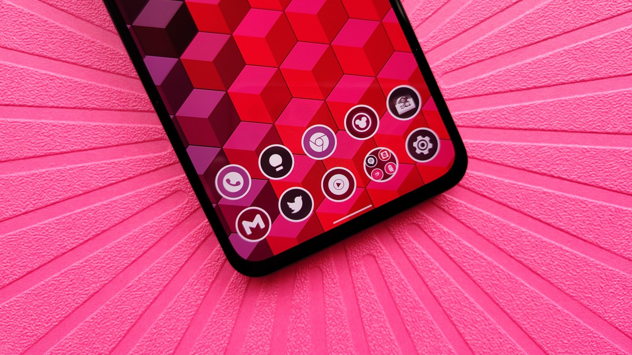
While Android 12 will be arriving soon, the most striking visual change will be Pixel-exclusive at launch. While Material You as a whole will be part of Android 12 and can be implemented by all Android manufacturers, but the Dynamic Color picker is limited to the Pixel line. Dynamic Color is the algorithm that will analyze your wallpaper then pick complementary colors to tint system elements and your app icons, and even if we can't get Google's super-secret color formula, we can still get app icons that change with our wallpapers easily using Icon Pack Studio and one of the best Android launchers.
Icon Pack Studio allows you to craft custom icon packs, that can then be exported and applied like any third-party icon pack. However, you won't need to re-export and re-apply each time you change your wallpaper if you use Smart Launcher 5. The Smart Launcher team built Icon Pack Studio and integrated it into its launcher, so you'll get the best experience using both apps together for a true Material You icon pack with automatic adaptation when you swap wallpaper. These two apps make up half of my favorite theming system, and the categorized app drawer in Smart Launcher 5 is a great asset for those with too many apps installed.
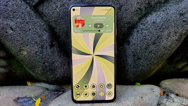
Before you begin, you'll want to decide which of the following four Material You icon pack styles you want to use, based upon how the Material You themed icons react when dark mode is on or off:
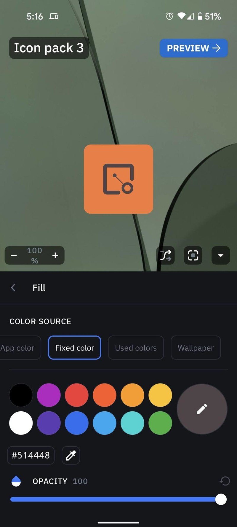
- Classic light mode: Wallpaper-tinted background, gray (#514448) app logo — good for light or pastel-colored wallpapers
- Inverted light mode: Wallpaper-tinted background, white-colored app logo — good for dark-colored wallpapers
- Classic dark mode: Charcoal (#372F31) background, wallpaper-tinted app logo — good for busy wallpapers
- Inverted dark mode: White or cream (#FAFAED) background, wallpaper-tinted app logo — good for muted wallpapers
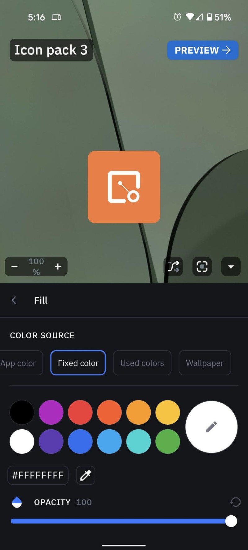
Keep the hex code for your desired pack in mind, as we'll be entering the gray/white color hues manually to contrast with our wallpaper colors. It's also worth noting that if the colors pulled from your wallpaper skew darker or lighter, you may wish to swap from charcoal to white tones. I usually use inverted light mode with a white logo and a white border for wider compatibility and better glanceability when hunting for icons in the drawer.
How to make a Material You icon pack
- Open Icon Pack Studio.
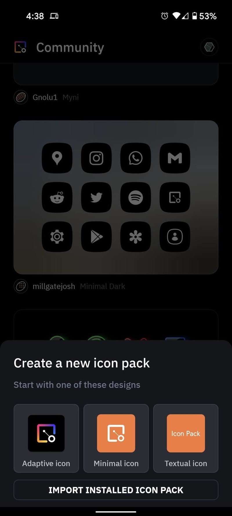
- Tap New at the bottom of the screen.
- Tap Minimal Icon as the starting point for the pack.
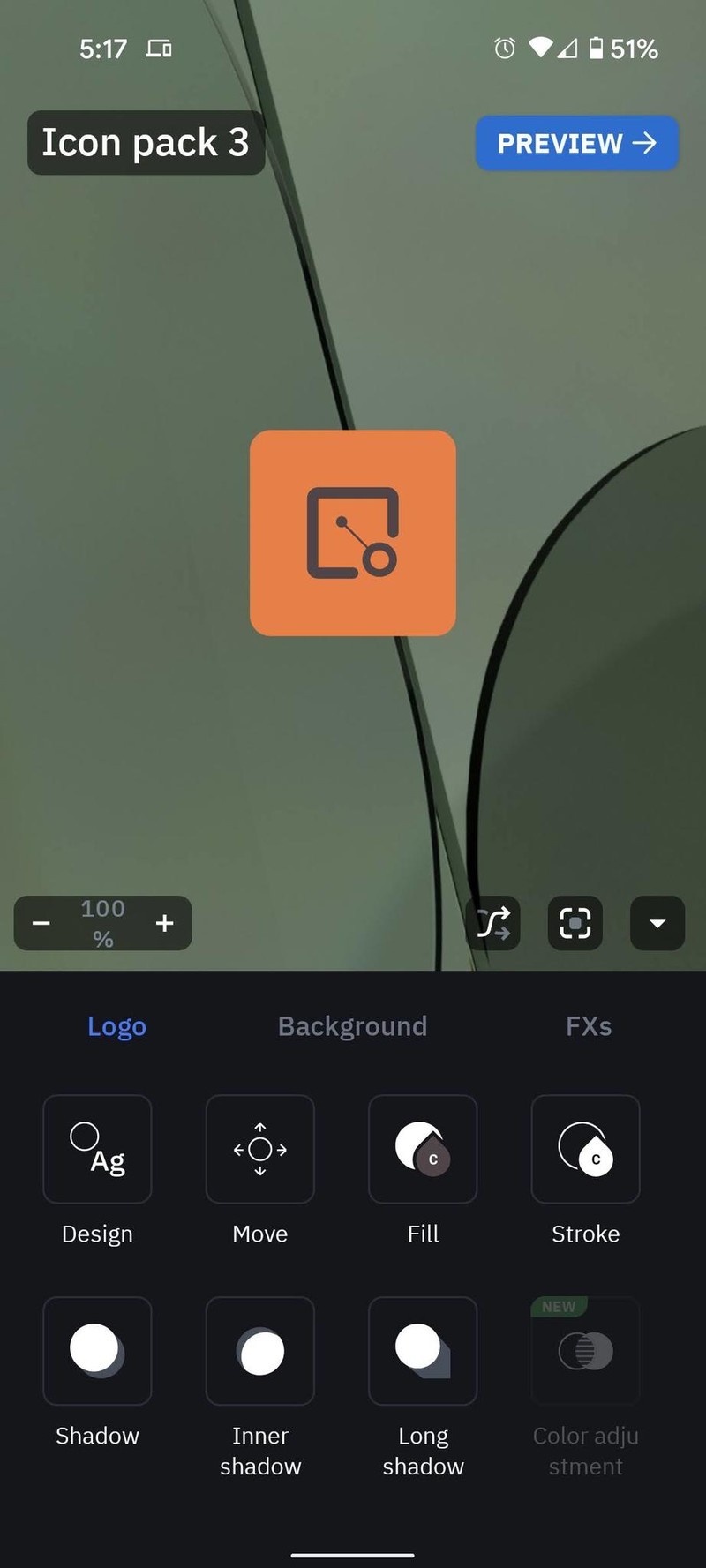
- In the Logo tab, tap Fill.Source: Android Central
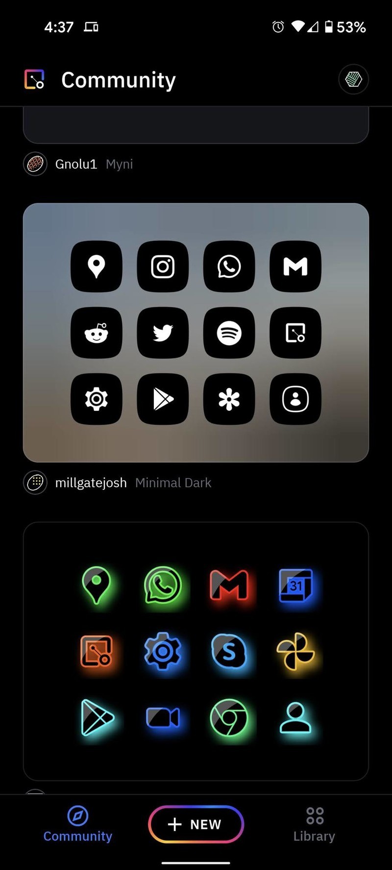
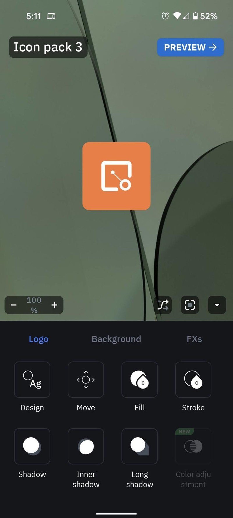
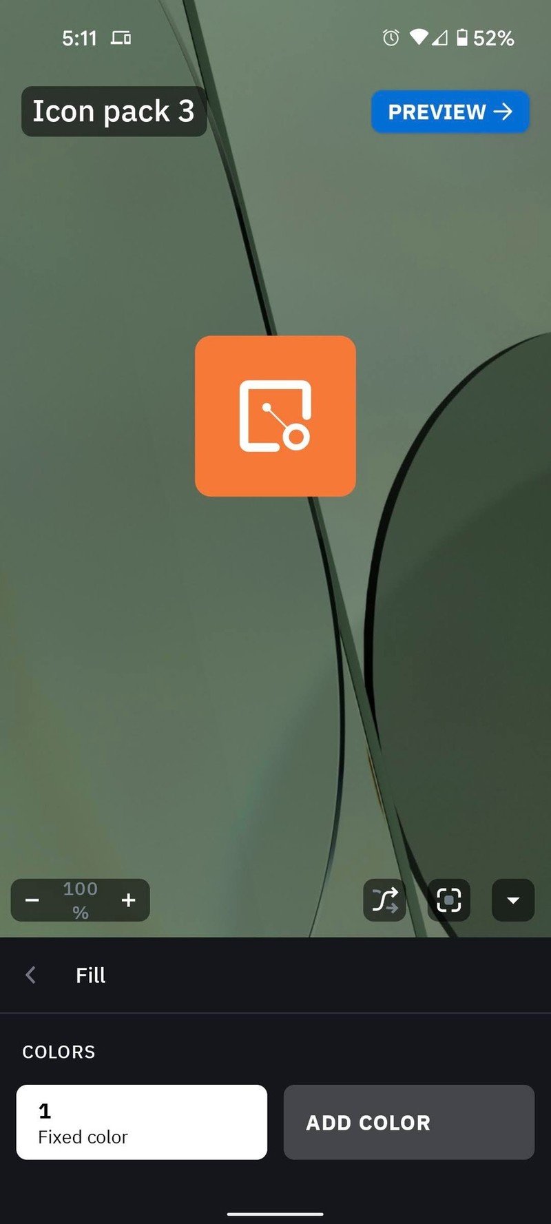
- Tap Color 1.
- Tap Fixed color under Color Source. if setting the dark mode themes, or tap the white circle*. If setting the light mode, tap the **hex code to input the numbers for gray (#514448)**.
- Tap the back arrow twice.Source: Android Central
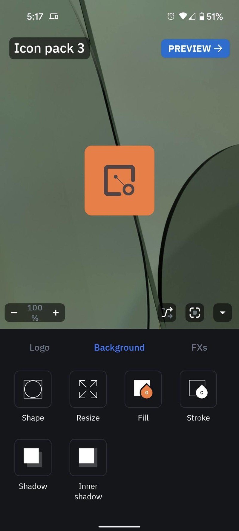
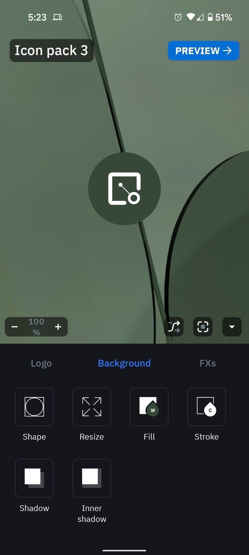
- Tap the Background tab.
- Tap Fill.
- Tap Color 1.Source: Android Central
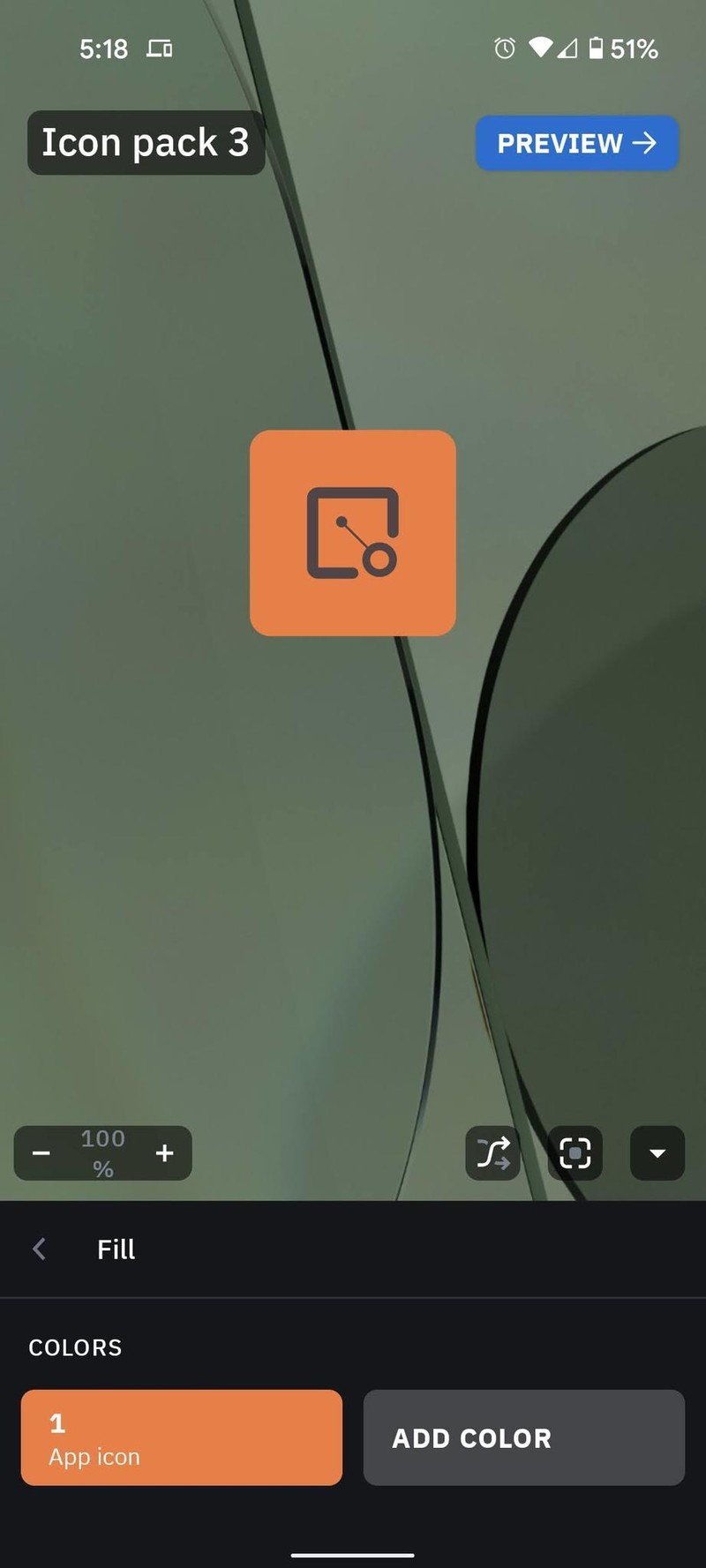
- Tap Wallpaper under Color Source, if setting the light mode themes. If setting the dark mode, tap the hex code to input the numbers for charcoal (#372F31), cream (#FAFAED), or white.
- If the wallpaper colors clash with your static color, repeat steps 4-6 using another color.
- Tap the back arrow twice.Source: Android Central
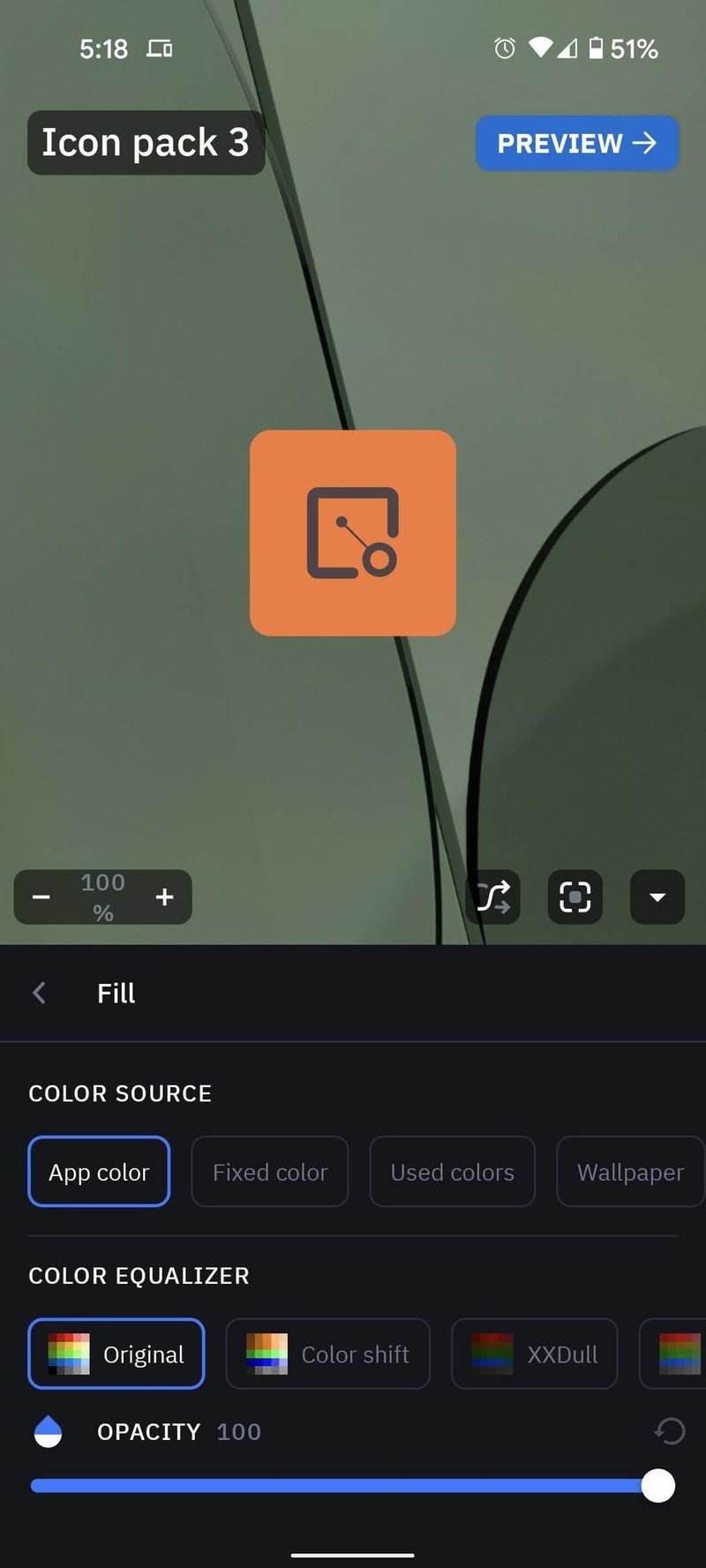
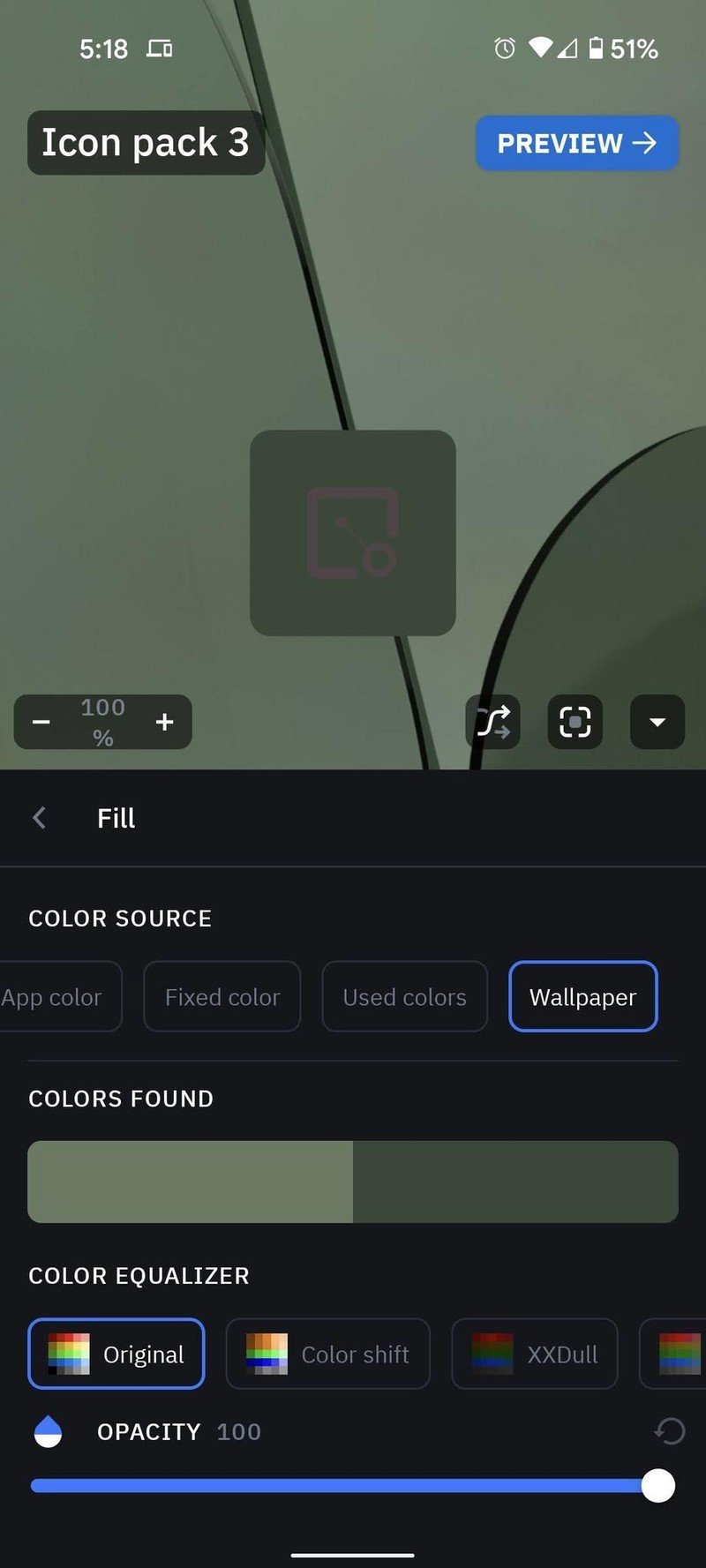
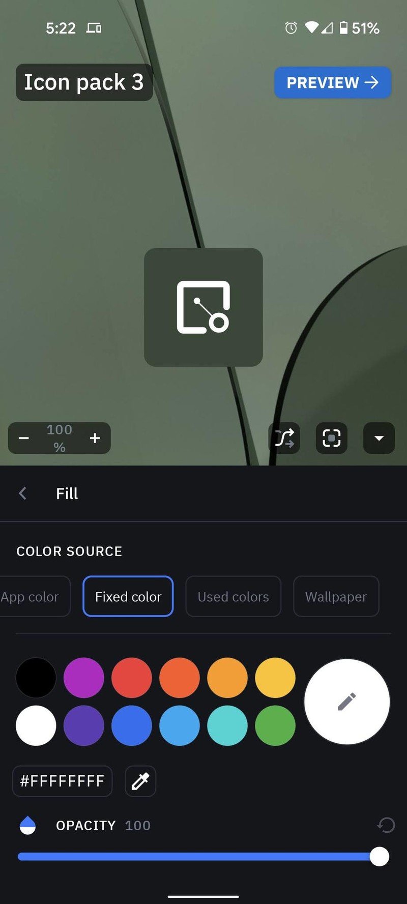
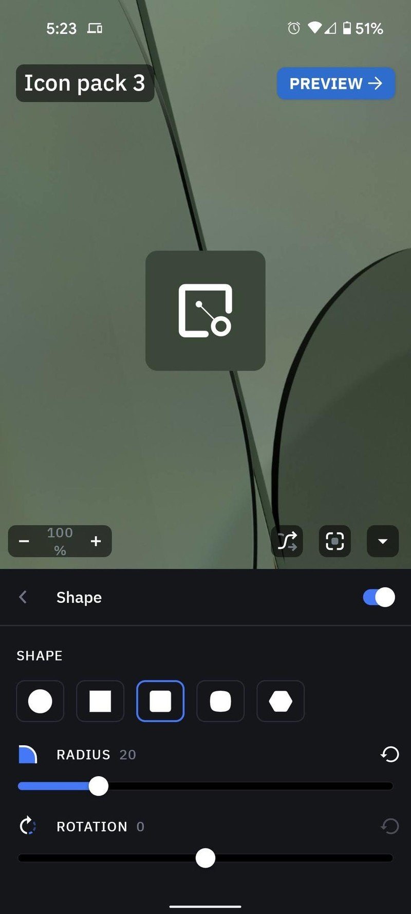
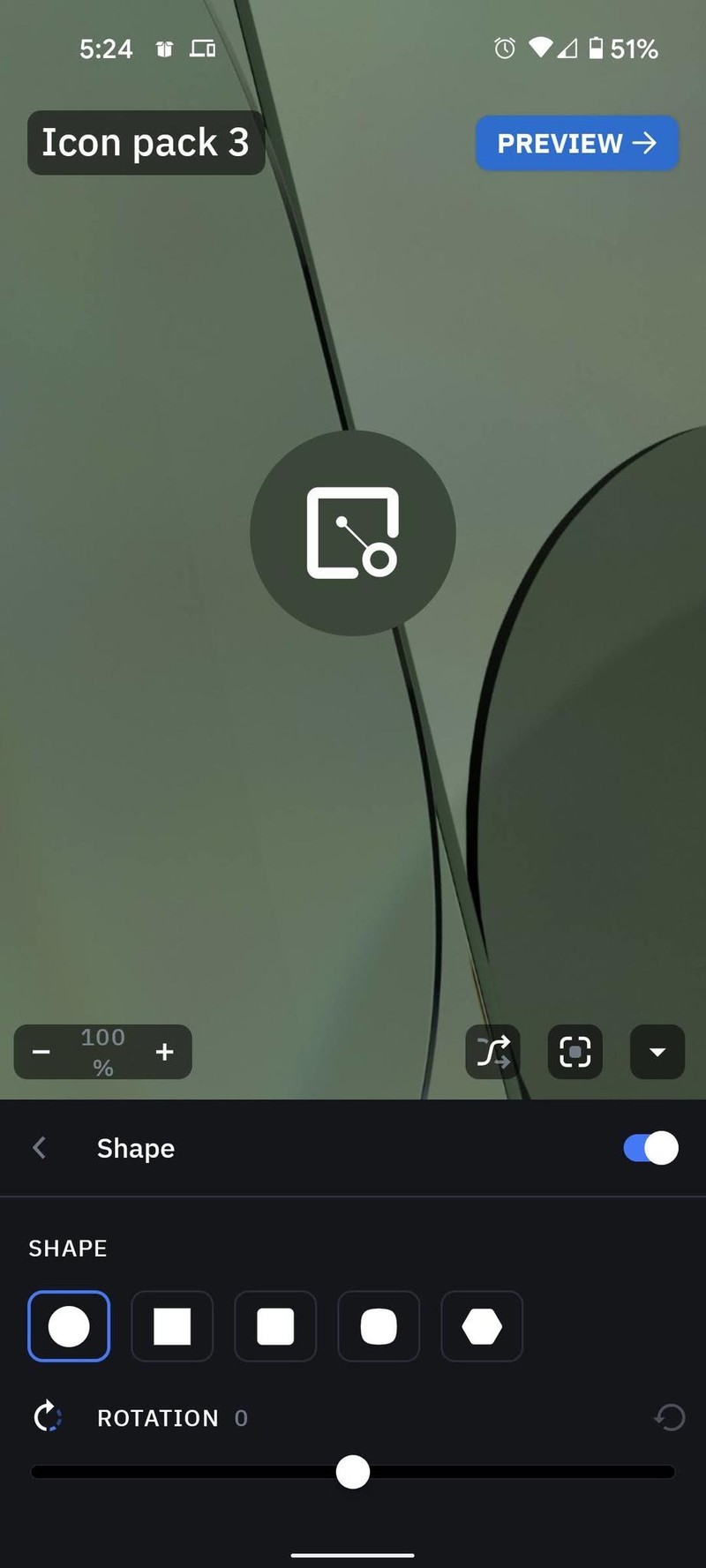
- Tap Shape.
- Select the desired shape.
- Tap the back arrow.Source: Android Central
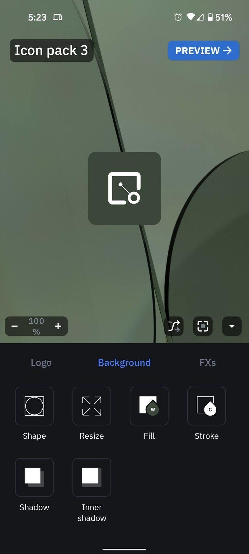
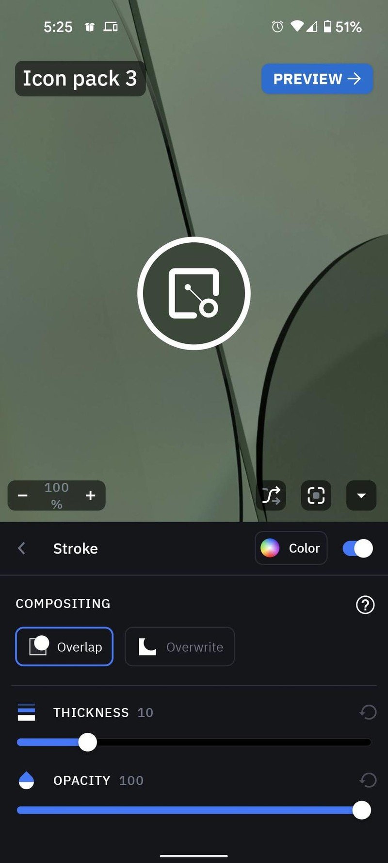
- (Optional) If you want to add a border to your icons for better definition, tap Stroke and set the same color as your app icons used in Step 6.
- Tap Preview.
- If you're happy with the pack, tap Apply.Source: Android Central
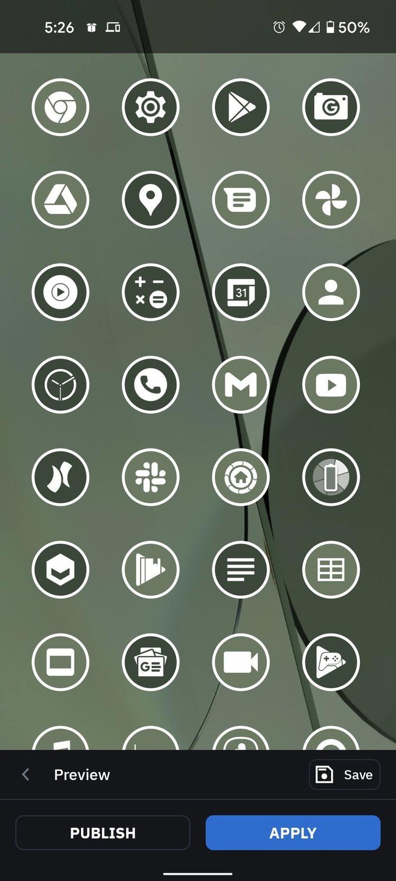
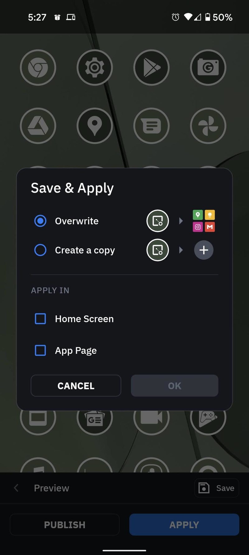
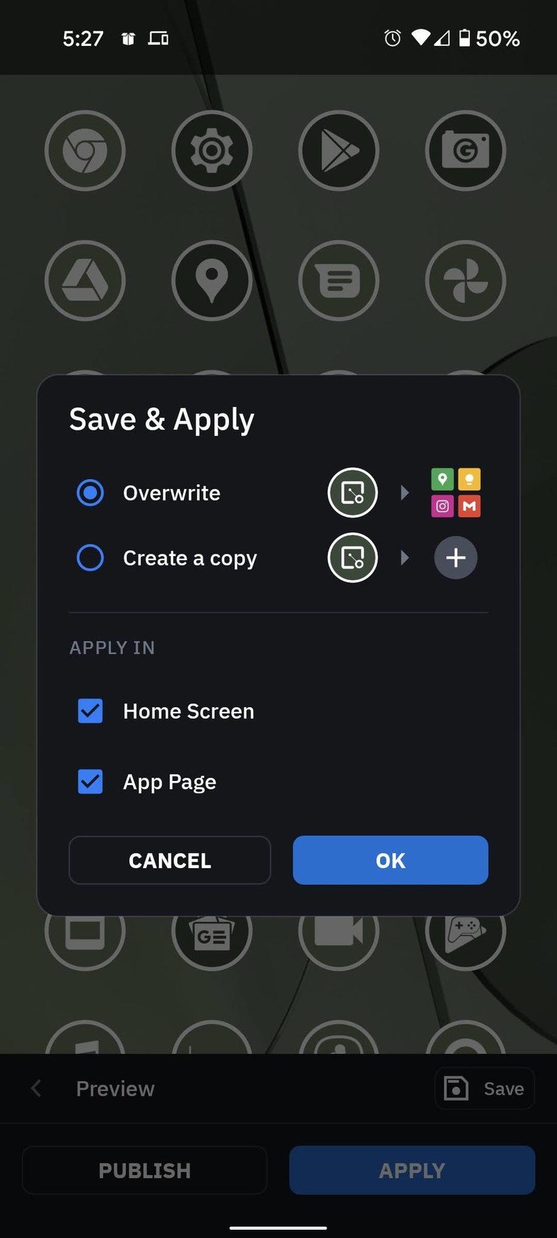
- If using Smart Launcher 5, tap Home Screen and App Page.
- Tap Apply.
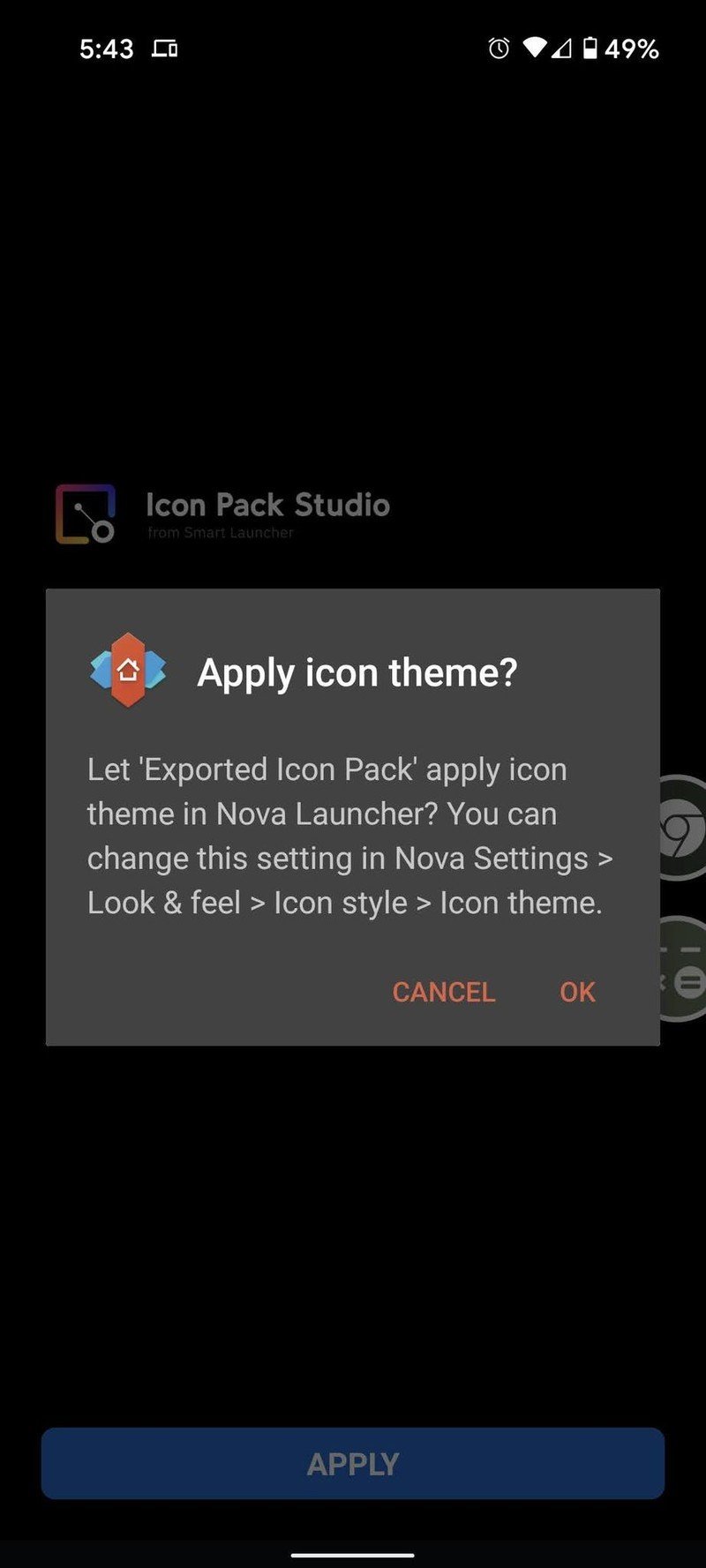
- If using a different launcher, tap OK.Source: Android Central
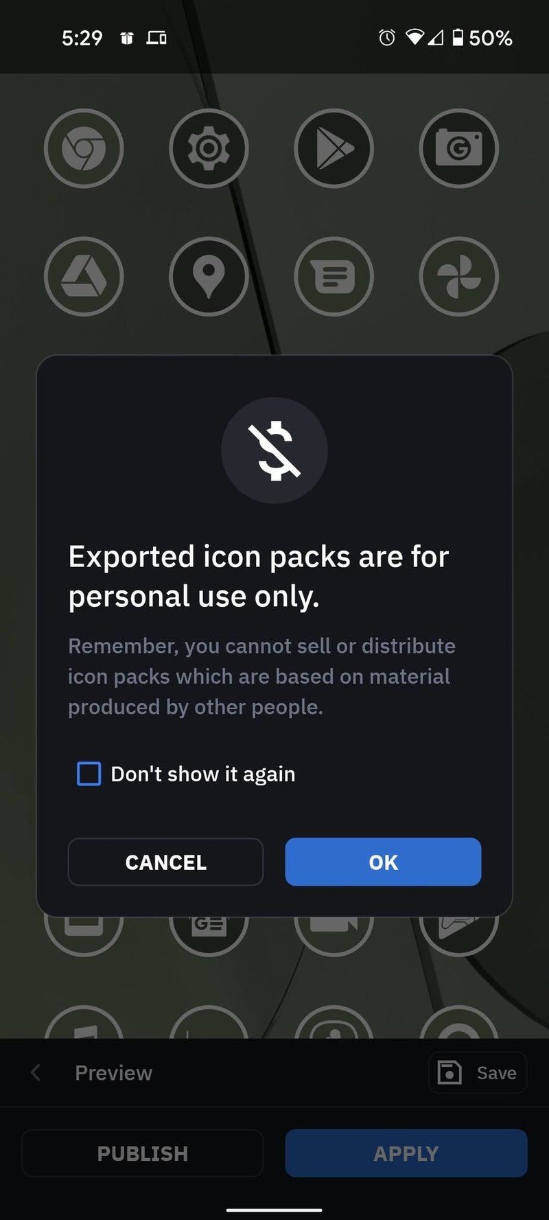
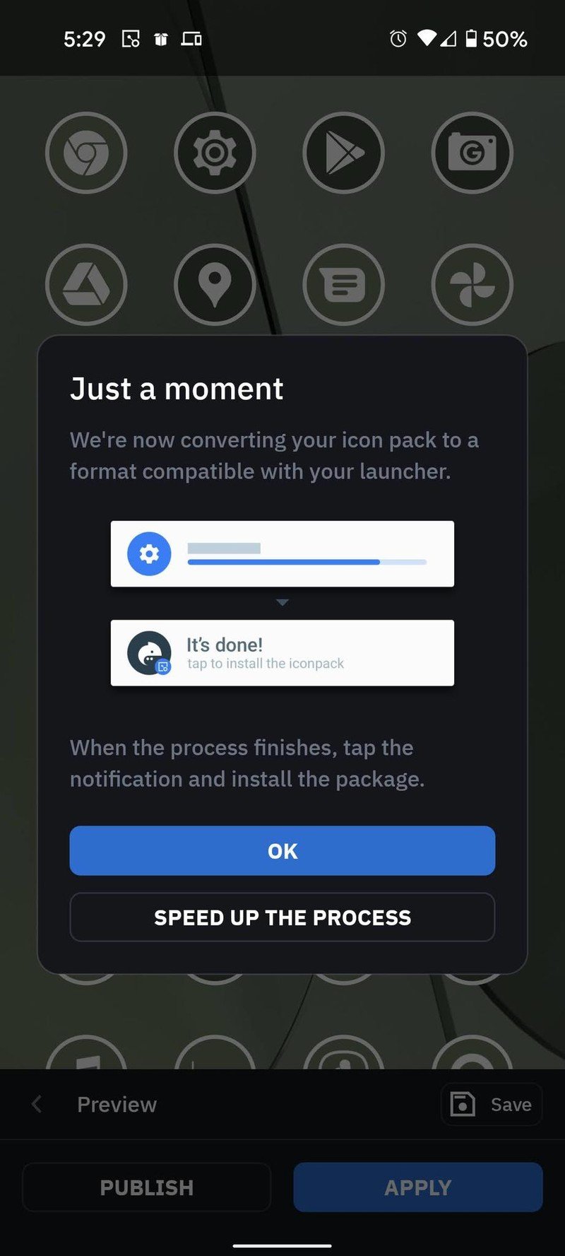
- Tap OK.
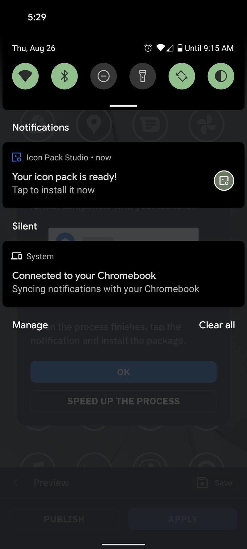
- Open the notification panel.
- Tap Your icon pack is ready!
- Tap Settings.Source: Android Central
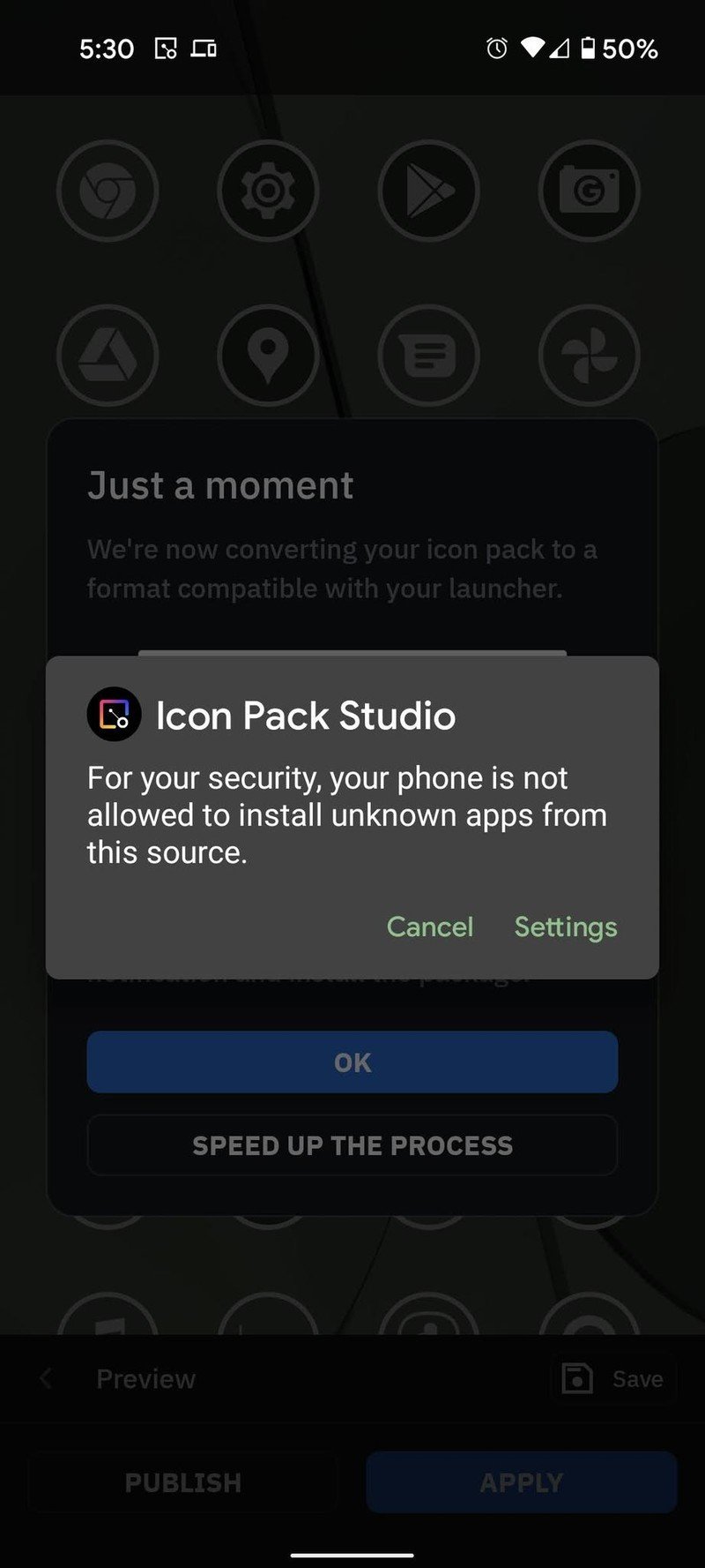
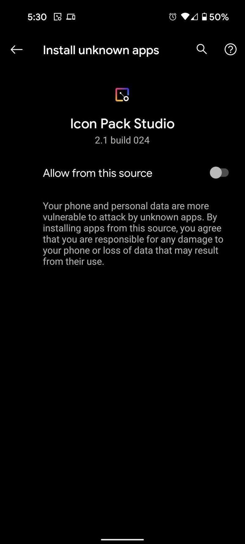
- Tap Allow from this source to toggle it on.
- Tap the back arrow or use the back gesture.
- Tap Install.Source: Android Central
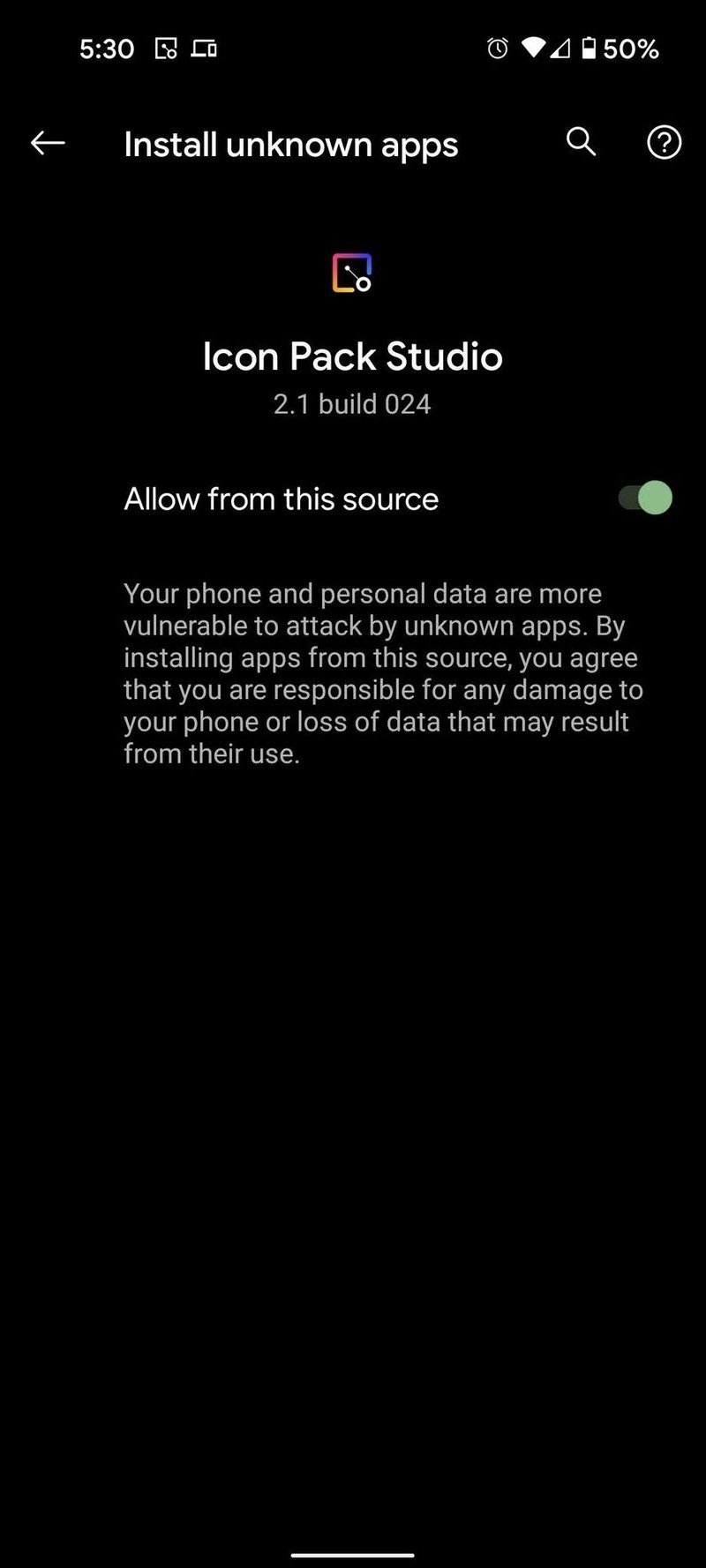
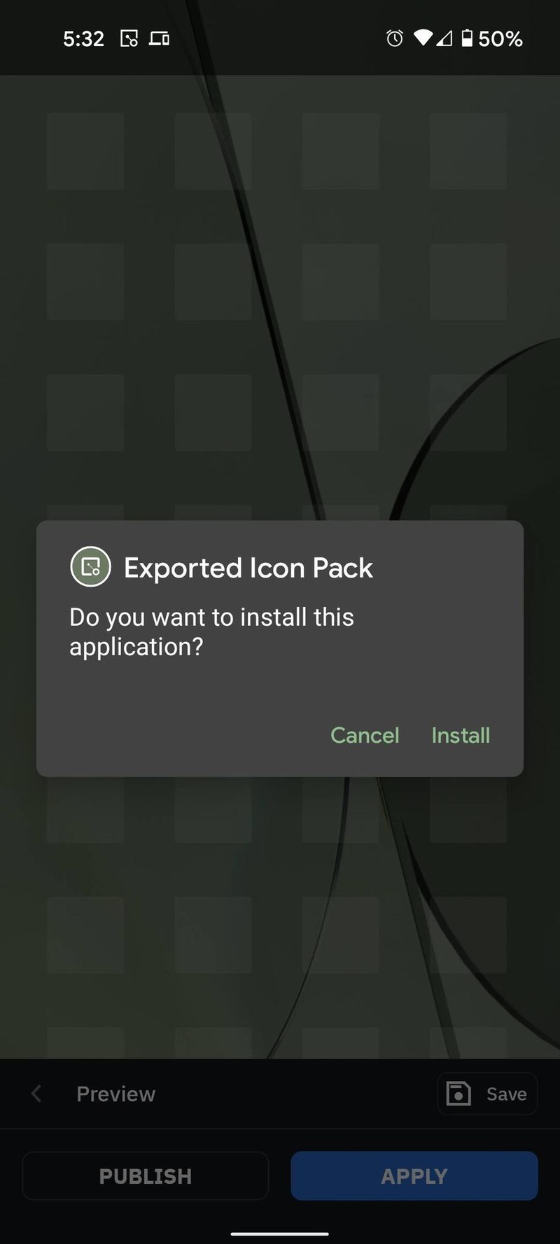
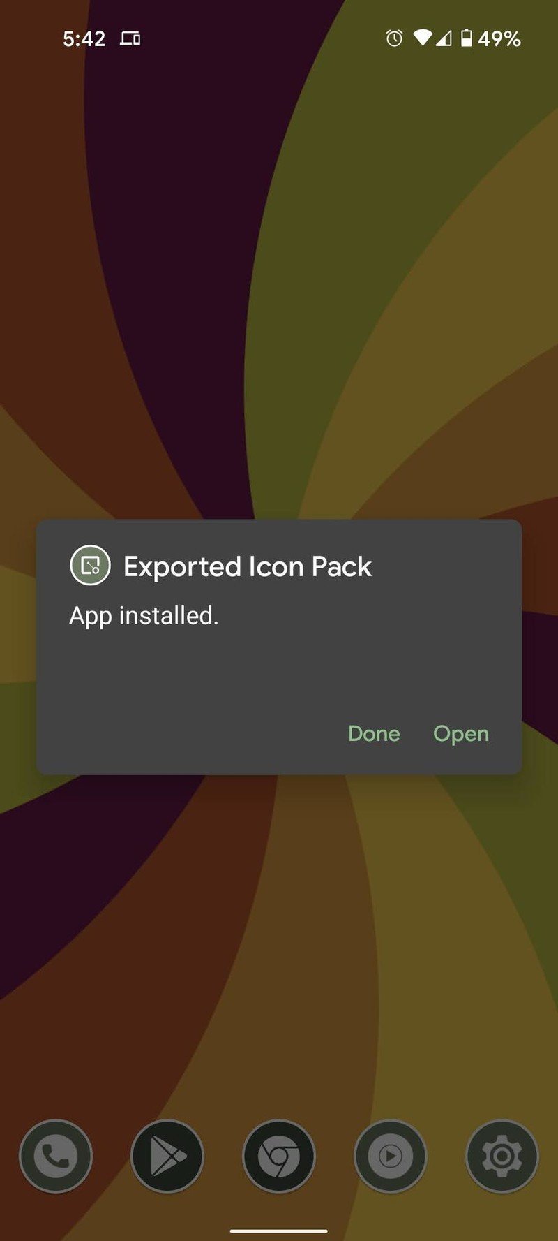
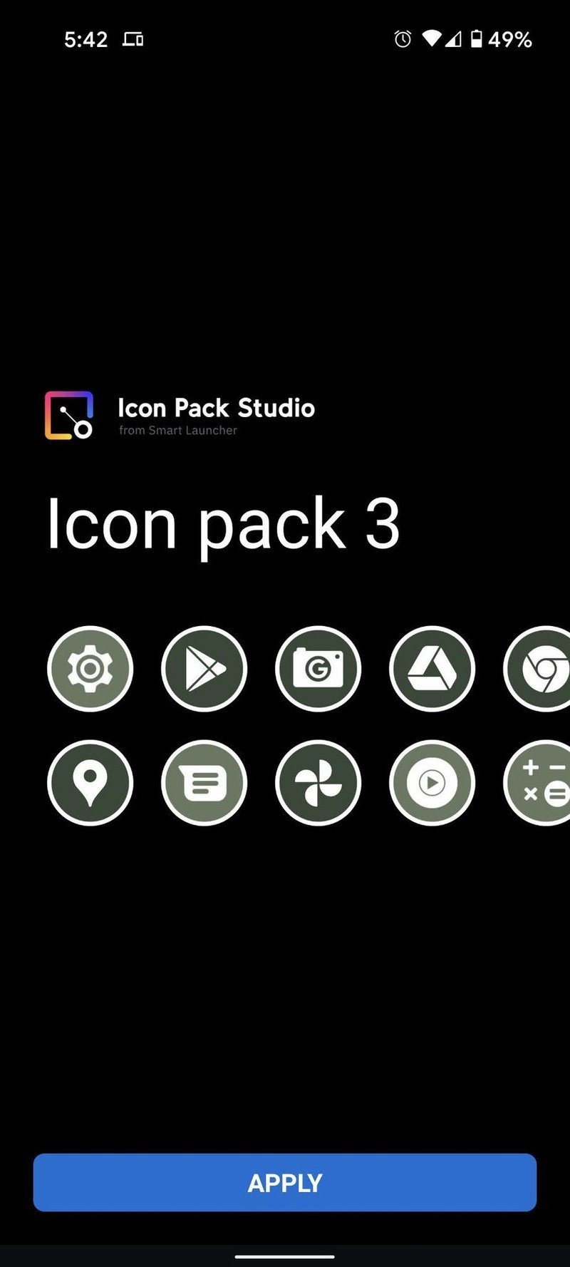
You can now apply the icon pack using the menu of your favored launcher. If you tap Open you can set it directly in some of the more popular launchers like Nova Launcher, Smart Launcher, and others. It's also important to note that while Smart Launcher's pretty good at pulling the colors from most wallpapers, every now and then it'll just pull straight black when dealing with dark or AMOLED-tuned wallpapers. If this happens, use the eyedropper tool next to the hex code, then select a shade from the wallpaper that's to your liking instead.
When changing wallpapers
If you're using Smart Launcher 5, the icons will automatically update each time you change wallpapers. However, if you're using another launcher, you'll have to manually update the pack, but it doesn't take long:
Be an expert in 5 minutes
Get the latest news from Android Central, your trusted companion in the world of Android
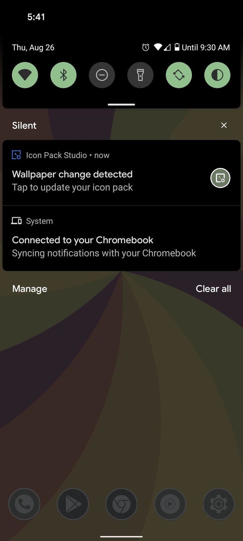
- Open the notification panel.
- Tap Wallpaper change detected.
- Tap Your icon pack is ready!
- Tap Install.Source: Android Central

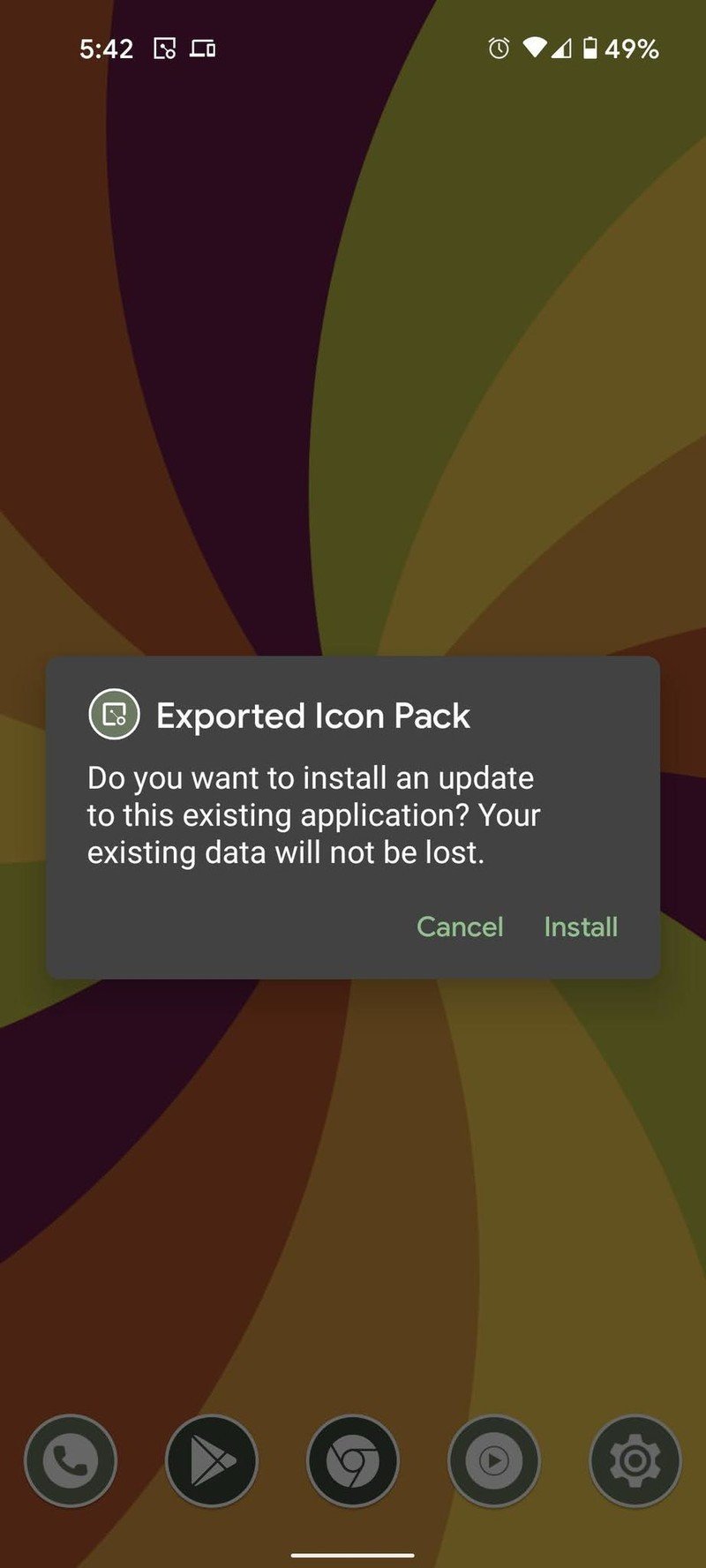
- Tap Open.
- Tap Apply.
- Tap OK.Source: Android Central
Why wait for Android 12?
One of the best parts of Android is the customization options. If you hate the icons that came with your phone, you can replace them. Can't get things the way on your home screen? It'll be a cinch with the best Android launchers. Can't get the latest Android look and feel? Theming to the rescue, and Icon Pack Studio can actually give us a better version of Material You's icon pack because we can get two to four colors extracted from a wallpaper, we can add textures, change the app logo color, and add strokes or gradients to them.
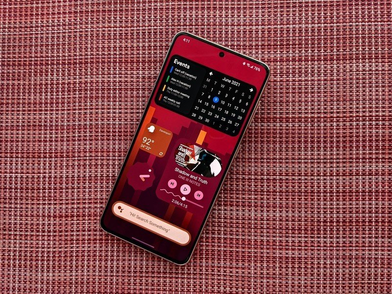
Best of all, you can do this for free — all Icon Pack Studio's in-app upgrade does is unlock some of the filters and more exotic options that are a bit too outlandish for most themes anyway. I added a gradient to an adaptive pack for added vibrancy and consistency in one of my packs and it worked out beautifully, at least as long as I stuck to wallpapers in the same portion of the color wheel.
If you're looking for more Material You goodness, some enterprising themers have built spectacular Material You widget packs that you can use to add dynamically colored widgets to any launcher you use — even built-in launchers that don't support third-party icon packs like Icon Pack Studio.
Meet the last icon pack you'll ever need
Icon Pack Studio allows you to make icon packs that are perfectly tailored to match your wallpaper, a custom theme, or even your chosen sports team's colors, adding in effects and depth to make it totally one of a kind. Unlike normal icon packs, you won't have to deal with any nasty holes for obscure apps, as this app applies the theme to all installed app icons.
As mentioned previously, Icon Pack Studio is made by the Smart Launcher team and integrates directly with the launcher so that you don't have to re-export and re-apply the icon pack each time you change wallpapers. So if you're looking for the closest experience to the Dynamic Color icons on the Android 12 Pixel Launcher, Smart Launcher 5 is the easy choice to make, especially given how easy it is to find your way around once you get the app drawer categorized.
The home screen and widget page layouts in Smart Launcher 5 are also quite praiseworthy, even if they may feel limited to some. App icons are confined to a single area in a set style, be it the classic circle and honeycomb views or the more traditional grid view. Widgets are then isolated on another layer that allows widgets to be precisely and perfectly placed. This does mean you can't scatter app icons in with your widgets, but I prefer to keep my app icons down closer to my thumb while the widgets I glance at can sit higher up.

Let your icons update instantly and your apps stay organized
Even if Smart Launcher 5 didn't make it insanely easy to swap between my themes (which it does), and even if it didn't have a breathtakingly simple home screen layout in regard to icon and widget layouts, Smart Launcher still has an excellent ace up its sleeve. The app drawer on Smart Launcher 5 can be categorized automatically, and then within each tab, you can sort between various styles or manually order apps the way you want them.
Have you listened to this week's Android Central Podcast?
Every week, the Android Central Podcast brings you the latest tech news, analysis and hot takes, with familiar co-hosts and special guests.
Ara Wagoner was a staff writer at Android Central. She themes phones and pokes YouTube Music with a stick. When she's not writing about cases, Chromebooks, or customization, she's wandering around Walt Disney World. If you see her without headphones, RUN. You can follow her on Twitter at @arawagco.
