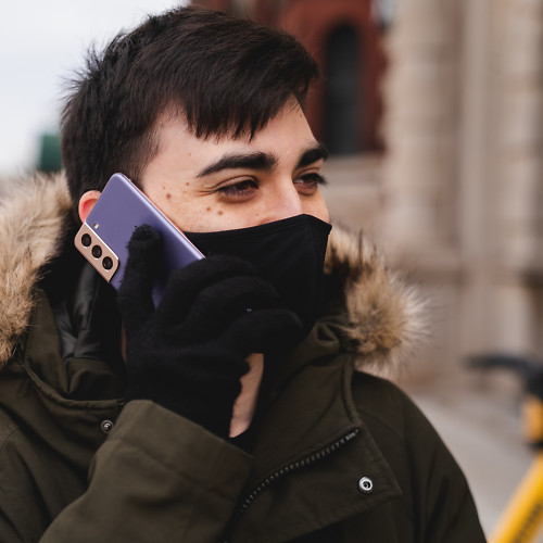
How does Instagram's new Focus mode compare to your phone's portrait mode?
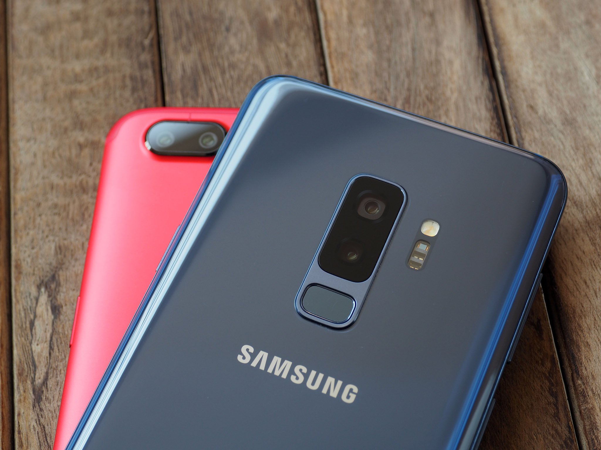
Instagram recently rolled out a new shooting mode in its Stories camera called Focus, which allows you to take artsy photos of yourself and friends with artificial bokeh and separation from your background. That's right — it's basically portrait mode, and it's rolling out to iPhone and Android users as we speak. But a lot of phones already have portrait mode, so ... what's the difference, and should you ditch your default camera app and start taking photos with Instagram instead?
The answer may depend on what phone you're carrying. I gathered some of the most popular phones I had sitting around the office and took some sample shots to compare the strengths and weaknesses of Instagram Focus. Here's a collection of photos of me looking cold and frustrated at gray skies and flurries in the middle of April, all taken with different phones and shooting modes!
iPhone X
When Instagram launched Focus, it immediately began rolling out to all iPhone users, so it only made sense to compare it to the iPhone X's portrait mode, which has frankly been pretty far behind what most modern Android phones are capable of. Focus solves one of the iPhone's biggest problems with shooting in portrait mode; since the default camera app uses the secondary zoom lens for portrait shots, you need to be far away from your subject, making it hard to get photos of friends in close quarters.
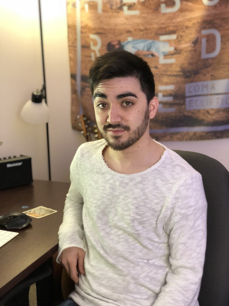

Using the Natural Light effect in Apple's portrait mode, image separation is impressive, doing a good job blurring out the banner behind me while leaving my hair mostly untouched. Background blur is mostly good as well, without any egregious stitching errors or focal plane oddities. Unfortunately, none of that can be said of the photo taken with Instagram Focus. Object separation is horrendous, with random sections of my body coming in and out of focus. The background and foreground are also uniformly blurred, which simply isn't how natural bokeh works. Image quality is also noticeably lower in general than the photo taken with the stock camera app.
Selfies
So about how selfies? Like Instagram, the iPhone X's stock camera app allows for portrait photos with artificial depth from the front camera as well as the rear. Comparing the two again, it's a more even split of pros and cons. Once again, the Focus photo has noticeably less facial detail, almost as if it were out of focus. However, this time Instagram seems to do a better job of object separation, as the iPhone's stock camera app inexplicably blurs my shirt along with the background.
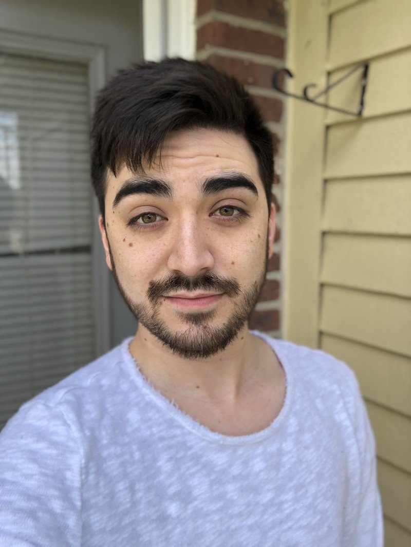
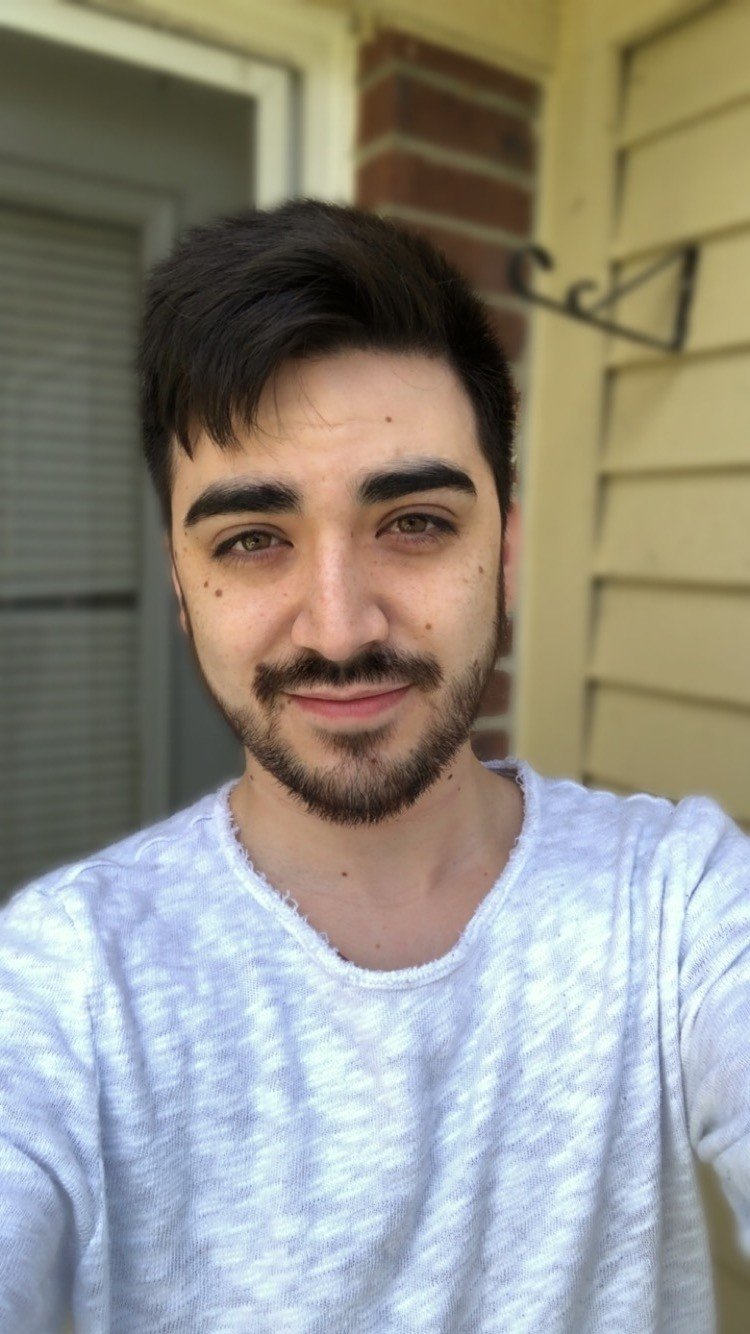
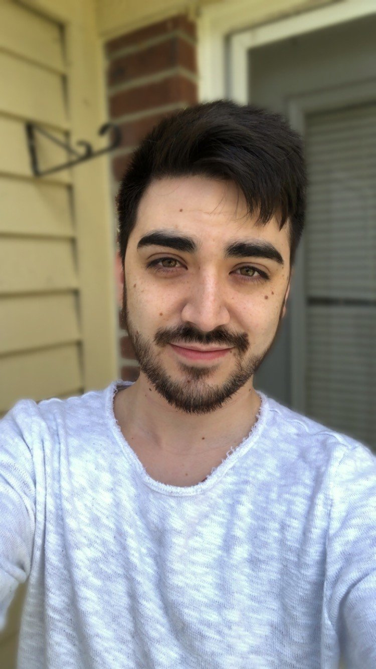
Instagram's object separation still isn't perfect, though. Both of my ears are blurred away, whereas the stock app does a slightly better job of leaving them intact. Interestingly, Instagram Focus actually takes a reversed photo by default. I uploaded the original photo as well as a flipped version in case you'd want a closer comparison against the shot taken with Apple's default camera app.
Be an expert in 5 minutes
Get the latest news from Android Central, your trusted companion in the world of Android
Galaxy S9
Things start to look better when we switch to the Galaxy S9, though Instagram Focus is still significantly softer than the selective focus mode in the stock camera app. From my glasses to my facial hair, the logo on my hoodie, and the sleep-deprived bags under my eyes, the S9's own camera software was simply able to pull in more detail. Samsung's selective focus also did a much better job at separating my hair from the sky behind me, whereas Instagram Focus seems to have started blurring the image just past my hairline. In Focus's defense, however, the S9's selective focus seems to have decided the entire lower half of my torso was on a different focal plane, leading to an unnatural bokeh effect.


One thing to keep in mind is that Instagram captures photos in the same aspect ratio and resolution as your display, so while the selective focus shot was captured in 4:3, the photo taken with Focus matches the Galaxy S9's 18.5:9 aspect ratio, and measures in at 2076x1080. While the aspect ratio isn't necessarily a big deal, the reduced resolution can be, since the 4:3 shot comes in at a much larger 4032x3024.
Selfies
The difference is a bit less noticeable when taking selfies. Instagram's photo actually looks sharper than Samsung's this time, though it still struggles with hair separation, and the difference in resolution is still in play.

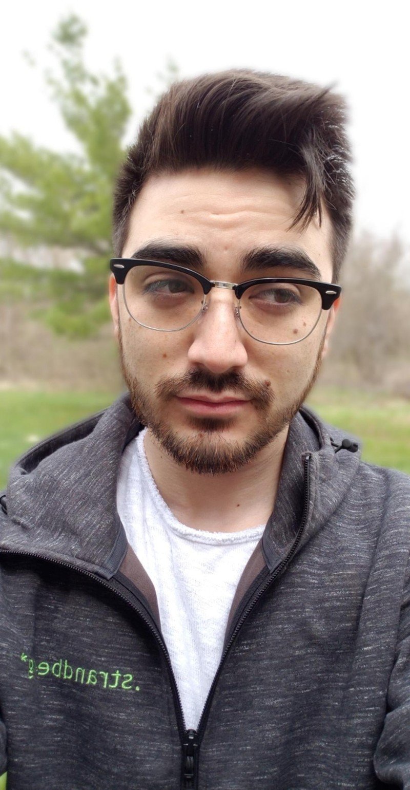

One thing I didn't care for with the photo taken with Instagram is how heavily saturated it is, but aside from that I'd call these sample shots pretty evenly matched. You may also find the Focus shot a bit oversharpened, pulling out more undesirable details and imperfections, but I personally prefer it to the softer look of the stock camera's results.
Huawei Mate 10 Pro
On to the Mate 10 Pro, my go-to phone for dependable battery life, the differences here are a bit more subtle, with a few standouts for each camera. Yet again, the photo taken with Instagram Focus is less sharp, but by a slimmer margin than on the Galaxy S9. While the Mate 10 Pro's portrait mode has more detail, I'm happy with the clarity in either photo.
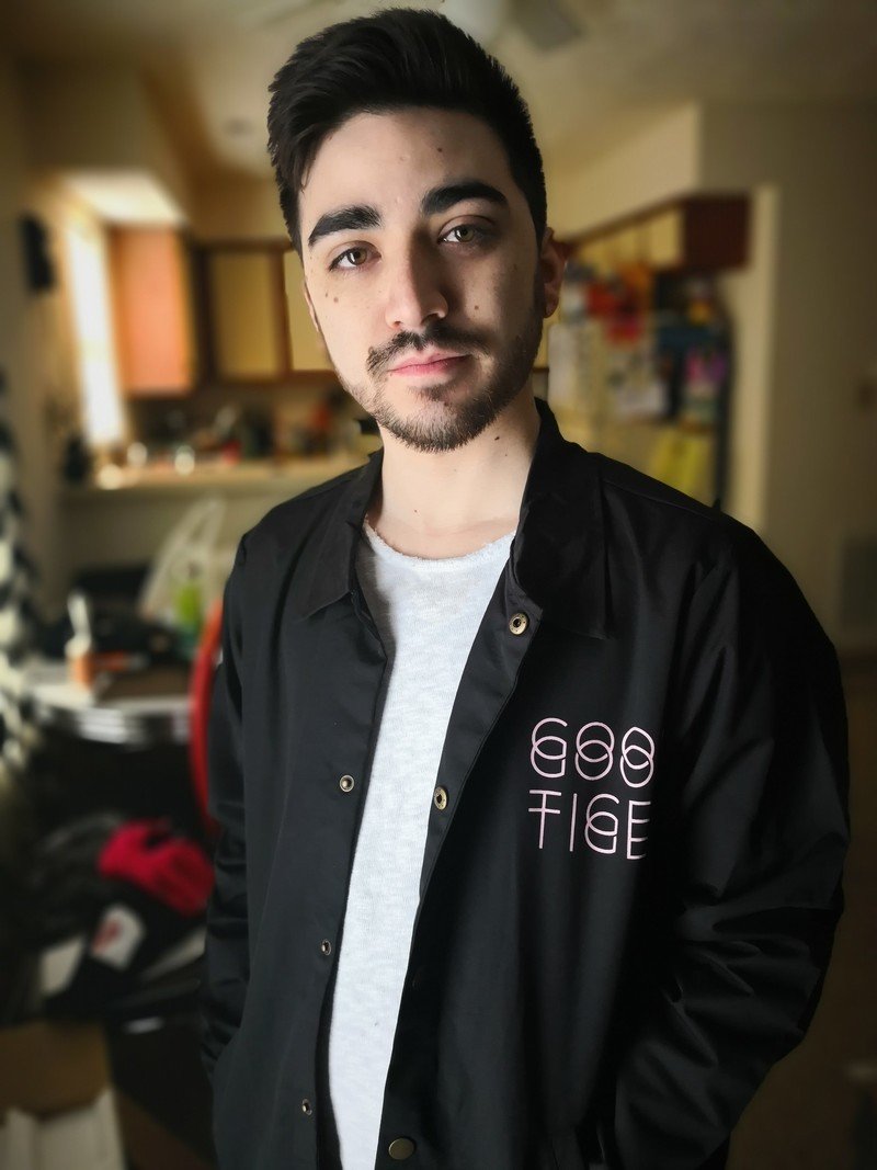
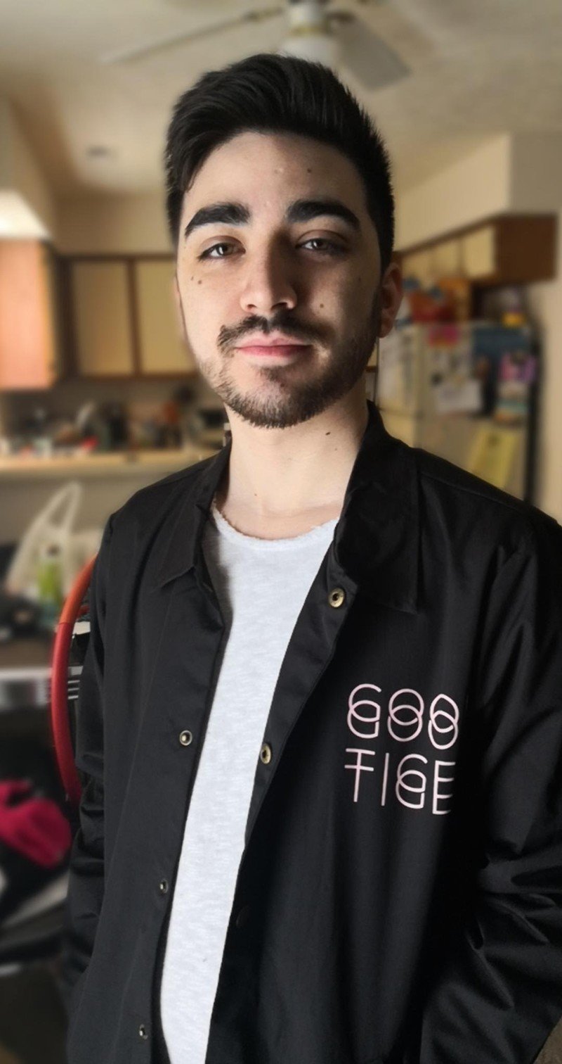
The biggest difference I noticed was color; while the Focus photos were more saturated on the Galaxy S9, I found the opposite to be true with the Mate 10 Pro. The image taken in Huawei's camera app is much more saturated, particularly in the shadows, and there's a warmer overall tone than in Instagram's Focus mode.
Selfies
Just like the Galaxy S9, the Huawei Mate 10 Pro allows you to take portrait mode shots with either camera, as well as within Instagram's Focus mode. The Mate 10 Pro's front-facing camera is far from my top pick for taking selfies, but my findings with the rear camera seem to remain true up front, as well. My hoodie is much darker in the shot taken within Huawei's own camera app, and the grass shows a much warmer characteristic.


I actually prefer the background blur from Instagram's camera here, though; particularly with the tree behind me, the blur looks considerably spottier in Huawei's shot.
OnePlus 5T
Finally, we get to the OnePlus 5T, one of my favorite phones of 2017. This one exhibits the most drastic differences between stock and Instagram cameras, mostly because OnePlus's built-in portrait mode is such a subtle effect. While this sounds like a criticism at first, I actually really appreciate this — it's a much more natural look, in my opinion, and more closely matches the results you'd see from a dedicated DSLR at f/3.5 or so. There's no overly heavyhanded background blur in the shot from the 5T's default camera software, though my right arm (pictured left) falls out of focus around my elbow.
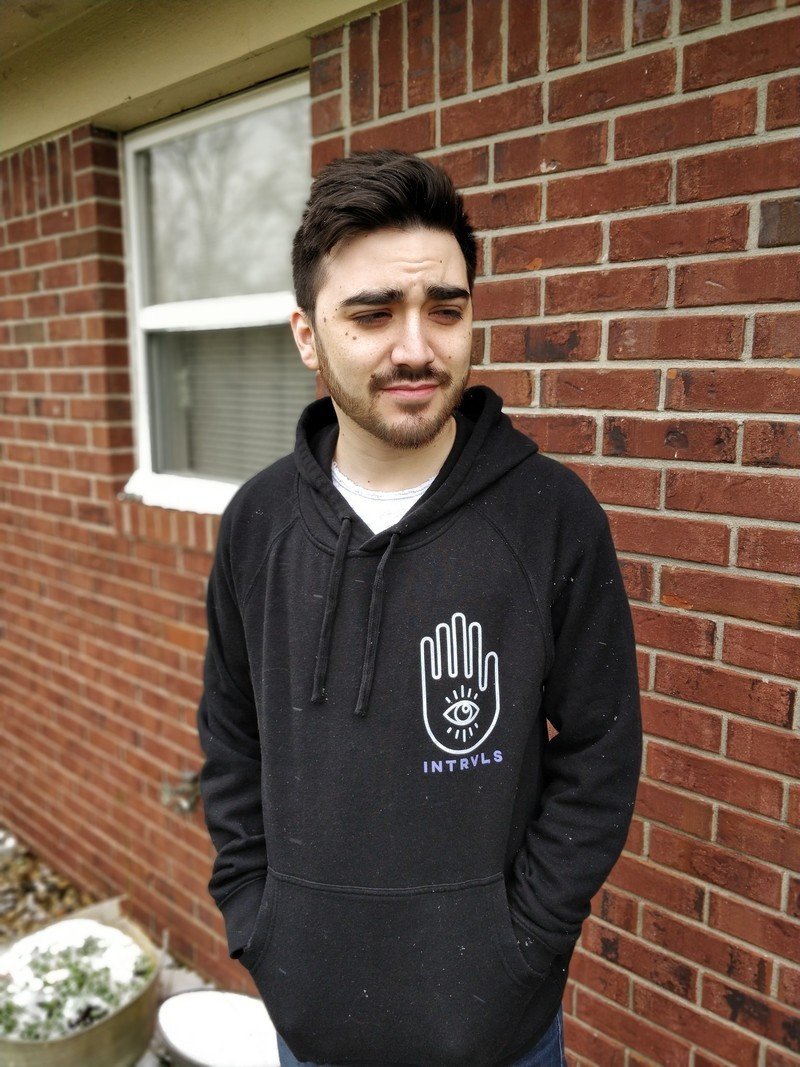
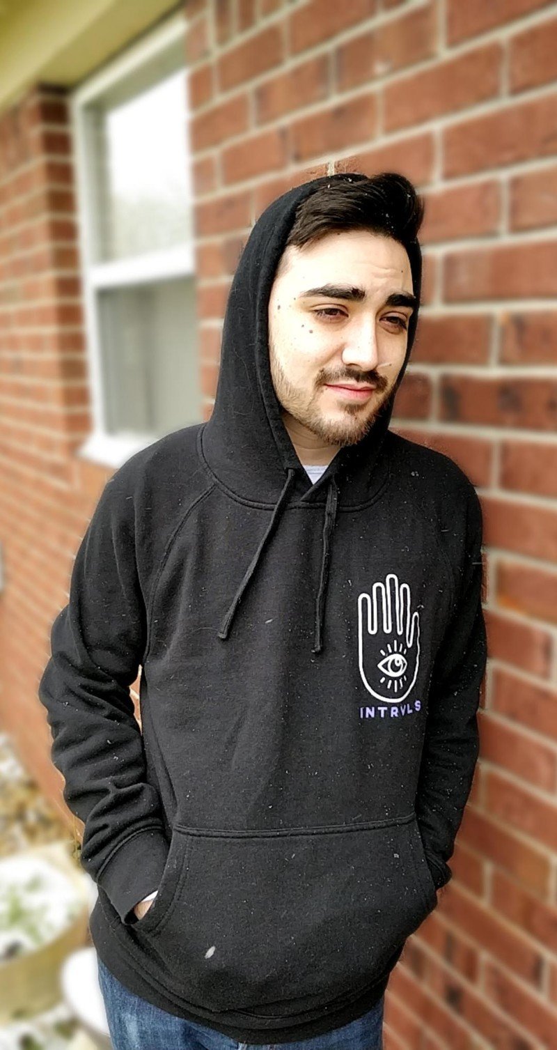
On the other hand, background blur is much stronger with Instagram Focus. I'm completely separated from the brick wall — even the spot I'm leaning against. Separation is noticeably weaker here compared to the Focus shots taken on other phones, with spotty stitching all around me from my hood to my shoulders. My face is also a bit blown out in the Focus shot, and colors are dramatically cooler toned than the photo taken with the OnePlus camera software.
While Instagram Focus still works with the front-facing camera, the OnePlus 5T doesn't offer portrait mode for the front camera in its own software, so these rear shots wrap up the comparison!
What's your take?
With a limited selection of phones at my disposal to test and compare, I can't definitively say that Instagram Focus will be better or worse than your phone's stock camera software overall. That'll largely depend on factors like which phone you're using, how important resolution and aspect ratio are to you, and whether you prefer a more natural look or full-stop artificial bokeh.
Whatever your preference, let us know in the comments below!
Hayato was a product reviewer and video editor for Android Central.
